The Artistry of the Mentally Ill: The 1922 Book That Published the Fascinating Work of Schizophrenic Patients, and Influenced Paul Klee, Wassily Kandinsky & Other Avant Garde Artists
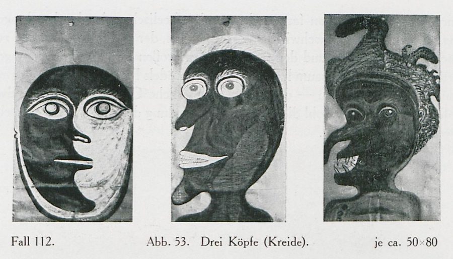
It’s an enduring irony of art history: artists whose work has come to define high culture are often characterized by various mental health issues. But the artwork of ordinary, anonymous people who struggle with those same issues is regarded as therapy, maybe, or a diversion, or a meaningless form of busy work. Though the art world has created a market for “outsider art,” it can seem like such work and its creators get viewed through an ethnographic lens rather than humanizing portraits of the artist.
As Michel Foucault demonstrated in Madness and Civilization, institutions sprung over the course of modern European history to quarantine certain classes of people from the rest of society, even if it is troublingly clear to many of us that the distinctions cannot hold—hence, perhaps, the morbid fascination with the madness of famous professional artists. In 1922, German psychiatrist Hans Prinzhorn challenged this reigning orthodoxy with the publication of Artistry of the Mentally Ill.
The book, writes the Public Domain Review, “reflected a breakdown of high culture’s claim to ‘civilization,’ exposing the misery and turmoil at the heart of modern life.… Against the grain, the book granted voice to the previously marginalised: those incarcerated, those deemed insane, those suffering under poverty, those untrained, those in the wrong type of institution.”
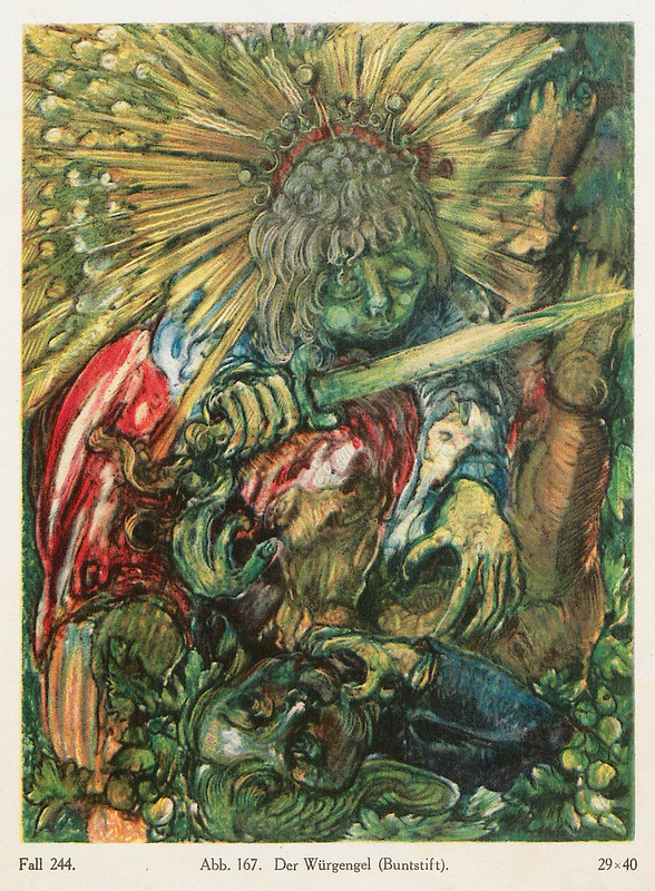
It granted those artists an audience, more to the point, of appreciative fellow artists like Paul Klee, Max Ernst, and Jean Debuffet (who would coin the term Art Brut in response). As should be abundantly clear from the small sampling of images here from the book, modernists took much from the images they saw in Prinzhorn’s book, most of it the unattributed and anonymous work of schizophrenic artists, some of whom themselves draw from earlier modernist trends.
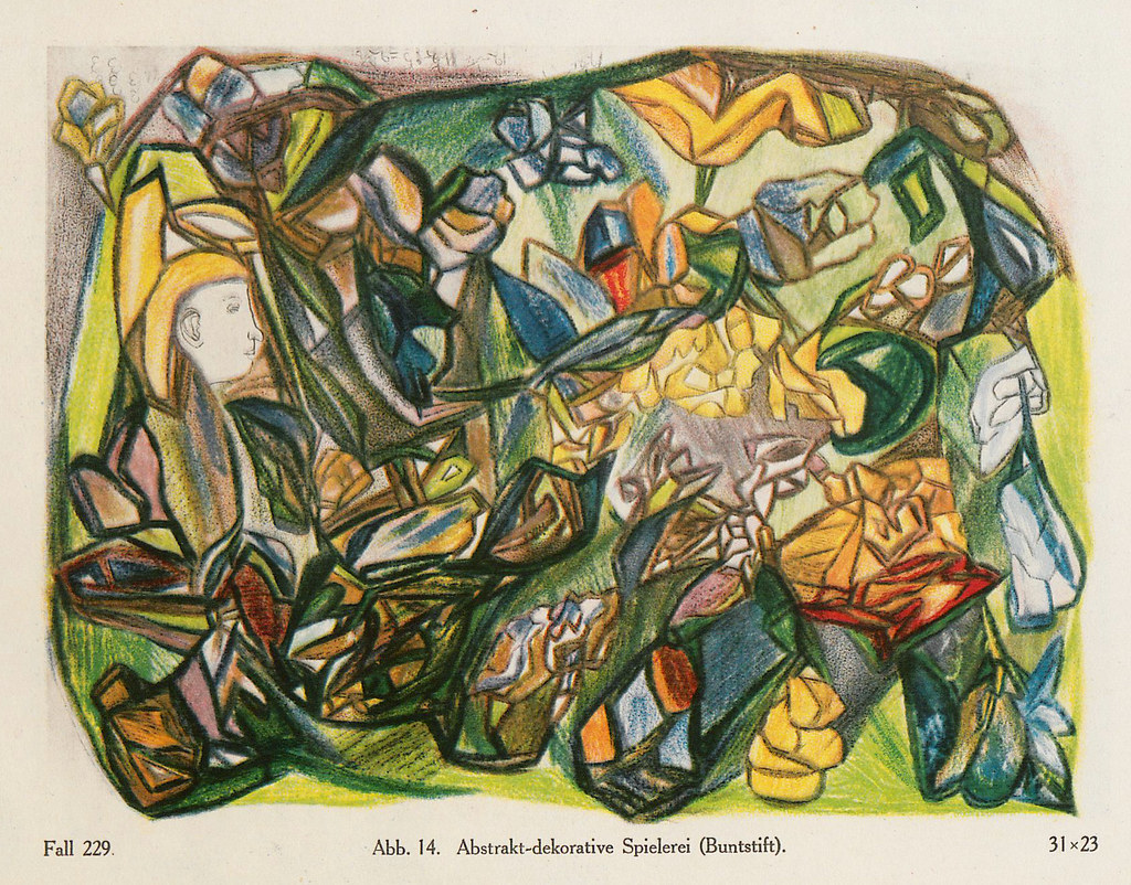
When the Nazis held their “Degenerate Art” exhibitions in 1937, a portion of Prinzhorn’s collection of “over 5000 paintings, drawings, and carvings” was included next to the avant-garde artists it influenced. Art historian Stephanie Barron argues that “one quarter of the illustration pages in the [Degenerate Art Exhibiton’s] guide featured reproductions of the work of these psychiatric patients.” Modernists identified, in complicated ways, with those excluded from civilization, and they were subjected to the same treatment—“the insane and the avant-garde were here equated, both equally pathologized.”
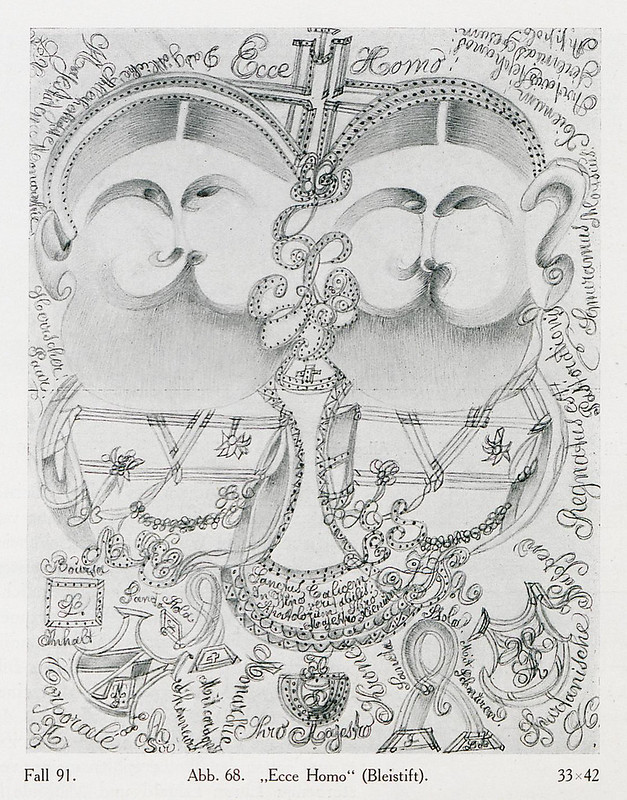
Prinzhorn’s book receded into obscurity, along with the artists it carefully collected and published. It deserves to be far better known, both for its own sake and for its significant influence on the early 20th century avant-garde, and hence all subsequent avant-garde art. The book takes the work it presents seriously—not as childlike attempts or therapeutic interventions, but as expressions of six basic drives “that give rise to image making,” as the Public Domain Review summarizes.
Those universal drives include “an expressive urge, the urge to play, an ornamental urge, an ordering tendency, a tendency to imitate, and the need for symbols. For Prinzhorn, image making is driven by our intense desire to leave traces.” Art, wrote Prinzhorn, represents “an urge in man not to be absorbed passively into his environment, but to impress on it traces of his existence beyond those of purposeful activity.”
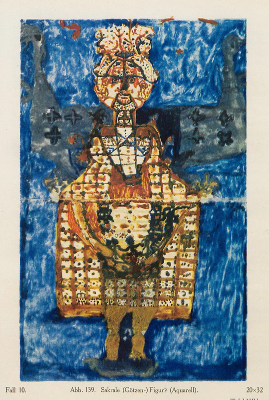
The theories of artists like Kandinsky and Debuffet expressed some similar ideas. The former ascended to the realm of spirit and symbol, and the latter acerbically castigated the empty, out-of-touch veneration of high culture. Who knows what the artists here had in mind when creating their work? In Prinzhorn’s analysis, theoretical concerns may be largely irrelevant. The creation of art, by anyone, is a universal human drive that requires no special training, no social sanction, no web of brokers, curators, and collectors. Maybe this is a threatening message to people who police the boundaries of culture.
The middle classes of his day, wrote Debuffet, were “convinced that [their] fashionable knowledge legitimizes the preservation of their caste. They work at persuading the lower classes of this, at convincing some of them of the necessity to safeguard art, that is to say armchairs, that is to say the bourgeois who know with which silk it is proper to upholster these armchairs.” Reducing art to a status symbol turns it into so much furniture, he argued; a “recourse to antique styles takes the place of good taste.” In the “raw art” of the mentally ill, Debuffet and other modernists saw a renewal of a primal human drive, the creative act.
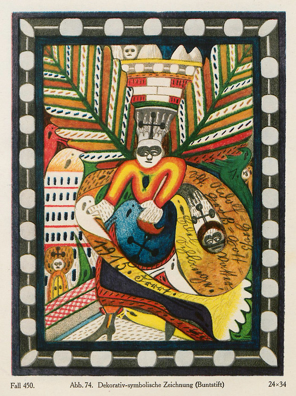
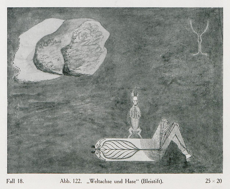
Prinzhorn’s neglected book is out of print, though you can purchase an expensive 1972 edition on Amazon, and even an expensive Kindle version. See much more of this incredible artwork at the Public Domain Review and read brief profiles from the ten schizophrenic artists Prinzhorn identified in a later section of the book. Artists like Karl Brendel, an amputee former bricklayer from Turingian, who carved haunting wood sculptures and began his art career sculpting with chewed bread, and August Neter, to whom 10,000 figures once appeared in a single vision that later became the subject of enigmatic pencil drawings like World Axis and Rabbit, below.
Related Content:
Artist Draws Nine Portraits on LSD During 1950s Research Experiment
Josh Jones is a writer and musician based in Durham, NC. Follow him at @jdmagness
Read More...What is Camp? When the “Good Taste of Bad Taste” Becomes an Aesthetic
Even if you don’t care about high fashion or high society — to the extent that those two things have a place in the current culture — you probably glimpsed some of the coverage of what attendees wore to the Met Gala earlier this month. Or perhaps coverage isn’t strong enough a word: what most of the many observers of the Metropolitan Museum of Art’s Costume Institute annual fundraising gala did certainly qualified as analysis, and in not a few cases tipped over into exegesis. That enthusiasm was matched by the flamboyance of the clothing worn to the event — an event whose co-chairs included Lady Gaga, a suitable figurehead indeed for a party that this year took on the theme of camp.
But what exactly is camp? You can get an in-depth look at how the world of fashion has interpreted that elaborate and entertaining but nevertheless elusive cultural concept in the Met’s show Camp: Notes on Fashion, which runs at the Met Fifth Avenue until early September.
“Susan Sontag’s 1964 essay Notes on ‘Camp’ provides the framework for the exhibition,” says the Met’s web site, “which examines how the elements of irony, humor, parody, pastiche, artifice, theatricality, and exaggeration are expressed in fashion.” But for a broader understanding of camp, you’ll want to go back to Sontag’s and read all of the 58 theses it nailed to the door of the mid-1960s zeitgeist.
According to Sontag, camp is “not a natural mode of sensibility” but a “love of the unnatural: of artifice and exaggeration.” It offers a “way of seeing the world as an aesthetic phenomenon.” Most anything manmade can be camp, and Sontag’s list of examples include Tiffany lamps, “the Brown Derby restaurant on Sunset Boulevard in L.A.,” Aubrey Beardsley drawings, and old Flash Gordon comics. Elevating style “at the expense of content,” camp is suffused with “the love of the exaggerated, the ‘off,’ of things-being-what-they-are-not.” Camp is not irony, but it “sees everything in quotation marks.” The essential element of camp is “seriousness, a seriousness that fails.” Camp “asserts that good taste is not simply good taste; that there exists, indeed, a good taste of bad taste.”
“When Sontag published ‘Notes on Camp,’ she was fascinated by people who could look at cultural products as fun and ironic,” says Sontag biographer Benjamin Moser in a recent Interview magazine survey of the subject. And though Sontag’s essay remains the definitive statement on camp, not everyone has agreed on exactly what counts and does not count as camp in the 55 years since its publication in the Partisan Review. “Camp to me means over-the-top humor, usually coupled with big doses of glamour,” says fashion designer Jeremy Scott in the same Interview article. “To be interesting, camp has to have some kind of political consciousness and self-awareness about what it’s doing,” says filmmaker Bruce Labruce, challenging Sontag’s description of camp as apolitical.
And what will become of camp in the all-digitizing 21st century, when many eras increasingly coexist on the same culture plane? Our time “has cannibalized camp,” says cultural history professor Fabio Cleto, “but to say that it’s no longer camp because its aesthetics have gone mainstream is an overly simplistic reading. Camp has always been mourning its own death.” Even so, some of camp’s most high-profile champions have cast doubt on its viability. The phrase “good taste of bad taste” brings no figure to mind more quickly than Pink Flamingos and Hairspray director John Waters (who speaks on the origin of his good taste in bad taste in the Big Think video above). But even he speaks pessimistically to Interview about camp’s future: “Camp? Nothing is so bad it’s good now that we have Trump as president. He even ruined that.”
Related Content:
Why So Many People Adore The Room, the Worst Movie Ever Made? A Video Explainer
David Foster Wallace on What’s Wrong with Postmodernism: A Video Essay
The Star Wars Holiday Special (1978): It’s Oh So Kitsch
Susan Sontag’s 50 Favorite Films (and Her Own Cinematic Creations)
John Waters Talks About His Books and Role Models in a Whimsical Animated Video
Based in Seoul, Colin Marshall writes and broadcasts on cities, language, and culture. His projects include the book The Stateless City: a Walk through 21st-Century Los Angeles and the video series The City in Cinema. Follow him on Twitter at @colinmarshall or on Facebook.
Read More...The Shifting Power of the World’s Largest Cities Visualized Over 4,000 Years (2050 BC-2050 AD)

“When Rome fell….” The expression seems designed to conjure the Tarot card Tower that illustrates it, a sudden attack, a reckoning. “Fell,” in the case of most ancient empires, means declined, changed, and transformed over centuries. As all great cities do, Rome suffered many violent shocks during its fall, as it transitioned from a pagan to a Christian empire. The sacking of Rome in 410 left Romans reeling, trying to make meaning from upheaval. They found it in the pagan religion of their ancestors.
To which the defender of the one true faith—by his lights—Augustine of Hippo, answered with a rather odd defense of the new order. Rather than write a theological treatise or a fire-and-brimstone sermon, though it is these things as well, he wrote a book about cities: the City of God, pitted against the Earthly City (which is, you guessed it, aligned with the Devil). The medieval idea of cities as vehicles for the grudge matches of princes must have derived from this strange text, as well as from the emergent feudal order that turned dismembered empires into uneasy patchworks of cities. Rome didn’t fall, it decentralized, diversified, and propagated.
Augustine saw the city not only as a metaphor but also as the height of human power: doomed to fall in the final analysis, yet built to pose a formidable challenge to divine rule. But what is a city? Is it merely a stronghold for corruption and commerce or something more righteous? Is it an expression of class power, the worker bees who run it or just cogs in a machine, a la Metropolis? Is it an “assemblage,” defined by Gilles Deleuze and Felix Guattari as “a multiplicity which is made up of many heterogenous terms and which establishes liaisons, relations between them, across ages, sexes and reigns”?
In our post-post-modern moment, we find all of these ideas—the hierarchical and the horizontal—operating. Popular books like Ian Morris’s Why the West Rules—For Now seem to spring from an impulse common to apologists and secularists alike—the will to linear certainty. There is a sense in which 21st century thought has turned back to theology, stripped of the trappings of belief, to make sense of the rise and decline of the West. This faith demands not blind allegiance, but data, more and more and more data—to answer the burning question of 2001’s Planet of the Apes: “How’d these apes get like this?”
Then there’s the internet—a space for sharing gifs, a functional assemblage, and maybe someday, a city. Global circumstances seem to warrant reflection. Like the Romans, we want a story about how it came to pass, and we want to make and share animated infographic gifs about it. The gif at the top of the post is such a gif. Drawing on the sweeping, several-thousand-year historical argument of Morris’s book, and data from the UN Population Division, its creator whisks us through a visual narrative of supremacy-by-city over the course of roughly four-thousand years.
Sheer size, in this visual account, determines the winners—a simplistic criteria, but the model here is simplified for effect. It dramatizes arguments made and data gathered elsewhere. To get the full effect, you’d probably do well to read Morris’s book and, while you’re reaching for your wallet, the original article, behind a paywall at The Australian, for which this gif was made. Its title? “Why Rome is the World’s Best City.” The gif’s designer admits in a Reddit post, “We are dealing with historic demographic data here which are always debated among scholars…. I acknowledge that other scholars would add or delete certain cities that pop up in my map.”
For more on the idea of the city as assemblage, see European Graduate School professor Manuel DeLanda’s lecture “A Materialist History of Cities” and his book Assemblage Theory. Augustine insisted we view the city through the eye of faith—his faith. In the 21st century, DeLanda’s intellectual gestures, like Morris’s, are as grand, but he suggests throwing out Western schematics in a return to earlier religious practices. To understand a city, he suggests, we might need “tools to manipulate these intensities… in the form of a growing variety of psychoactive chemicals that can be deployed to go beyond the actual world, and produce at least a descriptive phenomenology of the virtual.”
Related Content:
Get the History of the World in 46 Lectures, Courtesy of Columbia University
Watch the History of the World Unfold on an Animated Map: From 200,000 BCE to Today
A Crash Course in World History
Josh Jones is a writer and musician based in Durham, NC. Follow him at @jdmagness
Read More...The Rise and Fall of Western Empires Visualized Through the Artful Metaphor of Cell Division
We can hardly understand how the modern world arrived at its current shape without understanding the history of colonial empire. But how best to understand the history of colonial empire? In animation above, visualization designers Pedro M. Cruz and Penousal Machado portray it through a biological lens, rendering the four most powerful empires in the Western world of the 18th and 19th centuries as cells. The years pass, and at first these four cells grow in size, but we all know the story must end with their division into dozens and dozens of the countries we see on the world map today — a geopolitical process for which mitosis provides an effective visual analogy.
Cruz and Machado happen to hail from Portugal, a nation that commanded one of those four empires and, in Aeon’s words, “controlled vast territories across the globe through a combination of seapower, economic control and brute force.” We may now regard Portugal as a small and pleasant European country, but it once held territory all around the world, from Mozambique to Macau to the somewhat larger land known as Brazil.
And the other three empires, French, Spanish, and British, grow even larger in their respective heydays. That’s especially true of the British Empire, whose dominance in cell form becomes starkly obvious by the time the animation reaches the 1840s, even though the United States of America has at that point long since drifted beyond its walls and floated away.
Wouldn’t the U.S. now be the biggest cell of all? Not under the strict definition of empire used a few centuries ago, when one country taking over and directly ruling over a remote land was considered standard operating procedure (and even, in some quarters, a glorious and necessary mission). But attempts have also been made to more clearly understand international relations in the late 20th and early 21st centuries by redefining the very term “empire” to include the kind of influence the U.S. exerts all around the world. It makes a kind of sense to do that, but as Cruz and Machado’s animation may remind us, we also still live very much in the cultural, linguistic, political, and economic world — or rather, petri dish — that those four mighty empires created.
via Aeon
Related Content:
Get the History of the World in 46 Lectures, Courtesy of Columbia University
Watch the History of the World Unfold on an Animated Map: From 200,000 BCE to Today
Animated Map Shows How the Five Major Religions Spread Across the World (3000 BC – 2000 AD)
5‑Minute Animation Maps 2,600 Years of Western Cultural History
The History of Civilization Mapped in 13 Minutes: 5000 BC to 2014 AD
Based in Seoul, Colin Marshall writes and broadcasts on cities, language, and culture. His projects include the book The Stateless City: a Walk through 21st-Century Los Angeles and the video series The City in Cinema. Follow him on Twitter at @colinmarshall or on Facebook.
Read More...How to Make a Medieval Manuscript: An Introduction in 7 Videos
All of us came of age in the era of mass-market books, bundles of text on paper printed quickly, cheaply, and in large quantities. Nothing about that would have been conceivable to the many varieties of artisan involved in the creation of just one manuscript in the Middle Ages. Even here in the 21st century we marvel at the beauty of medieval manuscripts, but we should also marvel at the sheer amount of specialized labor that went into making them.
We might best appreciate that labor by seeing it performed up close before our eyes, and a new video series allows us to do just that. “The British Library has released a set of seven videos to look at the process of creating medieval manuscripts,” says Medievalists.net.
“Patricia Lovett, a professional calligrapher and illuminator, hosts these 2–3 minute videos, which follow the process from the tools used to the techniques employed in designing an illuminated page.”
Lovett covers every step in the making of a medieval book: “how to make quill pens from bird feathers”; “the complex process behind making ink for writing in manuscripts” (which involves wasps); “how animal skins were selected and prepared for use in medieval manuscripts”; “the tools for ruling and line marking in medieval books”; “the variety of pigments that were in use in the Middle Ages” to apply vivid color to the pages; “how medieval artists painted the beautiful illustrations in their books”; and “the work behind painting and embellishing manuscripts and reproducing a lavishly illuminated page.”
“The word ‘manuscript’ derives from the Latin for written (scriptus) by hand (manu),” writes Lovett and British Library illuminated manuscript curator Kathleen Doyle, and who among us will forget that, after we’ve witnessed the careful manual labor on display in these videos? For further insight into the medieval manuscript-making process, have a look at the Getty Museum’s series of videos on the subject featured last year here on Open Culture.
We’ve also featured the alchemy of the pigments used to color the pages of medieval manuscripts; the pages of a medieval monk’s sketchbook that shows what went into the designs for these manuscripts’ illumination; and a look into the making of The Book of Kells, the Irish cultural treasure that stands as one of the very finest surviving examples of the illuminated manuscript form. (And since you’ll surely get curious about it sooner or later, we’ve also put up an explanation of why so many marginal drawings in medieval manuscripts include killer rabbits.)
Just as the books we read today — whether the aforementioned mass-market products or the relatively artisanal small-press creations or even the e‑books — reveal important qualities about the world we live in, so medieval manuscripts have much to say about the beliefs, the technology, and societal structures of the times that produced them. But for those who actually developed the skills for and dedicated the time and effort to that production, these manuscripts also showed something else. As Lovett and Doyle quote the 12th-century scribe Eadwine as proclaiming about his Eadwine Psalter, “The beauty of this book displays my genius.”
via Medievalists.net
Related Content:
How the Brilliant Colors of Medieval Illuminated Manuscripts Were Made with Alchemy
The Medieval Masterpiece, the Book of Kells, Is Now Digitized & Put Online
Based in Seoul, Colin Marshall writes and broadcasts on cities, language, and culture. His projects include the book The Stateless City: a Walk through 21st-Century Los Angeles and the video series The City in Cinema. Follow him on Twitter at @colinmarshall or on Facebook.
Read More...Why Do Sad People Like to Listen to Sad Music? Psychologists Answer the Question in Two Studies
I find it surprising that psychologists have only just begun to study the reasons that sad people love sad songs. There’s an entire genre named after sadness, and the blues inspired nearly all modern music in one way or another. Classical music is filled with dirges, elegies, laments, requiems, and “countless tear-jerkers.” Listen to the music of any ancient society and you will likely find the same. Humans, it seems, have some innate need to hear sad songs.
Maybe this isn’t too surprising. We aren’t the only species to experience grief, but we are the only one to have devised language, and ways to make it sing to us. We tell stories of loss through music, just as through every other art. This explanation hardly satisfies scientific curiosity, however. Psychologists want to know, specifically, why we do this. Or—more specifically—why sad people do this.
Maybe not everyone enjoys the maudlin jangle of The Smiths during a breakup, or wants to listen to Leonard Cohen after a loss. But enough people do that scenes of sad characters listening to sad songs (or being sad while sad songs play) are some of the most memorable, and memorably parodied, in movie history. Researchers Annemieke Van den Tol and Jane Edwards at the University of Limerick wanted to understand the phenomenon in a 2013 study, so they sought out participants online.
The researchers opted for a limited qualitative approach to get the ball rolling. “This issue has hardly been investigated before,” writes Christian Jarrett at The British Psychological Society’s Research Digest. Their sample consisted of a self-selecting group of adults, age 18 to 66. Thirty-five of them were men and 30 women. Most of the respondents were Irish, though some were also from the Netherlands, the U.S., Germany, and Spain.
Each of the study participants was asked to describe a specific time in their lives when “they’d had a negative experience and then chose to listen to a sad piece of music.” Their descriptions were then analyzed for recurring themes. Among the most common were nostalgia, a desire for connection, and a sense of “common humanity.” The participants also cited aesthetic appreciation and a “re-experiencing of their affect” in which the sad song helped them express their feelings and find relief.
A more recent study published in Emotion concentrated its focus. Rather than surveying people who had had sad times in their lives—a category that includes pretty much everyone—researchers at the University of South Florida surveyed people with major depression. Their sample size is hardly any larger, and the participants are more homogenous: 76 female undergraduates, half of whom had a diagnosis of major depressive disorder and half of whom did not.
The study replicated methods used in a 2015 study to find out whether people with depression tended to choose sad music over “happy and neutral music,” writes Jarrett. That turned out to be the case, the researchers found. The reason surprised them. Against “the provocative idea” argued in other research “that depressed people are seeking to perpetuate their low mood,” the study instead found that those “who favored sad music said that they did so because it was relaxing, calming or soothing.”
In some ways, the answers aren’t significantly different from those of people who are not clinically depressed but still experience periods of deep sadness. Sad songs give meaning to our pain and let us know we aren’t the only ones feeling it. But we know this. Everyone has at least one or two sad songs that soothe them, and some of us have whole playlists of them. The Paste magazine staff put together an excellent list of songs that helped them “hurt so good.” It’s got some of the finest writers and singers of sad songs on it: Tammy Wynette, Elliot Smith, Tom Waits, Patty Griffin, Prince, by way of Sinead O’Connor. If one of your sad songs isn’t on here, you’ll probably find a few new ones to add.
I’d suggest for inclusion, to start, The Cure’s “The Same Deep Water as You,” Etta James’ “I Rather Go Blind,” Bonnie ‘Prince’ Billie’s “I See a Darkness,” Radiohead’s “How to Disappear Completely,” and The Smith’s “That Joke Isn’t Funny Anymore.” Tell us, what would you add—and why would you want to do a thing like listen to sad music when you’re already miserable? Tell us your reasons, and your songs, below.
Related Content:
Nick Cave Creates a List of His 10 Favorite Songs–His Favorite “Hiding Songs”
Josh Jones is a writer and musician based in Durham, NC. Follow him at @jdmagness
Read More...Holocaust in Film and Literature: A Free Online Course from UCLA
Holocaust in Film and Literature is a course that provides insight into the History of Holocaust and its present memory through examination of challenges and problems encountered in trying to imagine its horror through media of literature and film.
About the Professor: Todd Presner is Associate Professor of Germanic Languages, Comparative Literature, and Jewish Studies. His research focuses on German-Jewish intellectual and cultural history, the history of media, visual culture, digital humanities, and cultural geography. He is the author of two books: The first, Mobile Modernity: Germans, Jews, Trains (Columbia University Press, 2007), maps German-Jewish intellectual history onto the development of the railway system; the second, Muscular Judaism: The Jewish Body and the Politics of Regeneration (Routledge, 2007), analyzes the aesthetic dimensions of the strong Jewish body.
You can view all 18 video lectures above, or find them on YouTube here.
Note: Some clips and images may have been blurred or removed to avoid copyright infringement.
Read More...Hear Isaac Asimov’s Story Award-Winning Story “Nightfall” Read by Stephen Eley
Above hear Isaac Asimov’s story “Nightfall” read by Stephen Eley. The novelette–which first appeared in Astounding Science Fiction, September 1941–tells the story about “the coming of darkness to the people of a planet ordinarily illuminated by sunlight at all times.” In 1968, The Science Fiction Writers of America voted “Nightfall” the best sci fi short story written prior to the 1965 establishment of the Nebula Awards.
The production above was created by the sci-fi podcast EscapePod. It will be added to our collection, 1,000 Free Audio Books: Download Great Books for Free.
If you would like to support the mission of Open Culture, consider making a donation to our site. It’s hard to rely 100% on ads, and your contributions will help us continue providing the best free cultural and educational materials to learners everywhere. You can contribute through PayPal, Patreon, and Venmo (@openculture). Thanks!
Read More...
Creating Video Games: A Free Online Course from MIT
Taught by Philip B. Tan, Richard Eberhardt, Sara Verrilli and Andrew Grant, Creating Video Games is an MIT course that “introduces students to the complexities of working in small, multidisciplinary teams to develop video games. Students will learn creative design and production methods, working together in small teams to design, develop, and thoroughly test their own original digital games. Design iteration across all aspects of video game development (game design, audio design, visual aesthetics, fiction and programming) will be stressed. Students will also be required to focus test their games, and will need to support and challenge their game design decisions with appropriate focus testing and data analysis.”
You can watch the 27 video lectures in the playlist above, or find them on YouTube or MIT’s website. Find the syllabus for the course here.
Creating Video Games will be added to our list, 1,700 Free Online Courses from Top Universities.
If you would like to support the mission of Open Culture, consider making a donation to our site. It’s hard to rely 100% on ads, and your contributions will help us continue providing the best free cultural and educational materials to learners everywhere. You can contribute through PayPal, Patreon, and Venmo (@openculture). Thanks!
Read More...Enter, Explore, and Learn About Rembrandt’s The Anatomy Lesson with a New Augmented-Reality App
More than 350 years after he painted them, the paintings of Rembrandt van Rijn still look real enough to step right into. Now, thanks to a new augmented reality app from the Mauritshuis museum, you can do just that through the screen of your phone, starting with Rembrandt’s famed early canvas The Anatomy Lesson of Dr. Nicolaes Tulp. “The augmented reality experience, a first for a museum, allows the user to experience the anatomical theatre of 1632 digitally,” says the Mauritshuis’ press release, “and to observe Dr. Tulp and his fellow physicians, as well as the subject of their examination, the corpse of Aris Kindt.”
“I entered it and was surrounded by its enveloping darkness, its piecemeal illuminations,” writes Hyperallergic’s Seph Rodney on his augmented-reality experience of The Anatomy Lesson. “I walked in front of and sometimes faced each of the characters arrayed around a central figure, a corpse, with its left arm missing its skin below the elbow. One man, rather overdressed in a black doublet with a white shirt collar and white sleeves accenting his head and hands uses a pair of forceps to hold the corpse’s exposed arm muscles and tendons stretched away from the bones beneath.”
As Rodney approaches the figure, “a small text box pops out telling me precisely this: that he is gazing at the book to make sense of what the body beneath him is saying in all its vascular and muscular complexity.”
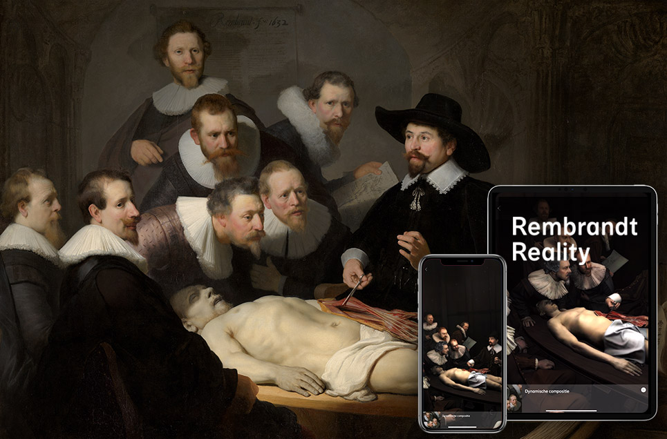
Sans text boxes, the scene will sound familiar to Rembrandt enthusiasts, but not even the most enthusiastic of them will have seen it in quite this way before. To build an augmented-reality version of the scene Rembrandt painted 387 years ago, “lookalikes of the main figures in the painting dressed up in seventeenth-century outfits and were then scanned with a 3D scanner made up of 600 reflex cameras. The original theatre in the Waag where Dr. Tulp gave his anatomy lesson in 1632 was then captured with the 3D scanner. These scans were then combined, after which 3D modelers gave the figures and the space the correct colors, textures and light.”
You can get a glimpse of the process in the short video at the top of the post, then download the Rembrandt Reality app in either its Google or Apple version and step into The Anatomy Lesson yourself. It may feel somewhat odd at first to simply stroll around the scene of an ongoing dissection of a human body, but in a way, the Mauritshuis’ digital opening of this immortal lesson to the world re-emphasizes the true nature of the original scene. When a physician of Tulp’s stature dissected a corpse, people from all around — medical professionals and otherwise — would come to watch the spectacle that could last for days. But could even Tulp, then Amsterdam’s city anatomist and later the city’s mayor, have imagined that this particular spectacle would last 387 years and counting?
via Hyperallergic
Related Content:
13 of Van Gogh’s Paintings Painstakingly Brought to Life with 3D Animation & Visual Mapping
Van Gogh’s 1888 Painting, “The Night Cafe,” Animated with Oculus Virtual Reality Software
Walk Inside a Surrealist Salvador Dalí Painting with This 360º Virtual Reality Video
Based in Seoul, Colin Marshall writes and broadcasts on cities, language, and culture. His projects include the book The Stateless City: a Walk through 21st-Century Los Angeles and the video series The City in Cinema. Follow him on Twitter at @colinmarshall or on Facebook.
Read More...Support Us
We're hoping to rely on loyal readers, rather than erratic ads. Please click the Donate button and support Open Culture. You can use Paypal, Venmo, Patreon, even Crypto! We thank you!

About Us

Open Culture scours the web for the best educational media. We find the free courses and audio books you need, the language lessons & educational videos you want, and plenty of enlightenment in between.
Advertise With Us
FREE UPDATES!
GET OUR DAILY EMAIL
Get the best cultural and educational resources on the web curated for you in a daily email. We never spam. Unsubscribe at any time.
FOLLOW ON SOCIAL MEDIA
Open Culture editor Dan Colman scours the web for the best educational media. He finds the free courses and audio books you need, the language lessons & movies you want, and plenty of enlightenment in between.
Advertise With Us

