If you would like to support the mission of Open Culture, consider making a donation to our site. It’s hard to rely 100% on ads, and your contributions will help us continue providing the best free cultural and educational materials to learners everywhere. You can contribute through PayPal, Patreon, and Venmo (@openculture). Thanks!
In the recorded history of philosophy, there may be no sharper a mind than Ludwig Wittgenstein. A bête noire, enfant terrible, and all other such phrases used to describe affronts to order and decorum, Wittgenstein also represented an anarchic force that disturbed the staid discipline. His teacher Bertrand Russell recognized the existential threat Wittgenstein posed to his profession (though not right away). When Wittgenstein handed Russell the compact, cryptic Tractatus Logico-Philosophicus, he admitted his student had gone beyond his own analytic insights in the pursuit of absolute clarity. Wittgenstein’s longtime mentor and friend, famed logician and mathematician Gottlob Frege, expressed criticism. Some have suggested he did so in part because he saw that Wittgenstein had rendered much of his work irrelevant.
Alain de Botton gives a brief but fascinating sketch of Wittgenstein’s ideas and incredibly odd biography in the School of Life video above. The eccentric Austrian savant, he asserts, “can help us with our communication problems” through his penetrating, though often impenetrable, claims about language. That may be so. But we may need to redefine what we mean by “communication.” According to Wittgenstein in the Tractatus, an overwhelming percentage of what we obsess about on a daily basis—political and religious abstractions, for example—is so totally incoherent and muddled that it means nothing at all. He revised this opinion dramatically in his later thought.
Though he published nothing after the Tractatus and soon became a near-recluse after his startling entry into analytic philosophy, notes from his students were collected and published as well as a posthumous book called Philosophical Investigations. This version of Wittgenstein’s approach to the problems of communication involves a development of the “ostensive”—or demonstrative—role of language. Wittgenstein made an argument that language can only serve a social, rather than a personal, subjective, function. To make the point, he introduced his “Beetle in a Box” analogy, which you can see explained above in an animated BBC video written by Nigel Warburton and narrated by Aidan Turner.
The analogy uses the idea of each of us claiming to have a beetle in a box as a stand in for our individual, private experiences. We all claim to have them (we can even observe brain states), but no one can ever see inside the theater of our minds to verify. We simply have to take each other’s word for it. We play “language games,” which only have meaning in respect to their context. That such games can be mutually intelligible among individuals who are otherwise opaque to each other has to do with our shared environment, abilities, and limitations. Should we, however, meet a lion who could speak—in perfectly intelligible English—we would not, Wittgenstein asserted, be able to understand a single word. The vastly different experiences of human versus lion would not translate through any medium.
Just above, we have an explanation of this thought experiment from an unlikely source, Ricky Gervais, in an attempted explanation to his comic foil Karl Pilkington, who takes things in his own peculiar direction. Though Wittgenstein used the idea for a different purpose, his observation about the unbridgeable chasm between humans and lions anticipates Thomas Nagel’s provocative claims in the 1974 essay “What is it like to be a bat?” We cannot inhabit the subjective states of beings so different from us, and therefore cannot say much of anything about their consciousness. Maybe it isn’t like anything to be a bat. Luckily for humans, we do have the ability to imagine each other’s experiences, in indirect, imperfect, roundabout, ways, and we all have enough shared context that we can, at least theoretically, use language to produce more clarity of thought and greater social harmony.
When I first read news of the now-infamous Google memo writer who claimed with a straight face that women are biologically unsuited to work in science and tech, I nearly choked on my cereal. A dozen examples instantly crowded to mind of women who have pioneered the very basis of our current technology while operating at an extreme disadvantage in a culture that explicitly believed they shouldn’t be there, this shouldn’t be happening, women shouldn’t be able to do a “man’s job!”
The memo, as Megan Molteni and Adam Rogers write at Wired, “is a species of discourse peculiar to politically polarized times: cherry-picking scientific evidence to support a pre-existing point of view.” Its specious evolutionary psychology pretends to objectivity even as it ignores reality. As Mulder would say, the truth is out there, if you care to look, and you don’t need to dig through classified FBI files. Just, well, Google it. No, not the pseudoscience, but the careers of women in STEM without whom we might not have such a thing as Google.
Women like Margaret Hamilton, who, beginning in 1961, helped NASA “develop the Apollo program’s guidance system” that took U.S. astronauts to the moon, as Maia Weinstock reports at MIT News. “For her work during this period, Hamilton has been credited with popularizing the concept of software engineering.” Robert McMillan put it best in a 2015 profile of Hamilton:
It might surprise today’s software makers that one of the founding fathers of their boys’ club was, in fact, a mother—and that should give them pause as they consider why the gender inequality of the Mad Men era persists to this day.
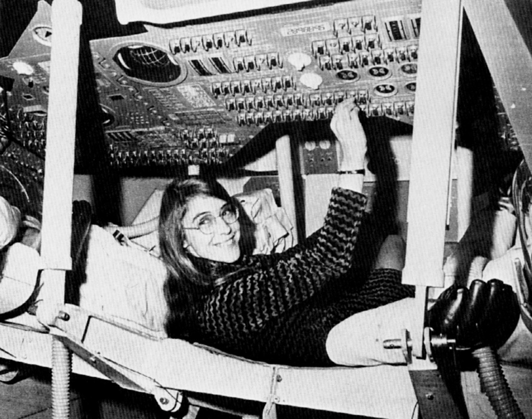
Hamilton was indeed a mother in her twenties with a degree in mathematics, working as a programmer at MIT and supporting her husband through Harvard Law, after which she planned to go to graduate school. “But the Apollo space program came along” and contracted with NASA to fulfill John F. Kennedy’s famous promise made that same year to land on the moon before the decade’s end—and before the Soviets did. NASA accomplished that goal thanks to Hamilton and her team.
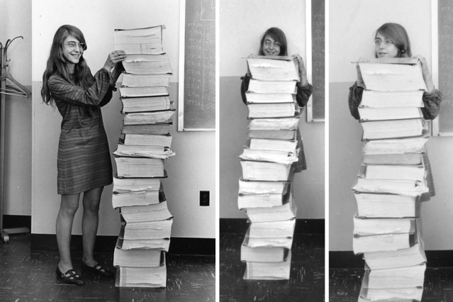
Photo courtesy of MIT Museum
Like many women crucial to the U.S. space program (many doubly marginalized by race and gender), Hamilton might have been lost to public consciousness were it not for a popular rediscovery. “In recent years,” notes Weinstock, “a striking photo of Hamilton and her team’s Apollo code has made the rounds on social media.” You can see that photo at the top of the post, taken in 1969 by a photographer for the MIT Instrumentation Laboratory. Used to promote the lab’s work on Apollo, the original caption read, in part, “Here, Margaret is shown standing beside listings of the software developed by her and the team she was in charge of, the LM [lunar module] and CM [command module] on-board flight software team.”
As Hank Green tells it in his condensed history above, Hamilton “rose through the ranks to become head of the Apollo Software development team.” Her focus on errors—how to prevent them and course correct when they arise—“saved Apollo 11 from having to abort the mission” of landing Neil Armstrong and Buzz Aldrin on the moon’s surface. McMillan explains that “as Hamilton and her colleagues were programming the Apollo spacecraft, they were also hatching what would become a $400 billion industry.” At Futurism, you can read a fascinating interview with Hamilton, in which she describes how she first learned to code, what her work for NASA was like, and what exactly was in those books stacked as high as she was tall. As a woman, she may have been an outlier in her field, but that fact is much better explained by the Occam’s razor of prejudice than by anything having to do with evolutionary determinism.
Taught by Yale professor Craig Wright, this course, Listening to Music, operates on the assumption that listening to music is “not simply a passive activity one can use to relax, but rather, an active and rewarding process.” When we understand the basic elements of Western music (e.g., rhythm, melody, and form), we can appreciate music in entirely new ways. That includes everything from classical music, rock and techno, to Gregorian chant and the blues.
If you would like to support the mission of Open Culture, consider making a donation to our site. It’s hard to rely 100% on ads, and your contributions will help us continue providing the best free cultural and educational materials to learners everywhere. You can contribute through PayPal, Patreon, and Venmo (@openculture). Thanks!
An artist just starting out might first imitate the styles of others, and if all goes well, the process of learning those styles will lead them to a style of their own. But how does one learn something like an artistic style in a way that isn’t simply imitative? Artificial intelligence, and especially the current developments in making computers not just think but learn, will certainly shed some light in the process — and produce, along the way, such fascinating projects as the video above, a re-envisioning of Disney’s Alice in Wonderland in the styles of famous artists: Pablo Picasso, Georgia O’Keeffe, Katsushika Hokusai, Frida Kahlo, Vincent van Gogh and others.
The idea behind this technological process, known as “style transfer,” is “to take two images, say, a photo of a person and a painting, and use these to create a third image that combines the content of the former with the style of the later,” says an explanatory post at the Paperspace Blog.
“The central problem of style transfer revolves around our ability to come up with a clear way of computing the ‘content’ of an image as distinct from computing the ‘style’ of an image. Before deep learning arrived at the scene, researchers had been handcrafting methods to extract the content and texture of images, merge them and see if the results were interesting or garbage.”
Deep learning, the family of methods that enable computers to teach themselves, involves providing an artificial intelligence system called a “neural network” with huge amounts of data and letting it draw inferences. In experiments like these, the systems take in visual data and make inferences about how one set of data, like the content of frames of Alice in Wonderland, might look when rendered in the colors and contours of another, such as some of the most famous paintings in all of art history. (Others have tried it, as we’ve previously featured, with 2001: A Space Odyssey and Blade Runner.) If the technology at work here piques your curiosity, have a look at Google’s free online course on deep learning or this new set of courses from Coursera— it probably won’t improve your art skills, but it will certainly increase your understanding of a development that will play an ever larger role in the culture and economy ahead.
Here’s a full list of painters used in the neural networked version of Alice:
Pablo Picasso
Georgia O’Keeffe
S.H. Raza
Hokusai
Frida Kahlo
Vincent van Gogh
Tarsila
Saloua Raouda Choucair
Lee Krasner
Sol Lewitt
Wu Guanzhong
Elaine de Kooning
Ibrahim el-Salahi
Minnie Pwerle
Jean-Michel Basquiat
Edvard Munch
Natalia Goncharova
When an artist becomes an adjective—think Orwellian, Kafkaesque, or Joycean—one of two things can happen: their work can be superficially appropriated, reduced to a collection of obvious gestures clumsily combined in bad pastiche. Or their distinctive style can inspire artists with more skill and depth to make original creations that may themselves become touchstones for the future. What might distinguish one from the other is the degree to which we understand not only the work of Orwell, Kafka, or Joyce, but also the work that influenced them.
When it comes to David Lynch, there’s no doubt that the “Lynchian” stands as a model for so much contemporary film and television. But while some directors make excellent use of Lynch’s influence, others strive for Lynchian atmosphere only to reach a kind of uninspired, unintentional parody. The sublime balance of humor and horror Lynch has achieved over the course of his extraordinary career seems like the kind of thing one shouldn’t attempt without serious study and preparation.
Without Lynch’s surrealist vision, oddball characterization and dialogue fall flat—as in Twin Peaks’ second season, which Lynch himself says “sucked.” So what defines the Lynchian? A very distinctive use of music, for one thing. And as the video essay above by Menno Kooistra demonstrates, the significant influence of painting. Lynch himself began painting and drawing at a young age and studied art at the School of the Museum of Fine Arts in Boston in the sixties. While he found his calling in film, his art education prepared him to dream up the unforgettable compositions of the Lynchian world.
Rene Magritte, Edward Hopper,Arnold Böcklin, and the master of psychological horror, Francis Bacon—all of these painters have directly informed Lynch’s nightmarish mise-en-scène. As you’ll see in Kooistra’s video, in side by side comparisons, Lynch adapts the work of his favorite artists for his own purposes. In an interview clip, he says he discovered Bacon at a gallery in 1966 and found the experience “thrilling”—later using the painter’s work as inspiration for The Elephant Man and Twin Peak’s disorienting Red Room.
We see Lynch’s homage to his favorite painters in Eraserhead and Blue Velvet, as well as the current, third season of Twin Peaks, over which he has (as he well should) complete creative control. You may not find Francis Bacon’s disturbing portraits quite as thrilling as Lynch does, or draw on Edward Hopper for a warped version of 1950’s Americana. These are Lynch’s references; they resonate on his particular frequency, and hence provide him with visual frames for his own personal dream logic.
But what we might take away from “The Art of David Lynch” is that the Lynchian is necessarily tied to a painterly sensibility, and that without the influence of fine art on composition, color, and framing, a Lynchian production may be in danger of looking—as he says of that disappointing Twin Peaks’ second season—“stupid and goofy.”
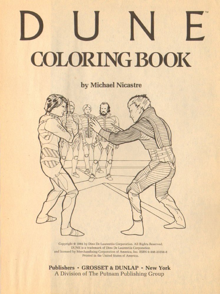
David Lynch’s Dune, the $40 million cinematic spectacle based on Frank Herbert’s science-fiction epic, faced more than its fair share of challenges: Lynch’s lack of artistic control, elaborate but not quite successful special effects, source material so unsuited to feature-film adaptation that audiences had to read glossaries before the first screenings. In an attempt to get ahead of bad buzz, the massive advertising and merchandising blitz had begun well before the movie’s Christmas 1984 release, but none of its flaks seemed to understand the enterprise of Dune any better than most of those viewers did.
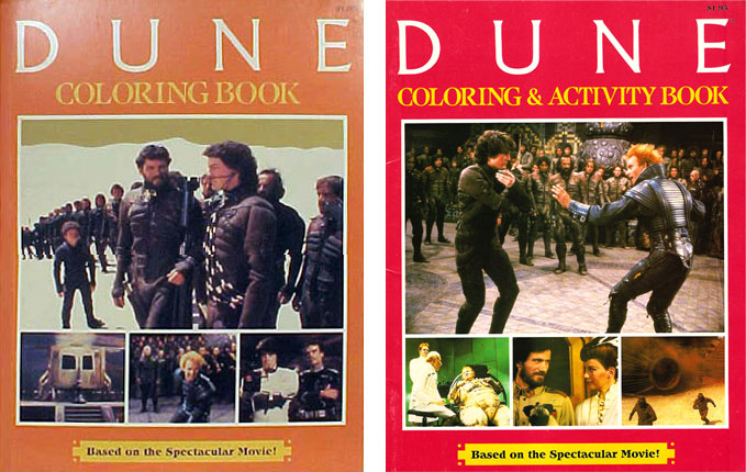
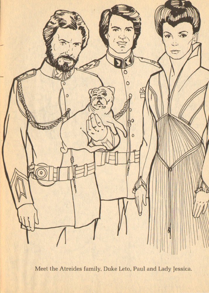
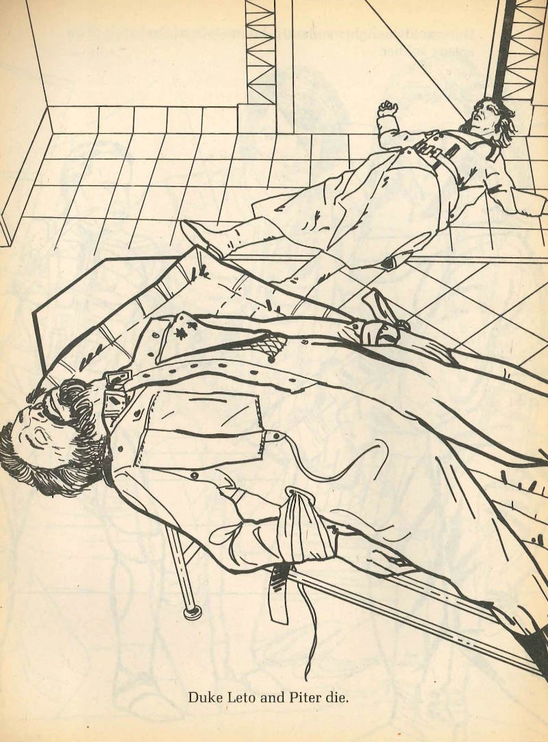
Case in point: the Dune coloring and activity books, evidence that, as Comics Alliance’s Jason Michelitch writes, “what Universal Pictures wanted was a Star Wars of their very own — a whiz-bang space adventure for eight-year-olds that they could merchandise the heck out of to the wide-eyed kids that just a year previous had wheedled their parents into buying plush ewok dolls and toy lightsabers. Instead, Lynch and producer Dino De Laurentis provided them with a dark epic actually fit for consumption by thinking adults. Imagine their chagrin.”
Meredith Yanos at Coilhouse offers a more detailed writeup of the hours of fun on offer in these tonally bizarre books: “First, there’s the Dune Coloring Book, 44 pages of lurid scenes featuring conspiratorial characters from the film. Then there’s the Dune Activity Book. 60 pages of puzzles and games, mazes and more pictures for coloring,” including a recipe for “No-Bake Spice Cookies” that substitutes common cinnamon for Dune’s Spice, a “wacky awareness spectrum narcotic that controls the universe.” Other volumes contain Dune-themed paper dolls, Dune-themed word puzzles, and even Dune-themed math problems.
Though Dune remains primarily remembered as one of the worst flops in cinema history (and even Lynch himself usually refuses to discuss it), a few fans have also come to its defense over the past 32 years. Some of them have no doubt wanted to pass this revisionist appreciation down to their children, a task the Dune coloring and activity books may (or may not) make easier. If you buy them on Amazon, you’ll have to pay between $45 and $75 each — nothing compared to the cost of anything in the actual production of Dune, of course, but still, you may want to keep an eye on eBay instead.
Walk around London with someone who knows its deep history — not hard to arrange, given the way London enthusiasts treat historical knowledge as a hypercompetitive sport — and you’ll have more than a few paths of “Roman roads” pointed out to you. Even in the city of Big Ben and Buckingham Palace, the Shard and the Gherkin, chicken shops and curry houses, there remain fragments and traces of the 2,000 miles of roads the Roman Army built between British towns and cities between 43 and 410 AD, Britain’s centuries as a province of the Roman Empire.
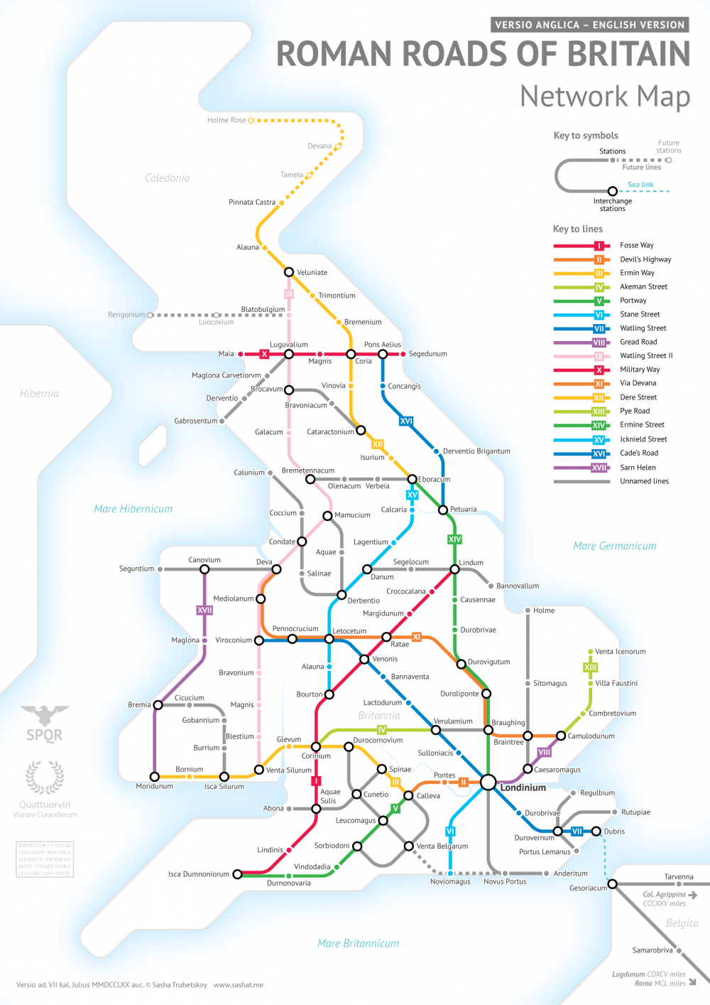
Though some of Britain’s Roman Roads have become modern motorways, most no longer exist in any form but those bits and pieces history buffs like to spot. This makes it difficult to get a sense of how they all ran and where — or at least it did until Sasha Trubetskoy made a Roman Roads of Britain Network Map in the graphic-design style of the subway maps you’ll find in London or any other major city today. Trubetskoy, an undergraduate statistics major at the University of Chicago, first found cartographical fame a few months ago with his “subway map” of roads across the entire Roman Empire circa 125 AD.
“Popular request,” he writes, demanded a Britain-specific follow up, a project he describes as “far more complicated than I had initially anticipated.” The challenges included not just the sheer number of Roman Roads in Britain but a lack of clarity about their exact location and extents. As in his previous map, Trubetskoy admits, “I had to do some simplifying and make some tough choices on which cities to include.” While this closer-up view demanded a more geographical faithfulness, he nevertheless “had to get rather creative with the historical evidence” in places, to the point of using such “not exactly Latin-sounding” names as “Watling Street” and “Ermin Way.”
Still, barring a revolutionary discovery in Roman history, you’re unlikely to find a more rigorous example of subway-mapped Roman Roads in Britain than this one. And for $9 USD you can have it as a “crisp PDF” suitable for printing as a poster and giving to anyone passionate about the history of Britain — or the history of Rome, or graphic design, or maps that aren’t what they might seem at first glance.
Above, watch ‘Adam,’ a short claymation made by Evelyn Jane Ross while attending the Rhode Island School of Design. As she points out in a recent interview, ‘Adam’ is “nothing like Wallace and Gromit; it’s neither a children’s story nor does it have a distinct character. Instead, it’s a poetic narrative depicting love and emotional sincerity. It uses the malleable nature of clay to emphasize the main idea, creation. ‘Adam’ also defies the perception that animation is a children’s medium. The film could easily be rated “R” for “MATURE” audiences only.” She then adds:
I read a quote by Stanley Kubrick, ‘A film is — or should be — more like music than like fiction. It should be a progression of moods and feelings. The theme, what’s behind the emotion, the meaning, all that comes later’. This quote really guided my progression. It seemed like a wonderful way to think of structure and timing. The meaning, yes, came later.
Although Ross made the film mainly to fulfill some senior year requirements at RISD, she got some extra mileage out of the claymation. Among other awards, it won Best Animated Film at the Yale Student Film Festival, the Berlin Flash Film Festival, and Santa Fe Independent Film Festival. And it was a BAFTA Student Awards Finalist. Enjoy.
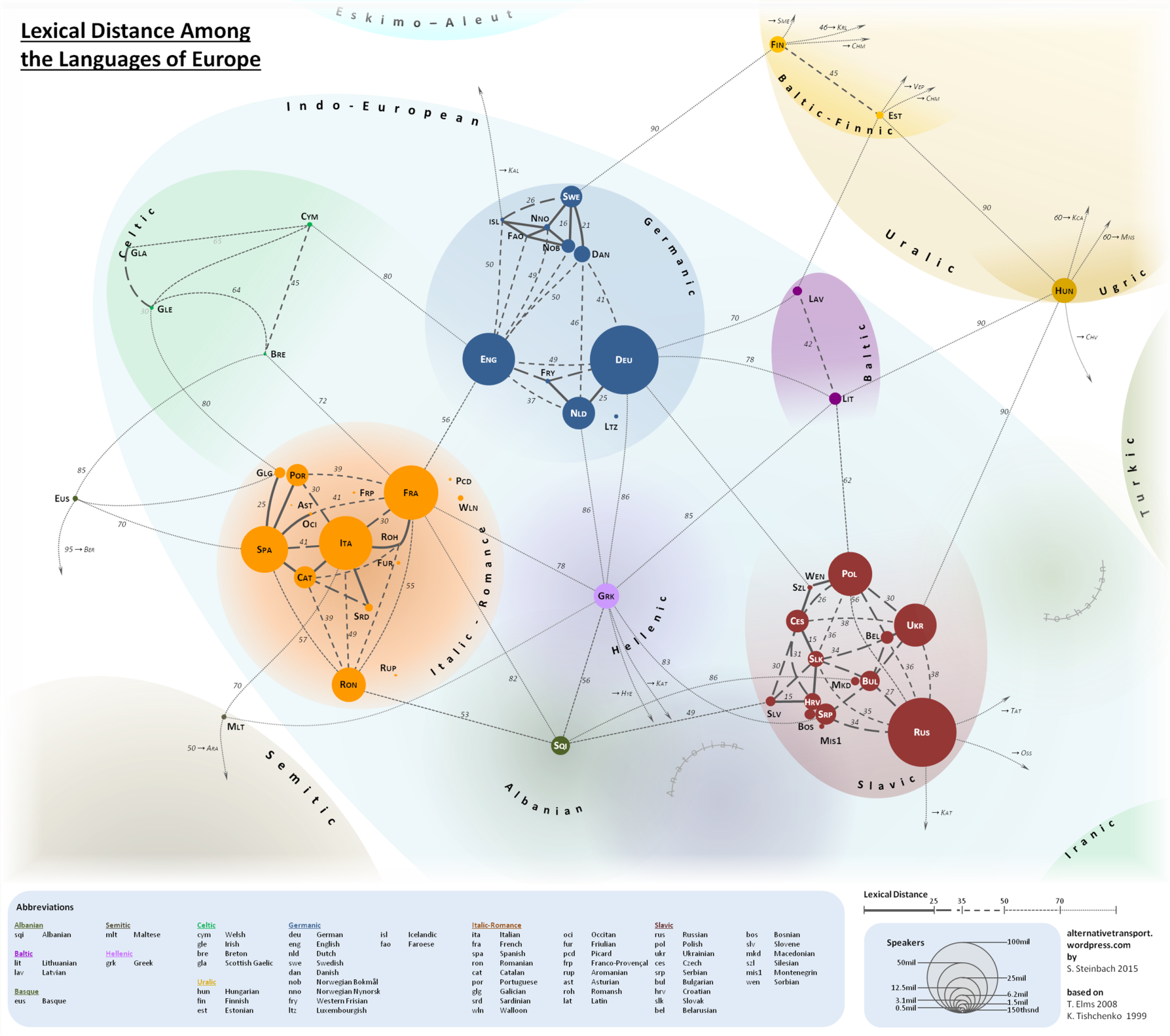
Stephen F. Steinbach, a resident of Vienna and a “cartography, language and travel enthusiast, with an engineering background,” is not a linguist. Steinbach, who runs the site Alternative Transport, seems much more interested in mapping and transportation than morphology and etymology. But he has made a contribution to a linguistic concept called “lexical difference” with the map you see above, a colorful 2015 visualization of European languages, grouped together in clusters according to their subfamilies (Italic-Romance, Baltic, Slavic, Germanic, etc.—see a much larger version here).
Straight and arcing lines span the relative distance these languages have presumably traveled from each other. Solid lines between languages represent a very close proximity, dashed lines of different thicknesses show more distance, and thin dotted lines traverse the greatest expanses.
Hungarian and Ukrainian, for example, have a lexical distance score of 90, where Polish and Ukrainian, both Slavic languages, are only 30 degrees from each other. “The map shows the language families that cover the continent,” writes Big Think, “large, familiar ones like Germanic, Italic-Romance and Slavic, smaller ones like Celtic, Baltic and Uralic; outliers like Semitic and Turkic; and isolates—orphan languages, without a family: Albanian and Greek.” (Technically, modern Greek does have a family—Hellenic—though it is the only surviving member.)
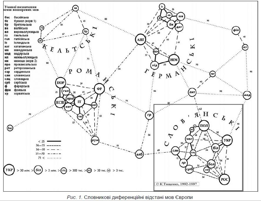
As we might expect from this subset of the durable Indo-European schema, the languages within each clustered group occupy the shortest distance from each other, with some exceptions. Romanian, for example, is slightly closer to Albanian than it is to French, its Romance cousin. The Slavic languages Russian and Polish seem to have traveled a bit further apart than Polish has from the Baltic language of Lithuanian. What does this mean, exactly? According to the measure of “lexical distance” proposed by Ukrainian linguist Konstantin Tishchenko, it means that closer languages might be more mutually intelligible, at least from a lexical standpoint, since they may share more cognates (similar-sounding and meaning words) and borrowings.
The idea received a much more trenchant critique more recently. Steinbach clarified that the theory, and the map, only compare written words and not syntax or speech. “It has nothing to do with grammar, syntax, rhythm or other important features that are important for intelligibility,” he writes. “It also compares a small list of words and not the entire vocabulary of one language to another.” This explanation does cast doubt on whether “lexical distance” is a meaningful concept. I’ll leave it to the linguists to decide. (Steinbach reached out to Tischchenko but has yet to receive a reply.)
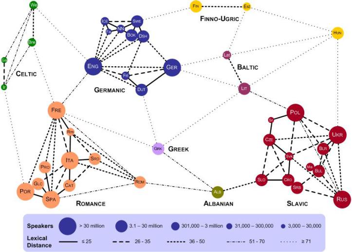
Tischchenko’s original “lexical distance” map, further up, drawn in 1997, gets the idea across with minimal fuss, but it leaves much to be desired graphically. (A large, hand-drawn color version improves upon the printed map.) Steinbach took his version from a 2008 English-language adaptation made by Teresa Elms in 2008 (above). In his blog post here, he explains all of the changes he made to Elms and Tischchenko’s designs. These include adjusting the size of the “bubbles” to proportionally represent the number of speakers of each language. Steinbach also added several languages, as well as “gravestones” for the dead Anatolian and Tocharian branches. In all, his map shows “54 languages, representing 670 million people.” He adds, vaguely, that “it checks out.”
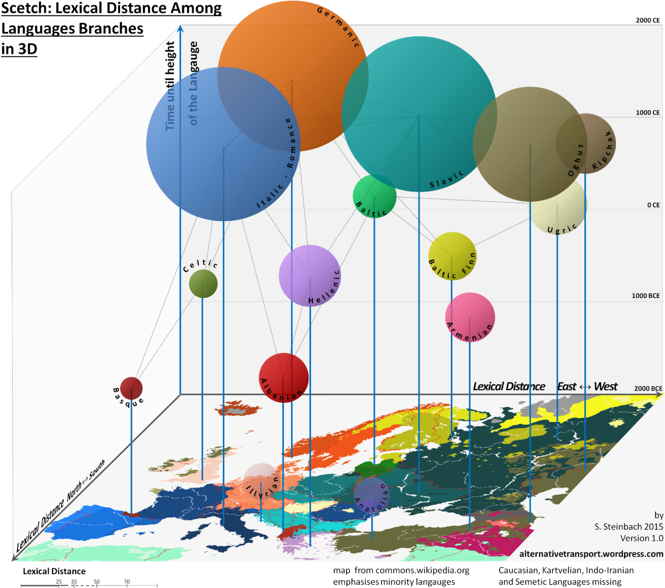
After posting his Lexical Distance Map, Steinbach proposed a “3D” version, with the added dimension of time. (See his preliminary sketch above.) The maps are intriguing, the theory of “lexical distance” an interesting one, but we should bear in mind, as Steinbach writes, that he is “no linguist,” and that this idea is hardly an orthodox one within the discipline.
We're hoping to rely on loyal readers, rather than erratic ads. Please click the Donate button and support Open Culture. You can use Paypal, Venmo, Patreon, even Crypto! We thank you!
Open Culture scours the web for the best educational media. We find the free courses and audio books you need, the language lessons & educational videos you want, and plenty of enlightenment in between.