How much special treatment should we give children, and how much should we regard them as small adults? The answer to that question varies not just between but within time periods and societies. The attitude in the 21st-century west can, at times, seem to have erred toward a patronizing overprotectiveness, but history has shown that if the social pendulum swings one way, it’ll probably swing the other in due time. We certainly find ourselves far from the view of children taken in medieval Europe, of which we catch a glimpse whenever we behold the babies in its paintings — babies that invariably, according to a Vox piece by Phil Edwards, “look like ugly old men.”
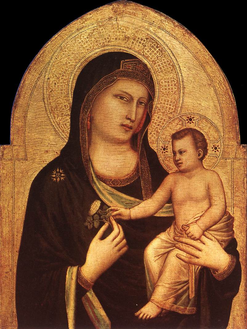
“Medieval portraits of children were usually commissioned by churches,” writes Edwards, “and that made the range of subjects limited to Jesus and a few other biblical babies. Medieval concepts of Jesus were deeply influenced by the homunculus, which literally means little man.” It also goes along with a strangeness prevalent in medieval art which, according to Creighton University art historian Matthew Averett, “stems from a lack of interest in naturalism” and a reliance on “expressionistic conventions.” These conditions changed, as did much else, with the Renaissance: “a transformation of the idea of children was underway: from tiny adults to uniquely innocent creatures” with the cuteness to match.
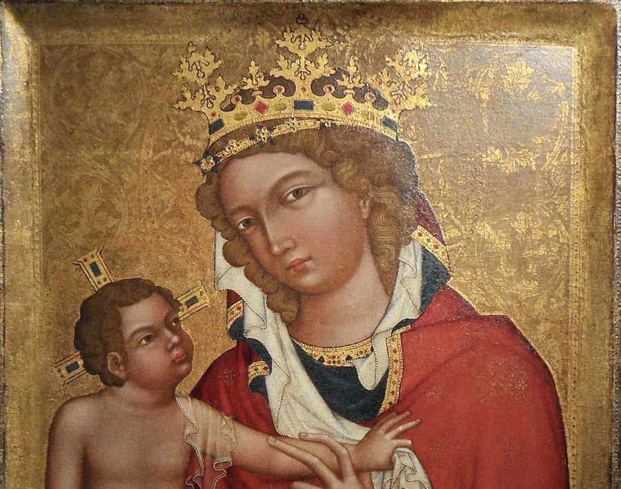
You can witness a veritable parade of oddly manlike medieval babies in the short video at the top of the post. “After the Renaissance, cherubs didn’t seem out of place, and neither did cuter pictures of baby Jesus,” says Edwards, narrating. “It’s kind of stayed that way since. We want babies who look like they need their cheeks pinched, not their prostates checked. We want them chubby and cute, and we want babies that fit our ideals” — ideals that have led from pudgy angels to the Gerber Baby to the collected work of Anne Geddes. We probably need not fear an aesthetic return to the middle-aged, homuncular babies of yore, but their frowny expressions have certainly made a comeback in real life: just look at any 21st-century infant immersed in an iPad.
Related Content:
Leonardo da Vinci’s Bizarre Caricatures & Monster Drawings
Based in Seoul, Colin Marshall writes and broadcasts on cities and culture. His projects include the book The Stateless City: a Walk through 21st-Century Los Angeles and the video series The City in Cinema. Follow him on Twitter at @colinmarshall or on Facebook.
