Anyone who watched Bob Ross’ The Joy of Painting from 1983 to 1994 knows the show had a bit of a surreal quality to it. With that soft voice, reduced often to a whisper, Ross slapped some paint onto the canvas, smeared it around, and eventually something magical appeared–a mountain, a stream, a forest, whatever. Nowadays, the show has experienced something of a renaissance and achieved cult status. 30 seasons of The Joy of Painting live on YouTube (legitimately, it seems), and they’ve become fodder for creative projects that take Bob Ross to new surreal heights. Exhibit 1, “Deeply Artificial Trees,” appears above.
This artwork represents what it would be like for an AI to watch Bob Ross on LSD (once someone invents digital drugs). It shows some of the unreasonable effectiveness and strange inner workings of deep learning systems. The unique characteristics of the human voice are learned and generated as well as hallucinations of a system trying to find images which are not there.
If you would like to support the mission of Open Culture, consider making a donation to our site. It’s hard to rely 100% on ads, and your contributions will help us continue providing the best free cultural and educational materials to learners everywhere. You can contribute through PayPal, Patreon, and Venmo (@openculture). Thanks!
No scene in a movie counts for as much as its opening, but even before its first frame passes through the projector, its poster has already made the real first impression. This remains basically as true in the era of digital cinema as it was when film actually passed through projectors. But while filmmakers only occasionally go back and retool their past works — not that the experience of, say, George Lucas and the original Star Wars trilogy vouches for the practice — film posters can easily undergo any number of revisions through the decades. What cinephile graphic designer wouldn’t want to take a shot at creating a new face for a favorite movie?
Last year, the Sydney-based designer Peter Majarich took shots at 365 of them, creating one new poster for an existing movie each and every day. “The feat is a huge undertaking,” writes the Creators Project’s Diana Shi, “but Majarich’s final products never give the impression of last-minute creations; instead, they show off an acute attention to detail and a bold, digital-influenced style. The inventiveness of each poster reveals how much of a cinephile Majarich really is.” His selections include “a pool of zeitgeist directors, Oscar winners, and art-house films with cult followings.
A rendering of De Palma’s Scarface is a subtle assembly of white powder to starkly draw out Al Pacino’s profile. While what looks like a body of complex coding language forms the blank-staring face of Alicia Vikander’s lead in Ex Machina.” You can browse all these at A Movie Poster a Day, see them displayed in sequence in the video above, and buy them on his design company’s site.
Their simultaneous aesthetic and cinematic references will please design- and film-lovers alike (groups hardly separate on the Venn diagram anyway), and while many constitute good visual gags, the best provide new perspectives on even much-watched favorite movies.
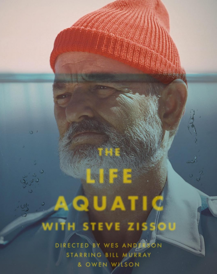
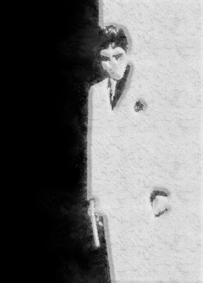
For Wes Anderson’s The Life Aquatic with Steve Zissou, Majarich depicts the emotional submersion of its seafaring protagonist; for Alfred Hitchcock’s Vertigohe works only with the title itself imbuing the type with the combination of shock and dread on display in the film; for David Lynch’s Mulholland Drive he uses a pink-skied landscape of the titular Los Angeles road leading off, as Lynch’s work often does, to who knows where. After you’ve seen the first 286, you’ll come upon a selection that will hardly surprise you: Gary Hustwit’s Helvetica.
The art of M.C. Escher apparently makes for some good puzzles. Head over to Amazon and you’ll find a number of ornate Escher works of art turned into traditional 1,000-piece puzzles. They’ll keep you busy for hours on end. But will they challenge you as much as the M.C. Escher Mirror Puzzle featured above? This puzzle takes things to another level. The directions read like this: “Use the slanted mirror inside each cube to reflect the image on the side of an adjacent cube. Once you place all nine cubes in the right pattern, a complete Escher image will appear.” Finish the first puzzle, and then start on the next one. There are five puzzles in this set.
If you would like to support the mission of Open Culture, consider making a donation to our site. It’s hard to rely 100% on ads, and your contributions will help us continue providing the best free cultural and educational materials to learners everywhere. You can contribute through PayPal, Patreon, and Venmo (@openculture). Thanks!
Few painters have created as rich a world as Hieronymus Bosch did in The Garden of Earthly Delights. The late 15th- or early 16th-century triptych, which depicts the creation of man, the licentious frolicking of all creatures on a paradisiacal Earth, and the subsequent fall into damnation, draws a scrutiny — and causes an amusement — as intense as ever. As we’ve previously featured here on Open Culture, you can now take a virtual tour of the painting (there’s even an app for it), see it brought to life with modern animation, and hear the song tattooed on the posterior of one of the work’s many characters.
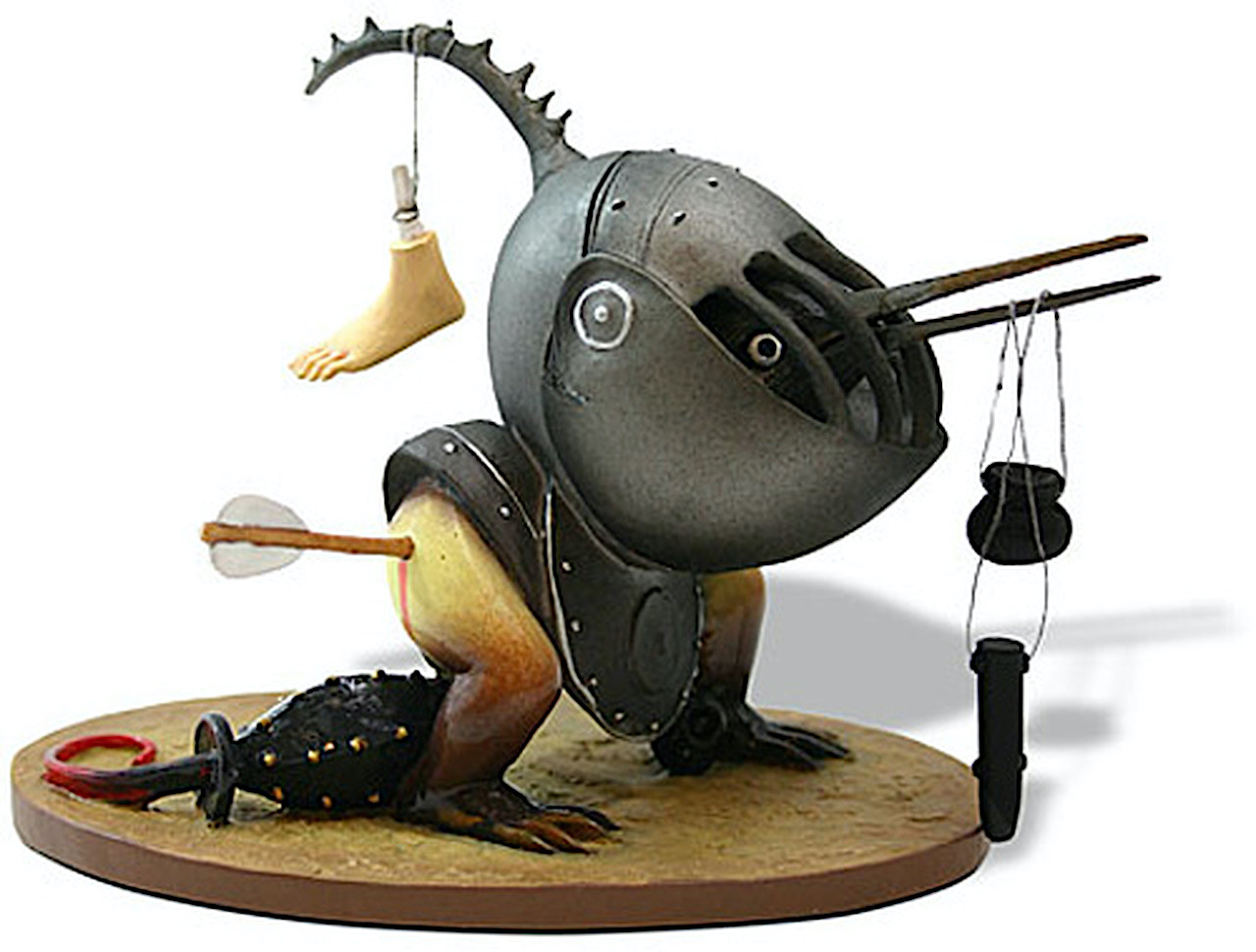
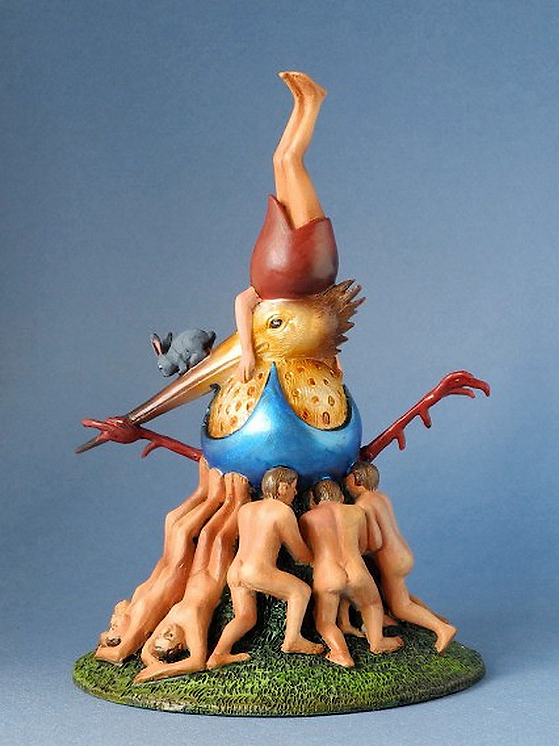
Bosch not only created a world with The Garden of Earthly Delights, he populated it thoroughly. And despite the human-centric story the work appears to take as its basis, the cast with which it retells it extends far beyond mere humanity: the panels feature not just wildlife of all shapes and sizes but a variety of mythical grotesques, from imps to chimeras to hybrids of man and animal to much more besides. He drew from the same surreal imaginative well to fill his other paintings, and you can now pull out a few of these colorful, menacing, preposterous, and darkly humorous characters yourself in collectible figurine form.
Though “not a big knickknack person,” Dangerous Minds’ Tara McGinley admits to digging this selection of “tiny objects” straight from the mind of Bosch, all “kinda cool-looking in their own obviously weird way” and none “too expensive. The figurines start at around $45, depending on quality, size and detail.” (You can find them on Amazon.) She highlights such issues as “Helmeted Bird Monster,” which according to manufacturers Parastone features a severed foot “swinging from the bird’s helmet referring to the horrible corporal punishments which could be expected in hell.”
“Devil on Night Chair,” one of the most recognizable denizens of The Garden of Earthly Delights’ third panel, comes cast in his famous position, “eating a person on a chair where he will excrete the human remains.” The considerably less satisfied “Fat Belly with Dagger” comes from the third panel of a different triptych, The Temptation of Saint Anthony, the dagger in his belly showing “the consequences of intemperance. His eyes look out at you in acknowledgment.” Its makers promise that “you will look at it in wonder as to how Bosch’s mind conceived of such an unusual little fellow.” Have a look at Dangerous Minds’ original post and Amazon’s Bosch figurine page for more information on how to obtain them, whether for yourself or as gifts for friends and family. They certainly won’t look at them the same way they do Hummel figurines.
Given the image of Communist Russia we’ve mostly inherited from Cold War Hollywood propaganda and cherry-picked TV documentaries, we tend to think of Communist art as sterile, brutalist, devoid of expressive emotion and experiment. But this has never been entirely so. While Party-approved social realism dominated in certain decades, experimental Russian animation, film, design, and literature flourished, even under extremely harsh conditions one wouldn’t wish on any artist.
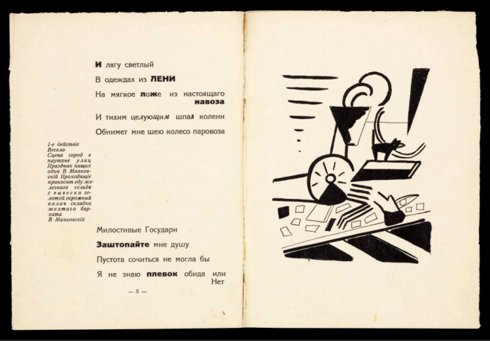
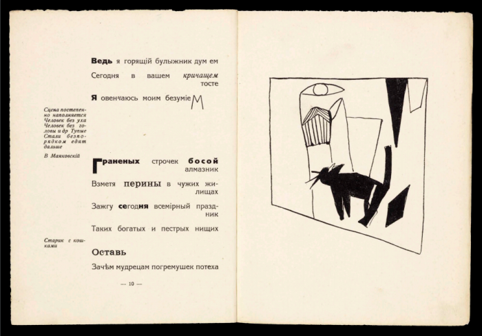
In the early days of the Revolution, one of the most influential forms of expression, Russian Futurism, brought its avant-gardism to the masses, and praised the Revolution while formally challenging every received idea or doctrine. Beginning in the early 20th century and working until the Soviet Union was formed and Trotsky banished, Futurist poets and artists like Vladimir Mayakovsky, Kazimir Malevich, Nalia Goncharova, and Velimir Khlebnikov contributed to a style called “Zaum,” a word, as we noted in a previous post, that can mean “transreason” or “beyond sense.” (A very unscientific, bourgeois approach, it would later be alleged by the Central Committee.)
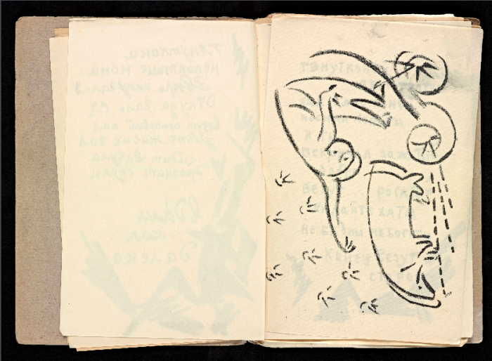
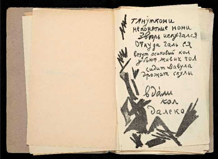
This archive contains about four dozen books by artist/poets like Khlebnikov whose 1914 Old-Fashioned Love; Forestly Boom, you can see pages from at the top of the post. Further up and just above, we see excerpts from Alexei Kruchenykh’s 1913 Vzorval’ (Explodity), a mostly hand-lettered publication with whimsical, dynamic drawings alternating with and surrounding the text. You’ll find over four dozen of these books at the Getty Research Institute. As you browse or search their catalogue, then click on an entry, you’ll want to click on the “View Online” button to see scanned images.
Each of these books—like Vladimir Mayakovsky’s 1913 play, Vladimir Mayakovsky: A Tragedy, above and below—makes a forceful visual impression even if we cannot understand the text. But in many ways, this is beside the point. Zaum poetry was meant to be heard as sound, not sense, and looked at as a physical artifact. Perloff’s book, writes the Getty, “uncovers a wide-ranging legacy in the midcentury global movement of sound and concrete poetry (the Brazilian Noigandres group, Ian Hamilton Finlay, and Henri Chopin), contemporary Western conceptual art, and the artist’s book.” In many ways, these artists represent a parallel tradition in modernism to the one we generally learn of in Western Europe and the U.S., and one just as rich and fascinating.
In elementary school, a playful teacher gave us an assignment. Everyone was to dream up some sort of amazing invention, then draw both a design and an advertisement for it.
It seemed most of my classmates were primed for a future in which sneakers would come equipped with fully operational, built-in wings.
I succumbed to peer pressure and turned in an ad showing a laughing, airborne boy, taunting an earthbound adult by dangling his be-winged sneaker-clad foot just a few inches out of reach.
My Fleet Foot was awarded a good grade, but I felt no passion for it. The invention that truly captured me was the one depicted in my favorite illustration from Patapoufs et Filifers, the funny French children’s book my father had passed down, about a war between fat and thin people. The thin characters were industrious and highly driven, but the fat ones knew how to live, lounging in feather beds beside wall spigots dispensing hot chocolate.
Those spigots were—then and now—a technological advancement I would love to see realized.
In the Fiction of Science, the short film above, Wong, a graphic designer and Google Creative Lab’s VP, shows how storytelling can put the spurs to those with the training and know-how to usher these wild-sounding advancements into the real world.
Case in point, the cell phone.
Martin Cooper, an engineer at Motorola, is widely regarded as the father of the mobile phone, but when we take a broader view, the cell phone actually has two daddies: Cooper and Wah Ming Chang, the artist responsible for many of Star Trek’s iconic props, including the phaser, the tricorder and the communicator—a “portable transceiver device in use by Starfleet crews since the mid-22nd century.”
(Not surprisingly, Cooper was a huge Star Trek fan.)
Touch screens and 3D fabrications born of hand gestures are among the many creative fictions that have quickly become reality as science and art intermingle on movie sets and in the lab.
If you’re inspired to take an active part in this revolution, Google Creative Lab is currently taking applications for The Five, a one-year paid program for five lucky innovators, drawn from a pool of artists, designers, filmmakers, developers, and other talented, multi-dextrous makers.
The story of literary modernism in the English-speaking world is most often told through a small collection of Great Works of Art. These poems and novels appeared suddenly after the shock and carnage of World War I, as Europeans and Americans faced the psychological aftermath of mechanized modern combat and its senseless capacity for mass destruction. T.S. Eliot’s The Waste Land surveyed the wreckage of European culture and tradition, James Joyce’s Ulysses showed us history as a “nightmare” from which its protagonist is “trying to awake,” Virginia Woolf’s Jacob’s Roomshowed the modern self as nothing more than a collection of memories and perceptions, emptied of solid existence….
The project started small in 1996 and has since bloomed into a major resource for scholars and readers. As the MJP’s motto has it, modernism began not with the major works that have come to define it most; “modernism began in the magazines,” small publications with limited readerships that often piqued little interest outside their communities.
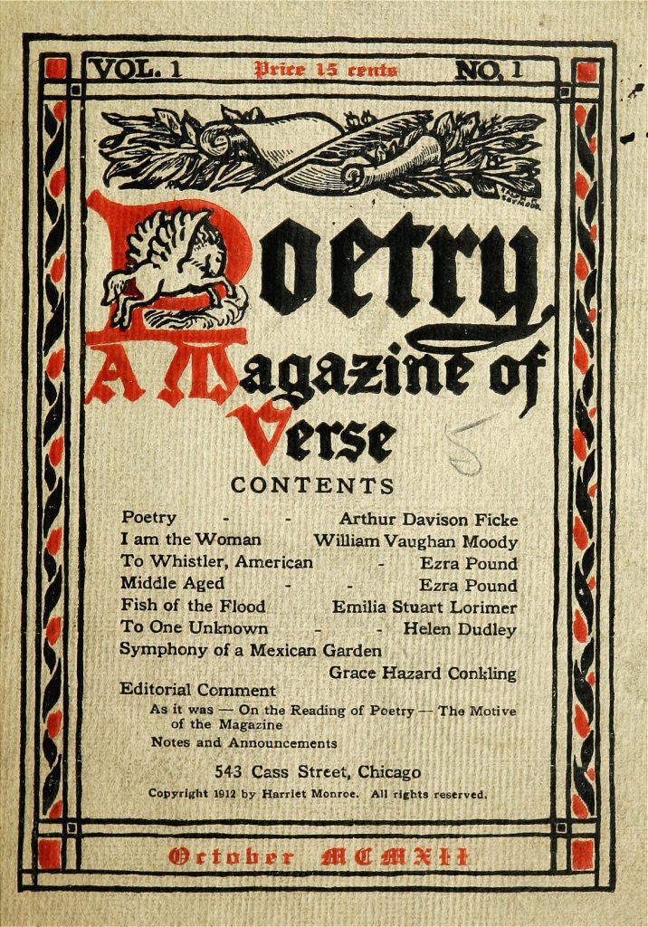
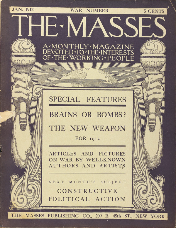
In many of these magazines, such as Harriet Monroe’s Poetry—still around today—we can see bridges between Victorian and modernist poetry. The first issue of Poetry from 1912 (top), for example, features famous Victorian poet William Vaughan Moody next to emerging literary dynamo Ezra Pound, who edited Eliot’s The Waste Land ten years later. Although the exponents of modernism are often divorced from a political context, many modernist writers appeared early in “little magazines” like The Masses, further up, “perhaps the most vibrant and innovative magazine of its day.”
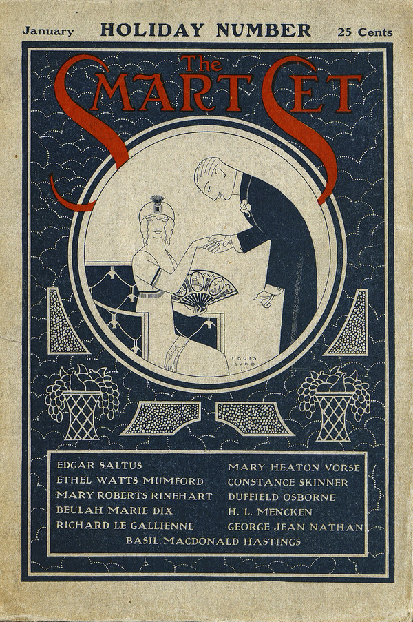
Founded in 1911 as an illustrated socialist monthly, The Masses’ policy was “to do as it Pleases and Conciliate Nobody, not even its Readers.” The magazine published Carl Sandburg, Louis Untermeyer, Amy Lowell, Upton Sinclair, and Sherwood Anderson, among many others. But modernism took root on varied terrain, such that at the same time as The Masses represented major literary change, so too did The Smart Set, founded in 1900 “as a magazine for and about New York’s social elite.” This magazine soon “evolved into something much more important—an expression of popular modernism,” publishing F. Scott Fitzgerald, Joseph Conrad, James Joyce and others.
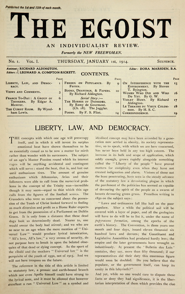
The editorship in 1913 of Willard Huntington Wright “established The Smart Set’s high literary credentials” with figures like Pound and W.B. Yeats. Wright “would up nearly bankrupting the journal” before H.L. Mencken and George Jean Nathan took over the following year. Next to The Smart Set in contemporary importance are magazines like The Egoist, which grew out of an earlier short-lived “weekly feminist review,” The Freewoman.
Begun in 1913 as The New Freewoman by Freewoman editor Dora Marsden, and later edited by Harriet Weaver, The Egoist is only one example of the crucial importance female editors and writers had in bringing literary modernism to fruition. The Egoisteventually took on Eliot as its literary editor and published his seminal essay “Tradition and the Individual Talent.”
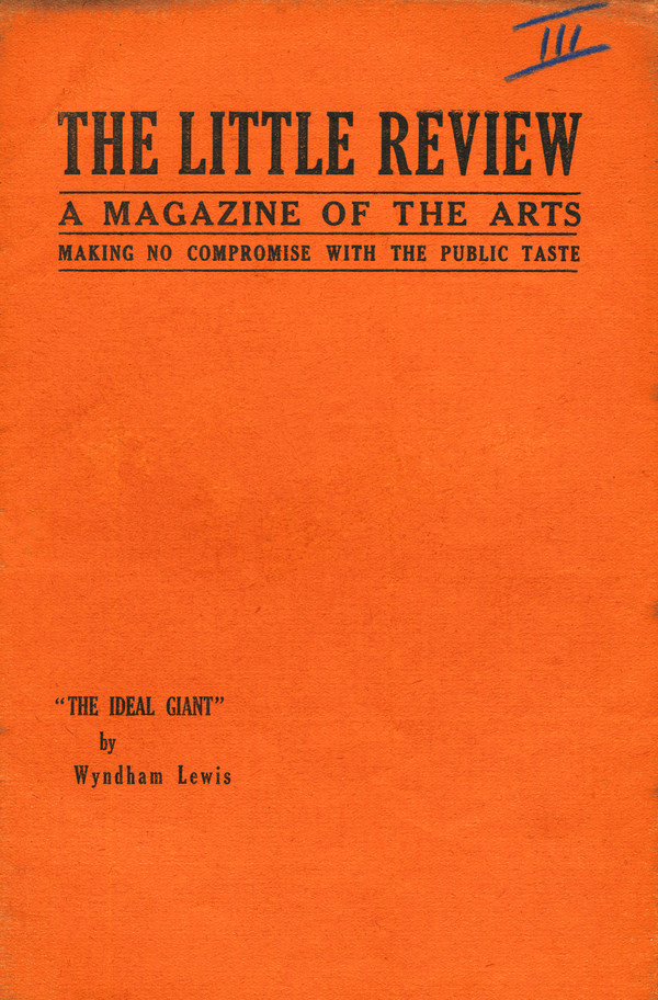
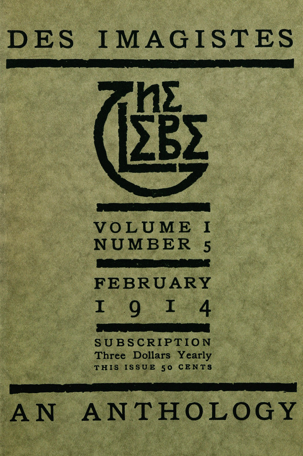
Other publications critical to the growth of modernist literature were The Little Review, Des Imagistes—a series of anthologies organized and edited by Pound—and the W.E.B. Du Bois-edited The Crisis, the NAACP’s official journal, which published work from Jessie Faucet, Charles Chesnutt, Countee Cullen, Langston Hughes, James Weldon Johnson, Jean Toomer, and many other figures central to the Harlem Renaissance. You’ll find dozens of issues of these and many other modernist journals from the period, represented as scanned images and PDFs at the Modernist Journals Project. At the MJP homepage, you also find biographies of the authors and artists who appear in these journals’ pages, as well as book excerpts and essays about the period of the “little magazines,” when the modernists who became famous in the twenties, and household names decades later, discovered new forms and created new literary communities.
Quirky, artist-customized guest rooms equipped with wifi, fridge, and safes…
Leather couches and “an air of undeserved authority” in the communal areas…
VIPs who spring for the Presidential suite will enjoy access to a tiki bar, library, and Dead Sea minerals for use in a plunge bath spacious enough for four…
The artist Banksy’s latest massive-scale project may never find its way onto Palestine’s official tourism site, but it’s no joke. The fully functioning hotel is set to open for online bookings on March 11.
Visitors should be prepared to put a $1000 deposit on their credit cards at check in, a security measure aimed at those who might be tempted to walk off with artwork by Sami Musa, Dominique Petrin, or the hotel’s famous founder.
Guests are also cautioned to contain their excitement about their upcoming stay when passing through customs at Tel Aviv airport, where travelers who blab about their intentions to visit the West Bank are often subjected to extra scrutiny. One wonders how many Tel Aviv TSA officers would get the appeal of staying in a hotel that boasts of its terrible views of the wall dividing Palestine from Israel.
The hotel’s proximity to the wall provides both its name and its raison‑d’etre. Banksy is marking the centenary of British control of Palestine by enticing visitors to educate themselves, using his customary humor and lack of polemic as the launching pad.
To that end, a museum and gallery on the premises will be open to the public, offering “a warm welcome to people from all sides of the conflict and across the world.” (The hotel’s FAQ counters the notion that the project is an anti-Semitic statement, issuing a zero-tolerance policy where fanaticism is concerned.)
One of the hotel’s most original amenities is its in-house graffiti supplies store, staffed by experts ready to dispense “local advice and guidance” to visitors eager to contribute to the Wall’s proliferating street art. (For inspiration, refer to Banky’s work from a 2015 trip to Gaza, below.)
Armchair travelers can check out Banksy’s Walled Off Hotel here.
The online reservations desk will open for business on March 11, the same day the gallery and museum open to the public.
We're hoping to rely on loyal readers, rather than erratic ads. Please click the Donate button and support Open Culture. You can use Paypal, Venmo, Patreon, even Crypto! We thank you!
Open Culture scours the web for the best educational media. We find the free courses and audio books you need, the language lessons & educational videos you want, and plenty of enlightenment in between.