On May 3, 1967, Dr. Timothy Leary, that high priest of hallucinogens, faced off in a debate with MIT professor Dr. Jerome Lettvin about LSD in MIT’s Kresge Auditorium. Leary spent the debate in the lotus position, dressed in a white gown, beads and bare feet. The very picture of a counter culture icon. Lettvin, on the other hand, cuts a distinctly conservative figure, sporting a short-sleeved white shirt, a skinny tie and thick-framed glasses. On first blush, the debate might look like a stereotypical clash between the hip versus the square, but it ended up being much more interesting than that. Lettvin, who proved to be at least as charismatic as Leary, more than held his own against the man Richard Nixon once called “the most dangerous man in American.” You can watch the full debate above.
Leary speaks for the first half of the video. For those familiar with his routine, little of what you see will come as a surprise. He argues that LSD is a “a way of life and a sacrament and a sacrament is something that gets you high.” He goes on to cite groundbreaking figures like Einstein, Newton and William James who struggled to understand reality and consciousness. “The real goal of the scientist is to flip out,” he said to a packed auditorium filled with future scientists. “I don’t know if LSD is good or bad. It’s a gamble. It’s a risk. The sacrament is always a risk. … What isn’t? But LSD is the best gamble in the house.” Aiding him with his argument is a psychedelic picture show featuring a steady stream of images including ocean waves rolling backward, children bouncing on trampolines, and a man in a goatee eating soup, all set to a soundtrack by Ravi Shankar.
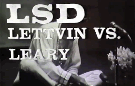
“Tim, your argument is exceedingly seductive,” Lettvin concedes at the beginning of his presentation (it begins around the 30:30 mark), which had none of the visual razzamatazz of Leary’s spiel. “I feel like this man is [in] the hands of the devil.”
Lettvin, however, proves not to be your standard anti-drug scold. At one point in the debate, he proclaims, “I can conceive of no more immoral thing than has been done by the government in the wholesale banning of drugs. … There’s a fundamentally monstrous thing about forbidding rather than reasoning people out.” And that’s exactly what Lettvin set out to do — reason the audience against taking acid. “The question is not scientific but moral,” he says. LSD has the potential to rob takers of their critical faculties, rendering them permanently spaced out. “The price seems a little steep to pay. You are settling for a permanent second rate world by the abnegation of the intellect.”
Lettvin’s performance is all the more impressive because he had little time to prepare. The faculty member who was originally slated to debate Leary bowed out at the last moment, and organizers scrambled to get someone, anyone, to face down the famed guru. Lettvin reportedly came straight from the lab to the auditorium and he even had to borrow a tie. Too bad Leary didn’t have a spare Nehru jacket.
Related Content:
Beyond Timothy Leary: 2002 Film Revisits History of LSD
Artist Draws Nine Portraits on LSD During 1950s Research Experiment
Watch The Bicycle Trip: An Animation of The World’s First LSD Trip in 1943
Beyond Timothy Leary: 2002 Film Revisits History of LSD
Jonathan Crow is a Los Angeles-based writer and filmmaker whose work has appeared in Yahoo!, The Hollywood Reporter, and other publications. You can follow him at @jonccrow. And check out his blog Veeptopus, featuring one new drawing of a vice president with an octopus on his head daily. The Veeptopus store is here.