The 1855 Map That Revolutionized Disease Prevention & Data Visualization: Discover John Snow’s Broad Street Pump Map
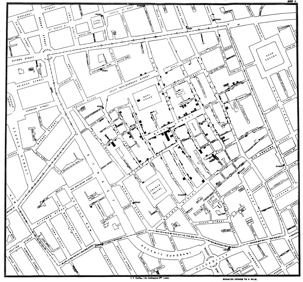
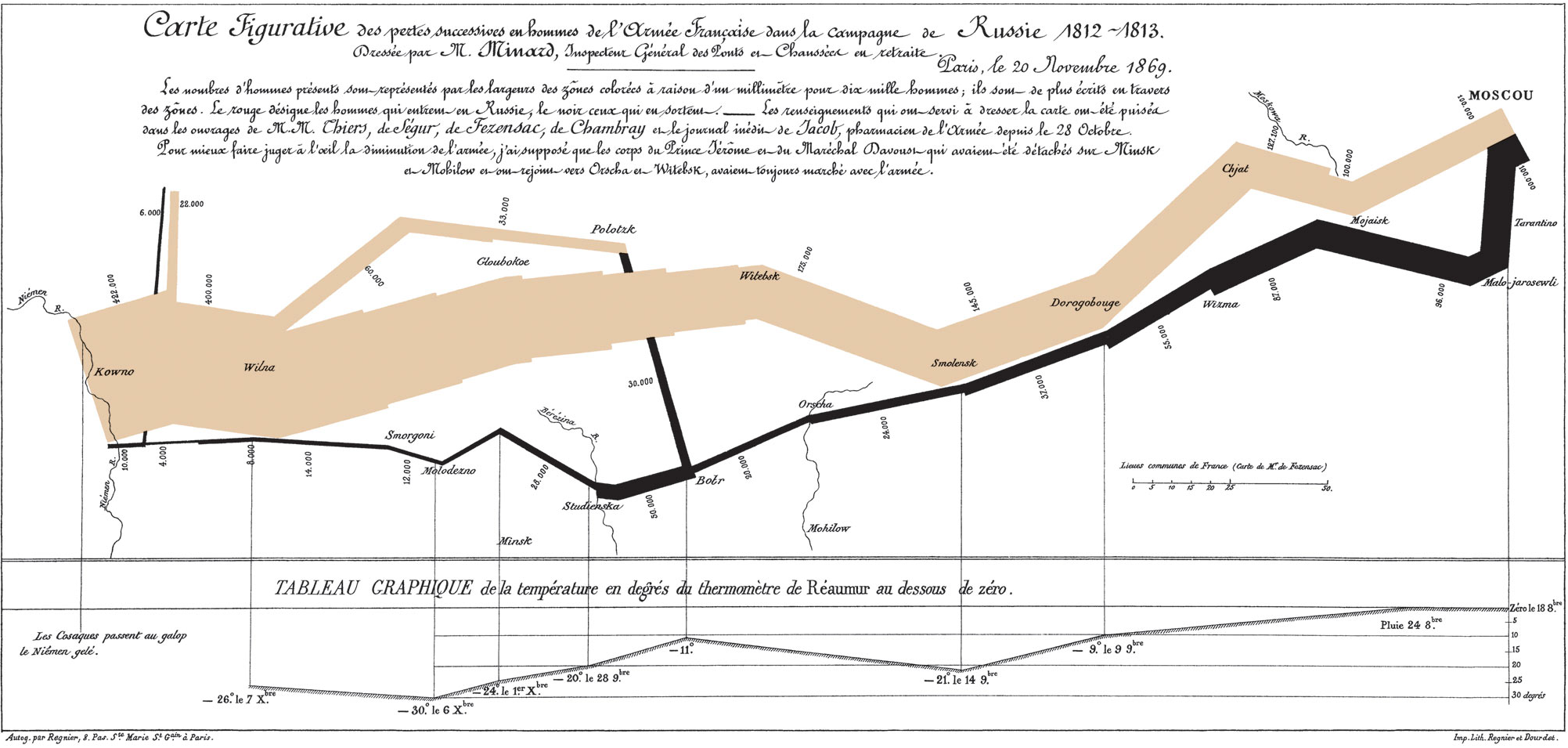
No, he didn’t help defeat an implacable zombie army intent on wiping out all life. But English obstetrician John Snow seems as important as the similarly-named Game of Thrones hero for his role in persuading modern medicine of the germ theory of disease. During the 1854 outbreak of cholera in London, Snow convinced authorities and critics that the disease spread from a contaminated water pump on Broad Street, leading to the now-legendary infographic map above showing the incidences of cholera clustered around the pump.
Snow’s persistence resulted in the removal of the handle from the Broad Street pump and has been credited with ending an epidemic that claimed 500 lives. The Broad Street pump map has become “an enduring feature of the folklore of public health and epidemiology,” write the authors of an article published in The Lancet. They also point out that, contrary to popular retellings, the “map did not give rise to the insight” that the pump and its germ-covered handle caused the outbreak. “Rather it tended to confirm theories already held by the various investigators.”
Snow himself published a pamphlet in 1849 called “On the Mode of Communication of Cholera” in which he argued that “cholera is communicated by the evacuations from the alimentary canal.” As he reminded readers of The Edinburgh Medical Journal in an 1856 letter, in that same year, “Dr William Budd published a pamphlet ‘On Malignant Cholera’ in which he expressed views similar to my own.” Germ theory had a long, distinguished history already, and Snow and his contemporaries made sound, evidence-based arguments for it.
But their position “largely went ignored by the medical establishment,” notes Randy Alfred at Wired, “and was opposed by a local water company near one London outbreak.” The accepted, mainstream scientific opinion held that all disease was spread through “miasma,” or bad air. Pollution, it was thought, must be the cause. After the pump handle’s removal, Snow published an 1855 monograph on waterborne diseases. This was the first public appearance of the legendary map—after the removal of the handle.
Helping to inform Snow’s map, another investigator, parish priest Henry Whitehead had “concluded that it was the washing of soiled diapers into drains which flowed to the communal cesspool that contaminated the pump and started the outbreak,” writes Atlas Obscura. Whitehead, a former critic of germ theory, later pointed out that the removal of the pump handle didn’t actually stop the epidemic, which, he said, “had already run its course” by that point.
Nonetheless, Snow and other proponents of the theory were vindicated, Whitehead had to admit, and Snow’s intervention “had probably everything to do with preventing a new outbreak.” The simple, yet sophisticated data visualization would lead to radical new ways of conceptualizing disease outbreaks, helping to stop or prevent who knows how many epidemics before they killed hundreds or thousands. Snow’s map also deserves credit for giving “data journalists a model of how to work today.”
It was hardly the first or only data visualization of cholera outbreaks of the time. “As early as the 1830s,” Visual Capitalist points out, “geographers began using spacial analysis to study cholera epidemiology.” But Snow’s was by far the most influential, and effective, of them all. In his TED talk above, journalist Steven Johnson (author of The Ghost Map:The Story of London’s Most Terrifying Epidemic and How It Changed Science, Cities, and the Modern World) tells the story of how the outbreak, and Snow’s theory and map, “helped create the world that we live in today, and particularly the kind of city that we live in today.”
Read a Q&A with Johnson here; head over to The Guardian’s Data Blog to see Snow’s visualization recreated over a modern, satellite-view map of London and the Soho neighborhood of the famous Broad Street pump; and learn more about Snow and deadly cholera outbreaks in the crowded European cities of the early 19th century at the John Snow Archive and Research Companion online.
Related Content:
The Art of Data Visualization: How to Tell Complex Stories Through Smart Design
Josh Jones is a writer and musician based in Durham, NC. Follow him at @jdmagness
Read More...Napoleon’s Disastrous Invasion of Russia Detailed in an 1869 Data Visualization: It’s Been Called “the Best Statistical Graphic Ever Drawn”
It’s tempting to associate data visualizations with PowerPoint and online graphics, which have enabled an unheard-of capacity for disseminating full-color images. But the form reaches much further back in history. Further back, even, than the front pages of USA Today and glossy sidebars of Time and
Newsweek. In 1900, for example, W.E.B. Du Bois made impressive use of several full-color data visualizations for the First Pan-African Conference in London, with no access whatsoever to desktop publishing software or a laser printer.
Almost fifty years before Du Bois turned statistics into swirls of color and shape, Florence Nightingale used her little-known graphic design skills to illustrate the causes of disease in the Crimean War and John Snow (not Jon Snow) illustrated his revolutionary Broad Street Pump cholera theory with a famous infographic street map.
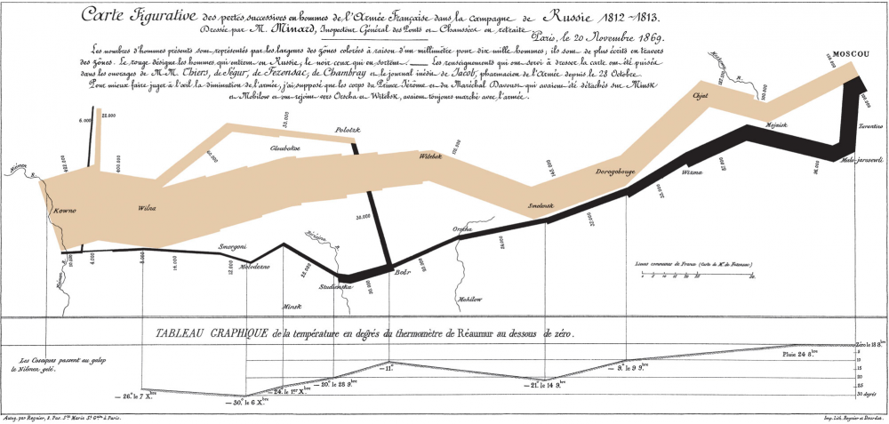
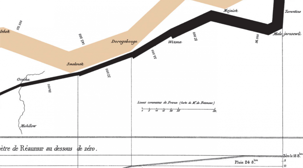
Around this same time, another data visualization pioneer, Charles Joseph Minard, produced some of the most highly-regarded infographics ever made, including the 1869 illustration above of Napoleon’s march to, and retreat from, Moscow in the War of 1812. View it in a large format here.
Made fifty years after the event, when Minard was 80 years old, the map has been called by the bible of data visualization studies—Edward Tufte’s The Visual Display of Quantitative Information—“probably the best statistical graphic ever drawn.” Over at thoughtbot.com, Joanne Cheng sums up the context, if you needed a historical refresher: “The year is 1812 and Napoleon is doing pretty well for himself. He has most of Europe under his control, except for the UK.”
Angered by Czar Alexander’s refusal to support a UK trade embargo to weaken their defenses, Napoleon “gathers a massive army of over 400,000 to attack Russia.” The campaign was disastrous: overconfident advances on Moscow turned into devastating wintertime retreats during which the Grande Armée only “narrowly escaped complete annihilation.” So, how does Minard’s 1869 Tableau Graphique tell this grand story of hubris and icy carnage? And, Cheng asks, “what makes it so good?”
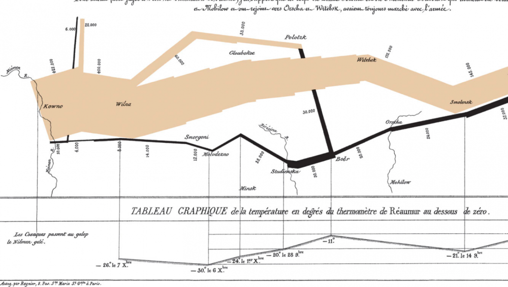
Cheng breaks Minard’s series of jagged lines and shapes down into more conventional XY axis line graphs to show how he coordinated a huge amount of information, including the locations (by longitude) of different groups of Napoleon’s troops at different points in time, their direction, and the precipitously falling temperatures in the stages of retreat. He drew from a list of the best historical sources he could consult at the time, turning dense prose into the spare, clean lines that set data scientists’ hearts a‑flutter.
Minard began his career in a much more recognizably 19-century design field, building bridges, dams, and canals across Europe for the first few decades of the 1800s. As a civil engineer “he had the good fortune to take part in almost all the great questions of public works which ushered in our century,” noted an obituary published in Annals of Bridges and Roads the year after Minard’s death in 1870. “And during the twenty years of retirement, always au courant of the technical and economic sciences, he endeavored to popularize the most salient results.”
He did so by venturing outside the subject of engineering, while using the “innovative techniques he had invented for the purpose of displaying flows of people” on paper, writes Michael Sandberg at DataViz. In order to tell the tragic tale” of Napoleon’s crushing defeat “in a single image,” Minard imagined the event as a dynamic physical structure.
Minard’s chart shows six types of information: geography, time, temperature, the course and direction of the army’s movement, and the number of troops remaining. The widths of the gold (outward) and black (returning) paths represent the size of the force, one millimetre to 10,000 men. Geographical features and major battles are marked and named, and plummeting temperatures on the return journey are shown along the bottom.
This was hardly Minard’s first infographic. In fact, he made “scores of other graphics and charts,” National Geographic writes, “as well as nearly 50 maps. He pioneered several important thematic mapping techniques and perfected others, such as using flow lines on a map.” (See other examples of his work at National Geographic’s site.) Minard may not be much remembered for his infrastructure, but his ability, as his obituarist wrote, to turn “the dry and complicated columns of statistical data” into “images mathematically proportioned” has made him a legend in data science history circles.
Again, view Minard’s visualization of Napoleon’s failed invasion in a large format here.
Related Content:
Josh Jones is a writer and musician based in Durham, NC. Follow him at @jdmagness
Read More...Arnold Schoenberg, Avant-Garde Composer, Creates a System of Symbols for Notating Tennis Matches
This time each summer, as the conclusion of this year’s fortnight-long championship at Wimbledon approaches, even the most private of the tennis enthusiasts in all of our circles make themselves known. Love of that particular game runs down all walks of life, but seems to exist in particularly high concentrations among cultural creators: not just writers like Martin Amis, Geoff Dyer, and David Foster Wallace, all of whose bodies of work contain eloquent thoughts on tennis, but composers of music as well.
Take Arnold Schoenberg, who well into his old age continued not just to create the innovative music for which we remember him, but to spend time on the court as well. Though born in Vienna, Schoenberg eventually landed in the right place to enjoy tennis on the regular: southern California, to which he fled in 1933 after being informed of how inhospitable his homeland would soon become to persons of Jewish heritage. Few famous composers of that time had less in common than Schoenberg and George Gershwin, but their shared enjoyment of tennis made them into fast partners.
According to Howard Pollack’s life of Gershwin, fellow composer Albert Sendrey left a “revealing account” of one of the weekly matches between “the thirty-eight-year-old Gershwin and the sixty-two-year-old Schoenberg, contrasting the alternately ‘nervous’ and ‘nonchalant,’ ‘relentless’ and ‘chivalrous’ Gershwin, ‘playing to an audience,’ with the ‘overly eager’ and ‘choppy’ Schoenberg who ‘has learned to shut his mind against public opinion.’ ” Any parallels between playing style and musical sensibility are, of course, entirely coincidental.
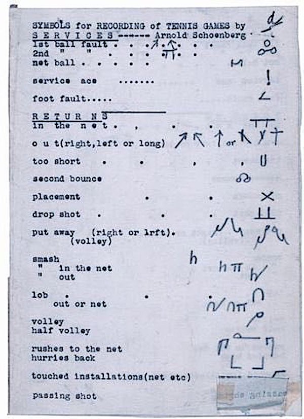
The cerebral nature of Schoenberg’s compositions may not suggest a temperament suited for physical activity of any kind, but even in Austria Schoenberg had been a keen sportsman. And as a fair few tennis-loving writers have explained, the game does possess an intellectual side, and one made more easily analyzable, at least in theory, by a system of Schoenberg’s invention. “Toward the end of his life, Schoenberg — always fascinated by rules, analysis, and invention — would come up with a form of notation to transcribe the tennis matches of his athlete son Ronald,” writes Mark Berry in Arnold Schoenberg. You can see this system laid out on the sheet above, recently posted on Twitter by Henry Gough-Cooper.
The marks look vaguely similar to those of certain dance notation systems, a natural enough resemblance considering the kind of footwork tennis demands. But ideally, Schoenberg’s notation would also have rendered a game of tennis as comprehensible as one of chess — another pursuit to which Schoenberg applied his mind. He came up with “an expanded four-player, ten-square version of the traditional game,” writes Berry, “involving superpowers and lesser powers all compelled to forge alliances, with new pieces such as airplanes, tanks, submarines, and so forth.” Schoenberg’s “coalition chess,” as he called it, seems to have caught on no more than his tennis notation system did. But then, the man who pioneered the twelve-tone technique never did go in for mass acceptance.
via @NotationIsGreat and Henry Gough-Cooper on Twitter
Related Content:
Vi Hart Uses Her Video Magic to Demystify Stravinsky and Schoenberg’s 12-Tone Compositions
John Coltrane Draws a Picture Illustrating the Mathematics of Music
Bob Dylan and George Harrison Play Tennis, 1969
Based in Seoul, Colin Marshall writes and broadcasts on cities, language, and culture. His projects include the book The Stateless City: a Walk through 21st-Century Los Angeles and the video series The City in Cinema. Follow him on Twitter at @colinmarshall, on Facebook, or on Instagram.
Read More...Lennon or McCartney? Scientists Use Artificial Intelligence to Figure Out Who Wrote Iconic Beatles Songs
Do you agonize over the fact that you don’t know for certain who wrote what percentage of your favorite Beatles songs? Do you need to know if a line or phrase is Lennon or McCartney’s before you can enjoy “A Hard Day’s Night,” “In My Life,” and other timeless tunes? Have you lost sleep over the disputed authorship of “Do You Want to Know a Secret”?
I hope not. As Lennon/McCartney themselves wrote, in the end, the songs we love are equal to the love we give the songs…. or something like that. How much we can say with certainty who penned which lyric or melody or played which riff or rhythm part doesn’t add to our emotional experience. But that knowledge does add more to our appreciation than fodder for forum wars or lawsuits.
Pulling these iconic songs into their constituent parts helps confirm our understanding of how those parts contributed differently to making the whole evolve; how Lennon’s directness and simplicity complemented and contrasted with McCartney’s use of “more non-standard musical motifs” and a higher degree of complexity. Or, at least, that’s what an AI found when it analyzed hundreds of Beatles hits in an effort to “build a ‘musical fingerprint’ for each songwriter,” reports Alex Matthews-King at the Independent.
After putting the machine learning algorithm through an initial training phase of “listening” to a complete works, researchers at Harvard “asked” the program to assess “iconic songs, or musical fragments, recorded between 1962 and 1966, where debate rages over who was the major influence.” Much of that debate has been fueled by the songwriters themselves, whose memories in interviews conflict, but who are generally thought to have written most songs individually under their joint songwriting partnership.
The scientists from Harvard and Dalhousie University in Canada were able to gauge with somewhere around 76 percent accuracy whether songs or parts of songs were written by Lennon or McCartney. (Spoiler alert: The AI “was able to identify some, including ‘Ask Me Why’, ‘Do You Want to Know a Secret’ and the bridge to ‘A Hard Day’s Night’, as belonging to John Lennon with up to 90 per cent certainty,” writes The Daily Mail.) Senior lecturer in statistics at Harvard and paper author Mark Glickman explains the larger purpose of the project to the Financial Times: “Our work is essentially a blueprint for those wanting to follow changes in music over time. Using our machine learning model, you could potentially home in on all the different influences of a given musician.”
If you’re using their work to win arguments, be prepared to explain how the study obtained its results and why they are any more reliable than decades of detective work and expert listening by humans. As a non-statistics person, I’ll leave that explanation to more qualified individuals. I’m satisfied: whether McCartney wrote all of the music for “In My Life” or just the bridge, as Lennon claimed, won’t change the way it moves me one bit.
Related Content:
A Brief History of Sampling: From the Beatles to the Beastie Boys
Josh Jones is a writer and musician based in Durham, NC. Follow him at @jdmagness
Read More...Anton Chekhov’s Six Rules For Writing Fiction
Whether due to insecurity, inexperience, or just intellectual curiosity, writers of fiction can sometimes privilege sounding smart over connecting with their readers. The result is the dreaded “information dump,” an attempt to include everything: everything, that is, but that which makes fiction compelling: minutely detailed descriptions of characters we care about; sharply observed situations that move us; moral complexity that feels earned and genuine…
All qualities that might fall under the adjective “Chekhovian.”
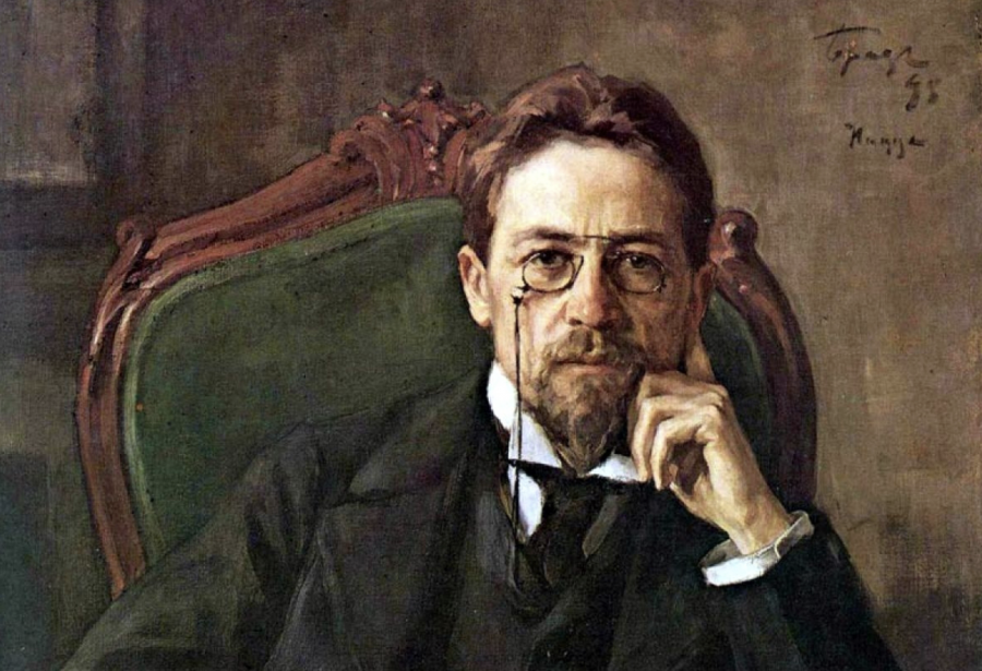
Anton Pavlovich Chekhov, country doctor and masterful short story writer, put himself through medical school by writing fiction readers could not put down. He has since become a standard for realist concision—the short story analogue to Gustave Flaubert’s mastery of the novel form.
And like Flaubert, Chekhov mastered his art by placing strict limits on himself. These he outlined in an 1886 letter to his brother Aleksandr in a concise six-point list, which you’ll find below.
- Absence of lengthy verbiage of political-social-economic nature;
- Total objectivity;
- Truthful description of persons and objects;
- Extreme brevity;
- Audacity and originality: flee the stereotype;
- Compassion
Many of these prescriptions can sound like the CIA-approved rules informally enforced by the 20th-century Iowa Writer’s Workshop. One can draw a line from Chekhov to Raymond Carver, Flannery O’Connor, John Updike, and other writers likely to have appeared in The New Yorker. But many writers besides Chekhov have complained of overly verbose, opinionated fiction.
19th century writer Henry James disparaged what he called the “large loose baggy monsters” of Fyodor Dostoevsky and other serial novelists, for example. Another novelist, Jay McInerney takes a phrase from Renaissance scholar Walter Pater to describe the brevity of the short story: the form, he writes, creates a “hard, gemlike flame.” This seems to be what Chekhov strove for in his mature work.
But three years earlier, he had perfected a very different kind of story, and issued a very different list of prescriptions to his brother. In 1883, Chekhov advised that if Aleksandr wished to get published in the magazine Fragments, he should observe the following: “1. The shorter, the better; 2. A bit of ideology and being up to date is most à propos; 3. Caricature is just fine, but ignorance of civil service ranks and of the seasons is strictly prohibited.”
We can see the author’s noted concern for accuracy, but not the ultimate and most concise item on his mature list: Compassion, a quality that eclipses typology and ideology. Chekhov may not always have adhered closely to some of his own rules, as ethnographic writer Kirin Narayan shows. After all, who can achieve “total objectivity”? But “embedded” in this ideal is “the recognition” writes Maria Popova at Brain Pickings, “that no depiction of reality is realistic unless it includes an empathic account of all perspectives.”
via Brain Pickings
Related Content:
Toni Morrison Dispenses Sound Writing Advice: Tips You Can Apply to Your Own Work
Josh Jones is a writer and musician based in Durham, NC. Follow him at @jdmagness
Read More...Queen Guitarist Brian May Is Also an Astrophysicist: Read His PhD Thesis Online

Photo by ESO/G. Huedepohl, via Wikimedia Commons
Queen couldn’t possibly have been Queen without Freddie Mercury, nor could it have been Queen without Brian May. Thanks not least to the recent biopic, Bohemian Rhapsody, the band’s already larger-than-life lead singer has become even larger still. But its guitarist, despite the film’s surface treatment of his character, is in his own way an equally implausible figure. Not only did he show musical promise early, forming his first group while still at school, he also got his A Levels in physics, mathematics, and applied mathematics, going on to earn a Bachelor of Science in Physics with honors at Imperial College London.
Naturally, May then went for his PhD, continuing at Imperial College where he studied the velocity of, and light reflected by, interplanetary dust in the Solar System. He began the program in 1970, but “in 1974, when Queen was but a princess in its infancy, May chose to abandon his doctorate studies to focus on the band in their quest to conquer the world.” So wrote The Telegraph’s Felix Lowe in 2007, the year the by-then 60-year-old (and long world-famous) rocker finally handed in his thesis. “The 48,000-word tome, Radial Velocities in the Zodiacal Dust Cloud, which sounds suspiciously like a Spinal Tap LP, was stored in the loft of his home in Surrey.” You can read it online here.
According to its abstract, May’s thesis “documents the building of a pressure-scanned Fabry-Perot Spectrometer, equipped with a photomultiplier and pulse-counting electronics, and its deployment at the Observatorio del Teide at Izaña in Tenerife, at an altitude of 7,700 feet (2567 m), for the purpose of recording high-resolution spectra of the Zodiacal Light.” Space.com describes the Zodiacial Light as “a misty diffuse cone of light that appears in the western sky after sunset and in the eastern sky before sunrise,” one that has long tricked casual observers into “seeing it as the first sign of morning twilight.” Astronomers now recognize it as “reflected sunlight shining on scattered space debris clustered most densely near the sun.”
In his abstract, May also notes the unusually long period of study as 1970–2007, made possible in part by the fact that little other research had been done in this particular subject area during Queen’s reign on the charts and thereafter. Still, he had catching up to do, including observational work in Tenerife (as much of a hardship posting as that isn’t). Since being awarded his doctorate, May’s scientific activities have continued, as have his musical ones and other pursuits besides, such as animal-rights activism and stereography. (Sometimes these intersect: the 2017 photobook Queen in 3‑D, for example, uses a VR viewing device of May’s own design.) The next time you meet a youngster dithering over whether to go into astrophysics or found one of the most successful rock bands of all time, point them to May’s example and let them know doing both isn’t without precedent.
Related Content:
Guitarist Brian May Explains the Making of Queen’s Classic Song, ‘Bohemian Rhapsody’
Brian May’s Homemade Guitar, Made From Old Tables, Bike and Motorcycle Parts & More
Based in Seoul, Colin Marshall writes and broadcasts on cities, language, and culture. His projects include the book The Stateless City: a Walk through 21st-Century Los Angeles and the video series The City in Cinema. Follow him on Twitter at @colinmarshall, on Facebook, or on Instagram.
Read More...A Quick Six Minute Journey Through Modern Art: How You Get from Manet’s 1862 Painting, “The Luncheon on the Grass,” to Jackson Pollock 1950s Drip Paintings
Even those not intimately familiar with Jackson Pollock’s work know to file him under a category called “abstract expressionism,” but somehow his massive paintings — and the layer upon layer of drips that constitute their visual and textural surface — still seem to slip categorization. Some of the painter’s fans would surely claim that, more than sixty years after his death, he does indeed still stand apart. But how far apart, really? Evan Puschak, better known as the Nerdwriter, takes on that question in the video essay above, “How Art Arrived at Jackson Pollock.”
Puschak considers a particular Pollock painting from 1950, “the only abstract work of art that has ever floored me in person as soon as my eyes caught it,” and asks why appreciation comes so much more easily for him with it than with other non-figurative works of art. “I don’t think the power of this Pollock depends on its place in the history of art.” he says. “Its style, its use of color, its hyperactivity are intrinsic qualities, but I do think the history of art has a lot to say.” In many ways, “they’re the culmination of something that has a foggy beginning about a century or two before, with the gradual end of church and noble patronage of the arts and the dawn of painters painting what was important to them.”
This line of thinking sets Puschak in search of the beginning of modern art itself, which some find in the early 1860s in the highly figurative work of Edouard Manet, with its “flattened” imagery and “scandalous subject matter.” Monet and his colleagues brought about the movement known as Impressionism, “concerning themselves not with the objects they see in the world but how the light plays off them.” From then on the degree of abstraction intensifies with each subsequent movement in painting, and by the turn of the 20th century “art has unraveled. Its centuries-long aim of reproducing the physical world in perspective, color and form is rapidly being abandoned.”
The highly compressed six-minute journey that Puschak takes through art history to get him to Pollock’s “drip paintings,” which the artist began creating in the 1940s, also includes stops at post impressionism; the work of Vincent Van Gogh (notably his “ugliest masterpiece” Night Cafe, subject of a previous Nerdwriter analysis); Wassily Kandinsky and Pablo Picasso; Dada and the Surrealist Manifesto, all in the span of less than a hundred years. “A fast-changing world contributed hugely, of course, but beyond that I do believe there’s a drive in us to take things as far as they can go, and the century of modern art is an exhilarating example of that” — and the oeuvre of Pollock himself remains an example of “how irrepressible human creativity can be.”
Related Content:
Jackson Pollock 51: Short Film Captures the Painter Creating Abstract Expressionist Art
Watch Portrait of an Artist: Jackson Pollock, the 1987 Documentary Narrated by Melvyn Bragg
The MoMA Teaches You How to Paint Like Pollock, Rothko, de Kooning & Other Abstract Painters
Dripped: An Animated Tribute to Jackson Pollock’s Signature Painting Technique
Based in Seoul, Colin Marshall writes and broadcasts on cities, language, and culture. His projects include the book The Stateless City: a Walk through 21st-Century Los Angeles and the video series The City in Cinema. Follow him on Twitter at @colinmarshall, on Facebook, or on Instagram.
Read More...Michel Foucault and Noam Chomsky Debate Human Nature & Power on Dutch TV (1971)
Two academic stars and heroes of anti-authoritarian leftist political thought sit down to debate human nature—nowadays such events occur more rarely than they did in the 60s and 70s, when the counterculture and anti-war movements made both Michel Foucault and Noam Chomsky famous. Now, when two thinkers of such caliber sit down together, their conversation is immediately distilled into tweeted commentary, sometimes illustrated with gifs and video clips. We get the gist and move on to the next link.
In 1971, when Foucault and Chomsky joined host Fons Elders on Dutch TV, those viewers who tuned in would have to follow the conversation for themselves—for the most part—though it aired in a partly abridged version with commentary from a Professor L.W. Nauta. “Chomsky is at the height of his linguistic-scientific mode,” notes New Inquiry, where “Foucault performs a genealogy of scientific truth itself.”
After an introduction in Dutch by Dr. Nauta, Elders welcomes his guests onstage in English as “tonight’s debaters,” two “mountain diggers, working at the opposite sides of the same mountains, with different tools, without knowing even if they are working in each other’s direction.” It’s a characterization that amuses both Chomsky and Foucault, who aren’t discovering each other’s differences so much as enacting them for the studio audience of “early-70s Dutch intelligentsia.”
The two do find some common ground, in Foucault’s critique of the dominant history of science, for example. Where they differ, they seem to be speaking different languages, and they are also literally speaking different languages. Chomsky begins in English, Foucault responds in English with apologies for his lack of fluency, then switches to French. Those of us who aren’t fluent in both languages will have to rely on the translation, as many of us do when reading Foucault as well, a situation that should give us pause before we draw conclusions about what we think he’s saying.
Still, those inclined to reject Foucault as a rejector of science should pay closer attention to him, even in translation (into English, Portuguese, and Japanese subtitles in the video above). He does not reject the notion of scientific fact, but rather, as Wittgenstein had decades earlier, points out that much of what we take as conceptual reality is no more than vague, meaningless abstraction, “peripheral” words and phrases that do “not all have the same degree of elaboration” as more precise scientific terms.
Fuzzy ideas, for example, like “human nature… do not play an ‘organizing’ role within science.” Neither “instruments of analysis” nor “descriptive either,” they “simply serve to point out some problems, or rather to point out certain fields in need of study.” They are signposts for the unknown, a “scientific shopping list,” as Professor Nauta puts it when he breaks in to helpfully explain to viewers at home what he thinks Foucault means. Nauta’s interventions are drier than the main action—apparently no one thought in 1971 to sensationalize the event.
Well, almost no one thought to sensationalize the event. Anarchist host Elders “wanted to jazz things up a bit,” writes Eugene Wolters at Critical Theory. “Aside from offering Foucault hashish for part of his payment, Elder tried repeatedly to get Foucault to wear a bright red wig.” According to the James Miller in The Passion of Michel Foucault, Elders “kept poking Foucault under the table, pointing to the red wig on his lap, and whispering, ‘put it on, put it on.”
Chomsky found the exchange less than amusing, later calling Foucault “totally amoral” and saying that he “wildly exaggerates.” These minor spectacles aside, the Chomsky-Foucault debate is less epic showdown and more two mostly parallel, only occasionally intersecting, discourses on “a wide range of topics, from science, history, and behaviorism to creativity, freedom, and the struggle for justice in the realm of politics.” If some of that discussion seems overly obscure at times, just imagine Foucault in a bright red wig, and later enjoying what he and his friends called “Chomsky hash.”
The text of their debate has been published. Read The Chomsky-Foucault Debate: On Human Nature.
Related Content:
Michel Foucault Offers a Clear, Compelling Introduction to His Philosophical Project (1966)
Noam Chomsky Makes His First Power Point Presentation
Josh Jones is a writer and musician based in Durham, NC. Follow him at @jdmagness
Read More...Lost Miles Davis Album, Rubberband, Will Finally Be Released This Fall: Hear the Title Track, “Rubberband,” in Five Different Versions
Jazz is a collaborative art, no matter how big the egos and outsized the personalities involved. Even bandleaders as autocratic as Miles Davis are referred to in the context of their ensembles and in the company of their finest players. Davis knew how good his collaborators were. He gave them ample space to prove it and pushed them to improve. Usually pushed them out the door, to legendary solo careers and new musical dynasties: John Coltrane and Herbie Hancock come to mind immediately.
As the 80s dawned, popular music on the whole became increasingly producer-driven. Digital synthesizers and samplers took prominence, and jazz greats like Davis and Hancock followed suit. (Would Coltrane have made computer music in the 80s had he lived to see them?) In 1986, Davis’s album Tutu fiercely “divided fans and critics,” notes Jazzwise magazine. “Miles recorded his trumpet parts over a lush electric soundscape, produced from a battery of samplers, synthesizers, sequencers and drum machines.”
Mostly “produced, arranged, played, and composed,” by bassist Marcus Miller—anticipating the current phenomenon of producer-created albums—Tutu “was a product of the 80s, a decade where music was often in danger of becoming subservient to technology.” In Davis’ hands, the technological approach to jazz produced a classic that “continues to thrive” in the jazz world, covered by several major artists. Another album Davis recorded around the same time, Rubberband, never got the chance to have this kind of impact—but we will soon get to imagine what might have happened had he released the 1986 funk, soul, dance album at the time.
In its finished form—finished, that is, by original producers Randy Hall and Zane Giles, and Davis’ nephew Vince Wilburn, Jr., who played drums on the album—Rubberband sounds ahead of its time, seeming to forecast the smooth neo-soul sound of a decade later. But who knows how much this is an artifact of recent studio decisions. The impression, in any case, comes only from the title track, released last year in five different versions on the Rubberband EP. Featuring singer Ledisi, the song presages the hip-hop-adjacent, horn-and-female-vocal-driven funk of the Brand New Heavies, Erykah Badu, and Meshell Ndegeocello.
At the same time, “Rubberband” incorporates some of the more banal elements of the genre, such as an upbeat, somewhat insipid chorus about making a better life. The track crosses fully over into contemporary dance music—it is no longer jazz at all, really. Whether or not we can say that about the entire album remains to be seen. The full, completed, album will be released on September 6th (pre-order here), with a cover painting by Davis himself. “Set to be his first album for Warner Bros. Records following his departure from longtime label Columbia,” reports Pitchfork, “that record was ultimately shelved” in favor of Tutu.
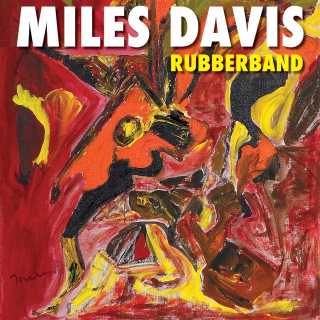
The record features other guest singers, so we might expect more jams like “Rubberband,” but one never really knows with Davis, who arguably invented—or at least perfected—producer-driven, studio-made jazz records many years earlier, first on the groundbreaking In a Silent Way in 1969, then on the even more groundbreaking Bitches Brew in 1970. Even as his music began to sound more commercial, its roots in four decades of radically changing jazz every few years made it wholly original to the minds of Miles Davis and his collaborators.
via Pitchfork
Related Content:
Kind of Blue: How Miles Davis Changed Jazz
Hear a 65-Hour, Chronological Playlist of Miles Davis’ Revolutionary Jazz Albums
Listen to The Night When Miles Davis Opened for the Grateful Dead in 1970
Josh Jones is a writer and musician based in Durham, NC. Follow him at @jdmagness
Read More...Radiohead Releases 18 Hours of Demos from OK Computer for a Limited Time–After Hackers Try to Hold Them for Ransom
This strategy will not work in most ransomware attacks—if your personal data is stolen, releasing all of it to the public for a small fee might diffuse the blackmailer’s bomb, but your problems will only have just begun. But for Radiohead, releasing 18 hours of demo material from minidisks recorded between 1995 and 1998, during the making of their landmark OK Computer, turned out to be just the thing. For a limited time, 18 days from the announcement, you can buy all 18 hours of that material on Bandcamp for the low price of £18 (about $23), with all proceeds benefiting the climate change advocacy group Extinction Rebellion. The music can also be streamed for free (click on the player above) during that time.
The minidisk archive was stolen from Thom Yorke by a hacker who demanded $150,000 or threatened to release them. Guitarist Jonny Greenwood announced the theft on Twitter and Facebook. “We got hacked last week—someone stole Thom’s minidisk archive from around the time of OK Computer…. For £18 you can find out if we should have paid that ransom.”
He prefaced the demos with some modest commentary: “Never intended for public consumption (though some clips did reach the cassette in the OK Computer reissue) it’s only tangentially interesting. And very, very long. Not a phone download. Rainy out, isn’t it though?”
Although bands release demo material all the time—or their record companies do, at least—few go out of their way to talk up alternate takes, sketches, skeletal early versions, and rejected songs. But fan communities often treat such material as akin to finding lost ancient literary sources. Witness the 65-page document titled OK Minidisc already published online, a detailed analysis of the demos by a group from online Radiohead fandom that will likely now forever feature in the band’s accumulated lore.
The demo collection, simply called MINIDISCS [HACKED], will give Radiohead scholars lay and professional a wealth of evidence to draw on for decades—insights into their production process and the evolution of Thom Yorke’s writing. (The first track is an early version of OK Computer’s “Exit Music (For a Film)” with mopey, self-pitying lyrics that might have fit better on the band’s debut album).
As a listening experience, sitting through 18 hours of outtakes may be “only tangentially interesting” and certainly “very, very long.” But when it comes to an album as widely and deeply worshipped as OK Computer, this material might as well be Dead Sea Scrolls.
Surely the minidisk archive’s kidnapper(s) counted on the massive profile of the 1997 album when they named their price, but they didn’t know quite who they were dealing with. Contribute to climate action and become an independent Ok Computer scholar yourself by buying and downloading (with a solid broadband connection) all 18 hours of the MINIDISCS [HACKED] collection at Bandcamp. Or stream it all above.
Related Content:
Radiohead’s Thom Yorke Gives Teenage Girls Endearing Advice About Boys (And Much More)
Josh Jones is a writer and musician based in Durham, NC. Follow him at @jdmagness
Read More...Support Us
We're hoping to rely on loyal readers, rather than erratic ads. Please click the Donate button and support Open Culture. You can use Paypal, Venmo, Patreon, even Crypto! We thank you!

About Us

Open Culture scours the web for the best educational media. We find the free courses and audio books you need, the language lessons & educational videos you want, and plenty of enlightenment in between.
Advertise With Us
FREE UPDATES!
GET OUR DAILY EMAIL
Get the best cultural and educational resources on the web curated for you in a daily email. We never spam. Unsubscribe at any time.
FOLLOW ON SOCIAL MEDIA
Open Culture editor Dan Colman scours the web for the best educational media. He finds the free courses and audio books you need, the language lessons & movies you want, and plenty of enlightenment in between.
Advertise With Us