The Mirrors of Ingmar Bergman, Narrated with the Poetry of Sylvia Plath
Kagonada, the video-essayist behind the cinematic supercuts of Kubrick’s “One-Point Perspective” and Ozu’s “Passageways” returns with a look at mirrors in the films of Ingmar Bergman, set to a plaintive Vivaldi work for two mandolins, and a reading of Sylvia Plath’s “Mirror.”
Mirrors and reflections turn up right in the beginning of Bergman’s films as a motif, when Jenny, the middle-aged protagonist of Crisis exclaims to her image, “You can’t see from the outside, but beneath this face … oh, my God!” Mirrors show their viewers a true face behind the mask in his films, mortality, failure, duplicity–everything fake stripped away. It’s a time to take stock and a time to break down.
It’s quite lovely, this cut, with Plath’s description of her wall “pink, with speckles” matching the color shot from Fanny & Alexander; or “Faces and darkness separate us over and over” as Nine-Christine Jönsson draws a frowny face and writes “lonely” on her reflection from Port of Call. The video is also a tribute to Bergman’s favorite actresses, from Harriet Andersson to Liv Ullmann.
Incidentally, Sylvia Plath was not just a fan of the filmmaker, she based her poem “Three Women” on Bergman’s film So Close to Life (aka Brink of Life) which she had seen in a London cinema in either 1961 or 1962.
If you would like to support the mission of Open Culture, consider making a donation to our site. It’s hard to rely 100% on ads, and your contributions will help us continue providing the best free cultural and educational materials to learners everywhere. You can contribute through PayPal, Patreon, and Venmo (@openculture). Thanks!
Related Content:
Ingmar Bergman’s Soap Commercials Wash Away the Existential Despair
Ingmar Bergman Visits The Dick Cavett Show, 1971
Hear Sylvia Plath Read 15 Poems From Her Final Collection, Ariel
Ted Mills is a freelance writer on the arts who currently hosts the FunkZone Podcast. You can also follow him on Twitter at @tedmills and/or watch his films here.
Read More...A Racy Philosophy Lesson on Kant’s Aesthetics by Alain de Botton’s “School of Life”
For the past two decades, Alain de Botton has refined his knack for popularizing philosophical and literary ideas. In 1997, he published his bestseller, How Proust Can Change Your Life. Next came his six-part video series, A Guide to Happiness, where de Botton showed how thinkers like Montaigne, Seneca and Schopenhauer can help you grapple with timeless questions — like dealing with anger, managing your love life, or maintaining your self-esteem. And, by 2008, we find Alain opening The School of Life, a London-based operation that has as its tagline “good ideas for everyday life.”
The School of Life offers classes, publishes books, makes films, and now produces YouTube videos, some of which we’ve featured here before. The School’s latest release won’t go unnoticed. A three minute lesson on Kant’s aesthetics, the video features an eroticized teacher talking quickly and authoritatively in German about difficult aspects relating to Kant’s philosophy. Things get meta pretty quickly, and soon the distracting camera work starts making Kant’s very point about the nature of the subjective. The charged imagery is not, in other words, entirely gratuitous — but it’s certainly pretty unconventional, and whether it’s effective, I guess that’s up for debate. Next, up Nietzsche, we’re told.
If you would like some deeper introductions to Kant’s philosophy, please see our list of 130 Free Online Philosophy Courses. Kant’s Critique of Judgment appears in our collection, 135 Free Philosophy eBooks.
Related Content:
The Daily Habits of Highly Productive Philosophers: Nietzsche, Marx & Immanuel Kant
How Martin Luther King, Jr. Used Hegel, Kant & Nietzsche to Overturn Segregation in America
Read More...
Wes Anderson Likes the Color Red (and Yellow)
Red seems to be a magnet for angry bulls and great directors. After all, it’s the color that seems to stand out more than any other. Yasujiro Ozu, for one, made the jump to color movies very reluctantly late in his career and promptly became obsessed with the color red. His production team kept a box on set of small red household things – a matchbox, an umbrella, a teakettle — which he used to place in the background of just about every shot. Jean-Luc Godard famously bathed Brigitte Bardot’s backside in red light for his first color film Contempt. When critics complained that his feature, Pierrot le Fou, was too bloody, he quipped, “It’s not blood, it’s red.” And from HAL 9000’s unforgiving electronic eye in 2001 to the buckets of blood pouring out of the elevator from hell in The Shining, Stanley Kubrick built some of his most memorable scenes around the color red.
Editor and designer Rishi Kaneria, who seems to be making a career out of pointing out the color choices of auteurs, has just released a video called “Red & Yellow: A Wes Anderson Supercut” that squarely places Wes Anderson among the ranks of cinema’s great crimson-loving stylists – from Ben Stiller’s sweats in The Royal Tenenbaums to the luxurious carpets of his latest effort The Grand Budapest Hotel. As you might gather from the title of Kaneria’s short, Anderson is also a fan of the color yellow too. You can watch the video above. And you can watch Kaneria’s look into Kubrick’s use of red below.
Related Content:
The Perfect Symmetry of Wes Anderson’s Movies
A Glimpse Into How Wes Anderson Creatively Remixes/Recycles Scenes in His Different Films
Watch Wes Anderson’s Charming New Short Film, Castello Cavalcanti, Starring Jason Schwartzman
Wes Anderson’s First Short Film: The Black-and-White, Jazz-Scored Bottle Rocket (1992)
Orson Welles Names His 10 Favorite Films: From Chaplin’s City Lights to Ford’s Stagecoach
I hope Orson Welles got used to seeing his name on top-ten-films-of-all-time lists. He became a mainstay as soon as critical consensus declared his debut Citizen Kane probably the most important motion picture ever made, and some cinephiles give special notice to his subsequent works, such as The Lady from Shanghai, Touch of Evil, F for Fake, and — for true contrarians only — The Trial. So what does a man whose projects appear on so many top-ten lists from critics and other filmmakers alike put on his own?
“I don’t like cinema,” goes one perhaps-apocryphal Welles quote. “I like making cinema.” (Sometimes-heard variation: “I don’t like cinema unless I shoot it.”) But even if he actually said and believed that, he still managed to put together the following list of favorites in the early 1950s, about a decade after having entered the filmmaking game but with most of the cinema he would make still to come:
- City Lights (Charlie Chaplin)
- Greed (Erich von Stroheim, 1924)
- Intolerance (D.W. Griffith, 1916)
- Nanook of the North (Robert Flaherty, 1992)
- Shoe Shine (Vittorio De Sica, 1946)
- The Battleship Potemkin (Sergei Eisenstein, 1925)
- La Femme du Boulanger (Marcel Pagnol, 1938)
- Grand Illusion (Jean Renoir, 1937)
- Stagecoach (John Ford, 1939)
- Our Daily Bread (King Vidor, 1934)
If Citizen Kane opened up the possibilities of cinema — and to get an idea of just how much influence it has had from its release to this day, simply watch any film made before it — the pictures Welles puts onto his list, in large part a classicist’s even in the 50s, gave cinema its form in the first place. If you plan on doing a self-administered course in film history, you could do much worse than beginning with the favorite films of Orson Welles — then moving on, of course, to the films of Orson Welles.
Related Content:
Listen to Eight Interviews of Orson Welles by Filmmaker Peter Bogdanovich (1969–1972)
Discover the Lost Films of Orson Welles
Watch Orson Welles’ The Stranger Free Online, Where 1940s Film Noir Meets Real Horrors of WWII
The Hearts of Age: Orson Welles’ Surrealist First Film (1934)
Orson Welles Explains Why Ignorance Was His Major “Gift” to Citizen Kane
Colin Marshall hosts and produces Notebook on Cities and Culture as well as the video series The City in Cinema and writes essays on cities, language, Asia, and men’s style. He’s at work on a book about Los Angeles, A Los Angeles Primer. Follow him on Twitter at @colinmarshall or on Facebook.
Read More...A Gallery of Mad Magazine’s Rollicking Fake Advertisements from the 1960s
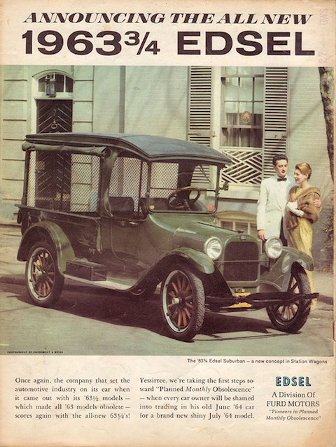
I can well remember the first time I read Mad Magazine. I was probably around Bart Simpson’s age, but nowhere near his degree of wiseass-ness. I found the humor of the adult world mostly mystifying and also pretty tame, given my rather sheltered existence. It was my discovery of Mad—stacks and stacks of old Mads, to be precise, in the rec room of a family acquaintance—that cracked the shell, one of those formative loss-of-innocence moments that are ultimately edifying. At the time, I couldn’t tell sophisticated satire from puerile parody, and the average issue of Mad was no Gulliver’s Travels. Nonetheless, its gleeful skewering of the American civil religion of politics, celebrity, professional sports, commerce, and middle class comfort hooked me instantly, and taught me about the value of freethought before I’d ever heard the name Jonathan Swift.
Founded as a comic book by editor Harvey Kurtzman and publisher William Gaines in 1952, Mad and its gap-toothed mascot Alfred E. Newman (still active today!) pioneered populist satire and inspired many lesser imitators. One distinctive feature of the magazine for almost its entire existence was its ability to run without advertising, allowing it to tear apart materialist culture without fear of biting the hands that fed it. Instead, for decades, the magazine ran fake spoof ads like those you see here. At the top, for example, see a 1963 ad for the “1963 ¾ Edsel,” an update of the “1963 ½ models—which made all ’63 models obsolete.” The text goes on to state frankly, “we’re taking the first steps toward “Planned Monthly Obsolescence—when every car owner will be shamed into trading in his old June ’64 car for a brand new shiny July ’64 model.” Apple, take note.
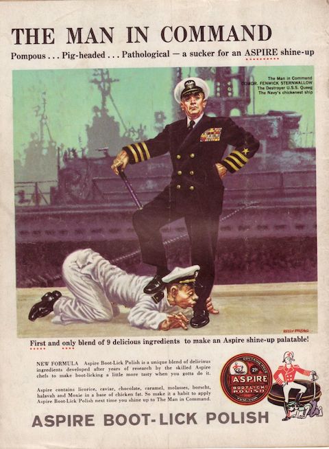
In the 1960 spoof ad above, military culture gets a send-up with “Aspire Boot-Lick Polish,” made for “The Man in Command: Pompous… Pig-headed… Pathological.” The flavored boot polish—“licorice, caviar, chocolate, caramel, molasses, borscht, halavah, and Moxie in a base of chicken fat”—is said to make “boot-licking a little more tasty when you gotta do it.” A clever inset links the U.S. chain of command with previous empires, showing a cartoon European naval officer of centuries past getting his boots licked by a subordinate sailor.

Just above, the disturbing 1969 fake ad for “Cemetery Filler Cigarettes” predates the tobacco trials of the 1990s by decades. Long promoted for their health benefits, calming effects, sophistication, and taste—as in that memorable first episode of Mad Men—cigarettes are exposed for the mass killers they are by none other than “Adolph Hitler”. (Another 1970 fake ad for “Winsom Cigarettes” uses an actual cemetery to similar effect.)
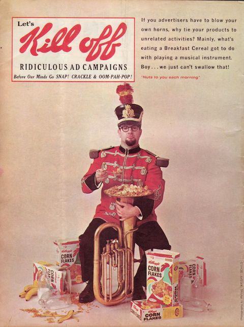
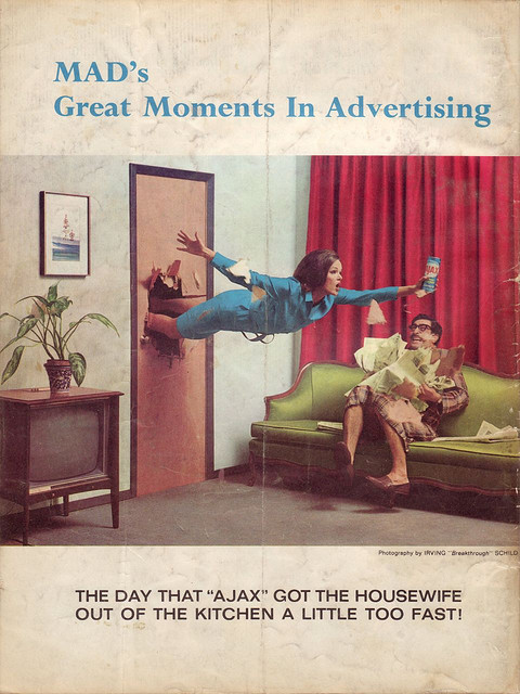
While cigarette companies were a frequent target of Mad’s fake ads, just as often they took on the inanity of the entire ad industry itself, as in the above 1965 meta-ad for “Let’s Kill Off Ridiculous Ad Campaigns.” The text reads, “If you advertisers have to blow your own horns, why tie your products to unrelated activities? Mainly, what’s eating a Breakfast Cereal got to do with playing a musical instrument? Boy… we just can’t swallow that!” Another regular feature was “Mad’s Great Moments in Advertising,” a kind of highlight blooper reel of ads gone wrong. The example below, also from 1965, spoofs the promises of cleaning product ads to make the lives of housewives easier with a product that works just a little too well.
All of these fake Mad ads come from a Flickr account compiled by user “Jaspardo.” See many more of them there, and for even more of the magazine’s illustrious past, check out this Flavorwire gallery of “The 10 Greatest Mad Magazine Covers.”
Related Content:
Men In Commercials Being Jerks About Coffee: A Mashup of 1950s & 1960s TV Ads
Before Mad Men: Familiar and Forgotten Ads from 1950s to 1980s Now Online
Eisenhower Answers America: The First Political Advertisements on American TV (1952)
Josh Jones is a writer and musician based in Durham, NC. Follow him at @jdmagness
Read More...Advertisements from Japan’s Golden Age of Art Deco

Get talking with graphic design people, and Japan will come up sooner or later. That country, always a world leader in aesthetics, has put the time and energy of generations into perfecting the discipline. You can see this progress charted out on the Tokyo-based Ian Lynam Design’s “Misruptions/Disruptions: A Japanese Graphic Design History Timeline.” It labels the busy period of 1910–1941 as the time of an “adoption of Western Avant Garde aesthetics in Graphic Design & Typography, coinciding with Left-leaning experimentation and increased state suppression of the Left” — and the time that gave rise to Japanese Art Deco.

Last year, I attended Deco Japan, a show at the Seattle Art Museum, which showcased a great many artifacts from that prewar movement of such combined artistic and commercial abundance. It put on display all manner of paintings, vases, pieces of furniture, household items, and packages, but somehow, the period advertisements struck me as still the most vital of all. The Japanese graphic designers who made them drew, in the words of Capital’s Grace-Yvette Gemmell, “on staples of progressive European and American high and popular art, incorporating stylized versions of gears and clocks that bring to mind Fritz Lang’s Metropolis and Charlie Chaplin’s Modern Times.”

This makes more sense than it sounds like it would: “the Deco use of foreign imagery and design elements was a virtually seamless process given existing practices of both abstraction and cultural appropriation at work in the decorative arts at the time in Japan. Many traditional designs already possessed a sort of visual affinity with the Art Deco aesthetic; the synthesis of conventional design elements with contemporary, pared-down forms appealed to the culture’s collective knowledge of traditional motifs and symbols while feeding their desire for modern consumer products that reflected a keen sense of cosmopolitanism perfectly combining the old with the ultramodern.”
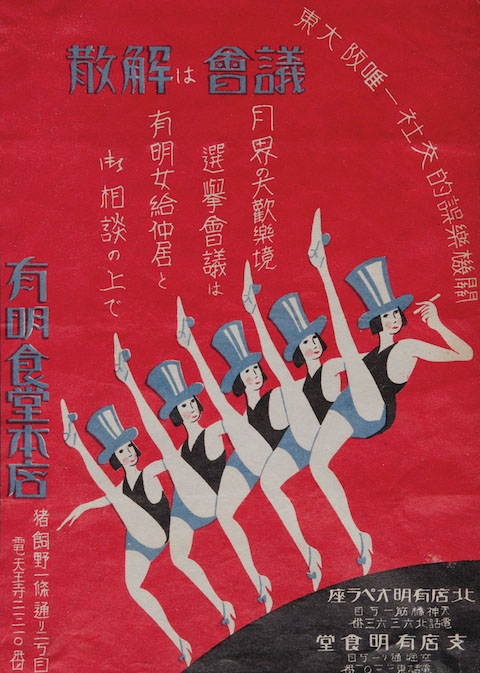
Many of the advertisements, or other works of graphic design like leaflets and magazine covers, to come out of Japan’s Art Deco golden age feature the image of the “moga,” or, in Japanized English, “modern girl.” Having appeared in Japan as a new kind of jazz-loving, bob-haired, relatively liberated woman, the moga quickly became an attractive commercial proposition. The Asian Art Museum printed up a leaflet of their own, listing off the “ten qualifications for being a moga” as originally enumerated in 1929 by illustrator Takabatake Kashō in the magazine Fujin sekai (Ladies’ World):
- Strength, the “enemy” of conventional femininity
- Conspicuous consumption of Western food and drink
- Devotion to jazz records, dancing, and smoking Golden Bat cigarettes from a metal cigarette holder
- Knowledge of the types of Western liquor and a willingness to flirt to get them for free
- Devotion to fashion from Paris and Hollywood as seen in foreign fashion magazines
- Devotion to cinema
- Real or feigned interest in dance halls as a way to show off one’s ostensible decadence to mobo (modern boys)
- Strolling in the Ginza every Saturday and Sunday night
- Pawning things to get money to buy new clothes for each season
- Offering one’s lips to any man who is useful, even if he is bald or ugly, but keeping one’s chastity because “infringement of chastity” lawsuits are out of style

Sound a fair bit more interesting than the women demanded for today’s ads in the West, don’t they?
Related Content:
Gaze at Global Movie Posters for Hitchcock’s Vertigo: U.S., Japan, Italy, Poland & Beyond
René Magritte’s Early Art Deco Advertising Posters, 1924–1927
Hand-Colored Photographs of 19th Century Japan
Colin Marshall hosts and produces Notebook on Cities and Culture as well as the video series The City in Cinema and writes essays on cities, language, Asia, and men’s style. He’s at work on a book about Los Angeles, A Los Angeles Primer. Follow him on Twitter at @colinmarshall or on Facebook.
Read More...Designer Reimagines Iconic Movie Posters With Minimalist Designs: Reservoir Dogs, The Matrix & More

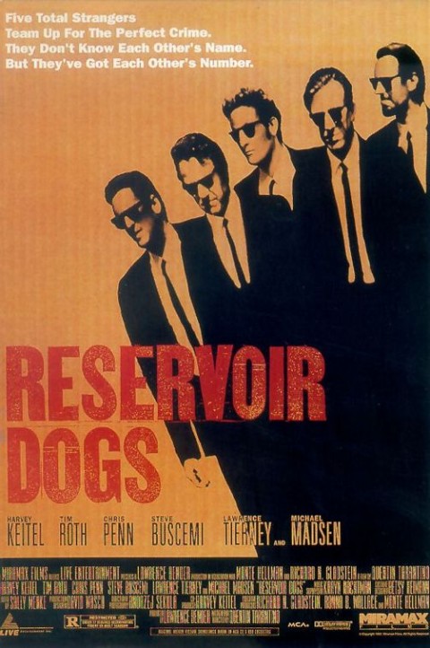
While watching Interstellar and hating it, designer Nick Barclay came up with a project for himself — taking the posters of famous films and reimagining them with a minimalist design that uses only circles. Above, you can see his clever take on Tarantino’s Reservoir Dogs. It’s a far cry, to be sure, from the original movie poster found below.
Over at My Modern Met, you’ll find other minimalist designs for The Matrix, The Lord of the Rings, Bram Stoker’s Dracula, Forrest Gump, Harry Potter, Pulp Fiction, Trainspotting, 101 Dalmations, Léon: The Professional, The Deer Hunter, Total Recall, Monsters Inc., and, of course, 2001: A Space Odyssey.
Prints can be purchased on Barclay’s website.
Related Content:
Gaze at Global Movie Posters for Hitchcock’s Vertigo: U.S., Japan, Italy, Poland & Beyond
50 Film Posters From Poland: From The Empire Strikes Back to Raiders of the Lost Ark
Read More...
Watch the Coen Brothers’ TV Commercials: Swiss Cigarettes, Gap Jeans, Taxes & Clean Coal
Raising Arizona; The Big Lebowski; O Brother, Where Art Thou? — Joel and Ethan Coen have made more than a few movies not just widely beloved, but also widely thought of as eccentric. One thus wouldn’t imagine their sensibility translating well to advertising, that means of occasional support for many an uncompromising auteur. But just as the Coen brothers have brought Hollywood at least partially over to their way of creating, they’ve also, on several occasions, bent the form of the commercial to their advantage.
Take the Coen brothers’ Parisienne cigarette commercial at the top, previously featured here on Open Culture (alongside David Lynch, Emir Kusturica, Roman Polanski and, Jean-Luc Godard’s work for the same apparently auteur-loving brand). But if they felt guilty about thus encouraging the befouling of the air, they surely cleared their own consciences with the satirical spot about “clean coal” just above. And in the slightly more straightforward Gap ad below, they used the mainstream-yet-alternative icons Christina Ricci and Dennis Hopper:
And even if you keep up with the Coen brothers’ short film work, you may never have seen the spot below, which originally aired during the 2002 Super Bowl. Working for H&R Block, they use perhaps the least promising setting imaginable, a slow-moving tax law lecture, to create a dystopian vision not a million miles from the one Ridley Scott used to introduce the Apple Macintosh eighteen Super Bowls before.
Related Content:
Cigarette Commercials from David Lynch, the Coen Brothers and Jean Luc Godard
Tuileries: A Short, Slightly Twisted Film by Joel and Ethan Coen
World Cinema: Joel and Ethan Coen’s Playful Homage to Cinema History
Colin Marshall hosts and produces Notebook on Cities and Culture as well as the video series The City in Cinema and writes essays on cities, language, Asia, and men’s style. He’s at work on a book about Los Angeles, A Los Angeles Primer. Follow him on Twitter at @colinmarshall or on Facebook.
Read More...The Clash Play Their Final Show (San Bernardino, 1983)
Few bands in rock ‘n’ roll history have faced as many charges of selling out—back when the term meant something—as The Clash. Even before they’d released their first record, they were accused of killing punk rock by signing to major label CBS. And 1985’s Cut the Crap, the final Clash release (hardly a Clash record at all by any true fan’s measure) has more or less been seen, rightly or not, as a money grab. For a band who stood in solidarity with working people and revolutionary leftist movements, The Clash walked a delicate line between financial success and political credibility.
Most critics date the end of the band well before that hated final album, made without guitarist Mick Jones and longtime drummer Topper Headon. As Rolling Stone writes, “The Clash came to a rather sad ending in May 1983,” when they accepted a $500,000 offer from Apple co-founder Steve Wozniak to headline the ‘New Wave Day’ of a massive festival in San Bernardino, California.
By this time, Headon had been kicked out of the band for drug problems, replaced by 23-year-old Pete Howard, “and Mick Jones and Joe Strummer were barely speaking.”
By the time they got to San Bernardino, California for the festival, they were in complete disarray. Things got worse when they learned fans were paying $25 to attend the show. They had been told previously that prices would be set at $17, and shortly before they went onstage, they held a press conference. The band announced they wouldn’t go on unless Apple gave $100,000 to charity. It was chaos. Some later claimed the real cause of their rage was the knowledge that Van Halen were getting a million dollars for their set.
Arriving onstage two hours late, under a banner that read “The Clash Not For Sale,” they played an angry set of songs, between which Strummer taunted the crowd. He opens with a sneer: “Alright then, here we are, in the capital of the decadent U.S. of A. This here set of music is now dedicated to making sure that those people in the crowd who have children, there is something left for them later in the centuries.” It’s an odd statement, announcing Strummer’s sense that The Clash were leaving a legacy, and that they were exiting the cultural stage.
Despite their rage, they still walked away with half a million bucks. Four months later, Mick Jones was out—the San Bernardino concert would be his last with the band—and The Clash, as the world had known them, were effectively dead. As a swan song, it’s a hell of a show, infighting and lineup changes aside. See the whole thing above (except “London Calling,” which cuts off midway through). It’s maybe a shame they didn’t retire the name after this performance, however. Though Strummer and bassist Paul Simenon toured with three replacements as The Clash in the years to come and, writes Dangerous Minds, “did a few things worth remembering between 1984 and 1986,” in most people’s minds, that part of the band’s history is best left out of the official record.
Related Content:
Josh Jones is a writer and musician based in Durham, NC. Follow him at @jdmagness.
Read More...Richard Dawkins Reads “Love Letters” from “Fans” (NSFW)
Richard Dawkins — some know him as the Oxford evolutionary biologist who coined the term “meme” in his influential 1976 book, The Selfish Gene; others consider him a leading figure in the New Atheism movement, a position he has assumed unapologetically. In recent years, Dawkins has made his case against religion though different forms of media: books, documentaries, college lectures, and public debates. He can be aggressive and snide, to be sure. But he dishes out far less than he receives in return. Just witness him reading the “love letters” (as he euphemistically calls them) that he has received from the general public. They are not safe for work. You can see him reading a previous batch of letters here.
Related Content:
Richard Dawkins’ Documentary The God Delusion Tackles Faith & Religious Violence (2006)
Richard Dawkins Explains Why There Was Never a First Human Being
Free Online Biology Courses
Read More...
Support Us
We're hoping to rely on loyal readers, rather than erratic ads. Please click the Donate button and support Open Culture. You can use Paypal, Venmo, Patreon, even Crypto! We thank you!

About Us

Open Culture scours the web for the best educational media. We find the free courses and audio books you need, the language lessons & educational videos you want, and plenty of enlightenment in between.
Advertise With Us

FREE UPDATES!
GET OUR DAILY EMAIL
Get the best cultural and educational resources on the web curated for you in a daily email. We never spam. Unsubscribe at any time.
FOLLOW ON SOCIAL MEDIA

Open Culture editor Dan Colman scours the web for the best educational media. He finds the free courses and audio books you need, the language lessons & movies you want, and plenty of enlightenment in between.
Advertise With Us

