40,000 Early Modern Maps Are Now Freely Available Online (Courtesy of the British Library)
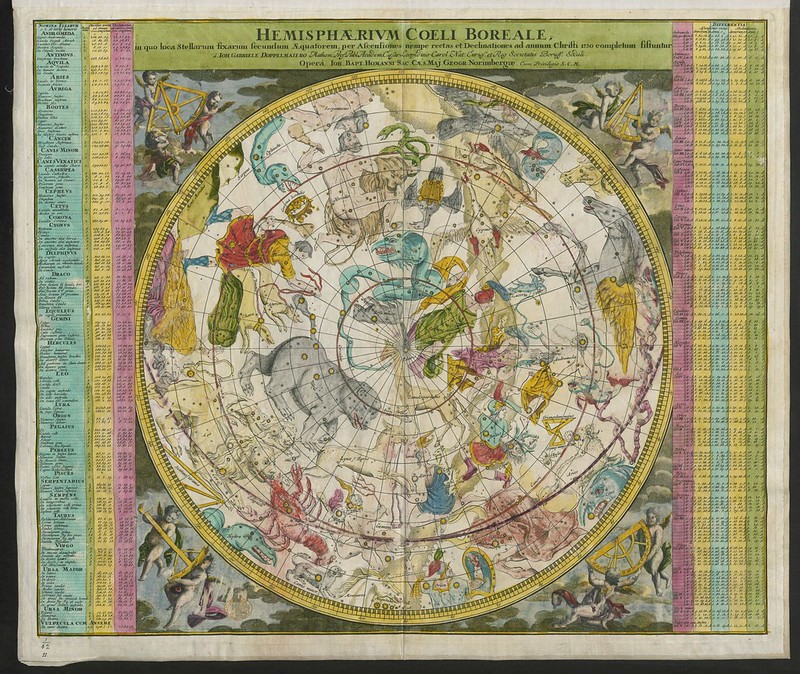
Most of us do not, today, live in desperate need of maps. On the internet we can easily find not only the current maps we need to navigate most any territory on Earth, but also an increasing proportion of all the maps made before as well. You can find the latter in places like the David Rumsey Map Collection, which, as we wrote last year here on Open Culture, now boasts 91,000 historic maps free to download. It will surely add even more, as humanity seems to have only just begun digitizing its own many attempts to make the physical world legible, an art that goes back (as you know if you read the University of Chicago’s The History of Cartography online) to prehistoric Lascaux cave paintings of the night sky.
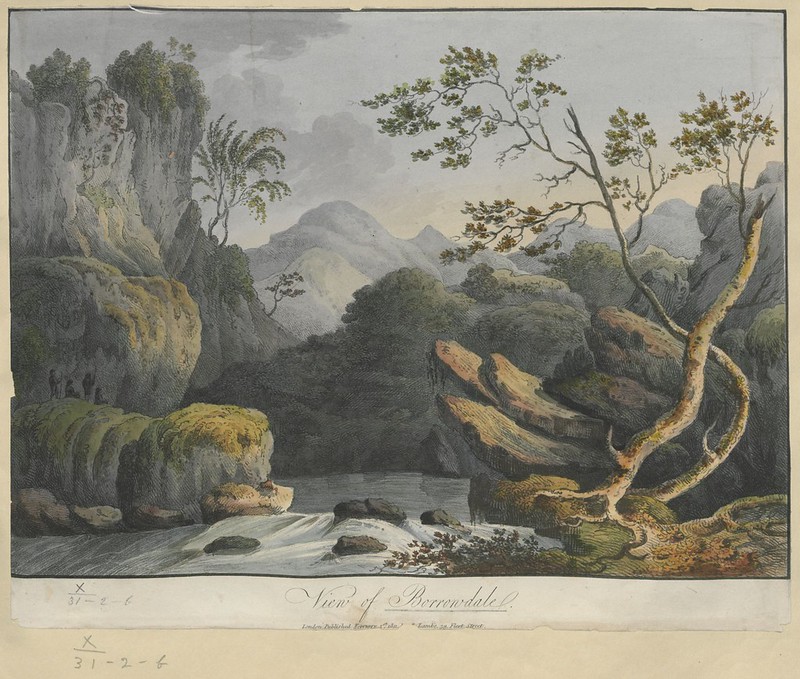
By that standard, the maps currently being digitized and uploaded by the British Library are downright modern — or early modern, to be more specific. Dating between 1500 and 1824, says Medievalists.net, these maps “are part of the Topographical Collection of King George III (K. Top),” which also includes “maps, atlases, architectural drawings, cartoons and watercolors.”
Part of “the larger King’s Library which was presented to the Nation by George IV in 1823,” the collection was amassed “during the formative period of the British Empire” and thus shows “how Britain viewed and interacted with the wider world during this period.”
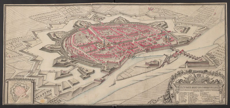
The British Library plans to post 40,000 of these maps (broadly considered), and you can now view the first set of roughly 18,000 at the institution’s Flickr Commons collection. Medievalists.net names as highlights of the full Topographical Collection of King George III such artifacts as “a hand-drawn map of New York City, presented to the future James II in 1664,” “The vast Kangxi Map of China of 1719 made by the Italian Jesuit Matteo Ripa,” “the earliest comprehensive land-use map of London from 1800,” and even “watercolors by noted 18th century artists such as Paul Sandby and Samuel Hieronymus Grimm.”
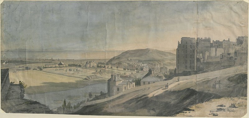
Many of the pieces the British Library has thus far uploaded to Flickr look like maps to us still today, but just as many, perhaps most, strike us more as works of art. This goes for traditional bird’s-eye-views rendered more vividly (and sometimes imaginatively) than we’re used to, as well for as richly drawn or even painted landscapes, all of which exist to provide a faithful representation of land, sea, and sky. You can view more such images along that spectrum, as well as read their stories in context, at the British Library’s Picturing Places site. The artistic and historical richness exuded by these maps today echoes the more tangible value they had when first created: back then, those who had the maps possessed the world.
Related Content:
Behold an Incredibly Detailed, Handmade Map Of Medieval Trade Routes
Download 91,000 Historic Maps from the Massive David Rumsey Map Collection
Based in Seoul, Colin Marshall writes and broadcasts on cities, language, and culture. His projects include the Substack newsletter Books on Cities, the book The Stateless City: a Walk through 21st-Century Los Angeles and the video series The City in Cinema. Follow him on Twitter at @colinmarshall, on Facebook, or on Instagram.
Read More...How the Iconic Colors of the New York City Subway System Were Invented: See the 1930 Color Chart Created by Architect Squire J. Vickers
There may be no more welcome sight to a New Yorker than their own Pantone-colored circle on an arriving subway train. (Provided it’s also the right train number or letter; is making local stops (or express stops); has not been rerouted due to track work, death or injury, etc.) The psychological effect is not unlike a preschooler spotting her brightly-colored cubby at the end of a long day. Therein lies the comforting lovey—screen time, climate control, maybe a nap in a window seat on the way home….
But as every New Yorker also knows, the color-coded subway system didn’t always have such a cheerful, Sesame Street-like look. Buried beneath the MTA’s modern exterior, with those colored circles adopted piecemeal over the chaotic 1970s, is a much older system—three systems, in fact—that had far less navigable signage. “The current New York subway system was formed in 1940,” writes Paul Shaw in a comprehensive history of subway sign fonts, “when the IRT (Interborough Rapid Transit), the BMT (Brooklyn-Manhattan Transit) and the IND (Independent) lines were merged.”
The first two lines were built by the city and leased to private owners, with some elevated sections dating all the way back to 1885. “The first ‘signs’ in the New York City subway system were created by Heins & LaFarge, architects of the IRT,” who established the tradition of mosaic tiles on platform walls. The BMT “followed suit under Squire J. Vickers, who took over the architectural duties in 1908.” The lettering and design of these tiled signs shifted, from 19th century gothic styles to 20th century art deco.
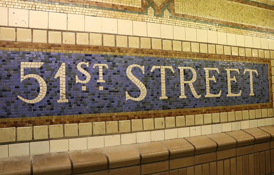
Image by Elvert Barnes, via Wikimedia Commons
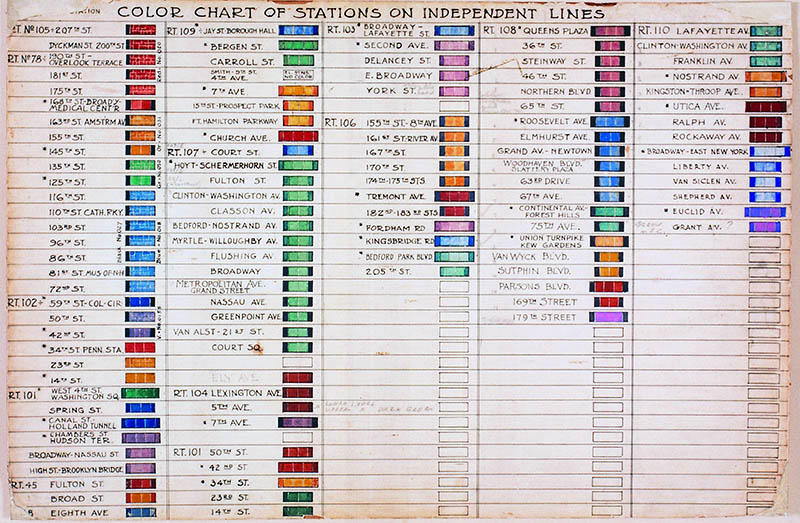
When construction on the IND system began, Vickers, now architect of the entire system and its lead designer, created a color-coding system to identify each station. (See the chart above from 1930.) “The color variations within this system are subtle,” notes 6sqft. “Though they’re grouped by color family, i.e. the five primary colors, different shades are used within those families. Color names are based on paint chips and Berol Prismacolor pencils. Red stations include ‘Scarlet Red’ ‘Carmine Red’ and ‘Tuscan Red,’ just to name a few.” This level of specificity continues through each of the primary and secondary colors.

It’s not entirely clear why Vickers chose the color scheme he did. (See a subway map imagined with his color-coding system, above, by designer vanshnookenraggen.) One theory is that the system was designed to help non-English-speaking riders navigate the trains, but “there isn’t anything that we were able to find that says definitively ‘This is the reason why we are doing that,’” says New York Transit Museum curator Jodi Shapiro. The colors may have been chosen to stand out in artificial light, she speculates, and “not look dingy and have some kind of cheerful effect…. Yellow and blue are very natural colors: yellow like sunlight, green like grass, blue like water. I don’t think that’s an accident.”
Whatever the reasoning, the color-coding did not simplify signage in the rapidly expanding system, which became incomprehensible to riders when all three subways, and their different, numbering, and lettering systems, combined into an “untenable mess of overlapping sign systems,” Shaw writes. Confusion reigned into the 1960s, when Bob Noorda and Massimo Vignelli, creator of an iconic 1972 subway map, completed “the Bible” of NYC transit design, the New York City Transit Authority Graphics Standards Manual. The new designers used “a rainbow of 22 different colors to assign to each subway line,” Untapped Cities writes, “and gave the routes new names.”
Colors were further simplified in 1979 when John Tauranac and Michael Hertz designed the maps we know today. To solve the problem of different routes sharing the same colors, they assigned colors based on “trunk routes,” or the portion of the tracks that pass through Manhattan. “All trains that share a trunk route are the same color”—a system that works beautifully. And it only took eighty years to get there. The frustration designers have felt over the decades can be neatly summed up in one word offered by Tauranac at a recent NYC subway map symposium: “Basta!” Or in a New York English, “Enough with all these colors already!”
via Untapped Cities/6sqft
Related Content:
Designer Massimo Vignelli Revisits and Defends His Iconic 1972 New York City Subway Map
A Subway Ride Through New York City: Watch Vintage Footage from 1905
Undercity: Exploring the Underbelly of New York City
Josh Jones is a writer and musician based in Washington, DC. Follow him @jdmagness
Read More...10 Hours of Nick Offerman Quietly Drinking Single Malt Scotch by the Fire
Just a handy way to keep your mind off of the sturm and drang of the US election today.
If this doesn’t quite do the trick, find some alternatives in the Relateds below.
Related Content:
Meditation for Beginners: Buddhist Monks & Teachers Explain the Basics
Stream 72 Hours of Ambient Sounds from Blade Runner: Relax, Go to Sleep in a Dystopian Future
10 Hours of Ambient Arctic Sounds Will Help You Relax, Meditate, Study & Sleep
Read More...Three Days in Twin Peaks: An In-Depth Journey Through the Evocative Locations of David Lynch’s TV Series
After a time of great personal loss, a friend of mine set off on a road trip around the United States. When I later asked what part of the country had made the deepest impression on him, he named a few towns about thirty miles east of Seattle: the shooting locations, he hardly needed tell a fellow David Lynch fan, of Twin Peaks. Raised in Spokane, Washington, among a variety of other modest American cities, Lynch saw clearly the look and feel of the titular setting by the time he co-created the show with writer Mark Frost. He eventually found it in the Washingtonian towns of Snoqualmie, North Bend and Fall City, which even today offer a friendly reception to the occasional Twin Peaks pilgrim — at least according to my friend.
This was more recently corroborated by Jeremiah Beaver, creator of Youtube “Twin Peaks theory and analysis show” Take the Ring. Thirty years after the premiere of the famously cryptic yet transfixing original series, the Indianapolis-based Beaver made the trip to Washington to visit its every remaining location — as well as those used in the 1992 prequel film Twin Peaks: Fire Walk with Me, 2017’s Twin Peaks: The Return, and even these productions’ deleted scenes.
Into the half-hour-long “Three Days in Twin Peaks” Beaver fits a great deal of information related to Twin Peaks’ production and mythos as well as the real-life history of the relevant places. “It was at times hard to distinguish the Twin Peaks that lived in my imagination versus the ground beneath my feet,” he admits.
Beaver makes his way to locations both major and minor, from the Twin Peaks Sheriff’s Department (now the DirtFish Rally Racing School) and the Double R diner (Twede’s Cafe, “one of the few spots in Washington state that really owns its Peakness”) to the shack of the Book House biker club and the bench in E.J. Roberts Park once sat upon by the late Harry Dean Stanton’s Carl Robb. Some real buildings played dual roles: both Twin Peaks’ Blue Pine Lodge and Great Northern Hotel are in reality different parts of Poulsbo’s Kiana Lodge, and the Mt. Si Motel appears as “two different motels with elements of the supernatural,” first in Fire Walk with Me, then even more seedily in The Return. “That fresh mountain air and smell of trees is no joke,” says Beaver, words to heed if you plan on making your own Twin Peaks pilgrimage — and if you do, you can surely guess how he describes the coffee and cherry pie at Twede’s.
Related Content:
David Lynch Draws a Map of Twin Peaks (to Help Pitch the Show to ABC)
Watch an Epic, 4‑Hour Video Essay on the Making & Mythology of David Lynch’s Twin Peaks
Twin Peaks Actually Explained: A Four-Hour Video Essay Demystifies It All
Play the Twin Peaks Video Game: Retro Fun for David Lynch Fans
Based in Seoul, Colin Marshall writes and broadcasts on cities, language, and culture. His projects include the Substack newsletter Books on Cities, the book The Stateless City: a Walk through 21st-Century Los Angeles and the video series The City in Cinema. Follow him on Twitter at @colinmarshall, on Facebook, or on Instagram.
Read More...Martin Luther King: “You Know Who to Vote For. I’m Just Asking You to Vote!” (1964)
The more things change, the more they stay the same.
At another turning point in U.S. history–when LBJ ran against Barry Goldwater in the 1964 presidential election–Martin Luther King, Jr. urged voters to stand up and be counted. To set the scene, the UCLA Film & Television Archive writes:
King, who had just been named the winner of the Nobel Peace Prize for his commitment to nonviolent resistance, embarked on a cross-country get-out-the-vote campaign in support of incumbent Democrat Lyndon B. Johnson. Republican challenger Barry Goldwater opposed the Civil Rights Act of 1964 in favor of states’ rights and represented, for King, a setback for the civil rights movement and “a great dark night of social destruction” (Los Angeles Times). King also advocated for more African American representation in Congress and spoke against ballot measures that would perpetuate discrimination. To vote was not only a civic duty, it was a moral imperative.
His words speak to our moment today as much, if not more, than they did to the events of 56 years ago. Speaking to a crowd in LA, King said:
“Suffice it to say that we stand in one of the most momentous periods of human history. And in these days of emotional tension, when the problems of the world are gigantic in extent and chaotic in detail, all men of good will must make the right decisions.”
“We must decide whether … we will allow our nation to be relegated to a second-rate power in the world with no moral voice.”
“We must decide next Tuesday whether America will take the high road of justice and peace, compassion for the poor and underprivileged, or whether this nation will tread the low road of man’s inhumanity to man, of injustice, of short-sightedness.”
“Each of us has a moral responsibility, if we are of voting age and if we are registered, to participate in that decision. I come here to urge every person under the sound of my voice to go to the polls on the 3rd of November and vote your convictions.”
Amen.
Related Content:
How Martin Luther King, Jr. Used Nietzsche, Hegel & Kant to Overturn Segregation in America
Read More...The Iconic Photography of Gordon Parks: An Introduction to the Renaissance American Artist
I felt the need for me to somehow or another, use humanity to get people to become aware of how people suffered. That was what drove me to it.
Poet, novelist, jazz pianist, classical composer, co-founder of Essence magazine, and first Black director of a major Hollywood film, based on a book he himself wrote.… Oh, and he also directed Shaft, the high watermark of Blaxploitation film and a production, says Evan Puschak, the Nerdwriter, above, “that helped to save MGM and the larger studio system from bankruptcy.” Gordon Parks lived “enough for ten lives,” but the resume above misses out on Parks’ “greatest contribution to American art in the 20th century… his photography.”
The self-taught Parks began taking pictures at 25, inspired by newsreel footage of the bombing of an American gunship. After seeing the film, he purchased his first camera and soon moved to Chicago, where he honed his craft in the early 40s and developed the skills that would bring him to the New Deal’s Farm Security Administration. There he worked under the legendary Roy Stryker, the former Columbia economist who also hired Dorothea Lange, Walker Evans, Edwin Rosskam, and other photographers who went on to have long careers in photojournalism.
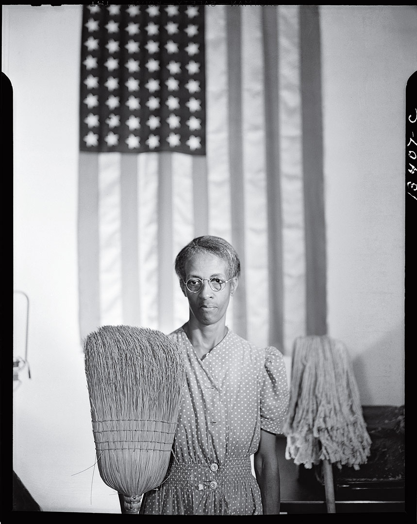
None of these Depression-era government photographers neglected the Black experience in America; under Stryker’s direction, the FSA did its best to faithfully document working-class and poor Americans of all backgrounds. Before being commissioned to do so, however, Parks, the only Black photographer in the group, was already seeking out candid, intimate images of life on the South Side of Chicago. When he began working for the FSA, he produced one of the most iconic images of the period, “American Gothic,” a solo restaging of the Grant Woods painting featuring a cleaning woman named Ella Watson, broom in one hand, mop in the other.
Stryker, one of the most daring photo editors of the time, helped establish the bold documentary style that dominated in the coming decades of Look and Life magazines. But even he saw Parks’ “American Gothic” as too incendiary. As Parks remembers in a clip above, “he says, ‘Well, you’re getting the idea, but you’re going to get us all fired. (Laughs) He says, ‘This is a government agency, and that picture is an indictment against America.’” Parks did not get fired. Instead, he went on to work for the FSA’s successor, the Office of War Information, and photographed the Tuskegee Airmen.
Parks’ skills as an artist were wide-ranging: his vision took in everything. He documented the Black experience in the 20th century with more sensitivity and depth than any other photographer. His photo essay of a Harlem gang leader earned him the first staff appointment for a Black photographer at Life in 1948. He would go on to document the Civil Rights movement and both celebrated and ordinary people around the country and the world for the next several decades, returning often to the fashion photography in which he got his start. He was a renaissance artist with an activist’s heart. Parks once called the camera a “weapon against poverty and racism,” but he tended to wield it much more like a paintbrush.
You can view galleries of Parks’ photographic work at The Gordon Parks Foundation website.
Related Content:
Yale Presents an Archive of 170,000 Photographs Documenting the Great Depression
Found: Lost Great Depression Photos Capturing Hard Times on Farms, and in Town
Josh Jones is a writer and musician based in Washington, DC. Follow him @jdmagness
Read More...A Quay Brothers Animation Explains Anamorphosis, the Renaissance Illusion That Hides Pictures within Pictures
First appearances can be deceiving.
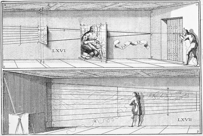
Take physicist Emmanuel Maignan’s 1642 fresco in a corridor of Rome’s Trinità dei Monti monastery.
Viewed head on, it appears to be a somewhat unconventional landscape in which one of the few remaining branches of a mutilated tree spreads over a city, far in the distance. Streaky clouds suggest heavy weather is brewing.

Stroll to the end of the corridor and take another look. You’ll find that the tree has contracted, and the clouds have reconfigured themselves into a portrait of Saint Francesco of Paola, praying beneath its boughs.

It’s a prime example of oblique anamorphosis, an image that has been deliberately distorted by an artist well versed in perspective, with the end result that the image’s true nature will only be revealed to those viewing the work from an unconventional point.
The Quay Brothers’ documentary short, above, a collaboration with art historian Roger Cardinal, uses a combination of their delightfully creepy signature puppet stop motion, as well as animated 3‑D cut outs, to lift the curtains on how the human eye can be manipulated, using principles of perspective.
Anamorphosis may not seem like such a feat in an age when a number of software programs can provide a major assist, but why would Renaissance artists put themselves to so much extra trouble?
The Quay Brothers delve into this too.
Perhaps the artist was injecting a bit of social criticism, like Hans Holbein the Younger, whose 1533 portrait, The Ambassadors, includes a secret anamorphic skull. This could be taken as a jab at the excesses of the wealthy young diplomats who provide the painting’s subject, except that the one who commissioned the work, Jean de Dinteville, prized the motto “Memento mori.”
Maybe he knowingly ordered up the naked death’s head to go along with his ermine and bling, an example of having one’s cake and eating it too, and yet another dizzying head trip for those viewing the painting from the intended angle.
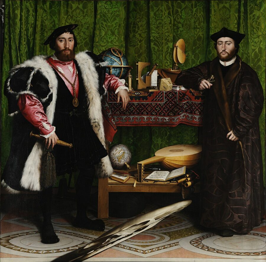
(Betcha didn’t have to work too hard to guess the skull’s location, though…)

Or an artist might choose to employ anamorphosis as a brown paper wrapper of sorts, as in the case of Erhard Schön’s erotic woodblock prints.
Elsewhere, the goal was to emphasize patience, reflection, and cleaving to a pious path by rewarding those who craned their necks toward a spiritual peephole with an appropriately religious view.
(Pity the poor pilgrim who stepped up expecting Erhard Schön…)
For a 21st-century take on anamorphic art, have a look at the work of the graffiti collective TRULY | Urban Artists here.
The Quay Brothers’ short film, “De Artificiali Perspectiva, or Anamorphosis,” has been made available on The Met Museum’s YouTube channel.
via Aeon
Related Content:
Optical Poems by Oskar Fischinger, the Avant-Garde Animator Despised by Hitler, Dissed by Disney
The Anatomical Drawings of Renaissance Man, Leonardo da Vinci
Ayun Halliday is an author, illustrator, theater maker and Chief Primatologist of the East Village Inky zine. Follow her @AyunHalliday.
Read More...When Louis Armstrong Stopped a Civil War in The Congo (1960)
When Louis Armstrong appeared in his hometown of New Orleans for the first time in nine years in 1965, it was, Ben Schwarz writes, “a low point for his critical estimation.” A younger generation saw his refusal to march on the front lines of the civil rights movement, risking life and limb, as a “racial cop-out,” as journalist Andrew Kopkind wrote at the time. Armstrong was seen as “a breezy entertainer with all the gravitas of a Jimmy Durante or Dean Martin.”
The criticism was unfair. Armstrong only played New Orleans in 1965 after the passage of the Civil Rights Act, having boycotted the city in 1956 when it banned integrated bands. In 1957 after events in Little Rock, Arkansas, Armstrong refused a State Department-sponsored tour of the Soviet Union over Eisenhower’s handling of the situation. He spoke out forcefully, used words you can’t repeat on NPR, called governor Orval Faubus an “ignorant plowboy” and the president “two-faced.”
But he preferred touring and making money to marching, and was happy to play for the State Department and PepsiCo on a 1960 tour of the African continent to promote, ostensibly, the opening of five new bottling plants. When he arrived in Leopoldville, capital city of the Congo, in late October, he even stopped a civil war, managing “to call a brief intermission in a country that had been unstable before his arrival,” Jayson Overby writes at the West End Blog.
Unstable is an understatement. The newly-independent country’s first elected president, Patrice Lumumba, had just been deposed in a coup by anti-communist Joseph Mobutu, survived a “bizarre” assassination attempt by the C.I.A., and would soon be on his way to torture and execution after the UN turned its back on him. The country was coming apart when Armstrong arrived. Then, it stopped. As he put it in a later interview, “Man, they even declared peace in The Congo fighting the day I showed up in Leopoldville.”
“Just for that day,” writes Overby, “he blew his horn and played with his band the sweet sound of jazz for a large crowd. But no sooner after Louis departed, the war resumed.” This being a joint state/commerce operation during the Cold War, there is of course much more to the story, some which lends credence to criticism of Armstrong as a government pawn used during “goodwill” tours to test out various forms of cultural warfare. That was, at least, the official stance of Moscow, according to the AP newsreel at the top of the post.
The Soviets “blasted Armstrong’s visit as a diversionary tactic,” and it was. Ricky Riccardi at the Louis Armstrong House Museum covers the event in great detail, including highlighting several declassified State Department memos that show the planning. In one, from October 14th, the first U.S. ambassador to the country, Clare Hayes Timberlake, argues that “cooperation with private firm might soften propaganda implications.”
After the October 27th performance, Timberlake judged the appearance “highly successful from standpoint over-all psychological impact on this troubled city.” Clearly, the 10,000 Congolese who showed up to see Satchmo play needed the break. But the diplomats misread the audience reaction, thinking they didn’t like the music when they started to leave at dusk. “Given the climate in Leopoldville,” Riccardi writes, “one can’t blame the locals for not wanting to stay out longer than they had to.” But it was, nonetheless, the State Department declared, the “first happy event” in the city since the country’s independence.
Related Content:
Louis Armstrong Remembers How He Survived the 1918 Flu Epidemic in New Orleans
The Cleanest Recordings of 1920s Louis Armstrong Songs You’ll Ever Hear
Josh Jones is a writer and musician based in Durham, NC. Follow him at @jdmagness
Read More...Why Masks Work: A Slow Motion Demonstration (Plus a Guest Appearance by Dr. Fauci)
The Slo Mo Guys specialize in taking everyday occurrences and slowing them down … way down, so that we can see them in a new way. In this clip, they let you see what happens when you talk without a mask, and then with a mask–all in order to demonstrate why a mask helps prevent the transmission of COVID-19, a disease that’s mainly spread when people are exposed to respiratory droplets carrying infectious virus. Around the 4 minute mark, the host is joined by Dr. Anthony Fauci, who offers commentary on the footage.
If you would like to support the mission of Open Culture, consider making a donation to our site. It’s hard to rely 100% on ads, and your contributions will help us continue providing the best free cultural and educational materials to learners everywhere. You can contribute through PayPal, Patreon, and Venmo (@openculture). Thanks!
Related Content:
MIT Presents a Free Course on the COVID-19 Pandemic, Featuring Anthony Fauci & Other Experts
Bill Nye Shows How Face Masks Actually Protect You–and Why You Should Wear Them
Dr. Fauci Reads an Undergrad’s Entire Thesis, Then Follows Up with an Encouraging Letter
Read More...Sean Connery (RIP) Reads C.P. Cavafy’s Epic Poem “Ithaca,” Set to the Music of Vangelis
This video combines three things that make me happy: the voice of Sean Connery (who passed away today), the music of Vangelis (Blade Runner, Chariots of Fire), and the poetry of C.P. Cavafy. Put them all together and you get a blissful soundscape of rolling synth lines, rolling Scottish R’s, and a succession of Homeric images and anaphoric lines. And the video’s quite nice as well.
Anyway, it seems rude to say much more and drown the poem in commentary. So, follow along with Sean Connery.
Find the text of the poem after the jump. (more…)
Read More...Support Us
We're hoping to rely on loyal readers, rather than erratic ads. Please click the Donate button and support Open Culture. You can use Paypal, Venmo, Patreon, even Crypto! We thank you!

About Us

Open Culture scours the web for the best educational media. We find the free courses and audio books you need, the language lessons & educational videos you want, and plenty of enlightenment in between.
Advertise With Us

FREE UPDATES!
GET OUR DAILY EMAIL
Get the best cultural and educational resources on the web curated for you in a daily email. We never spam. Unsubscribe at any time.
FOLLOW ON SOCIAL MEDIA

Open Culture editor Dan Colman scours the web for the best educational media. He finds the free courses and audio books you need, the language lessons & movies you want, and plenty of enlightenment in between.
Advertise With Us


