Even in our age of unprecedentedly abundant images, delivered to us at all times by print, film, television, and especially the ever-multiplying forms of digital media, something inside us still values paintings. It must have to do with their physicality, the physicality of oil on canvas or whatever tangible materials the painter originally used. But in that great advantage of the painting lies the great disadvantage of the painting: tangible materials degrade over time, and many, if not most, of the paintings we most revere have been around for a long time indeed, and few of them have come down to us in pristine shape.
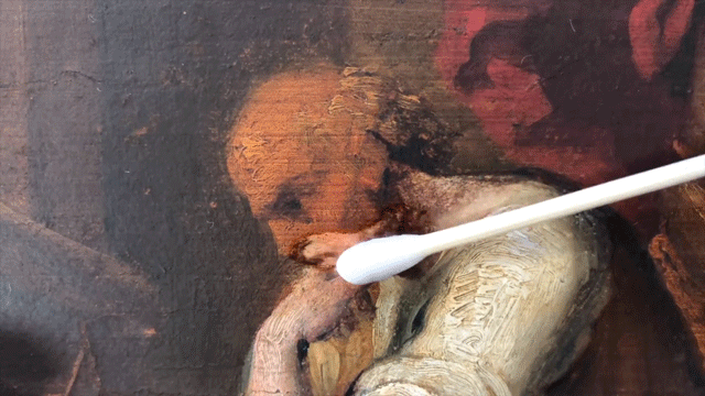
Enter the art restorer, who takes on the task of undoing, painstakingly and entirely by hand, both the ravages of time and the blunders of less competent stewards who have come before. In this case, enter Julian Baumgartner of Chicago’s Baumgartner Fine Art Restoration, a meditative short documentary on whose practice we featured earlier this year here on Open Culture.
You can see much more of it in these videos: in the one above, writes Colossal’s Kate Sierzputowski, Baumgartner “condenses over 40 hours of delicate swiping, scraping, and paint retouching into a 11.5 minute narrated video” showing and explaining his restoration of The Assassination of Archimedes.
The project, not atypical for a painting restoration, “involved cleaning a darkened varnish from the surface of the piece, removing the work from its original wooden panel using both modern and traditional techniques, mounting the thin paper-based painting to acid-free board, and finally touching up small areas that had become worn over the years.” Baumgartner’s Youtube channel also offers similar condensed restoration videos of two other paintings, Mother Mary and a portrait by the American Impressionist William Merrit Chase.
Baumgartner packs into each of these videos an impressive amount of knowledge about his restoration techniques, which few of us outside his field would have had any reason to know — or even imagine —before. They’ve racked up their hundreds of thousands of views in part thanks to that intellectual stimulation, no doubt, but all these physical materials and the sounds they make have also attracted a crowd that shares a variety of enthusiasm unknown before the age of digital media. I’m talking, of course, about ASMR video fans, whom Baumgartner has obliged by creating a version of his The Assassination of Archimedes restoration especially for them. Now there’s an art restorer for the 21st century.
Based in Seoul, Colin Marshall writes and broadcasts on cities, language, and culture. His projects include the book The Stateless City: a Walk through 21st-Century Los Angeles and the video series The City in Cinema. Follow him on Twitter at @colinmarshall or on Facebook.
While life lasts, let us live it, not pass through as zombies, and let us find in art a glorious passageway to a deeper understanding of our essential humanity.
- Sister Wendy Beckett (1930–2018)
Sister Wendy, a cloistered nun whose passion for art led her to wander out into the world, where she became a star of global proportions, entertained the television masses with her frank humanist assessments.
Unfazed by nudity, carnality, and other sensual excesses, she initially came across as a funny-looking, grandma-aged virgin in an old-fashioned habit, lisping rhapsodically about appendages and entanglements we expect most Brides of Christ to shy away from.
Having beaten the jokers to the punch, she took her rapt audience along for the ride, barnstorming across the continent, eager to encounter works she knew only from the reproductions Church higher ups gave her permission to study in the 1980s.
She was grateful to the artists—1000s of them—for providing her such an excellent lens with which to contemplate God’s creations. Eroticism, greed, physical love, horrific violence—Sister Wendy never flinched.
“Great art offers more than pleasure; it offers the pain of spiritual growth, drawing us into areas of ourselves that we may not wish to encounter. It will not leave us in our mental or moral laziness,” she wrote in the foreword to Sister Wendy’s 1000 Masterpieces, her handpicked selection of the greatest paintings of Western art. (“A thousand sounded like so many until we got down to it and then began the anguish of choice,” she later opined.)
A lover of color and texture, she was unique in her ability to appreciate shades of grey, delving deeply into the psychological motivations of both the subjects and the artists themselves.
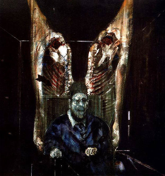
Here, he shows the pope, father of the Catholic Church, both enthroned and imprisoned by his position. Bacon’s relationship with his own father was a very stormy one, and perhaps he has used some of that fear and hatred to conjure up this ghostly vision of a screaming pope, his face frozen in a rictus of anguish.
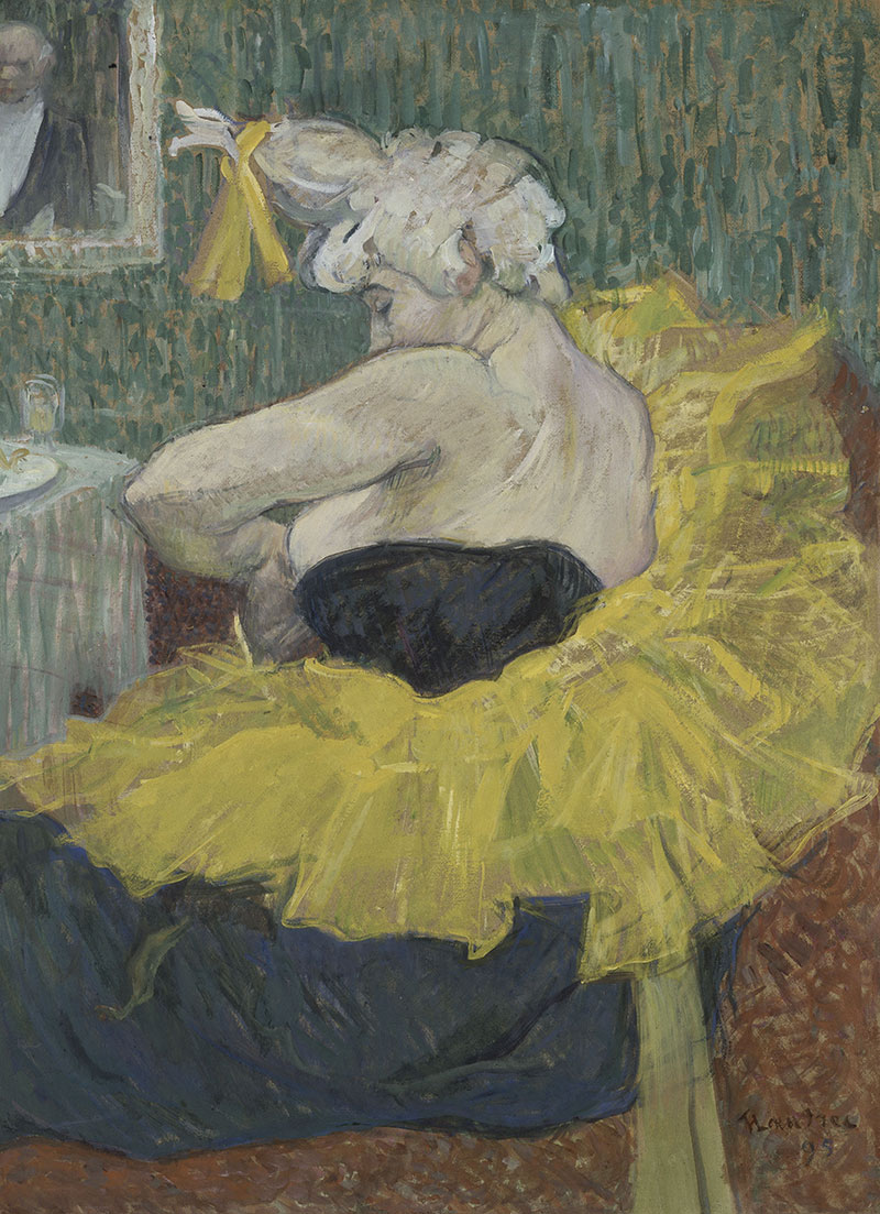
On Henri De Toulouse-Lautrec’s The Clown Chau-u-Kao (1895):
Toulouse-Lautrec, as the last descendant of an ancient French family, must have been bitterly conscious of his own physical deformities and to many people he, too, was a figure of fun…He shows us Chau-U-Kao preparing for her act with dignity and serenity, the great swirl of her frill seems to bracket the clown so that we can truly look at her, see the pathos of that blowzy and sagging flesh, and move on to the nobility of the nose and the intense eyes. This is a degradation, but one that has been chosen by the performer and redeemed by intelligence and will power.
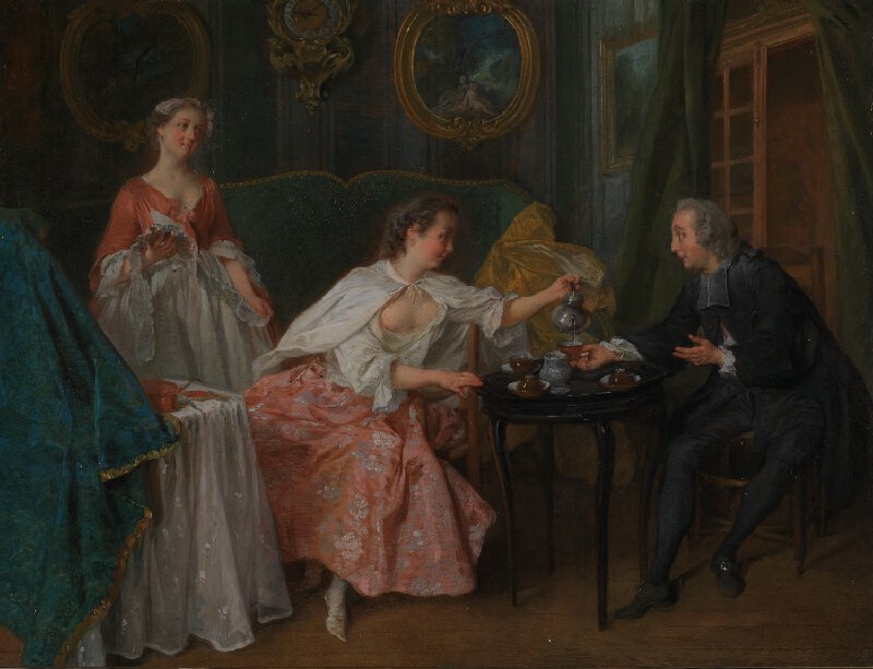
On Nicolas Lancret’s The Four Times of the Day: Morning (1739):
Morning is filled with witty observation — a delightful young woman (who is clearly no better than she should be) is entertaining a young cleric, seemingly unaware of the temptation offered by that casually exposed bosom. He holds out his cup, but his eyes are fied, alas, on that region of the feminine anatomy that his profession forbids him.
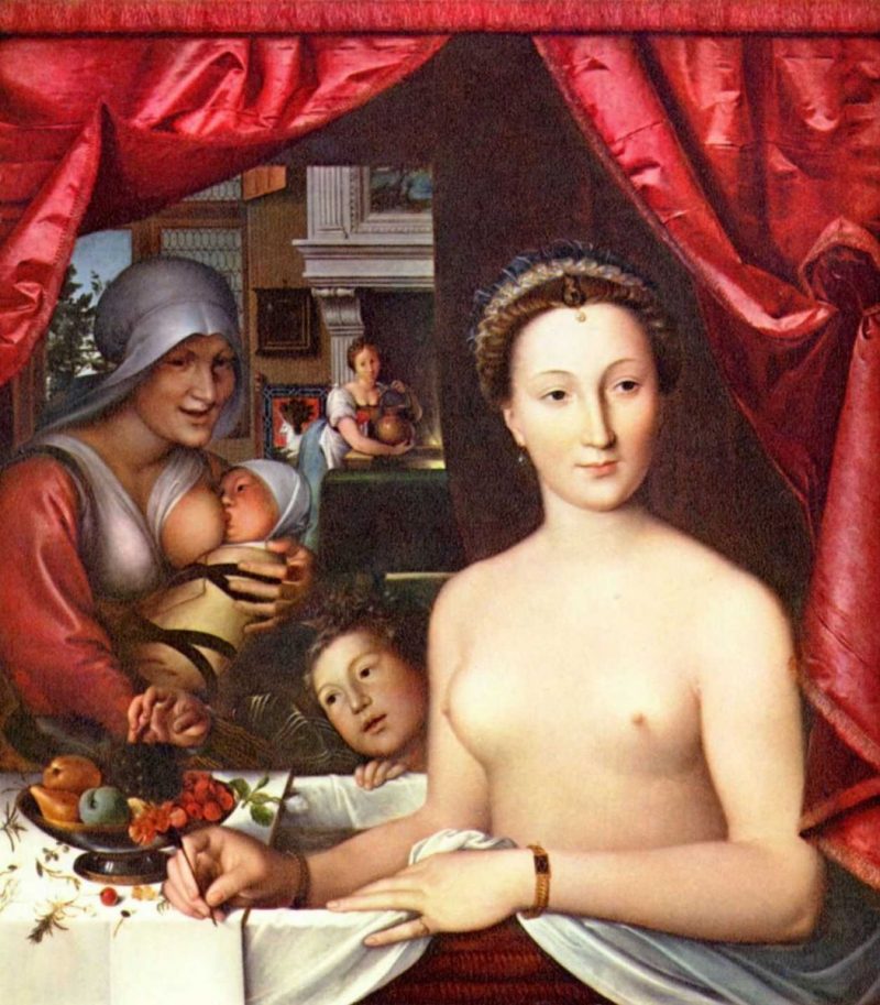
On François Clouet’s Diane De Poitiers (c. 1571)
The implication would seem to be that this shameless beauty with her prominent nipples and overflowing bowl of ripe fruit, is a woman of dubious morals. Yet one cannot but feel that the artist admires the natural freedom of his subject. Her children and her grinning wet-nurse are at her side, and, in the background, the maid prepares hot water. /surely this domestic scene is no more than a simple and endearing vignette.
Her generous takes on these and other artworks are irresistible. How wonderful it would be to approach every piece of art with such thought and compassion.
Fortunately, Sister Wendy, who passed away last week at the age of 88, left behind a how-to of sorts in the form of her 2005 essay, “The Art of Looking at Art,” from which we have extracted the following 10 rules.
Sister Wendy Beckett’s 10 Rules for Engaging with Art
Visit museums
They are the prime locus where the uniqueness of an artist’s work can be encountered.
Prioritize quality time over quantity of works viewed
Sociologists, lurking inconspicuously with stopwatches, have discovered the average time museum visitors spend looking at a work of art: it is roughly two seconds. We walk all too casually through museums, passing objects that will yield up their meaning and exert their power only if they are seriously contemplated in solitude.
Fly solo
If Sister Wendy could spend over four decades sequestered in a small mobile home on the grounds of Carmelite monastery in Norfolk, surely you can go alone. Do not complicate your contemplation by tethering yourself to a friend who cannot wait to exit through the gift shop.
Buy a postcard
…take it home for prolonged and (more or less) distractionless contemplation. If we do not have access to a museum, we can still experience reproductions—books, postcards, posters, television, film—in solitude, though the work lacks immediacy. We must, therefore, make an imaginative leap (visualizing texture and dimension) if reproduction is our only possible access to art. Whatever the way in which we come into contact with art, the crux, as in all serious matters, is how much we want the experience. The encounter with art is precious, and so it costs us in terms of time, effort, and focus.
Pull up a chair, whenever possible
It has been well said that the basic condition for art appreciation is a chair.
Don’t hate on yourself for being a philistine.
However inviolate our self-esteem, most of us have felt a sinking of the spirit before a work of art that, while highly praised by critics, to us seems meaningless. It is all too easy to conclude, perhaps subconsciously, that others have a necessary knowledge or acumen that we lack.
Take responsibility for educating yourself…
Art is created by specific artists living in and fashioned by a specific culture, and it helps to understand this culture if we are to understand and appreciate the totality of the work. This involves some preparation. Whether we choose to “see” a totem pole, a ceramic bowl, a painting, or a mask, we should come to it with an understanding of its iconography. We should know, for example, that a bat in Chinese art is a symbol for happiness and a jaguar in Mesoamerican art is an image of the supernatural. If need be, we should have read the artist’s biography: the ready response to the painting of Vincent van Gogh or Rembrandt, or of Caravaggio or Michelangelo, comes partly from viewers’ sympathy with the conditions, both historical and temperamental, from which these paintings came.
…but don’t be a prisoner to facts and expert opinions
A paradox: we need to do some research, and then we need to forget it…We have delimited a work if we judge it in advance. Faced with the work, we must try to dispel all the busy suggestions of the mind and simply contemplate the object in front of us. The mind and its facts come in later, but the first, though prepared, experience should be as undefended, as innocent, and as humble as we can make it.
Celebrate our common humanity
Art is our legacy, our means of sharing in the spiritual greatness of other men and women—those who are known, as with most of the great European painters and sculptors, and those who are unknown, as with many of the great carvers, potters, sculptors, and painters from Africa, Asia, the Middle East, and Latin America. Art represents a continuum of human experience across all parts of the world and all periods of history.
Listen to others but see with your own eyes
We should listen to the appreciations of others, but then we should put them aside and advance toward a work of art in the loneliness of our own truth.
Sister Wendy’s television shows can be found on PBS, the BBC, and as DVDs. Her books are well represented in libraries and from booksellerslike Amazon. (We have learned so much in the year her dictionary-sized 1000 Paintings has been parked next to our commode…)
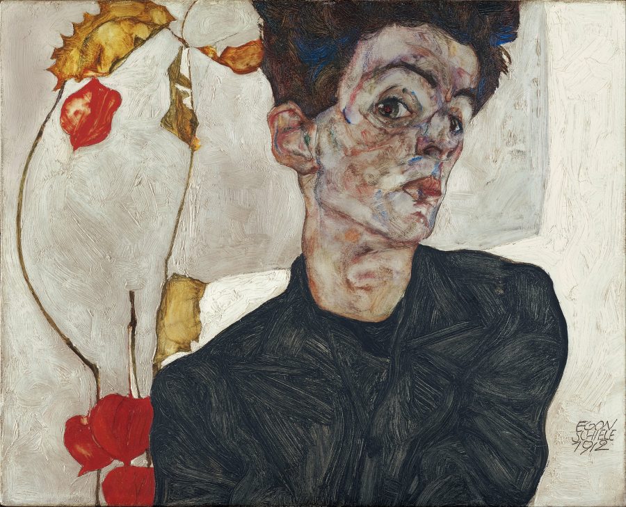
If you’ve ever mistaken an Egon Schiele for a Gustav Klimt, you can surely be forgiven—the Austrian modernist don served as a North Star for Schiele, who sought out Klimt, apprenticed himself, and received a great deal of encouragement from his elder. But he would soon strike out on his own, developing a grotesque, exaggerated, yet elegantly sensual style that shocked his contemporaries and made him a leading figure of Austrian Expressionism.
Now, a century after his death in 1918 at age 28, a number of exhibitions have highlighted the complexity of his brief career, during which he “created a formidable output that turned him into a real icon for new generations,” writes Elena Martinique.
Schiele achieved “a remarkable impact and permanency” and it’s easy to see why. Best known for his erotic, elongated portraits and self-portraits, “searing explorations of their sitter’s psyches,” as The Art Story describes them, his depictions of the human form are considered some of the “most remarkable of the 20th century.”
The details of Schiele’s short life paint the picture of a modernist rock star. He is as famous for his work as for his “licentious lifestyle… marked by scandal, notoriety, and a tragically early death… at a time when he was on the verge of the commercial success that had eluded him for much of his career.” In his short life, Martinique notes, Schiele produced “over 400 paintings; close to 3,000 watercolors and drawings; 21 sketchbooks; 17 graphics; and 4 sculptures.”
This incredible body of work will be made available in full online in a project spearheaded by Jane Kallir, co-director of New York’s Galerie St. Etienne, which mounted Schiele’s first American solo exhibition in 1941 and recently staged a “comprehensive survey of the artist’s artistic development.” Kallir authored the most recent catalogue raisonné of Schiele’s work, and rather than publish another print edition, she has decided to put the full catalogue online, under the auspices of her research institute.
The project currently “details 419 works and counting, with a particular emphasis on Schiele’s paintings,” reports Meilan Solly at Smithsonian. His drawings and watercolors will be added in 2019. Though it is a public resource, the online catalogue is designed for scholars, who can use it to “trace specific pieces’ provenance or debunk the existence of forgeries.” Kallir continues the work of her grandfather, Otto Kallir, who wrote the first complete catalogue of the artist’s work in 1930.
That early reference has proven invaluable “in the tangle courtroom drama surrounding the restitution of Nazi-looted art.” The centenary of Schiele’s death on October 31, 2018 has brought even more interest to his work, and a rise in fakes circulating in the art market. “It is very important to have a reliable and readily accessible means of identifying authentic works of art,” Kallir writes in a statement. There is no one better placed than her to create it.
These latter works show a radical development: from the conservative, traditional style of his earliest painting, to the heavily Klimt-influenced work of 1908–9, to 1910–18, when he discovered and perfected his own peculiar vision.
Season’s greetings from Banksy. Two months after shredding a painting at a London auction, the street artist has resurfaced again. This time in Port Talbot, Wales, where he spray-painted a holiday mural on two sides of a garage. One sides shows a young boy frolicking in what looks like falling snow. The other side makes you realize that the snow is really a fire spewing toxic ash.
According to the BBC, Gary Owen, a Port Talbot resident, messaged Banksy last summer and asked him to put a spotlight on Port Talbot’s chronic pollution problem. The steelworks of the industrial town puts dust in the air, creating potential health risks for children. When Owen learned about the mural, he reportedly said: “It’s brilliant. I couldn’t take it in. I didn’t think it was true.” That’s all before some “some drunk halfwit” tried to attack the painting–very fortunately to no avail.
If you would like to support the mission of Open Culture, consider making a donation to our site. It’s hard to rely 100% on ads, and your contributions will help us continue providing the best free cultural and educational materials to learners everywhere. You can contribute through PayPal, Patreon, and Venmo (@openculture). Thanks!
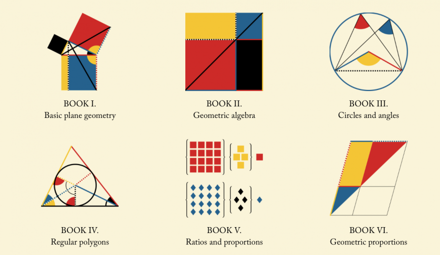
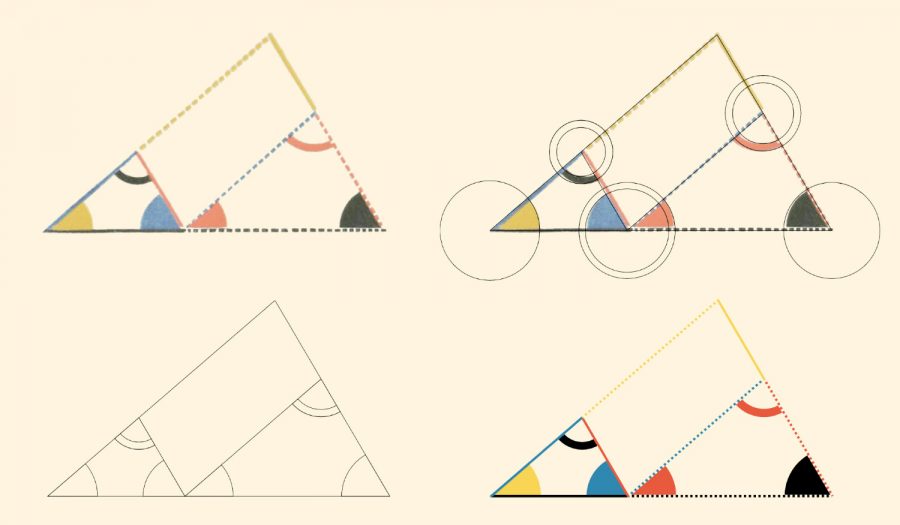
For two millennia, Euclid’s Elements, the foundational ancient work on geometry by the famed Greek mathematician, was required reading for educated people. (The “classically educated” read them in the original Greek.) The influence of the Elements in philosophy and mathematics cannot be overstated; so inspiring are Euclid’s proofs and axioms that Edna St. Vincent Millay wrote a sonnet in his honor. But over time, Euclid’s principles were streamlined into textbooks, and the Elements was read less and less.
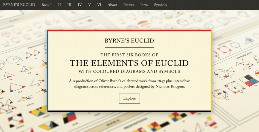
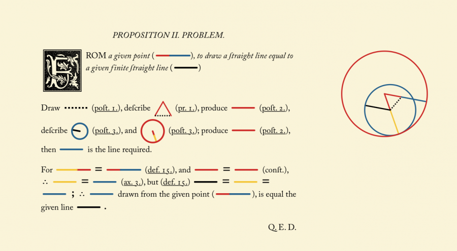
In 1847, maybe sensing that the popularity of Euclid’s text was fading, Irish professor of mathematics Oliver Byrne worked with London publisher William Pickering to produce his own edition of the Elements, or half of it, with original illustrations that carefully explain the text.
“Byrne’s edition was one of the first multicolor printed books,” writes designer Nicholas Rougeux. “The precise use of colors and diagrams meant that the book was very challenging and expensive to reproduce.” It met with little notice at the time.
Byrne’s edition—The First Six Books of The Elements of Euclid in which Coloured Diagrams and Symbols are Used Instead of Letters for the Greater Ease of Learners—might have passed into obscurity had a reference to it in Edward Tufte’s Envisioning Informationnot sparked renewed interest. From there followed a beautiful new edition by TASCHEN and an article on Byrne’s diagrams in mathematics journal Convergence. Rougeux picked up the thread and decided to create an online version. “Like others,” he writes, “I was drawn to its beautiful diagrams and typography.” He has done both of those features ample justice.
As in another of Rougeux’s online reproductions—his Werner’s Nomenclature of Colours—the designer has taken a great deal of care to preserve the original intentions while adapting the book to the web. In this case, that means the spelling (including the use of the long s), typeface (Caslon), stylized initial capitals, and Byrne’s alternate designs for mathematical symbols have all been retained. But Rougeux has also made the diagrams interactive, “with clickable shapes to aid in understanding the shapes being referenced.”
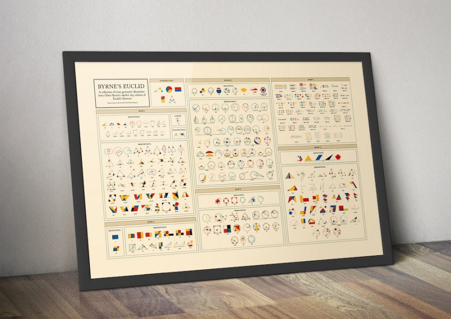
He has also turned all of those lovely diagrams into an attractive poster you can hang on the wall for quick reference or as a conversation piece, though this semaphore-like arrangement of illustrations—like the simplified Euclid in modern textbooks—cannot replace or supplant the original text. You can read Euclid in ancient Greek (see a primer here), in Latin and Arabic, in English translations here, here, here, and many other places and languages as well.
For an experience that combines, however, the best of ancient wisdom and modern information technology—from both the 19th and the 21st centuries—Rougeux’s free, online edition of Byrne’s Euclid can’t be beat. Learn more about the meticulous process of recreating Byrne’s text and diagrams (illustrated above) here.
In his cheeky invention of a character called Marvin Pontiac, an obscure West African-born bluesman, the avant-garde composer and saxophonist John Lurie created “a wry and purposeful sendup of the ways in which critics canonize and worship the disenfranchised and bedeviled,” Amanda Petrusich writes at The New Yorker. Lurie’s satire shows how the critical fetish for outsider artists has a persistent emphasis: a hyperfocus on “misshapen yet pervasive ideas” about class, race, education, and ability as markers of primitive authenticity.
The term “outsider art” can sound patronizing and even predatory, laden with assumptions about who does and who does not deserve inclusion and agency in the art world. Outsider art gets collected, exhibited, catalogued, and sold, usually accompanied by a semi-mythology about the artist’s fringe circumstances. Yet the artists themselves rarely seem to be the primary beneficiaries of any largesse. In the case of the fictional Marvin Pontiac, his status as “dead and heretofore undiscovered” makes the question moot. The same goes for the very real and perhaps most famous of outsider artists, whose life story can sometimes make Lurie’s Pontiac seem underwritten by comparison.
Reclusive hospital custodian Henry Darger spent his early years, after both parents died, in an orphanage and the Illinois Asylum for Feeble-Minded Children. He spent his almost completely solitary adult life in a second-floor room on the North Side of Chicago, attending Mass daily (often several times a day), before passing away in 1973 in the same old age home in which his father died. He had one friend, left only four photographs of himself, and his few acquaintances were never even sure how to pronounce his last name (it’s a hard “g”). In his last diary entry, New Year’s Day, 1971, Darger wrote, “I had a very poor nothing like Christmas. Never had a good Christmas all my life, nor a good new year, and now… I am very bitter but fortunately not revengeful, though I feel should be how I am.”
So much for “outsider.” As for the label “Artist”—inscribed on his pauper’s grave (along with “Protector of Children”)—Darger shocked the art world, who had no idea he even existed, when his landlord discovered the typescript of an unpublished 15,000-page fantasy novel, The Story of the Vivian Girls, in What is Known as the Realms of the Unreal, of the Glandeco-Angelinian War Storm, Caused by the Child Slave Rebellion. Also in his apartment were a 8,500 follow-up, Further Adventures of the Vivian Girls in Chicago, and several hundred “panoramic ‘illustrations,’” notes the “official” Henry Darger website: “many of them double-sided and more than 9 feet in length.”
These works, we learn in the PBS video at the top, “The Secret Life of Henry Darger,” now regularly sell for hundreds of thousands of dollars. Darger, it seems, never meant for anyone to see them at all. Perhaps for good reason. His work leaves “a set of contradictory impressions,” Edward Gómez writes at Hyperallergic, “a celebration of childhood fulsomeness and a whiff of pedophiliac perversion.” The latter impression seems to have less to do with criminal sexual inclinations than with contemporary cultural perceptions about childhood. Compare Darger’s work, for example, with Lewis Carroll’s obsession with children, alarming to us now but not at all unusual at the time.
Still, Darger’s hundreds of “drawings of naked, prepubescent girls whose bodies prominently include male genitals” have raised all sorts of questions. Critics have pointed to the obvious influence of Victorian children’s literature, but perhaps even more pervasive was Darger’s own painful childhood, his considerable discomfort with the adult world, and his expressed desire to protect children who might suffer similarly (a preoccupation shared by Charles Dickens). Learn about Darger’s troubled, tragic childhood in the Down the Rabbit Hole video biography above, and in these two portraits, see why his work deserves—despite but not because of his marginality and oddness, his being self-taught, and his desire for his art to disappear—the posthumous acclaim it has received. Like that quintessential outsider artist, William Blake, Darger left behind a daringly original body of work that is as compelling and beautiful as it is disturbing and otherworldly.
To delve deeper into Darger’s world, check out the 2004 documentary, The Realms of the Unreal, which can be viewed on Youtube, or purchased on Amazon. The film’s trailer appears below.
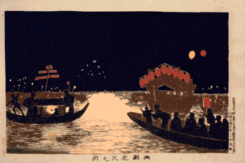
Much of the image we have of life in Japan in the 17th through the 19th century, we have because of woodblock prints, or specifically ukiyo‑e, or “pictures of the floating world,” which vividly capture a great variety of scenes and the people who inhabited them. The once-closed-off Japan has changed a great deal since that era, on most levels even more so than other countries, and the artistic portrayals of Japanese life have also multiplied enormously. Yet even in the 21st century, ukiyo‑e continue to provide a compelling image of Japan in its essence.
But that doesn’t mean that ukiyo‑e prints can’t be updated to reflect the present day. Filmmaker and animator Atsuki Segawa, writes Spoon & Tamago’s Johnny Waldman, “takes traditional Japanese Ukiyo‑e woodblock prints and sets them into motion through digital animation. He began his collection of ‘moving ukiyo‑e’ in 2015 and has been slowly adding to his collection.” At those two linked Spoon & Tamago posts you can see a selection of ten of Segawa’s creations, which hybridize not just art forms but eras.
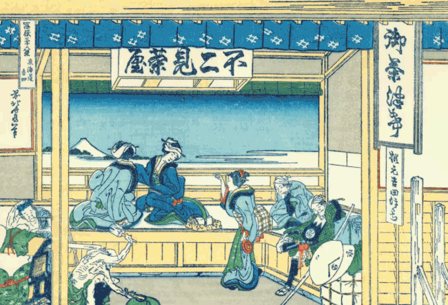
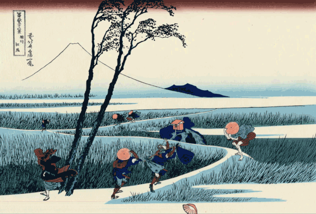
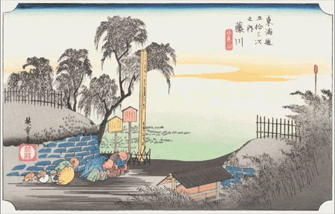
Here you can see Segawa’s take on, from top to bottom, Kiyochika Kobayashi’s Firework Show at Ryogoku, Katsushika Hokusai’s Yoshida at Tōkaidō, Toshusai Sharaku’s Nakamura Konozo and Nakajima Wadayemon (“If anyone has ever eaten oden you’ll know how this man feels,” adds Waldman), Hokusai’s Ejiri in Suruga Province, Hokusai’s Great Wave, and Utagawa Hiroshige’s Fujikawa. Keep your eye on that last and you’ll notice Doc Brown and Marty McFly cruising through the scene, only the most obvious of the anachronistic touches (though as time travelers, what really counts as anachronism?) Segawa has added to these classic ukiyo‑e and set into motion.
Segawa’s other “moving ukiyo” introduce flying drones into an Osaka marketplace, the multicolored lights of speeding cars down a quiet seaside road, a Shinkansen bullet train passing a resting place full of weary foot travelers, and violent motion to the waves and boats in Hokusai’s Great Wave off Kanazawa, quite possibly the most famous ukiyo‑e print of them all.
Sheer incongruity — incongruity between the times of the elements depicted and referenced, between the aesthetics of the past and the aesthetics of the present, and between the technologies used to create and display the originals and these light-hearted revisions — has much to do with the appeal of these images, but somehow it all makes them feel much more, not less, like Japan itself.
Based in Seoul, Colin Marshall writes and broadcasts on cities, language, and culture. His projects include the book The Stateless City: a Walk through 21st-Century Los Angeles and the video series The City in Cinema. Follow him on Twitter at @colinmarshall or on Facebook.
It can be both a blessing and curse for an artist to toil at the behest of an influential patron. Financial support and powerful connections are among the obvious perks. Being hamstrung by someone else’s ego and timeframe are some of the less welcome realities on the flip side.
Although af Klint was an accomplished botanical and landscape painter who trained at the Royal Academy in Stockholm, “Paintings for the Temple,” 193 works produced between 1906 and 1915 upon order of her spirit guide, are brightly colored abstractions.
In his 1920 essay, Creative Confession, Klee wrote, “art does not reproduce the visible; rather, it makes visible.”
It was a sentiment Klint shared, but the spiritual message encoded in her work was intended for a future audience. She instructed her nephew that her work was to be kept under wraps until twenty years after her death. (She died in 1944, the same year as Kandinsky and Mondrian, but her work was not publicly shown until 1986, when the Los Angeles County Museum of Art organized an exhibition titled The Spiritual in Art.)
Perhaps af Klint did not foresee how dramatically the respectability of spiritualism and seances—a popular pursuit of her time, and one shared by Mondrian and Kandinsky—would decline.
Her dedication to carrying out her spirit guide’s mission may remind some modern viewers of Henry Darger, the Chicago janitor who created hundreds of artworks and thousands of pages of text documenting the Glandeco-Angelinian War Storm, a strange and gory series of events taking place in an alternate reality that was very real to him.
Thus far no one has fully divined the spirit’s message af Klint devoted so much of her life to preserving.
As critic Roberta Smith notes in her New York Times review of the Guggenheim show, af Klint, a member of the Swedish Lodge of the Theosophical Society, was well versed in occult spiritualism, Rosicrucianism, Buddhism, Darwinism, and the science of subatomic particles.
Hints of these interests are threaded throughout her work.
Color also helps to unlock the narrative. She used blue and lilac to represent female energy, rose and yellow for male, and green for the unity of the two. The Guardian’s Kate Kellaway reports that the artist may have been influenced by Goethe’s 1810 Theory of Colours.
Moving on to geometry, overlapping discs also stand for unity. U‑shapes reference the spiritual world and spirals denote evolution.
Af Klint’s spiral obsession was not confined to the canvas. Roberta Smith reveals that af Klint envisioned a spiral-shaped building for the exhibition of The Paintings for the Temple. Visitors would ascend a spiral staircase toward the heavens, the exact configuration described by architect Frank Lloyd Wright’s interior ramps at the Guggenheim.
Perhaps we are getting closer to understanding.
We're hoping to rely on loyal readers, rather than erratic ads. Please click the Donate button and support Open Culture. You can use Paypal, Venmo, Patreon, even Crypto! We thank you!
Open Culture scours the web for the best educational media. We find the free courses and audio books you need, the language lessons & educational videos you want, and plenty of enlightenment in between.