He’s drawn to the stark, the geometric, the abstract. No heaving bosoms, no forbidden love, though there’s no denying that sex was a topic of great clinical interest to several of the authors featured above, including psychiatrists Charles Rycroft, H. R. Beech, and R.D. Laing.
Visually, the psycho-analytic titles appear interchangeable with the more straightforward texts in this, Lederer’s third in a series of lightly animated period book covers:
The Intelligent Woman’s Guide to Atomic Radiation
Medical Complications During Pregnancy
Generalized Thermodynamics
Pinwheels, ripples, and scrolling harlequin patterns abound. Stare at them long enough if you want to cure your insomnia or become one with the universe.
Tilman Grundig’s soundtrackensures that the playing field will stay level. No title is singled out for extra sonic attention.
That said, Noise by Rupert Taylor, an expert consultant in acoustics and noise control, stands apart for the humor and narrative sensibility of its visual representation.
Perhaps that’s why Lederer saved it for last.
To date, he’s animated 157 covers. Enjoy them all above.
Somewhere in the annals of the internet–if this sprawling, near-sentient thing we call the internet actually has annals–there is a fine, fine quote by filmmaker John Waters:
We need to make books cool again. If you go home with somebody and they don’t have books, don’t fuck them. Don’t let them explore you until they’ve explored the secret universes of books. Don’t let them connect with you until they’ve walked between the lines on the pages.
Books are cool, if you have to withhold yourself from someone for a bit in order for them to realize this then do so.
You can read the full study by Joanna Sikora here at Social Science Research, which used data from 160,000 adults from 31 countries. The data came from a survey that asked people ages 25 to 65 to think back on being 16 years old. How many books were they surrounded by at home during that time?
The average number at home was 115 books, though in Norway the average size was 212 books and in Turkey it was 27. Needless to say, no matter the size of the library, having books in the home was a good thing. The researches also found that literacy rates climbed as the number of books climbed, but at some point–350 books to be exact–these rates plateau’d.
In comparison, a person who had not grown up around books but had earned a university degree wound up being just as literate as someone with a large home library and only nine years of schooling.
According to Sikora, “Early exposure to books in [the] parental home matters because books are an integral part of routines and practices that enhance lifelong cognitive competencies.”
What does that bode for a more digital future? The study seems to suggest that while books are not going away any time soon, it is indeed this book-based literacy that leads many of us to online sites like Open Culture, where we spend our time reading articles like this one. (Instead of, you know, watching cat videos or playing Fortnite.)
Ted Mills is a freelance writer on the arts who currently hosts the artist interview-based FunkZone Podcast and is the producer of KCRW’s Curious Coast. You can also follow him on Twitter at @tedmills, read his other arts writing at tedmills.com and/or watch his films here.
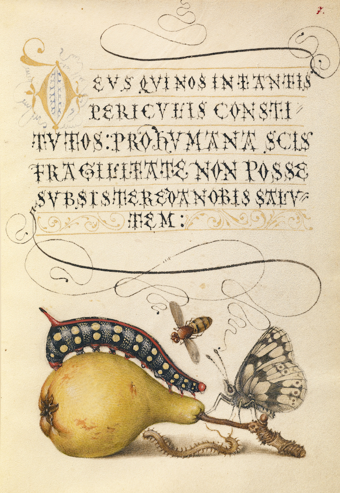
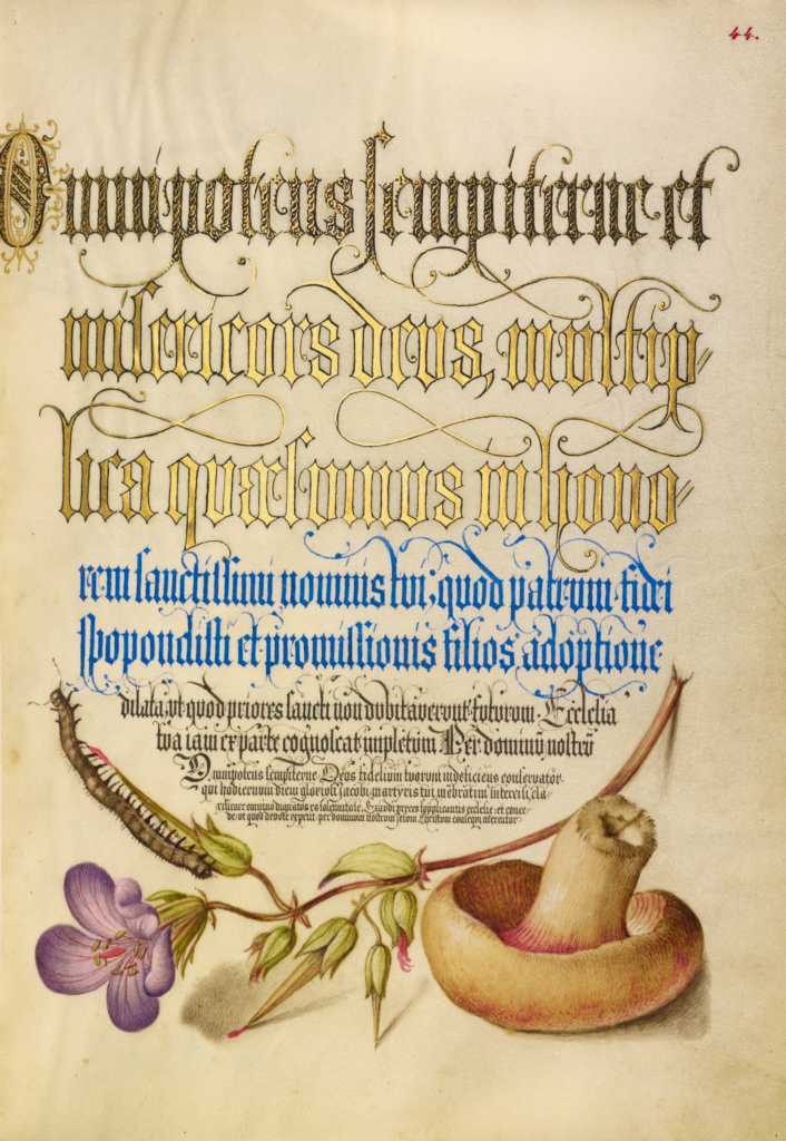
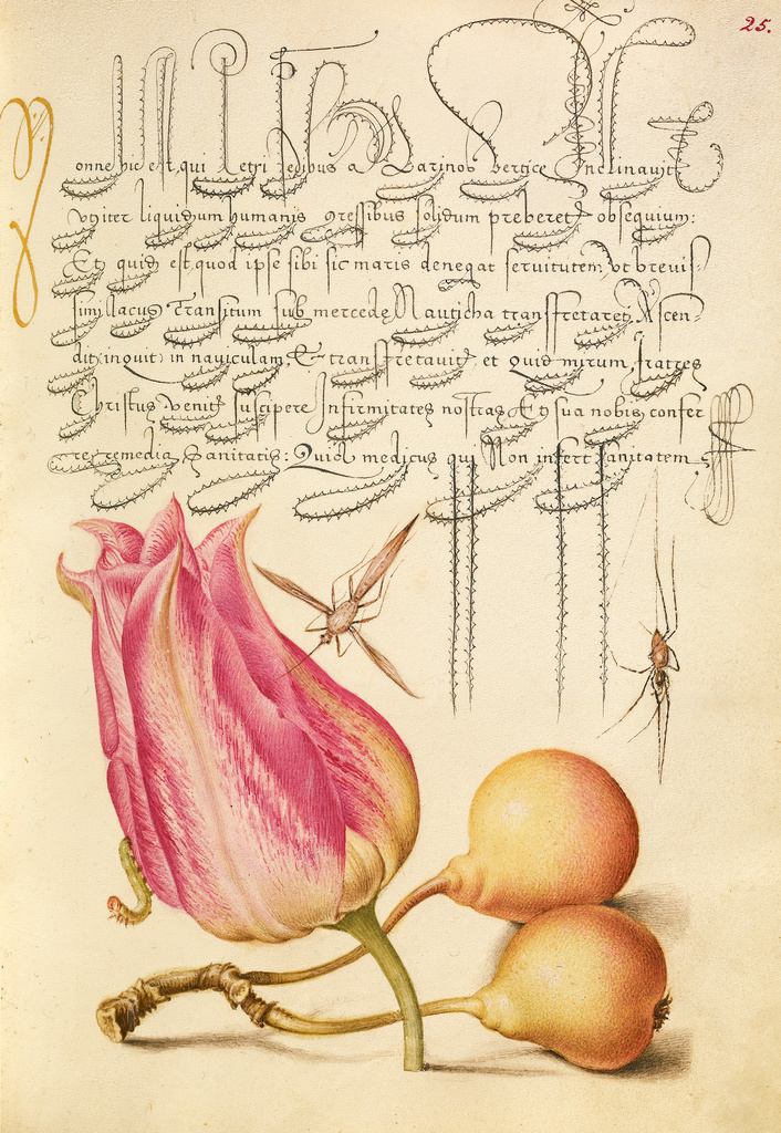
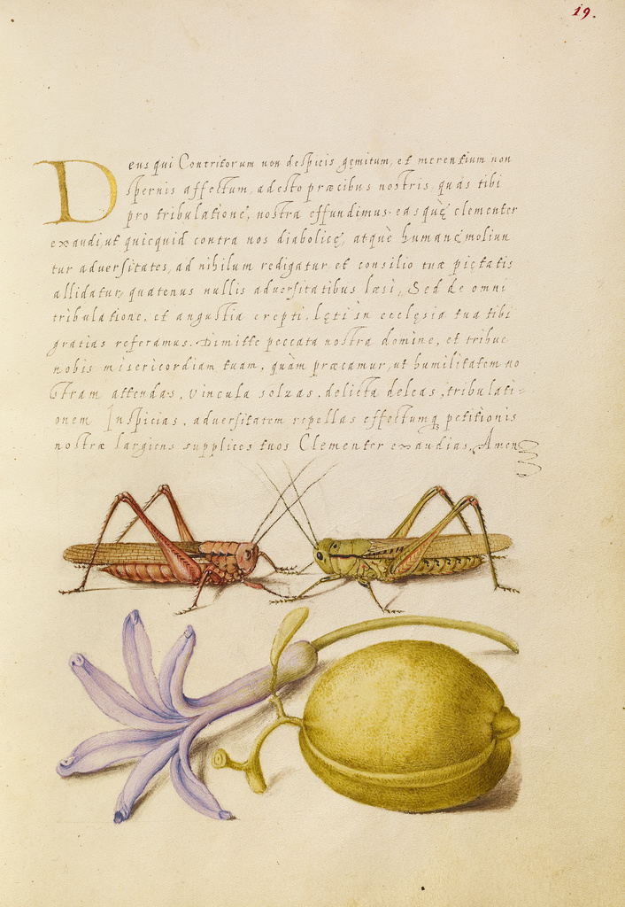
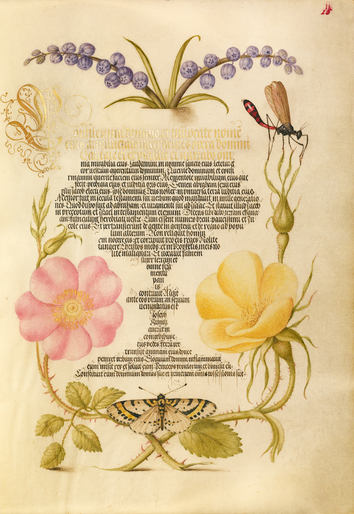
Whenever a technology develops just enough to become interesting, someone inevitably pushes it to extremes. In the case of that reliable and long-lived technology known as the book, writers and artists were looking for ways to maximize its potential as a device for conveying the written word and the drawn image as far back as the 16th century. One particularly glorious example, The Model Book of Calligraphy, has come available online, to view or download, thanks to the Getty. This decades-spanning collaboration shows off not just the artistic writing implied by the title but illustrations whose vividness and detail remain striking even today.
“In the 1500s, as printing became the most common method of producing books, intellectuals increasingly valued the inventiveness of scribes and the aesthetic qualities of writing,” says the Getty’s site.
“From 1561 to 1562, Georg Bocskay, the Croatian-born court secretary to the Holy Roman Emperor Ferdinand I, created this Model Book of Calligraphy in Vienna to demonstrate his technical mastery of the immense range of writing styles known to him.”
Three decades later, “Emperor Rudolph II, Ferdinand’s grandson, commissioned Joris Hoefnagel” — a Flemish artist well known at the time for his specialization in subjects to do with natural history — “to illuminate Bocskay’s model book. Hoefnagel added fruit, flowers, and insects to nearly every page, composing them so as to enhance the unity and balance of the page’s design. It was one of the most unusual collaborations between scribe and painter in the history of manuscript illumination.”
What we see when we flip through (or zoom in to great levels of digital detail on) The Model Book of Calligraphy’s 184 pages may look like a unified work executed all at once (see them all at the bottom of this page), but it actually combines the sensibilities of not just two creators separated by not just the art forms in which they specialized but more than thirty years of time. Hoefnagel, however, didn’t stay entirely out of the realm of the textual: though most of what he brought to the manuscript takes the form of illuminations, he also added an entirely new section on writing the alphabet. He understood the importance of not just well-crafted pictures and text but their appealing integration, a concept familiar to any designer working in today’s forms of cutting-edge media — as books were four centuries ago. You can purchase print editions that reproduce portions or the entirety of The Model Book of Calligraphy.
Based in Seoul, Colin Marshall writes and broadcasts on cities, language, and culture. His projects include the book The Stateless City: a Walk through 21st-Century Los Angeles and the video series The City in Cinema. Follow him on Twitter at @colinmarshall or on Facebook.
Hard to believe it’s almost a decade ago now since Patti Smith’s Just Kidstook over Barnes & Noble displays, topped bestseller lists, won the National Book Award, and sent Wikipedia searches for “Patti Smith” into the stratosphere. A memoir of her gritty New York salad days with roommate/lover/best friend/soulmate/photographer Robert Mapplethorpe, the book immediately entered “that golden canon of classic New York stories about young people coming to the city to find out who they were meant to be,” as NPR’s Maureen Corrigan writes.
Indeed, Just Kidsshould be considered representative, its full text now a locus classicus of bohemian finding-yourself-in-New-York stories. (The embittered converse of the genre is forever crowned by Joan Didion’s “Goodbye to All That.”) But Smith didn’t rest on the many laurels the book garnered her. She released a widely-acclaimed album two years later, with a bonus track on the deluxe edition called “Just Kids,” then collaborated with Colombian artist José Antonio Suárez Londoño on the (sadly out-of-print) Hecatomb.
In 2015, Smith followed Just Kids with another memoir, M Train, a travelogue of sorts—of her literary pilgrimages and journeys through the city that embraced her. But as her work ethic shows, and as Just Kidsdocuments in detail, she didn’t just luck out in the big city but fought her way to creative freedom and independence with zeal and real self-confidence, believing in the power of poetry and rock and roll, and of her place among the sixties royalty she encountered while “still a gangly twenty-two-year-old book clerk, struggling simultaneously with several unfinished poems.”
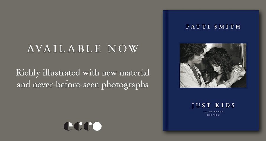
“I felt an inexplicable sense of kinship with these people,” she wrote, for example, of her run-ins with Janis Joplin, Grace Slick, and Jimi Hendrix ahead of Woodstock, a “feeling of prescience” that she might “one day walk in their path.” She saw “infinite possibilities” in the Chelsea Hotel’s plaster ceiling, “the mandala of my life.” You may call it faith, hubris, or delusion, but she sure showed us, and keeps showing us, that she earned her cred. Just Kidswill inspire young artists for generations, not only through its first, explosive printing, but through a possible series on Showtime, who acquired the rights in 2015, and, now, in an illustrated edition just released last week.
The book resonates for its depictions of a bygone, decayed New York, when free spirits could scrape together their artistic selves with next to nothing, without having to craft their every move for social media. Smith’s vividly expressive writing brings that lost world alive in a wildly successful experiment, as she told KCRW in a 2010 interview, to “infuse truth with magic and love.”
The full-color illustrated edition of Just Kids features never-before published photos, drawings, and other ephemera depicting major figures in Smith’s young life, like Sam Shepard, William Burroughs, and Allen Ginsberg, as well as her and Mapplethorpe’s first Brooklyn apartment, the iconic Max’s Kansas City, and the fire escape of the Chelsea Hotel. Order a copy here.
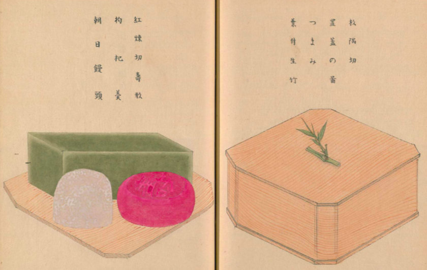
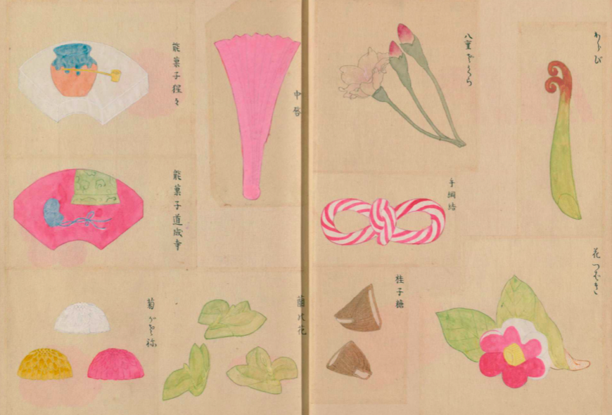
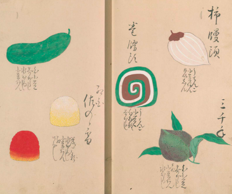
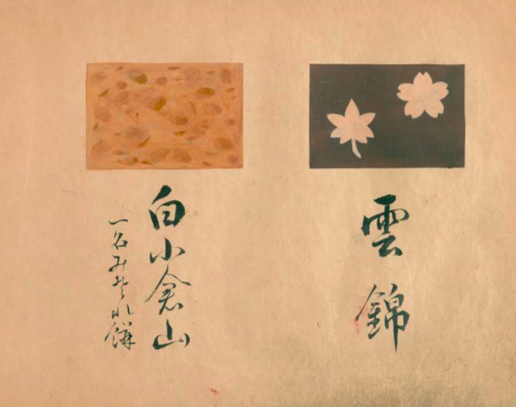
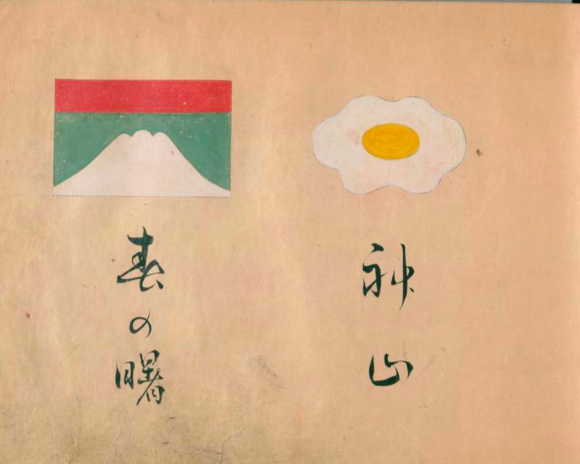
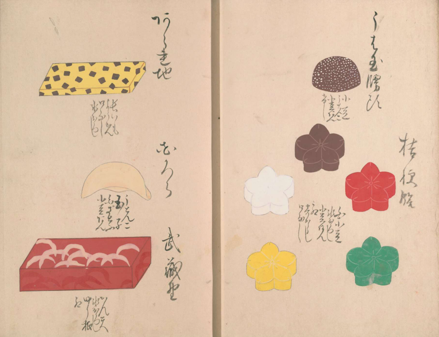
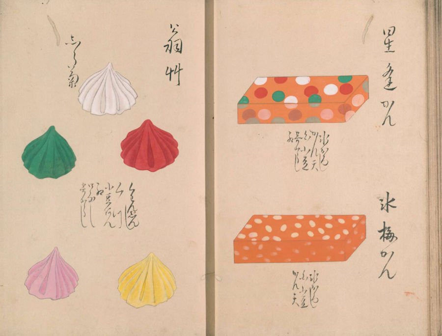
If you’ve been to Japan, or even to any of the Japanese neighborhoods in cities around the world, you’ve seen wagashi (和菓子). You’ve probably, at least for a moment, marveled at their appearance as well: though essentially nothing more than sweet treats, they’re made with such striking variety and refinement that you might hesitate to bite into them.
First created in the 16th century, when trade with China made sugar into a staple in Japan, wagashi have developed into one of the country’s signature delicacies, appreciated for their taste but beloved for their form. You can browse and download a three-volume catalog of wagashi designs, itself centuries old, at the web site of Japan’s National Diet Library: volume one, volume two, volume three.
The site also has a special section about wagashi, though in Japanese only. The catalog itself, of course, also contains text in no other language, but wagashi isn’t about words.
Even without knowing Japanese, you can flip through each volume’s pages (volume one — volume two -volume three) and recognize the look of dozens of sweets you’ve seen or maybe even sampled in real life, where their colors may well look even more vivid than on the page.
Like most realms of traditional Japanese culture, wagashi demands painstaking craftsmanship. Often brought out at festivals and given as gifts, it also celebrates different aspects of Japan: its seasons, its landscapes, chapters of its history, and even its works of literature. Some wagashi designs do this abstractly, while others lean toward the representative, replicating real sights and symbols in a form both recognizable and edible.
Many wagashi, as Boing Boing’s Andrea James writes, “still look the same as they did hundreds of years ago when the art form flourished in the Edo period” of the 17th and 18th century. Instagram, as she points out, has proven a natural online home for not just the kind of traditional wagashi seen in these catalogs but designs that pay tribute to figures of more recent vintage, such as Rilakkuma and the aliens from Toy Story.
And though Halloween may not be an originally Japanese holiday, it hasn’t stopped modern wagashi-makers from bringing out the ghosts, skulls, and jack-o-lanterns in force.
Based in Seoul, Colin Marshall writes and broadcasts on cities, language, and culture. His projects include the book The Stateless City: a Walk through 21st-Century Los Angeles and the video series The City in Cinema. Follow him on Twitter at @colinmarshall or on Facebook.
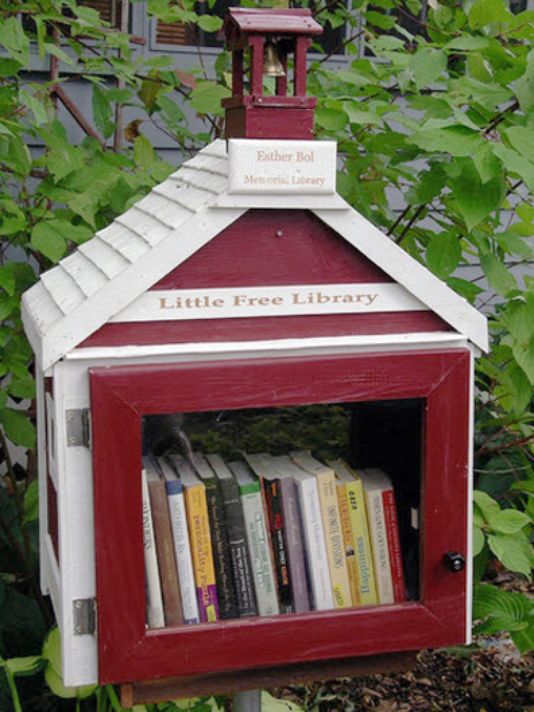
“The Little Free Library: Billions and billions read.”
In the 2013 Ted‑X talk above, Todd Bol, founder of the Little Free Library movement, expressed the desire that one day, he might be able to boast that his labor of love had surpassed McDonalds with regard to the number of customers’ served.
He seemed proudest of the libraries’ community building effect (though he was also pretty chuffed when Reader’s Digest ranked the project above Bruce Springsteen in its 2013 feature ”50 Surprising Reasons We Love America.” )
A steward who posted news of his dog’s death on the side of his library received sympathy cards from neighbors both known and unknown to him.
A steward who specializes in giving away cookbooks, and invites patrons to snip herbs from an adjacent garden, frequently wakes to find homemade quiche and other goodies on the doorstep.
Technology has come so far that we consider it no great achievement when a device the size of a single paper book can contain hundreds, even thousands, of different texts. But 21st-century humanity didn’t come up with the idea of putting multiple books in one, nor did we first bring that idea into being — not by a long shot. Medieval book historian Erik Kwakkel points, for example, to the “dos-à-dos” (back to back) binding of the 16th and 17th centuries, which made for books “like Siamese twins in that they present two different entities joined at their backs: each part has one board for itself, while a third is shared between the two,” so “reading the one text you can flip the ‘book’ to consult the other.”
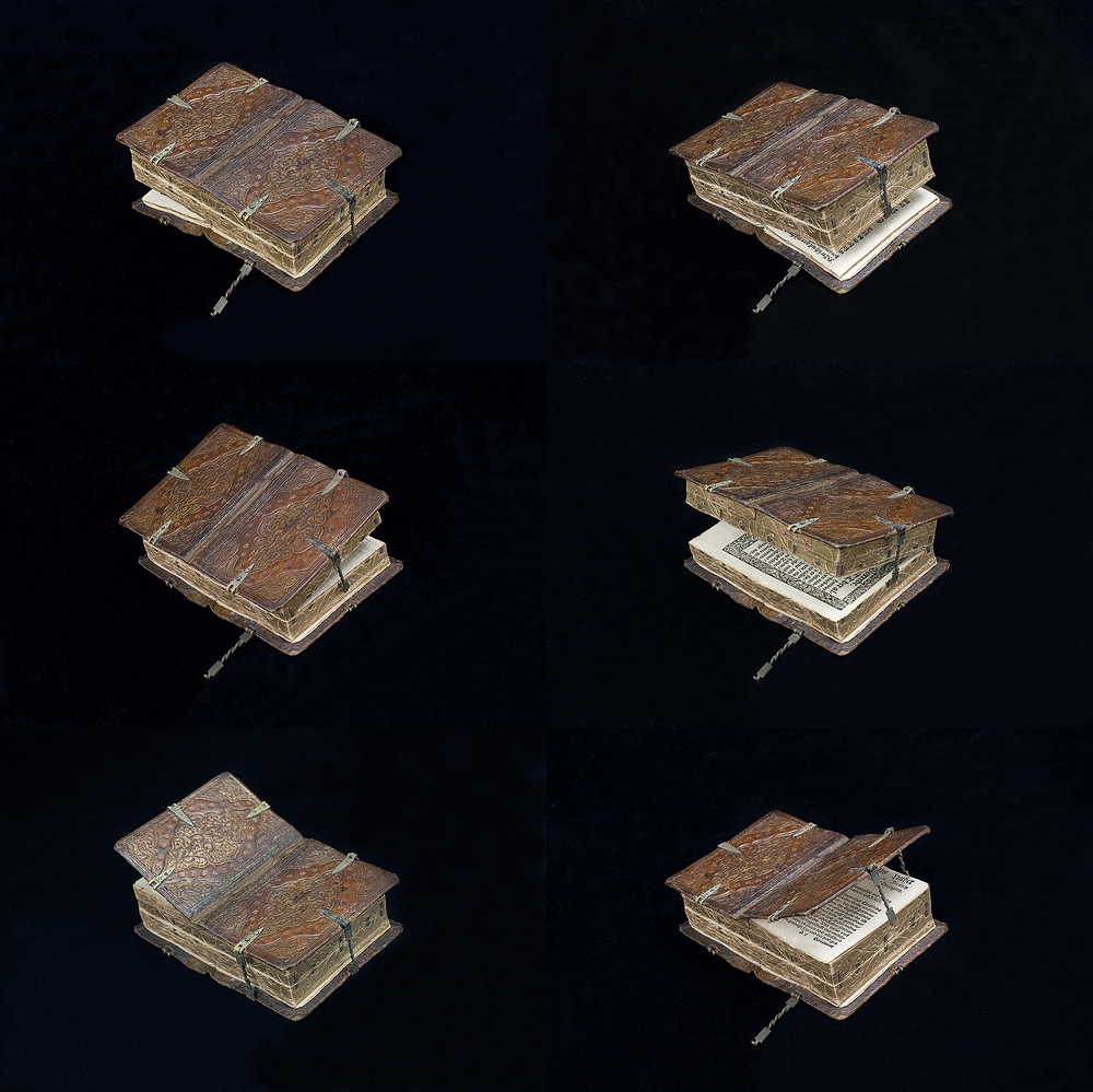
Not long thereafter, Kwakkel posted an artifact that blows the dos-à-dos out of the water: a 16th-century book that contains no fewer than six different books in a single binding. “They are all devotional texts printed in Germany during the 1550s and 1570s (including Martin Luther, Der kleine Catechismus) and each one is closed with its own tiny clasp,” he writes.
“While it may have been difficult to keep track of a particular text’s location, a book you can open in six different ways is quite the display of craftsmanship.” You can admire it — and try to figure it out — from a variety of different angles at the Flickr account of the National Library of Sweden, where it currently resides in the archives of the Royal Library.
Four or five centuries ago, a book like this would no doubt have impressed its beholders as much as or even more than the most advanced piece of handheld consumer electronics impresses us today. But when the internet discovered Kwakkel’s post, it became clear that this six-in-one devotional captivates us in much the same way as a brand-new, never-before-seen digital device. “With a literacy rate hovering around an estimated 5 to 10 percent of the population during the Middle Ages, only a select few of society’s upper echelons and religious castes had use for books,” Andrew Tarantola reminds us. “So who would have use for a sextuplet of stories bound by a single, multi-hinged cover like this? Some seriously busy scholar.” And he writes that not on a site for enthusiasts of old books, Medieval history, or religious scholarship, but at the temple of tech worship known as Gizmodo.
Based in Seoul, Colin Marshall writes and broadcasts on cities, language, and culture. His projects include the book The Stateless City: a Walk through 21st-Century Los Angeles and the video series The City in Cinema. Follow him on Twitter at @colinmarshall or on Facebook.
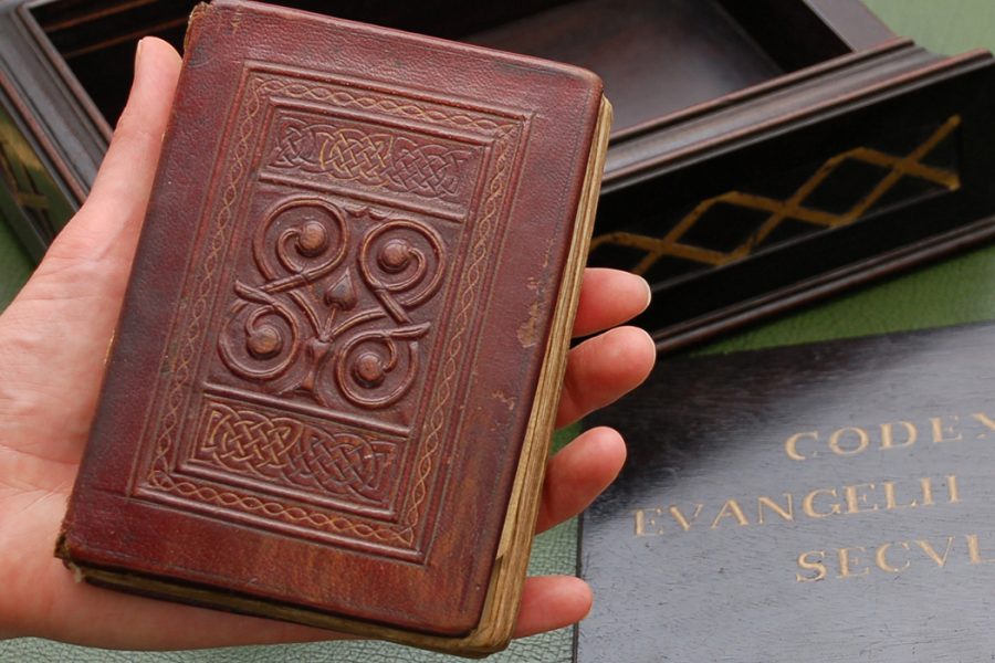
If you’re a British history buff, next month is an ideal time to be in London for the British Library’s “once-in-a-generation exhibition” Anglo-Saxon Kingdoms: Art, Word, War, opening October 19th and featuring the illuminated Lindisfarne Gospels, Beowulf, Bede’s Ecclesiastical History, the “world-famous” Domesday Book, and Codex Amiatinus, a “giant Northumbrian Bible taken to Italy in 716” and returning to England for the first time in 1300 years. But with all of these manuscript stars stealing the show, one special exhibit might go overlooked, the St. Cuthbert Gospel, the oldest surviving intact European book.
A Latin copy of the Gospel of John, the book was originally called the Stonyhurst Gospel, after its first owner, Stonyhurst College. It acquired its current name because it was found inside the coffin of St. Cuthbert, a hermit monk who died in 687 and whose remains, legend has it, were incorruptible. This supposed miracle inspired a cult that placed offerings around Cuthbert’s tomb. Just when and how the small book made its way into his coffin remains a mystery. It was likely sometime between the 700s and 800s CE, when his body was moved to Durham due to Viking raids.
When Cuthbert’s casket was opened in 1104, the book was found “in miraculously perfect condition,” writes the British Library, inside “a satchel-like container of red leather with a badly-frayed sling made of silken threads.” Scholars have dated the book’s creation to between 700 and 730, and its interest for academics and lay people alike lies not only in the legend of St. Cuthbert but in the book’s physical qualities and its own uncorrupted nature. As Allison Meier writes at JSTOR Daily, “the 1,300-year-old manuscript retains its original pages and binding,” a remarkable fact for a book of its age.
Its condition makes it an “important example of Insular art, which was created on the British Isles and Ireland between 600 and 900 CE.” The general features of this style involve “the layering of pattern, line, and color on seemingly flat surfaces,” notes Oxford Bibliographies, in order to create “complex spatial patterns.” Scholar Robert D. Stevick describes these properties on the ornate dyed leather covers of the St. Cuthbert Gospel:
There is interlace pattern in two panels on the front cover, step-pattern implying two crosses on the lower cover, a prominent double vine scroll at the center of the front cover—elements of this early art that have been well catalogued for their individual features as well as for their affinities to similar decorative elements in other artifacts.
Bound with a sewing technique that originated in North Africa (and therefore often called “Coptic sewing”), the “simple but elegant” book, Meier explains, “reflects the transmission of publishing knowledge across Europe” from the Mediterranean. Its small size and placement in a leather pouch is also significant. St. John’s Gospel “was sometimes employed as a protective talisman,” worn in a pouch on the body to ward off evil. Why one of Cuthbert’s admirers would have given such a talisman to his corpse remains unclear.
If you can’t make it to the British Library to see this fascinating artifact in person, you can see its miraculously well-preserved binding and pages in scans at the British Library site here.
We're hoping to rely on loyal readers, rather than erratic ads. Please click the Donate button and support Open Culture. You can use Paypal, Venmo, Patreon, even Crypto! We thank you!
Open Culture scours the web for the best educational media. We find the free courses and audio books you need, the language lessons & educational videos you want, and plenty of enlightenment in between.