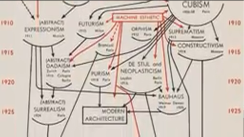
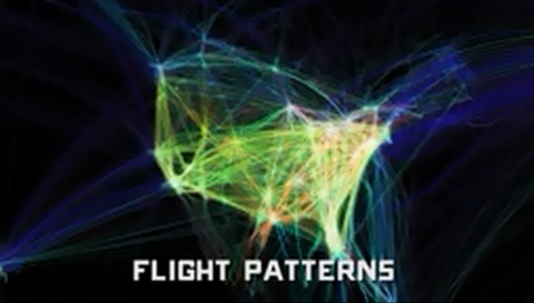
The History of Typography Told in Five Animated Minutes

Caslon, Baskerville, Hel­veti­ca… these names have graced many a pull down menu, but what do they sig­ni­fy, exact­ly?

Graph­ic design­er Ben Bar­rett-For­rest spent 140 hours ani­mat­ing the 291 paper let­ters on dis­play in the His­to­ry of Typog­ra­phy, an intro­duc­tion to the ways in which lan­guage has been expressed visu­al­ly over time.

From Guten­berg’s inky, monk-inspired Black­lis­ter font to the ever-con­tro­ver­sial Com­ic Sans, Bar­rett-For­rest employs stop motion to spell out the quan­tifi­able rea­sons that cer­tain ser­ifs and stroke types are easy on the eye. Let’s not tell the cre­ators of Lla­ma Font or Mr. Twig­gy, but leg­i­bil­i­ty is the moth­er of sur­vival in this are­na.

If you would like to sign up for Open Culture’s free email newslet­ter, please find it here. It’s a great way to see our new posts, all bun­dled in one email, each day.

If you would like to sup­port the mis­sion of Open Cul­ture, con­sid­er mak­ing a dona­tion to our site. It’s hard to rely 100% on ads, and your con­tri­bu­tions will help us con­tin­ue pro­vid­ing the best free cul­tur­al and edu­ca­tion­al mate­ri­als to learn­ers every­where. You can con­tribute through Pay­Pal, Patre­on, and Ven­mo (@openculture). Thanks!

Relat­ed Con­tent:

Font Based on Sig­mund Freud’s Hand­writ­ing Com­ing Cour­tesy of Suc­cess­ful Kick­starter Cam­paign

A Short Ani­mat­ed His­to­ry of the GIF

Ayun Hal­l­i­day has devot­ed the last 15 years to  pro­duc­ing The East Vil­lage Inky, an entire­ly hand­writ­ten zine whose aging read­ers com­plain that they can no long make out the tiny print.

A Short Animated History of the GIF

In 1987, Com­puserve begat­teth Image For­mat 87A.

Image For­mat 87A begat­teth Graph­ics Inter­change For­mat or GIF (rhymes with a cer­tain brand of peanut but­ter, the video his­to­ry above help­ful­ly points out).

The pro­lif­er­a­tions of free online GIF gen­er­a­tors begat­teth the count­less annoy­ing, smarmy, bone­head­ed ani­mat­ed loops you’ve seen junk­ing up emails, pro­file pic­tures, and MySpace pages.

Of course, some of them are also pret­ty cool, which is why they’re being cel­e­brat­ed with a fes­ti­val at the Brook­lyn Acad­e­my of Music. No tick­ets nec­es­sary. Mov­ing the Still: A GIF Fes­ti­val will be screen­ing through June on the out­door elec­tron­ic bill­board meant to pro­mote upcom­ing and cur­rent attrac­tions. Con­ceiv­ably, view­ers with wheels and time to spare could take it in on an end­less loop of their own, by cir­cling up Flat­bush to Lafayette, then mov­ing up when the light changes, bat­tling traf­fic from the near­by Bar­clays Cen­ter on the return leg.

What do we stand to see in this fes­ti­val? The video his­to­ry leads us to believe that any­thing is pos­si­ble, though cer­tain things—accidental hap­pen­ings, laser cats, col­or­ful barf­ing (…wait, col­or­ful barfing?)—have a built in appeal.

Relat­ed Con­tent:

A Gallery of Stan­ley Kubrick Cin­ema­graphs: Icon­ic Moments Briefly Ani­mat­ed

Kids (and Less Savvy Mar­keters) Imag­ine the Inter­net in 1995

Ayun Hal­l­i­day grav­i­tates toward the paper GIFs known as flip books. Fol­low her @AyunHalliday

The Making of John Mayer’s ‘Born & Raised’ Album Artwork, Captured in 18 Minute Short Film

This eigh­teen minute doc­u­men­tary takes you inside the work of David A. Smith, an Eng­lish artist who spe­cial­izes in “high-qual­i­ty orna­men­tal hand-craft­ed reverse glass signs and dec­o­ra­tive sil­vered and gild­ed mir­rors.” (Got that? You may want to read that last part again.) In some­thing of a depar­ture from ear­li­er projects, Smith designed an ornate “turn-of-the-cen­tu­ry, trade-card styled album cov­er” for John May­er’s album Born & Raised. His work is metic­u­lous and exact­ing. And this “Behind The Scenes” film, com­plete with com­men­tary from May­er and Smith, cap­tures the artist’s process in lov­ing detail. Now please sit back and enjoy.

Find us on Face­bookTwit­ter and Google Plus and we’ll make it easy to share intel­li­gent media with your friends!  

by | Permalink | Make a Comment ( 1 ) |

Visit the Museum of Endangered Sounds, and Experience a Blast from Technology’s Past

As gear­heads go, Bren­dan Chil­cut­t’s a pret­ty sen­ti­men­tal guy, and not just because he signs his cor­re­spon­dence with “love.” In Jan­u­ary, 2012, he found­ed the Muse­um of Endan­gered Sounds to keep out­mod­ed tech­nol­o­gy’s most icon­ic nois­es from van­ish­ing from the col­lec­tive mem­o­ry. Click on any image in the muse­um’s online col­lec­tion to be trans­port­ed in the Prous­t­ian sense.

Some of the exhibits—a man­u­al type­writer, a rotary phone—were already amply pre­served, thanks to a pro­lif­er­a­tion of cin­e­mat­ic appear­ances in their hey­day.

Oth­ers might well have slipped away unno­ticed, if not for Chil­cut­t’s cura­to­r­i­al efforts. Remem­ber that num­ber you could call to have a record­ed voice inform you of the cor­rect time? How about the sta­t­ic of an ana­log TV tuned to an emp­ty sta­tion? The hum of a mal­func­tion­ing Dis­c­man, the chirp of a Tamagotchi…wait, what’s that I hear? The dis­con­cert­ing whoosh of time speed­ing up?

Drown it out by acti­vat­ing all thir­ty exhibits at once. Let them sound their bar­bar­ic yaw­ps simul­ta­ne­ous­ly as the kids try to fig­ure out what that rack­et is.

h/t goes to @sheerly

Relat­ed Con­tent:

“Glitch” Artists Com­pose with Soft­ware Crash­es and Cor­rupt­ed Files

40 Great Film­mak­ers Go Old School, Shoot Short Films with 100 Year Old Cam­era

How Film Was Made: A Kodak Nos­tal­gia Moment

Ayun Hal­l­i­day is still try­ing to text on a cell phone from 2003

Discover J.R.R. Tolkien’s Personal Book Cover Designs for The Lord of the Rings Trilogy

The Fellowship Of The Ring Book Cover by JRR Tolkien_1-480

In some rare cas­es, adap­ta­tions and inter­pre­ta­tions of a lit­er­ary work can sur­pass the source. Despite hun­dreds of valiant efforts on the part of fans, film­mak­ers, game/toy design­ers, and radio pro­duc­ers, this has nev­er been true of the ful­ly-real­ized fan­ta­sy world in J.R.R. Tolkien’s The Hob­bit and The Lord of the Rings tril­o­gy. (not that it’s ever been anyone’s intent). As we not­ed in a post last week, Tolkien’s fic­tion­al world is so intri­cate, its sources so vast and var­ied, that Corey Olsen, “The Tolkien Pro­fes­sor,” has made it his entire life’s work to open that world up to stu­dents and curi­ous read­ers, most recent­ly with his eight-part lec­ture series on The Hob­bit.

The Two Towers Book Cover by JRR Tolkien_1-480

One might also add illus­tra­tors to the list of Tolkien inter­preters above who have—in the almost eighty years since The Hobbit’s pub­li­ca­tion and six­ty years since the first appear­ance of The Lord of the Rings trilogy—done their best to visu­al­ize Tolkien’s world. But per­haps no one did so bet­ter than the mas­ter him­self. Long known as a visu­al artist as well as a lit­er­ary one, Tolkien left behind over 100 illus­tra­tions for The Hob­bit, one of which adorns 2011’s Harper­Collins 75th anniver­sary edi­tion of the book. He also cre­at­ed these orig­i­nal cov­er designs for each book in The Lord of the Rings tril­o­gy.

The Return Of The King Book Cover by JRR Tolkien_1-480

ring-eye-device

In the long and com­plex pub­li­ca­tion his­to­ry of Tolkien’s most famous of works, it’s unclear if these designs ever made it onto books pub­lished dur­ing his life­time, but the sig­il in the cen­ter of The Fel­low­ship of the Ring design (left), with its omi­nous eye of Sauron sur­round­ed by elvish runes and topped by the one ring, did grace the ele­gant, min­i­mal­ist cov­ers of the first edi­tion of the tril­o­gy. Tolkien’s art­work received a thor­ough treat­ment in a 1995 mono­graph J.R.R. Tolkien Artist & Illus­tra­tor, which cov­ers over 60 years of Tolkien’s life as an artist, and the mag­ic of flickr brings us this com­pendi­um of Tolkien illus­tra­tions.

Relat­ed Con­tent: 

Lis­ten to J.R.R. Tolkien Read Poems from The Fel­low­ship of the Ring, in Elvish and Eng­lish (1952)

The Art of the Book Cov­er Explained at TED

Vladimir Nabokov Mar­vels Over Dif­fer­ent “Loli­ta” Book Cov­ers

Jack Kerouac’s Hand-Drawn Cov­er for On the Road

Josh Jones is a writer, edi­tor, and musi­cian based in Wash­ing­ton, DC. Fol­low him @jdmagness

Walter Cronkite Imagines the Home of the 21st Century … Back in 1967

Liv­ing room, 2001:

In 1967, exec­u­tives at CBS tele­vi­sion made a bold move and changed the net­work’s long-run­ning doc­u­men­tary series, The 20th Cen­tu­ry, from a pro­gram look­ing back at the past to one look­ing ahead to the future. The 21st Cen­tu­ry, as it was renamed, was host­ed by Wal­ter Cronkite and ran for three sea­sons. In one of the ear­ly episodes, “At Home, 2001,” which aired on March 12, 1967, Cronkite cites a gov­ern­ment report pre­dict­ing that by the year 2000, tech­nol­o­gy will have low­ered the aver­age Amer­i­can work week to 30 hours, with a one-month vaca­tion. What will peo­ple do with all that free time? In the scene above, Cronkite makes a fair­ly accu­rate pre­dic­tion of today’s state-of-the-art home enter­tain­ment sys­tems. Although the knobs and dials look a bit archa­ic, the basic prin­ci­ple is there. But what­ev­er hap­pened to that 30-hour work week?

Home office, 2001:

“Now this is where a man might spend most of his time in the 21st cen­tu­ry,” says Cronkite as he walks into the home office of the future, above. “This equip­ment will allow him to car­ry on nor­mal busi­ness activ­i­ties with­out ever going to an office away from home.”

In envi­sion­ing the office of the future as a mas­cu­line domain, Cronkite makes the same mis­take as Stan­ley Kubrick and Arthur C. Clarke of imag­in­ing tech­no­log­i­cal change with­out social change. (Remem­ber the moon shut­tle stew­ardess in 2001: A Space Odyssey?) But he oth­er­wise offers a fair­ly pre­scient vision of some of the home com­put­ing, Inter­net and telecom­mu­ni­ca­tions advances that have indeed come to pass.

Kitchen, 2001:

Cronkite’s pow­ers of pre­dic­tion fail him when he reach­es the Rube Gold­ber­gian “kitchen of 2001,” which mis­takes gra­tu­itous automa­tion for con­ve­nience. As one YouTube com­men­ta­tor said of the clip above, the only thing that resem­bles the kitchen of today is the microwave oven–and microwaves already exist­ed in 1967.

But “At Home, 2001,” is much more thought-pro­vok­ing than a few “gee whiz” pre­dic­tions about the gad­gets of the future. Cronkite inter­views the archi­tect Philip John­son and oth­er lead­ing design­ers of his day for a deep­er dis­cus­sion about the ten­sion that exists between our deep-seat­ed, basi­cal­ly agrar­i­an expec­ta­tions for a home and the real­i­ties of urban con­ges­tion and sub­ur­ban sprawl. You can watch the com­plete 25-minute pro­gram at A/V Geeks. And to read more about it, see Matt Novak’s piece at Pale­o­Fu­ture. “Can we find a com­pro­mise between our increas­ing­ly urban way of liv­ing and the pride and pri­va­cy of the indi­vid­ual home?” asks Cronkite at the end of the pro­gram. “It will take deci­sions that go beyond tech­nol­o­gy, deci­sions about the qual­i­ty of the life we want to lead, to answer the ques­tion ‘How will we live in the 21st cen­tu­ry?’ ”

via Kot­tke

Relat­ed Con­tent:

Arthur C. Clarke Pre­dicts the Future in 1964 … And Kind of Nails It

The Inter­net Imag­ined in 1969

Mar­shall McLuhan: The World is a Glob­al Vil­lage

1930s Fash­ion Design­ers Imag­ine How Peo­ple Would Dress in the Year 2000

The Tiny Transforming Apartment: 8 Rooms in 420 Square Feet

Wel­come to the New York city apart­ment of Gra­ham Hill, a Cana­di­an-born archi­tect com­mit­ted to bring­ing sus­tain­abil­i­ty into the main­stream. His apart­ment does more with less. It has a foot­print of only 420 square feet. Yet it’s ele­gant­ly-designed and com­plete­ly func­tion­al. What ini­tial­ly looks like a sim­ple stu­dio unfolds into much more, a Soho apart­ment that fea­tures no less than eight rooms — a bed­room, guest room, kitchen, office and the rest. We’ll let Gra­ham, the founder of treehugger.com, take you on the grand tour, and we’ll leave you to won­der what a design­er could do with this Parisian apart­ment mea­sur­ing only 17 square feet.…

H/T Jason G. via Giz­mo­do

Fol­low us on Face­bookTwit­ter and Google Plus and share intel­li­gent media with your friends! They’ll thank you for it.

by | Permalink | Make a Comment ( 7 ) |

The ABC of Architects: An Animated Flipbook of Famous Architects and Their Best-Known Buildings

As a new-ish par­ent, I’ve been inun­dat­ed with alpha­bet books from well-mean­ing friends and fam­i­ly, and I am most grate­ful for them all. But I’m espe­cial­ly glad for a set that uses images from the Met­ro­pol­i­tan Muse­um of Art to illus­trate each let­ter. My daugh­ter gets lost in the paint­ings, prints, etch­ings, etc., and you know what? So do I. It’s that rare meet­ing of adult high art and kid for­mat­ting that keeps us both engaged.

The above video, while not strict­ly for chil­dren, could cer­tain­ly work as well. A con­cept of the Argen­tine group Ombu Archi­tec­ture and graph­ic design­er Fed­eri­co Gon­za­lez, “The ABC of Archi­tects” is a vin­tage flip­book trib­ute to the last 100 years or so in inter­na­tion­al archi­tec­ture, set to a jaun­ty, gold­en-age-of-radio score by Eugene C. Rose and George Ruble (which you can down­load for free here).

With the kind of quaint globe-hop­ping (but with­out the passé racism) of a Tintin com­ic, “The ABC of Archi­tects” skips through its list of twen­ty-six revered names from almost as many countries–from Fin­ish Alvar Aal­to to Iraqi-British Zaha Hadid. There are many names I don’t know and many famil­iar favorites. I can imag­ine this appeal­ing to preschool­ers or seri­ous stu­dents, and for some of the same rea­sons. While the cre­ators express grief at hav­ing to leave out so many artists, “The ABC of Archi­tects” is noth­ing less than joy­ous and inspir­ing.

via Dooby­Brain

h/t Jim­my Askew

Relat­ed Con­tent

The His­to­ry of West­ern Archi­tec­ture: From Ancient Greece to Roco­co (A Free Online Course)

Ice Cube & Charles Eames Rev­el in L.A. Archi­tec­ture

Archi­tec­ture in Motion

Josh Jones is a writer, musi­cian, and muse­um-hop­ping father.

« Go BackMore in this category... »
Quantcast