Long ago, we showed you some startling footage of an elderly, arthritic Pierre-Auguste Renoir, painting with horribly deformed hands. Today we offer a more idyllic image of a French Impressionist painter in his golden years: Claude Monet on a sunny day in his beautiful garden at Giverny.
Once again, the footage was produced by Sacha Guitry for his project Ceux de Chez Nous, or “Those of Our Land.” It was shot in the summer of 1915, when Monet was 74 years old. It was not the best time in Monet’s life. His second wife and eldest son had both died in the previous few years, and his eyesight was getting progressively worse due to cataracts. But despite the emotional and physical setbacks, Monet would soon rebound, making the last decade of his life (he died in 1926 at the age of 86) an extremely productive period in which he painted many of his most famous studies of water lilies.
At the beginning of the film clip we see Guitry and Monet talking with each other. Then Monet paints on a large canvas beside a lily pond. It’s a shame the camera doesn’t show the painting Monet is working on, but it’s fascinating to see the great artist all clad in white, a cigarette dangling from his lips, painting in his lovely garden.
If you would like to support the mission of Open Culture, consider making a donation to our site. It’s hard to rely 100% on ads, and your contributions will help us continue providing the best free cultural and educational materials to learners everywhere. You can contribute through PayPal, Patreon, and Venmo (@openculture). Thanks!
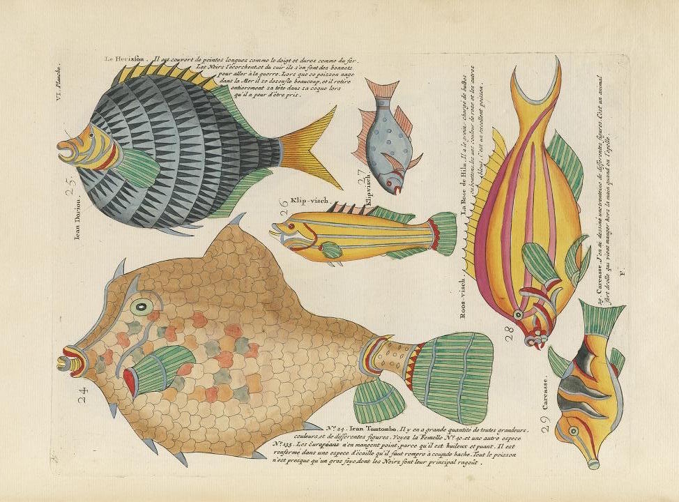
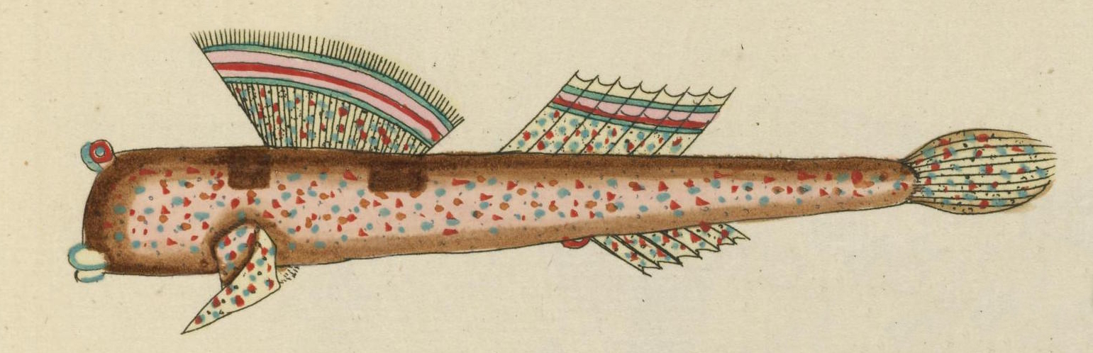
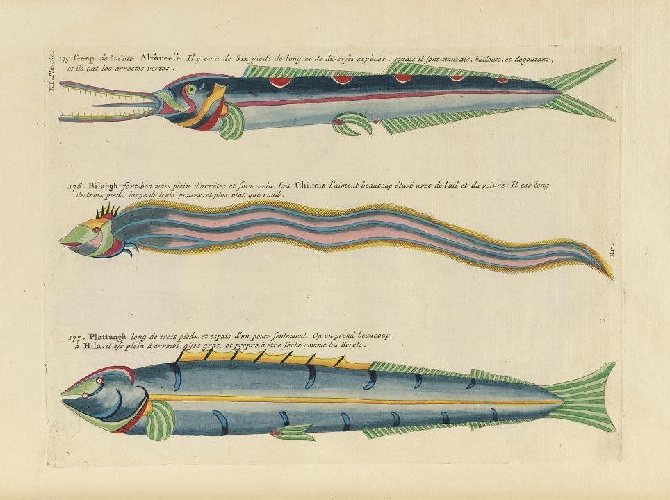
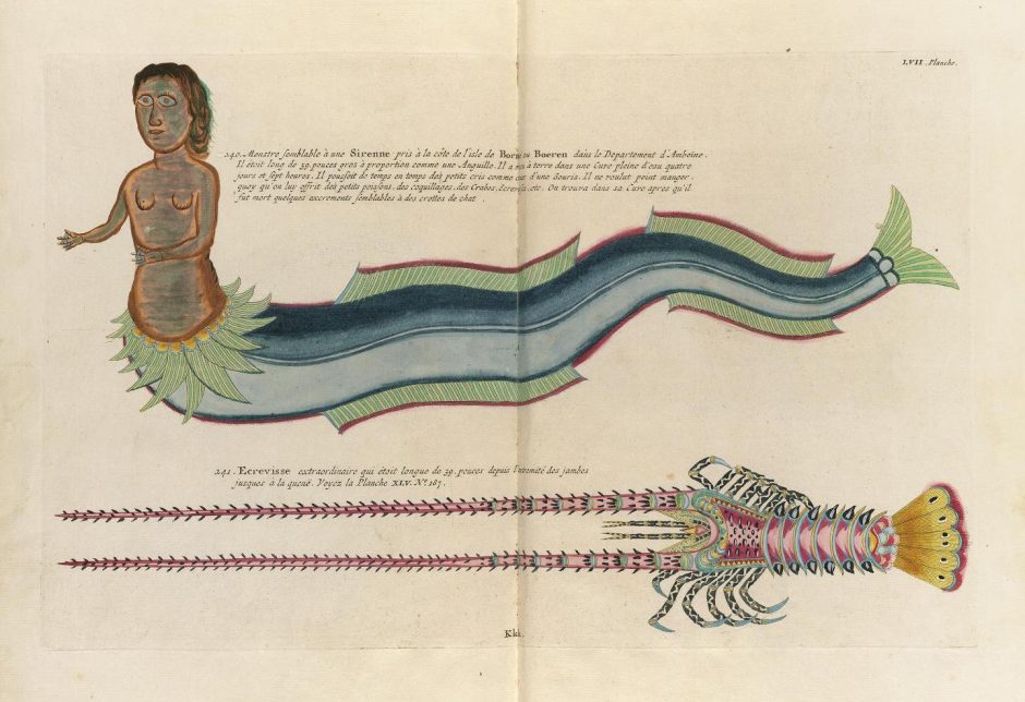
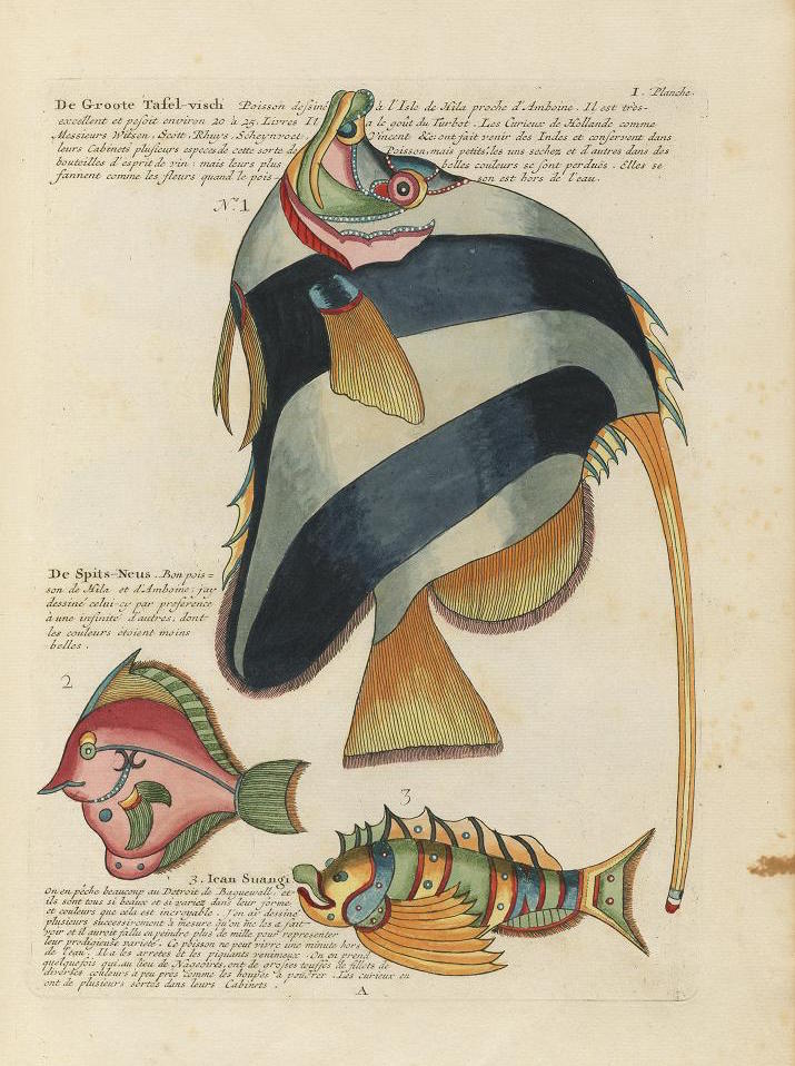
Whether in the tanks into which we gaze at the aquarium or the CGI-intensive wildlife-based gagfests at which we gaze in the theater, most of us in the 21st century have seen more than a few funny fish. Eighteenth-century Europeans couldn’t have said the same. The great majority passed their entire lives without so much as a glance at the form of even one live exotic creature of the deep, and most of those who have a sense of what such a sight looked like probably got it from an illustration. But even so, some of the illustrated fish of the day must have proven unforgettable, especially the ones in Louis Renard’s Poissons, Ecrevisses et Crabes.
First published in 1719 with a second edition, seen here, in 1754, Renard’s book, whose full title translates to Fishes, Crayfishes, and Crabs, of Diverse Colors and Extraordinary Form, that Are Found Around the Islands of the Moluccas and on the Coasts of the Southern Lands, showed its readers, in full color for the very first time, creatures the likes of which they’d never have had occasion even to imagine. The book’s 460 hand-colored copper engravings depict, according to the Glasgow University Library, “415 fishes, 41 crustaceans, two stick insects, a dugong and a mermaid.”
The specimens in the first part of the book tend toward the realistic, while those of the second “verge on the surreal,” many of which “bear no similarity to any living creatures,” some of which bear “small human faces, suns, moons and stars” on their flanks and carapaces, most possessed of colors “applied in a rather arbitrary fashion,” though brilliantly so. In the short accompanying texts, “several of the fish” — presumably not the mermaid — “are assessed in terms of their edibility and are accompanied by brief recipes.”
Renard himself, who lived from 1678 to 1746, seems to have had a career as colorful as the fish in his book. “As well as spending some seventeen years as a publisher and bookdealer,” he also “sold medicines, brokered English bonds and, more intriguingly, acted as a spy for the British Crown, being employed by Queen Anne, George I and George II.” Far from keeping that part of his life a secret, “Renard used his status as an ‘agent’ to help advertise his books. This particular work is actually dedicated to George I while the title-page describes the publisher as ‘Louis Renard, Agent de Sa Majesté Britannique.’ ”
You can behold more of Poissons, Ecrevisses et Crabesat the Public Domain Review. “If the illustrations are breathtaking to us now, with all the hours of David Attenborough documentaries under our belts,” they write, “one can only imagine the impact this would have had on a European audience of the eighteenth century, to which the exotic ocean life of the East would have been virtually unknown.”
Though received as a respectable scientific work in its day — and even, as the Glasgow University Library puts it, “a product of the Enlightenment” — the book now stands as an enchanting tribute to the combination of a little knowledge and a lot of human imagination.
Based in Seoul, Colin Marshall writes and broadcasts on cities and culture. His projects include the book The Stateless City: a Walk through 21st-Century Los Angeles and the video series The City in Cinema. Follow him on Twitter at @colinmarshall or on Facebook.
As the standout example of the “Renaissance Man” ideal, Leonardo da Vinci racked up no small number of accomplishments in his life. He also had his eccentricities, and tried his hand at a number of experiments that might look a bit odd even to his admirers today. In the case of one practice he eventually mastered and with which he stuck, he tried his hand in a more literal sense than usual: Leonardo, the evidence clearly shows, had a habit of writing backwards, starting at the right side of the page and moving to the left.
“Only when he was writing something intended for other people did he write in the normal direction,” says the Museum of Science. Why did he write backwards? That remains one of the host of so far unanswerable questions about Leonardo’s remarkable life, but “one idea is that it may have kept his hands clean. People who were contemporaries of Leonardo left records that they saw him write and paint left handed. He also made sketches showing his own left hand at work. As a lefty, this mirrored writing style would have prevented him from smudging his ink as he wrote.”
Or Leonardo could have developed his “mirror writing” out of fear, a hypothesis acknowledged even by books for young readers: “Throughout his life, he was worried about the possibility of others stealing his ideas,” writes Rachel A. Koestler-Grack in Leonardo Da Vinci: Artist, Inventor, and Renaissance Man. “The observations in his notebooks were written in such a way that they could be read only by holding the books up to a mirror.” The blog Walker’s Chaptersmakes a representative counterargument: “Do you really think that a man as clever as Leonardo thought it was a good way to prevent people from reading his notes? This man, this genius, if he truly wanted to make his notes readable only to himself, he would’ve invented an entirely new language for this purpose. We’re talking about a dude who conceptualized parachutes even before helicopters were a thing.”
Perhaps the most widely seen piece of Leonardo’s mirror writing is his notes on Vitruvian Man(a piece of which appears at the top of the post), his enormously famous drawing that fits the proportions of the human body into the geometry of both a circle and a square (and whose elegant mathematics we featured last week). Many examples of mirror writing exist after Leonardo, from his countryman Matteo Zaccolini’s 17th-century treatise on color to the 18th- and 19th-century calligraphy of the Ottoman Empire to the front of ambulances today. Each of those has its function, but one wonders whether as curious a mind as Leonardo’s would want to write backwards simply for the joy of mastering and using a skill, any skill, however much it might baffle others — or indeed, because it might baffle them.
If you’re interested in all things da Vinci, make sure you check out the new bestselling biography, Leonardo da Vinci, by Walter Isaacson.
Based in Seoul, Colin Marshall writes and broadcasts on cities and culture. His projects include the book The Stateless City: a Walk through 21st-Century Los Angeles and the video series The City in Cinema. Follow him on Twitter at @colinmarshall or on Facebook.
How much special treatment should we give children, and how much should we regard them as small adults? The answer to that question varies not just between but within time periods and societies. The attitude in the 21st-century west can, at times, seem to have erred toward a patronizing overprotectiveness, but history has shown that if the social pendulum swings one way, it’ll probably swing the other in due time. We certainly find ourselves far from the view of children taken in medieval Europe, of which we catch a glimpse whenever we behold the babies in its paintings — babies that invariably, according to a Voxpiece by Phil Edwards, “look like ugly old men.”
“Medieval portraits of children were usually commissioned by churches,” writes Edwards, “and that made the range of subjects limited to Jesus and a few other biblical babies. Medieval concepts of Jesus were deeply influenced by the homunculus, which literally means little man.” It also goes along with a strangeness prevalent in medieval art which, according to Creighton University art historian Matthew Averett, “stems from a lack of interest in naturalism” and a reliance on “expressionistic conventions.” These conditions changed, as did much else, with the Renaissance: “a transformation of the idea of children was underway: from tiny adults to uniquely innocent creatures” with the cuteness to match.
You can witness a veritable parade of oddly manlike medieval babies in the short video at the top of the post. “After the Renaissance, cherubs didn’t seem out of place, and neither did cuter pictures of baby Jesus,” says Edwards, narrating. “It’s kind of stayed that way since. We want babies who look like they need their cheeks pinched, not their prostates checked. We want them chubby and cute, and we want babies that fit our ideals” — ideals that have led from pudgy angels to the Gerber Baby to the collected work of Anne Geddes. We probably need not fear an aesthetic return to the middle-aged, homuncular babies of yore, but their frowny expressions have certainly made a comeback in real life: just look at any 21st-century infant immersed in an iPad.
Based in Seoul, Colin Marshall writes and broadcasts on cities and culture. His projects include the book The Stateless City: a Walk through 21st-Century Los Angeles and the video series The City in Cinema. Follow him on Twitter at @colinmarshall or on Facebook.
Hues which have words, and speak to ye of heaven,
Floats o’er this vast and wondrous monument,
And shadows forth its glory.
—Lord Byron, Childe Harold’s Pilgrimage (1818)
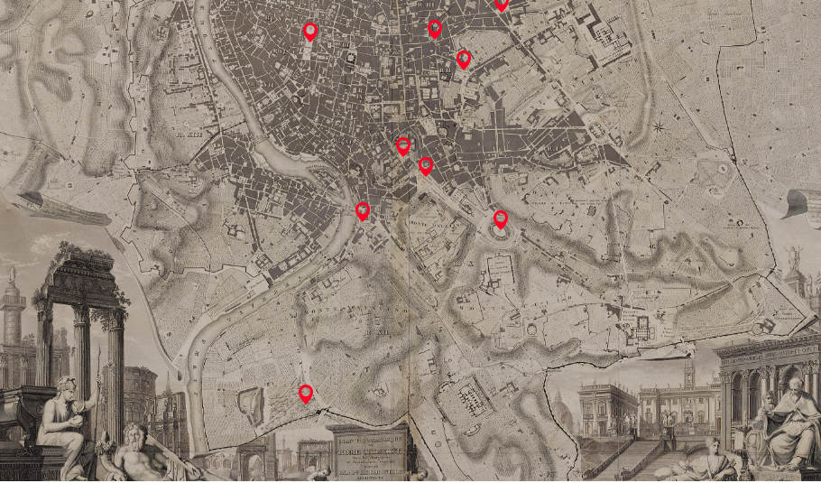
A modern visitor to Rome, drawn to the Coliseum on a moonlit night, is unlikely to be so bewitched, sandwiched between his or her fellow tourists and an army of vendors aggressively peddling light-up whirligigs, knock off designer scarves, and acrylic columns etched with the Eternal City’s must-see attractions.
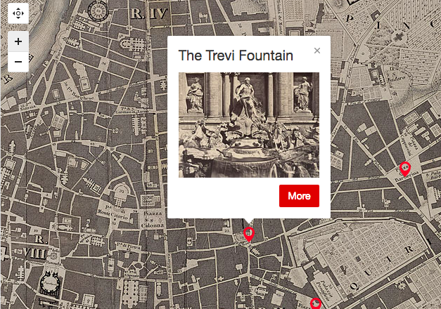
These days, your best bet for touring Rome’s best known landmarks in peace may be an interactive map, compliments of the Morgan Library and Museum. Based on Paul-Marie Letarouilly’s picturesque 1841 city plan, each digital pin can be expanded to reveal descriptions by nineteenth-century authors and side-by-side, then-and-now comparisons of the featured monuments.
The enduring popularity of the film Three Coins in the Fountain, coupled with the invention of the selfie stick has turned the area around the Trevi Fountain into a pickpocket’s dream and a claustrophobe’s worst nightmare.
Not so in Nathaniel Hawthorne’s day, though unlike Lord Byron, he cultivated a cool remove, at least at first:
They and the rest of the party descended some steps to the water’s brim, and, after a sip or two, stood gazing at the absurd design of the fountain, where some sculptor of Bernini’s school had gone absolutely mad in marble. It was a great palace-front, with niches and many bas-reliefs, out of which looked Agrippa’s legendary virgin, and several of the allegoric sisterhood; while, at the base, appeared Neptune, with his floundering steeds and Tritons blowing their horns about him, and twenty other artificial fantasies, which the calm moonlight soothed into better taste than was native to them. And, after all, it was as magnificent a piece of work as ever human skill contrived. At the foot of the palatial façade was strown, with careful art and ordered irregularity, a broad and broken heap of massive rock, looking as if it might have lain there since the deluge. Over a central precipice fell the water, in a semicircular cascade; and from a hundred crevices, on all sides, snowy jets gushed up, and streams spouted out of the mouths and nostrils of stone monsters, and fell in glistening drops; while other rivulets, that had run wild, came leaping from one rude step to another, over stones that were mossy, slimy, and green with sedge, because in a century of their wild play, Nature had adopted the Fountain of Trevi, with all its elaborate devices, for her own.
The human statues garbed as gladiators and charioteers spend hours in the blazing sun at the foot of the Spanish Steps—the heirs to the artists and models who populated William Wetmore Story’s Roba di Roma:
All day long, these steps are flooded with sunshine in which, stretched at length, or gathered in picturesque groups, models of every age and both sexes bask away the hours when they are free from employment in the studios. … Sometimes a group of artists, passing by, will pause and steadily examine one of these models, turn him about, pose him, point out his defects and excellences, give him a baiocco, and pass on. It is, in fact, a models’ exchange.
The Medici Villa houses the Académie de France, and its gardens remain a pleasant respite, even in 2017. Visitors who aren’t wholly consumed with finding a wifi signal may find themselves fantasizing about a different life, much as Henry James did in his Italian Hours:
Such a dim light as of a fabled, haunted place, such a soft suffusion of tender grey-green tones, such a company of gnarled and twisted little miniature trunks—dwarfs playing with each other at being giants—and such a shower of golden sparkles drifting in from the vivid West! … I should name for my own first wish that one didn’t have to be a Frenchman to come and live and dream and work at the Académie de France. Can there be for a while a happier destiny than that of a young artist conscious of talent and of no errand but to educate, polish and perfect it, transplanted to these sacred shades?…What mornings and afternoons one might spend there, brush in hand, unpreoccupied, untormented, pensioned, satisfied—either persuading one’s self that one would be “doing something” in consequence or not caring if one shouldn’t be.
Every week, five million people in the United Kingdom alone tune in to the BBC’s Fake or Fortune?, a television show about the provenance and attribution of notable works of art. That may well say something about the British character, but it says even more about its host and co-creator, art dealer Philip Mould. Involved with antiques from a very early age, he displays in Fake or Fortune? and his other media projects a keen sense of not just how a piece of art appeals to us, but what hidden potential it carries within. Take, for instance, the grimy 17th-century portrait you can see partially restored in the clip above, which he posted on Twitter this week.
At first glance, the painting might not look that much worse for wear than anything else from the Jacobean era, but even the first few minutes of work reveal the true brilliance of the colors hidden underneath what turn out to be layers of brown and yellow. They’ve actually built up in the name of preservation: over about 200 years, a few (or more than a few) coats of varnish had been applied to the canvas in order to protect it, but that varnish turns color over time. Luckily, with the right tools and the right technique, it comes off.
“The painting was originally ina private collection in England,” Mould told the Telegraph. “A mixture of gel and solvent was created, specifically just to remove the varnish and not to damage the underlying paint.” Certainly the portrait’s subject would approve of her appearance’s return to its former splendor, though little information remains as to the identity of the lady herself: “We don’t know the identity yet but certain iconographic clues are starting to emerge,” said Mould. “All we know is she is 36 and it was painted in 1617.”
And so we happen upon another of the compelling aspects of art history: its potential to turn into a detective story. But if you’d like to accompany the narrative experience with a little more technical knowledge, have a look at the short video above showing what it takes to revive a 400-year-old masterwork. People once commissioned portraits so that posterity could know their likenesses, but one wonders if they understood just how far into posterity their likenesses would make it — some of them, thanks to art restorers, looking fresher than they have for centuries.
Based in Seoul, Colin Marshall writes and broadcasts on cities and culture. His projects include the book The Stateless City: a Walk through 21st-Century Los Angeles and the video series The City in Cinema. Follow him on Twitter at @colinmarshall or on Facebook.
Nearly 500 years after his death, we still admire Leonardo da Vinci’s many and varied accomplishments in painting, sculpture, architecture, science, and quite a few other fields besides, most of which would have begun with his putting down some part of the formidable contents of his head on to a piece of paper. (As we’ve seen, sometimes he needed to draw up a to-do list first.) Some of those works remained on paper, and even became famous in that humble form. If you’ve only seen one of Leonardo’s drawings, for instance, it’s almost certainly Vitruvian Man.
Leonardo’s circa-1490 study of the proportions of the human body — or to put it in more common terms, the picture of the naked fellow standing inside a square and a circle — stands at an intersection of art and mathematics, one at which Leonardo spent a great deal of time throughout his life. The Ted-ED lesson above, written by educator James Earle, gets into “the geometric, religious and philosophical significance of this deceptively simple drawing” whose title references the first-century BCE Roman architect and civil engineer Marcus Vitruvius Pollio, who claimed that “the navel is the center of the human body, and that if one takes a compass and places the fixed point on the navel, a circle can be drawn perfectly around the body.”
Vitruvius also realized that “arm span and height have a nearly perfect correspondence in the human body, thus placing the body perfectly inside a square as well.” Both he and Leonardo saw real implications in this alignment between anatomy and geography, beginning with the notion that buildings and other works of man should also take on these “perfect” proportions. All of this ties in with the problem, first proposed by ancient geometers, of “squaring the circle,” that is, finding a procedure to hand-draw a square and a circle both of equal area. Leonardo used Vitruvian Man to point toward one possible solution using the human body.
You can learn more about the importance and legacy of the drawing in the BBC documentary The Beauty of Diagrams, available on Youtube (part one, part two). “Although the diagram doesn’t represent some huge scientific breakthrough,” says its host, mathematician Marcus du Sautoy, “it captures an idea: that mathematics underpins both nature and the manmade world. It represents a synthesis of architecture, anatomy, and geometry. But it’s the perfection and elegance of Leonardo’s solution to this riddle of the square and the circle in Vitruvius which gives the diagram its power and its beauty.” And judging by the unabated popularity of Vitruvian Manparodies, it looks to have at least another half-millennium of relevance ahead.
Based in Seoul, Colin Marshall writes and broadcasts on cities and culture. His projects include the book The Stateless City: a Walk through 21st-Century Los Angeles and the video series The City in Cinema. Follow him on Twitter at @colinmarshall or on Facebook.
When we think of political propaganda, we do not typically think of French Neoclassical painter Jacques-Louis David. There’s something debased about the term—it stinks of insincerity, staginess, emotional manipulation, qualities that cannot possibly belong to great art. But let us put aside this prejudice and consider David’s 1787 The Death of Socrates. Created two years before the start of the French Revolution, the painting “gave expression to the principle of resisting unjust authority,” and—like its source, Plato’s Phaedo—it makes a martyr of its hero, who is the soul of reason and a thorn in the side of dogma and tradition.
Nonetheless, as Evan Puschak, the Nerdwriter, shows us in the short video above, The Death of Socrates situates itself firmly within the traditions of European art, drawing heavily on classical sculptures and friezes as well as the greatest works of the Renaissance. There are echoes of da Vinci’s Last Supper in the number of figures and their placement, and a distinct reference of Raphael’s School of Athens in Socrates’ upward-pointing finger, which belongs to Plato in the earlier painting. Here, David has Plato, already an old man, seated at the foot of the bed, the scene arranged behind him as if “exploding from the back of his head.”
Socrates, says Puschak, “has been discussing at length the immortality of the soul, and he doesn’t even seem to care that he’s about to take the implement of his death in hand. On the contrary, Socrates is defiant… David idealizes him… he would have been 70 at the time and somewhat less muscular and beautiful than painted here.” He is a “symbol of strength over passion, of stoic commitment to an abstract ideal,” a theme David articulated with much less subtlety in an earlier painting, The Oath of the Horatii, with its Roman salutes and bundled swords—a “severe, moralistic canvas,” with which the artist “effectively invented the Neoclassical style.”
In The Death of Socrates, David refines his moralistic tendencies, and Puschak ties the composition loosely to a sense of prophecy about the coming Terror after the storming of the Bastille. The Nerdwriter summation of the painting’s angles and influences does help us see it anew. But Puschak’s vague historicizing doesn’t quite do the artist justice, failing to mention David’s direct part in the wave of bloody executions under Robespierre.
David was an active supporter of the Revolution and designed “uniforms, banners, triumphal arches, and inspirational props for the Jacobin Club’s propaganda,” notes a Boston College account. He was also “elected a Deputy form the city of Paris, and voted for the execution of Louis XVI.” Historians have identified over “300 victims for whom David signed execution orders.” The severity of his earlier classical scenes comes into greater focus in The Death of Socrates around the central figure, a great man of history, one whose heroic feats and tragic sacrifices drive the course of all events worth mentioning.
Indeed, we can see David’s work as a visual precursor to philosopher and historian Thomas Carlyle’s theories of “the heroic in history.” (Carlyle also happened to write the 19th century’s definitive history of the French Revolution.) In 1793, David took his visual great man theory and Neoclassical style and applied them for the first time to a contemporary event, the murder of his friendJean-Paul Marat, Swiss Jacobin journalist, by the Girondist Charlotte Corday. (Learn more in the Khan Academy video above.) This is one of three canvases David made of “martyrs of the Revolution”—the other two are lost to history. And it is here that we can see the evolution of his political painting from classical allegory to contemporary propaganda, in a canvas widely hailed, along with The Death of Socrates, as one of the greatest European paintings of the age.
We can look to David for both formal mastery and didactic intent. But we should not look to him for political constancy. He was no John Milton—the poet of the English Revolution who was still devoted to the cause even after the restoration of the monarch. David, on the other hand, “could easily be denounced as a brilliant cynic,” writes Michael Glover at The Independent. Once Napoleon came to power and began his rapid ascension to the self-appointed role of Emperor, David quickly became court painter, and created the two most famous portraits of the ruler.
We’re quite familiar with The Emperor Napoleon in His Study at the Tuileries, in which the subject stands in an awkward pose, his hand thrust into his waistcoat. And surely know Napoleon at the Saint-Bernard Pass, above. Here, the finger pointing upward takes on an entirely new resonance than it has in The Death of Socrates. It is the gesture not of a man nobly prepared to leave the world behind, but of one who plans to conquer and subdue it under his absolute rule.
We're hoping to rely on loyal readers, rather than erratic ads. Please click the Donate button and support Open Culture. You can use Paypal, Venmo, Patreon, even Crypto! We thank you!
Open Culture scours the web for the best educational media. We find the free courses and audio books you need, the language lessons & educational videos you want, and plenty of enlightenment in between.


