Quentin Tarantino’s World War II Reading List
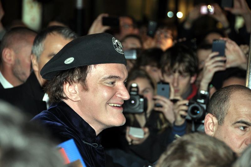
Image by Georges Biard, via Wikimedia Commons
With his first three features Reservoir Dogs, Pulp Fiction, and Jackie Brown, Quentin Tarantino claimed 1990s Los Angeles as his own. Then he struck boldly out into not just new geographical and cultural territories, but other time periods. With his first full-on period piece, 2009’s Inglourious Basterds, he showed audiences just how he intended to use history: twisting it for his own cinematic purposes, of course, but only making his departures after steeping himself in accounts of the time in which he envisioned his story taking place. This naturally involves plenty of reading, and Tarantino recently provided HistoryNet with a few titles that helped him properly situate Inglourious Basterds in the Europe of the Second World War.
Tarantino calls Ian Ousby’s Occupation: The Ordeal of France 1940–1944 “a very good overview that answered all of my questions about life in Nazi-occupied France.” Ulysses Lee’s The Employment of Negro Troops is “the most profound thing I’ve ever read on both the war and racist America of the 1940s, commissioned by the U.S. Army to examine the effectiveness of their employment of black soldiers.” And for Tarantino, who doesn’t just make films but lives and breathes them, understanding Nazi Germany means understanding its cinema, beginning with Eric Rentschler’s Ministry of Illusion: Nazi Cinema and Its Afterlife, “a wonderful critical reexamination of German cinema under Joseph Goebbels” that “goes far beyond the demonizing approach employed by most writers on this subject,” including even excerpts from Goebbels’ diaries.
Rentschler also “dares to make a fair appraisal of Nazi filmmaker Veit Harlan,” who made antisemitic blockbusters as one of Goebbels’ leading propaganda directors. But the work of no Nazi filmmaker had as much of an impact as that of Leni Riefenstahl, two books about whom Tarantino puts on his World War II reading list: Glenn B. Infield’s Leni Riefenstahl: The Fallen Film Goddess, the first he ever read about her, as well as Riefenstahl’s eponymous memoir, which he calls “mesmerizing. Though you can’t believe half of it. That still leaves half to ponder. Her descriptions of normal friendly conversations with Hitler are amazing and ring of truth” — and that praise comes from a filmmaker who made his own name with good dialogue.
In a recent DGA Quarterly conversation with Martin Scorsese, Tarantino revealed that he’s also at work on a book of his own about that era: “I’ve got this character who had been in World War II and he saw a lot of bloodshed there. Now he’s back home, and it’s like the ’50s, and he doesn’t respond to movies anymore. He finds them juvenile after everything that he’s been through. As far as he’s concerned, Hollywood movies are movies. And so then, all of a sudden, he starts hearing about these foreign movies by Kurosawa and Fellini,” thinking “maybe they might have something more than this phony Hollywood stuff.” He soon finds himself drawn inexorably in: “Some of them he likes and some of them he doesn’t like and some of them he doesn’t understand, but he knows he’s seeing something.” This is hardly the kind of premise that leads straight to the kind of violent catharsis in which Tarantino specializes, but then, he’s pulled off more unlikely artistic feats in his time.
Related Content:
Quentin Tarantino Explains How to Write & Direct Movies
How Quentin Tarantino Steals from Other Movies: A Video Essay
Based in Seoul, Colin Marshall writes and broadcasts on cities, language, and culture. His projects include the book The Stateless City: a Walk through 21st-Century Los Angeles and the video series The City in Cinema. Follow him on Twitter at @colinmarshall or on Facebook.
Read More...Watch Klaus Nomi Debut His New Wave Vaudeville Show: The Birth of the Opera-Singing Space Alien (1978)
Given the history of New York’s East Village as the first foreign language neighborhood in the country after waves of European immigration, perhaps it’s only natural that Klaus Nomi, opera-singing German performance artist who made a name for himself in the punk clubs of the late 70s, would find a home there.
By his time, the tenements had given way to other demographic waves: including Beatniks, writers, actors, Warholian Factory superstars, and punk and New Wave scenesters, whom Dangerous Mind’s Richard Metzger calls a “second generation” after Warhol, “drawn in by that Warhol myth but doing their own things.”
Even amidst the thriving DIY experimentalism of Post-Warholian art, fashion, and music, of a scene including Talking Heads, Jean-Michel Basquiat, and Keith Haring, Nomi stood out. It was the way he seemed to inhabit two time periods at once. He arrived both as a cabaret performer from Weimar Germany—a tragic clown with the voice of an angel—and as a thoroughly convincing intergalactic traveler, teleporting in briefly from the future.
No one was prepared for this when he made his New York debut at Irving Plaza’s New Wave Vaudeville show in 1978, evoking an even earlier era by singing “Mon cœur s’ouvre à ta voix,” from Camille Saint-Saëns’ 1877 opera Samson et Dalila. After his stunning performance, he would disappear from the stage in a confusion of strobe lights and smoke. East Village artist Joey Arias remembers, “It was like he was from a different planet and his parents were calling him home.”
Other acts at New Wave Vaudeville, a four-night East Village variety show, were “doing a punk version of Mickey Rooney, ‘We’re going to do a goofy show,’” says Kristian Hoffman, the musician who became Nomi’s musical director. In came Nomi with “a whole different level of accomplishment.” MC David McDermott was obliged to announce that he was not singing to a recording. You can see Nomi debut at New Wave Vaudeville above, in a clip from the 2004 film The Nomi Song.
The significance of these early performances goes far beyond the immediate shock of their first audiences. At these shows, Nomi met Hoffman, who would form his band and write the songs for which he became best known. Producer and director of the New Wave Vaudeville show Susan Hannaford and Ann Magnuson were also the owner and bartender at Club 57, where Nomi would help them organize exhibits by artists like Kenny Scharf.
Seeing Nomi’s debut can still feel a bit like watching a visitor arrive from both the past and the future at once. And it is lucky we have this early footage of an artist who would to on to perform with David Bowie and become a gay icon and pioneer of theatrical New Wave. But we should also see his arrival on the scene as an essential document of the history of the East Village, and its transformation into “a playground,” as Messy Nessy writes, “for artistic misanthropes, anarchists, exhibitionists, queers, poets, punks and everything in between,” including opera-singing aliens from West Berlin.
via Messy Nessy
Related Content:
The Enchanting Opera Performances of Klaus Nomi
Klaus Nomi Performs with Kraftwerk on German Television (1982)
David Bowie and Klaus Nomi’s Hypnotic Performance on SNL (1979)
Josh Jones is a writer and musician based in Durham, NC. Follow him at @jdmagness
Read More...Download Stunning 3D Scans of the Bust of Nefertiti, Now Released by Berlin’s Neues Museum
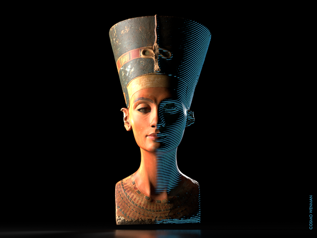
Two years ago, a scandalous “art heist” at the Neues Museum in Berlin—involving illegally made 3D scans of the bust of Nefertiti—turned out to be a different kind of crime. The two Egyptian artists who released the scans claimed they had made the images with a hidden “hacked Kinect Sensor,” reports Annalee Newitz at Ars Technica. But digital artist and designer Cosmo Wenman discovered these were scans made by the Neues Museum itself, which had been stolen by the artists or perhaps a museum employee.
The initial controversy stemmed from the fact that the museum strictly controls images of the artwork, and had refused to release any of their Nefertiti scans to the public. The practice, Wenman pointed out, is consistent across dozens of institutions around the world. “There are many influential museums, universities, and private collections that have extremely high-quality 3D data of important works, but they are not sharing that data with the public.” He lists many prominent examples in a recent Reason article; the long list includes the Venus de Milo, Rodin’s Thinker, and works by Donatello, Bernini, and Michelangelo.
Whatever their reasons, the aggressively proprietary attitude adopted by the Neues seems strange considering the controversial provenance of the Nefertiti bust. Germany has long claimed that it acquired the bust legally in 1912. But at the time, the British controlled Egypt, and Egyptians themselves had little say over the fate of their national treasures. Furthermore, the chain of custody seems to include at least a few documented instances of fraud. Egypt has been demanding that the artifact be repatriated “ever since it first went on display.”
This critical historical context notwithstanding, the bust is already “one of the most copied works of ancient Egyptian art,” and one of the most famous. “Museums should not be repositories of secret knowledge,” Wenman argued in his blog post. Prestigious cultural institutions “are in the best position to produce and publish 3D data of their works and provide authoritative context and commentary.”
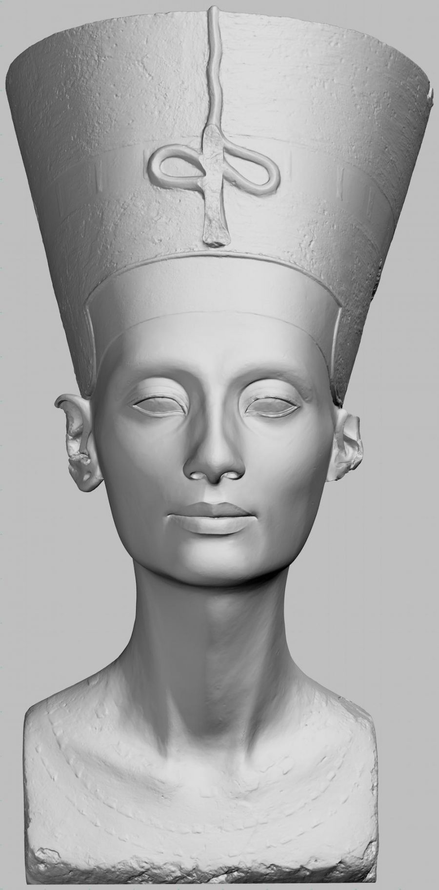
Wenman waged a “3‑year-long freedom of information effort” to liberate the scans. His request was initially met with “the gift shop defense”—the museum claimed releasing the images would threaten sales of Nefertiti merchandise. When the appeal to commerce failed to dissuade Wenman, the museum let him examine the scans “in a controlled setting”; they were essentially treating the images, he writes, “like a state secret.” Finally, they relented, allowing Wenman to publish the scans, without any institutional support.
He has done so, and urged others to share his Reason article on social media to get word out about the files, now available to download and use under a CC BY-NC-SA license. He has also taken his own liberties with the scans, colorizing and adding the blue 3D mapping lines himself to the image at the top, for example, drawn from his own interactive 3D model, which you can view and download here. These are examples of his vision for high-quality 3D scans of artworks, which can and should “be adapted, multiplied, and remixed.”
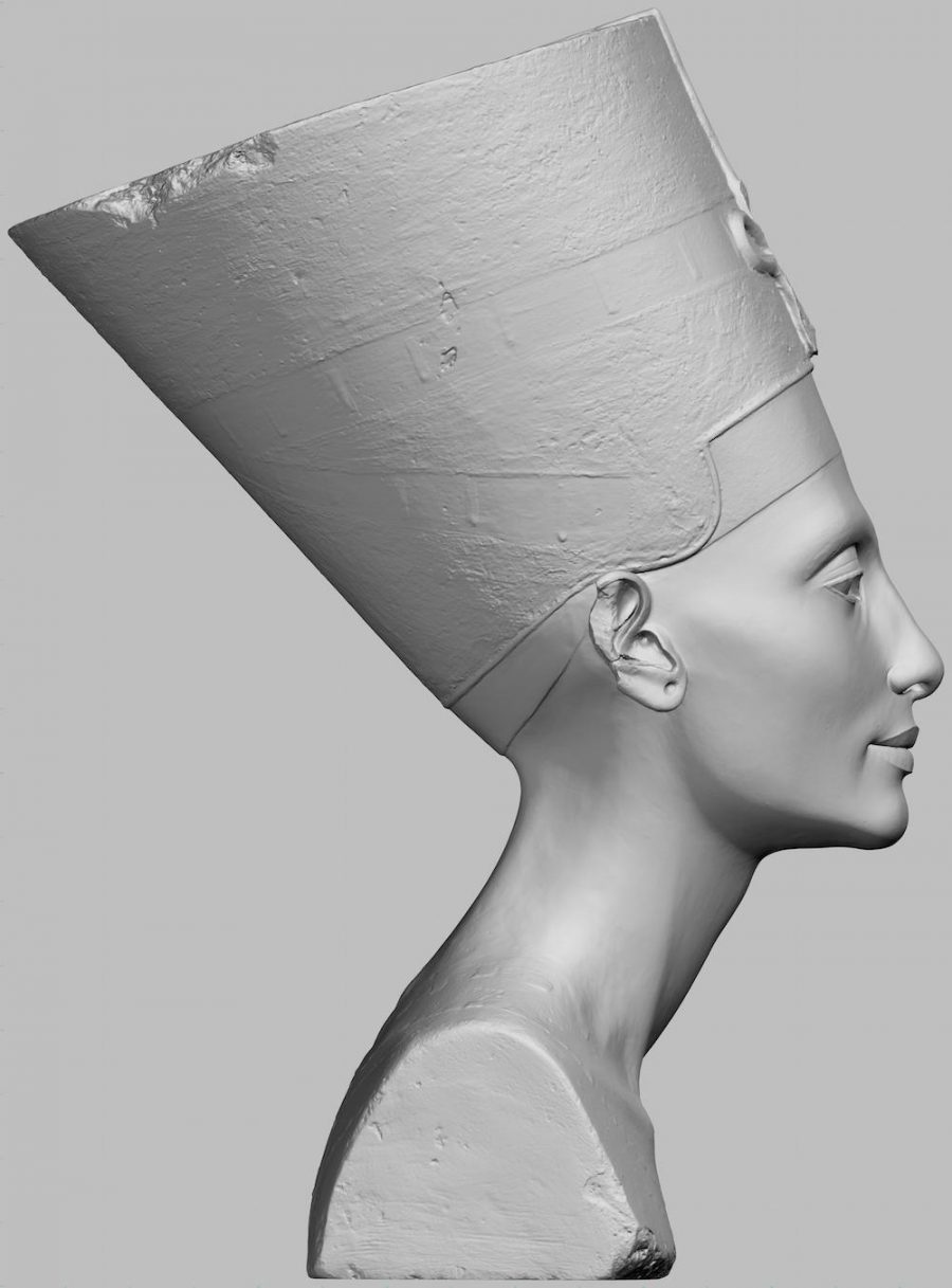
“The best place to celebrate great art,” says Wenman, “is in a vibrant, lively, and anarchic popular culture. The world’s back catalog of art should be set free to run wild in our visual and tactile landscape.” Organizations like Scan the World have been releasing unofficial 3D scans to the public for the past couple years, but these cannot guarantee the accuracy of models rendered by the institutions themselves.
Whether the actual bust of Nefertiti should be returned to Egypt is a somewhat more complicated question, since the 3,000-year old artifact may be too fragile to move and too culturally important to risk damaging in transit. But whether or not its virtual representations should be given to everyone who wants them seems more straightforward.
The images already belong to the public, in a sense, Wenman suggests. Withholding them for the sake of protecting sales seems like a violation of the spirit in which most cultural institutions were founded. Download the Nefertiti scans at Thingiverse, see Wenman’s own 3D models at Sketchfab, and read all of his correspondence with the museum throughout the freedom of information process here. Next, he writes, he’s lobbying for the release of official 3D Rodin scans. Watch this space.
Josh Jones is a writer and musician based in Durham, NC. Follow him at @jdmagness
Read More...David Lynch Visualizes How Transcendental Meditation Works, Using a Sharpie & Big Pad of Paper
Second only to the Beatles, David Lynch has become synonymous with the practice of Transcendental Meditation. And while the results were certainly mixed for the Fab Four, Lynch, in all his idiosyncrasies, has become the face of TM. He didn’t dabble with it mid-career. Instead, meditation helped create his career, as both his practice and the filming of Eraserhead started around 1972.
“…[L]ooking back,” he said in a Daily Beast interview in 2014, “I was filled with anger and took it out on my first wife and made her life miserable. I had a low-grade depression, and wasn’t really self-assured. If I’d gone forward without the ability to transcend every day, I think the pressures of the business could’ve gotten me.”
His career has been transcendent for sure, and as head of his eponymous foundation, he’s spreading the word, bringing TM to schools and calling in fellow creatives to extol its virtues.
But how does Lynch himself explain Transcendental Meditation? In this video, Lynch, armed with a pad of paper and a Sharpie, takes us on a scientific journey down past atoms and protons, and down to the unified field theory of quantum physics. A “no-thing” out of which all matter emerges. Scientists can’t take us into the unified field…but the mind can. Hence, meditation.
“The mantra is the key that opens the door,” he explains. (What is that mantra? It’s a personal one that the Maharishi, or someone high on the TM chain will give you after training…if you believe the TM pitch. Not everybody believes it needs be so proprietary, or expensive.)
With a mantra the mind can dive deep and then deeper: “Each deeper level of mind and each deeper level of intellect has more happiness,” he says. Go deep enough and the mind hits the equivalent of the unified field, and there…transcendence.
“Pure, unbounded, infinite consciousness…” he promises. “Transcendental meditation is just the vehicle to get you here.”
This can’t be the first time Lynch has drawn this diagram, but it really is one of the best visualizations of how science and meditation have arrived at the same conclusion. And it’s also why science is now studying the effects of meditation on the brain. For those looking for more on Lynch and meditation, we have you covered.
Related Content:
An Animated David Lynch Explains Where He Gets His Ideas
David Lynch Muses About the Magic of Cinema & Meditation in a New Abstract Short Film
David Lynch Talks Meditation with Paul McCartney
Ted Mills is a freelance writer on the arts who currently hosts the artist interview-based FunkZone Podcast and is the producer of KCRW’s Curious Coast. You can also follow him on Twitter at @tedmills, read his other arts writing at tedmills.com and/or watch his films here.
Read More...How Art Nouveau Inspired the Psychedelic Designs of the 1960s
“In the late 1800’s new technology was changing the way the world worked, and the way that it looked,” the Vox video above explains. “Some people, especially artists, living through the technological revolution, were not so into all the new industry. To be blunt, they thought it was ugly.” They responded with organic forms and intricate patterns that evoked a pre-industrial world while simultaneously showcasing, and selling, the most modern ideas and products.
Drawing on the handcrafted aesthetic of the Arts and Crafts Movement, the Gothic revival, the florid, ornate paintings of the Pre-Raphaelites, a fascination with Japanese woodblock prints, and the strange, beautiful illustrations of sea creatures by Ernst Haeckel, artists began to challenge late Victorian orthodoxies. The style we now know as Art Nouveau emerged.
It went by many names: Jugendstil, Mondernisme, Tiffany Style, Glasgow Style, Stile Liberty, Sezessionstil. Each identified a collection of traits with which we are now familiar from the many hundreds of posters and advertisements of the time. Grand, flowing lines, intricate patterns, vibrant, often clashing colors, bold hand-lettering, feminine figures and elaborate, exotic themes….
The descriptions of Art Nouveau’s qualities also apply to the poster and album cover art of the psychedelic 1960s, and no wonder, given the significant influence of the former upon the latter. The artists of the acid rock period rebelled not so much against industrialization as the military-industrial-complex. At the epicenter of the movement was the San Francisco of Jefferson Airplane and the Grateful Dead.
Venues like the Filmore and the Avalon advertised the hippie revolution with eye-catching posters inspired by those that once lined the thoroughfares of Europe in an age before TV, radio, and neon signs. Art Nouveau-like designs had already returned with the flower patterns popular in fabrics at the time. 60s graphic designers saw these seductive styles as the key to a new psychedelic vision.
It’s easy to see why. Flowers, curves, peacocks, updates of Art Nouveau images from the past (including skeletons and roses)—dialed up to 11 with “eye-vibrating” colors—made the perfect visual accompaniment for the acid-flavored Romanticism that took root during the Vietnam era. Even the fonts were poached from turn-of-the-century graphic art. Famous 60s designers like Wes Wilson confessed their admiration for modernism, “the idea,” Wilson told Time in 1967, “of really putting it all out there.”
Just as Art Nouveau flowered into an international style, with some presciently trippy manifestations in Brazil and other places, so too did the 60s psychedelic poster, spreading from San Francisco to every corner of the globe. And as Art Nouveau became the house style for the counterculture of the early 20th century—celebrating sexual and cultural experimentation and occult interests—it announced the birth of flower power and its recovery of modernism’s expressive freedoms.
Related Content:
Harry Clarke’s 1926 Illustrations of Goethe’s Faust: Art That Inspired the Psychedelic 60s
Behold the Beautiful Designs of Brazil’s 1920s Art Deco Magazine, Para Todos
Josh Jones is a writer and musician based in Durham, NC. Follow him at @jdmagness
Read More...What Ancient Chinese Sounded Like — and How We Know It: An Animated Introduction
No student of Chinese has an easy time with pronunciation. Even linguist Joshua Rudder, who tells animated stories on his Youtube channel NativeLang about languages around the world and how they came to be, admits his own struggles to get it right. “But lately I’ve been burying myself in hundreds of pages of Chinese linguistic history, and you know what? I’m in good company,” says Rudder in the introduction to the video above, “What ‘Ancient’ Chinese Sounded Like — and How We Know.” “Chinese pronunciation puzzled experts in China for a long, long time.”
This leads into the story of one particular expert, a 19th scholar named Chen Li who sought to recover Chinese pronunciations that even then seemed to have been lost to history. “How do you recover the sounds immortalized in classical texts? How do you make the old poems rhyme again?” And how do you do it when “you have no recordings, no phonetic transcriptions, not even an alphabet — you’re working with characters.” Ah yes, characters, those thousands of logograms, evolved over millennia, that still today bedevil anyone trying to get a handle on the Chinese language, not excluding the Chinese themselves. That goes especially for someone as linguistically ambitious as Chen Li.
Chen Li’s research on the correct pronunciation of ancient Chinese brought him to the Qieyun, an even then-1200-year-old dictionary of fanqie (反切), or the pronunciation of single characters described by using combinations of other characters. (On Wikipedia, you can find assembled links to scanned fragments of the text currently held in places like the British Library and the Bibliothèque nationale de France.) Drawing on not just the Qieyun but other sources as well, Chen Li’s painstaking work of reconstructing old pronunciations overturned the long-standing teaching that the Chinese language had 36 initial consonant sounds. He found that it had 41. But even after that discovery, the nature of these “precise sounds” remained unknown, an incompleteness of knowledge chipped away at by the Swedish scholar Bernard Karlgren in the 1900s, who took into account “the many living varieties” of the Chinese language.
Other Asian languages with vocabulary descended from Chinese also come in to play. Rudder takes the example of the word for “country,” pronounced guó (國) in modern Mandarin but kuk in Korean (국), koku in Japanese (国), and kuək in Vietnamese (quốc), all suggesting a common ancient Chinese ancestor word ending in a K‑like consonant sound. But however much progress has been made, this research into “ancient” Chinese has turned out to be research into a linguistic period of “middle Chinese,” which reveals evidence of “an even older language to uncover, a thousand years older still.” The work of a linguistic history, just like the humbler work of a Chinese language-learner, is never done.
Related Content:
What Ancient Latin Sounded Like, And How We Know It
A Map of How the Word “Tea” Spread Across the World
Based in Seoul, Colin Marshall writes and broadcasts on cities, language, and culture. His projects include the book The Stateless City: a Walk through 21st-Century Los Angeles and the video series The City in Cinema. Follow him on Twitter at @colinmarshall or on Facebook.
Read More...Salvador Dalí’s Iconic Deck of Tarot Cards Get Re-Issued: It’s Out Today
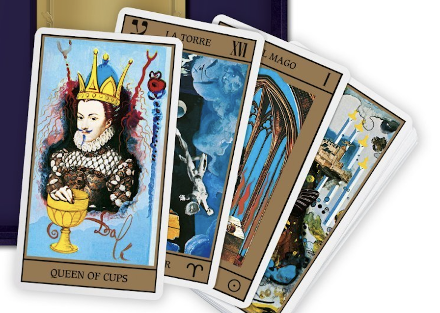
Last month, we highlighted Salvador Dali’s deck of Tarot cards. Originally created in 1984, the tarot deck is now being re-issued by Taschen in a beautiful 184-page art book. For those interested, the official release date is today. Read all about the famous deck here. Or purchase your own set of Dali’s tarot cards here.
If you would like to support the mission of Open Culture, consider making a donation to our site. It’s hard to rely 100% on ads, and your contributions will help us continue providing the best free cultural and educational materials to learners everywhere. You can contribute through PayPal, Patreon, and Venmo (@openculture). Thanks!
Read More...Download Hellvetica, a Font that Makes the Elegant Spacing of Helvetica Look as Ugly as Possible
Among typography enthusiasts, all non-contrarians love Helvetica. Some, like filmmaker Gary Hustwit and New York subway map creator Massimo Vignelli, even made a documentary about it. Created by Swiss graphic designer Max Miedinger with Haas Type Foundry president Eduard Hoffmann and first introduced in 1957, Helvetica still stands as a visual definition of not just modernism but modernity itself. That owes in part to its clean, unambiguous lines, and also to its use of space: as all the aforementioned typography enthusiasts will have noticed, Helvetica leaves little room between its letters, which imbues text written in the font with a certain solidity. No wonder it so often appears, more than half a century after its debut, on the signage of public institutions as well as on the promotion of products that live or die by the ostensible timelessness of their designs.
But as times change, so must even near-perfect fonts: hence Helvetica Now. “Four years ago, our German office [was] kicking around the idea of creating a new version of Helvetica,” Charles Nix, type director at Helvetica-rights-holder Monotype tells The Verge. “They had identified a short laundry list of things that would be better.” What shortcomings they found arose from the fact that the font had been designed for an analog age of optical printing, and “when we went digital, a lot of that nuance of optical sizing sort of washed away.” Ultimately, the project was less about updating Helvetica than restoring characters lost in its adaptation to digital, including “the straight-legged capital ‘R,’ single-story lowercase ‘a,’ lowercase ‘u’ without a trailing serif, a lowercase ‘t’ without a tailing stroke on the bottom right, a beardless ‘g,’ some rounded punctuation.”
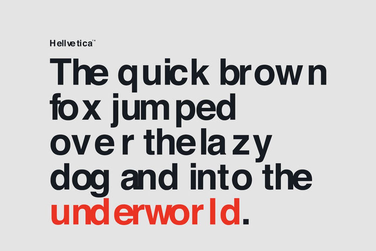
The development of Helvetica Now also necessitated a close look at all the versions of Helvetica so far developed (the most notable major revision being Neue Helvetica, released in 1983) and adapting their best characteristics for an age of screens. Few of those characteristics demanded more attention than the spacing — or to use the typographical term, the kerning. But however astonishing a showcase it may be, Helvetica Now doesn’t drive home the importance of the art of kerning in as visceral a manner as another new typeface: Hellvetica, designed by New York creative directors Zack Roif and Matthew Woodward. Much painstaking labor has also gone into Hellvetica’s kerning, but not to make it as beautiful as possible: on the contrary, Roif and Woodard have taken Helvetica and kerned it for maximum ugliness.
The Verge’s Jon Porter describes Hellvetica as “a self-aware Comic Sans with kerning that’s somehow much much worse.” If that most hated Windows font hasn’t been enough to inflict psychological disturbance on the designers in your life, you can head to Hellvetica’s official site and “experience it in all its uneven, gappy glory.” Roif and Woodard have made Hellvetica free to use, something that certainly can’t be said of any genuine version of Helvetica. In fact, the sheer cost of licensing that most modern of all fonts has, in recent years, pushed even the formerly Helvetica-using likes of Apple, Google, and IBM to come up with their own typefaces instead — all of which, tellingly, resemble Helvetica. We can consider them all weapons in the life of a designer, which, as Vignelli put it, “is a life of fight. Fight against the ugliness.” Happy downloading…
Related Content:
The History of Typography Told in Five Animated Minutes
Designer Massimo Vignelli Revisits and Defends His Iconic 1972 New York City Subway Map
Van Gogh’s Ugliest Masterpiece: A Break Down of His Late, Great Painting, The Night Café (1888)
Based in Seoul, Colin Marshall writes and broadcasts on cities, language, and culture. His projects include the book The Stateless City: a Walk through 21st-Century Los Angeles and the video series The City in Cinema. Follow him on Twitter at @colinmarshall or on Facebook.
Read More...How Humans Migrated Across The Globe Over 200,000 Years: An Animated Look
Coverage of the refugee crisis peaked in 2015. By the end of the year, note researchers at the University of Bergen, “this was one of the hottest topics, not only for politicians, but for participants in the public debate,” including far-right xenophobes given megaphones. Whatever their intent, Daniel Trilling argues at The Guardian, the explosion of refugee stories had the effect of framing “these newly arrived people as others, people from ‘over there,’ who had little to do with Europe itself and were strangers.”
Such a characterization ignores the crucial context of Europe’s presence in nearly every part of the world over the past several centuries. And it frames mass migration as extraordinary, not the norm. The crisis aspect is real, the result of dangerously accelerated movement of capital and climate change. But mass movements of people seeking better conditions, safety, opportunity, etc. may be the oldest and most common feature of human history, as the Science Insider video shows above.
The yellow arrows that fly across the globe in the dramatic animation make it seem like early humans moved by bullet train. But when consequential shifts in climate occurred at a glacial pace—and economies were built on what people carried on their backs—mass migrations happened over the span of thousands of years. Yet they happened continuously throughout last 200,000 to 70,000 years of human history, give or take. We may never know what drove so many of our distant ancestors to spread around the world.
But how can we know what routes they took to get there? “Thanks to the amazing work of anthropologists and paleontologists like those working on National Geographic’s Genographic Project,” Science Insider explains, “we can begin to piece together the story of our ancestors.” The Genographic Project was launched by National Geographic in 2005, “in collaboration with scientists and universities around the world.” Since then, it has collected the genetic data of over 1 million people, “with a goal of revealing patterns of human migration.”
The project assures us it is “anonymous, nonmedical, and nonprofit.” Participants submitted their own DNA with National Geographic’s “Geno” ancestry kits (and may still do so until next month). They can receive a “deep ancestry” report and customized migration map; and they can learn how closely they are related to “historical geniuses,” a category that, for some reason, includes Jesse James.
Do projects like these veer close to recreating the “race science” of previous centuries? Are they valid ways of reconstructing the “human story” of ancestry, as National Geographic puts it? Critics like science journalist Angela Saini are skeptical. “DNA testing cannot tell you that,” she says in an interview on NPR, but it can “make us believe that identity is biological, when identity is cultural.” National Geographic seems to disavow associations between genetics and race, writing, “science defines you by your DNA, society defines you by the color of your skin.” But it does so at the end of a video about a group of people bonding over their similar features.
Despite the significance modern humans have ascribed to variations in phenotype, race is a culturally defined category and not a scientific one, argues Joseph L. Graves, professor of biological sciences at the Joint School of Nanoscience and Nanoengineering.. “Everything we know about our genetics has proven that we are far more alike than we are different. If more people understood that, it would be easier to debunk the myth that people of a certain race are ‘naturally’ one way or another,” or that refugees and asylum seekers are dangerous others instead of just like every other human who has moved around the world over the last 200,000 years.
Related Content:
Colorful Animation Visualizes 200 Years of Immigration to the U.S. (1820-Present)
Where Did Human Beings Come From? 7 Million Years of Human Evolution Visualized in Six Minutes
Josh Jones is a writer and musician based in Durham, NC. Follow him at @jdmagness
Read More...The Velvet Underground as Peanuts Characters: Snoopy Morphs Into Lou Reed, Charlie Brown Into Andy Warhol
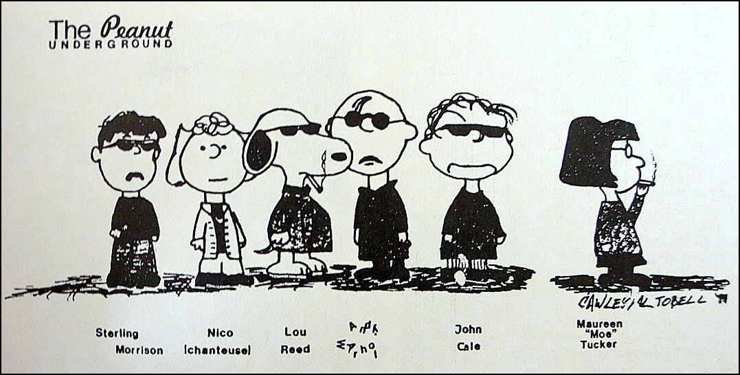
The fun cartoon above was apparently found in a “Guide to the Velvet Underground and Andy Warhol’s Factory” published by the French magazine, Les Inrockuptibles in 1990. It came around the same time the Fondation Cartier pour l’art contemporain (located in Paris) held an exhibition dedicated to Andy Warhol. Of course, Warhol famously took a break from painting in the mid-1960s and, among other things, threw his influence behind the up-and-coming NYC band, The Velvet Underground. Serving as the band’s manager, he “produced” VU’s first album, which meant designing the album cover and giving the band members — Lou Reed, John Cale, Sterling Morrison, Maureen Tucker and Nico — the freedom to make whatever album they pleased, up to a certain point. Above, you can see these same musicians reimagined as Peanuts characters.
If you would like to support the mission of Open Culture, consider making a donation to our site. It’s hard to rely 100% on ads, and your contributions will help us continue providing the best free cultural and educational materials to learners everywhere. You can contribute through PayPal, Patreon, and Venmo (@openculture). Thanks!
Related Content:
The Velvet Underground Captured in Color Concert Footage by Andy Warhol (1967)
Read More...Support Us
We're hoping to rely on loyal readers, rather than erratic ads. Please click the Donate button and support Open Culture. You can use Paypal, Venmo, Patreon, even Crypto! We thank you!

About Us

Open Culture scours the web for the best educational media. We find the free courses and audio books you need, the language lessons & educational videos you want, and plenty of enlightenment in between.
Advertise With Us

FREE UPDATES!
GET OUR DAILY EMAIL
Get the best cultural and educational resources on the web curated for you in a daily email. We never spam. Unsubscribe at any time.
FOLLOW ON SOCIAL MEDIA

Open Culture editor Dan Colman scours the web for the best educational media. He finds the free courses and audio books you need, the language lessons & movies you want, and plenty of enlightenment in between.
Advertise With Us


