These Four Manuscripts Contain All of the Literature Written in Old English–and Beyond That, There’s Nothing More
Book historians and rare manuscript librarians do not have the most glamorous jobs by the usual standards. They deal with weathered, tattered, fragmentary scraps of text in archaic languages and lettering. It’s work unlikely to receive the Hollywood (or Netflix) treatment unless wizards, witches, or occult detectives are involved. But the relative obscurity of these professions does not make the work any less valuable. Without dedicated archivists and preservationists, a slow collective amnesia, or worse, can set in.
One might call this attitude precious. Specialists are useful, art is great, but with sophisticated machine learning, we can make, store, and print copies of every historical artifact in the world, along with all of the accumulated knowledge about them. What need to dote on crumbling manuscripts? Why the special status of the original? The question, taken up by Walter Benjamin in his 1936 essay, “The Work of Art in the Age of Mechanical Reproduction,” comes down in part to something he called “aura.”
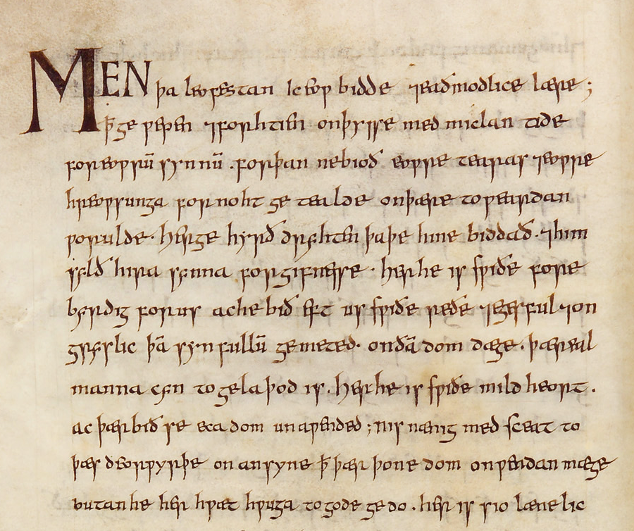
Take the case of four manuscripts, all of which recently appeared together at the British Library’s extensive exhibition Anglo-Saxon Kingdoms: Art, Word, War: The Vercelli Book, the Junius Manuscript, the Exeter Book, and the Beowulf Manuscript contain riddles, religious texts, elegies, and the oldest manuscript of the oldest known poem in English. These represent the sum total of extant original literary manuscripts in Old English, a tongue several centuries distant from our own but still embedded deep within the structure of every modern version of the language.
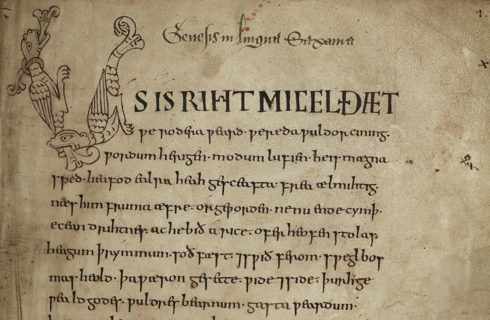
Each manuscript has what, as Benjamin wrote, “even the most perfect reproduction of a work of art is lacking… its presence in time and space, its unique existence at the place where it happens to be.” Josephine Livingstone puts the matter more plainly at The New Republic.
Why are these four books so special? It has to do, I think, with the concept of the original—a concept we have almost entirely lost touch with. The Beowulf Manuscript… is not merely a representation of a story; it is the story…. The manuscripts confront us with a former version of our literary selves; identities that we barely recognize, and which estrange us from ourselves.
We can reproduce history infinitely, but the only way to experience the humbling otherworldliness that dwarfs our cramped ideas about it is through its physical remainders. Livingstone doesn’t clarify whom she includes in the phrase “our literary selves,” but we might as well say, at minimum, this means every speaker of English and everyone who has read English literature in translation or felt the influence of English words and phrases in other languages.
We acquire the language we hear and read from literary sources, however remote; they are constitutive, the threads that weave together cultural narratives into a larger pattern. The original work of art, Benjamin argued, like the relic, has religious significance. And where the relic grounds the cult, art grounds material culture in such a way, he thought, that it repels fascism’s aesthetic obsession with destruction.
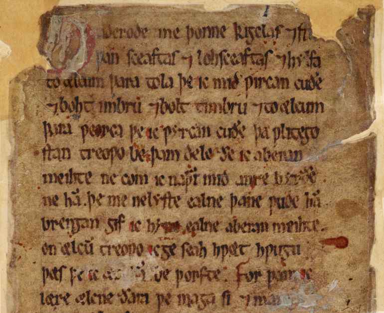
Original artifacts “must restore the instinctual power of the human bodily senses,” literary scholar Susan Buck-Morss elaborates, “for the sake of humanity’s self-preservation.” The statement may sound less grandiose in the context of Europe in 1936, or we might consider it just as relevant today (and expand it to include not only art but nature).
We can rely on the fact that, should the Beowulf Manuscript be destroyed, Livingstone grants, “the poem would still survive,” as would the image of the manuscript in very fine detail. That is “the hope contained in Benjamin’s dirge.” But what is lost can never appear in the world again. You can view most of these rare texts—The Vercelli Book, the Junius Manuscript, and the Beowulf Manuscript—in high resolution scans at the British and Bodleian Libraries.
The texts are a minuscule sampling of the number of cultural artifacts around the world worthy of preservation, and publicity. And they are a tiny sampling of the literary production of Old English. But on them rests a great deal of our understanding about the linguistic ancestors of the language, with more to learn, perhaps, as scanning technology becomes even more advanced, illuminating rather than replacing the original.
Related Content:
1,000-Year-Old Manuscript of Beowulf Digitized and Now Online
Europe’s Oldest Intact Book Was Preserved and Found in the Coffin of a Saint
Josh Jones is a writer and musician based in Durham, NC. Follow him at @jdmagness
Read More...Classic Radiohead Songs Re-Imagined as a Sci-Fi Book, Pulp Fiction Magazine & Other Nostalgic Artifacts

When we first checked in with artist and screenwriter Todd Alcott, he was immortalizing the work of stars who hit their stride in the 70s and 80s, as highly convincing pulp novel and magazine covers inspired by their most famous songs and lyrics. David Bowie’s “Young Americans” yields an East of Eden-like blonde couple reclining in the grass. Talking Heads’ “Life During Wartime” becomes an erotically violent, or violently erotic, magazine that ain’t fooling around.
Next, we took a look at Alcott’s series of pulp covers drawn from the work of Mr. Bob Dylan, bona fide godfather of classic rock, a period that gets a lion’s share of covers in Alcott’s imaginative Etsy rack, alongside other new wave and punk bands like The Clash, The Smiths, and Joy Division. Looking at these devoted tributes to musical giants of yore, rendered in adoring tributes to an even earlier era’s aesthetic, produces the kind of “of course!” reaction that makes Alcott’s work so enjoyable.
After all, pulp magazines and books are perhaps as responsible for the counterculture as LSD, with their proudly sexy poses, overheated teen fantasies, and bondage gear. (Prince gets his own series, a true joy.) But Alcott has moved on to a crop of artists who first appeared in the 90s class of alternative bands—from PJ Harvey, to Fiona Apple, to Nirvana, to Neutral Milk Hotel, to, as you can see here, Radiohead, the most long-lived and innovative stars of the era.
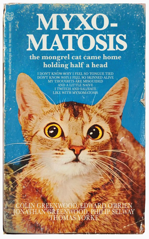
How well does Alcott’s approach work with artists who hit the scene when pulp fiction turned into Pulp Fiction, appropriated in a winking, expletive-filled splatter-fest that didn’t, technically, require its audience to know anything about pulp fiction? You’ll notice that Alcott has taken a novel approach to the concept in many cases (reimagining PJ Harvey’s “This is Love!” as a 50s grindhouse flick, another genre that has been heavily Tarantino-ized).
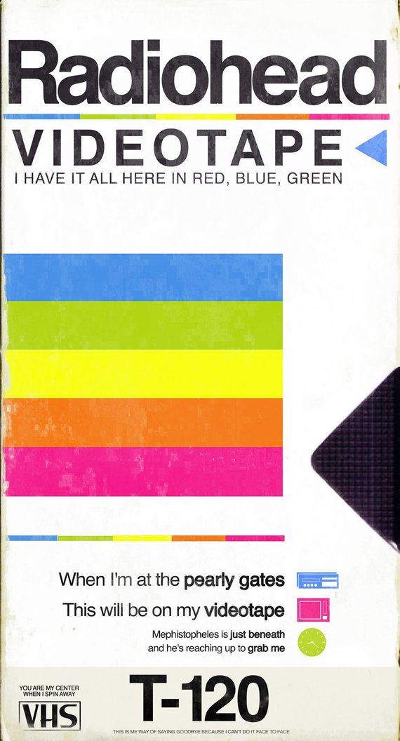
He converts Radiohead’s “Kid A” into that most treasured publication for futon-surfing hipsters circa 2000, the IKEA catalog. “Videotape” manifests in literal fashion as one of the oughties’ many objects of consumer electronics nostalgia, the 120-minute VHS. And “Myxomatosis,” from 2003’s Hail to the Thief, appears as a 1970s cat book, an artifact many Radiohead fans at the turn of the millennium might treasure as both an ironic Tumblr goof and a poignant reminder of childhood.
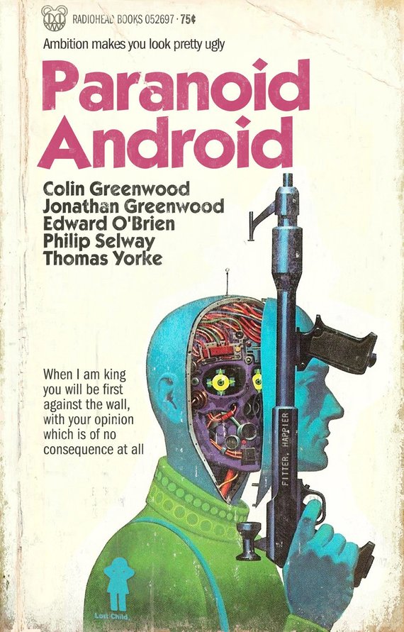
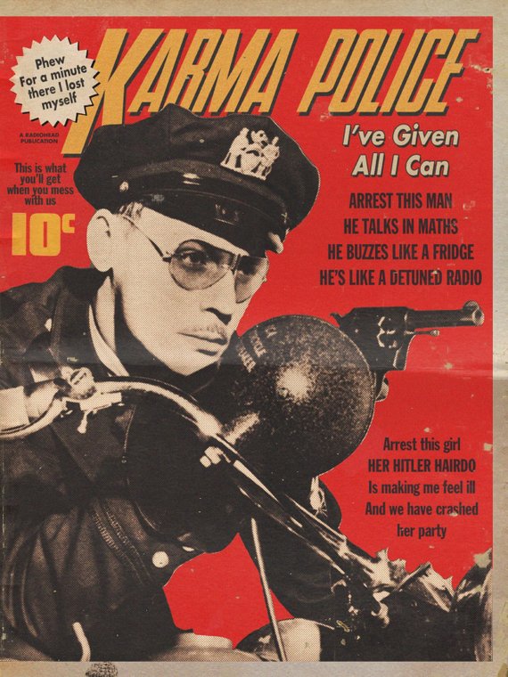
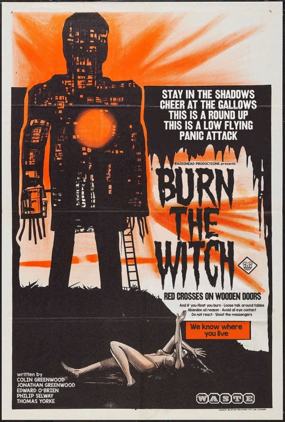
The Radiohead series does not fully abandon the pulp look—“Karma Police,” for example, gets the detective magazine treatment. But it does lean more heavily on later-20th century productions, like the 70s sci-fi cover of “Paranoid Android,” clearly inspired by Michael Crichton’s Westworld. Moon-Shaped Pool’s “Burn the Witch,” on the other hand, looks like a classic 50s Hammer Horror poster, but with a nod to Robin Hardy’s 1973 Wicker Man. (Both Crichton and Hardy have likewise been re-imagined for audiences who may never have seen the originals.)
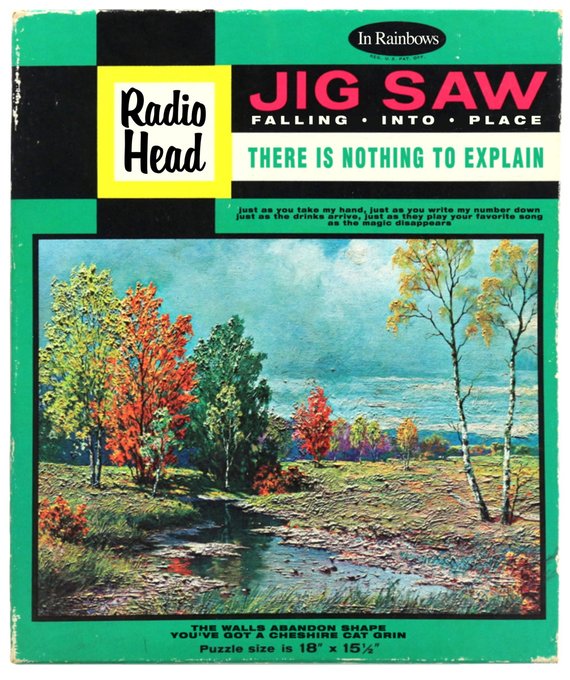
Perhaps the least interesting of Alcott’s riffs on the Radiohead catalog, “Jigsaw Falling into Place,” goes right for the obvious, though its idyllic, Bob Ross-like scene strikes a dissonant chord in illustrating a song that references closed circuit cameras and sawn-off shotguns. Speaking of obvious, maybe it seemed too on the nose to turn “Creep” into creepy pulp erotica. Still, I wonder how Alcott resisted. View and purchase in handmade print form all of Alcott’s songs-as-book covers, etc. at Etsy.
Related Content:
Josh Jones is a writer and musician based in Durham, NC. Follow him at @jdmagness
Read More...Download 586 Free Art Books from The Metropolitan Museum of Art

You could pay $118 on Amazon for the Metropolitan Museum of Art’s catalog The Art of Illumination: The Limbourg Brothers and the Belles Heures of Jean de France, Duc de Berry. Or you could pay $0 to download it at MetPublications, the site offering “five decades of Met Museum publications on art history available to read, download, and/or search for free.”
If that strikes you as an obvious choice, prepare to spend some serious time browsing MetPublications’ collection of free art books and catalogs.
You may remember that we featured the site a few years ago, back when it offered 397 whole books free for the reading, including American Impressionism and Realism: The Painting of Modern Life, 1885–1915; Leonardo da Vinci: Anatomical Drawings from the Royal Library; and Wisdom Embodied: Chinese Buddhist and Daoist Sculpture in The Metropolitan Museum of Art.
But the Met has kept adding to their digital trove since then, and, as a result, you can now find there no fewer than 586 art catalogs and other books besides. Those sit alongside the 400,000 free art images the museum put online last year.
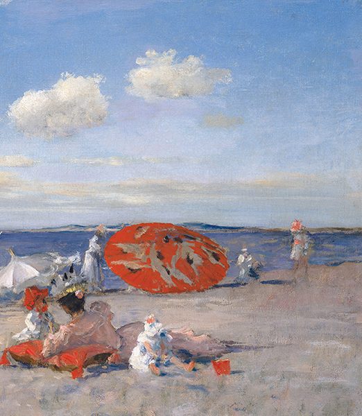
So have a look at MetPublications’ current collection and you’ll find you now have unlimited access to such lush as well as artistically, culturally, and historically varied volumes as African Ivories, Chess: East and West, Past and Present; Modern Design in The Metropolitan Museum of Art, 1890–1990; Vincent Van Gogh: The Drawings; French Art Deco; or even a guide to the museum itself (vintage 1972).
Since I haven’t yet turned to art collection — I suppose you need money for that — these books don’t necessarily make me covet the vast sweep of artworks they depict and contextualize. But they do make me wish for something even less probable: a time machine so I could go back and see all these exhibits firsthand.
Note: This is an updated version of a post that originally appeared on our site in March 2015.
Related Content:
1.8 Million Free Works of Art from World-Class Museums: A Meta List of Great Art Available Online
Download Over 250 Free Art Books From the Getty Museum
2,000+ Architecture & Art Books You Can Read Free at the Internet Archive
The Metropolitan Museum of Art Puts 400,000 High-Res Images Online & Makes Them Free to Use
The Guggenheim Puts 109 Free Modern Art Books Online
800 Free eBooks for iPad, Kindle & Other DevicesBased in Seoul, Colin Marshall writes and broadcasts on cities, language, and culture. His projects include the book The Stateless City: a Walk through 21st-Century Los Angeles and the video series The City in Cinema. Follow him on Twitter at @colinmarshall or on Facebook.
Read More...Hear the Sounds of World War I: A Gas Attack Recorded on the Front Line, and the Moment the Armistice Ended the War
The world recently commemorated the 100th anniversary of end of World War I, which came to its close on November 11th, 1918. The last veterans of that unprecedentedly large-scale military conflict, all of them centenarians or supercentenarians, died in the late 2000s and early 2010s. Though historical scholarship on the subject continues, the Great War, as it was widely known at the time, has now well and truly passed out of living memory. No one alive saw World War I for themselves, though we do have photographs, some of them in color; and no one alive heard World War I for themselves, though we do have a little recorded audio: in the clip above, you can hear the sounds of a gas shell bombardment in the war’s final year.
“Just before the end of the Great War, William Gaisberg, a sound recordist of the pre-electric era, took recording equipment to the Western Front in order to capture the sound of British artillery shelling German lines with poison gas,” writes media historian Brian Hanrahan at Sounding Out!. The “Gas Shell Bombardment” record, “a 12-inch HMV shellac disc, just over 2 minutes at 78 rpm,” came out just as the war ended, a few weeks after Gaisberg’s own death (probably of Spanish flu) and just after the end of the war itself. “Initially intended to promote War Bonds,” Hanrahan explains, ultimately the record was used to raise money for disabled veterans.”
Long billed as one of the first “actuality recordings” (the kind “documenting a real location and event beyond the performative space of the studio, imprinted with the audible material trace of an actual moment in space and time”), the record later came under scrutiny, which Hanrahan writes about in detail: “Close listening at slow speeds – just careful attention and notation, nothing more elaborate – revealed inconsistencies and oddities in the firing noises.” These and other qualities suggest layers of sound added after the fact, on top of the initial recording in the field, much like live concert recordings now get “sweetened” with additional layers of instrumentation (and even audience enthusiasm).
But we can hardly expect perfect fidelity from audio recordings of the events of a century ago, a time when audio recording itself was still in its infancy. You can hear another approach to the task of hearing World War I in the clip just above, an “interpretation” of the sound of the armistice causing the guns to fall silent. This realistic minute of sound was based on sound information collected in the field, using a technique called “sound ranging” in which, as Smithsonian’s Jason Daley explains, “technicians set up strings of microphones — actually barrels of oil dug into the ground — a certain distance apart, then used a piece of photographic film to visually record noise intensity,” much as “a seismometer records an earthquake.”
As part of its commemoration of the armistice’s centennial, London’s Imperial War Museum “commissioned the sound production company Coda to Coda to use the film strip of the guns firing away at 10:58 A.M. on November 11, 1918, then going silent when the clock strikes 11, the symbolic moment politicians determined the war would end, to try and recreate what that instant may have sounded like.” Though you can hear the result on the internet, you can also go to the Imperial War Museum exhibition Making a New World in person and more intensely experience it through the “soundbar” installed there, on which “visitors to the exhibit lean their elbows on the bar and place their hands on their ears. The sound is then conducted through their arms to their skulls where they can both hear and feel the moment,” the moment that birthed that “New World” — in not just the political sense but the technological one, and many others besides — in which we still live today.
Related Content:
Watch World War I Unfold in a 6 Minute Time-Lapse Film: Every Day From 1914 to 1918
The Great War: Video Series Will Document How WWI Unfolded, Week-by-Week, for the Next 4 Years
The First Color Photos From World War I: The German Front
British Actors Read Poignant Poetry from World War I
Based in Seoul, Colin Marshall writes and broadcasts on cities, language, and culture. His projects include the book The Stateless City: a Walk through 21st-Century Los Angeles and the video series The City in Cinema. Follow him on Twitter at @colinmarshall or on Facebook.
Read More...Watch “The Midnight Parasites,” a Surreal Japanese Animation Set in the World of Hieronymus Bosch’s The Garden of Earthly Delights (1972)
Hieronymus Bosch’s bizarre paintings might have looked perfectly ordinary to his contemporaries, argues Stanley Meisler in “The World of Bosch.” Modern viewers may find this very hard to believe. We approach Bosch through layers of Freudian interpretation and Surrealist appreciation. We cannot help “regarding the scores of bizarre monsters”—allegories for sins and punishments far more legible in 15th-century Netherlands—“as a kind of dark and cruel comic relief.”
While Bosch might have intended his work as serious sermonizing, it is impossible for us to inhabit the medieval consciousness of his time and place. There’s just no getting around the fact that Bosch is really weird—weirder even (or more imaginatively allegorical) than nearly any other artist of his time. In some very important ways, he belongs to a 20th-century aesthetic of post-Freudian dream logic as much as he belonged to peculiar medieval visions of heaven and hell.
Bosch “described terrible, unbearable holocausts crushing mankind for its sins,” writes Meisler, visions that seemed both stranger and more familiar in the wake of so many man-made holocausts whose absurdities defy reason. What modern horrors does famed Japanese animator Yōji Kuri invoke in his psychedelic 1972 film “The Midnight Parasites,” above, a surrealist short set in the world of Bosch?
Dangerous Minds’ Paul Gallagher describes the plot, such as it is:
Here Kuri imagines what would life might be like if we all lived in Bosch’s painting “Garden of Earthly Delights.” It’s a basically shit and death or rather a cycle of life where blue figures live and die; eat shit and shit gold; are skewered, and devoured; are regurgitated and reborn to carry on the cycle once again.
Kuri’s satirical vision, in films long favored by counter-cultural audiences, has “bite,” writes Animation World Network’s Chris Robinson: “he helped lift Japanese animation out of decades of cozy narrative cartoons into a new era of graphic and conceptual experimentation. His films mock and shock, attacking technology, population expansion, monotony of modern society… Witnessing the surrender of Japan during WW2, the devastation of his country followed by the quick rise of Western inspired materialist culture and rampant consumption, Kuri, like many of his colleagues at the time, questioned the state and direction of his society and world.”
His creative appropriation of Bosch, “dark, dirty, oddly beautiful, with a groovy soundtrack,” Gallagher writes, may not, as Meisler worries of many modern takes, get Bosch wrong at all. Though the Dutch artist’s symbolism may never be comprehensible—or anything less than hallucinatory—to us moderns, Kuri’s half-playful reimagining uses Boschian figures for some serious moralizing, showing us a hell world governed by grave lapses and cruelties Bosch could never have imagined.
Related Content:
Josh Jones is a writer and musician based in Durham, NC. Follow him at @jdmagness
Read More...Glenn Gould’s Heavily Marked-Up Score for the Goldberg Variations Surfaces, Letting Us Look Inside His Creative Process
Does it make sense to call Glenn Gould, that most prodigious and unusual interpreter of classical piano, a composer? While his radio documentary trilogy should earn him the title, his classical performances and recordings remain bound—albeit sometimes maddeningly loosely for certain tastes—to the work of others, whether Mozart, Schoenberg, Strauss, Sibelius, Beethoven, Brahms, or J.S. Bach, who provided Gould with the material that would launch his career, the “Goldberg” Variations, which he first recorded at 22 in 1955 to widespread acclaim and admiration. His debut became one of the best-selling classical albums of all time.
Famously Gould made another recording of the “Goldberg” in 1981, the year before his early death at 50, “leaving the two Bach statements as bookends to his career,” writes Michael Cooper at The New York Times. Gould revered the composers he recorded and expounded on their virtues at length in written, televised, and broadcast commentaries. This was especially the case with Bach, whom he described as “first and last an architect, a constructor of sound, and what makes him so inestimably valuable to us is that he was beyond a doubt the greatest architect of sound who ever lived.”
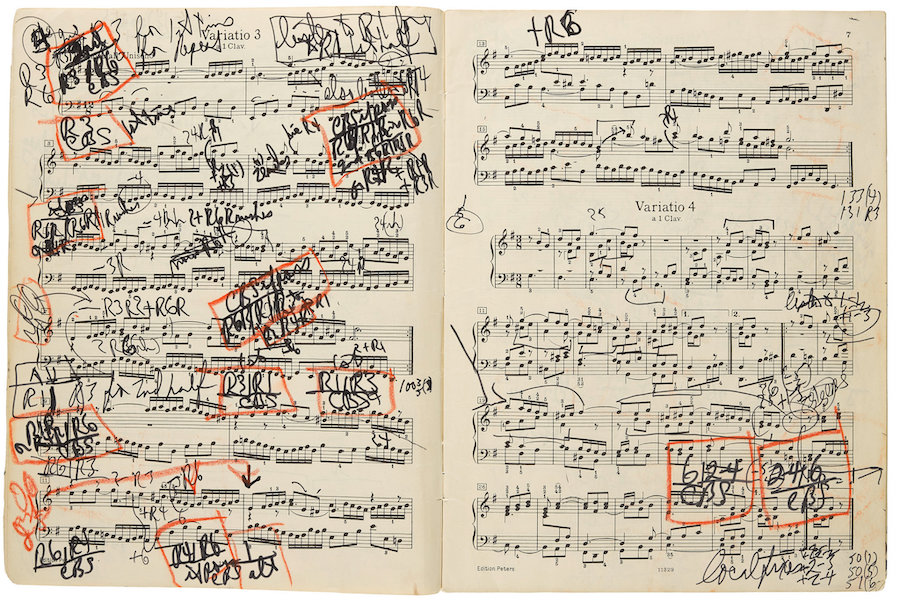
The Canadian pianist was more than content to devote his life to others’ constructions of sound, rather than trying his hand at writing them himself, but if Bach was an architect of sound, we might compare Gould to a director—a meticulous auteur with a singular and solitary vision. Take his heavily marked up score for the 1981 “Goldberg,” above, recently resurfaced and destined for auction on December 5th at Bonhams in New York. “I would call this the equivalent of a shooting script of a movie,” comments critic and University of Southern California professor Tim Page.
Gould chose the studio over live performance early in his career, finding that the controlled experience of recording—the ability to do multiple takes and edit them together in a kind of narrative dynamic—provided him with maximum creative freedom. His 1981 “Goldberg,” “electrified the classical music world nearly as much as his classic 1955 recording had,” writes pianist Anthony Tommasini. His recordings resonate far outside the classical world, such that a Toronto hip-hop producer has even remixed his work.
There is another case for thinking of Gould himself as something of a modern producer/remixer—of other composers’ works and of his own performances. Page, who knew Gould well, speculates that he would have loved the internet. “I bet, without any interference,” he says, “Glenn would have recorded three or four different versions of the same piece and put them all out there for people to listen to and even chose from.” He took to modern techniques and technologies without reservation.
Gould’s friendliness to modernity, and its enthusiastic embrace of him, makes him seem like so much more than a pianist, and of course, he was. But we should also consider him—and all great classical interpreters—as at least a co-composer, a role as old as classical music itself. As pianist Jeremy Denk writes, each score is “at once a book and a book waiting to be written.” (Tommasini points out that “Bach’s scores leave much to the choices and tastes of performers,” and in the case of “Goldberg,” we have only reconstructions of the original.) The Variations, after all, are not named for Bach, but for virtuoso harpsichordist Johann Gottlieb Goldberg, likely the original performer of the piece.
The particularly idiosyncratic approach of a pianist like Gould, writes Denk, with much ambivalence, “found perversity in the music and teased it out, but mostly he just slathered it on; piece after piece, he made brilliant but deeply unintuitive, ‘unnatural’ choices, and made them work through sheer force of will.” Now, in his 1981 “Goldberg” score, fans and scholars can see for themselves how much deliberation was involved in his apparent willfulness.
In Gould’s interpretations, we cannot separate the player from the work. “He immortalized his phobias,” his passions, and his personal eccentricities, Denk writes, “by grafting them onto Bach,” with the effect that his recordings “erase the distance of centuries; they dissolve the varnish that has piled up, and make Bach one with the anxieties of the present.” See Gould recording his 1981 “Goldberg” Variations further up, and read about the 2015 transcription of the recording by Nicholas Hopkins here.
Related Content:
Watch a 27-Year-Old Glenn Gould Play Bach & Put His Musical Genius on Display (1959)
Listen to Glenn Gould’s Shockingly Experimental Radio Documentary, The Idea of North (1967)
Josh Jones is a writer and musician based in Durham, NC. Follow him at @jdmagness
Read More...An Animated Introduction to the Forgotten Pioneer in Quantum Theory, Grete Hermann
From Aeon Video comes a short, vividly-animated tribute to Grete Hermann (1901–1984), the German mathematician and philosopher who made important, but often forgotten, contributions to quantum mechanics. Aeon introduces the video with these words:
In the early 20th century, Newtonian physics was upended by experiments that revealed a bizarre subatomic universe riddled with peculiarities and inconsistencies. Why do photons and electrons behave as both particles and waves? Why should the act of observation affect the behaviour of physical systems? More than just a puzzle for scientists to sort out, this quantum strangeness had unsettling implications for our understanding of reality, including the very concept of truth.
The German mathematician and philosopher Grete Hermann offered some intriguing and original answers to these puzzles. In a quantum universe, she argued, the notion of absolute truth must be abandoned in favour of a fragmented view – one in which the way we measure the world affects the slice of it that we can see. She referred to this idea as the ‘splitting of truth’, and believed it extended far beyond the laboratory walls and into everyday life. With a striking visual style inspired by the modern art of Hermann’s era, this Aeon Original video explores one of Hermann’s profound but undervalued contributions to quantum theory – as well as her own split life as an anti-Nazi activist, social justice reformer and educator.
The short was directed and animated by Julie Gratz and Ivo Stoop, and produced by Kellen Quinn.
If you would like to support the mission of Open Culture, consider making a donation to our site. It’s hard to rely 100% on ads, and your contributions will help us continue providing the best free cultural and educational materials to learners everywhere. You can contribute through PayPal, Patreon, and Venmo (@openculture). Thanks!
Related Content:
Read More...The Captivating Story Behind the Making of Ansel Adams’ Most Famous Photograph, Moonrise, Hernandez, New Mexico
Ansel Adams captured many an American landscape as no photographer had before or has since, but in his large catalog you’ll find few pictures as immediately striking as — and none more famous than — Moonrise, Hernandez, New Mexico. Originally taken from the shoulder of a highway passing through the community of Hernandez in 1941, the shot captures the moon rising above a cluster of houses, a church with a graveyard, and a mountain range in the background. All of those might seem like pretty standard elements of a remote part of America in that era, but the sheer visual impact Adams draws from them shows what separates a road-trip snapshot from the work of a dedicated photographer.
Few photographers in the history of the medium have been quite as dedicated as Adams, whose techniques we’ve previously featured here on Open Culture. But as much as his deliberateness and patience have become the stuff of photographic legend, Moonrise was very much a seat-of-the-pants achievement.

Adams was driving around the west with his son Michael and friend Cedric Wright at the behest of Secretary of the Interior Harold Ickes, who had commissioned Adams to produce large-format photographs for the Department of the Interior’s new museum. Toward the end of one not particularly productive day on the job came the big moment. As Adams himself tells it in Examples: The Making of Forty Photographs:
We were sailing southward along the highway not far from Espanola when I glanced to the left and saw an extraordinary situation — an inevitable photograph! I almost ditched the car and rushed to set up my 8×10 camera. I was yelling to my companions to bring me things from the car as I struggled to change components on my Cooke Triple-Convertible lens. I had a clear visualization of the image I wanted, but when the Wratten No. 15 (G) filter and the film holder were in place, I could not find my Weston exposure meter! The situation was desperate: the low sun was trailing the edge of the clouds in the west, and shadow would soon dim the white crosses.
While an experienced photographer today probably won’t have used the same gear as Adams, they’ll certainly recognize the dreadful feeling of being about to lose a precious image. What came to the rescue of Moonrise wasn’t any piece of Adams’ equipment — he never did find that light meter — but the fact that he’d already spent so much time immersed so deeply in the practice of photography that he could set up and load his camera as if by pure instinct. Then, when he remembered that he knew the luminosity of the moon (250 foot candles, for the record), he could calculate the proper exposure for the image he’d already visualized in his head: one with a bright moon and just enough light on the ground to make the crosses in the churchyard glow.
You can learn more about the making and nature of Adams’ best-known photograph, prints of which command high prices at auction to this day, in the three videos here: first Adams’ own description of his process making it, then a short by the Ansel Adams Gallery examining a rare “mural-sized” print from the early 1970s, then a look into the picture’s backstory by Swann Auction Galleries. The tale of the picture’s taking, dramatic though it is, doesn’t quite convey the full extent of the photographic work it took to create the image known to everyone familiar with Adams’ work (and many who aren’t familiar with it): he also had to go through quite a bit of trial and error in the development process to imbue the sky with just the right darkness. If any photographer could produce Moonrise, Hernandez, New Mexico, Ansel Adams could. But we might reflect on the fact that even a master like Ansel Adams only had one Moonrise, Hernandez, New Mexico in his career — and even he almost missed it.
via Petapixel
Related Content:
226 Ansel Adams Photographs of Great American National Parks Are Now Online
How to Take Photographs Like Ansel Adams: The Master Explains The Art of “Visualization”
200 Ansel Adams Photographs Expose the Rigors of Life in Japanese Internment Camps During WW II
Based in Seoul, Colin Marshall writes and broadcasts on cities, language, and culture. His projects include the book The Stateless City: a Walk through 21st-Century Los Angeles and the video series The City in Cinema. Follow him on Twitter at @colinmarshall or on Facebook.
Read More...A New Christmas Commercial Takes You on a Sentimental Journey Through Elton John’s Rich Musical Life
The Bitch is Back…or is he?
Yes, Elton John is spending the next couple of years bidding adieu to fans on his Goodbye Yellow Brick Road world tour.
And yes, there’s a soon-to-be released biopic, Rocketman.
On the other hand, there’s the ridiculously pneumatic two-minute television commercial above, upscale department store John Lewis’s attempt to best rivals Sainsbury’s and Marks & Spencer in the unofficial British holiday advert bowl.
These annual productions are as hotly anticipated as Superbowl ads, but this year’s entry, in which viewers travel backwards in time nearly 70 years to the three-year-old Elton (née Reginald Dwight) receiving a (SPOILER!) piano from his granny, has proved a bit of a misfire.
Viewers are flocking to social media to lambast the ad for inadvertently suggesting that Elton John is the reason for the season. (Popular subjects from Christmases past include Paddington Bear, penguins, and boxer dogs.)
There’s also a bit of cynicism surrounding the fact that John Lewis hustled to add digital keyboards to its inventory prior to the release of “The Boy And The Piano”…
And then there’s the rumor that Sir Elton took home £5 million for his participation in the four day shoot.
Several of the star’s most outré looks have been faithfully recreated, but, Christmas aside, it’s hard not to feel that this portrait is rather too sanitized. You won’t find any friends rolling ‘round the basement floor here. His dad, an RAF officer with whom he had a thorny relationship is similarly stricken from the record. There’s nary a whisper of drugs or diva-esque behavior.
As columnist Stuart Heritage notes in The Guardian before offering a hilarious alliterative script in which Sir Elton screams profanities, flings vases, and badmouths Madonna:
Elton John isn’t a great pop star because he sings songs about little dancers, crocodiles that rock, and being able to stand up. No, Elton John is a great pop star because he is knotty and complicated and, well, a bit of a dick sometimes.
A number of spoofs have already cropped up, and naturally there’s a Making Of, below—also set to “Your Song”—wherein the young actors who embodied Sir Elton at various stages of his life and career, sometimes with the help of prosthetics, hold forth.
Also… while we don’t dismiss out of hand the possibility that sentimental attachment could have caused Sir Elton to hold on to his childhood piano, we’ll eat our platform boots if that’s what constitutes his Christmas tree.
Related Content:
Elton John Sings His Classic Hit ‘Your Song’ Through the Years
Enjoy a Bluegrass Performance of Elton John’s 1972 Hit, “Rocket Man”
Sell & Spin: The History of Advertising, Narrated by Dick Cavett (1999)
Ayun Halliday is an author, illustrator, theater maker and Chief Primatologist of the East Village Inky zine. Join her in NYC this December for the 10th anniversary production of Greg Kotis’ apocalyptic holiday tale, The Truth About Santa, and the next monthly installment of her book-based variety show, Necromancers of the Public Domain. Follow her @AyunHalliday.
Read More...An Archive of 800+ Imaginative Propaganda Maps Designed to Shape Opinions & Beliefs: Enter Cornell’s Persuasive Maps Collection
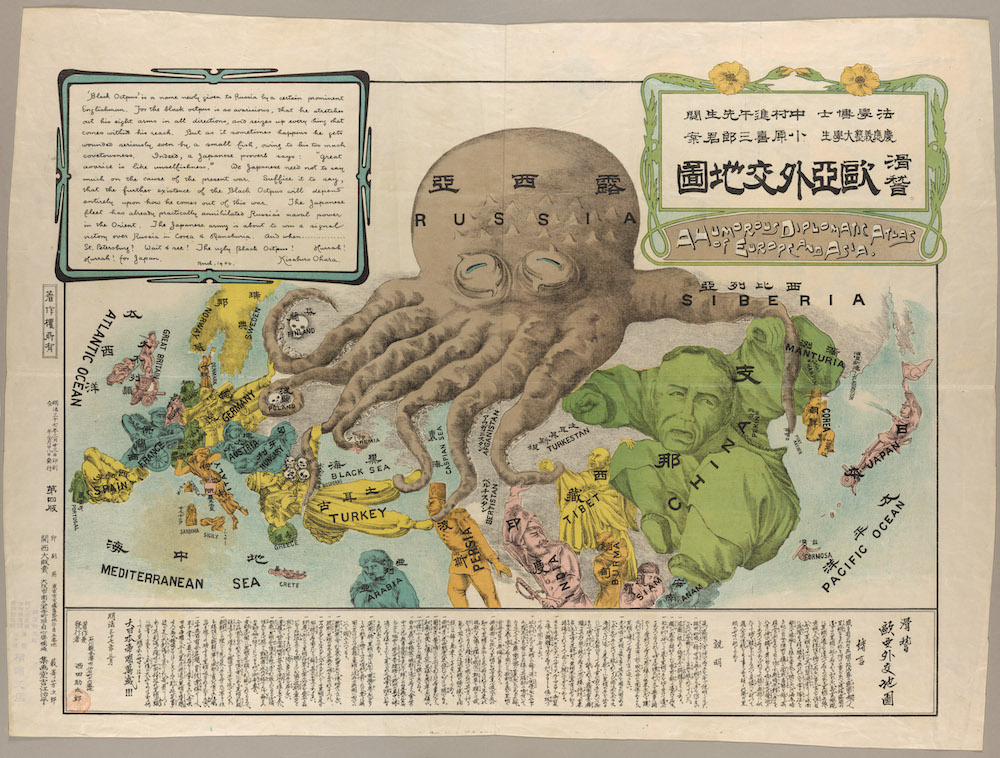
We tend to take a very special interest in archives and maps on this site—and especially in archives of maps. Yet it is rare, if not unheard of, to discover a map archive in which every single entry repays attention. The PJ Mode Persuasive Cartography Collection at Cornell University Library is such an archive. Each map in the collection, from the most simplified to the most elaborate, tells not only one story, but several, overlapping ones about its creators, their intended audience, their antagonists, the conscious and unconscious processes at work in their political psyches, the geo-political view from where they stood.
Maps drawn as propaganda must be broad and bold, casting aside precision for the pressing matter at hand. Even when finely detailed or laden with statistics, such maps press their meaning upon us with unsubtle force.
One especially resonant example of persuasive cartography, for example, at the top shows us an early version of a widely-used motif—the “Cartographic Land Octopus,” or CLO, as Frank Jacobs dubs it at Big Think. The CLO has never gone out of style since its likely origin in J.J. van Brederode’s “Humorous War Map” of 1870, which depicts Russia as a monstrous mollusk. Later, Caricaturist Fred W. Rose printed a reprise, the “Serio-Comic War Map for the Year 1877.”
A full twenty-seven years later, a Japanese student used the very same design for his satirical map of Russia-as-Octopus, the occasion this time the Russo-Japanese War. Titled “A Humorous Diplomatic Atlas of Europe and Asia,” the Japanese map cites Rose, or “a certain prominent Englishman,” as its inspiration. Its text reads, in part:
The black octopus is so avaricious, that he stretches out his eight arms in all directions, and seizes up every thing that comes within his reach. But as it sometimes happens he gets wounded seriously even by a small fish, owing to his too much covetousness.
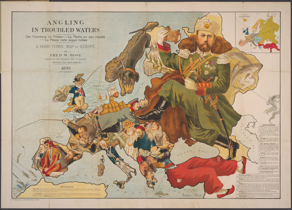
No doubt Russian persuasive cartographers had a different view of who was or wasn’t an octopus. Many years after his octopus map, Fred Rose dropped sea creatures for fishing in another of his serio-comic maps, “Angling in Troubled Waters,” above, this one from 1899, and showing Russia as a massive incarnation of the tsar, his boots posed to walk all over Europe. After the revolution, the Russian octopus returned, bearing different names but no less menacing a beast.
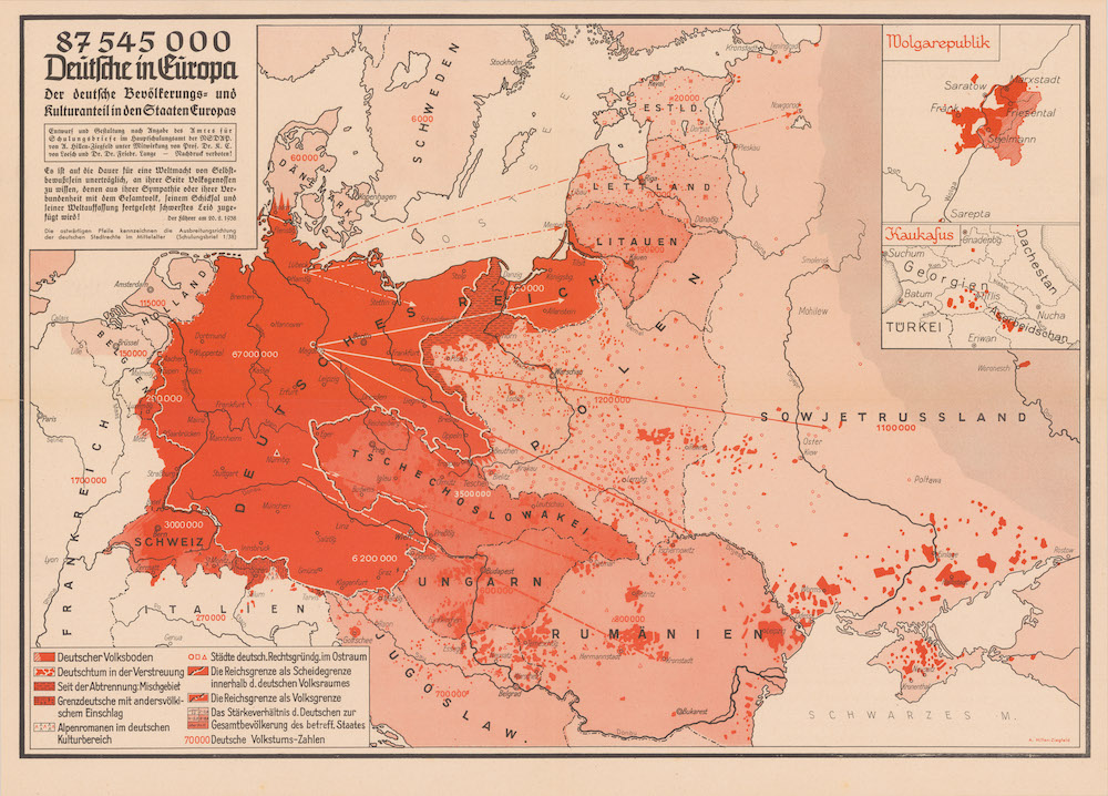
Many maps in the collection show contradictory views of Russia, or Great Britain, or whatever world power at the time threatened to overrun everyone else. It’s interesting to see the continuity of such depictions over decades, and centuries (Jacobs shows examples of Russian octopi from 1938 and 2008). The map above from 1938 reflects “Nazi expansionist goals,” notes Cornell’s digital collections, by showing the supposed “German” populations scattered all over Europe and the need, as Hitler argued in the quoted speech, to protect and liberate “national comrades” by means of annexation, bombing, and invasion.
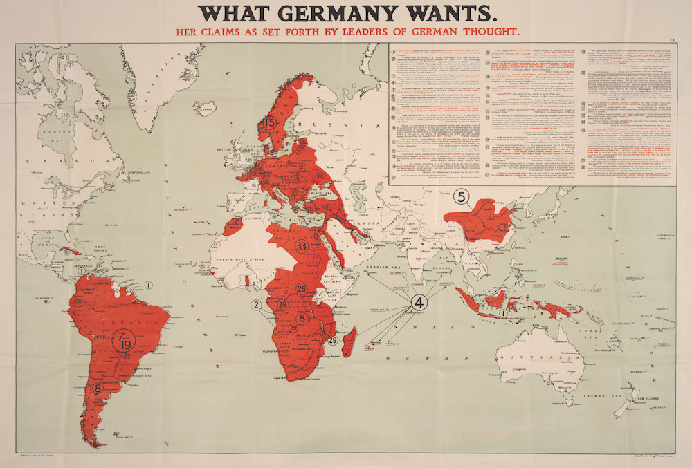
Where the blood red of the German map represents the “blood” of the volk, in the map above, from 1917, it stands in for the blood of everyone else if the “leaders of German thought” get what they want. Where the Reich map took aim at Europe, the quoted “former generals,” notes Cornell, “and well-known Pangermanists” in the WWI-era map above wanted to colonize most of the world, a particular affront to the British, who were well on their way to doing so, and to a lesser degree, the French, who wanted to. These two world powers had been at it far longer, however, and not without fierce opposition at home as well as in the colonies.
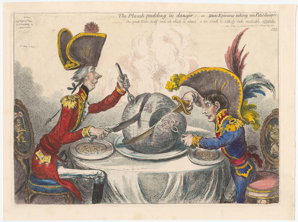
The famous eighteenth century British caricaturist James Gillray’s most famous print, from 1805, shows William Pitt and Napoleon seated at table, carving up the world between them to consume it.
A steaming ‘plum-pudding’ globe, both intent on carving themselves a substantial portion…. Pitt appears calm, meticulous and confident, spearing the pudding with a trident indicative of British naval supremacy. He lays claim to the oceans and the West Indies. In contrast Napoleon Bonaparte reaches from this chair with covetous, twitching eyes fixed on the prize of Europe and cuts away France, Holland, Spain, Switzerland, Italy and the Mediterranean.
Gillray’s cartoon hardly counts as a “map” but it deserves inclusion in this fine collection. Other notable maps featured include the 1904 “Distribution of Crime & Drunkenness in England and Wales,”a study in the persuasive use of correlation; the 1856 “Reynold’s Political Map of the United States,” illustrating the “stakes involved in the potential spread of slavery to the Western States” in support of the Republican Presidential candidate John Fremont; and the French Communist Party’s 1951 “Who is the Aggressor?” which shows American military bases around the world, their guns—or big black arrows—pointed at China and the U.S.S.R.
There are hundreds more persuasive maps, illustrating views theological, political, social, mechanical, and otherwise, dating from the 15th century to the 2000s. You can browse the whole collection or by date, creator, subject, repository, and format. All of the maps are annotated with catalog information and collector’s notes explaining their context. And all of them, from the frivolous to the world-historical, tell us far more than they intended with their peculiar ways of spatializing prejudices, fears, desires, beliefs, obsessions, and overt biases.
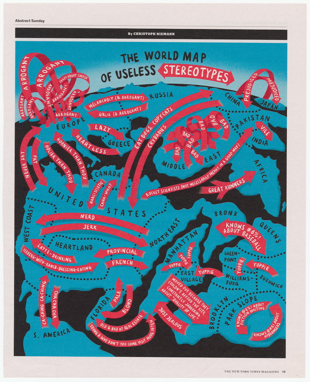
“Every map has a Who, What, Where and When about it,” as collector PJ Mode writes on the Cornell site. “But these maps had another element: Why? Since they were primarily ‘about’ something other than geography, understanding the map required finding the reasoning behind it.” The most recent entry in the archive, Christopher Neiman’s 2011 “World Map of Useless Stereotypes” from The New York Times Magazine turns the persuasive map in on itself, using its satirical devices to poke fun at propaganda’s reductive effects.
Related Content:
Josh Jones is a writer and musician based in Durham, NC. Follow him at @jdmagness
Read More...Support Us
We're hoping to rely on loyal readers, rather than erratic ads. Please click the Donate button and support Open Culture. You can use Paypal, Venmo, Patreon, even Crypto! We thank you!

About Us

Open Culture scours the web for the best educational media. We find the free courses and audio books you need, the language lessons & educational videos you want, and plenty of enlightenment in between.
Advertise With Us

FREE UPDATES!
GET OUR DAILY EMAIL
Get the best cultural and educational resources on the web curated for you in a daily email. We never spam. Unsubscribe at any time.
FOLLOW ON SOCIAL MEDIA

Open Culture editor Dan Colman scours the web for the best educational media. He finds the free courses and audio books you need, the language lessons & movies you want, and plenty of enlightenment in between.
Advertise With Us

