We’re living in the age of data and artificial intelligence (AI). Every second, vast amounts of data are being generated, processed, and analyzed. And increasingly AI plays a central role in how that data gets managed. For companies, governments, and individuals alike, understanding data is essential. This makes Data Analytics—especially when accompanied by AI skills—a valuable asset for most professionals.
Enter Google, which recently launched a professional certificate in Data Analytics–one that will “have you job-ready in less than 6 months.” Offered on the Coursera platform, the Data Analytics Professional Certificate consists of eight courses, including “Foundations: Data, Data, Everywhere,” “Prepare Data for Exploration,” “Data Analysis with R Programming,” and “Share Data Through the Art of Visualization.” And now the course sequence has incorporated videos exploring how to leverage artificial intelligence when working with data. Overall this program “includes over 180 hours of instruction and hundreds of practice-based assessments, which will help you simulate real-world data analytics scenarios that are critical for success in the workplace.”
Upon completion, students–even those who haven’t pursued a college degree–can directly apply for jobs (e.g., junior or associate data analyst, database administrator, etc.) with Google and over 150 U.S. employers, including Deloitte, Target, and Verizon. You can start a 7‑day free trial and explore the courses here. If you continue beyond the free trial, Google/Coursera will charge $49 per month. That translates to about $300 after 6 months, the time estimated to complete the certificate.
Finally, it’s worth mentioning that anyone who enrolls in this certificate before November 30, 2024 will get access to Google AI Essentials at no cost.
Note: Open Culture has a partnership with Coursera. If readers enroll in certain Coursera courses and programs, it helps support Open Culture.
Or an artistically gifted woman of the same era, looking for a steady, respectable source of income.
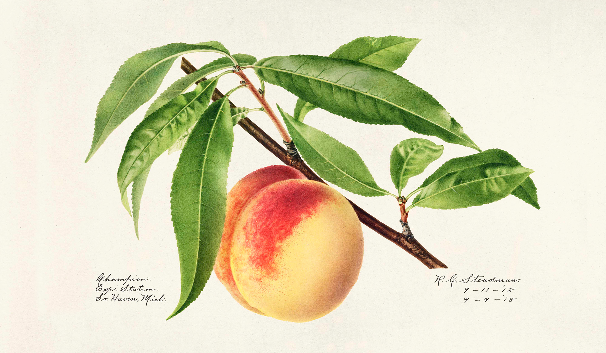
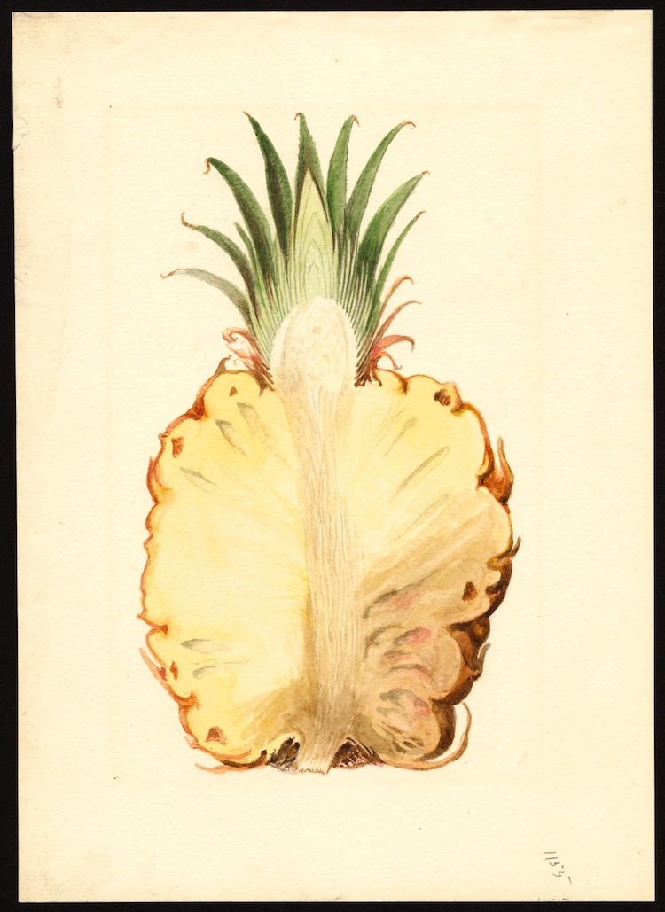
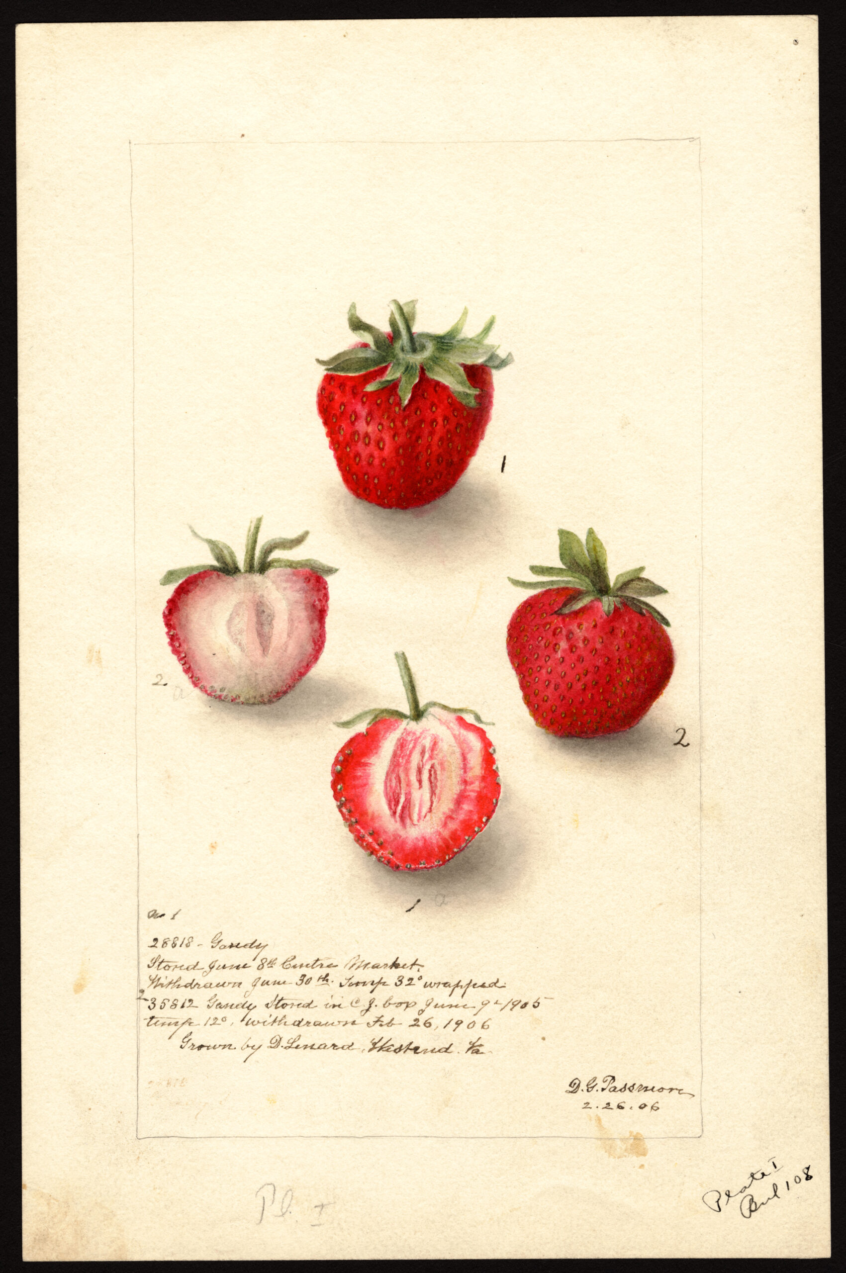
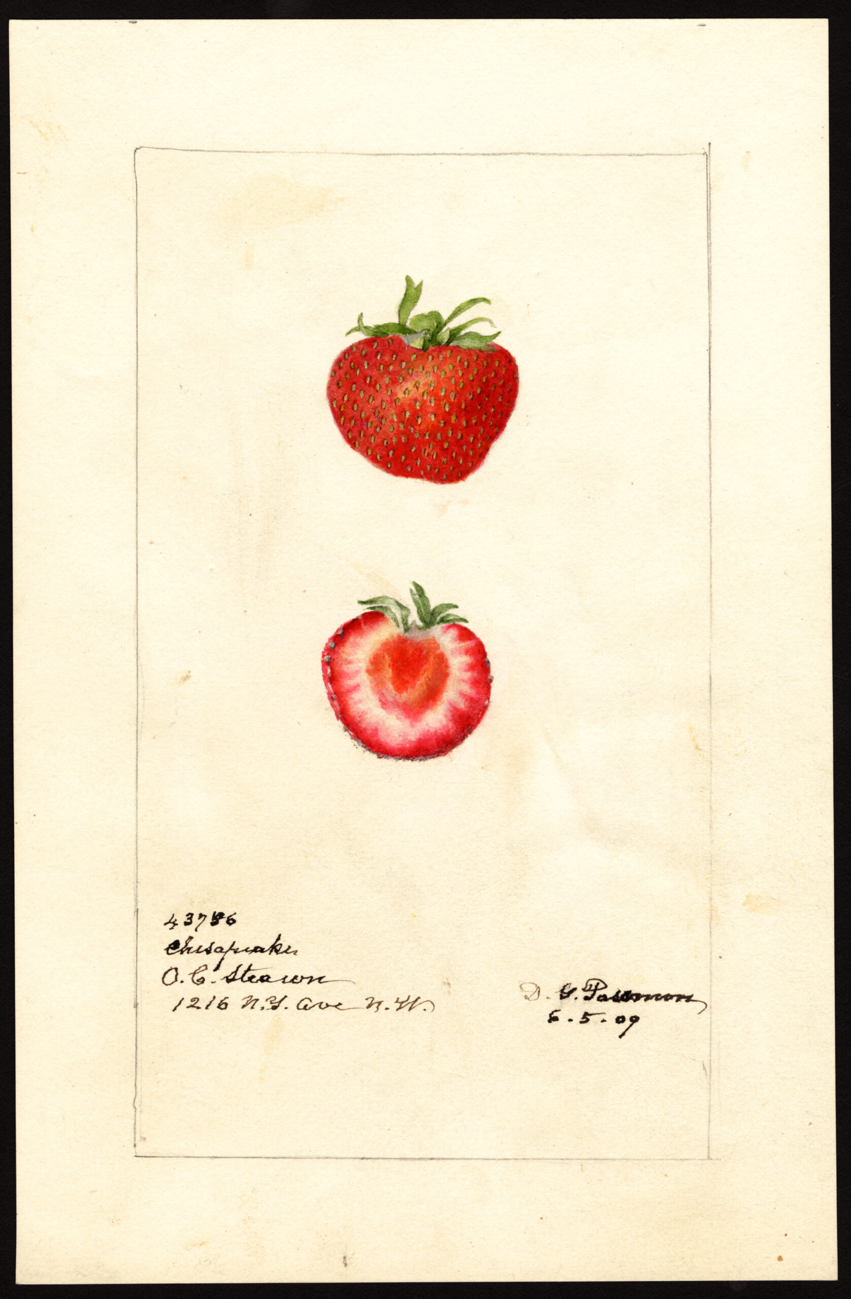
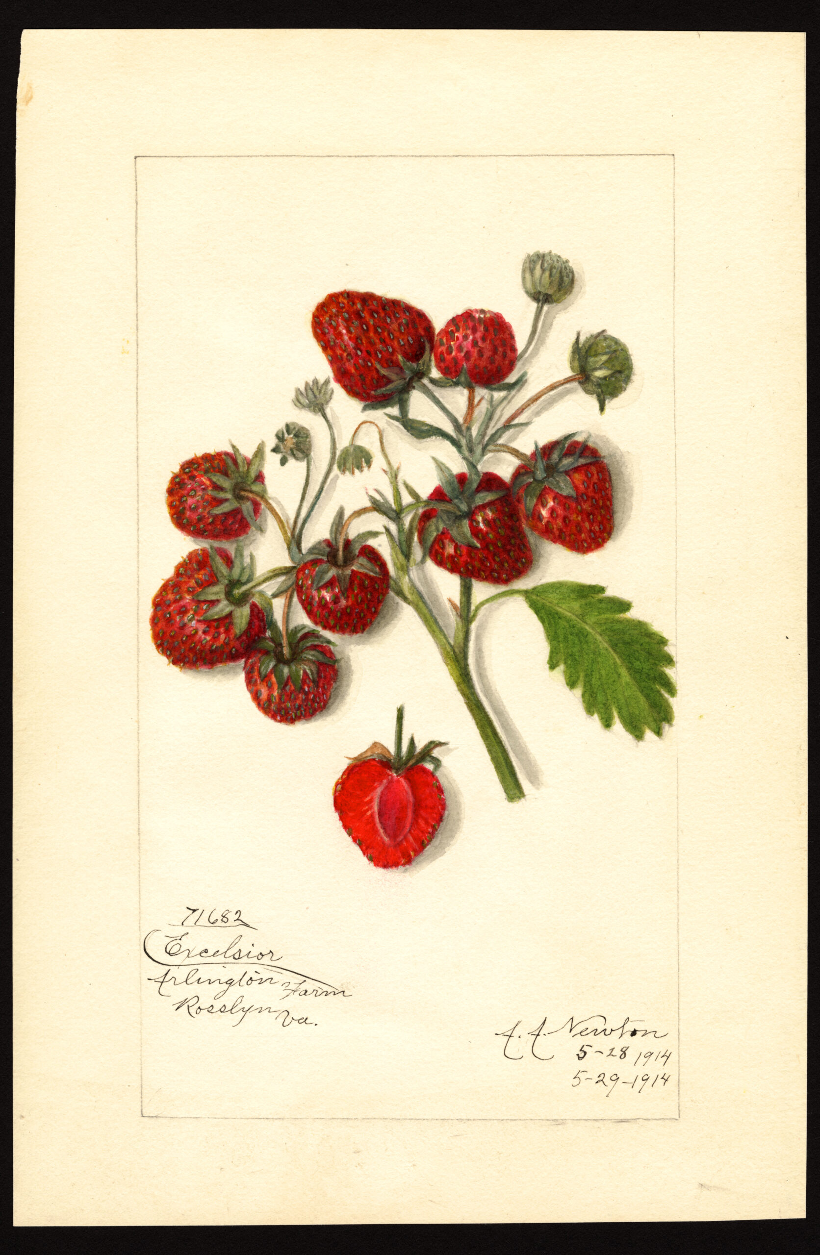
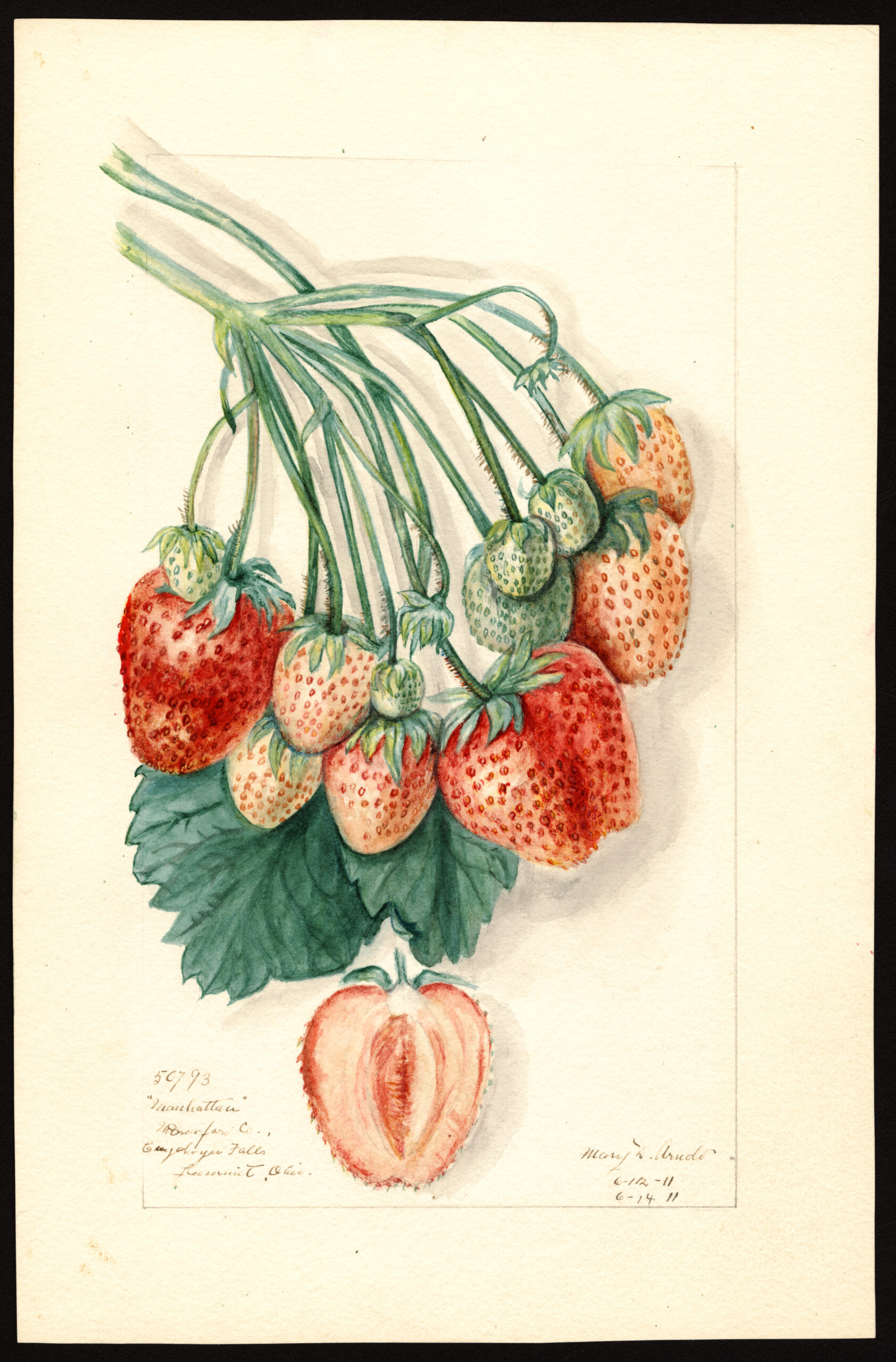
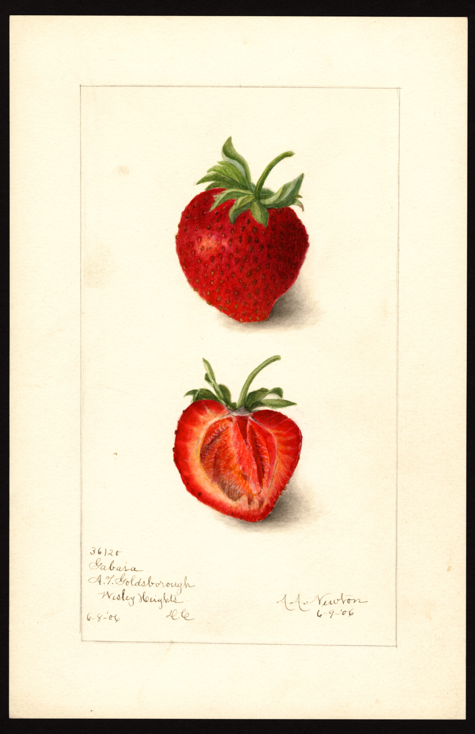
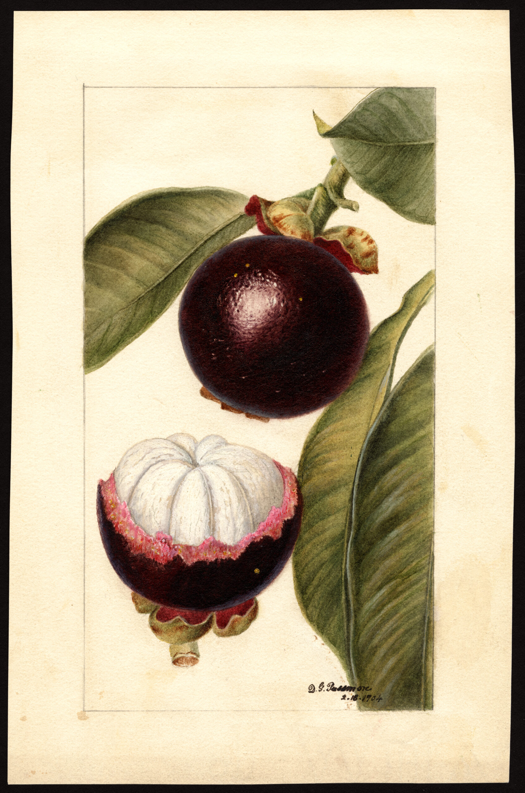
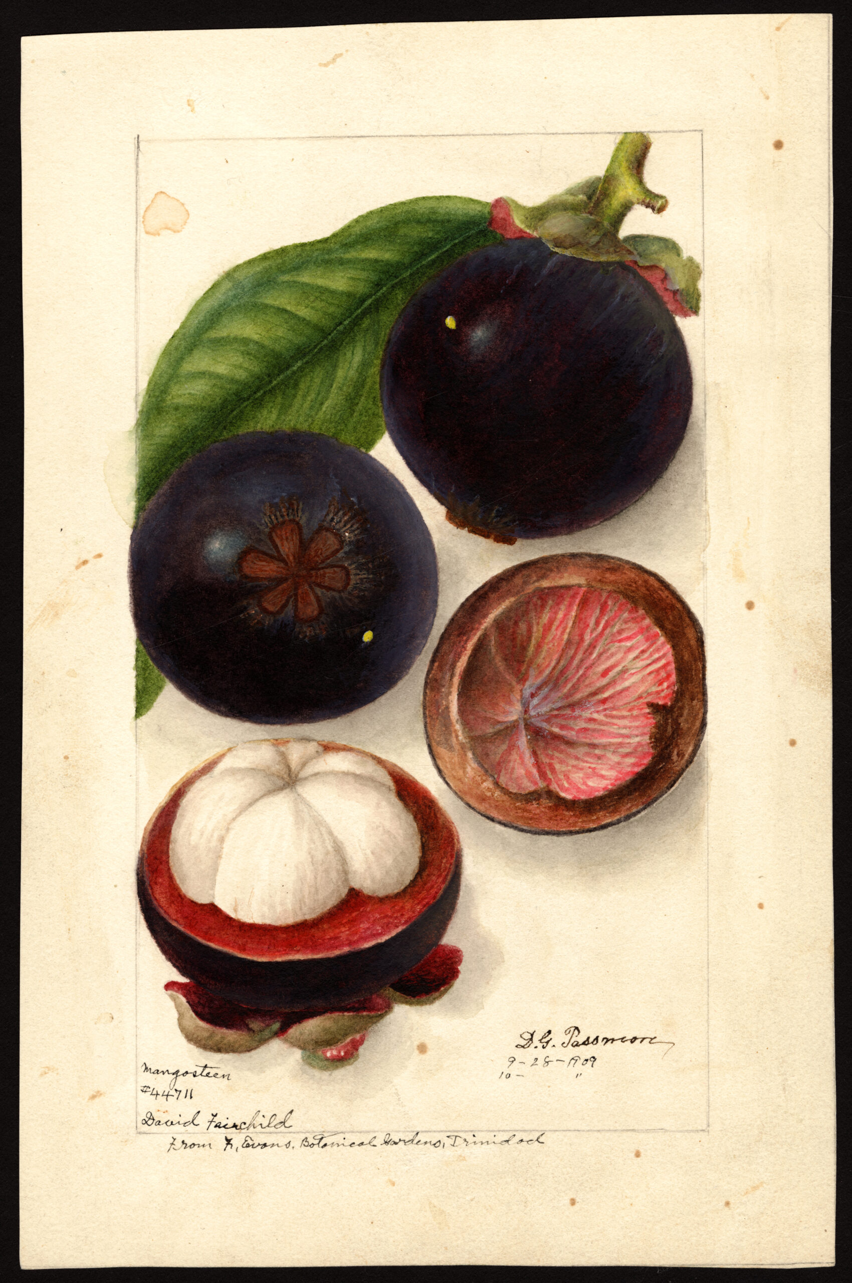
In 1886, long before color photography was a viable option, the US Department of Agriculture engaged approximately 21, mostly female illustrators to create realistic renderings of hundreds of fruit varieties for lithographic reproduction in USDA articles, reports, and bulletins.
According to the Division of Pomology’s first chief, Henry E. Van Deman, the artists’ mandate was to capture “the natural size, shape, and color of both the exterior and interior of the fruit, with the leaves and twigs characteristic of each.”
If a specimen was going bad, the artist was under strict orders to represent the damage faithfully — no prettying things up.
As Alice Tangerini, staff illustrator and curator for botanical art in the Smithsonian’s National Museum of Natural History writes, “botanical illustrators and their works serve the scientist, depict(ing) what a botanist describes, acting as the proofreader for the scientific description:”
Digital photography, although increasingly used, cannot make judgements about the intricacies of portraying the plant parts a scientist may wish to emphasize and a camera cannot reconstruct a lifelike botanical specimen from dried, pressed material… the thought process mediating that decision of every aspect of the illustration lives in the head of the illustrator.
…the illustrator also has an eye for the aesthetics of botanical illustration, knowing that a drawing must capture the interest of the viewer to be a viable form of communication. Attention to accuracy is important, but excellence of style and technique used is also primary for an illustration to endure as a work of art and science.
(Fruit breeders’ rights were formally protected with the establishment of the Plant Patent Act of 1930, which decreed that anyone who “invented or discovered and asexually reproduced any distinct and new variety of plant” could receive a patent.)
The collection’s 7,497 watercolors of realistically-rendered fruits capture both the commonplace and the exotic in mouthwatering detail.
Both aesthetically and as a scientific database, the Pomological Watercolor Collection is the berries — specifically, Gandy, Chesapeake, Excelsior, Manhattan, and Gabara to namecheck but a few types of Fragaria, aka strawberries, preserved therein.
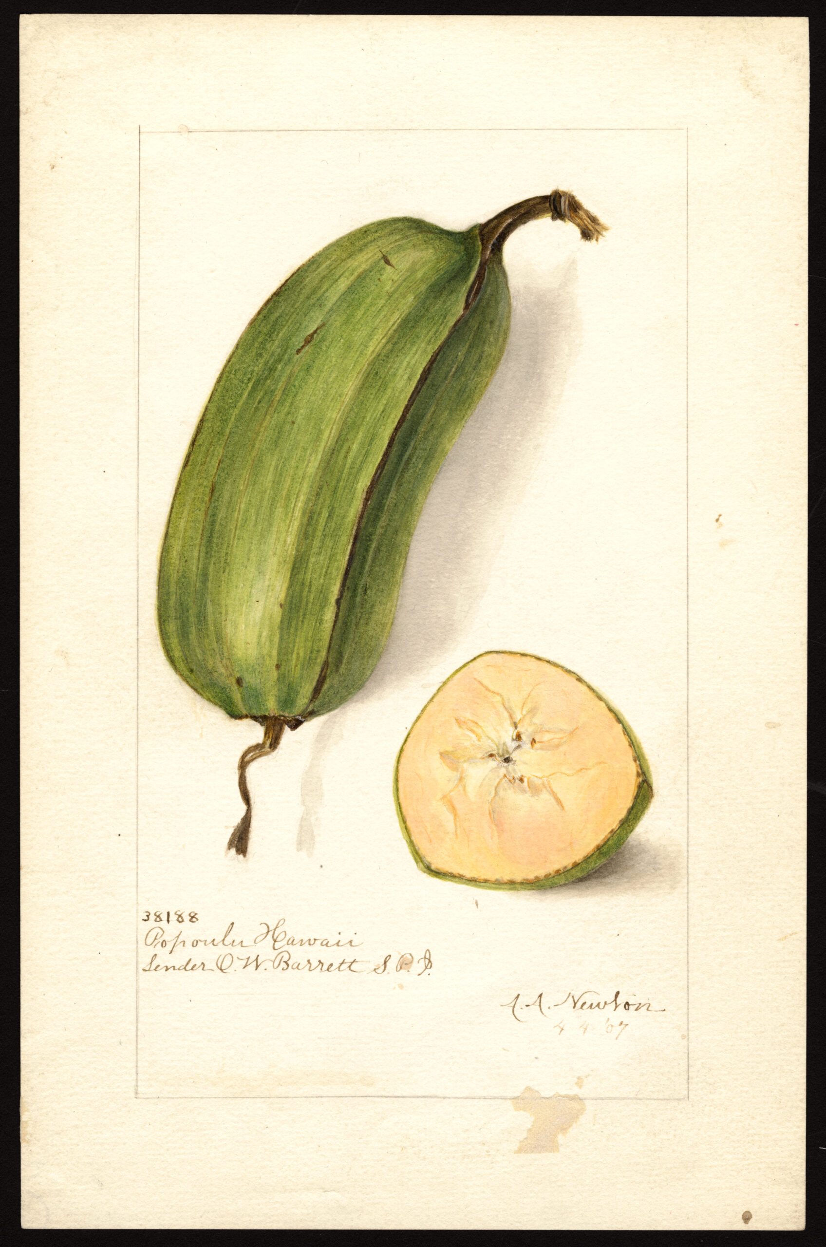
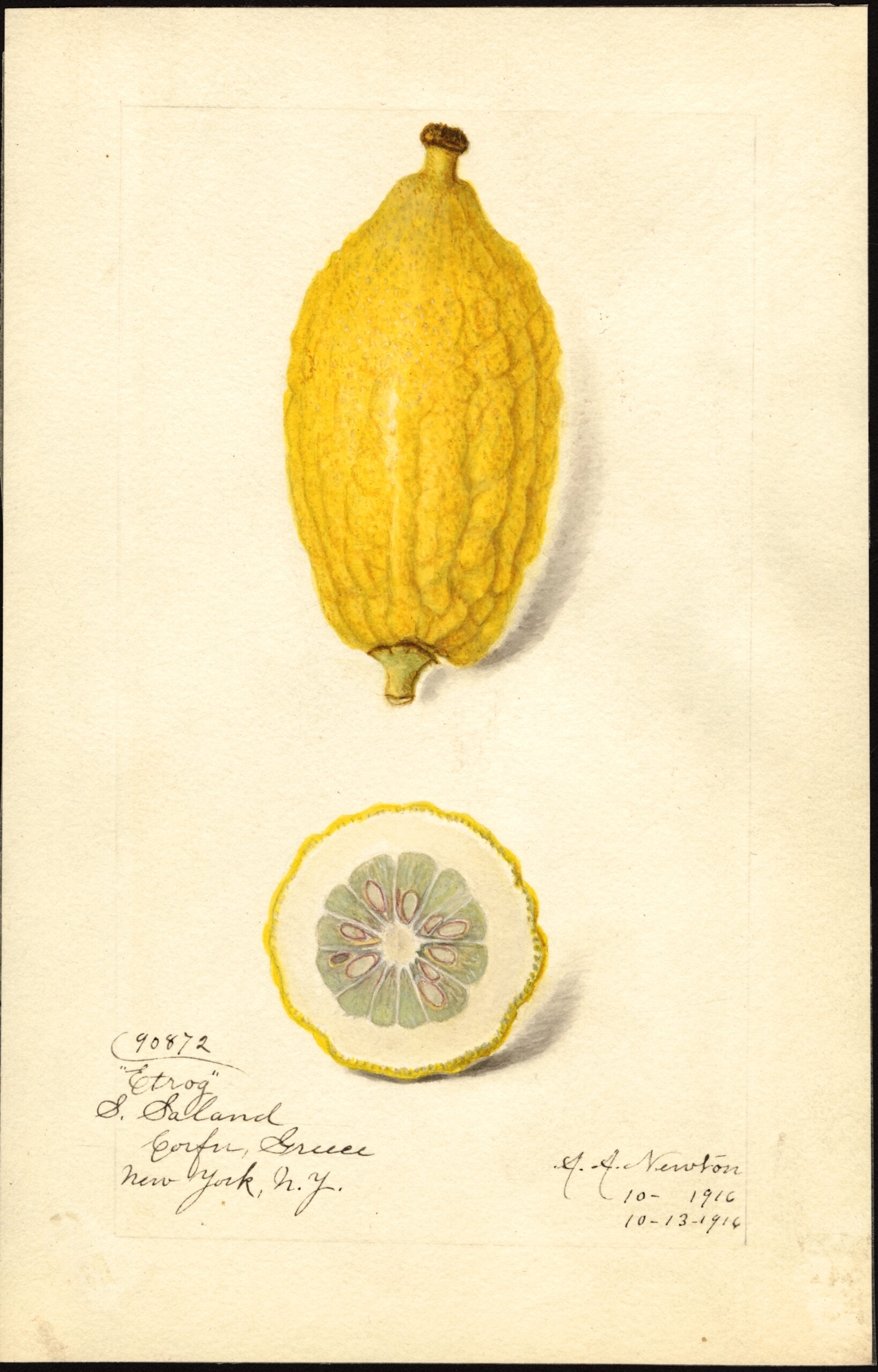
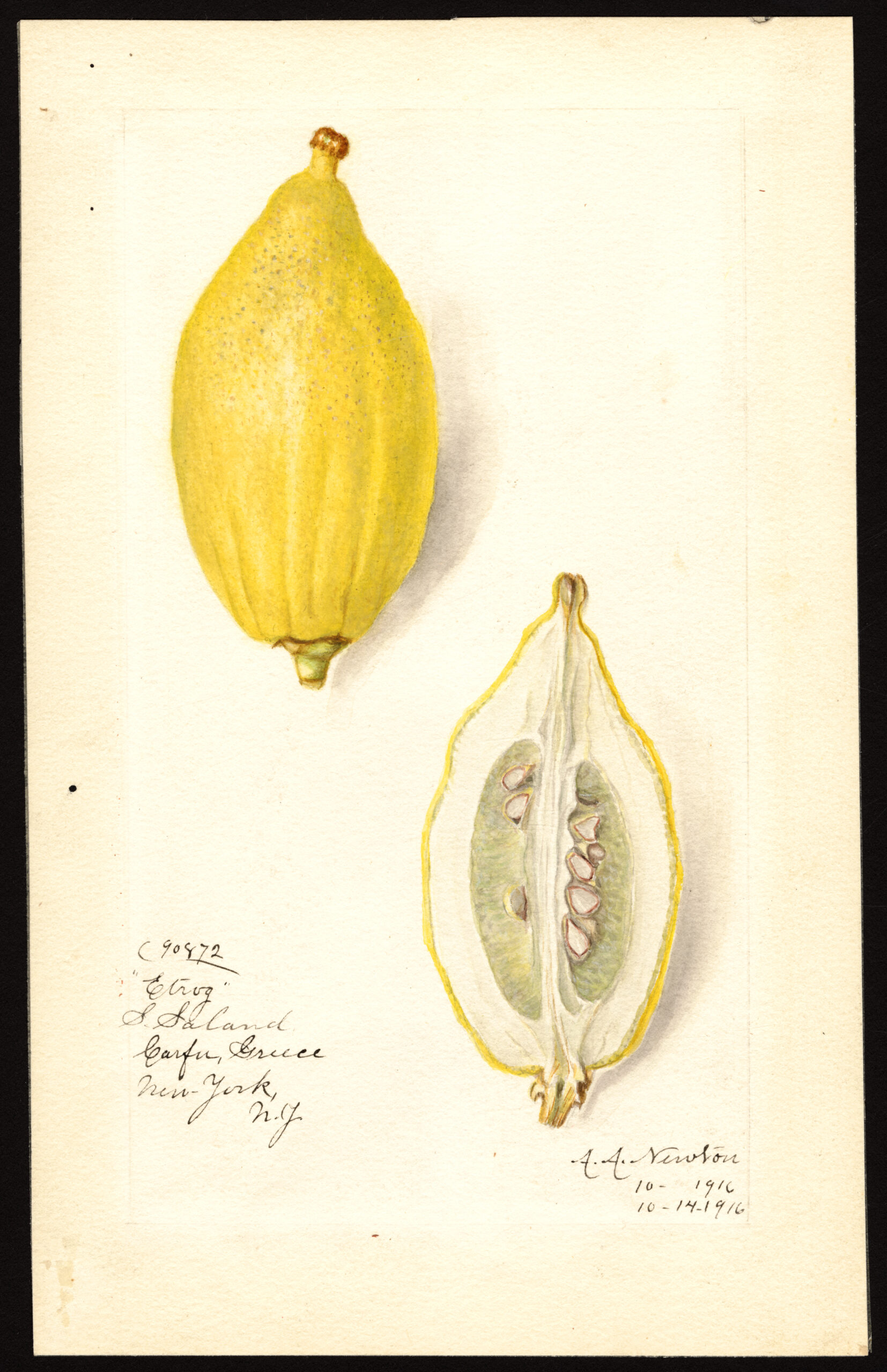
Other fruits remain lesser known on our shores. The USDA sponsored global expeditions specifically to gather specimens such as the ones below.
The thick, square-ended Popoulu banana would never be mistaken for a Chiquita from the outside. According to The World of Bananas in Hawai’i: Then and Now, its lineage dates back tens of thousands of years to the Vanuatu archipelago.
If you celebrate the harvest festival Sukkot, you likely encountered an etrog within the last month. The notoriously fiddly crop has been cultivated domestically since 1980, when a yeshiva student in Brooklyn, seeking to keep costs down and ensure that kosher protocols were maintained, convinced a third-generation California citrus grower by the name of Fitzgerald to give it a go.
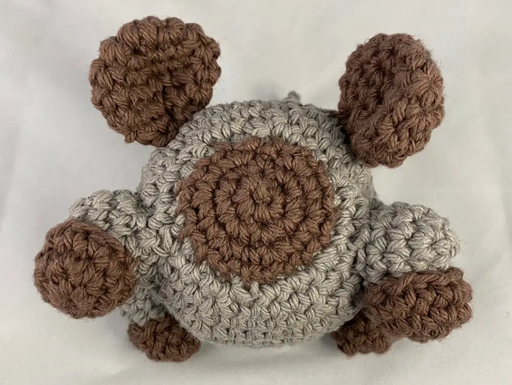
More recently, the poet and international educator has combined her interest in amigurumi crocheted animals and ChatGPT, the open source AI chatbot.
Having crocheted an amiguruminarwhal for a nephew earlier this year, she hopped on ChatGPT and asked it to create “a crochet pattern for a narwhal stuffed animal using worsted weight yarn.”
The result might have discouraged another querent, but Woolner got out her crochet hook and sallied forth, following ChatGPTs instructions to the letter, despite a number of red flags indicating that the chatbot’s grasp of narwhal anatomy was highly unreliable.
Its ignorance is part of its DNA. As a large language model, ChatGPT is capable of producing predictive text based on vast amounts of data in its memory bank. But it can’t see images.
It has no idea what a cat looks like or even what crochet is. It simply connects words that frequently appear together in its training data. The result is superficially plausible passages of text that often fall apart when exposed to the scrutiny of an expert—what’s been called “fluent bullshit.”
It’s also not too hot at math, a skill set knitters and crocheters bring to bear reading patterns, which traffic in numbers of rows and stitches, indicated by abbreviations that really flummox a chatbot.
Rnd 7: sc even (12); F/O and leave a long strand of yarn to sew the dorsal fin between rnds # 18–23. Do not stuff the fin.
Pity poor ChatGPT, though, like Woolner, it tried.
Their collaboration became a cause célèbre when Woolner debuted the “AI generated narwhal crochet monstrosity” on TikTok, aptly comparing the large tusk ChatGPT had her position atop its head to a chef’s toque.
Is that the best AI can do?
A recent This American Life episode details how Sebastien Bubeck, a machine learning researcher at Microsoft, commanded another large language model, GPT‑4, to create code that TikZ, a vector graphics producer, could use to “draw” a unicorn.
This collaborative experiment was perhaps more empirically successful than the ChatGPT amigurumi patterns Woolner dutifully rendered in yarn and fiberfill. This American Life’s David Kestenbaum was sufficiently awed by the resulting image to hazard a guess that “when people eventually write the history of this crazy moment we are in, they may include this unicorn.”
It’s not good, but it’s a fucking unicorn. The body is just an oval. It’s got four stupid rectangles for legs. But there are little squares for hooves. There’s a mane, an oval for the head. And on top of the head, a tiny yellow triangle, the horn. This is insane to say, but I felt like I was seeing inside its head. Like it had pieced together some idea of what a unicorn looked like and this was it.
Let’s not poo poo the merits of Woolner’s ongoing explorations though. As one commenter observed, it seems she’s “found a way to instantiate the weird messed up artifacts of AI generated images in the physical universe.”
To which Woolner responded that she “will either be spared or be one of the first to perish when AI takes over governance of us meat sacks.”
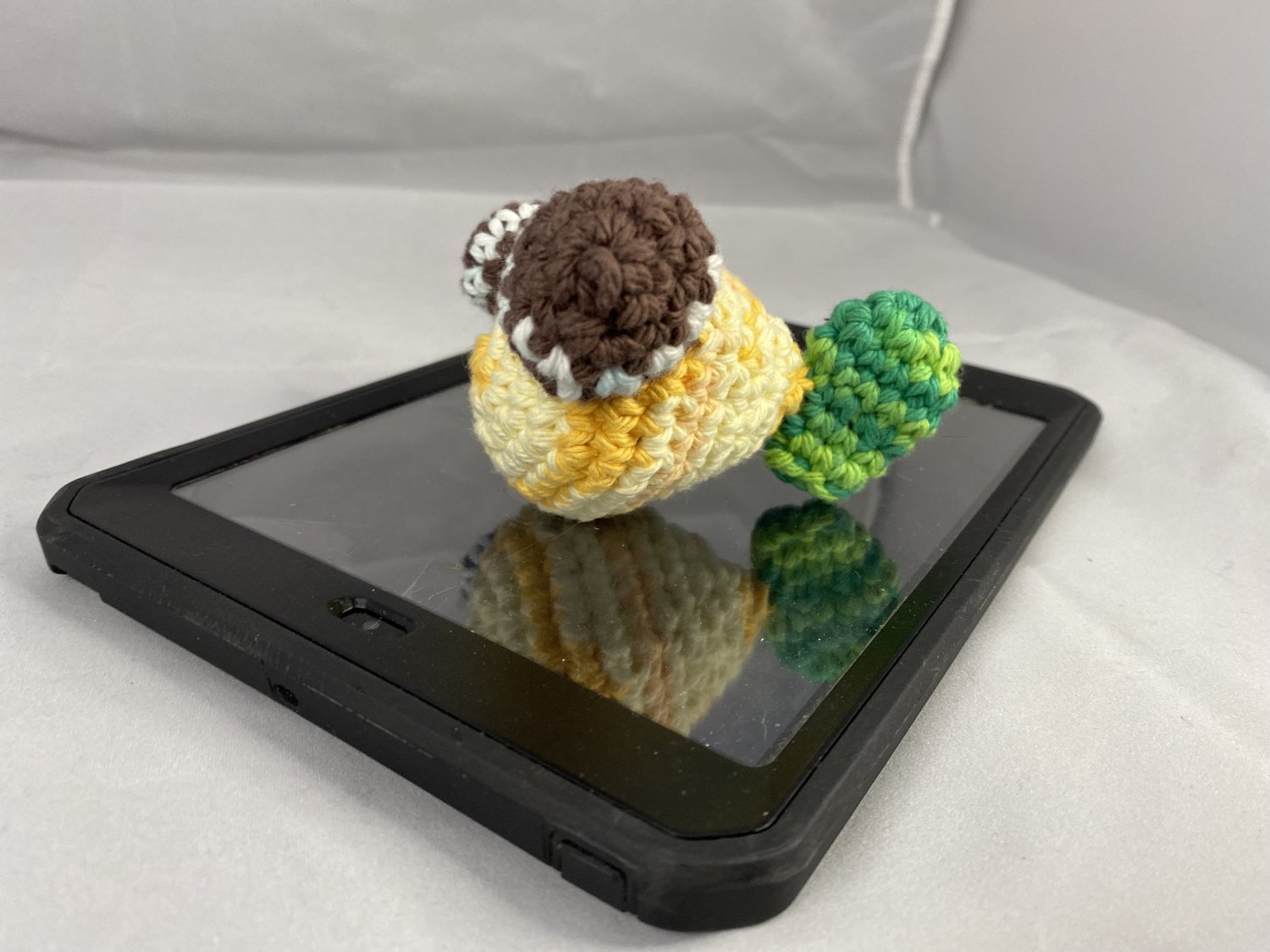
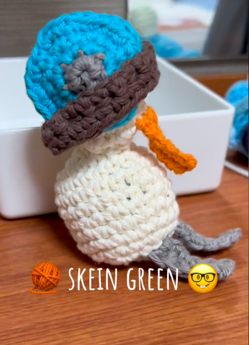
In the meantime, she’s continuing to harness ChatGPT to birth more monstrous amigurumi. Gerald the Narwhal’s has been joined by a cat, an otter, Norma the Normal Fish, XL the Newt, and Skein Green, a pelican bearing get well wishes for author and science vlogger Hank Green.
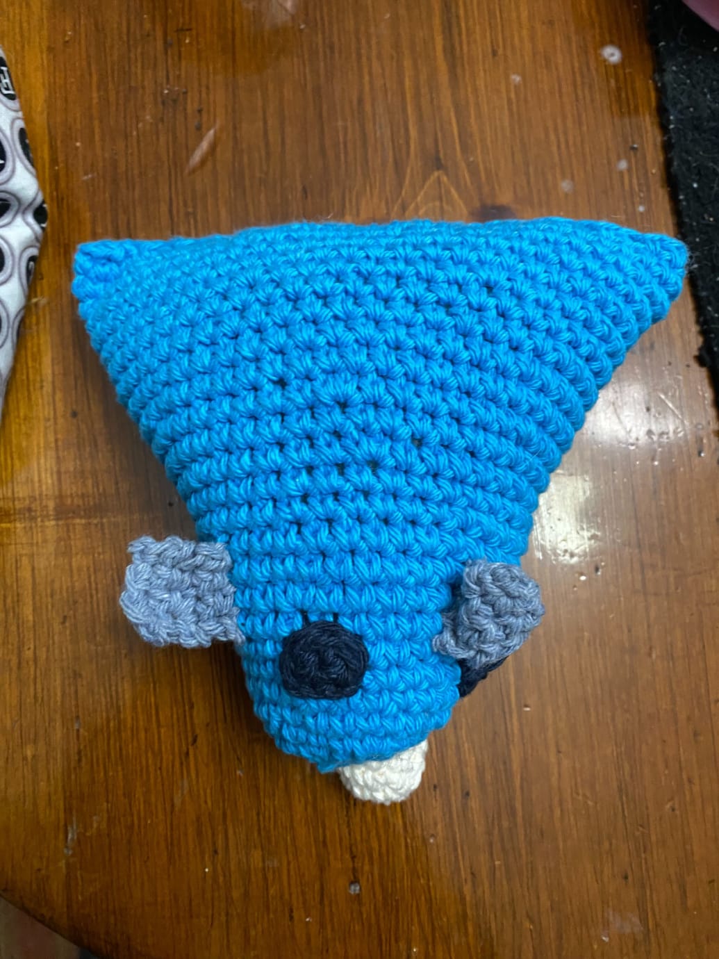
Two weeks later, the Daily Beast pronounced this attempt, nicknamed Gerard, “even less narwhal-looking than the first. Its body was a massive stuffed triangle, and its tusk looked like a gumdrop at one end.”
Woolner dubbed Gerard possibly the most frustrating AI-generated amigurumi of her acquaintance, owing to an onslaught of specificity on ChatCPT’s part. It overloaded her with instructions for every individual stitch, sometimes calling for more stitches in a row than existed in the entire pattern, then dipped out without telling her how to complete the body and tail.
As silly as it all may seem, Woolner believes her ChatGPT amigurumi collabsare a healthy model for artists using AI technology:
I think if there are ways for people in the arts to continue to create, but also approach AI as a tool and as a potential collaborator, that is really interesting. Because then we can start to branch out into completely different, new art forms and creative expressions—things that we couldn’t necessarily do before or didn’t have the spark or the idea to do can be explored.
If you, like Hank Green, have fallen for one of Woolner’s unholy creations, downloadable patterns are available here for $2 a pop.
Those seeking alternatives to fiberfill are advised to stuff their amigurumi with “abandoned hopes and dreams” or “all those free tee shirts you get from giving blood and running road races or whatever you do for fun”.
“The inhabitants of fifteenth-century Florence included Brunelleschi, Ghiberti, Donatello, Masaccio, Filippo Lippi, Fra Angelico, Verrocchio, Botticelli, Leonardo, and Michelangelo,” writes tech investor and essayist Paul Graham. “Milan at the time was as big as Florence. How many fifteenth century Milanese artists can you name?” Once you get thinking about the question of “what happened to the Milanese Leonardo,” it’s hard to stop. So it seems to have been for network physicist Albert-László Barabási, whose work on the distribution of scientific genius we featured last month here on Open Culture. Graham’s speculation also applied to that line of inquiry, but it applies much more directly to Barabási’s work on artistic fame.
“In the contemporary art context, the value of an artwork is determined by very complex networks,” Barabási explains in the Big Think video above. Factors include “who is the artist, where has that artist exhibited before, where was that work exhibited before, who owns it and who owned it before, and how these multiple links connect to the canon and to art history in general.” In search of a clearer understanding of their relative importance and the nature of their interactions, he and a team of researchers gathered all the relevant data to produce “a worldwide map of institutions, where it turned out that the most central nodes — the most connected nodes — happened to be also the most prestigious museums: MoMA, Tate, Gagosian Gallery.”
So far, this may come as no great surprise to anyone familiar with the art world. But the most interesting characteristic of this network map, Barabási says, is that it “allowed us to predict artistic success. That is, if you give me an artist and their first five exhibits, I’d put them on the map and we could fast-forward their career to where they’re going to be ten, twenty years from now.” In the past, the artists who made it big tended to start their career in some proximity to the map’s central institutions.“It’s very difficult for somebody to enter from the periphery. But our research shows that it’s possible”: such artists “exhibited everywhere they were willing to show their work,” eventually making influential connections by these “many random acts of exhibition.”
This research, published a few years ago in Science, “confirms how important networks are in art, and how important it is for an artist to really understand the networks in which their work is embedded.” Location matters a great deal, but that doesn’t consign talent to irrelevance. The more talented artists are, “the more and higher-level institutions are willing to work with them.” If you’re an artist, “who was willing to work with you in your first five exhibits is already a measure of your talent and your future journey in the art world.” But even if you’re not an artist, you underestimate simultaneous importance of ability and connections — and how those two factors interact with each other — at your peril. From art to science to insurance claims adjustment to professional bowling, every field involves networks: networks that, as Barabási’s work has shown us, aren’t always visible.
Based in Seoul, Colin Marshall writes and broadcasts on cities, language, and culture. His projects include the Substack newsletterBooks on Cities, the book The Stateless City: a Walk through 21st-Century Los Angeles and the video series The City in Cinema. Follow him on Twitter at @colinmarshall or on Facebook.
Having come out less than two weeks ago, the American Museum of Natural History video above incorporates up-to-date information on the number of human beings on planet Earth. But what’s interesting here isn’t so much the current global-population figure (eight billion, incidentally) as how we reached it. That story emerges through an animated visualization that compresses a period of 300,000 years — with all its migrations, its growing and declining empires, its major trade routes, its technological developments, its plagues, and its wars — into about four and a half minutes.
“Modern humans evolved in Africa about 300,000 years ago,” says the video’s explanatory text. “Around 100,000 years ago, we began migrating around the globe,” a process that shows no signs of stopping here in the twenty-first century.
The same can’t be said for the way our numbers have increased over the past few hundred years, at least according to the projection that “global population will peak this century” around ten billion, due to “average fertility rates falling in nearly every country.” For some, this is not entirely unwelcome, given that “as our population grows, so has our use of Earth’s resources.”
It’s been a while since the developed world has felt a widespread fear of overpopulation, which had a climate change-like power to inspire apocalyptic visions in the nineteen-seventies. Nowadays, we’re more likely to hear warnings of imminent global population collapse, with low-birthrate countries like South Korea, where I live, held up as cautionary demographic examples. From another perspective, the patterns of humanity’s expansion thus far could also be used to illustrate calls to explore and colonize other planets, not least to secure our species a path to survival should something go seriously wrong here on Earth. However our population graph changes in the future, we can rest assured that we’ll always think of ourselves as living at one kind of decisive moment or another.
Based in Seoul, Colin Marshall writes and broadcasts on cities, language, and culture. His projects include the Substack newsletterBooks on Cities, the book The Stateless City: a Walk through 21st-Century Los Angeles and the video series The City in Cinema. Follow him on Twitter at @colinmarshall or on Facebook.
Genius sells. Publishers of biographies and studios behind Oscar-winning dramas can tell you that. So can network scientist Albert-László Barabási, who has actually conducted research into the nature of genius. “What really determines the ‘genius’ label?” he asks in the Big Think video above. When he and his collaborators “compared all geniuses to their scientific peers, we realized that there are really two very different classes: ordinary genius and peerless genius.” Considering the latter, Barabási points to the perhaps unsurprising example of Albert Einstein.
“When we looked at the scientists working at the same time, roughly in the same areas of physics that he did,” Barabási explains, “there was no one who would have a comparable productivity or scientific impact to him. He was truly alone.” Illustrating the class of “ordinary genius” is a figure almost as well-known as Einstein: Stephen Hawking. “To our surprise, we realized, there were about six other scientists who worked in roughly the same area, and had comparable, often bigger impacts than Stephen Hawking had” — and yet only he was publicly labeled a “genius.”
“The ‘genius’ label is a construct that society assigns to exceptional accomplishment, but exceptional accomplishment is not sufficient to get the genius label.” Throughout history, “remarkable individuals were always born in the vicinity of big cultural centers, and everything that is outside of the cultural centers was typically a desert of exceptional accomplishments.” Today, as venture capitalist and essayist Paul Graham once wrote, “a thousand Leonardos and a thousand Michelangelos walk among us. If DNA ruled, we should be greeted daily by artistic marvels. We aren’t, and the reason is that to make Leonardo you need more than his innate ability. You also need Florence in 1450.”
What would it take to discover the “hidden geniuses” who may have been born into unpropitious circumstances? This is one concern behind Barabási’s inquiry into the nature of scientific prominence. The question of “how does the quality of the idea that I picked, and the ultimate success, and my ability as a scientist connect to each other” led him to develop the “Q factor,” the measure of “our ability to turn ideas into discoveries.” His analysis of the data shows that, throughout a scientist’s career, the Q factor remains more or less stable. Applying it to big data “could help us to discover those that really had the accomplishment and deserve the genius label and put them in the right place.” If he’s correct, we can expect a bumper crop of books and movies on a whole new wave of geniuses in the years to come.
Based in Seoul, Colin Marshall writes and broadcasts on cities, language, and culture. His projects include the Substack newsletterBooks on Cities, the book The Stateless City: a Walk through 21st-Century Los Angeles and the video series The City in Cinema. Follow him on Twitter at @colinmarshall or on Facebook.
“If you see a pie chart projected twelve feet high in front of you, you know you’re in the hands of an idiot.” These words have stuck with me since I heard them spoken by Edward Tufte, one of the most respected living authorities on data visualization. The latter-day sins of pie-chart-makers (especially those who make them in PowerPoint) are many and varied, but the original sin of the pie chart itself is that of fundamentally misrepresenting one-dimensional information — a company budget, a city’s population demographics — in two-dimensional form.
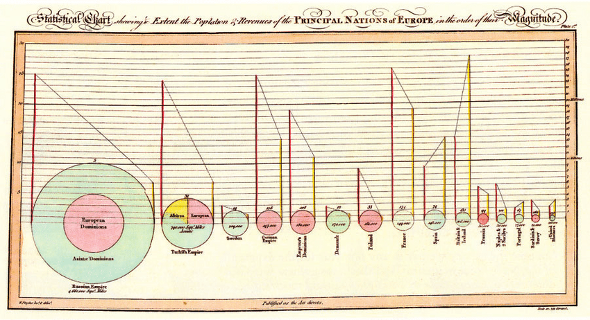
Yet the pie chart was created by a master, indeed the first master, of information design, the late-eighteenth- and early-nineteenth-century Scottish economist William Playfair. Tufte includes Playfair’s first pie chart, an illustration of the land holdings of various nations and empires circa 1800, in his book The Visual Display of Quantitative Information.
“The circle represents the area of each country,” Tufte explains. “The line on the left, the population in millions read on the vertical scales; the line on the right, the revenue (taxes) collected in millions of pounds sterling read also on the vertical scale.” The dotted lines between them show, in Playfair’s words, whether “the country is burdened with heavy taxes or otherwise” in proportion to its population.
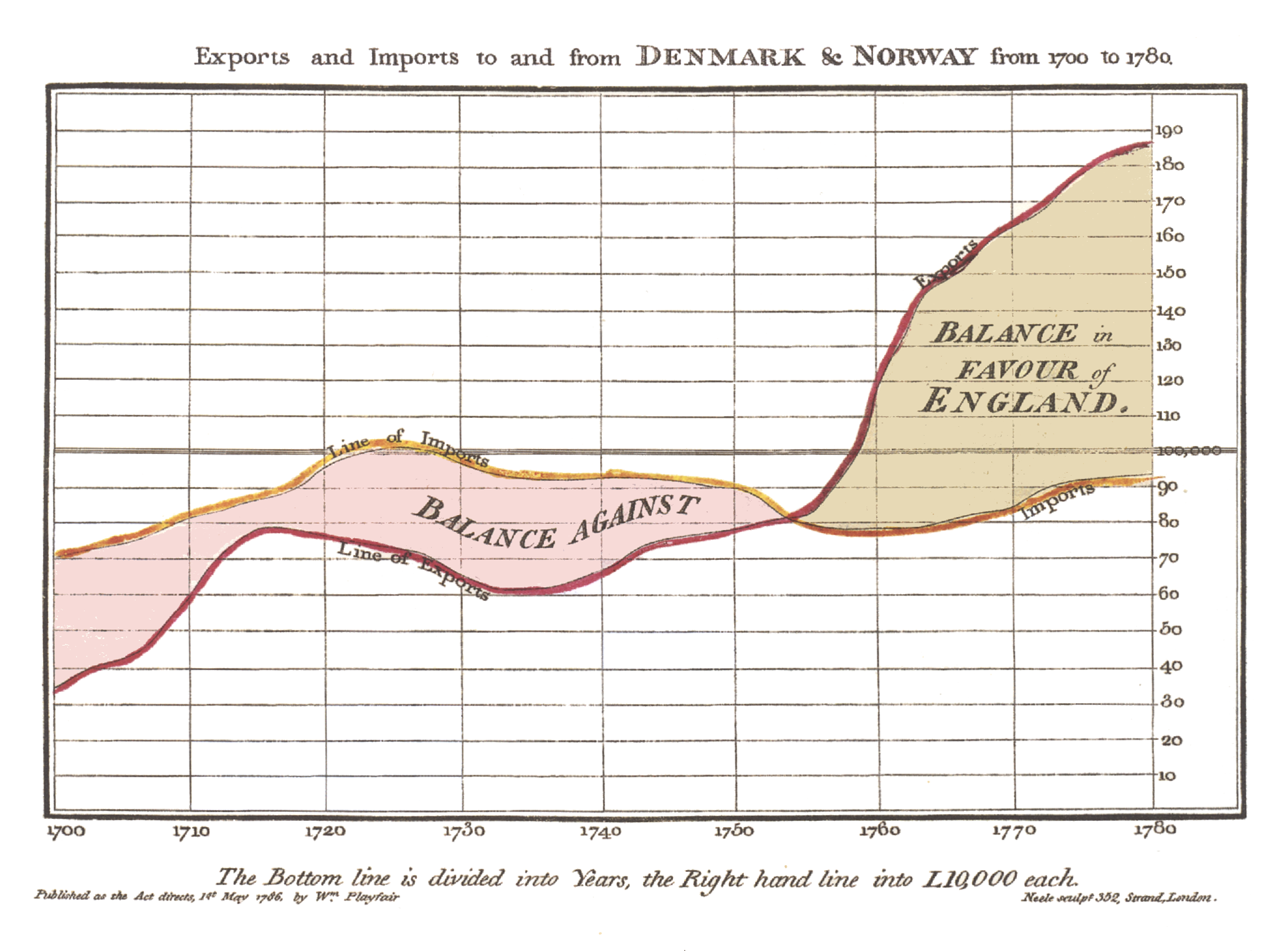
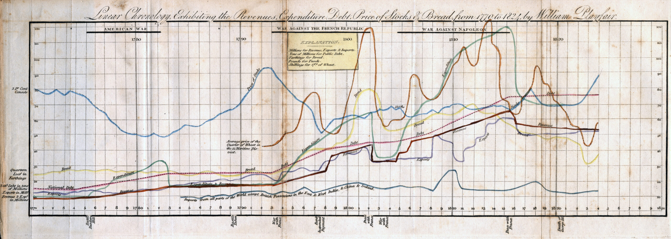
Playfair was experimenting with data visualization long before his invention of the pie chart. He also came up with the more truthful bar chart, history’s first example of which appeared in his Commercial and Political Atlas of 1786. That same book also contains the striking graph above, of England’s “exports and imports to and from Denmark and Norway from 1700 to 1780,” whose lines create fields that make the balance of trade legible at a glance. A much later example of the line graph, another form Playfair is credited with inventing, appears just below, “exhibiting the revenues, expenditure, debt, price of stocks and bread from 1770 to 1824,” a period spanning the American and French Revolutions as well as the Napoleonic Wars.
It’s safe to say that Playfair lived in interesting times, and even within that context lived an unusually interesting life. During Great Britain’s wars with France, he served his country as a secret agent, even coming up with a plan to counterfeit assignats, a French currency at the time, in order to destabilize the enemy’s economy. “Their assignats are their money,” he wrote in 1793, “and it is better to destroy this paper founded upon an iniquitous extortion and a villainous deception than to shed the blood of men.” Two years after the plan went into effect, the assignat was worthless and France’s ship of state had more or less run aground. Playfair’s measures may seem extreme, but then, you don’t win a war with pie charts.
Based in Seoul, Colin Marshall writes and broadcasts on cities, language, and culture. His projects include the Substack newsletterBooks on Cities, the book The Stateless City: a Walk through 21st-Century Los Angeles and the video series The City in Cinema. Follow him on Twitter at @colinmarshall or on Facebook.
Almost two and a half centuries after its first publication, Adam Smith’s An Inquiry into the Nature and Causes of the Wealth of Nations is much better known as simply The Wealth of Nations. Had he written it today, the text itself, which runs between a formidable 500–700 pages in most editions, would also be considerably shorter. It’s not just that writers in Smith’s day went in for length per se (though many now read as if they did), but that graphs hadn’t been invented yet. Much of what he’d discovered about the nature of economics could have been expressed more concisely — and much more clearly — in pictures rather than words.
As it happens, the kind of informational graphs we know best today would be invented by Smith’s fellow Scot William Playfair in 1786, just a decade after The Wealth of Nations came out. “Data visualization is everywhere today, but when Playfair first created them over 200 years ago, using shapes to represent numbers was largely sneered at,” says Adam Rutherford in the Royal Society video above.
“How could drawings truly represent solid scientific data? But now, data visualization has become an art form of its own.” There follow “five graphs that changed the world,” beginning with the map of water pumps that physician John Snow used to determine the cause of a cholera epidemic in 1850s London, previously featured here on Open Culture.
We’ve also posted W. E. B. Du Bois’ “handmade charts showcasing the educational, social, and business accomplishments of black Americans in the 35 years since slavery had been officially abolished.” The other world-changing graphs here include Florence Nightingale’s “coxcomb” that showed how unsanitary hospital conditions killed more soldiers during the Crimean War than did actual fighting; the so-called Kallikak Family Tree, a fraudulent visual case for removing the “feeble-minded” from society; and Ed Hawkins’ more recent red-and-blue “warming stripes” designed to present the effects of climate change to a non-scientific audience. Using just blocks of color, with neither numbers nor text, Hawkins’ bold graph harks back to an earlier golden era of data visualization: after Playfair, but before PowerPoint.
Based in Seoul, Colin Marshall writes and broadcasts on cities, language, and culture. His projects include the Substack newsletterBooks on Cities, the book The Stateless City: a Walk through 21st-Century Los Angeles and the video series The City in Cinema. Follow him on Twitter at @colinmarshall or on Facebook.
We're hoping to rely on loyal readers, rather than erratic ads. Please click the Donate button and support Open Culture. You can use Paypal, Venmo, Patreon, even Crypto! We thank you!
Open Culture scours the web for the best educational media. We find the free courses and audio books you need, the language lessons & educational videos you want, and plenty of enlightenment in between.