A 2021 profile in The Guardian documents the creation process:
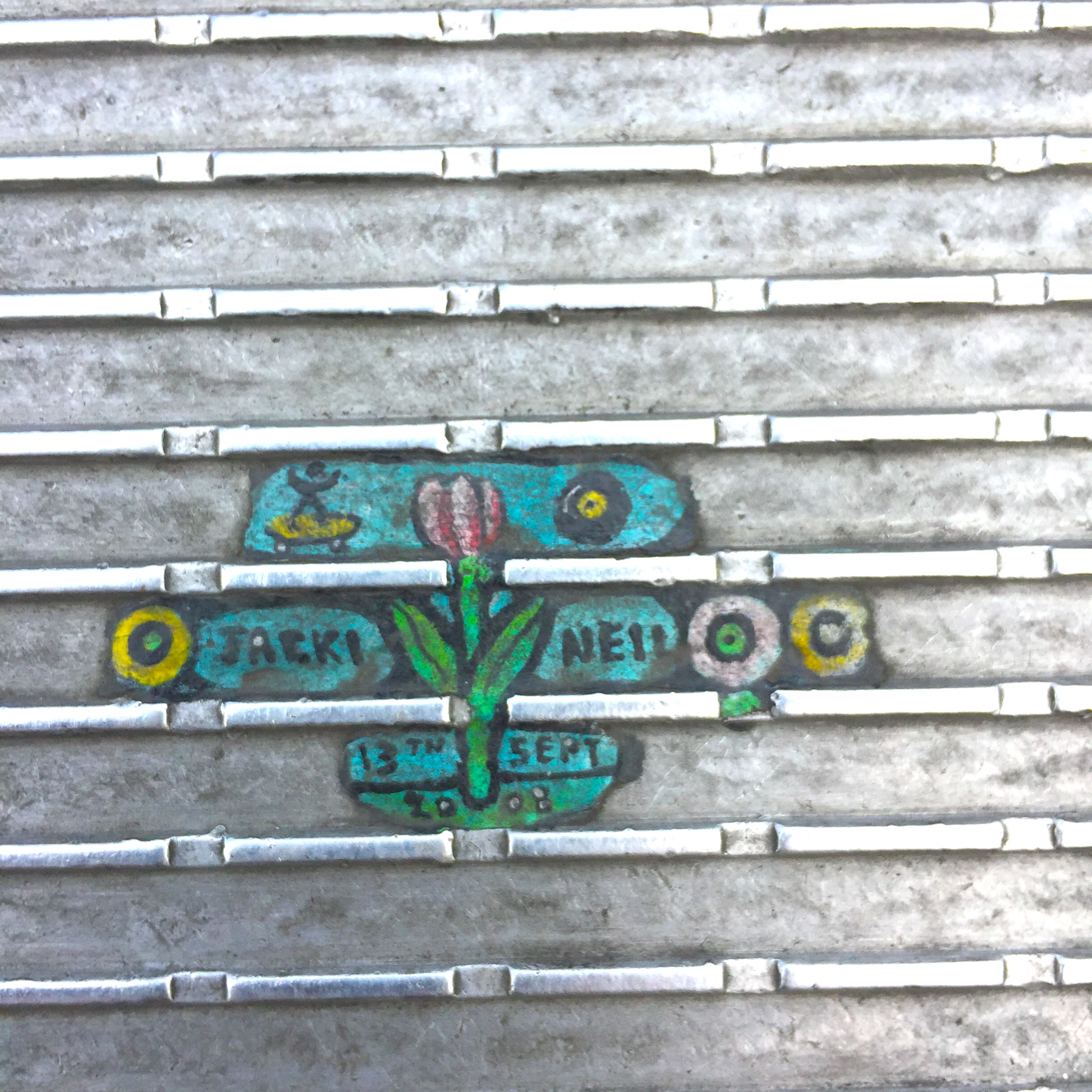
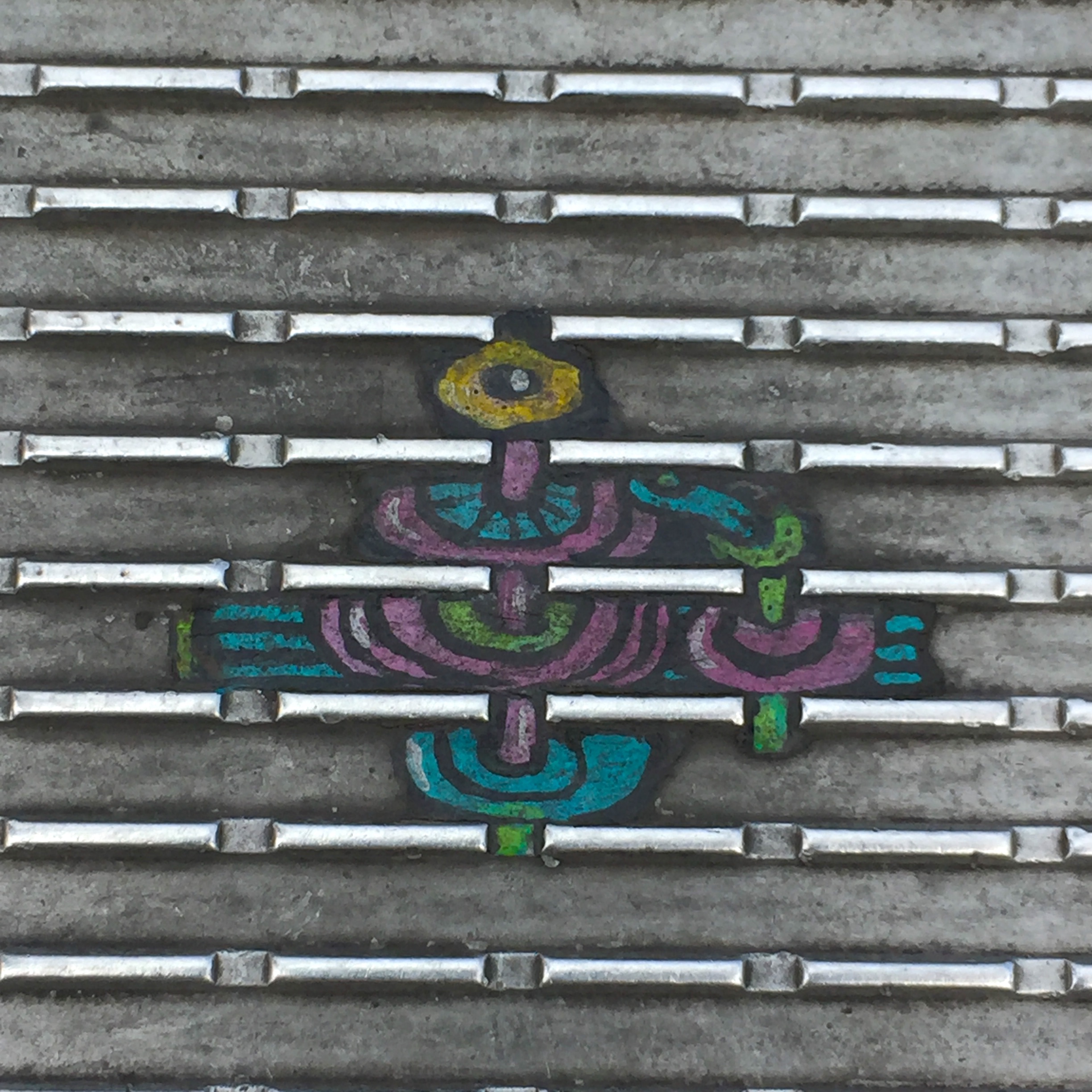
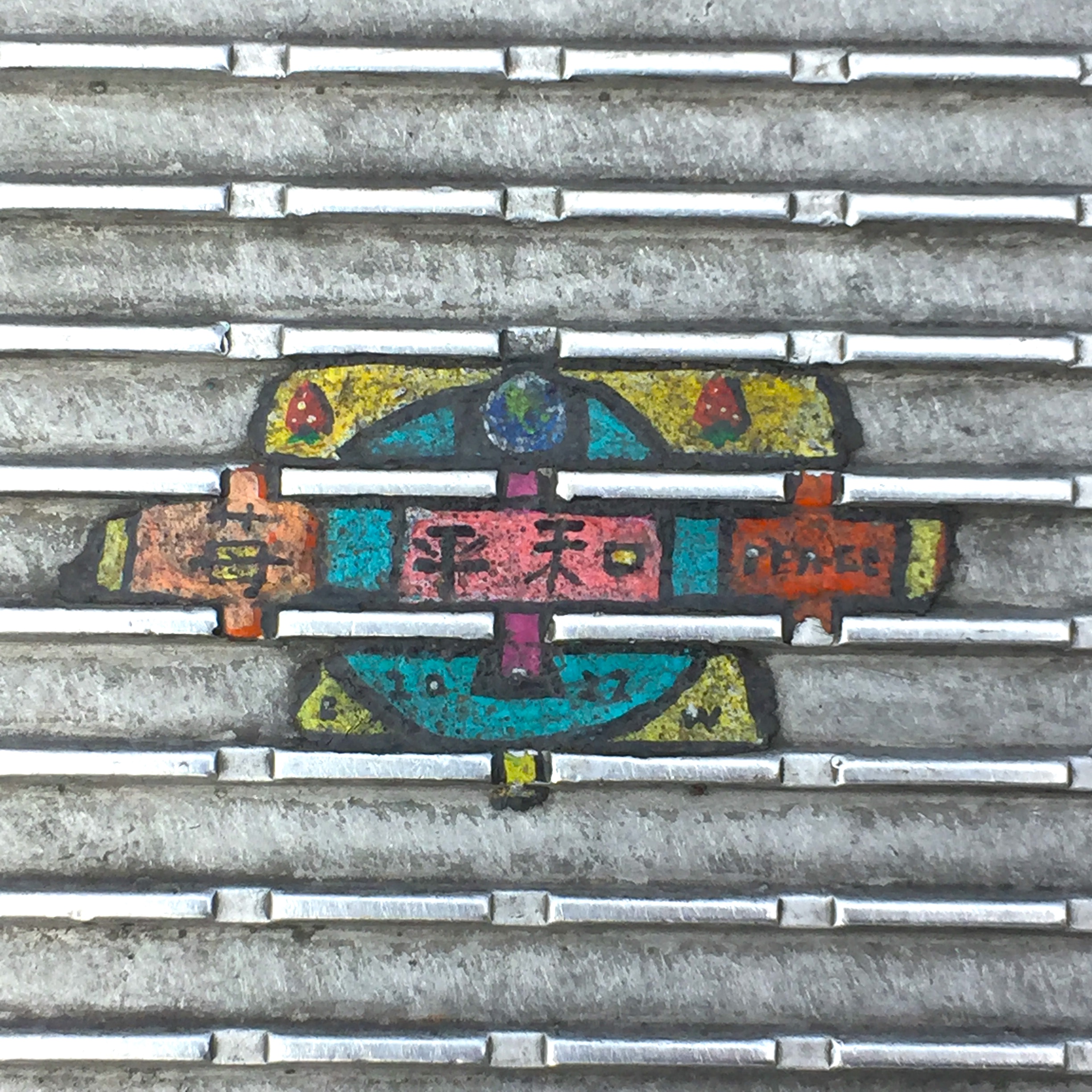
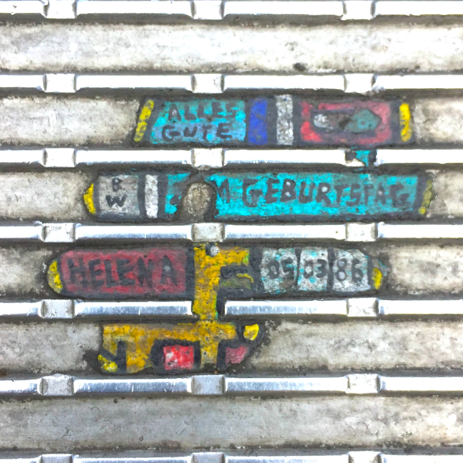
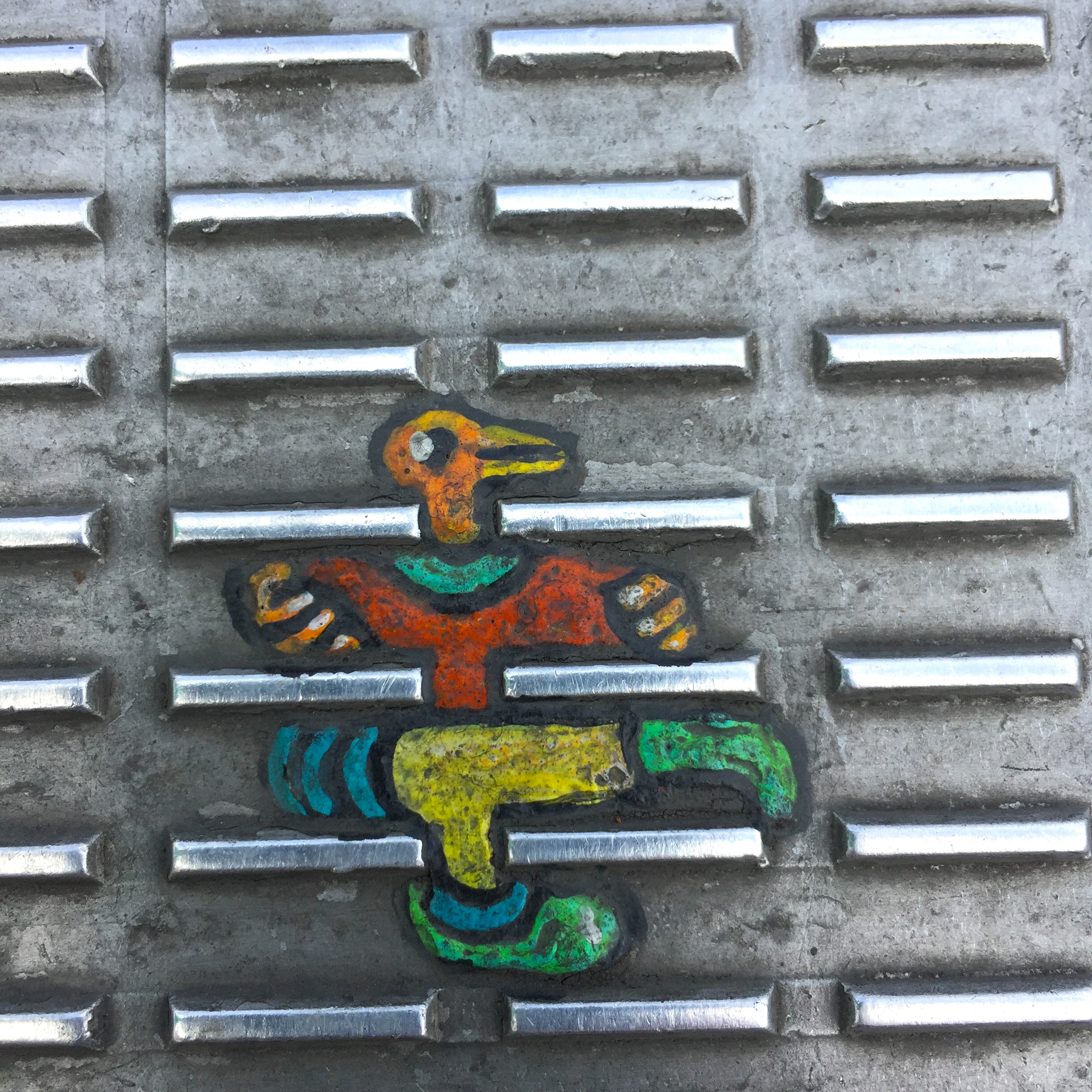
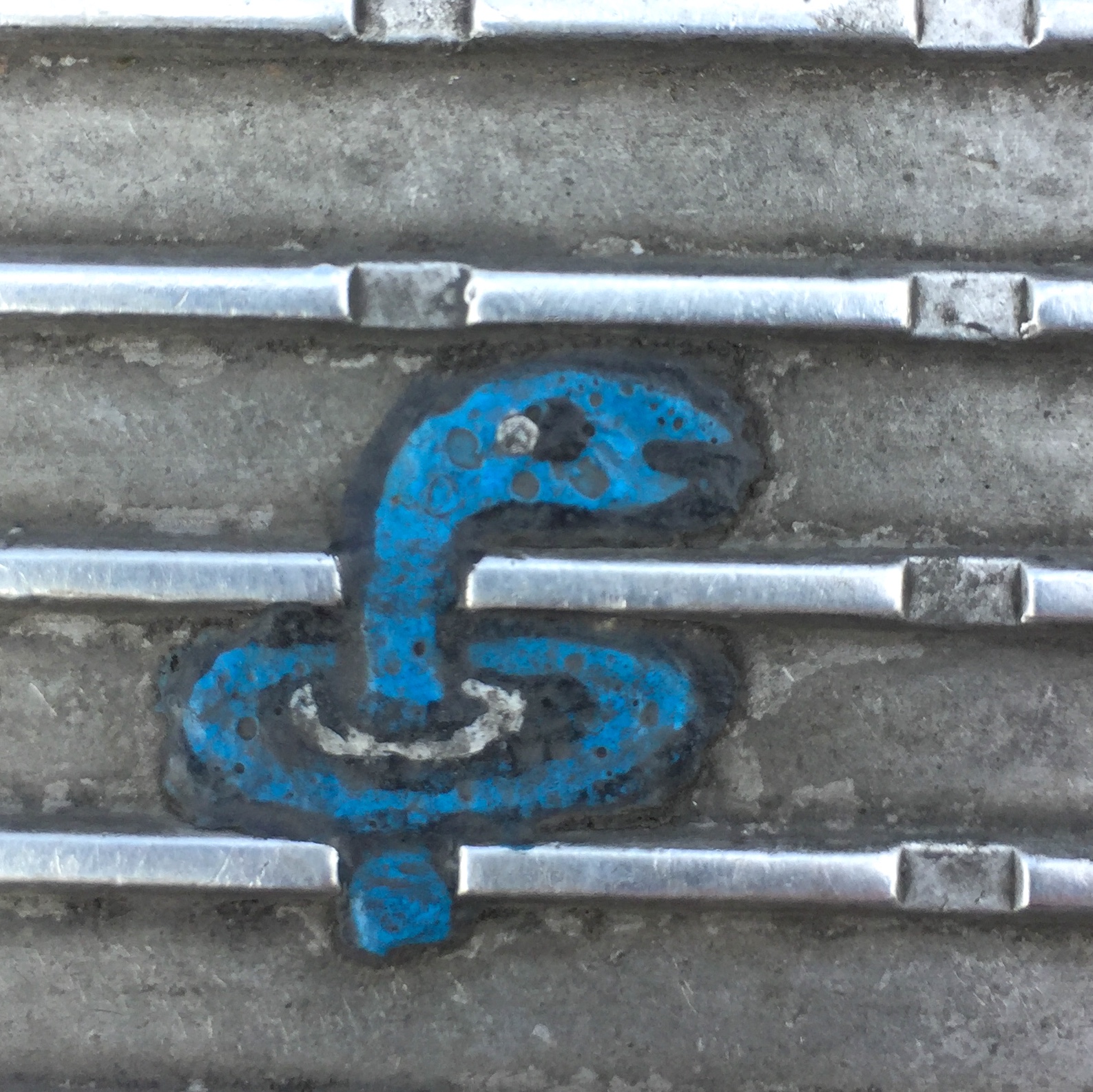
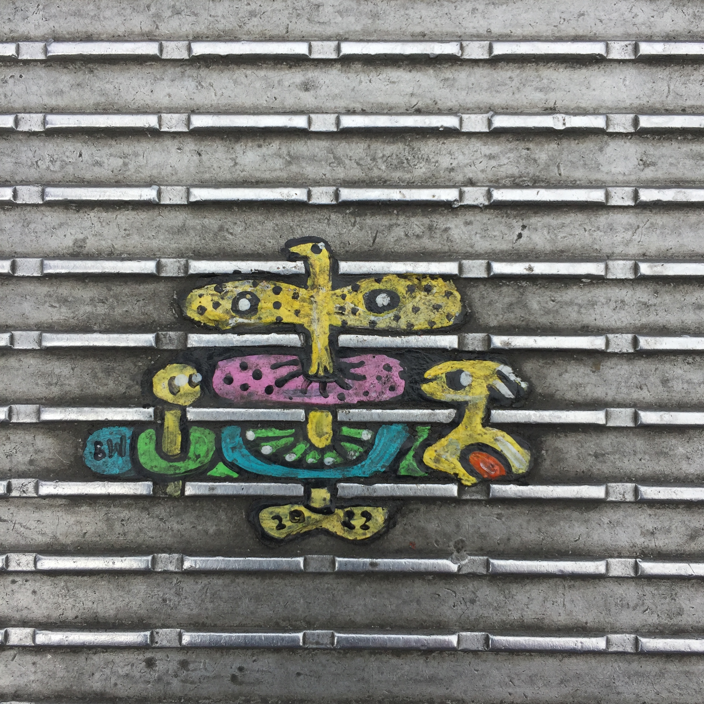
The technique is very precise. He first softens the oval of flattened gum a little with a blowtorch, sprays it with lacquer and then applies three coats of acrylic enamel, usually to a design from his latest book of requests that come from people who stop and crouch and talk. He uses tiny modelers’ brushes, quick-drying his work with a lighter flame as he goes along, and then seals it with more lacquer. Each painting takes a few hours and can last for many years.
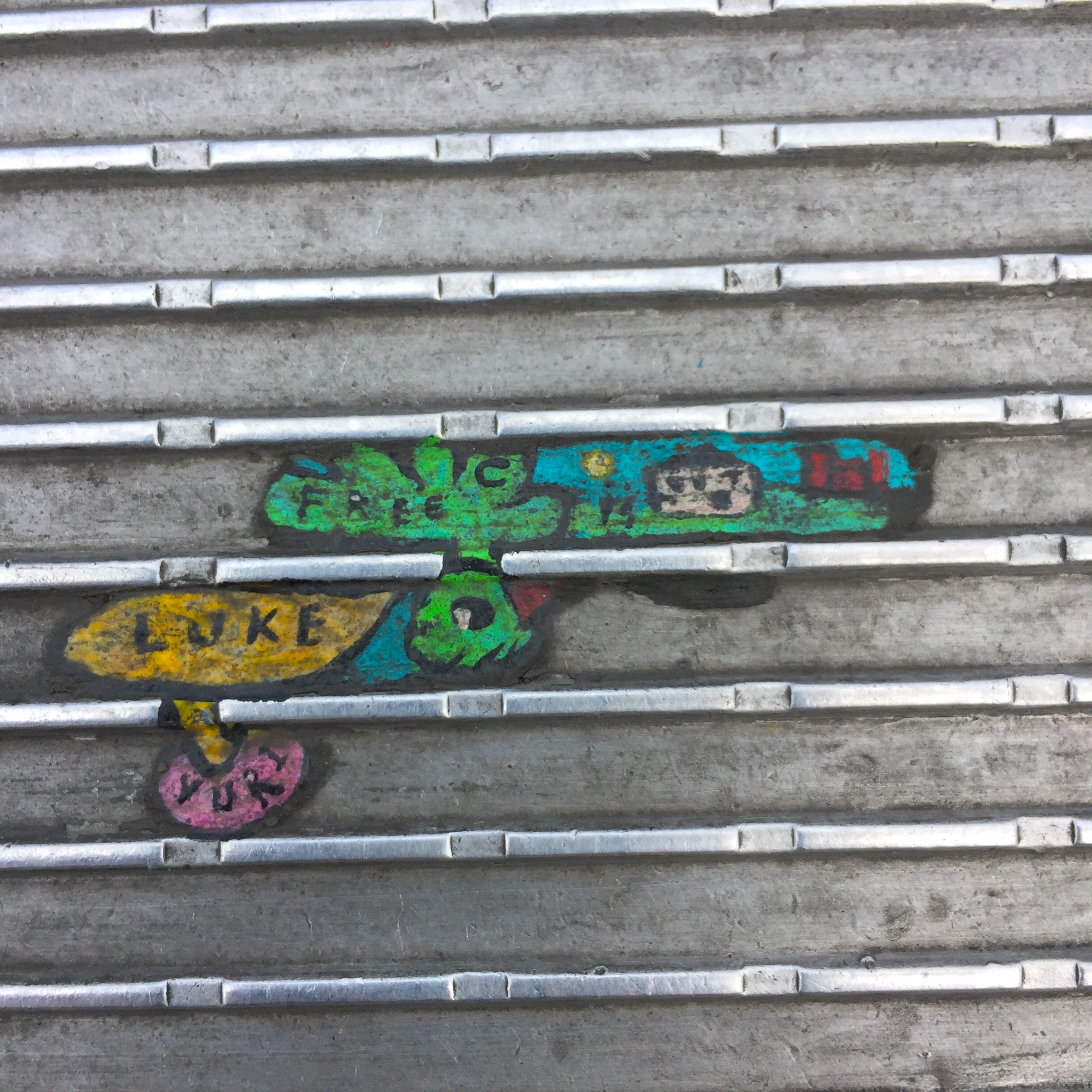
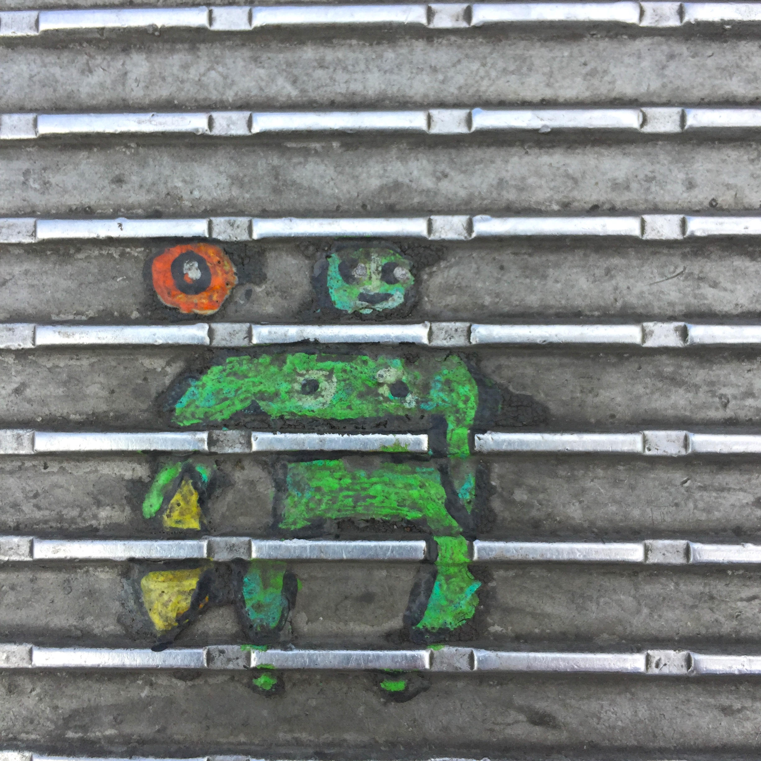
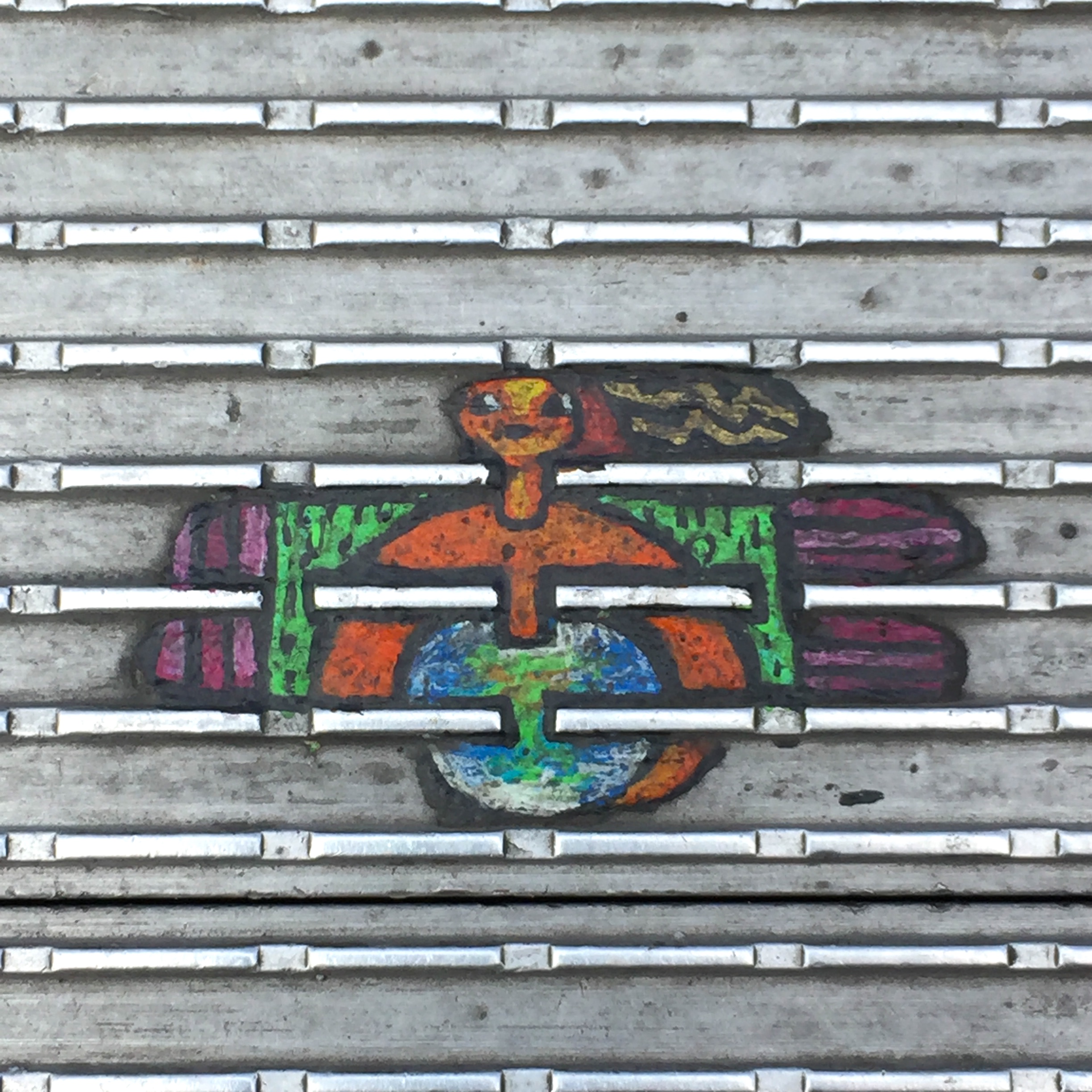
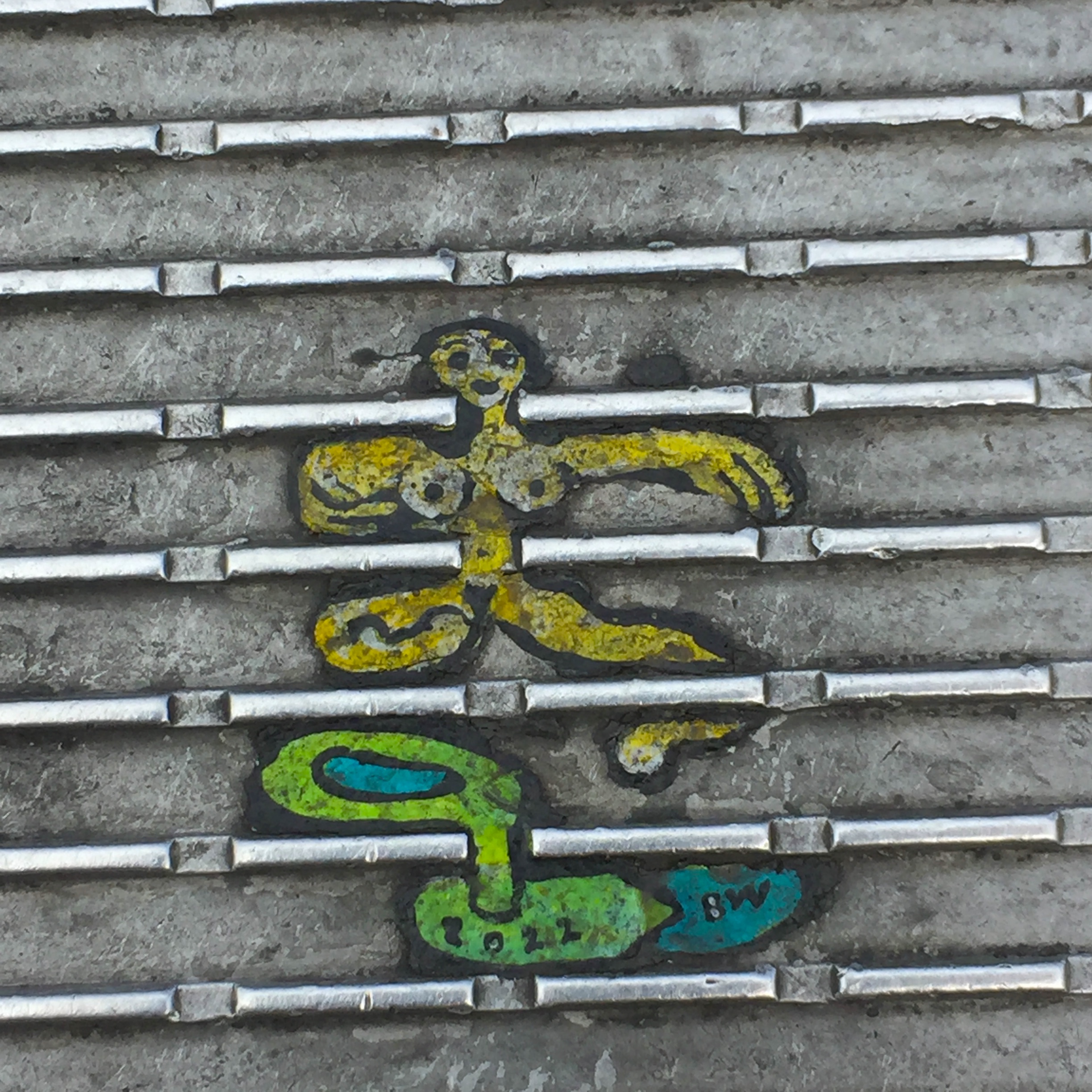
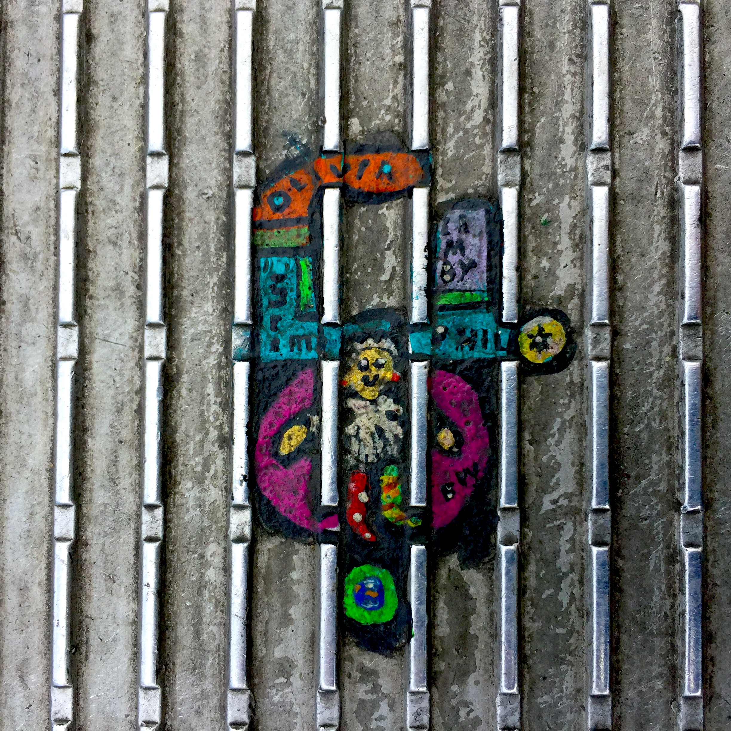
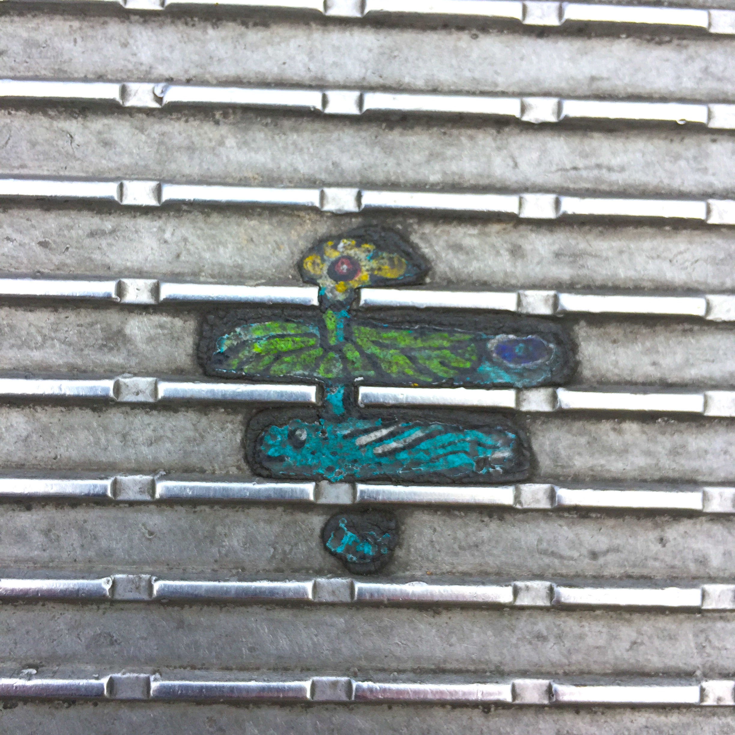
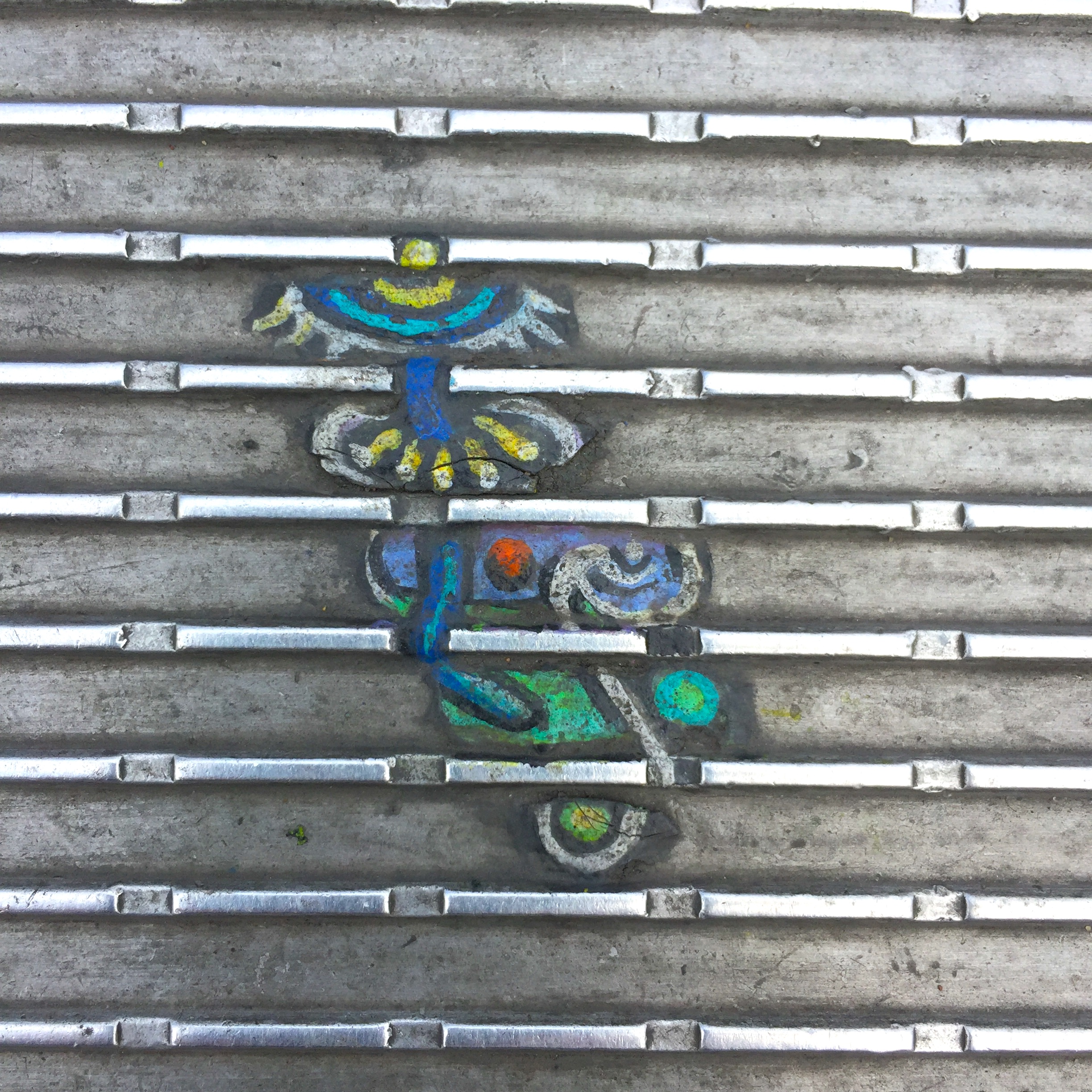
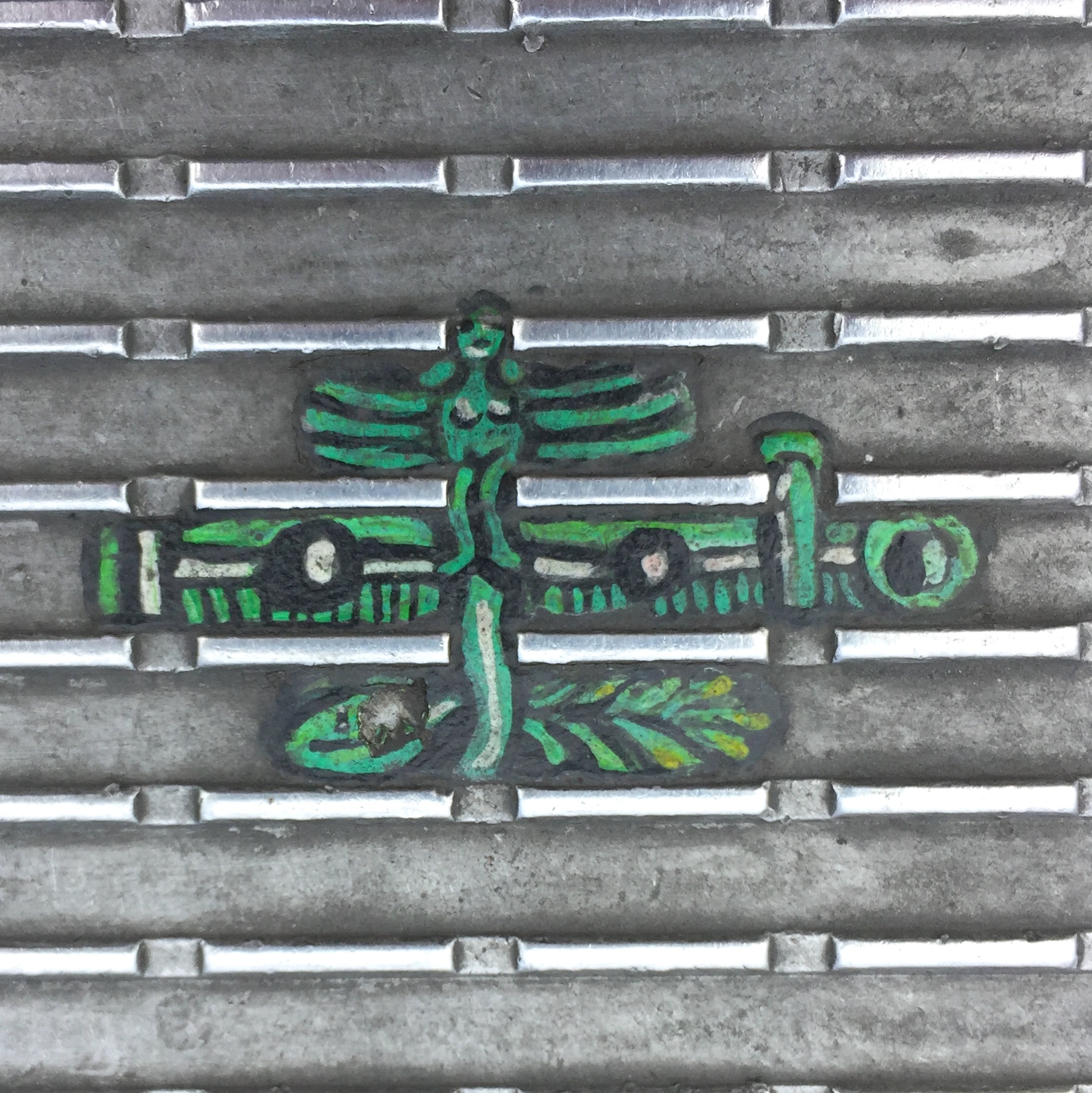
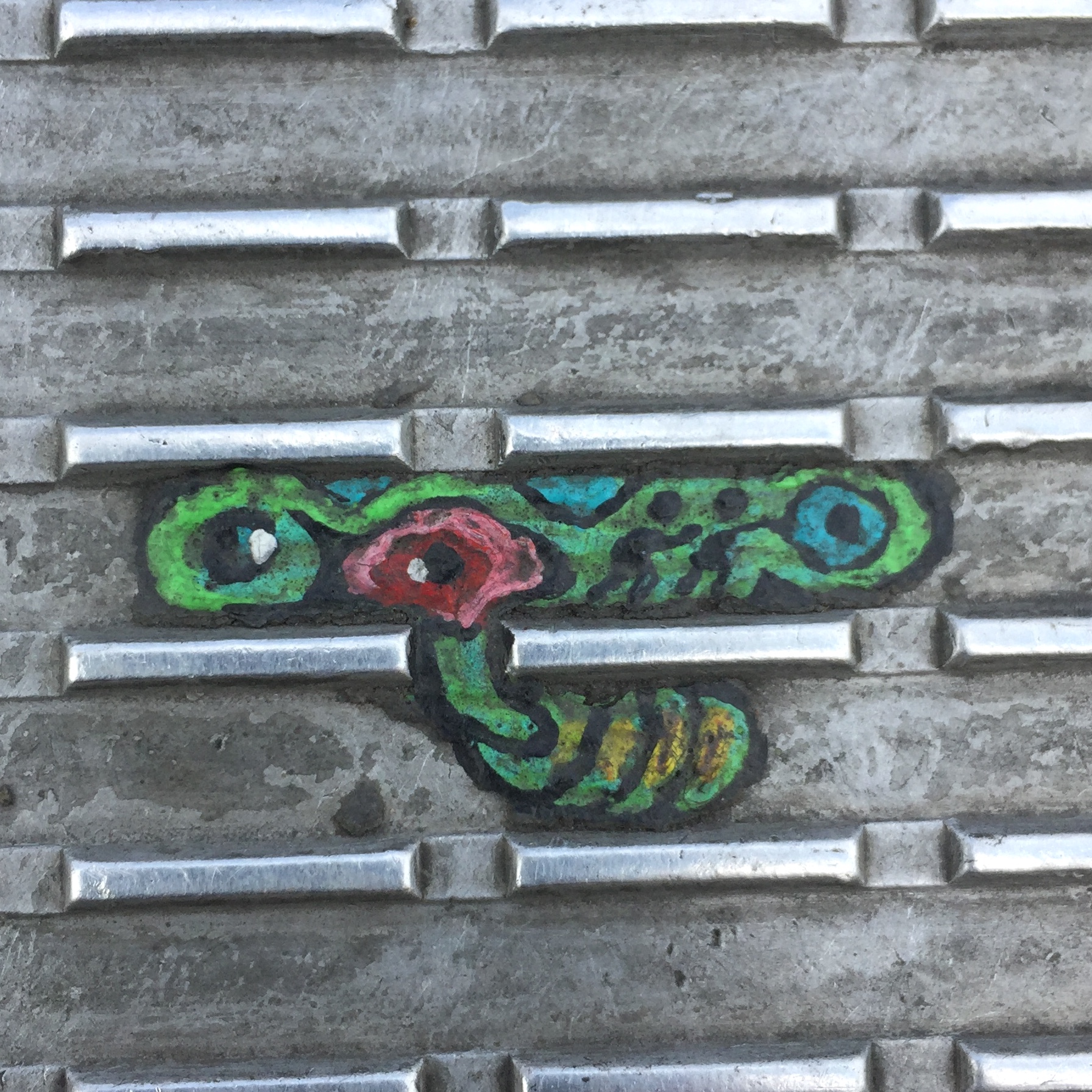
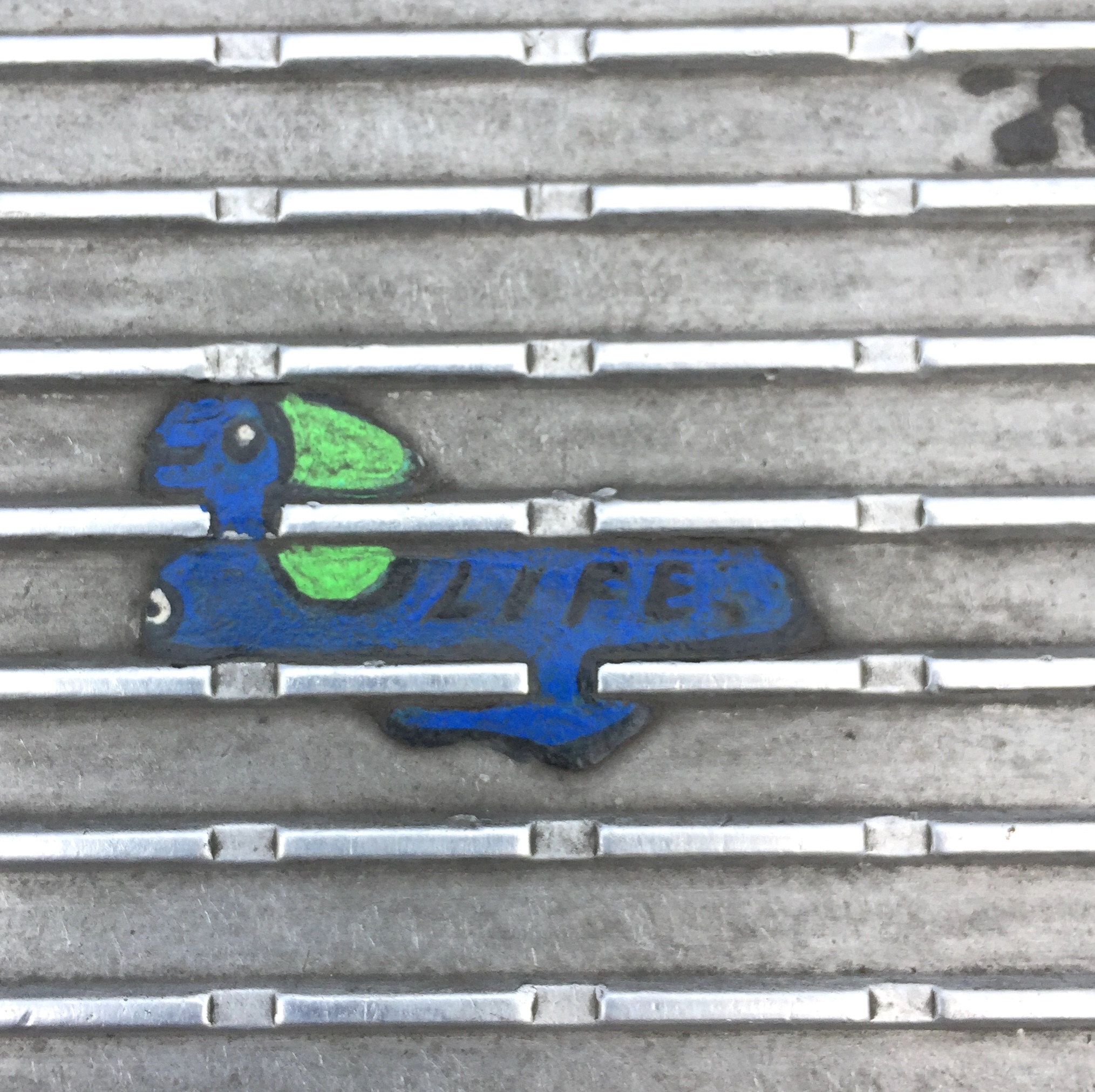
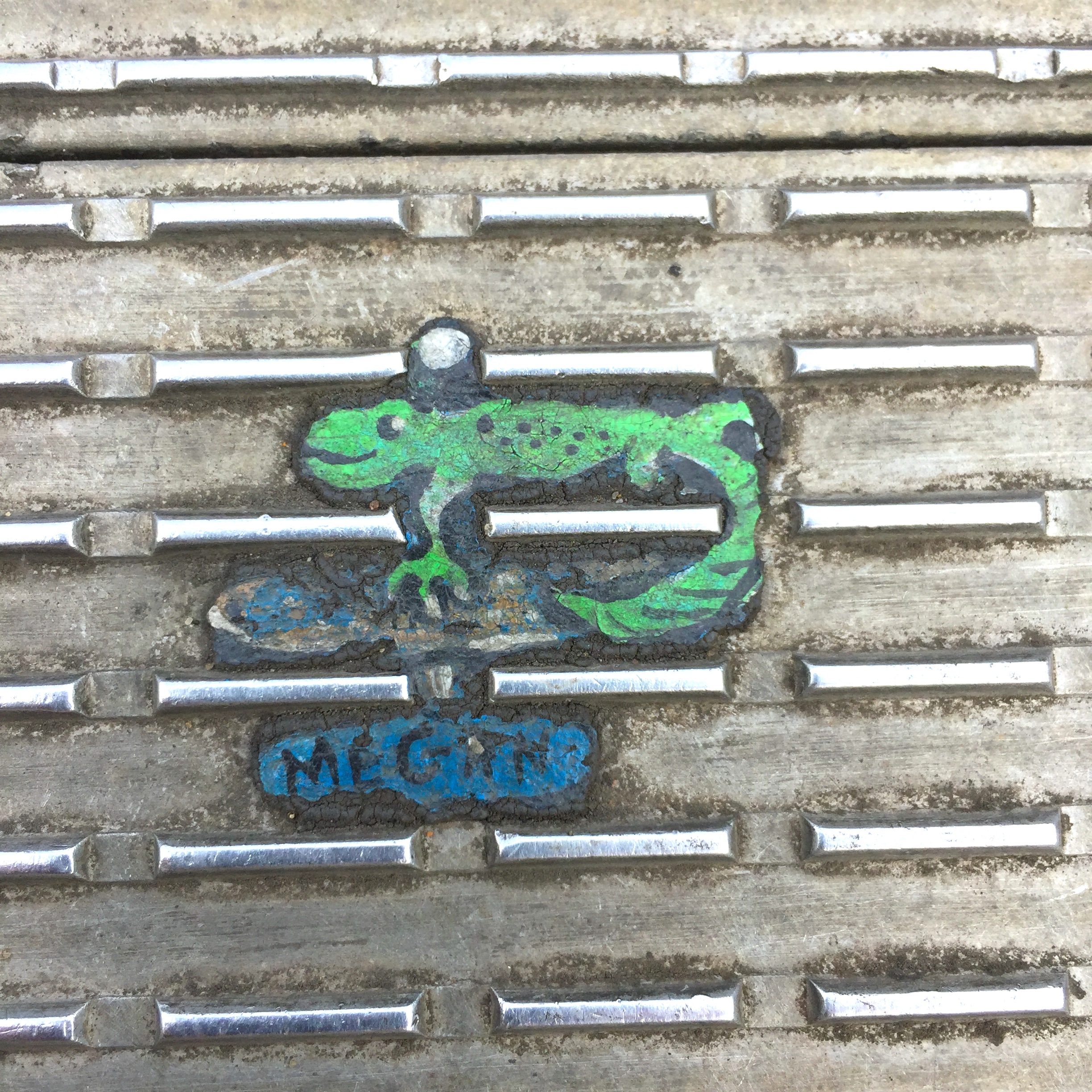
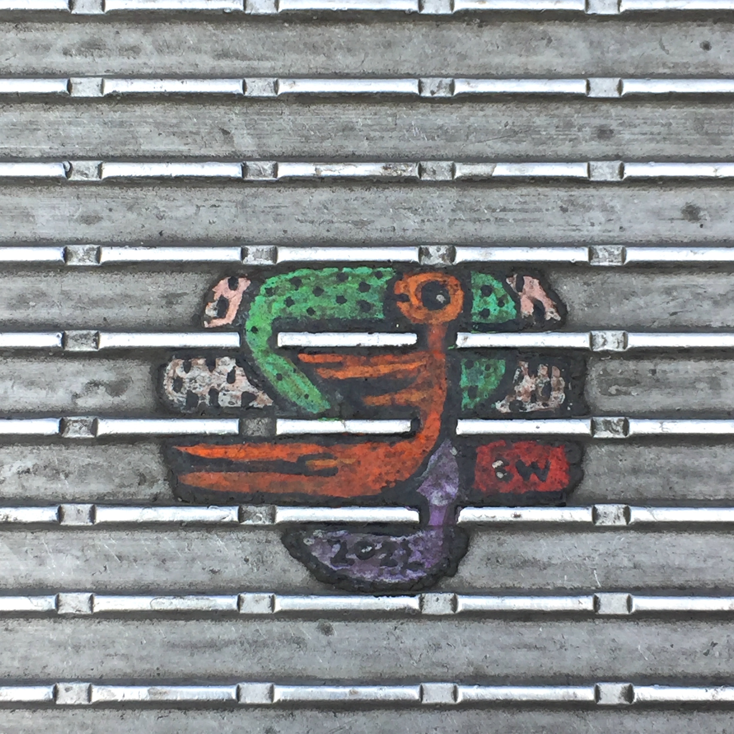
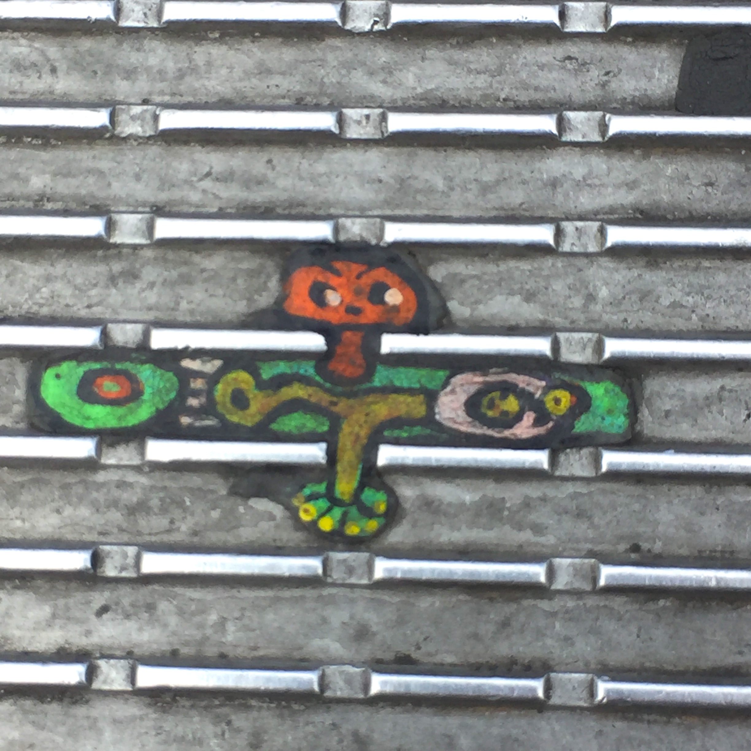
Unsurprisingly, Wilson works very, very small.
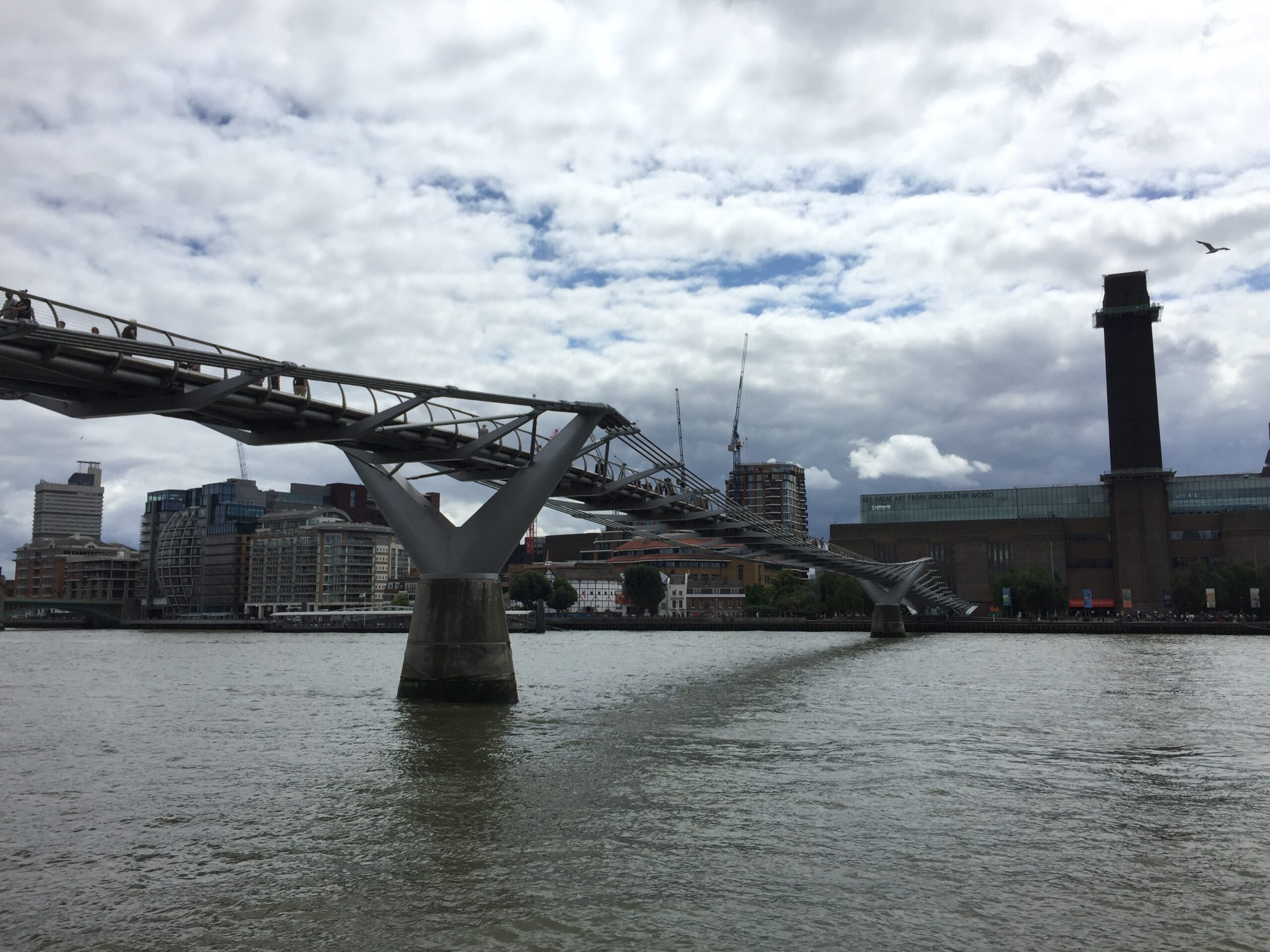
For every Millennium Bridge pedestrian who’s hip to the ever-evolving solo exhibition underfoot, there are several hundred who remain completely oblivious.
Stoop to admire a miniature portrait, abstract, or commemorative work, and the bulk of your fellow pedestrians will give you a wide berth, though every now and then a concerned or curious party will stop to see what the deal is.
Wilson, who works sprawled on the bridge’s metal treads, his nose close to touching his tiny, untraditional canvas, receives a similar response, as described in Zachary Denman’s short documentary, Chewing Gum Man:
They make think I’ve fallen over and they may think I’ve had a cardiac arrest or something, so I’ve had lots of ambulances turning up…I’ve had loads of police.
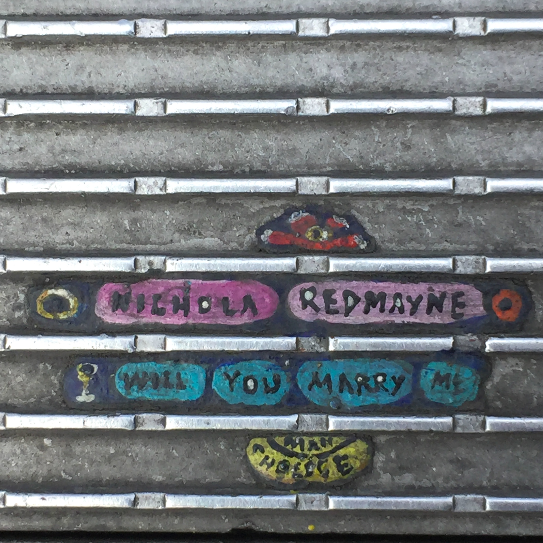
His subjects are suggested by the shape of the spat out gum, by friends, by strangers who stop to watch him work:
I’ve had to deal with people memorializing people who have been murdered. People who have been so lonely, or remembering favorite pets; people who are destitute in all sorts of ways. It goes from proposal pictures, ‘Will you marry me?’, to people who I drew when they were kids and they now have their own kids.
Like any street artist, Wilson’s had his share of run ins with the law, including a wrongful 2010 arrest for criminal damage, when a crowd of schoolchildren who’d been enthusiastically watching an itty bitty St. Pauls taking shape on a blob of gum witnessed him being dragged off by his feet. (He asked if he could finish the picture first…)
He may not get permission to create the public works he goes out daily to create, but he contributes by clearing the area of litter, and as he points out, painting on discarded gum doesn’t constitute defacing anyone’s actual property:
Technically in one sense, I’m working within the law …if I paint on chewing gum, it’s like finding No Man’s Land or common ground. It’s a space which is not under the jurisdiction of a local or national government.
See more of Ben Wilson’s work in his online Gum Gallery.
Photos in this article taken by Ayun Halliday, 2022. All rights reserved.
If you don’t believe chairs can be art, you’ll have to take it up with the curators, gallerists, collectors, architects, and designers around the world who spend their lives obsessing over chair design. Every major museum has a furniture collection, and every collection displaying furniture gives special pride of place to the radical innovations of modernist chairs, from early artisan creations of the Bauhaus to mass-produced mid-century chairs of legend. Chairs are status symbols, art objects, and physical manifestations of leisure, power, and repose.
Artist Marcel Breuer, a Bauhaus designer, architect, and instructor, applied more than his share of innovative ideas to a series of chairs and tables designed and built in the 1920s and 30s. The most iconic of these, from a design perspective, may be the “Wassily,” a club chair-shaped contraption made of steel tubing and canvas straps. (The chair acquired the name because Breuer’s Bauhaus colleague Wassily Kandinsky so admired it.) One rarely encounters this chair outside the environs of upscale furniture galleries and the finer homes and waiting rooms.
Breuer’s Cesca, however, the Wassily’s smaller, more utilitarian cousin from 1928, seems to show up all over the place. Also called the B32 (with an armchair version called the B64), the Cesca’s one-piece, steel tube design was, like Breuer’s full line of Bauhaus furniture, inspired by his experiments in bike-building and interest in “mass production and standardization,” he said. Unlike the Wassily, which might set you back around $3,300 for a quality reproduction, a Cesca comes in at around 1/10th the price, and seems ubiquitous, the Vox video above points out.
No, it’s still not cheap, but Breuer’s rattan chair design is widely beloved and copied. “The cantilevered cane-and-chrome chair is all over the place,” Vox writes, “in trendy homes, in movies and on TV shows, even tattooed on people’s bodies.… [This] somewhat unassuming two-legged chair is the realization of a manifesto’s worth of utopian ideals about design and functionality.” It satisfies the school’s brief, that is to say, for the utilitarian as utopian, as Breuer himself later commented on his design:
I already had the concept of spanning the seat with fabric in tension as a substitute for thick upholstery. I also wanted a frame that would be resilient and elastic [as well as] achieve transparency of forms to attain both visual and physical lightness.… I considered such polished and curved lines not only symbolic of our modern technology, but actually technology itself.
Learn more about the practical, comfortable, beauty of the Cesca — and the ideals of the Bauhaus — in the video at the top. Learn more about the chair’s designer, Marcel Breuer, in this online MoMA monograph by Christopher Wilk.
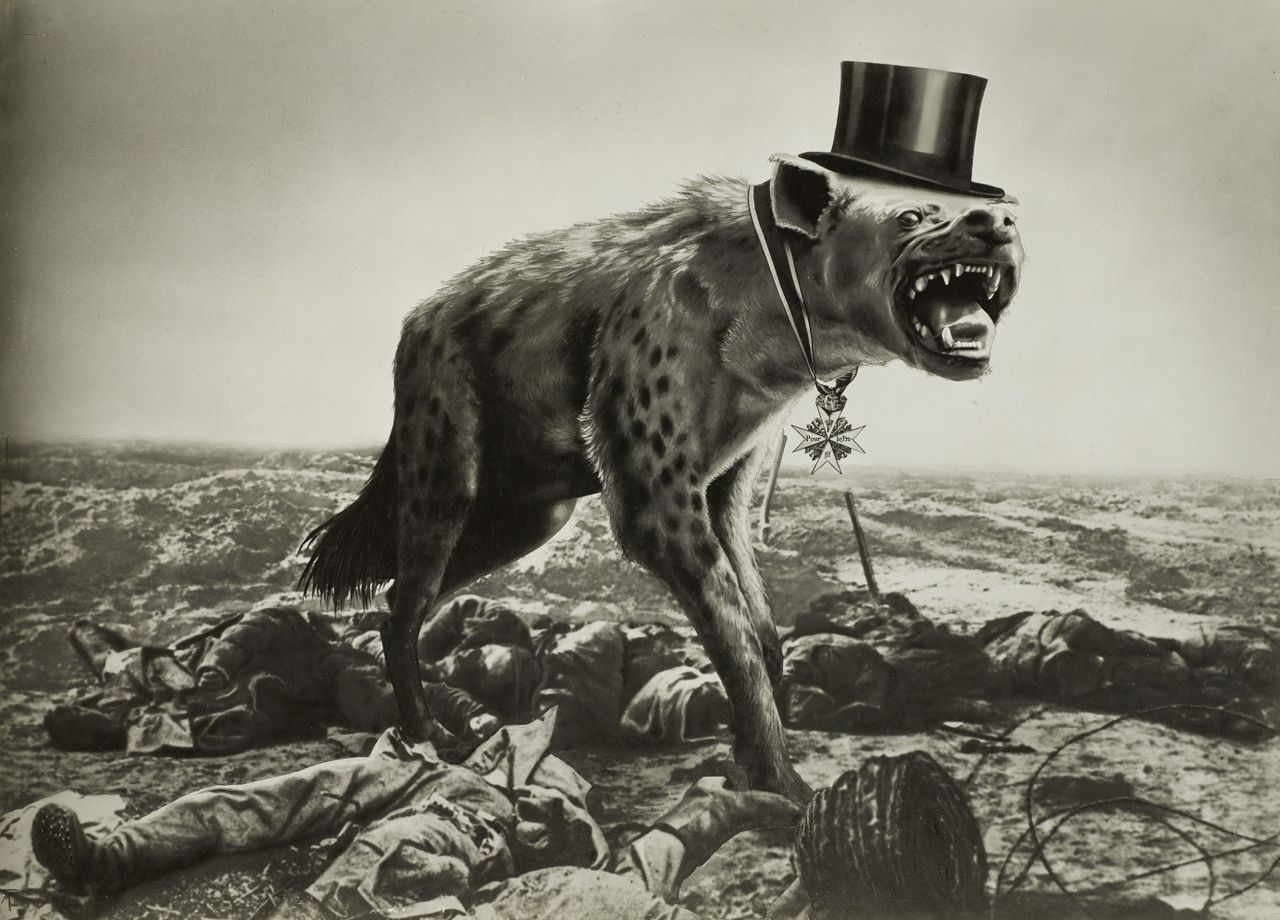
The story of artist John Heartfield — born Helmut Franz Josef Herzfeld in Berlin in 1891 — begins like a German fairy tale. In 1899, his parents, ill and poverty-stricken, abandoned Helmut and his three siblings in a mountain cabin at Aigen, near Salzburg. The hungry children were discovered four days later by the mayor of the town and his wife, who took them in and fostered them. Meanwhile, their uncle, a lawyer, appeared with a trust from their wealthy grandfather’s estate to fund their educations.
Helmut trained at several art schools in Germany, eventually arriving at the School of Arts and Crafts in the bohemian Berlin of the 1910s, where he abandoned his dream of becoming a painter and instead invented hugely effective anti-war propaganda art during World War I and the rise of the Nazis. As The Canvas video above explains, Heartfield’s work pointedly encapsulates the “anti-bourgeois, anti-capitalist, anti-fascist” attitudes of radical Berlin Dadaists. He was “one of Hitler’s most creative critics.”
Herzfeld began his anti-war art campaign by anglicizing his name to counter rising anti-British sentiment at the start of World War I. As John Heartfield, he collaborated with his brother, Weiland, and satirical artist George Grosz on the leftist journal New Youth and the revolutionary publishing house, Malik Verlag. After the war, they joined the German Communist party. (Heartfield “received his party book,” writes Sybille Fuchs, “from KPD leader Rosa Luxemburg herself.”); they also became “founding members of the Berlin Dadaists,” developing the photomontage style Heartfield used throughout his graphic design career.
“Photomontage allowed Heartfield to create loaded and politically contentious images,” the Getty writes. “To compose his works, he chose recognizable press photographs of politicians or events from the mainstream illustrated press.… Heartfield’s strongest work used variations of scale and stark juxtapositions to activate his already gruesome photo-fragments. The result could have a frightening visual impact.” They also had widespread influence, becoming an almost standard style of radical protest art throughout Europe in the early part of the 20th century.
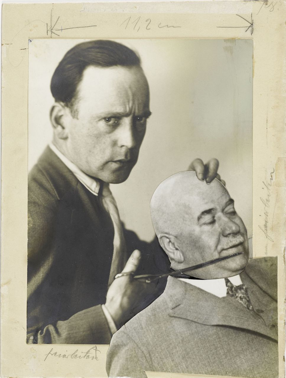
On rare occasions, Heartfield included photographs of himself, as in the self-portrait below with scissors clipping the head of the Berlin police commissioner; or he used his own photography, as in an unglamorous shot a young pregnant woman behind whose head Heartfield places what appears to be the body of a dead young man. The 1930 work protested Weimar’s anti-abortion laws with the title “Forced Supplier of Human Material Take Courage! The State Needs Unemployed People and Soldiers!”
John Heartfield, Self-Portrait with the Police Commissioner Zörgiebel
Heartfield’s direct attacks on state power were allied with his support for worker movements. “In 1929, following ten years of activity in photomontage and publishing,” The Art Institute of Chicago writes, “John Heartfield began working for the left-wing periodical Worker’s Illustrated Magazine (Arbeiter-Illustrierte-Zeitung [AIZ]).” This weekly publication “served from the first as a major organ of opposition to the rising National Socialist Party.” Heartfield’s provocative covers mocked Hitler and portrayed the power of organized labor against the fascist threat. He traveled to the Soviet Union in 1931 under the magazine’s auspices and gave photomontage courses to the Red Army. His style spread internationally until the lifeless propaganda painting of Socialist Realism purged modernist art from the party style.
Unfortunately for Heartfield, and for Europe, the German left failed to present a unified front against Nazism as the KPD also became increasingly dogmatic and Stalinist. The artist and the editors of the AIZ were forced to flee to Prague when Hitler took power in 1933. (Heartfield reportedly escaped a “gang of Nazi thugs,” writes Fuchs, by leaping from his balcony in Berlin). In Czechoslovakia, he continued his counter-propaganda campaign against Hitler through the covers of the AIZ. When the Nazis occupied Prague in 1938, he fled again, to London but never stopped working through the war. He would eventually return to Berlin in the early 1950s and take up a career as a professor of literature.
Heartfield is a complicated figure — an overlooked yet key member of the German avant garde who, with his brother Weiland and artists like George Grosz revolutionized the media of photography, typography, and printing in order to virulently oppose war, oppression, and Nazism, despite the dangers to their livelihoods and lives. You can learn more about the artist’s life and work at the Official John Heartfield Exhibition site, which features many of the collages shown in the Canvas video at the top. (See especially the feature on Heartfield’s relevance to our current moment.) Also, don’t miss this interactive online exhibition from the Akademie Der Künste in Berlin, which controls the artist’s estate and has put a number of rare photos and documents online.
Damien Hirst is into NFTs. Some will regard this as a reflection on the artist, and others a reflection on the technology. Whether you take those reflections to be positive or negative reveals something about your own concept of how the art world, the business world, and the digital world intersect. So will your reaction to The Currency, Hirst’s just-completed art project and technological experiment. Launched in July of last year, it produced 10,000 unique non-fungible tokens “that were each associated with corresponding artworks the British artist made in 2016,” as Artnet’s Caroline Goldstein writes. “The digital tokens were sold via a lottery system for $2,000.”
Hirst also laid down an unprecedented condition: he announced “that his collectors would have to make a choice between the physical artwork and its digital version, and set a one-year deadline — asking them, in effect, to vote for which had more lasting value.” For each buyer who chooses the original work, Hirst would assign its NFT to an inaccessible address, the closest thing to destroying it. And for each buyer who chooses the NFT, Hirst would throw the paper version onto a bonfire. The final numbers, as Hirst tweeted out at the end of last month, came to “5,149 physicals and 4,851 NFTs (meaning I will have to burn 4,851 corresponding physical Tenders).” Hirst also retained 1,000 copies for himself.
“In the beginning I had thought I would definitely choose all physical,” Hirst explains. “Then I thought half-half and then I felt I had to keep all my 1,000 as NFTs and then all paper again and round and round I’ve gone, head in a spin.” In the end he went wholly digital, having decided that “I need to show my 100 percent support and confidence in the NFT world (even though it means I will have to destroy the corresponding 1000 physical artworks).” Perhaps this was a victory of Hirst’s neophilia, but then, those instincts have served him well before: few living artists have managed to draw such public fascination, enamored or hostile, for so many years straight — let alone such formidable sale prices, and not just for his stuffed shark.
“I’ve never really understood money,” Hirst says to Stephen Fry in the video above. (You can watch an extended version of their conversation here.) “All these things — art, money, commerce — they’re all ethereal,” ultimately based on nothing more than “belief and trust.” Returning to the techniques of his early “spot paintings” — those he made himself before farming the task out to steadier-handed assistants — and minting the results into unique digital objects for sale was perhaps an attempt to get his head around the even less intuitive concept of the NFT. All told, The Currency brought in about $89 million in revenue. More telling will be the price of its tokens on the secondary market, where they’re changing hands at the moment for around $7,000: a price impossible properly to evaluate for now, and thus not without the thrilling ambiguity of certain modern artworks.
Based in Seoul, Colin Marshall writes and broadcasts on cities, language, and culture. His projects include the Substack newsletterBooks on Cities, the book The Stateless City: a Walk through 21st-Century Los Angeles and the video series The City in Cinema. Follow him on Twitter at @colinmarshall, on Facebook, or on Instagram.
These women’s contributions to the movement were considerable, but Krasner and deKooning spent much of their careers overshadowed by celebrated husbands — fellow Abstract Expressionists Jackson Pollock and Willem de Kooning.
The New York-based Abstract Expressionism deposed Paris as the center of the art world, and was the most macho of movements. Krasner, Frankenthaler, and Elaine de Kooning often heard their work described as “feminine”, “lyrical”, or “delicate”, the implication being that it was somehow less than.
Hans Hofmann, an Abstract Expressionist who ran the 8th Street atelier where Krasner studied after training at Cooper Union, the Art Students League, and the National Academy of Design, and working for the WPA’s Federal Art Project, once praised one of her canvases by saying, “This is so good you would not believe it was done by a woman.”
Payne and Shurvell detail how the sociable Krasner, already established in the NYC art scene, shared important contacts with Pollock, with whom she became romantically entangled shortly after their work was shown alongside Picasso’s, Matisse’s , and Georges Braque’s in the pivotal 1942 French and American Painting exhibition at the McMillen Gallery.
She was an energetic promoter of his work, and a cheerleader when he flagged.
They married and moved to Long Island in an unsuccessful bid to put the kibosh on his drinking and extracurricular affairs. He commandeered a barn on the property for his studio, while she made do with a bedroom.
While Pollock ranged around large canvases laid on the barn floor, famously splattering, Krasner produced a Little Image series on a table, sometimes applying paint straight from the tube.
MoMA’s description of an untitled Little Image in their collection states:
Krasner likened these symbols to Hebrew letters, which she had studied as a child but could no longer read or write. In any case, she said, she was interested in creating a language of private symbols that did not communicate any one specific meaning.”
After Pollock died in a car crash while driving under the influence — his mistress survived — Krasner claimed the barn studio for her own practice.
It was a transformative move. Her work not only grew larger, it was informed by the full-body gestures that went into its creation.
Ten years later, she got her first solo show in New York, and MoMA gave her a retrospective in 1984, six months before her death.
In a wildly entertaining 1978 interview on Inside New York’s Art World, below, Krasner recalls how early on, her gender didn’t factor into how her work was received.
I start in high school, and it’s only women artists, all women. Then I’m at Cooper Union, woman’s art school, all women artists and even when I’m on WPA later on, there’s no — you know, there’s nothing unusual about being a woman and being an artist. It’s considerably later that all this begins to happen, specifically when the seat moves from Paris, which was the center, and shifts into New York, and I think that period is known as Abstract Expressionism, where we now have galleries, price, money, attention. Up ’til then it’s a pretty quiet scene. That’s when I’m first aware of being a woman and “a situation” is there.
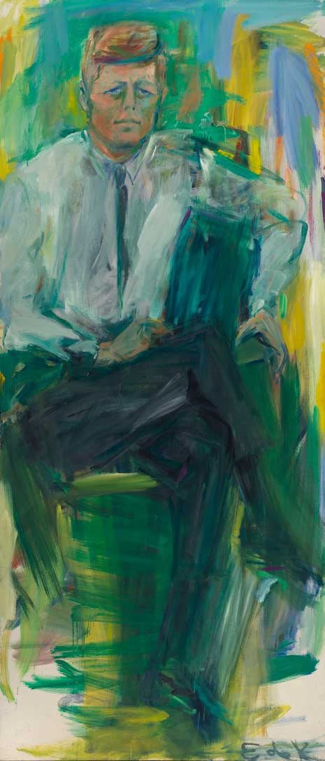
Elaine de Kooning was an abstract portraitist, an art critic, a political activist, a teacher, and “the fastest brush in town”, but these accomplishments were all too often viewed as less of an achievement than being Mrs. Willem de Kooning, the female half of an Abstract Expressionist “it couple.”
Great Art Cities Explained suggests that the twenty year period in which she and Willem were estranged — they reconciled when she was in her late 50s — was one of personal and artistic growth. She took inspiration from the bullfights she witnessed on her travels, turned a lusty female gaze on male subjects, and was commissioned to paint President Kennedy’s official portrait:
All my sketches from life as he talked on the phone, jotted down notes, read papers, held conferences, had to be made very quickly, catching features and gestures, half for memory, even as I looked, because he never sat still. It was not so much that he seemed restless, rather, he sat like an athlete or college boy, constantly shifting in his chair. At first this impression of youthfulness was a hurdle, as was the fact that he never sat still.
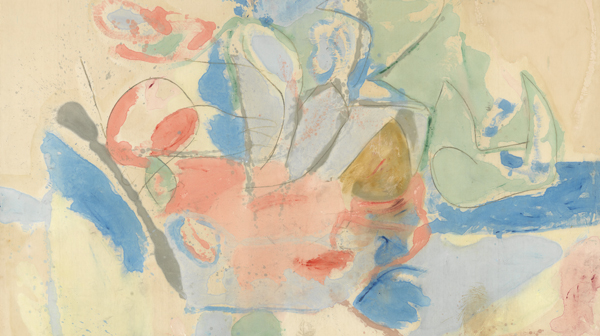
Like Krasner and Elaine de Kooning, Helen Frankenthaler was also part of an Abstract Expressionist golden couple, but fortune decreed she would not play a distant second fiddle to husband Robert Motherwell .
This surely owes something to her pioneering development of the “soak-stain” technique, wherein she poured turpentine-thinned oil paint directly onto unprimed canvas, laid flat.
Soak-stain pre-dated her marriage.
After a visit to Frankenthaler’s studio, where they viewed her landmark Mountains and Sea, above, abstract painters Kenneth Noland and Morris Louis also adopted the technique, as well as her penchant for broad, flat expanses of color — what became known as Color Field Painting.
Like Pollock, Frankenthaler scored a LIFE Magazine spread, though as Art She Says observes, not all LIFE artist profiles were created equal:
The dialogue between these two spreads appears to be a tale of socially-determined masculine energy and feminine composure. Though Pollock’s dominant stance is a key part of his artistic praxis, the issue is not that he is standing while she is sitting. Rather, it is that, with Pollock, we are allowed to glimpse into the intimate sides of his tortured and groundbreaking practice. In stark opposition, Parks’ images of Frankenthaler reinforce our need to see women artists as highly curated, polished figures who are as complete as the masterpieces that they produce. Even if those works appear highly abstracted and visceral, each stroke is perceived, at some level, to represent a calculated, perfected moment of visual enlightenment.
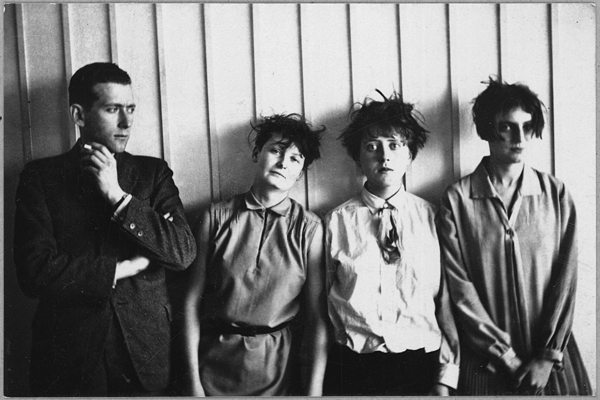
Take a look at photos of Bush Tetras — a three-girl-one-guy No Wave/Post-Punk band from the early 1980s downtown Manhattan scene. Now, look at the photograph above, “Marcel Breuer and His Harem,” by Bauhaus photographer Erich Consemüller, taken sometime around 1927. Except for the fact that Breuer looks more like Ron Mael of Sparks sans mustache than drummer Dee Pop, one might mistake this for a photo of the punk band. This raises a few questions: did art students Bush Tetras look to the women of the Bauhaus for their style? Or did the women of the Bauhaus look to the future and see punk? The second scenario seems more likely since the women of Bauhaus have not, until recently, been terribly well-known.
I personally feel cheated after studying art and art history in college many years ago and only now getting introduced to several significant artists of the radical German art school founded by Walter Gropius. All of its famous exponents and art stars are men, but it seems the gender ratio of the Bauhaus was closer to that of the general population (as was, in many cases, that of the early punk and post-punk scenes).
But we don’t tend to learn the names or see the work of these artists, and, in some cases, their work has been posthumously attributed to their male colleagues. Nor are we familiar with their progressive personal style, essential in Bauhaus’s total approach to revolutionizing the arts, including fashion, as a way to liberate humanity from the dogmas of the past.
How unfortunate that the memory of Bauhaus, like the memory of punk, replicated the same old rules its artists broke. The school’s gender equality was radical, hence the photograph’s satirical title, which “expresses the precise opposite of what the photo itself shows,” notes the site Bauhaus Kooperation: “the modernity, emancipation, equality, or even superiority, of the women in it.” The “junior master” of the carpentry workshop, Breuer looks at the three artists to his left “skeptically, with his arms crossed,” as if to say, “ ‘These are ‘my’ women?!’ ” The artists of the “harem,” from left to right, are Breuer’s wife Martha Erps, Katt Both, and the photographer’s wife, Ruth Hollós, who “seems to be suppressing laughter as she looks towards the photographer (her husband).”
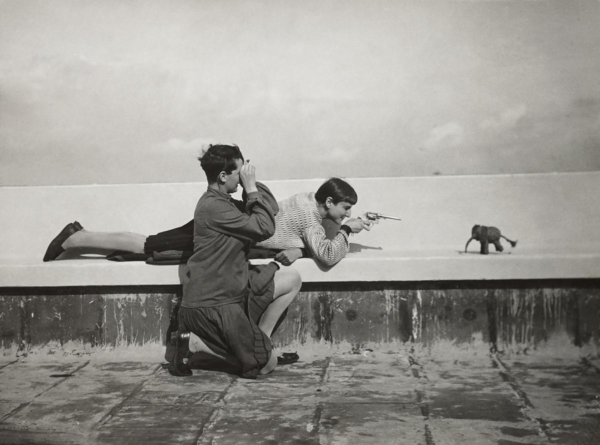
Erich Consemüller, who taught architecture at the Bauhaus, had been tasked by Gropius with documenting the school and its life. Gropius partnered him with photographer Lucia Moholy, wife of László Moholy-Nagy (see a photo of her above, taken by her husband sometime between 1924–28). Moholy took mostly exterior shots like the photograph by her further up of Erps and Hollós on the roof of the Atelierhaus in Dessau in the mid 1920s. Consemüller mainly focused on interiors in his work, with experimental exceptions like the “Mechanical Fantasy” series seen here, which uses clothing, poses, and double exposures to visually emphasize a kind of uniformity of purpose, placing and joining male and female Bauhaus artists in almost typographical arrangements.
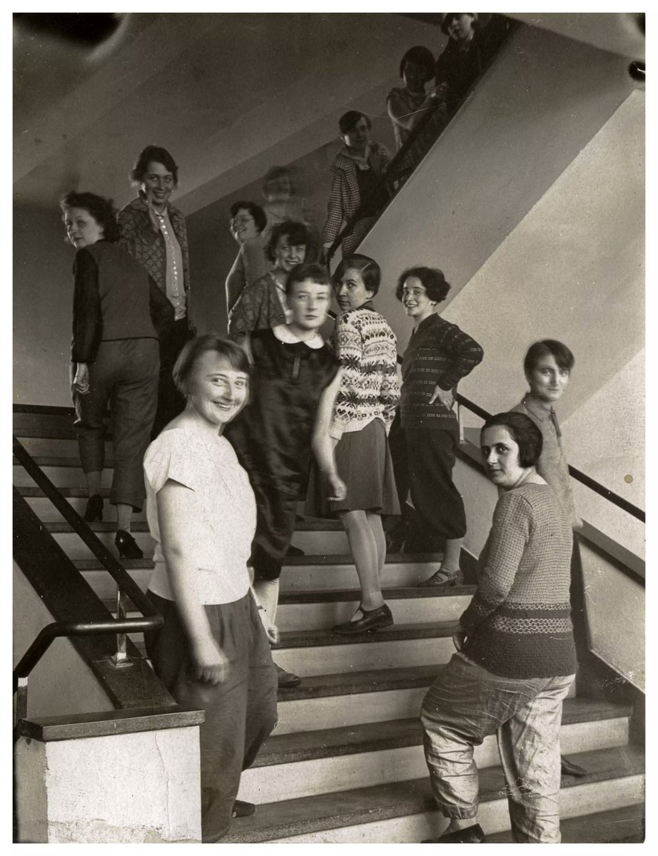
Indeed, nearly all of the artists of the Bauhaus — as was the school’s practice — tried their hand at photography, and many used the medium to document, in ways both casual and deliberate, the Bauhaus’ commitment to gender equity and the full inclusion of women artists in its programs, a statement painter and photographer T. Lux Feininger seems to underline in the group photograph below of the school’s weavers on the steps of the new Bauhaus building in 1927. (Artists in the shot: Léna Bergner, Gunta Stölzl, Ljuba Monastirsky, Otti Berger, Lis Beyer, Elisabeth Mueller, Rosa Berger, Ruth Hollós, and Lisbeth Oestreicher.)
Bauhaus artists, both men and women, were very much like early punks in some ways, inventing new ways to shake up the establishment and break out of prescribed roles. But instead of a downtown alternative to the status quo, they offered a recipe for its full transformation through art. Who can say how far that movement would have progressed had it not been splintered by the Nazis. “Together,” as Gropius wrote, “let us call for, devise, and create the construction of the future, comprising everything in one form, architecture, sculpture and painting,” and most everything else in the built and visual environments, he might have added.
We’ve had fun at the expense of the multi-hyphenate: i.e. “I’m an actor-slash-drummer-slash-makeup-artist-slash-brand-ambassador,” etc…. And, fair enough. Few people are good enough at their one job to reasonably excel at two or three, right? But then again, we live in the kind of hyperspecialized world Henry Ford could only dream of, and consider ourselves highly favored if we’re allowed to be just the one thing long enough to retire and do nothing.
What if we could have multiple identities without being thought of as unserious, eccentric, or mentally ill?
Discussions of Syd Barrett, Pink Floyd’s founding singer and guitarist, never pass without reference to his mental illness and abrupt disappearance from the stage. But they also rarely engage with Barrett as an artist post-Pink Floyd: namely, his two underrated solo albums; and his output as a painter, the medium in which he began his career and to which he returned for the last thirty years of his life.
If Barrett were allowed a role other than crazy diamond (a role, we must allow, assigned to him by his former bandmates), we might see more of his work in gallery collections and exhibitions. One cannot say this about every famous musician who paints. For Barrett, art was not a hobby, and it called to him before music. It was in his student days at Cambridgeshire College of Arts and Technology that he met David Gilmour. From Cambridge he moved to Camberwell College of Arts in London and began to produce and exhibit mature student work (see here).
Barrett’s work “shows some of the advantages of an art school training,” wrote a reviewer of a 1964 exhibition. “He is already showing himself a sensitive handler of oil paint who wisely limits his palette to gain richness and density.” (Barrett had displayed a prodigious early talent for achieving these qualities in watercolor — see, for example, an impressive, impressionistic still-life of orange dahlias, auctioned off in 2021, made when the artist was only 15.)
His training gave him the confidence to break away from formal exercises during this period and experiment with different styles and subjects, from the disturbing, primitivist Lions to the hollow-eyed, Munch-like Portrait of a Girl. Barrett’s first student period ended in the mid-sixties, as Pink Floyd began to take off and Barrett “turned into a songwriter” (then-manager Andrew King later wrote) “it seemed like overnight.”
After his spell with Pink Floyd and brief solo recording career came to an end, Barrett moved back to Cambridge with his mother in 1978, dropped the nickname “Syd” and began painting again as Roger Barrett, avoiding any mention of life in music. From that year until he died, he worked in several styles and different media, painting striking abstractions and landscapes and even making his own furniture designs.
While he burned many canvases, many from this time survive. See a selected chronology of his work in the video above and in the photoshere. Try to put aside the story of Syd Barrett the tragic Pink Floyd frontman, and let the work of Roger Barrett the artist inspire you.
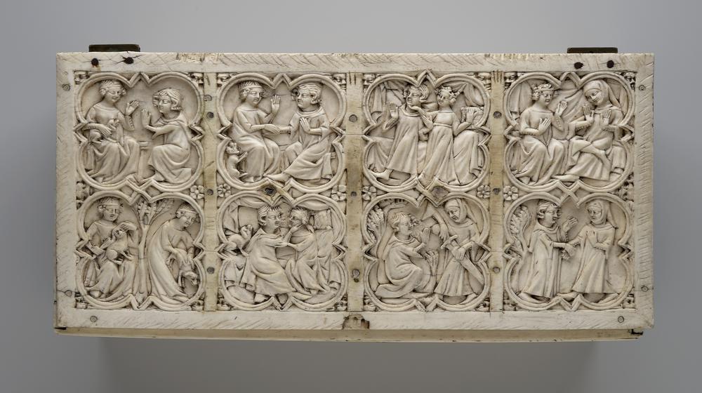
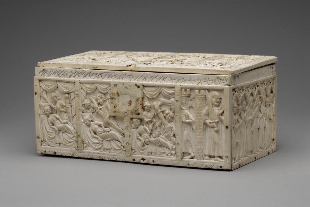
The Châtelaine de Vergy, a courtly romance that was wildly popular in the mid-13th century, would’ve made a crowd pleasing graphic novel adaptation. It’s got sex, treachery, a trio of violent deaths, and a cute pup in a supporting role.
Seeing as how the form had yet to be invented, medieval audiences got the next best thing — a Gothic ivory casket on which the story is rendered as a series of carved pictures that start on the lid and wrap around the sides.
In an earlier video for the British Museum’s Curator’s Corner series, Late Medieval Collections Curator Naomi Speakman admitted that the purpose of such deluxe caskets is difficult to pin down. Were they tokens from one lover to another? Wedding gifts? Jewelry boxes? Document cases?
Unclear, but the intricate carvings’ narrative has definitely been identified as that of The Châtelaine de Vergy, a steamy secular alternative to the religious scenes whose depiction consumed a fair number of medieval elephant tusks.
A very graphic novelesque conceit Speakman points to in the British Museum’s casket finds the Duke of Burgundy breaking the frame (to use comics terminology), reaching behind the gutter to help himself to the sword the Châtelaine’s knightly lover has just plunged into his own breast.
Peer around to the far side of the casket to find out what the Duke intends to do with that sword. It’s a shocker that silences the trumpets, quiets the dancing ladies, and might even have laid ground for a sequel: Chatelaine: The Duke’s Wrath.
Read Eugene Mason’s early 20th century translation of The Chatelaine of Vergi here.
Watch more episodes of the British Museum’s Curator’s Corner here.
We're hoping to rely on loyal readers, rather than erratic ads. Please click the Donate button and support Open Culture. You can use Paypal, Venmo, Patreon, even Crypto! We thank you!
Open Culture scours the web for the best educational media. We find the free courses and audio books you need, the language lessons & educational videos you want, and plenty of enlightenment in between.