Is “Rain” the Perfect Beatles Song?: A New Video Explores the Radical Innovations of the 1966 B‑Side
“That one was the gift of God… of Ja actually—the god of marijuana, right? So Ja gave me that one.”
The Beatles 1966 Revolver, a mini-masterpiece, contains all the elements that would inform the band’s revolutionary late-60s sound on Sgt. Pepper’s, Abbey Road, The White Album, and Let it Be. The album’s first track, “Taxman,” announced “a sweeping shift in the essential nature of the Beatles’ sound,” writes music historian Kenneth Womack. Its ultimate track, “Tomorrow Never Knows,” was “the greatest leap into the future” up to that point in their career, argues pop culture writer Robert Rodriguez, who literally wrote the book, or a book, on the sea change that was Revolver.
Critical to discussion of this period, however, is a single that appeared at the same time, and proved just as important to the Beatles’, and thus pop music’s, evolution. Though not especially innovative musically or lyrically, “Paperback Writer” was the first Beatles’ recording to bring Paul McCartney’s bass forward in the mix, showcasing the utterly distinctive playing that would later form the backbone of songs like “Come Together.” The record’s B‑side, “Rain,” moreover, is the first Beatles song to use backwards tape, a staple of psychedelic music thereafter.
In fact, “Rain” was “the first backwards tape on any record anywhere. Before Hendrix, before The Who, before any f*cker,” John Lennon bragged. (He conceded that the novelty hit “They’re Coming to Take Me Away, Ha Haaa!” got there a little earlier, “but it’s not the same thing.”). Lennon claimed the song as his, although McCartney later claimed co-authorship. But Lennon gave credit for the backwards voices and guitars to “Ja,” telling Playboy in 1980:
I got home from the studio and I was stoned out of my mind on marijuana… and, as I usually do, I listened to what I’d recorded that day. Somehow it got on backwards and I sat there, transfixed, with the earphones on, with a big hash joint.
There’s much more to the story of “Rain,” as you’ll hear in the You Can’t Unhear This video above. The track came out of “what would arguably be the most revolutionary week of their recording career… working closely with their beloved producer George Martin and an eager young EMI engineer named Geoff Emerick.” In “Rain,” specifically, they took full advantage of a discovery made on “Tomorrow Never Knows” — the impact of slowing down recordings.
The band “played the rhythm track really fast,” during recording, “so that when the tape was played back at normal speed everything would be so much slower, changing the texture,” remembered Emerick. This led to what McCartney would call a “big ominous noise”:
The drums became a giant drum kit. If you slow down a footstep it becomes a giant’s footstep, it adds a few tones to the weight of the person. So we got a big, ponderous, thunderous backing and then we worked on top of that as normal.
Ringo called it the greatest performance of his musical career: “I think I just played amazing… I think it was the first time I used this trick of starting a break by hitting the hi-hat first instead of going directly to a drum off the hi-hat.”
Contrarians love takes about iconic artists like the Beatles that overstate the importance of deep cuts and minor recordings. But in the case of “Rain” — the B‑side of a 1966 single that didn’t appear on the album that changed rock and roll and the counterculture that same year– believe the hype. The Beatles themselves single out the song as seminally important to their musical development for good reason. Or as Sir Paul recalls, “It was nice, I really enjoyed that one.”
Related Content:
How “Strawberry Fields Forever” Contains “the Craziest Edit” in Beatles History
Hear the Beautiful Isolated Vocal Harmonies from the Beatles’ “Something”
Josh Jones is a writer and musician based in Durham, NC. Follow him at @jdmagness
Read More...Harvard’s Digital Giza Project Lets You Access the Largest Online Archive on the Egyptian Pyramids (Including a 3D Giza Tour)
Nothing excites the imagination of young history-and-science-minded kids like the Egyptian pyramids, which is maybe why so many people grow up into amateur Egyptologists with very strong opinions about the pyramids. For such people, access to the highest quality information seems critical for their online debates. For professional academics and serious students of ancient Egypt such access is critical to doing their work properly. All lovers and students of ancient Egypt will find what they need, freely available, at Harvard University’s Digital Giza Project.
“Children and specialized scholars alike may study the material culture of this ancient civilization from afar,” Harvard’s Metalab writes, “often with greater access than could be achieved in person.” The project opened at Harvard in 2011 after spending its first eleven years at the Museum of Fine Arts, Boston with the goal of “digitizing and posting for free online all of the archaeological documentation from the Harvard University—Boston Museum of Fine Arts Expedition to Giza, Egypt (about 1904–1947),” notes the about page.
The Digital Giza Project was born from a need to centralize research and artifacts that have been scattered all over the globe. “Documents and images are held in faraway archives,” the Harvard Gazette points out, “artifacts and other relics of ancient Egypt have been dispersed, stolen, or destroyed, and tombs and monuments have been dismantled, weather-worn, or locked away behind passages filled in when an excavation closes.” Other obstacles to research include the expense of travel and, more recently, the impossibility of visiting far-off sites.
Expanding far beyond the scope of the original expeditions, the project has partnered with “many other institutions around the world with Giza-related collections” to compile its searchable library of downloadable PDF books and journal articles. Kids, adult enthusiasts, and specialists will all appreciate Giza 3D, a reconstruction with guided tours of all the major archeological sites at the pyramids, from tombs to temples to the Great Sphinx, as well as links to images and archeological details about each of the various finds within.
For a preview of the multimedia experience on offer at the Digital Giza Project, see the videos here from project’s YouTube channel. Each short video provides a wealth of information; young learners and those just getting started in their Egyptology studies can find lessons, glossaries, an overview of the people and places of Giza, and more at the Giza @ School page. Whatever your age, occupation, or level of commitment, if you’re interested in learning more about the pyramids at Giza, you need to bookmark Digital Giza. Start here.
Related Content:
What Ancient Egyptian Sounded Like & How We Know It
Josh Jones is a writer and musician based in Durham, NC. Follow him at @jdmagness
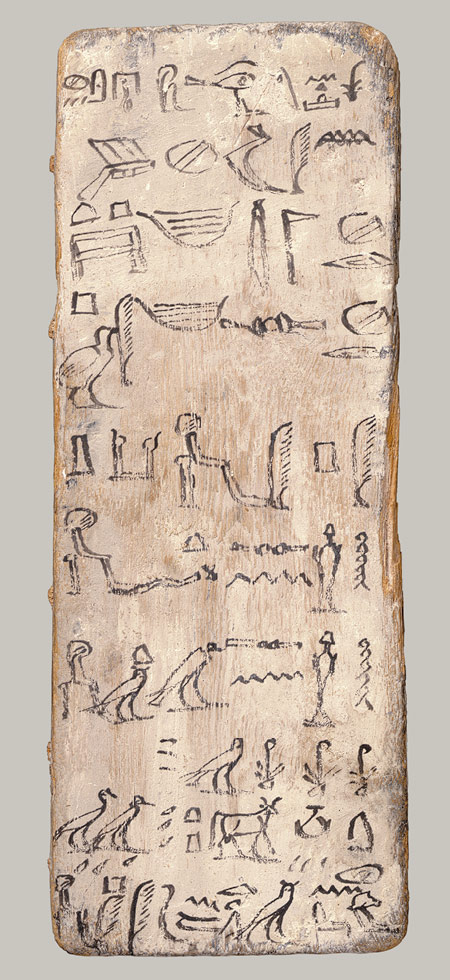
Read More...A 4,000-Year-Old Student ‘Writing Board’ from Ancient Egypt (with Teacher’s Corrections in Red)

Americans raised on Laura Ingalls Wilder’s Little House books tend to associate slates with one room schoolhouses and rote exercises involving reading, writing and ‘rithmetic.
Had we been reared along the banks of the Nile, would our minds go to ancient gessoed boards like the 4000-year-old Middle Kingdom example above?
Like our familiar tablet-sized blackboards, this paper — or should we say papyrus? — saver was designed to be used again and again, with whitewash serving as a form of eraser.
As Egyptologist William C. Hayes, former Curator of Egyptian Art at the Metropolitan Museum wrote in The Scepter of Egypt: A Background for the Study of the Egyptian Antiquities in The Metropolitan Museum of Art. Vol. 1, From the Earliest Times to the End of the Middle Kingdom, the writing board at the top of the page:
…bears parts of two model letters of the very formal and ultra-poite variety addressed to a superior official. The writers consistently refer to themselves as “this servant” and to their addressees as “the Master (may he live, prosper, and be well.)” The longer letter was composed and written by a young man named Iny-su, son of Sekhsekh, who calls himself a “Servant of the Estate” and who, probably in jest, has used the name of his own brother, Peh-ny-su, as that of the distinguished addressee. Following a long-winded preamble, in which the gods of Thebes and adjacent towns are invoked in behalf of the recipient, we get down to the text of the letter and find that it concerns the delivery of various parts of a ship, probably a sacred barque. In spite of its formality and fine phraseology, the letter is riddled with misspellings and other mistakes which have been corrected in red ink, probably by the master scribe in charge of the class.
Iny-su would also have been expected to memorize the text he had copied out, a practice that carried forward to our one-room-schoolhouses, where children droned their way through texts from McGuffey’s Eclectic Readers.
Another ancient Egyptian writing board in the Met’s collection finds an apprentice scribe fumbling with imperfectly formed, unevenly spaced hieroglyphs.
Fetch the whitewash and say it with me, class — practice makes perfect.
The first tablet inspired some lively discussion and more than a few punchlines on Reddit, where commenter The-Lord-Moccasin mused:
I remember reading somewhere that Egyptian students were taught to write by transcribing stories of the awful lives of the average peasants, to motivate and make them appreciate their education. Like “the farmer toils all day in the burning field, and prays he doesn’t feed the lions; the fisherman sits in fear on his boat as the crocodile lurks below.”
Always thought it sounded effective as hell.
We can’t verify it, but we second that emotion.
Note: The red markings on the image up top indicate where spelling mistakes were corrected by a teacher.
via @ddoniolvalcroze
Related Content:
What Ancient Egyptian Sounded Like & How We Know It
Ayun Halliday is an author, illustrator, theater maker and Chief Primatologist of the East Village Inky zine. Follow her @AyunHalliday.
Read More...The Letterform Archive Launches a New Online Archive of Graphic Design, Featuring 9,000 Hi-Fi Images
An online design museum made by and for designers? The concept seems obvious, but has taken decades in internet years for the reality to fully emerge in the Letterform Archive. Now that it has, we can see why. Good design may look simple, but no one should be fooled into thinking it’s easy. “After years of development and months of feedback,” write the creators of the Letterform Archive online design museum, “we’re opening up the Online Archive to everyone. This project is a labor of love from everyone on our staff, and many generous volunteers, and we hope it provides a source of beautiful distraction and inspiration to all who love letters.”
That’s letters as in fonts, not epistles, and there are thousands of them in the archive. But there are also thousands of photographs, lithographs, silkscreens, etc. representing the height of modern simplicity. This and other unifying threads run through the collection of the Letterform Archive, which offers “unprecedented access… with nearly 1,500 objects and 9,000 hi-fi images.”
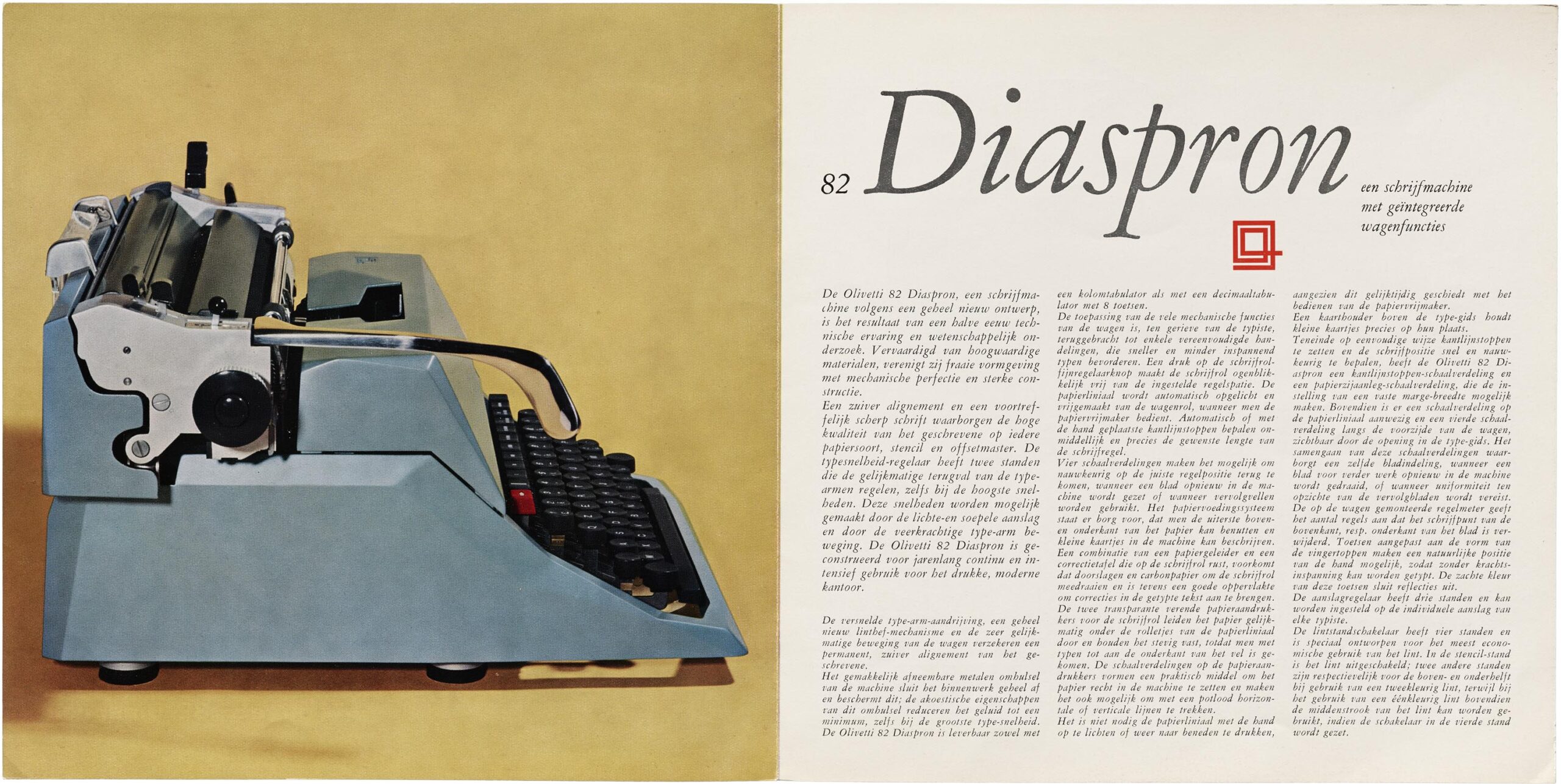
You’ll find in the Archive the sleek elegance of 1960s Olivetti catalogs, the iconic militancy of Emory Douglas’ designs for The Black Panther newspaper, and the eerily stark militancy of the “SILENCE=DEATH” t‑shirt from the 1980s AIDS crisis.

The site was built around the ideal of “radical accessibility,” with the aim of capturing “a sense of what it’s like to visit the Archive” (which lives permanently in San Francisco). But the focus is not on the casual onlooker — Letterform Archive online caters specifically to graphic designers, which makes its interface even simpler, more elegant, and easier to use for everyone, coincidentally (or not).
The graphic design focus also means there are functions specific to the discipline that designers won’t find in other online image libraries: “we encourage you to use the search filters: click on each category to explore disciplines like lettering, and formats like type specimens, or combine filters like decades and countries to narrow your view to a specific time and place.”
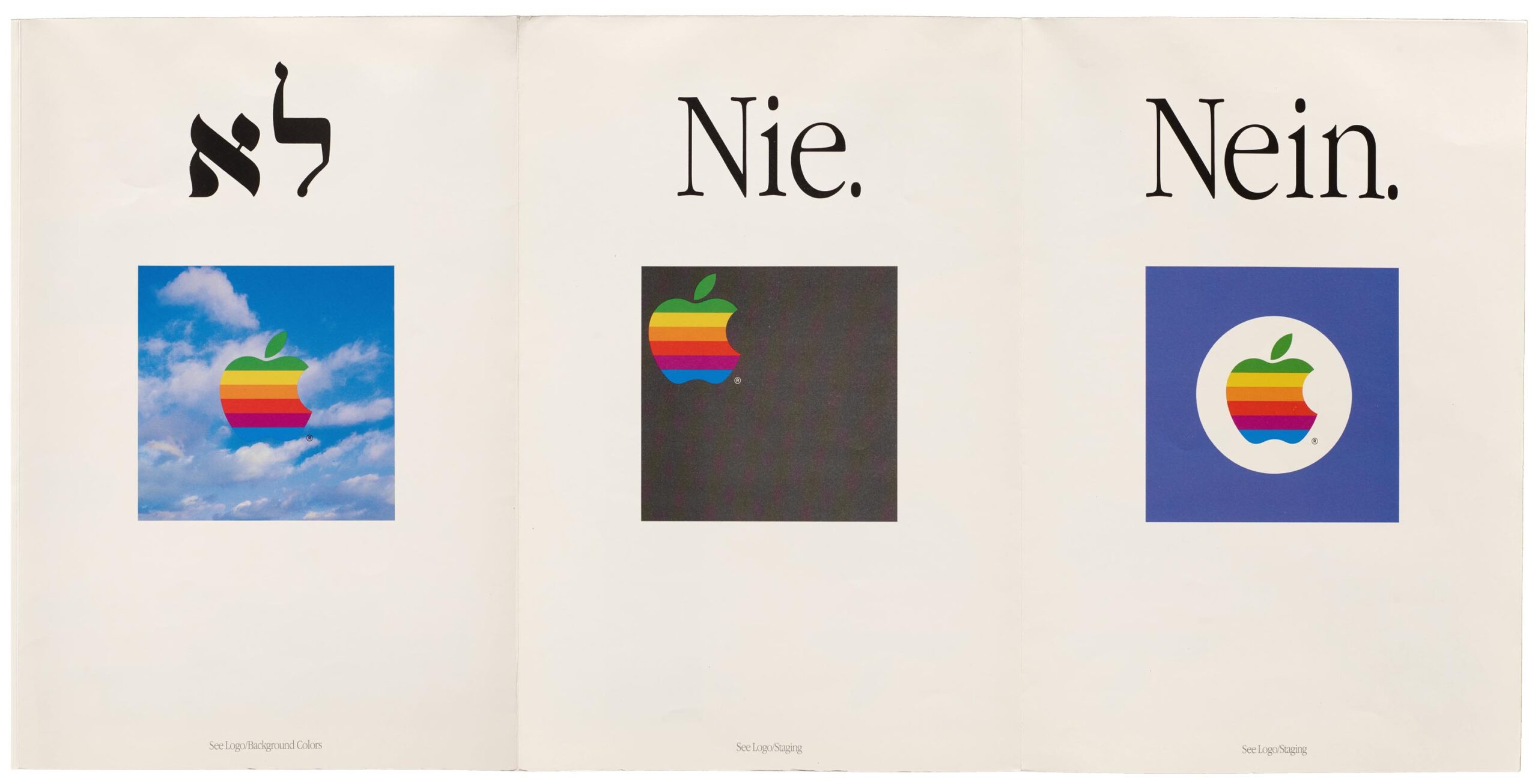
From the radical typography of Dada to the radical 60s zine scene to the sleek designs (and Neins) found in a 1987 Apple Logo Standards pamphlet, the museum has something for everyone interested in recent graphic design history and typology. But it’s not all sleek simplicity. There are also rare artifacts of elaborately intricate design, like the Persian Yusef and Zulaikha manuscript, below, dating from between 1880 and 1910. You’ll find dozens more such treasures in the Letterform Archive here.

Related Content:
Josh Jones is a writer and musician based in Durham, NC. Follow him at @jdmagness
Read More...A Long-Lost Soviet Adaptation of The Lord of the Rings Resurfaces on YouTube–and Tolkien Fans Rejoice (1991)
When Peter Jackson’s The Fellowship of the Ring came out in 2001, it heralded a cinematic adaptation of J.R.R. Tolkien’s Lord of the Rings trilogy that would, at long last, possess scale, production value, and sheer ambition enough to do justice to the original novels. This set it somewhat apart from the version of The Fellowship of the Ring that had aired just ten years before on Leningrad Television — and hasn’t been seen since, at least until its recent upload (in two parts) to Youtube. An unofficial adaptation, Khraniteli tells a story every single Tolkien reader around the world will recognize, even if they don’t understand unsubtitled Russian. The production’s appeal lies in any case not in its dialogue, but what we’ll call its look and feel.
“Featuring a score by Andrei Romanov of the rock band Akvarium and some incredibly cheap production design, no one is going to confuse this Lord of the Rings with Jackson’s films,” writes /Film’s Chris Evangelista. “The sets look like, well, sets, and the special effects — if you can call them that — are delightfully hokey. This appears to have had almost no budget, and that only lends to the charm.”
Despite its cheapness, Khraniteli displays exuberance on multiple levels, including its often-theatrical performances as well as visual effects, executed with the still-new video technology of the time, that oscillate between the hokily traditional and the nearly avant-garde. Some scenes, in fact, look not entirely dissimilar to those of Prospero’s Books, Peter Greenaway’s high-tech vision of Shakespeare that also premiered in 1991.
That year was the Soviet Union’s last, and the prolonged political shakeup that ensued could partially explain why Khraniteli went unseen for so long. Until now, obscurity-hunters have had to make do with The Fairytale Journey of Mr. Bilbo Baggins, The Hobbit (previously featured here on Open Culture), Leningrad Television’s earlier adaptation of Tolkien’s pre-Lord of the Rings children’s novel. It was the now long-gone Leningrad Television’s successor entity 5TV that just put the Soviet Fellowship of the Ring online — and in seemingly pristine condition at that — to the delight of global Tolkien enthusiasts who’d known only rumors of its existence. And as many of them have already found, for all the shortcomings, Khraniteli still has Tom Bombadil, for whose omission from his sprawling blockbusters Jackson will surely never hear the end.
Related Content:
The 1985 Soviet TV Adaptation of The Hobbit: Cheap and Yet Strangely Charming
Illustrations of The Lord of the Rings in Russian Iconography Style (1993)
Soviet-Era Illustrations Of J. R. R. Tolkien’s The Hobbit (1976)
The Lord of the Rings Mythology Explained in 10 Minutes, in Two Illustrated Videos
Based in Seoul, Colin Marshall writes and broadcasts on cities, language, and culture. His projects include the Substack newsletter Books on Cities, the book The Stateless City: a Walk through 21st-Century Los Angeles and the video series The City in Cinema. Follow him on Twitter at @colinmarshall or on Facebook.
Read More...The New Enlightenment and the Fight to Free Knowledge: Part 3
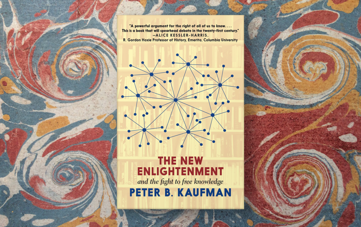
Editor’s Note: MIT Open Learning’s Peter B. Kaufman has just published The New Enlightenment and the Fight to Free Knowledge, a book that takes a historical look at the powerful forces that have purposely crippled our efforts to share knowledge widely and freely. His new work also maps out what we can do about it. Generously, Peter has made his book available through Open Culture by publishing three short essays along with links to the corresponding freely licensed sections of his book. Today, you can read his third essay “The Republic of Images” (below). Find his first essay, “The Monsterverse” here, his second essay “On Wikipedia, the Encyclopédie, and the Verifiability of Information” here, and purchase the entire book online.
In November 1965, after some hondling between the Carnegie Corporation and the Ford Foundation, a senior executive from Carnegie called former president of MIT James Killian with an invitation. Would Killian be interested in assembling a commission to study educational television with an eye toward strengthening the American system of learning on screen, and could he start right away? Killian jumped; a commission was formed; and two years, eight meetings, 225 interviews, and 92 site visits later, the Carnegie Commission’s report comes out, a bill gets written, the bill becomes law, and President Johnson is signing the 1967 Public Television Act to create public television and radio.
At the signing ceremony, Johnson said, “Today, we rededicate a part of the airwaves – which belong to all the people – and we dedicate them for the enlightenment of all the people. We must consider,” he said, “new ways to build a great network for knowledge – not just a broadcast system, but one that employs every means of sending and storing information that the individual can use.”
Heady stuff. But it gets even better:
Think of the lives that this would change:
The student in a small college could tap the resources of a great university. […]
The country doctor getting help from a distant laboratory or a teaching hospital;
A scholar in Atlanta might draw instantly on a library in New York;
A famous teacher could reach with ideas and inspirations into some far-off classroom, so that no child need be neglected.
Eventually, I think this electronic knowledge bank could be as valuable as the Federal Reserve Bank.
And such a system could involve other nations, too – it could involve them in a partnership to share knowledge and to thus enrich all mankind.
A wild and visionary idea? Not at all. Yesterday’s strangest dreams are today’s headlines and change is getting swifter every moment.
I have already asked my advisers to begin to explore the possibility of a network for knowledge – and then to draw up a suggested blueprint for it.
The system he was signing into law, Johnson said, “will be free, and it will be independent – and it will belong to all of our people.”
A new network for knowledge.
Imagine.
Fifty years later, totally (seemingly) unrelated, then MIT president Charles Vest went on to speak of something else, something that became MIT Open Courseware. Together with new foundations – this time the Hewlett Foundation and the Mellon Foundation led the way – Vest envisioned “a transcendent, accessible, empowering, dynamic, communally constructed framework of open materials and platforms on which much of higher education worldwide can be constructed or enhanced:”
A meta-university that will enable, not replace, residential campuses, that will bring cost efficiencies to institutions through the shared development of educational materials. That will be adaptive, not prescriptive. It will serve teachers and learners in both structured and informal contexts. It will speed the propagation of high-quality education and scholarship. It will build bridges across cultures and political boundaries. And it will be particularly important to the developing world.
Today, in our time of severe truth decay, our great epistemic crisis, it might be time again to envision another intervention, formative and transformational as the establishment of public broadcasting, imaginative and daring as the launch of open courseware and the open education movement. Indeed, something as breathtaking as the events above, and their own vital forbear over a century ago – the founding of a network of public libraries across America and other parts of the world (which also happened with Andrew Carnegie’s financial support).
The original Enlightenment brought us Newton’s physics, Rousseau’s political philosophy, Linnaeus’s taxonomies, Montesquieu’s laws, the Declaration of Independence, the Declaration of the Rights of Man – it was the Age of Reason. Its founders – as we noted in [Parts 1 and II on] Open Culture – comprised between themselves what became known as the great Republic of Letters. They were all men, though; and they all were white; while they had access to their own means and to the mean of media production, and they delivered new systems of thinking much of the modern world is based on today, their circles were limited; their imaginations were not our imaginations.
Today we have a chance to do more – to take advantage of the cultures and communities that have arisen in the centuries and from the struggles since that time, to launch a new Enlightenment, and to realize perhaps in bolder and more secure ways this new network for knowledge. Video, more than text now, has taken over the internet; video is a new key to our networked world. The company Cisco Systems – which makes many of the devices that connect us – deploys a forecasting tool it calls the Visual Networking Index (VNI). The latest VNI tells us that there were 3.4 billion Internet users on the planet in 2017, almost half of the planet’s current population of 7.7 billion people. By 2022, there will be 4.8 billion Internet users: 60 percent of the planet, and more people in the world will be connected to the Internet than not. By 2022, more than 28 billion “devices and connections” will be online. And – here’s the kicker – video will make up 82 percent of global Internet traffic. Video is dominant already. During peak evening hours in the Americas, Netflix can account for as much as 40 percent of downstream Internet traffic, and Netflix – Netflix alone – constitutes 15 percent of Internet traffic worldwide. All this forecasting was completed before the pandemic; before 125 million cases of Corona virus; before 3 million deaths worldwide; before the explosion of Zoom.
We are living in a video age. What will be our next media intervention? How do knowledge institutions secure their deservedly central place in search and on the web? We need to look over our rights vis-à-vis the government and the giant companies that increasingly control our Internet; we need to look at the growing power we have to contribute to access to knowledge and share our wealth especially in the online Commons; we need to make sure that the public record, especially video (and especially video of all the lies and crimes, and of all the outrageous falsehoods leaders circulate about COVID) is all archived and preserved. We need to strengthen how much of the network we own and control.
What’s important is that we have begun to reach toward the point where there is equity in the leadership of our knowledge institutions. No longer are white men and only white men in charge of the Library of Congress, for example, or the Smithsonian Institution, or, and thus by extension, of our new Enlightenment. New and diverse study and action groups are being formed specifically to address our information disorder. But many more of our leading knowledge institutions – and, critically, foundations and funding agencies again – need to lead this work. This is a 20th-anniversary year for MIT Open CourseWare, for Wikipedia, and for Creative Commons; indeed, MIT OCW starts to celebrate its birthday this month. Many other like-minded progressive institutions and their supporters are on the move. That network for knowledge is coming again: this time, our new Enlightenment moment will belong to all of us.
Peter B. Kaufman works at MIT Open Learning and is the author of The New Enlightenment and the Fight to Free Knowledge.
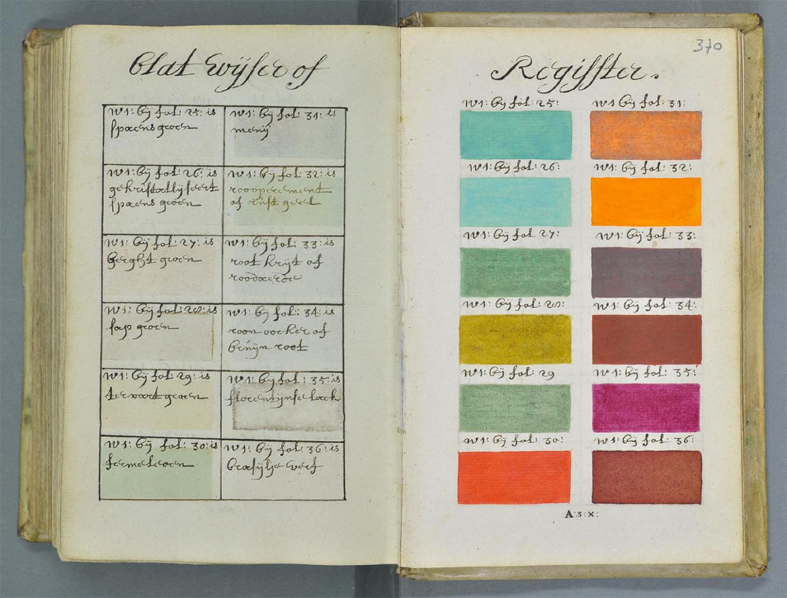
Read More...A 900-Page Pre-Pantone Guide to Color from 1692: A Complete High-Resolution Digital Scan
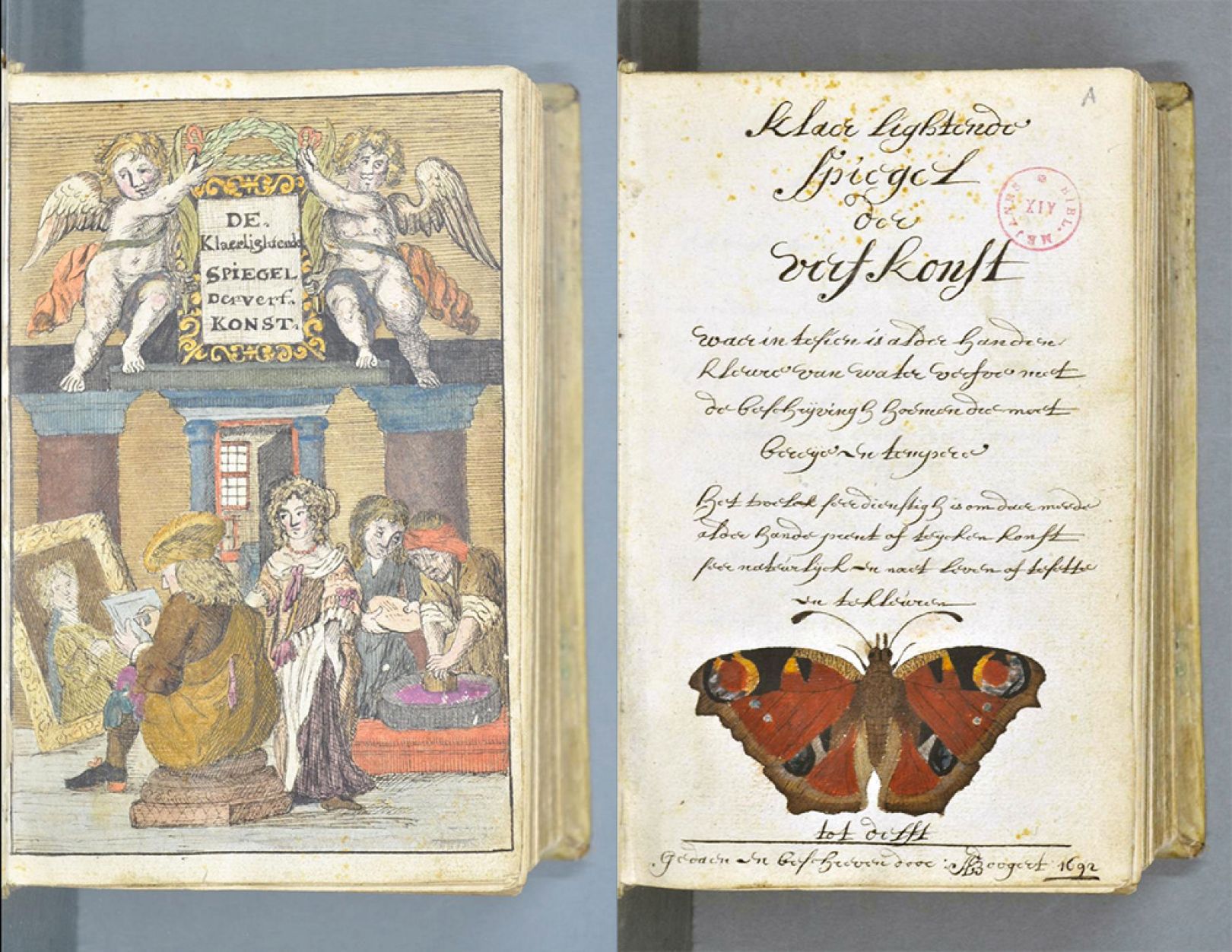
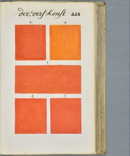
There’s ahead of its time, then there’s Traité des couleurs servant à la peinture à l’eau — or, in its original Dutch title, Klaer Lightende Spiegel der Verfkonst, a 900-page book of paint colors made before any such things were common tools of the artist’s, scientist’s, and industrial designer’s trade. Author and artist A. Boogert created one, and only one, copy of his extraordinary manual on color mixing in 1692. Appearing on the threshold of modern color theory, and featuring over 700 pages of color swatches, the book draws on Aristotle’s system of color rather than the new understanding of the color spectrum, fully elaborated by Newton in his Opticks over a decade later.
It would be another hundred years before a flood tide of color books began to make the theory more practical: from Goethe’s 1810 Theory of Colors and Werner’s 1814 Nomenclature of Colour to the dream of color standardization realized: the Pantone company, launched in 1963.
But if A. Boogert had much influence on the theory or practical application of color in his day, there doesn’t seem to be much evidence for it. Of course most of the Dutch masters had died when the book was completed, and it seems unlikely that those still working in 1692 would have been familiar with its single copy.
Instead, the book was meant to educate watercolorists, hence its French title, which refers to “water-based paint.” (A literal translation of the Dutch runs something like “clearly lighting mirror of the painting art.”) Medieval historian Erik Kwakkel found the book in a French database, “and it turns out to be quite special,” he writes, “because it provides an unusual peek into the workshop of 17th-century painters and illustrators.
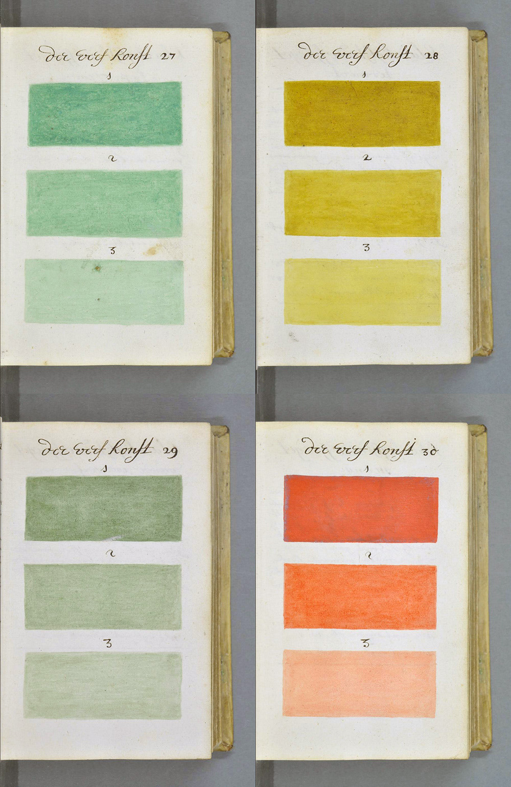
In over 700 pages of handwritten Dutch, the author, who identifies himself as A. Boogert, describes how to make watercolour paints. He explains how to mix the colours and how to change their tone by adding ‘one, two or three portions of water.’… In the 17th Century, an age known as the Golden Age of Dutch Painting, this manual would have hit the right spot.”
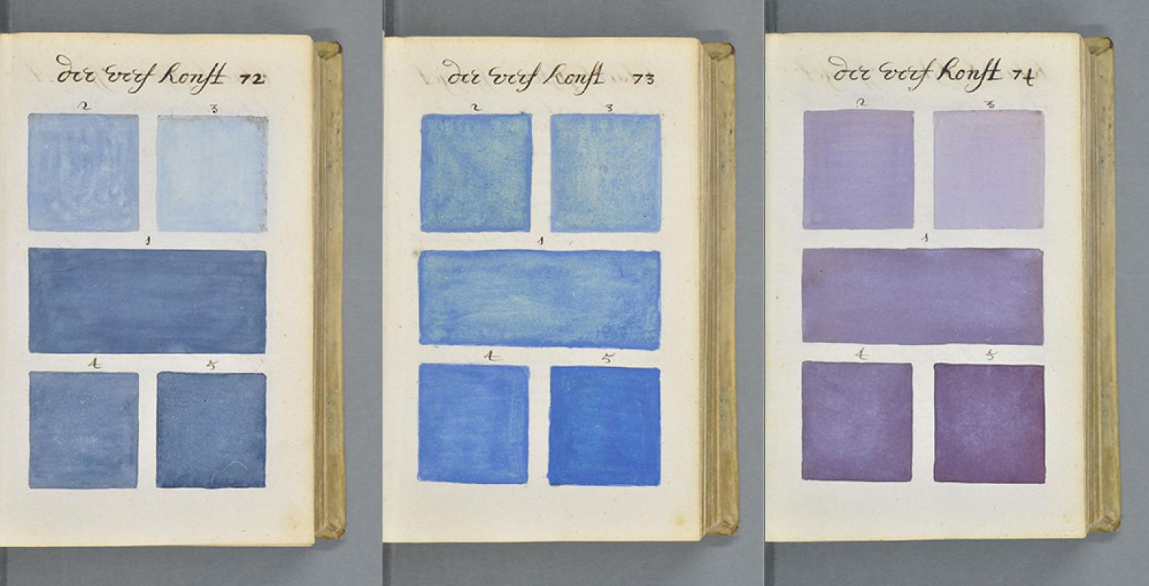
The book is currently housed at Bibliothèque Méjanes in Aix-en-Provence, where you’ll find full-page, zoomable, hi-resolution scans. “Beyond being informational, the images from the book are stunning and addictive flip through,” notes Refinery29. “They resemble page after page of Pantone color chips, except without the household name.” One wonders if “A. Boogert” would have become a household name had his book been printed and distributed. But his color system was already passing away in the Newtonian age of color spectrums and wheels, until paint chips finally came back in style. Visit the color manual online here.
Related Content:
The Vibrant Color Wheels Designed by Goethe, Newton & Other Theorists of Color (1665–1810)
Josh Jones is a writer and musician based in Durham, NC. Follow him at @jdmagness
Read More...Discover the First Modern Kitchen–the Frankfurt Kitchen–Pioneered by the Architect Margarete Schütte-Lihotzky (1926)
Nearly 100 years after it was introduced, architect Margarete (Grete) Schütte-Lihotzky’s famous Frankfurt Kitchen continues to exert enormous influence on kitchen design.
Schütte-Lihotzky analyzed designs for kitchens in train dining cars and made detailed time-motion studies of housewives’ dinner preparations in her quest to come up with something that would be space saving, efficient, inexpensively pre-fabricated, and easily installed in the new housing springing up in post-WWI Germany.
Schütte-Lihotzky hoped that her design would have a liberating effect, by reducing the time women spent in the kitchen. Nothing is left to chance in these 1.9 by 3.44 meters, with the main emphasis placed on the well-traveled “golden triangle” between worktop, stove, and sink.
The design’s scientific management honored ergonomics and efficiency, initiating a sort of household dance, but as filmmaker Maribeth Romslo, who directed eight dancers on a painstaking facsimile of a Frankfurt Kitchen, below, observes:
…as with any progress, there is friction and pressure. As women gain more rights (then and now), are they really just adding more to their to-do list of responsibilities? Adding to the number of plates they need to spin? They haven’t been excused from domestic duties in order to pursue careers or employment, the new responsibilities are additive.
(Note: enter your information to view the film.)
Choreographer Zoé Henrot, who also appears in the film, emphasizes the Frankfurt Kitchen’s design efficiencies and many of its famous features — the drawers for flour and other bulk goods, the adjustable stool, the cutting board with a receptacle for parings and peels.
At the same time, she manages to telegraph some possible Catch-22s.
Its diminutive size dictates that this workplace will be a solitary one — no helpers, guests, or small children.
The built-in expectations regarding uniformity of use leaves little room for culinary experimentation or a loosey goosey approach.
When crushingly repetitive tasks begin to chafe, options for escape are limited (if very well-suited to the expressive possibilities of modern dance).
Interestingly, many assume that a female architect working in 1926 would have brought some personal insights to the task that her male colleagues might have been lacking. Not so, as Schütte-Lihotzky readily admitted:
The truth of the matter was, I’d never run a household before designing the Frankfurt Kitchen, I’d never cooked, and had no idea about cooking.
Singer-songwriter Robert Rotifer is another artist who was moved to pay homage to Schütte-Lihotzky and the Frankfurt Kitchen, a “calculated move” that he describes as something closer to designing a kitchen than “divine inspiration”:
I sat on the train traveling from Canterbury up to London… I was about to record a new album, and I needed one more uptempo song, something driving and rhythmical. While the noisy combination of rickety train and worn-out tracks suggested a beat, I began to think about syncopations and subjects.
I thought about the mundane things nobody usually writes songs about, functional things that defy metaphor—tools, devices, household goods. As I listed some items in my head, I soon realized that kitchen utensils were the way to go. I thought about the mechanics of a kitchen, and that’s when the name of the creator of the famous Frankfurt Kitchen flashed up in my head.
There, in the natural rhythm of her name, was the syncopation I had been looking for: “I sing this out to Grete Schütte-Lihotzky.” Writing the rest of the lyrics was easy. The repetitive element would illustrate the way you keep returning to the same tasks and positions when you are working in a kitchen. In the middle-eight I would also find space for some of the criticisms that have been leveled at Schütte-Lihotzky’s kitchen over the decades, such as the way her design isolated the kitchen worker, i.e. traditionally the woman, from the rest of the family.
Rotifer, who also created the paintings used in the animated music video, gives the architect her due by including accomplishments beyond the Frankfurt Kitchen: her micro-apartment with “a disguised roll-out bed,” her terraced houses at the Werkbundsiedlung, a housing project’s kindergarten, a printing shop, and the Viennese Communist party headquarters.
It’s a lovely tribute to a design pioneer who, reflecting on her long career around the time of her 100th birthday, remarked:
If I had known that everyone would keep talking about nothing else, I would never have built that damned kitchen!
Museums that have acquired a Frankfurt Kitchen include Frankfurt’s Museum Angewandte Kunst, New York City’s Museum of Modern Art, London’s Victoria and Albert Museum, and Oslo’s National Museum.
Learn more about the Kitchen Dance Project in this conversation between filmmaker Maribeth Romslo, choreographer Zoé Emilie Henrot, and Minneapolis Institute of Art curator Jennifer Komar Olivarez.
Related Content:
Recipes from the Kitchen of Georgia O’Keeffe
The Politics & Philosophy of the Bauhaus Design Movement: A Short Introduction
Ayun Halliday is an author, illustrator, theater maker and Chief Primatologist of the East Village Inky zine. Follow her @AyunHalliday
Read More...The Archive of Healing Is Now Online: UCLA’s Digital Database Provides Access to Thousands of Traditional & Alternative Healing Methods

Photo by Katherine Hanlon on Unsplash
Folk medicine is, or should be, antithetical to capitalism, meaning it should not be possible to trademark, copyright, or otherwise own and sell plants and natural remedies to which everyone has access. The entire reason such practices developed over the course of millennia was to help communities of close affiliation survive and thrive, not to foster market competition between companies and individuals. The impulse to profit from suffering has distorted what we think of as healing, such that a strictly allopathic, or “Western,” approach to medicine relies on ethics of exclusion, exploitation, and outright harm.
What we tend to think of as modern medicine, the Archive of Healing writes, “is object-oriented (pharmaceuticals, technologically driven) and structured by historical injustice against women and people of color.” The Archive, a new digital project from the University of California, Los Angeles, offers “one of the most comprehensive databases of medicinal folklore in the world,” Valentina Di Liscia writes at Hyperallergic. “The interactive, searchable website boasts hundreds of thousands of entries describing cures, rituals, and healing methods spanning more than 200 years and seven continents.”
In countries like the United States, where healthcare is treated as a scarce commodity millions of people cannot afford, access to knowledge about effective, age-old natural wisdom has become critical. There may be no treatments for COVID-19 in the database, but there are likely traditional remedies, rituals, practices, treatments, ointments, etc. for just about every other illness one might encounter. The archive was curated over a period of more than thirty years by “a team of researchers at UCLA, working under the direction of Dr. Wayland Hand and then Dr. Michael Owen Jones,” the site notes in its brief history.
The material from the collection, which was originally called the “archive of traditional medicine,” came from “data on healing from over 3,200 publications, six university archives, as well as first-hand and second-hand information from anthropological and folkloric fieldnotes.” In 2016, when Dr. Delgado Shorter took over as director of the program, he “reorganized it with an eye to social sharing and allowing for users to submit new data and comment on existing data,” notes UCLA’s School of the Arts and Architecture in an interview with Shorter, who describes the project’s aims thus:
The whole goal here is to democratize what we think of as healing and knowledge about healing and take it across cultures in a way that’s respectful and gives attention to intellectual property rights.
This may seem like a delicate balancing act, between the scholarly, the folkloric, and the realms of rights, remuneration, and social power. The Archive strikes it with an ambitious set of tenets you can read here, including an emphasis on offering traditional and Indigenous healing practices “outside of often expensive allopathic and pharmaceutical approaches, and not as alternatives but as complementary modalities.”
The archive states as one of its theoretical bases that health should be treated “as a social goal with social methods that affirm relationality and kinship.” Those wishing to get involved with the Archive as partners or advisory board members can learn how at their About page, which also features the following disclaimer: “Statements made on this website have not been evaluated by the Food and Drug Administration. The information contained herein is not intended to diagnose, treat, cure or prevent any disease.” Use the information wisely, at your own risk, in other words.
To use the Archive of Healing, you will need to register with the site first.
via Hyperallergic
Related Content:
1,000-Year-Old Illustrated Guide to the Medicinal Use of Plants Now Digitized & Put Online
Josh Jones is a writer and musician based in Durham, NC. Follow him at @jdmagness
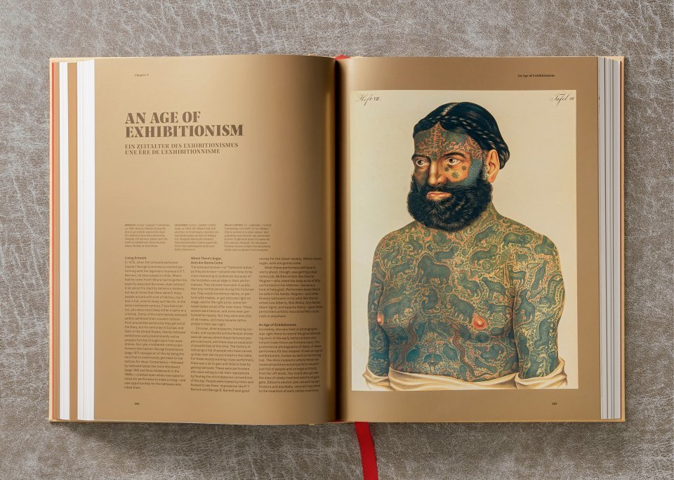
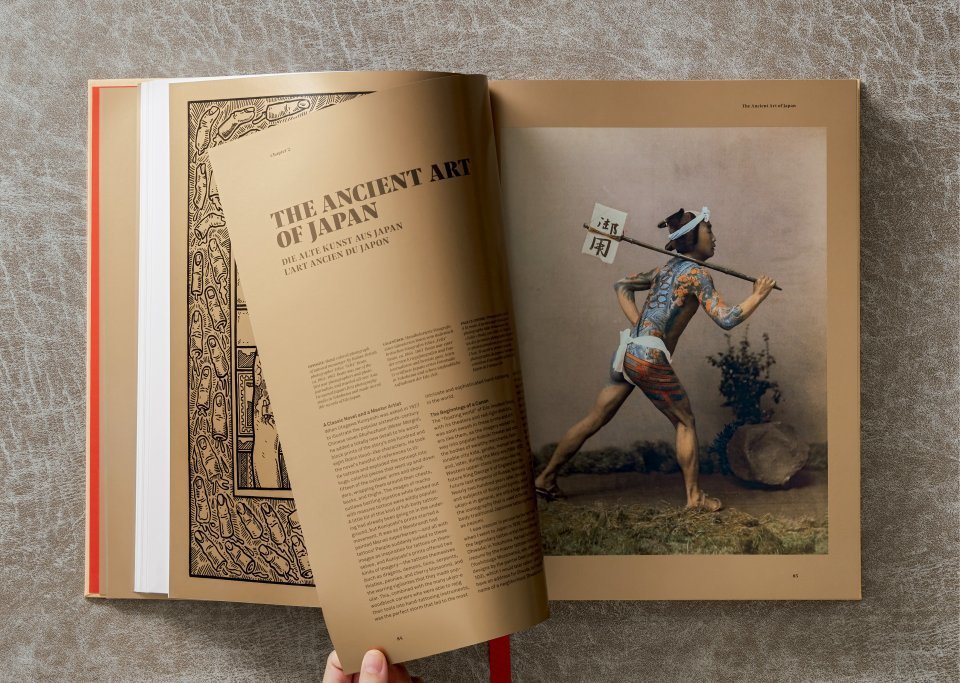
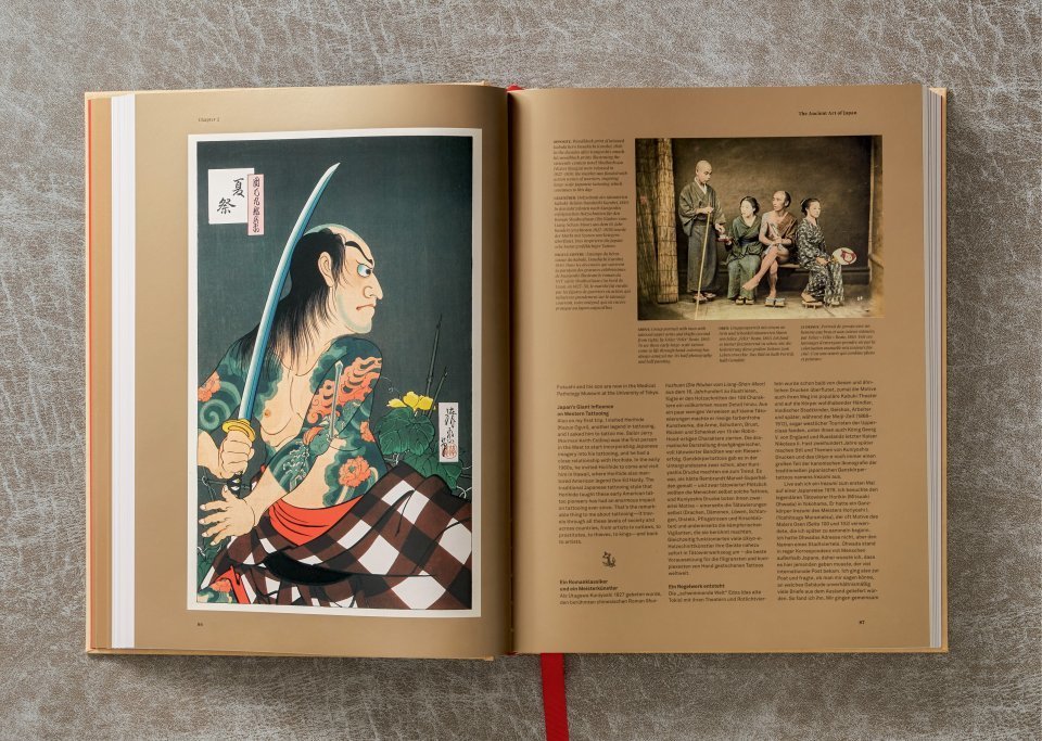
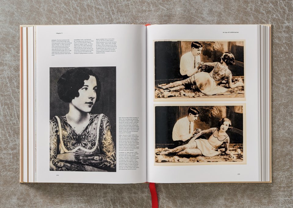
Read More...The History of Tattoos Gets Beautifully Documented in a New Book by Legendary Tattoo Artist Henk Schiffmacher (1730–1970)
I always think tattoos should communicate. If you see tattoos that don’t communicate, they’re worthless. —Henk Schiffmacher, tattoo artist
Tattooing is an ancient art whose grip on the American mainstream, and that of other Western cultures, is a comparatively recent development.
Long before he took up—or went under—a tattoo needle, legendary tattoo artist and self-described “very odd duck type of guy,” Henk Schiffmacher was a fledgling photographer and accidental collector of tattoo lore.
Inspired by the immersive approaches of Diane Arbus and journalist Hunter S. Thompson, Schiffmacher, aka Hanky Panky, attended tattoo conventions, seeking out any subculture where inked skin might reveal itself in the early 70s.
As he shared with fellow tattooer Eric Perfect in a characteristically rollicking, profane interview, his instincts became honed to the point where he “could smell” a tattoo concealed beneath clothing:
The kind of tattoos you used to see in those days, you do not see anymore, that stuff made in jail, in the German jails, like, you’d like see a guy who’d tattooed himself as far as his right hand could reach and the whole right (side) would be empty…I always loved that stuff which was never meant to be art which is straight from the heart.
When tattoo artists would write to him, requesting prints of his photos, he would save the letters, telling Hero’s Eric Goodfellow:
I would get stuff from all over the world. The whole envelope would be decorated, and the letter as well. I have letters from the Leu Family and they’re complete pieces of art, they’re hand painted with all kinds of illustrations. Also people from jail would write letters, and they would take time to write in between the lines in a different colour. So very, very unique letters.
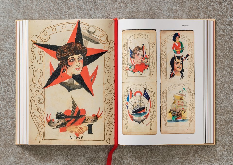
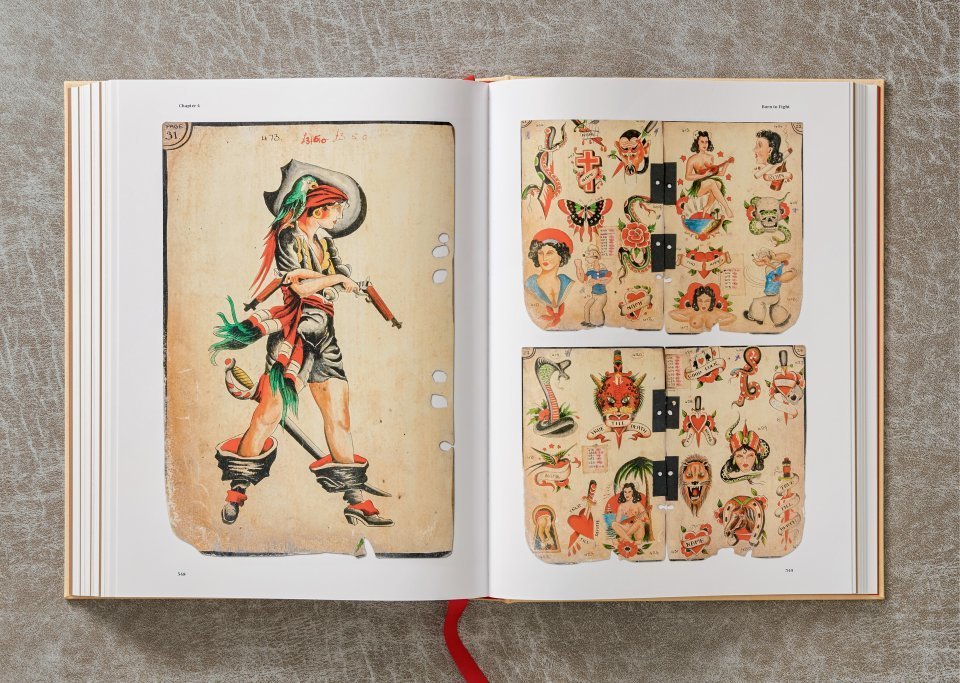
Such correspondence formed the earliest holdings in what is now one of the world’s biggest collections of contemporary and historical tattoo ephemera.
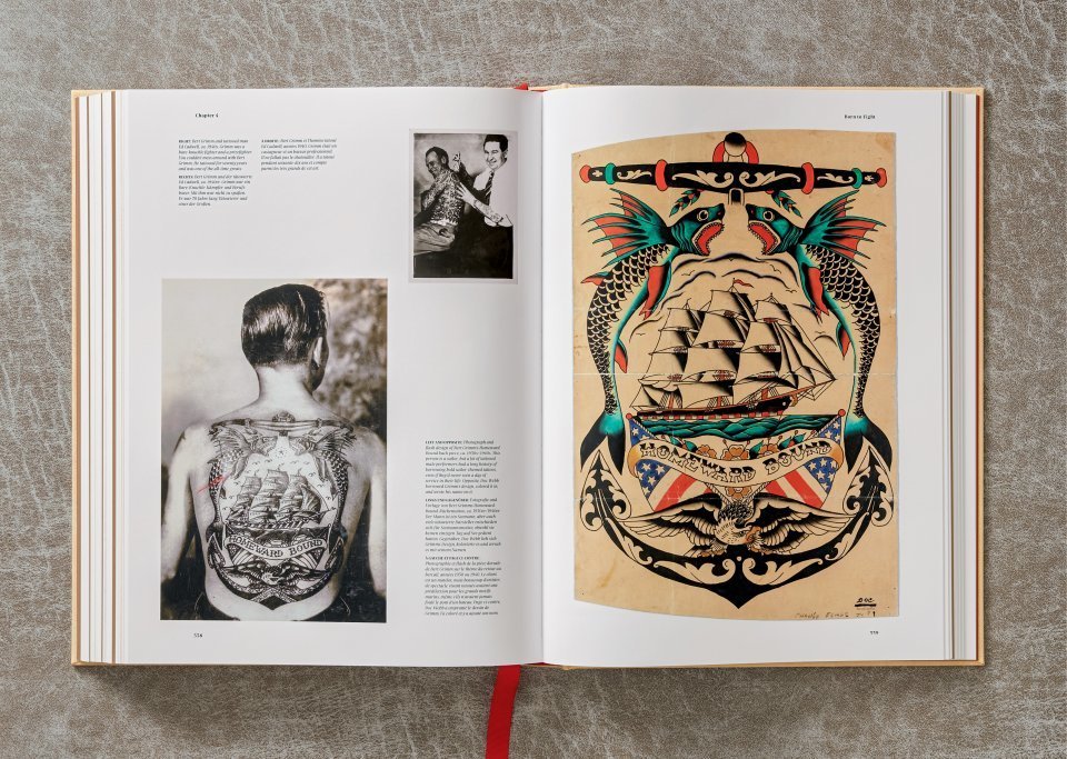
Schiffmacher (now the author of the new Taschen book, TATTOO. 1730s-1970s) realized that tattoos must be documented and preserved by someone with an open mind and vested interest, before they accompanied their recipients to the grave. Many families were ashamed of their loved ones’ interest in skin art, and apt to destroy any evidence of it.
On the other end of the spectrum is a portion of a 19th-century whaler’s arm, permanently emblazoned with Jesus and sweetheart, preserved in formaldehyde-filled jar. Schiffmacher acquired that, too, along with vintage tools, business cards, pages and pages of flash art, and some truly hair raising DIY ink recipes for those jailhouse stick and pokes. (He discusses the whaler’s tattoos in a 2014 TED Talk, below).
His collection also expanded to his own skin, his first canvas as a tattoo artist and proof of his dedication to a community that sees its share of tourists.
Schiffmacher’s command of global tattoo significance and history informs his preference for communicative tattoos, as opposed to obscure ice breakers requiring explanation.
When he first started conceiving of himself as an illustrated man, he imagined the delight any potential grandchildren would take in this graphic representation of his life’s adventures—“like Pippi Longstocking’s father.”
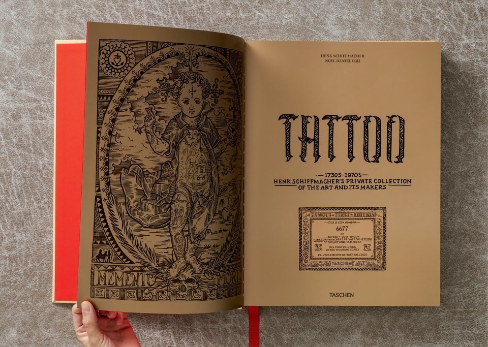
While his Tattoo Museum in Amsterdam is no more, his collection is far from mothballed. Earlier this year, Taschen published TATTOO. 1730s-1970s. Henk Schiffmacher’s Private Collection, a whopping 440-pager the irrepressible 69-year-old artist hefts with pride. You can purchase the book directly via Amazon.
Related Content:
Why Tattoos Are Permanent? New TED Ed Video Explains with Animation
Ayun Halliday is an author, illustrator, theater maker, the Chief Primatologist of the East Village Inky zine and the human alter ego of L’Ourse. Follow her @AyunHalliday.
Read More...Support Us
We're hoping to rely on loyal readers, rather than erratic ads. Please click the Donate button and support Open Culture. You can use Paypal, Venmo, Patreon, even Crypto! We thank you!

About Us

Open Culture scours the web for the best educational media. We find the free courses and audio books you need, the language lessons & educational videos you want, and plenty of enlightenment in between.
Advertise With Us
FREE UPDATES!
GET OUR DAILY EMAIL
Get the best cultural and educational resources on the web curated for you in a daily email. We never spam. Unsubscribe at any time.
FOLLOW ON SOCIAL MEDIA
Open Culture editor Dan Colman scours the web for the best educational media. He finds the free courses and audio books you need, the language lessons & movies you want, and plenty of enlightenment in between.
Advertise With Us