Explore a Big Archive of Vintage Early Comics: 1700–1929
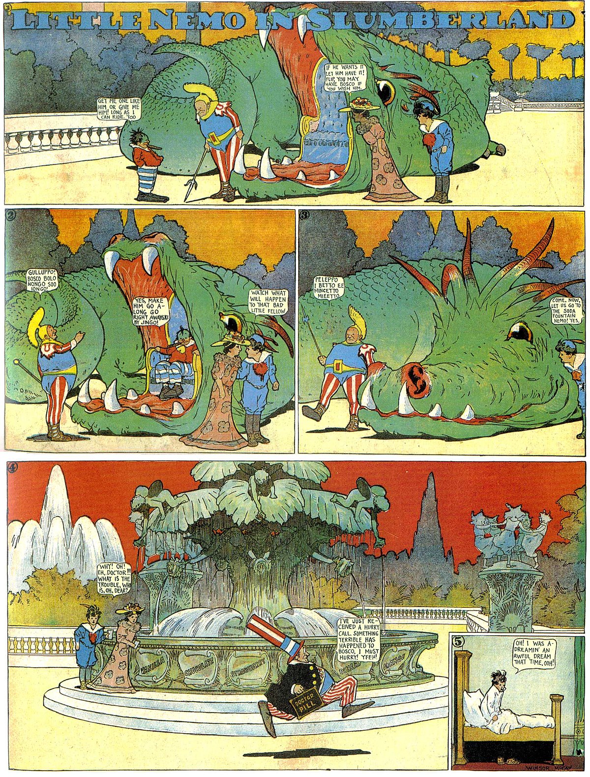
The popularity of graphic novels (and more than a few extremely lucrative superhero movie franchises) have conferred respectability on comics.
Handsome reissues of such stunning early works as Winsor McKay’s Little Nemo in Slumberland, George Herriman’s Krazy Kat, and Frank King’s Walt and Skeezix suggest that readers’ appetite for vintage comics extends deeper and further back than mere nostalgia for the Sunday funnies of their youth.
Artist Andy Bleck’s Andy’s Early Comics Archive is an excellent resource for those seeking to discover early examples of the form that have yet to be reissued in a collected edition. (Fair warning: reflecting the attitudes of the time, the collection does inevitably contains some racist imagery. Such imagery won’t be on display in this post.)
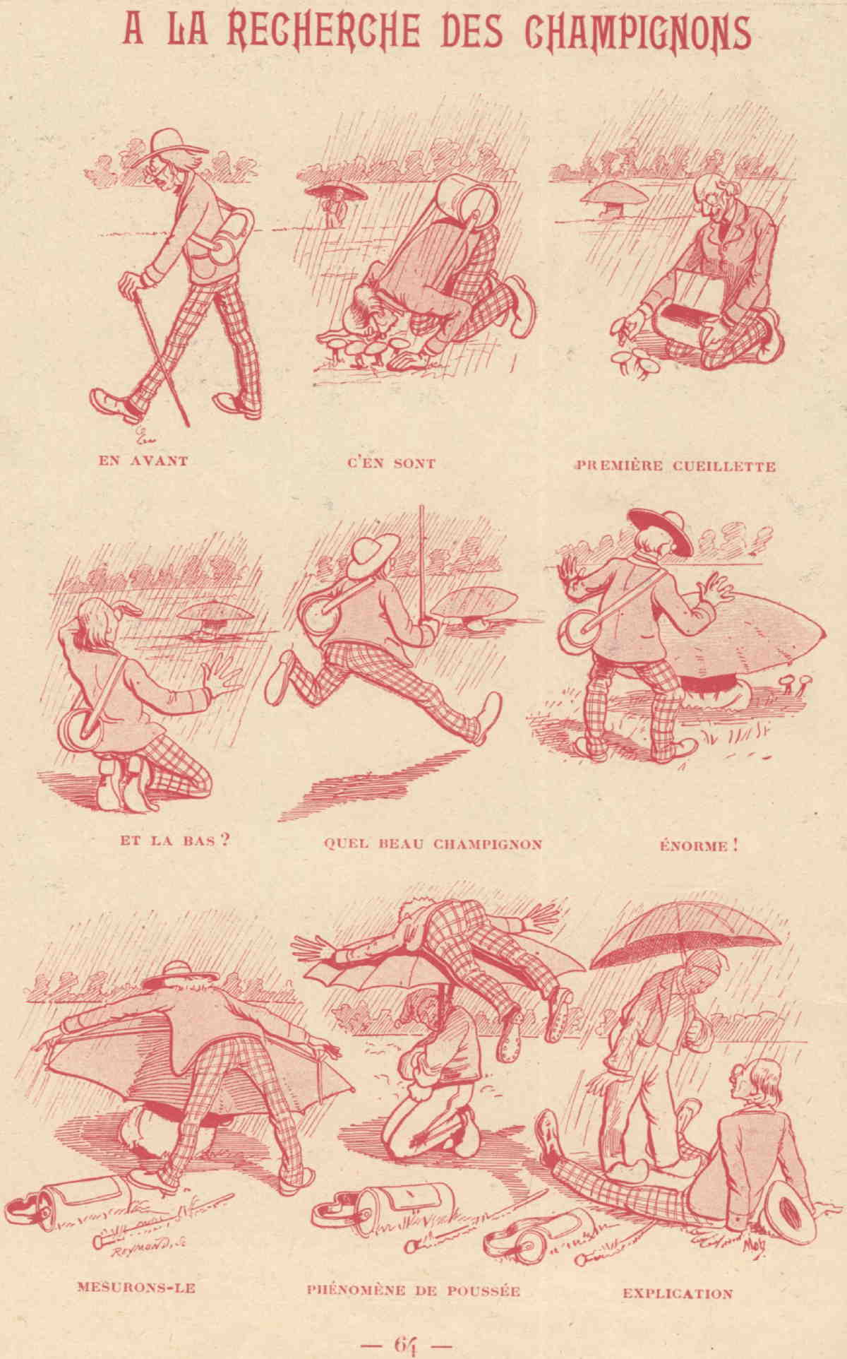
Bleck, the creator of Konky Kru, a beautifully simple, wordless series, as well as several self-published mini comics, takes a historian’s interest in his subject, beginning with the William Hogarth engravings A Harlot’s Progress from 1730:
The famous ‘progressions’ by Hogarth were not actually comics. The images don’t lead into and don’t interact with each other. Each shows a distinct, separate stage of a longer story. However, because of their great popularity, they established the very notion of telling entertaining stories with a series of pictures and so became a highly influential stepping stone for future developments.
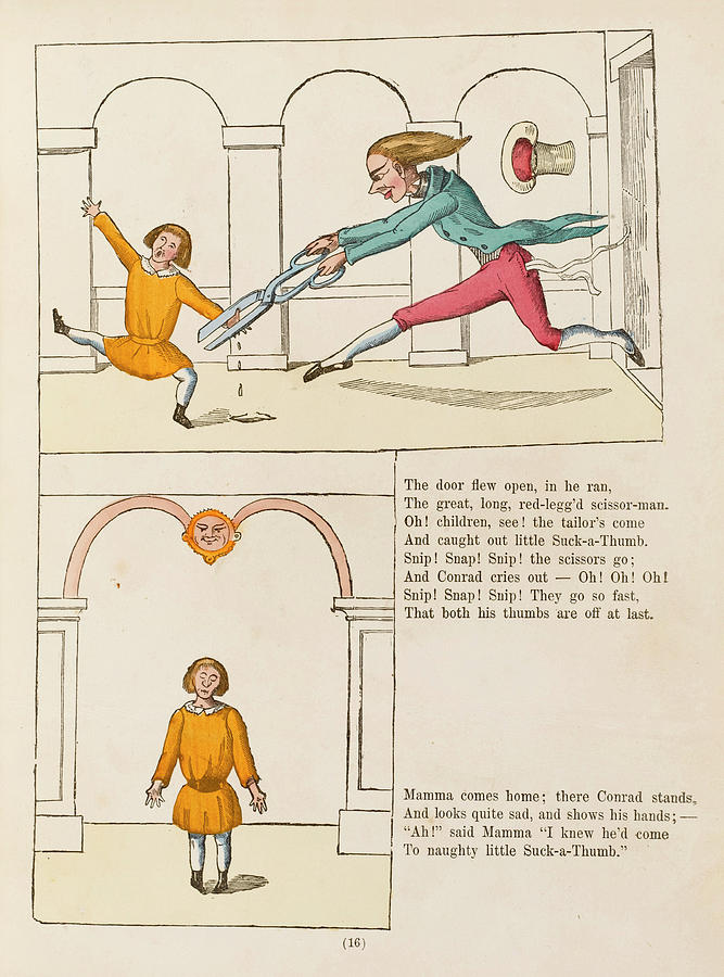
He also cites the influence of British political cartoons, Chinese woodcuts, illustrated fairy tales and nursery rhymes, and Heinrich Hoffmann’s Struwwelpeter, a book that terrified children into behaving by depicting the monstrous consequences befalling those who failed to do so.
Ironically, Franz Joseph Goez’s Lenardo und Blandine, an actual graphic novelette from 1783, “probably had little influence:”
It was too ahead of its time as far as the comic structure is concerned. In content, it was delightfully very much of its time, full of outrageous melodrama.
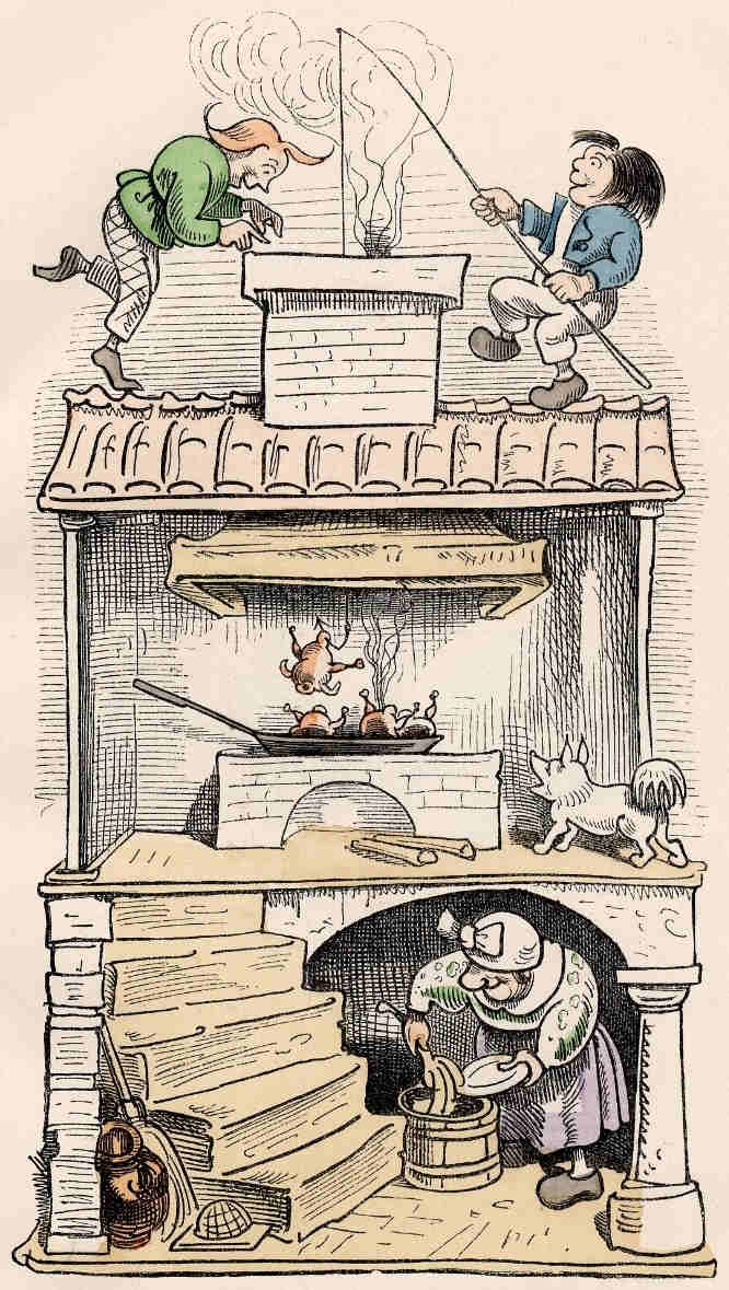
Things continued to evolve in the second half of the 19th-century, with picture broadsheets for children, such as the ones starring Wilhelm Busch’s wildly popular Max and Moritz. (See an English translation here.)
Bleck traces the birth of modern comics, whose storytelling vocabulary continues today, to the beginning of the 20th century, with American newspaper strips and particularly, the Sunday funnies:
The newspaper format was much larger and cheaper, providing a lot more empty space to fill. The audience was less sophisticated, but (possibly because of this) more open to a particular type of experimentation, despite the dumb and lowbrow humor… these American Sunday pages became the breeding ground for something new. Weirder, rougher, slapdashier. Also easier, for children, but not childish. More popular. More … somethingier.
Maybe it was that new type of human being, the urban immigrant, who was most prepared and eager to pay for all this new visual goings on.
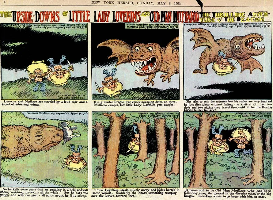
Andy’s Early Comics Archive can be searched chronologically, or alphabetically by artist’s name. Enter here.
Related Content
Read The Very First Comic Book: The Adventures of Obadiah Oldbuck (1837)
Download Over 22,000 Golden & Silver Age Comic Books from the Comic Book Plus Archive
Download 15,000+ Free Golden Age Comics from the Digital Comic Museum
- Ayun Halliday is the Chief Primatologist of the East Village Inky zine and author, most recently, of Creative, Not Famous: The Small Potato Manifesto. Follow her @AyunHalliday.
Read More...
Watch a Television Station Switch From Black & White to Color for First Time (1967)
The history of television is a murky, convoluted affair, filled with patent wars, corporate backstabbing, and stories of thwarted genius found in many such tales. The story of color TV can seem no less complicated, with patents stretching all the way back to 1904 (filed by a German inventor), decades before the magic box appeared in any living room. The first mechanical color system was designed by Scottish inventor John Logie Baird in 1928.
Attempts to broadcast color TV wouldn’t be made until the 1950s, with the first commercial broadcast made by CBS airing in 1951 on five stations. Hardly anyone could see it. When NBC broadcast the Tournament of Roses Parade in 1954, fewer than 8,500 American households owned a color TV set. By April 1961, an editorial in Television magazine argued that color “is still in the egg, and only skillful and expensive handling will get it out of the egg and on its feet.” Needless to say, the adoption of the new technology was exceedingly slow.
Ratings wars and advertising wars forced color to come of age in the mid-60s, and as a result “color TV transformed the way Americans saw the world, writes historian Susan Murray at Smithsonian, as well as the way “the world saw America.” Color television “was, in fact, often discussed by its proponents as an ideal form of American postwar consumer vision: a way of seeing the world (and all of its brightly hued goods) in a spectacular form of ‘living color.’” Color was explicitly talked up as spectacle, though sold to consumers as a truer representation of reality.
“Network executives pitched [color TV] to advertisers as a unique medium that would inspire attentiveness and emotional engagement,” writes Murray, “making [viewers] more likely to purchase advertised products, a growing myriad of consumer goods and appliances that were now available in a wider set of vibrant colors like turquoise and pink flamingo.” (Thanks, of course, to the advent of space-age polymers.) Such history provides us with more context for the puzzlement of newsman Bob Bruner in 1967 (above), introducing viewers to Iowa’s Channel 2 switch-over to color.
“I feel doubly honored to have been chosen to be the first one involved in our big change,” says Bruner after chatting with station manager Doug Grant, “because there are so many much more colorful characters around here than this report in the news.” That year, there were characters like Pink Floyd appearing for the first time on American Bandstand (see that footage colorized here), their psychedelic vibrancy muted in monochrome.
Bruner had already been upstaged nearly ten years earlier, when NBC’s WRC-TV in Washington, DC introduced its first color broadcast with President Dwight D. Eisenhower, who extolls the virtues of the medium above, in the oldest surviving color videotape recording. Even so, only around 25% of American households owned a color TV in 1967. It would be another decade before every American household (or every “consumer household”) had one, and not until the mid-80s until the medium reached full saturation around the globe.
Related Content:
Pink Floyd’s Debut on American TV, Restored in Color (1967)
Josh Jones is a writer and musician based in Durham, NC. Follow him at @jdmagness
Read More...What Did People Do Before the Invention of Eyeglasses?
You remember it — one of the most heartbreaking scenes on TV. A man longs for nothing more than time to read, to be free of all those people Sartre told us make our hells. Finally granted his wish by the H‑Bomb, he then accidentally break his glasses, rendering himself unable make out a word. Oh, cruel irony! Not an optometrist or optician in sight! Surely, there are “Time Enough at Last” jokes at eye care conventions worldwide.
Morality tales wrapped in science fiction might make us think about all sorts of things, but one of the most obvious questions when we witness the fate of Mr. Henry Bemis, “charter member in the fraternity of dreamers,” might be, but what did people do before corrective lenses? Were millions forced to accept his fate, living out their lives with farsightedness, nearsightedness, and other defects that impede vision? How did early humans survive in times much less hospitable to disabilities? At least there were others to read and describe things for them.…
In truth, the Twilight Zone is not far off the mark. Or at least nearsightedness and reading are closely linked. “As long as primates have been around, there’s probably been myopia,” says professor of ophthalmology Ivan Schwab. But Schwab argues in his book Evolution’s Witness: How Eyes Evolved that the rise of reading likely caused skyrocketing rates of myopia over the past three hundred years. “Though genes and nutrition may play a role in nearsightedness,” Natalie Jacewicz writes at NPR, “[Schwab] says education and myopia seem to be linked, suggesting that when people do a lot of close work, their eyes grow longer.”
As the History Dose video above explains, the oldest image of a pair of glasses dates from a 1351 painting of Cardinal Hugh of Saint-Cher. The painting is an anachronism — spectacles, the narrator tells us, were invented 23 years earlier in Pisa, after the cardinal’s death. They “gradually spread across Europe and travelled the Silk Road to China.” (The oldest surviving pair of glasses dates from around 1475). So what happened before 1286? As you’ll learn, glasses were not the only way to enlarge small items. In fact, humans have been using some form of magnifying lens to read small print (or manuscript or cuneiform or what-have-you) for thousands of years. Those lenses, however, corrected presbyopia, or far-sightedness.
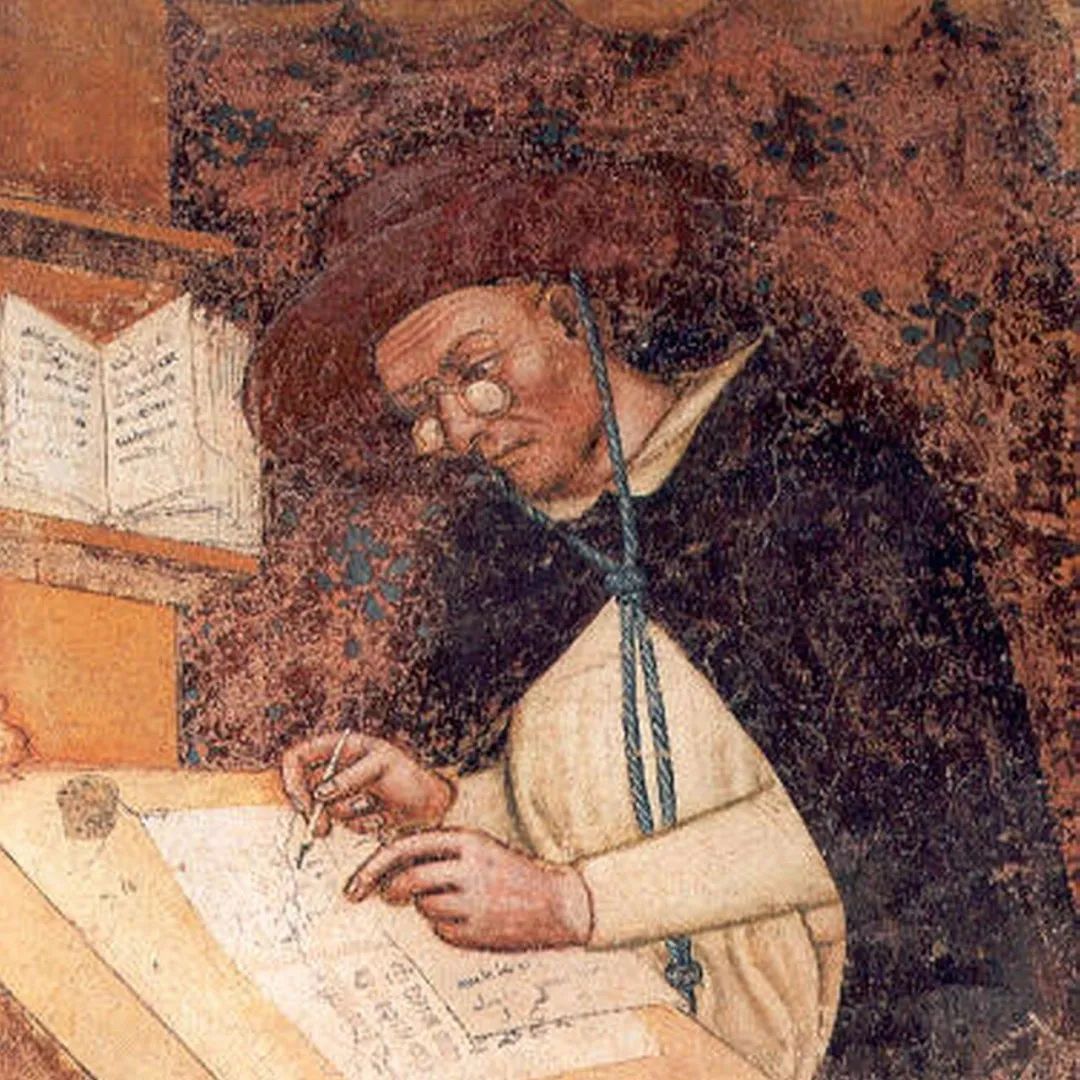
Those with myopia were mostly out of luck until the invention of sophisticated lens-grinding techniques and improved vision tests. But for most of human history, unless you were a sailor or a soldier, you “likely spent your day as an artisan, smith, or farm worker,” occupations where distance vision didn’t matter as much. In fact, artisans like medieval scribes and illuminators, says Neil Handley — museum curator of the College of Optometrists, London — were “actually encouraged to remain in their myopic condition, because it was actually ideal for them doing this job.”
It wasn’t until well after the time of Gutenberg that wearing lenses on one’s face became a thing — and hardly a popular thing at first. Early glasses were held up to the eyes, not worn. They were heavy, thick, and fragile. In the 15th century, “because… they were unusual and rare,” says Handley, “they were seen as having magical powers” and their wearers viewed as “in league with the devil, immoral.” That stigma went away, even if glasses picked up other associations that sometimes made their users the subject of taunts. But by the nineteenth century, glasses were common around the world.
Given that we all spend most of our time interacting with small text and images on handheld screens, it seems maybe they haven’t spread widely enough. “More than a billion, and maybe as many as 2.5 billion, people in the world need but don’t have glasses to correct for various vision impairments,” notes Livescience, citing figures from The New York Times. For many people, especially in the developing world, the question of how to get by in the world without eyeglasses is still a very pressing, present-day issue.
Related Content:
The World’s Oldest Surviving Pair of Glasses (Circa 1475)
James Joyce, With His Eyesight Failing, Draws a Sketch of Leopold Bloom (1926)
Josh Jones is a writer and musician based in Durham, NC. Follow him at @jdmagness
Read More...Flea Rocks “The Star Spangled Banner” on the Bass
It’s apparently a tradition–Flea performing “The Star Spangled Banner” before the start of an LA Lakers game, accompanied by the bass, and only the bass. The recording above took place over the past weekend. You can also watch other performances from 2016 and 2014. Somewhere, Jimi is smiling.
If you would like to support the mission of Open Culture, consider making a donation to our site. It’s hard to rely 100% on ads, and your contributions will help us continue providing the best free cultural and educational materials to learners everywhere. You can contribute through PayPal, Patreon, and Venmo (@openculture). Thanks!
Related Content
The Grateful Dead Rock the National Anthem at Candlestick Park: Opening Day, 1993
Read More...How to Wear a Toga the Official Ancient Roman Way
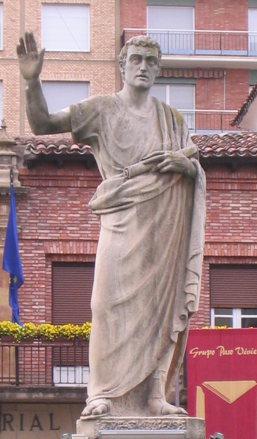
What does it take to wear an ancient Roman toga with dignity and grace?
Judging from the above demonstration by Dr Mary Harlow, Associate Professor of Ancient History at the University of Leicester, a couple of helpers, who, in the first century CE, would have invariably been enslaved, and thus ineligible for togas of their own.
The iconic outer garments, traditionally made of wool, begin as single, 12–16m lengths of fabric.
Extra hands were needed to keep the cloth from dragging on the dirty floor while the wearer was being wrapped, to secure the garment with additional pleats and tucks, and to create the pouch-like umbo at chest level, in a manner as aesthetically pleasing as every other fold and drape was expected to be.
As formal citizen’s garb, the toga was suitable for virtually every public occasion, as well as an audience with the emperor.
In addition to slaves, the toga was off-limits to foreigners, freedmen, and, with the notable exception of adulteresses and prostitutes, women.
Wealthier individuals flaunted their status by accenting their outfit with stripes of Tyrian Purple.
The BBC reports that dying even a single small swatch of fabric this shade “took tens of thousands of desiccated hypobranchial glands wrenched from the calcified coils of spiny murex sea snails” and that thus dyed, the fibers “retained the stench of the invertebrate’s marine excretions.”
Achieving that Tyrian Purple hue was “a very smelly process,” Dr. Harlow confirms, “but if you could retain a little bit of that fishy smell in your final garment, it would show your colleagues that you could afford the best.”
Given the laundry-related revelations of some toga investigating students in Salisbury University’s Department of Theatre and Dance study abroad program, above, a fishy odor might not have been the greatest olfactory challenge associated with this garment.
The students also share how toga-clad Romans dealt with stairs, and introduce viewers to 5 forms of toga:
Toga Virilis — the toga of manhood
Toga Praetexta — the pre-toga of manhood toga
Toga Pulla — a dark mourning toga
Toga Candida- a chalk whitened toga sported by those running for office
Toga Picta- to be worn by generals, praetors celebrating games and consuls. The emperor’s toga picta was dyed purple. Uh-oh.
Their youthful enthusiasm for antiquity is rousing, though Quintilian, the first century CE educator and expert in rhetoric might have had some thoughts on their clownish antics.
He certainly had a lot of thoughts about togas, which he shared in his instructive masterwork, Institutio Oratoria:
The toga itself should, in my opinion, be round, and cut to fit, otherwise there are a number of ways in which it may be unshapely. Its front edge should by preference reach to the middle of the shin, while the back should be higher in proportion as the girdle is higher
behind than in front. The fold is most becoming, if it fall to a point a little above the lower edge of the tunic, and should certainly never fall below it. The other fold which passes obliquely like a belt under the right shoulder and over the left, should neither be too tight nor too loose. The portion of the toga which is last to be arranged should fall rather low, since it will sit better thus and be kept in its place. A portion of the tunic also should be drawn back in order that it may not fall over the arm when we are pleading, and the fold should be thrown over the shoulder, while it will not be unbecoming if the edge be turned back. On the other hand, we should not cover the shoulder and the whole of the throat, otherwise our dress will be unduly narrowed and will lose the impressive effect produced by breadth at the chest. The left arm should only be raised so far as to form a right angle at the elbow, while the edge of the toga should fall in equal lengths on either side.
Quintillian was willing to let some of his high standards slide if the wearer’s toga had been untidied by the heat of rousing oration:
When, however, our speech draws near its close, more especially if fortune shows herself kind, practically everything is becoming; we may stream with sweat, show signs of fatigue, and let our dress fall in careless disorder and the toga slip loose from us on every side…On the other hand, if the toga falls down at the beginning of our speech, or when we have only proceeded but a little way, the failure to replace it is a sign of indifference, or sloth, or sheer ignorance of the way in which clothes should be worn.
We’re pretty sure he would have frowned on classical archaeologist Shelby Brown’s experiments using a twin-size poly-blend bed sheet in advance of an early 21st-century College Night at the Getty Villa.
Prospective guests were encouraged to attend in their “best togas.”
Could it be that the party planners , envisioning a civilized night of photo booths, classical art viewing, and light refreshments in the Herculaneum-inspired Getty Villa, were so ignorant of 1978’s notorious John Belushi vehicle Animal House?
…Estne volumen in toga, an solum tibi libet me videre?
Related Content
Roman Statues Weren’t White; They Were Once Painted in Vivid, Bright Colors
Archaeologists Discover an Ancient Roman Sandal with Nails Used for Tread
- Ayun Halliday is the Chief Primatologist of the East Village Inky zine and author, most recently, of Creative, Not Famous: The Small Potato Manifesto. Follow her @AyunHalliday.
Read More...Home Movies of Frida Kahlo (and a Side Order of Romantic Entanglements)
Early home movies have a certain predictable quality. Their subjects wander around, pointing at things. They shoo the camera away with embarrassed grins, cluster together awkwardly, and casually chat up their side pieces in front of their spouses….
Wait, what now?
The visit between married artists Frida Kahlo and Diego Rivera and exiled Russian Communist leader Leon Trotsky and his wife Natalia Sedova appears both cordial and ordinary in American photographer Ivan Heisler’s footage, above.
The Trotskys took up residence in La Casa Azul, Kahlo’s family home in January 1937, after Rivera persuaded President Lázaro Cárdenas to offer them sanctuary in Mexico.
Shortly after arrival, Sedova wrote a letter to friends, speaking warmly of the hospitality she was receiving:
We were breathing purified air…A motorcar…carried us across the fields of palms and cacti to the suburbs of Mexico City; a blue house, a patio filled with plants, airy rooms, collections of Pre-Columbian art, paintings from all over: we were on a new planet, in Rivera’s house.
Heisler’s slice of life film would appear to be a continuation of this relaxed and happy vibe.
Trotsky pats Rivera on the back and converses animatedly with Kahlo, nearly 30 years his junior. The two women embrace and stroll arm in arm, as the men take interest in a cactus. Sedova seems delighted when Rivera kisses her hand. Then everyone stands around and looks at trees.
Gosh, isn’t it nice when all members of two couples get along so well?
Is it possible, though, that an extra couple was lurking in plain sight?
Shortly after meeting, Trotsky and Kahlo entered into a brief but passionate fling, exchanging sweet nothings in English, concealing love notes between the pages of books, and borrowing Kahlo’s sister Cristina’s house for trysts.
They called it quits in July of 1937, after Sedova caught on and issued her husband an ultimatum.
According to the Hoover Institution Library and Archives, Heisler’s film was shot in 1938.
So we will amend our statement to say, isn’t it nice when two couples get along so well, even after two of them were discovered to be cheating on their partners with each other?
Kahlo’s and Rivera’s extramarital dalliances are hardly news, of course.
Dangerous Minds suggests that part of what drew Kahlo to Trotsky was the opportunity to get back at Rivera for his affair with Cristina — the sister who volunteered her house as love nest.
And in Vanity Fair, Amy Fine Collins details how Rivera “boasted to anyone who would listen” about Kahlo’s same sex liasons, but was apoplectic over her entanglements with men, including sculptor Isamu Noguchi, photographer Nickolas Muray, and Trotsky’s secretary Jean van Heijenoort, witness to the blatant flirtation between the artist and his boss.
The romance with Trotsky “infuriated him most” Collins writes, adding that “long after Trotsky’s assassination, Kahlo delighted in driving Rivera into a rage by humiliating him with the memory of her affair with the great Communist.”
…kind of makes one wish this little film had sound.
The absence of audio is also lamented by viewers of this colorized assemblage of amateur footage starring Kahlo and Rivera.
Trotsky appears again at the 1:03 mark. Dare we describe him as looking smitten?
There’s some speculation that the young woman at 1:17 is musician Chavela Vargas, another of Kahlo’s lovers. In that same moment, Kahlo proves herself as in command of her cinematic image as she was in her self-portraits. She’s as self-possessed as a movie star throughout.
Which makes the early glimpse of her sketching en plein air in a fur coat and Western style hat, feet propped on a low wall, all the more disarming.
It’s rare to see Frida Kahlo caught off guard, or so she appears, smiling and gesturing offscreen toward the ostensible subject of her drawing.
Is there a lip reader in the house?
(Serious question.)
For good measure, here is even more footage — the Kahlo-Riveras at the Casa Azul, as captured by Kahlo’s lover Nickolas Muray, whose famous 1939 portrait of the artist in a magenta rebozo was declared “marvelous as a Piero della Francesca” by her husband.
“To me it is more than that,” Kahlo wrote to Muray:
It is a treasure, and besides, it will always remind me [of] that morning we had breakfast together.
Understandably, some viewers remain disappointed that the snippets of Kahlo on film lack sound, but surely the “voice” in which she wrote her many loves, Diego included, is far more expressive than any audio that a home movie might have captured.
Which is not to say we’ll never hear Frida. Above is a recording the National Sound Library of Mexico believes to be her, from a radio show aired the year after her death.
The title of the text from which she is heard reading?
Portrait of Diego.
Related Content
The Intimacy of Frida Kahlo’s Self-Portraits: A Video Essay
A Brief Animated Introduction to the Life and Work of Frida Kahlo
What the Iconic Painting The Two Fridas Actually Tells Us About Frida Kahlo
Take a Virtual Tour of Frida Kahlo’s Blue House Free Online
– Ayun Halliday is the Chief Primatologist of the East Village Inky zine and creator, most just lately, of Inventive, Not Well-known: The Small Potato Manifesto. Comply with her @AyunHalliday.
Read More...Principles for Dealing with the Changing World Order: An Animated Video Explaining Key Ideas in Ray Dalio’s New Bestselling Book
Over the past five years, Ray Dalio, one of America’s most successful investors, has published a series of books, each meant to impart wisdom to a younger generation. The first book, Principles: Life and Work, shared the unconventional principles that have guided his life and career. It became a bestseller, selling well over one million copies. Next came Big Debt Crises, a study of financial crises and how nations navigate them. Finally, he has just published his latest bestseller, Principles for Dealing with the Changing World: Why Nations Succeed and Fail. A history of the rise and fall of empires over the last 500 years, the book uses the past to contemplate the future, particularly the fate of the United States and China. As was the case with Principles, Dalio has produced an animated video that explains key ideas in the book. Released in early March, the video has already been viewed 8.6 million times. Watch it above, and consider pairing it with his other animated video, How the Economic Machine Works.
If you would like to support the mission of Open Culture, consider making a donation to our site. It’s hard to rely 100% on ads, and your contributions will help us continue providing the best free cultural and educational materials to learners everywhere. You can contribute through PayPal, Patreon, and Venmo (@openculture). Thanks!
Related Content
The Principles for Success by Entrepreneur & Investor Ray Dalio: A 30-Minute Animated Primer
Read More...A Gallery of Fantastical Alchemical Drawings
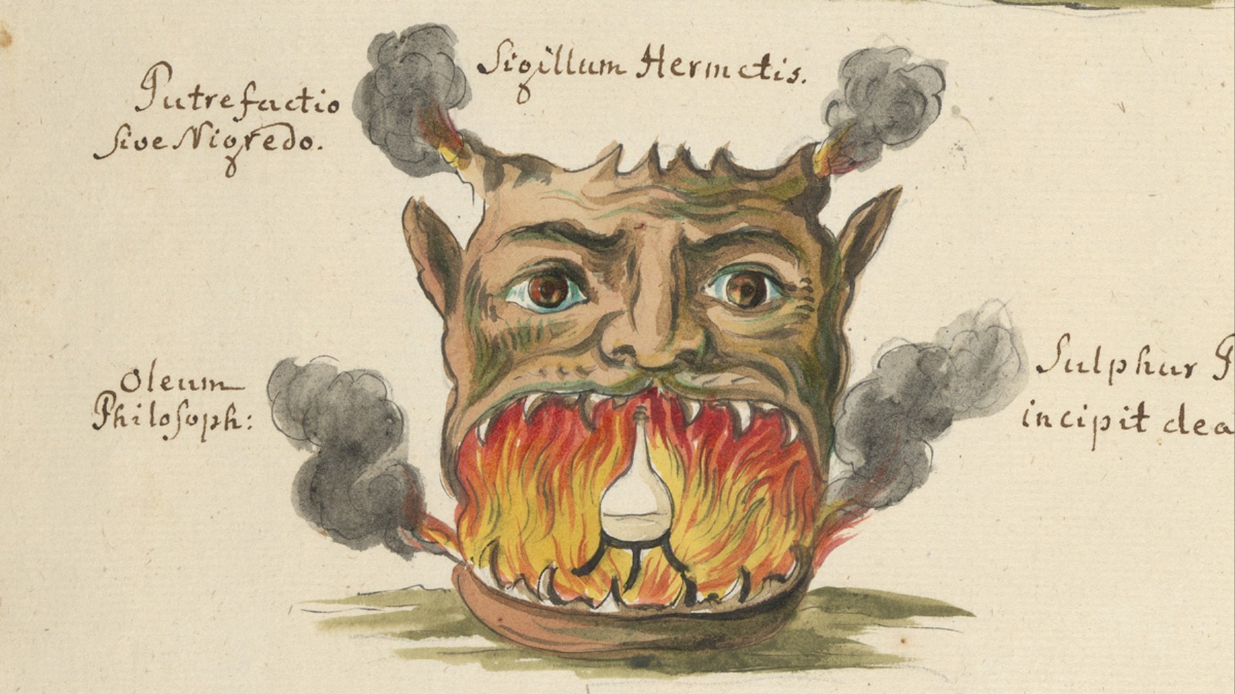
I once had to tell a ten-year-old that the Harry Potter book series was not a historical literary classic but a recent publishing phenomenon that occurred in my lifetime. She was amazed, but she wasn’t silly for thinking that the books might date from a faraway past. They do, after all, make frequent reference to figures from centuries when alchemy flourished in Europe, and magicians like Paracelsus and Nicholas Flamel (both of whom appear in Potter books and spin-offs) plied their solitary craft, such as it was. Should we call it magic, early science, occult religion, outsider art, or some admixture of the above?
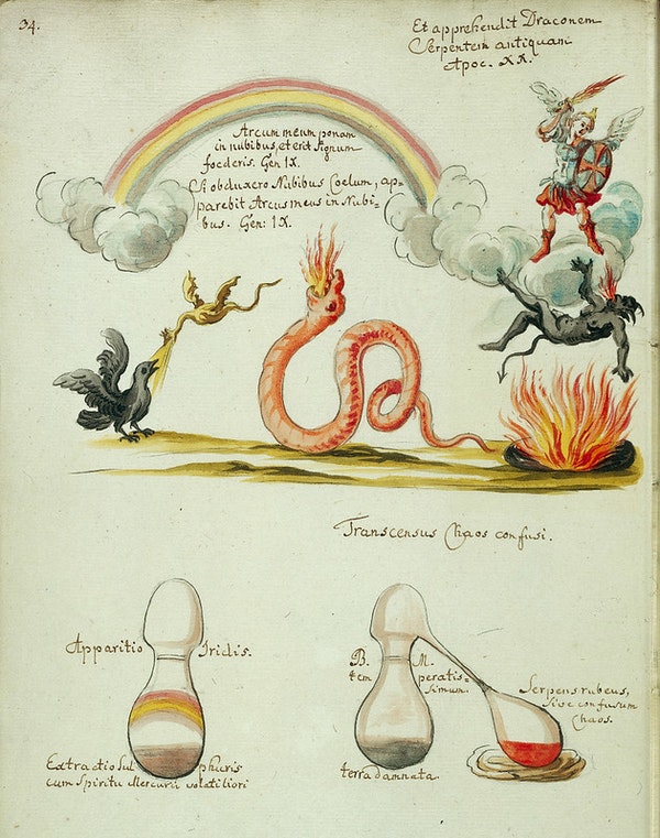
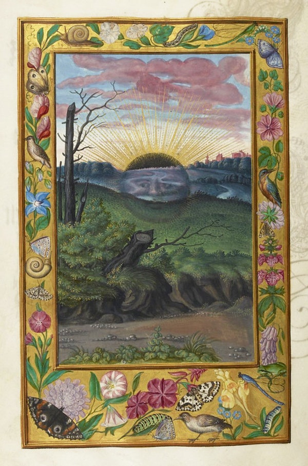
We can call it “black magic,” but the term was not, as the Christians thought, a reference to the devil, but to the soil of the Nile. “Derived from the Arabic root ‘kimia,’” writes the Public Domain Review, “from the Coptic ‘khem’ (referring to the fertile black soil of the Nile delta), the word ‘alchemy’ alludes to the dark mystery of the primordial or First Matter (the Khem).”
Finding this first substance constitutes “the alchemist’s central goal – along with the discovery of the Stone of Knowledge (The Philosopher’s Stone) and the key to Eternal Youth.”
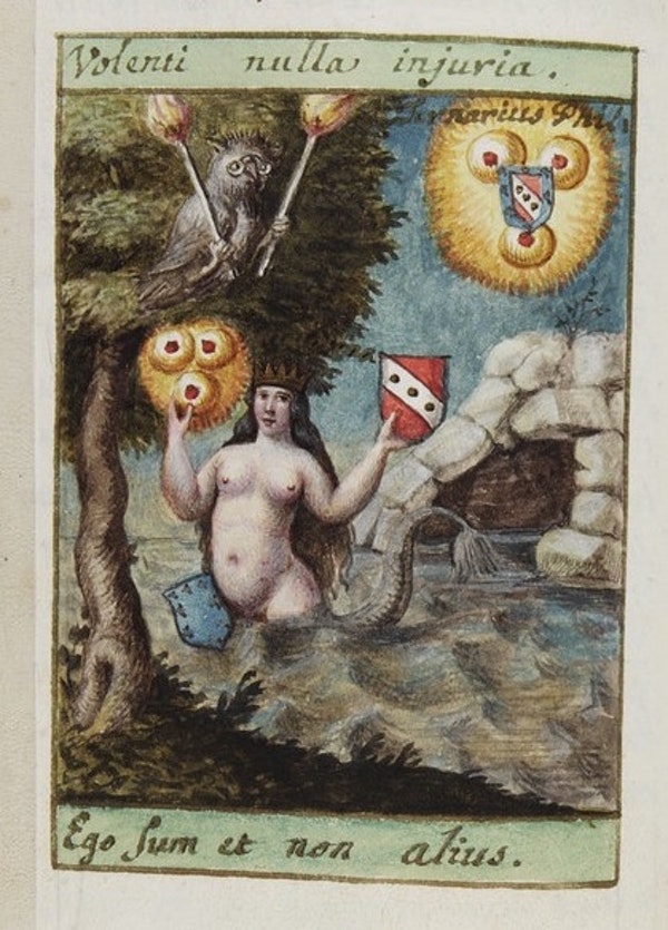
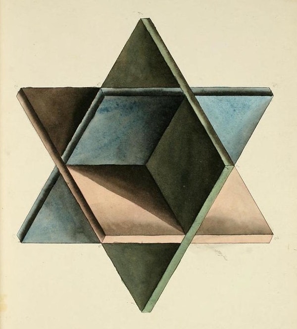
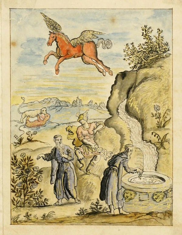
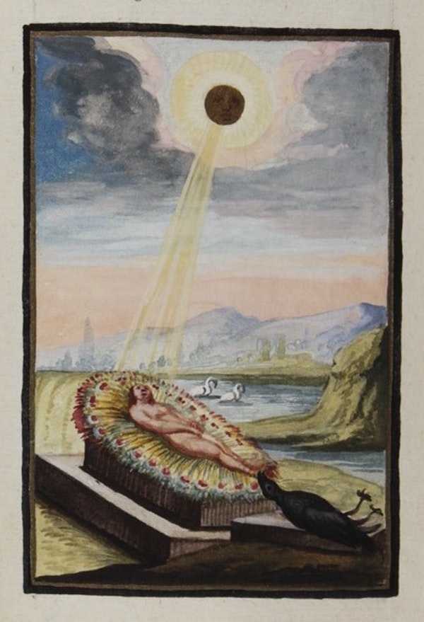
In the description above, we can see the roots of Rowling’s fictions and the origins of many a world-shaping modern myth. Alchemists study and change matter to produce certain effects – just as early scientists did – and it may surprise us to learn just how fervently some well-known early scientists, most especially Isaac Newton, pursued the alchemical course. But the essence of alchemy was imagination, and the artists who depicted alchemical rituals, magical creatures, mystical symbols, etc. had no shortage of it, as we see in the images here, drawn from Wellcome Images and the Manley Palmer Hall collection at the Internet Archive.
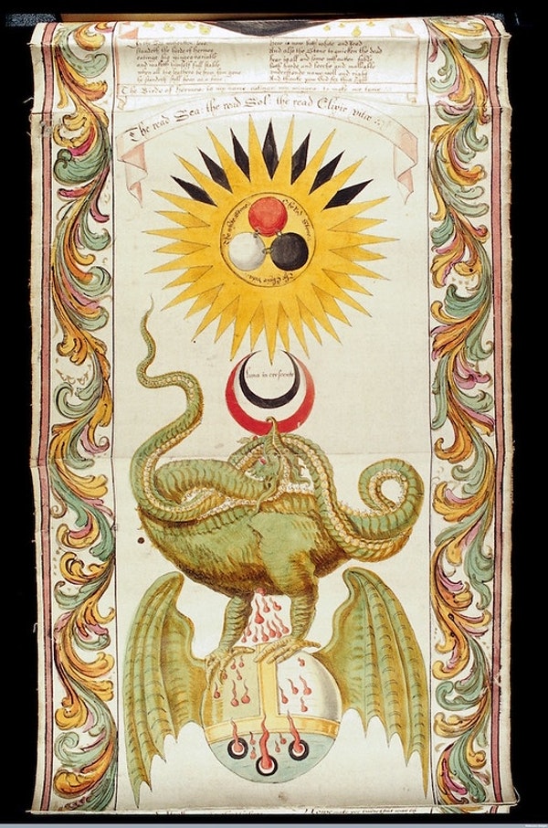
The images are strange, surreal, cryptic, and seem to reference no known reality. They are the inspiration for centuries of occult art and esoteric literature. But each one also had practical intent — to illustrate mysterious, often secretive processes for discovering the foundations of the universe, and profiting from them. If these techniques look nothing like our modern methods for doing the same, that’s for good reason, but it doesn’t mean that alchemy has nothing to do with science. It is, rather, science’s weird distant ancestor. See more alchemical images at the Public Domain Review.
Related Content:
How the Brilliant Colors of Medieval Illuminated Manuscripts Were Made with Alchemy
Videos Recreate Isaac Newton’s Neat Alchemy Experiments: Watch Silver Get Turned Into Gold
Josh Jones is a writer and musician based in Durham, NC. Follow him at @jdmagness
Read More...Francis Ford Coppola Breaks Down His Most Iconic Films: The Godfather, Apocalypse Now & More
Fifty years after its theatrical release, The Godfather remains a subject of lively cinephile conversation. What, as any of us might ask after a fresh semi-centennial viewing of Francis Ford Coppola’s mafia masterpiece, is this movie about? We need only ask Coppola himself, who has our answer in one word: succession. In the recent GQ interview above, he also explains the themes of other major works with similar succinctness: Apocalypse Now is about morality; The Conversation is about privacy. Such clean and simple encapsulations belie the nature of the film production process, and especially that of Coppola’s nineteen-seventies pictures, with their large scale, seriousness of purpose, and proneness to severe difficulty.
“What we consider real art is a movie that does not have a safety net,” Coppola says, and that applies without a doubt to movies like The Godfather and Apocalypse Now. Much as Orson Welles once said of his own experience making Citizen Kane, the young Coppola went into The Godfather ignorant of more or less everything involved in its content but life in an Italian-American family. But he had, in theater school, learned the techniques of “outwitting the faculty,” and dealing with the higher-ups at Hollywood studios turned out to require that same skill set. He thus found a way to include every element ruled insistently out by the executives, from New York locations and a period setting to performers like the then-unknown Al Pacino and then-washed-up Marlon Brando.
Brando didn’t take part in The Godfather Part II, but he did show up at the end of Apocalypse Now for a vividly memorable turn as the power-mad Colonel Kurtz. As Coppola remembers it, “when Brando arrived, he looked at me — he’s so smart — and he said, ‘You painted yourself in a corner, didn’t you?” The actor meant that the surreal qualities of the film had reached such an intensity that no conventional form of resolution could possibly suffice. This was the result of the fact that, as Coppola puts it, “one of the things that make a movie is the movie: it contributes to making itself.” In other words, as Coppola and his collaborators shot each scene (a process that famously resulted in over one million feet of footage), the very film taking shape before them suggested its own direction — in the case of Apocalypse Now, toward the ever darker and stranger.
Always candid about his professional struggles, Coppola has also been generous with technical and artistic explanations of just how his pictures have come together. Godfather fans will delight in his director’s-commentary tracks on the first and second parts of that trilogy; as for The Godfather Part III, Coppola released a new edit (in the manner of Apocalypse Now’s Redux and Final Cut) called The Godfather Coda: The Death of Michael Corleone in 2020. He discusses that project in the GQ interview, and also his work-in-progress Megalopolis. Having described The Godfather as essentially a Shakespearean tale, he’s now reaching further back in time: “Wouldn’t it be interesting if you made a Roman epic but didn’t set it in ancient Rome — set it in modern New York?” He also lets us in on Megalopolis’ surprising key word: not megalomania, nor ambition, nor power, but sincerity.
Related content:
A Behind-the-Scenes Look at the Casting of The Godfather with Coppola, Pacino, De Niro & Caan
Francis Ford Coppola’s Handwritten Casting Notes for The Godfather
Orson Welles Explains Why Ignorance Was His Major “Gift” to Citizen Kane
Based in Seoul, Colin Marshall writes and broadcasts on cities, language, and culture. His projects include the Substack newsletter Books on Cities, the book The Stateless City: a Walk through 21st-Century Los Angeles and the video series The City in Cinema. Follow him on Twitter at @colinmarshall or on Facebook.
Read More...Explore Rarely-Seen Art by J. R. R. Tolkien in a New Web Site Created by the Tolkien Estate
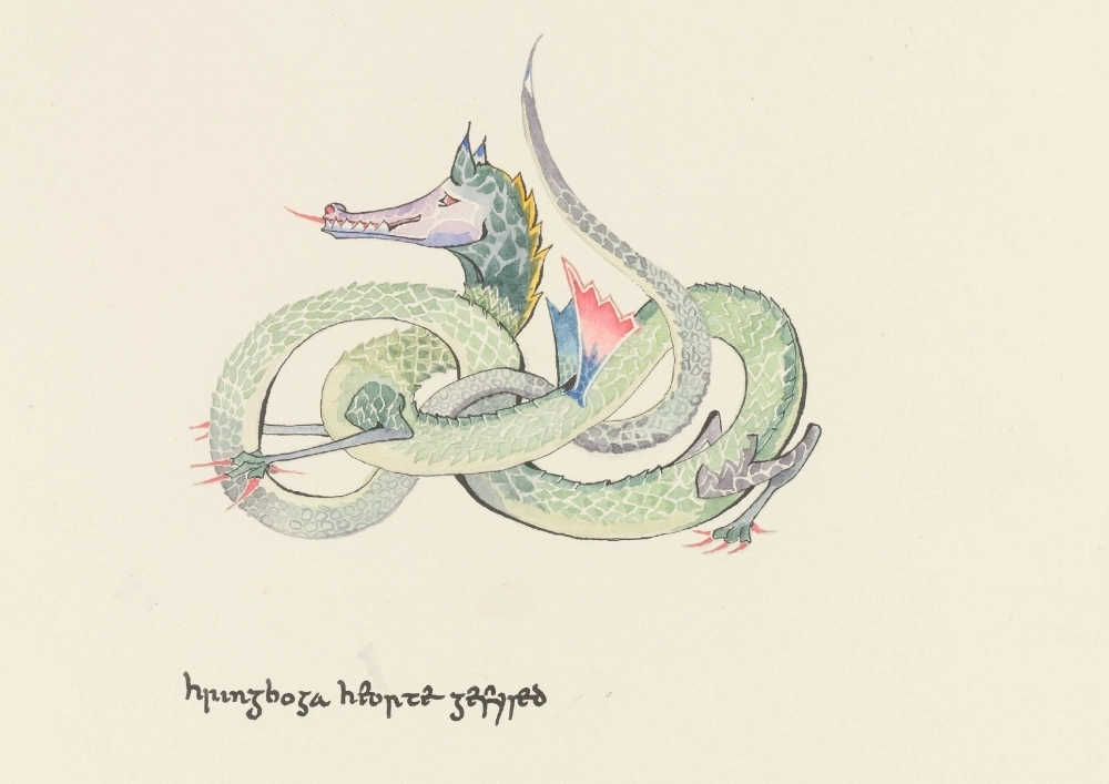
J. R. R. Tolkien managed to write the Lord of the Rings trilogy, which ought to be accomplishment enough for one mortal. But he also wrote the The Hobbit, the gateway for generations of children into his major work, as well as a host of other works of fiction, poetry, and scholarship, many of them not published until after his death in 1973. And those are only his writings: a lifelong artist, Tolkien also produced a great many drawings and paintings, book-cover designs, and pictures meant to delight his own children as well as the children of others.
Yet somehow more material has remained in the vault, and only now brought out for proper public consideration. As reported earlier this month by Artnet’s Sarah Cascone, Tolkien’s estate “has released a new website featuring artworks, some previously unseen,” all created by the man himself.
“In addition to a number of detailed maps, the estate has released illustrations Tolkien created for The Hobbit, The Lord of the Rings, and The Silmarillion, as well as drawings he made for his children, landscapes drawn from real life, and imagined abstractions.”
Tolkienologists will also thrill to the new site’s “previously unpublished photographs of Tolkien and his family, including his son Christopher, who drew the final versions of the Lord of the Rings maps for publication.” (Christopher died in 2020, and Tolkien’s last surviving child Priscilla died just last month.) Divided into sections dedicated to his writing, his painting, his scholarship, his letters, his life, and related audio-visual material, this online exhibition presents Tolkien as not just a world-builder but a man in full. In his life and work, he established the model for the modern fantasy novelist, but also — as underscored by a journey across his full narrative, intellectual, and artistic range — an ideal unlikely to be equaled any time soon. Visit the site here.
Related content
110 Drawings and Paintings by J. R. R. Tolkien: Of Middle-Earth and Beyond
Discover J. R. R. Tolkien’s Personal Book Cover Designs for The Lord of the Rings Trilogy
Map of Middle-Earth Annotated by Tolkien Found in a Copy of Lord of the Rings
Discover J. R. R. Tolkien’s Little-Known and Hand-Illustrated Children’s Book, Mr. Bliss
Based in Seoul, Colin Marshall writes and broadcasts on cities, language, and culture. His projects include the Substack newsletter Books on Cities, the book The Stateless City: a Walk through 21st-Century Los Angeles and the video series The City in Cinema. Follow him on Twitter at @colinmarshall or on Facebook.
Read More...Support Us
We're hoping to rely on loyal readers, rather than erratic ads. Please click the Donate button and support Open Culture. You can use Paypal, Venmo, Patreon, even Crypto! We thank you!

About Us

Open Culture scours the web for the best educational media. We find the free courses and audio books you need, the language lessons & educational videos you want, and plenty of enlightenment in between.
Advertise With Us

FREE UPDATES!
GET OUR DAILY EMAIL
Get the best cultural and educational resources on the web curated for you in a daily email. We never spam. Unsubscribe at any time.
FOLLOW ON SOCIAL MEDIA

Open Culture editor Dan Colman scours the web for the best educational media. He finds the free courses and audio books you need, the language lessons & movies you want, and plenty of enlightenment in between.
Advertise With Us

