A Vinyl Record Spins So Fast That It Shatters Into 50,000 Pieces
Gavin Free and Dan Gruchy, otherwise known as “The Slow Mo Guys,” took a vinyl record and spun it so fast that it shattered into roughly 50,000 pieces–give or take a few. Thanks to a Phantom v2640 camera, you can watch things disintegrate in slow motion, at about 12,500 frames per second. In a previous episode recorded several years ago, Free and Gruchy pushed a CD to its physical limits. You can watch that here.
Related Content:
You Can Have Your Ashes Turned Into a Playable Vinyl Record, When Your Day Comes
An Interactive Map of Every Record Shop in the World
How to Clean Your Vinyl Records with Wood Glue
Watch a Needle Ride Through LP Record Grooves Under an Electron Microscope
How Vinyl Records Are Made: A Primer from 1956
Read More...The Mother of All Maps of the “Father of Waters”: Behold the 11-Foot Traveler’s Map of the Mississippi River (1866)
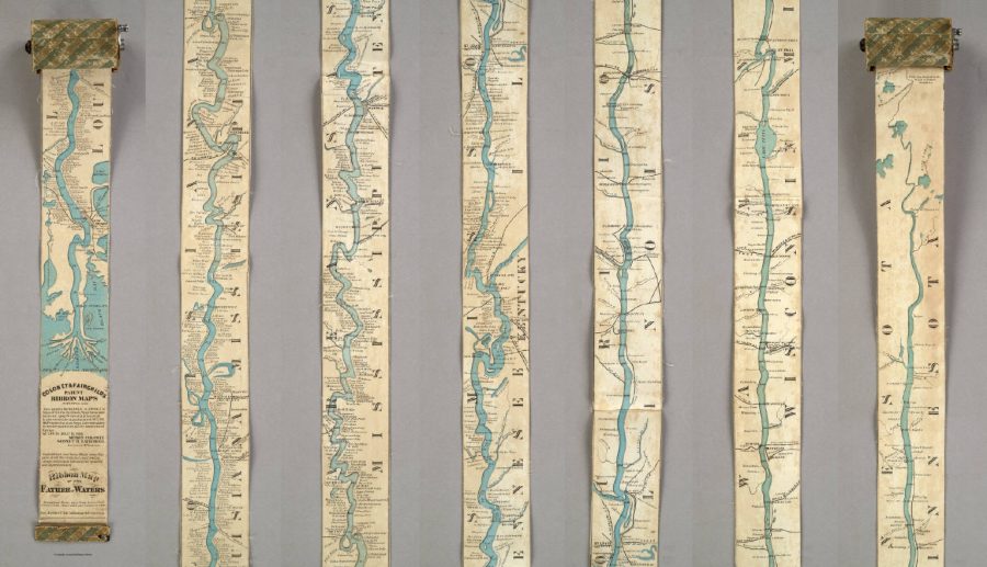
Image courtesy of the David Rumsey Map Center
Everybody knows a fact or two about the United States of America, even those who’ve never set foot there. At the very least, they know the US is a big country, but it’s one thing to know that and another to truly understand the scale involved. Today we offer you an artifact from cartographic history that illustrates it vividly: a 19th-century traveler’s map of the Mississippi River that, in order to display the length of that mighty 2,320-mile waterway, extends to a full eleven feet. (Or, for those especially unfamiliar with how things are in America, displays the river’s full 3,734-kilometer length at a full 3.35 meters.)
With a width of only three inches (or 7.62 centimeters), the Ribbon Map of the Father of Waters came on a spool the reader could use to unroll it to the relevant section of the river anywhere between the Gulf of Mexico and northern Minnesota. First published in 1866, just a year after the end of the Civil War, the map “was marketed toward tourists, who were flocking to the Mississippi to see the sights and ride the steamboats.” So writes Atlas Obscura’s Cara Giamo, who quotes art historian Nenette Luarca-Shoaf as describing the river as “a source of great awe. That kind of length, that kind of spaciousness was incomprehensible to a lot of folks who were coming from the East Coast.”
Luarca-Shoaf describes the map, an invention of St. Louis entrepreneurs Myron Coloney and Sidney B. Fairchild, in more detail in an article of her own at Common-Place. “The completely unfurled map extends beyond the limits of the user’s reach, wondrously embodying the scope of the river in the time it took to unroll it and in the eleven feet of space it now occupies,” she writes. “At the same time, the care required to wind the strip back into Coloney and Fairchild’s patented spool apparatus reiterates the precariousness of human control — either representational or environmental — over the mercurial Mississippi.” We still today talk about “scrolling” maps, though we now mean it as nothing more than a digital metaphor.
Unwieldy though it may seem, the Ribbon Map of the Father of Waters must have struck its travel-minded buyers in the 1860s — some 150 years before technology put touchscreens in all of our hands — as the height of cartographic convenience. Despite having sold out their Mississippi River map quickly enough to necessitate a second edition, though, Coloney and Fairchild did little more with their patented concept. You can see a surviving example of the Ribbon Map in greater detail at the Library of Congress and the David Rumsey Map Collection. The current generation of river tourists yearning for an understanding of the surprising breadth of America’s land and depth of its history may even constitute sufficient market for a replica. But what happens when it gets wet?
via Atlas Obscura and Slate
Related Content:
All the Rivers & Streams in the U.S. Shown in Rainbow Colours: A Data Visualization to Behold
William Faulkner Draws Maps of Yoknapatawpha County, the Fictional Home of His Great Novels
Learn the Untold History of the Chinese Community in the Mississippi Delta
Based in Seoul, Colin Marshall writes and broadcasts on cities and culture. His projects include the book The Stateless City: a Walk through 21st-Century Los Angeles and the video series The City in Cinema. Follow him on Twitter at @colinmarshall or on Facebook.
Read More...Henrietta Lacks Gets Immortalized in a Portrait: It’s Now on Display at the National Portrait Gallery
In my childhood, I heard stories about Henrietta Lacks’ miraculous cells. I heard these stories because she happened to have been my grandmother’s cousin. But this was just oral lore, I thought at first, legendary and implausible. Cells don’t just keep growing indefinitely. Nothing is immortal. That’s a safe assumption in most every other case, but millions of people now know what only a relatively self-contained community of researchers, doctors, biology students, and, eventually, the Lacks family once did: Henrietta’s cervical cancer cells continued to grow and multiply after her death in 1951. They may, indeed, do so forever.
The once anonymous cell line, called HeLa, has provided researchers worldwide with invaluable medical data. Henrietta herself went unrecognized and unremembered until fairly recently. That all changed after Rebecca Skloot’s book The Immortal Life of Henrietta Lacks, based on an earlier series of articles, appeared in 2010 to great acclaim. Since the publication of Skloot’s bestseller, the story of Henrietta and the Lacks family has further achieved renown in a 2017 film version starring Oprah Winfrey.
Suffice it say, seeing Henrietta arrive on the pop cultural stage has been a strange experience. (One made even weirder by other media moments, like indie band Yeasayer and former Dead Kennedys singer Jello Biafra releasing songs about her and her cells.) The injustices of Henrietta’s story are now well-known. She was poor and received substandard medical treatment. Her cells were harvested without her knowledge, and after her death, no one notified the family about the worldwide use of her cells for biomedical research. That is, until doctors did research on her children in the 70s, publishing family medical records without consent and gathering more data because the HeLa cells had contaminated other cell lines.
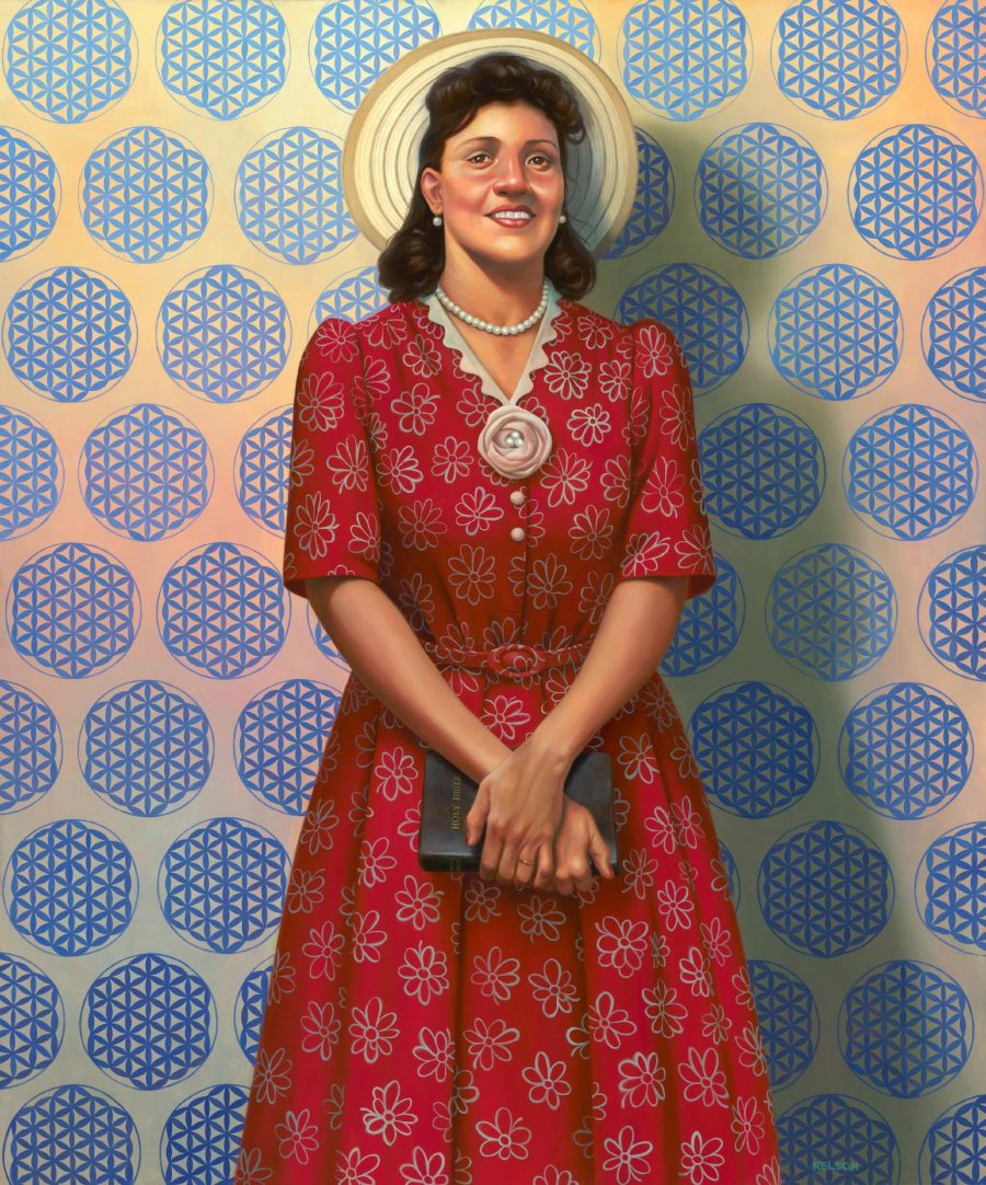
She has “become one of the most powerful symbols for informed consent in the history of science,” Nela Ulaby writes at NPR. She is also a symbol, says Bill Pretzer, senior curator at the National Museum of African American History and Culture (NMAAHC), “that history can be remade, re-remembered.” To that end, Henrietta has been immortalized as a whole human being, not just the source of extraordinarily immortal cells. Her portrait, by African-American artist Kadir Nelson, now hangs in the National Portrait Gallery, a representation of both the historical figure and her world-historical biological legacy.
Drawing on the photograph that adorns the cover of Skloot’s book, the portrait shows her “just like they said she was in life,” says her granddaughter Jeri Lacks-Whye, “happy, outgoing, giving,” and stylishly dressed. The two missing buttons on her dress represent the cells taken from her body, and the pattern behind her, which “almost looks like wallpaper,” says National Portrait Gallery curator Dorothy Moss, is “actually representative of her cells.” Other tributes, notes Ulaby, include a “high school for students interested in medicine” and “a minor planet whirling in the asteroid belt between Mars and Jupiter.” The cells have also generated billions of dollars in profit.
In life, she could never have imagined this strange kind of fame and fortune. The HeLa cells were instrumental in the development of the polio vaccine and research in cloning, gene mapping, and in vitro fertilization. They have traveled into space and around the world hundreds of times. The story of the person they came from, says Skloot in a 2010 interview, reminds us that “there are human beings behind every biological sample used in the laboratory… but they’re usually left out of the equation.” Making those lives an essential part of the conversation in medical research can help keep that research ethically honest, equitable, and, one hopes, based in serving human needs over corporate greed.
The portrait will remain at the National Portrait Gallery until November 4th, after which it will return to the NMAAHC.
Related Content:
Free Online Biology Courses
African-American History: Modern Freedom Struggle (A Free Course from Stanford)
Josh Jones is a writer and musician based in Durham, NC. Follow him at @jdmagness
Read More...A Pakistani Orchestra & Wynton Marsalis Play an Enchanting Version of John Coltrane’s “My Favorite Things”
Everyone knows “My Favorite Things.” Most know it because of the 1965 movie version of the Broadway musical for which Richard Rodgers originally composed the song. But many jazz enthusiasts credit the one true “My Favorite Things” to a different musical genius entirely: John Coltrane. The free jazz-pioneering saxophonist’s version of Rodgers’ show tune (a filmed performance of which we featured here on Open Culture a few years ago) first came out as the title track of an album he put out in 1961, two years after The Sound of Music’s original Broadway debut. Clocking in at nearly fourteen minutes, it gave listeners a tour de force demonstration of dramatic musical transformation.
“In 1960, Coltrane left Miles [Davis] and formed his own quartet to further explore modal playing, freer directions, and a growing Indian influence,” says the documentary The World According to John Coltrane. “They transformed ‘My Favorite Things,’ the cheerful populist song from ‘The Sound of Music,’ into a hypnotic eastern dervish dance. The recording was a hit and became Coltrane’s most requested tune—and a bridge to broad public acceptance.”
If Coltrane’s interpretation of the song brought it toward the East, what would an Eastern interpretation of his interpretation sound like? Now, thanks to Pakistan’s Sachal Jazz Ensemble, you can hear, and see, Coltrane’s “My Favorite Things” itself transformed dramatically again.
You may remember the Sachal Jazz Ensemble from when we featured their performance of Dave Brubeck’s “Take Five.” In the video up top, led by no less an American jazz luminary than Winton Marsalis, they and their traditional instruments (bansuri, tabla, sitar, dholak, and more), played with a modern sensibility, give a similar treatment to “My Favorite Things.” Their interpretation, though it runs only a comparatively brisk eight minutes or so, will sound quite unlike any jazz standard you’ve ever heard — or any show tune or piece of traditional Pakistani music, for that matter. It also hints at the vast musical possibilities still untapped by the hybridization of musical traditions, even when used to play a song many of us thought we’d been sick of for the past fifty years.
Related Content:
Pakistani Musicians Play a Delightful Version of Dave Brubeck’s Jazz Classic, “Take Five”
Watch John Coltrane and His Great Quintet Play ‘My Favorite Things’ (1961)
Based in Seoul, Colin Marshall writes and broadcasts on cities and culture. His projects include the book The Stateless City: a Walk through 21st-Century Los Angeles and the video series The City in Cinema. Follow him on Twitter at @colinmarshall or on Facebook.
Read More...Hear Philip Roth Read from Five of His Major Novels: Sabbath’s Theater, The Ghost Writer and More
“I saw and heard something remarkable just a few hours ago,” wrote New Yorker editor David Remnick a little over five years ago, “something I’m not likely to forget until all the mechanisms of remembering are shot and I’m tucked away for good.” He had attended an eightieth-birthday celebration for the late Philip Roth at the Newark Museum. There, after a series of tributes from fellow literary figures including Jonathan Lethem, Hermione Lee, and Edna O’Brien, the Newark-born-and-raised novelist gave what Remnick described as “the most astonishing literary performance I’ve ever witnessed.”
Roth began by naming all the memories of his Newark childhood about which he would not speak that evening, from “the newsreels at the Roosevelt Theatre” to “the fights at Laurel Garden” to “seeing Jackie Robinson play for the Montreal Royals against the Newark Bears, at Ruppert Stadium” and much else besides. Then, after admitting that he had committed paralipsis, the rhetorical technique of bringing up a subject by saying that you won’t, “Roth finally settled into his real theme of the night: death. Happy birthday, indeed!”
You can hear Roth’s performance in its 45-minute entirety in this video, in which he also reads a passage from 1995’s Sabbath’s Theater. You can see Roth giving another reading from that book, which he calls his favorite (and also “death-haunted”), in the 92Y video at the top of the post.
Its title character, the sex-obsessed 63-year-old puppeteer Mickey Sabbath, exists as a law unto himself. He lives a chaotic, sordidly pleasure-seeking life in response, Roth explains, “to a place where nothing keeps its promise and everything is perishable.”
Among Roth’s 31 books, the standalone Sabbath’s Theater lays a fair claim to the title of his masterpiece. But unlike other memorable Roth protagonists, Sabbath starred in no other books. The most sprawling character-connected series Roth wrote, which spans nine books written over nearly three decades, features novelist and authorial alter ego Nathan Zuckerman.
You can hear Roth read selections from the first three Zuckerman novels, 1979’s The Ghost Writer (also known as Zuckerman Bound), 1981’s Zuckerman Unbound, and 1983’s The Anatomy Lesson, in the three videos above. Roth’s last cycle of novels were connected not by common characters but by their short length and, in their brevity, even more intense explorations of the themes, or theme, always dear to him: what it means to have grown up American at a certain period in history, and how that meaning transforms and deepens with age.
In the video above, Roth reads the end of 2010’s Nemesis, his final novelistic meditation on that theme. In it several characters of his generation, then young boys, watch their teacher throw a javelin. “Running with the javelin aloft, stretching his throwing arm back behind his body, bringing the throwing arm through to release the javelin high over his shoulder, and releasing it then like an explosion, he seemed to us invincible.” The awe Nemesis’ narrator and his friends feel witnessing that athletic mastery, Roth’s readers feel — and will continue to feel — witnessing his literary mastery.
Related Content:
Philip Roth (RIP) Creates a List of the 15 Books That Influenced Him Most
What Was It Like to Have Philip Roth as an English Prof?
Philip Roth Predicts the Death of the Novel; Paul Auster Counters
Based in Seoul, Colin Marshall writes and broadcasts on cities and culture. His projects include the book The Stateless City: a Walk through 21st-Century Los Angeles and the video series The City in Cinema. Follow him on Twitter at @colinmarshall or on Facebook.
Read More...Watch the Rise and Fall of the British Empire in an Animated Time-Lapse Map ( 519 A.D. to 2014 A.D.)
The genre of animated time-lapse video maps—portraying the rise and fall of empires, the spread of people groups, the succession of rulers over hundreds of years, and other histories that used to fill entire textbooks—is one of those internet-only phenomena with useful, if limited application. As the bombastic music that sometimes accompanies these videos suggests, one primary effect is the production of maximally sweeping historical drama through mapping, which captures the imagination in ways dry prosaic descriptions often can’t.
The subject of the video above—the British Empire—seems to justify such an approach, given that, as one educational website notes, “the British Empire was the largest formal empire that the world had ever known.” Whether one celebrates or deplores this fact is a matter for political or moral debate—categories that have little seeming relevance to the production of animated video maps.
“At its height in 1922,” writes Jon Stone at The Independent, “the British Empire governed a fifth of the world’s population and the quarter of the world’s total land area.” His comment that this legacy “divides opinion” grossly understates the case. Yet as bare historical fact, the spread of the Empire is astonishing, an achievement of military and maritime power, unprecedented commercial ambition, bureaucratic systemization, trade maneuvering, and the massive displacement, detention, and enslavement of millions of people.
How did it happen? To paraphrase an often-divisive British singer, empire began at home.
The video begins in 519 A.D., after the end of Roman rule in England, when the so-called Heptarchy formed, the seven Anglo-Saxon tribal kingdoms ruled by Germanic peoples who killed off or enslaved the native Celts. From there, we proceed through the Norman invasion, the English attempts to take French territory in Europe, Henry VIII’s invasion and annexation of Ireland, and other colonizing and empire-building events that precede British entry onto the far-flung global stage with the founding of the British East India Company’s first post in Surat, India in 1612 and Puritan settlement at Plymouth in 1620.
We see these events unfold in a split screen map showing different parts of the world, with a box on the side providing context and a color-coded legend. This rush through Imperial history occurs at a relatively breakneck speed, taking only 18 minutes to cover 1,500 years.
The long, slow rise of the British Empire was followed by a precipitous fall. By the mid-20th century postwar years, Britain saw its major colonies in India, Africa, and the West Indies achieve independence one by one. “By 1979,” writes Adam Taylor at The Washington Post, the Empire “was reduced to a few pockets around the world.” And by the current year, the former global power’s overseas colonial holdings comprise 14 small territories, including mostly unpopulated Antarctic land and the Falkland Islands.
See many more fascinating animated time-lapse maps, documenting all of world history, at the creator Ollie Bye’s YouTube channel.
Related Content:
5‑Minute Animation Maps 2,600 Years of Western Cultural History
Watch the History of the World Unfold on an Animated Map: From 200,000 BCE to Today
Animated Map Shows How the Five Major Religions Spread Across the World (3000 BC – 2000 AD)
Josh Jones is a writer and musician based in Durham, NC. Follow him at @jdmagness
Read More...Discover David Lynch’s Bizarre & Minimalist Comic Strip, The Angriest Dog in the World (1983–1992)
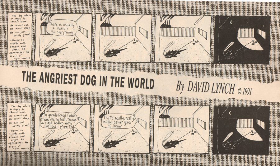
Most David Lynch fans discover him through his films. But those of us who read alternative weekly newspapers in their 1980s and 90s heyday may well have first encountered his work in another medium entirely: the comic strip. Like many of the best-known examples of the form, Lynch’s comic strip stars an animal, specifically a dog, but a dog “so angry he cannot move. He cannot eat. He cannot sleep. He can just barely growl. Bound so tightly with tension and anger, he approaches the state of rigor mortis.” That text, which prepared readers for a reading experience some way from Marmaduke, introduced each and every edition of The Angriest Dog in the World, which ran between 1983 and 1992.
During that entire time, the strip’s artwork never changed either: four panels in which the titular dog strains against a rope staked down in a suburban backyard, in the last of which night has fallen. The sole variation came in the word bubbles that occasionally emerged from the window of the house, presumably representing the voice of the dog’s owners.
You can see a few examples at Lynchnet and also on this blog. “If everything is real… then nothing is real as well,” it says one week. On another: “It must be clear to even the non-mathematician that the things in this world just don’t add up to beans.” Or, in a nod to the region of The Angriest Dog in the World’s home paper the LA Reader: “Bill… who is this San Andreas? I can’t believe it’s all his fault.”
“At some point David Lynch called up the editor at the time, James Vowell, and said, ‘Hi, I’d like to do a comic strip for you,’” says former Reader editor Richard Gehr as quoted by John F. Kelly at Spooky Comics. Every week thereafter, Lynch would phone the Reader to dictate the text of the latest strip. “We would give it to somebody in the production department and they would White Out the panels from the week before and write in a new, quote/unquote… gag.” The clip from The Incredibly Strange Film Show’s 1990 episode on Lynch above shows the evolution of the process: someone, one of Lynch’s assistants or perhaps Lynch himself, would regularly slip under the Reader’s office door an envelope containing word balloons written and ready to paste into the strip. (Dangerous Minds finds an interview where Vowell describes another production method altogether, involving wax paper.)
Lynch came up with the words, but what about the images? “I assume he drew the first iteration,” says Gehr as quoted by Kelly. “I don’t even know if the second and third [panels] were hand drawn. Those could have been mimeographed too or something.” The style does bear a resemblance to that of the town map Lynch drew to pitch Twin Peaks to ABC. The attentive fan can also find a host of other connections between The Angriest Dog in the World and Lynch’s other work. That factory in the background, for instance, looks like a place he’d photograph, or even a setting of Eraserhead, during whose frustrating years-long shoot he came up with the strip’s concept in the first place. “I had tremendous anger,” says Lynch in David Breskin’s book Inner Views. “And I think when I began meditating, one of the first things that left was a great chunk of that.” If only the Angriest Dog in the World could have found it in himself to do the same.
Related Content:
David Lynch Draws a Map of Twin Peaks (to Help Pitch the Show to ABC)
The Paintings of Filmmaker/Visual Artist David Lynch
David Lynch’s Photographs of Old Factories
David Lynch’s New ‘Crazy Clown Time’ Video: Intense Psychotic Backyard Craziness (NSFW)
Based in Seoul, Colin Marshall writes and broadcasts on cities and culture. His projects include the book The Stateless City: a Walk through 21st-Century Los Angeles and the video series The City in Cinema. Follow him on Twitter at @colinmarshall or on Facebook.
Read More...The Art of Sci-Fi Book Covers: From the Fantastical 1920s to the Psychedelic 1960s & Beyond
If you’ve never seen Gentlemen Broncos, the little-seen third feature by the Napoleon Dynamite-making husband-and-wife team Jared and Jerusha Hess, I highly recommend it. You must, though, enjoy the peculiar Hess sense of humor, a blend of the almost objectively detached and the heartily sophomoric fixed upon the preoccupations of deeply unfashionable sections of working-class America. In Gentlemen Broncos it makes itself felt immediately, even before the film’s story of a young aspiring science fiction writer in small-town Utah begins, with a tour de force opening credits sequence made up of homages to the pulpiest sci-fi book covers of, if not recent decades, then at least semi-recent decades.
The style of these cover images, though risible, no doubt look rich with associations to anyone who’s spent even small part of their lives reading mass-market sci-fi novels. To see more than a few higher examples, watch “The Art of Sci-Fi Book Covers,” the Nerdwriter video essay above that digs into the history of that enormously inventive yet seldom seriously considered artistic subfield.
Its begins with the world’s first science-fiction magazine Amazing Stories (an online archive of which we’ve previously featured here on Open Culture) and its pieces of fantastical, eye-catching cover art by Austria-Hungary-born illustrator Frank R. Paul. In the mid-1920s, says the Nerdwriter, “these covers were probably among the strangest art that the average American ever got to see.”
It would get stranger. The Nerdwriter follows the development of sci-fi cover art from the heyday of the Paul-illustrated Amazing Stories to the introduction of mass-market paperback books in the late 1930s to Penguin’s experimentation with existing works of modern art in the 1960s to the commissioning of new, even more bizarre and evocative works by all manner of publishers (some of them sci-fi specialists) thereafter. “You can walk into any used book store anywhere and get five of these old pulp books for a dollar each,” the Nerdwriter reminds us. “And then the art is with you; it’s in your home. As you read the stories, it’s on your bedside table. It’s art you hold with your hands. It’s not precious: it’s bent, folded, and creased. And above all, it’s weird.”
Related Content:
Download 650 Soviet Book Covers, Many Sporting Wonderful Avant-Garde Designs (1917–1942)
Based in Seoul, Colin Marshall writes and broadcasts on cities and culture. His projects include the book The Stateless City: a Walk through 21st-Century Los Angeles and the video series The City in Cinema. Follow him on Twitter at @colinmarshall or on Facebook.
Read More...Why Sitting Is The New Smoking: An Animated Explanation
In recent years, sitting has become the new smoking. “Past studies have found,” declares a 2014 article in The New York Times, “the more hours that people spend sitting, the more likely they are to develop diabetes, heart disease and other conditions, and potentially to die prematurely — even if they exercise regularly.” What’s the science behind this alarming claim? The animated TED-ED video (watch above) begins to paint the picture. But it doesn’t get into the latest and perhaps most important research. According to science writer Gretchen Reynolds, a recent Swedish study published in the British Journal of Sports Medicine suggests that when you sit all day, your telomeres (the tiny caps on the ends of DNA strands) get shorter. Which is not a good thing. As telomeres get shorter, the rate at which the body ages and decays speeds up. Conversely, the study found “that the telomeres in [those] who were sitting the least had lengthened. Their cells seemed to be growing physiologically younger.”
Several years ago, KQED radio in San Francisco aired a program dedicated to this question, featuring medical and ergonomics experts. To delve deeper into it, listen below.
Note: An earlier version of this post appeared on our site in 2015.
If you would like to support the mission of Open Culture, consider making a donation to our site. It’s hard to rely 100% on ads, and your contributions will help us continue providing the best free cultural and educational materials to learners everywhere. You can contribute through PayPal, Patreon, and Venmo (@openculture). Thanks!
Related Content:
Playing an Instrument Is a Great Workout For Your Brain: New Animation Explains Why
What’s a Scientifically-Proven Way to Improve Your Ability to Learn? Get Out and Exercise
Doc Martens Boots Now Come Adorned with Traditional Japanese Art

In wake of a recent prom cheongsam dust up, it remains to be seen whether Doc Martens’ special edition Eastern Art shoes and boots will be regarded as a misstep.
Dr. Martens’ Artist Series paid tribute to Western heavy hitters like Hieronymus Bosch, William Hogarth, JMW Turner, and William Blake.
Those eye-catching kicks may have inspired more than a few fashion-conscious punks to delve into art history, but what will consumers—and more importantly activists on the alert for cultural appropriation—make of the Eastern Art line?
The company website describes the inaugural design as:
…a new homage to traditional Japanese art with a fresh, contemporary … spin. Featuring detailed hand-drawn paintings, the art is digitally printed on a textured leather designed to emulate traditional Japanese parchment, while gold-tone eyelets and studding complete the look.
One wonders what led the footwear giant to go with a mishmash “inspired by” approach, when there are so many wonderful Edo period artists who merit a boot of their own?
Katsushika Hokusai’s The Dream of the Fisherman’s Wife (see here) would make for an unforgettable toe cap…
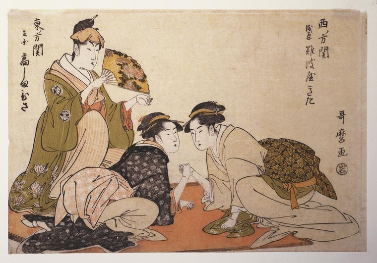
Kitagawa Utamaro could shod heels and ankles with the floating world.
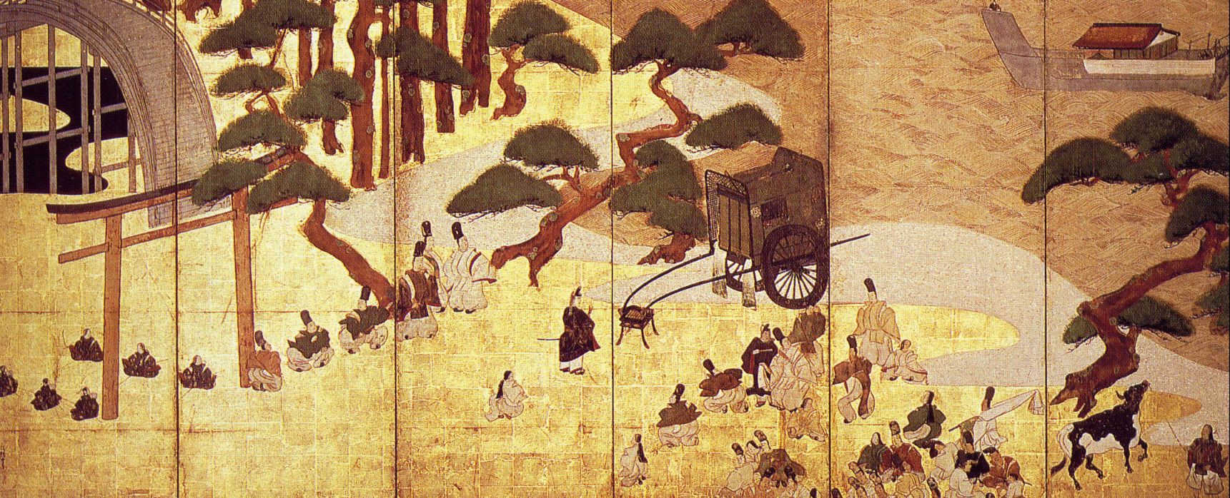
Tawaraya Sōtatsu’s work would easily transfer from screen to shoe.
Thus far, the lone complaints have centered on the pain of breaking in the new boots, a badge of honor among longtime wearers of the company’s best-selling 1460 Pascal style.
Asia Trend reports that Doc Martens has two shops in Japan, with plans to open more.
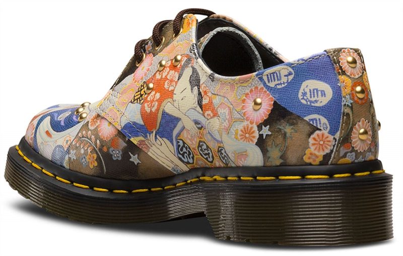
If you’re inclined to stomp around in a pair of Dr. Martens 1460 Pascal Eastern Art boots or 1461 Oxfords, best place your order soon, as these special editions have a way of selling out quickly.
Related Content:
Doc Martens Now Come Adorned with William Blake’s Art, Thanks to a Partnership with Tate Britain
Doc Martens Boots Adorned with Hieronymus Bosch’s “Garden of Earthly Delights”
Download 2,500 Beautiful Woodblock Prints and Drawings by Japanese Masters (1600–1915)
Ayun Halliday is an author, illustrator, theater maker and Chief Primatologist of the East Village Inky zine. Follow her @AyunHalliday.
Read More...Support Us
We're hoping to rely on loyal readers, rather than erratic ads. Please click the Donate button and support Open Culture. You can use Paypal, Venmo, Patreon, even Crypto! We thank you!

About Us

Open Culture scours the web for the best educational media. We find the free courses and audio books you need, the language lessons & educational videos you want, and plenty of enlightenment in between.
Advertise With Us

FREE UPDATES!
GET OUR DAILY EMAIL
Get the best cultural and educational resources on the web curated for you in a daily email. We never spam. Unsubscribe at any time.
FOLLOW ON SOCIAL MEDIA

Open Culture editor Dan Colman scours the web for the best educational media. He finds the free courses and audio books you need, the language lessons & movies you want, and plenty of enlightenment in between.
Advertise With Us

