Who wouldn’t love to take a road trip with beloved cartoonist and educator Lynda Barry? As evidenced by Grandma’s Way Out Party, above, an early-90s documentary made for Twin Cities Public Television, Barry not only finds the humor in every situation, she’s always up for a detour, whether to a time honored destination like Mount Rushmore or Old Faithful, or a more impulsive pitstop, like a Washington state car repair shop decorated with sculptures made from cast off mufflers or the Montana State Prison Hobby Store.
Alternating in the driver’s seat with then-boyfriend, storyteller Kevin Kling, she makes up songs on her accordion, clowns around in a cheap cowgirl hat, samples an oversized gas station donut, and chats up everyone she encounters.
At the World’s Only Corn Palace in Mitchell, South Dakota, she breaks the ice by asking a bearded local guy in official Corn Palace cap and t‑shirt if his job is the fulfillment of a long held dream.
“Nah,” he says. “I thought it was a joke … in Fargo, they call it the world’s biggest bird feeder. We do have the biggest birds in South Dakota. They get fed good.”
He leads them to Cal Schultz, the art teacher who designed over 25 years worth of murals festooning the exterior walls. Nudged by Barry to pick a favorite, Schultz chooses one that his 9th grade students worked on.
“I would have loved to have been in his class,” Barry, a teacher now herself, says emphatically. “I would have given anything to have worked on a Corn Palace when I was 14-years-old.”
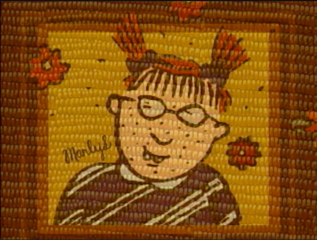
This point is driven home with a quick view of her best known creation, the pigtailed, bespectacled Marlys, ostensibly rendered in corn—an honor Marlys would no doubt appreciate.
Barry has long been lauded for her understanding of and respect for children’s inner lives, and we see this natural affinity in action when she befriends Desmond and Jake, two young participants in the Crow Fair Pow Wow, just south of Billings, Montana.
Frustrated by her inability to get a handle on the proceedings (“Why didn’t I learn it in school!? Why wasn’t it part of our curriculum?”), Barry retreats to the comfort of her sketchbook, which attracts the curious boys. Eventually, she draws their portraits to give them as keepsakes, getting to know them better in the process.
The drawings they make in return are treasured by the recipient, not least for the window they provide on the culture with which they are so casually familiar.
Barry and Kling also chance upon the Sturgis Motorcycle Rally, and after a bite at the Road Kill Cafe (“from your grill to ours”), Barry waxes philosophical about the then-unusual sight of so much tattooed flesh:
There’s something about the fact that they want something on them that they can’t wash off, that even on days when they don’t want people to know they’re a biker, it’s still there. And I have always loved that about people, like …drag queens who will shave off their eyebrows so they can draw perfect eyebrows on, or anybody who knows they’re different and does something to themselves physically so that even on their bad days, they can’t deny it. Because I think that in the end, that’s sort of what saves your life, that you wear your colors. You can’t help it.
The aforementioned muffler store prompts some musings that will be very familiar to anyone who has immersed themselves in Making Comics, Picture This, or any other of Barry’s instructional books containing her wonderfully loopy, intuitive creative exercises:
I think this urge to create is actually our animal instinct. And what’s sad is if we don’t let that come through us, I don’t think we have a full life on this earth. And I think we get sick because of it. I mean, it’s weird that it’s an instinct, but it’s an option, just like you can take a wild animal, a beautiful, wild animal and put him in a zoo. They live, they’re fine in their cage, but you don’t get to see them do the thing that a cheetah does best, which is, you know, just run like the wind and be able to jump and do the things… I mean, it’s our instinct, it’s instinctual, it’s our beautiful, beautiful, magical, poetic, mysterious instinct. And every once in a while, you see the flower of it come right up out of a gas station.
After 1653 miles and one squabble after overshooting a scheduled stop (“You don’t want me to go to Butte!”), the two arrive at their final destination, Barry’s childhood home in Seattle. The occasion? Barry’s Filipino grandmother’s 83rd birthday, and plans are afoot for a potluck bash at the local VFW hall. Fans will swoon to meet this venerated lady and the rest of Barry’s extended clan, and hear Barry’s reflections on what it was like to grow up in a working class neighborhood where most of the families were multi-racial.
“I walked in and it was everything Lynda said,” Kling marvels.
Indeed.
The journey is everything we could have hoped for, too.
Listen to a post-trip interview with Kling on Minnesota Public Radio.
H/t to reader Charlotte Booker
Related Content:
Cartoonist Lynda Barry Shows You How to Draw Batman in Her UW-Madison Course, “Making Comics”
Lynda Barry’s New Book Offers a Master Class in Making Comics
Ayun Halliday is an author, illustrator, theater maker and Chief Primatologist of the East Village Inky zine — current issue: #63 Follow her @AyunHalliday.
