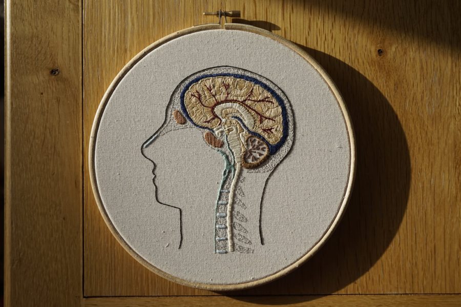
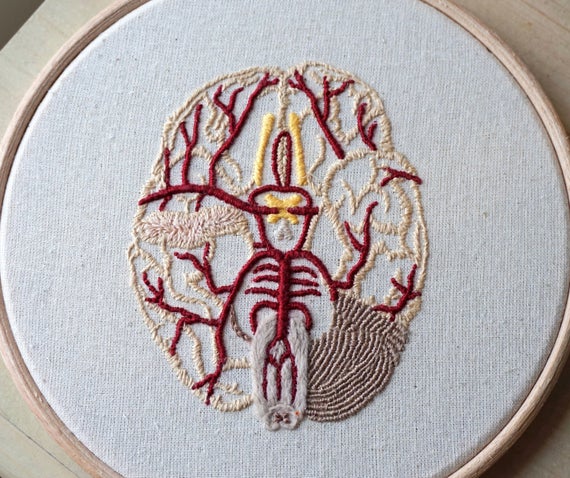
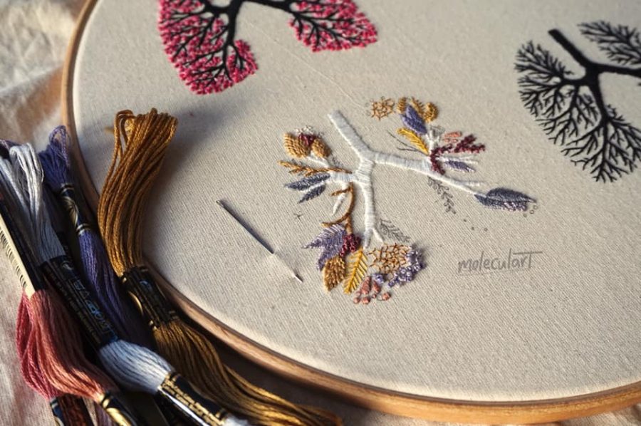
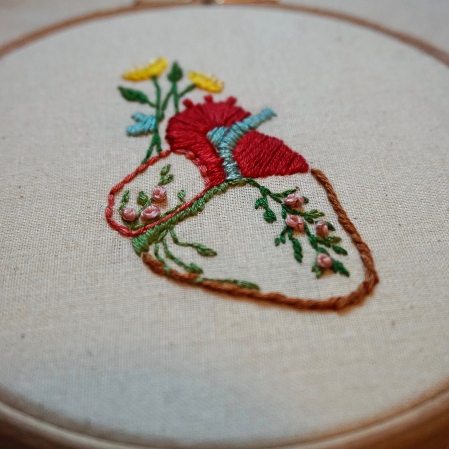
My first thought upon seeing the delicate, anatomy-based work of the 23-year-old embroidery artist and medical student Emmi Khan was that the Girl Scouts must have expanded the categories of skills eligible for merit badges.
(If memory serves, there was one for embroidery, but it certainly didn’t look like a cross-sectioned brain, or a sinus cavity.)
Closer inspection revealed that the circular views of Khan’s embroideries are not quite as tiny as the round badges stitched to high achieving Girl Scouts’ sashes, but rather still framed in the wooden hoops that are an essential tool of this artist’s trade.
Methods both scientific and artistic are a source of fascination for Khan, who began taking needlework inspiration from anatomy as an undergrad studying biomedical sciences. As she writes on her Moleculart website:
Science has particular methods: it is fundamentally objective, controlled, empirical. Similarly, art has particular methods: there is an emphasis on subjectivity and exploration, but there is also an element of regulation regarding how art is created… e.g. what type of needle to use to embroider or how to prime a canvas.
The procedures and techniques adopted by scientists and artists may be very different. Ultimately, however, they both have a common aim. Artists and scientists both want to 1) make sense of the vastness around them in new ways, and 2) present and communicate it to others through their own vision.
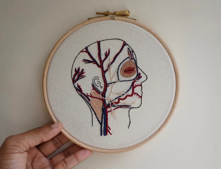
A glimpse at the flowers, intricate stitches, and other dainties that populate her Pinterest boards offers a further peek into Khan’s methods, and might prompt some readers to pick up a needle themselves, even those with no immediate plans to embroider a karyotype or The Circle of Willis, the circular anastomosis of arteries at the base of the brain.
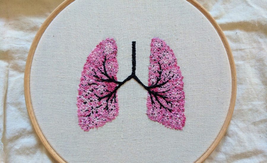
The Cardiff-based medical student delights in embellishing her threaded observations of internal organs with the occasional decorative element—sunflowers, posies, and the like…
She makes herself available on social media to answer questions on subjects ranging from embroidery tips to her relationship to science as a devout Muslim, and to share works in progress, like a set of lungs that embody the Four Seasons, commissioned by a customer in the States.
To see more of Emmi Khan’s work, including a downloadable anatomical floral heart embroidery pattern, visit Moleculart, her Instagram page, or her Etsy shop.
via Colossal
Related Content:
Behold an Anatomically Correct Replica of the Human Brain, Knitted by a Psychiatrist
An Artist Crochets a Life-Size, Anatomically-Correct Skeleton, Complete with Organs
Watch Nina Paley’s “Embroidermation,” a New, Stunningly Labor-Intensive Form of Animation
Ayun Halliday is an author, illustrator, theater maker and Chief Primatologist of the East Village Inky zine. Join her in NYC on Monday, February 3 when her monthly book-based variety show, Necromancers of the Public Domain celebrates New York: The Nation’s Metropolis (1921). Follow her @AyunHalliday.

