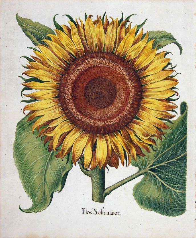
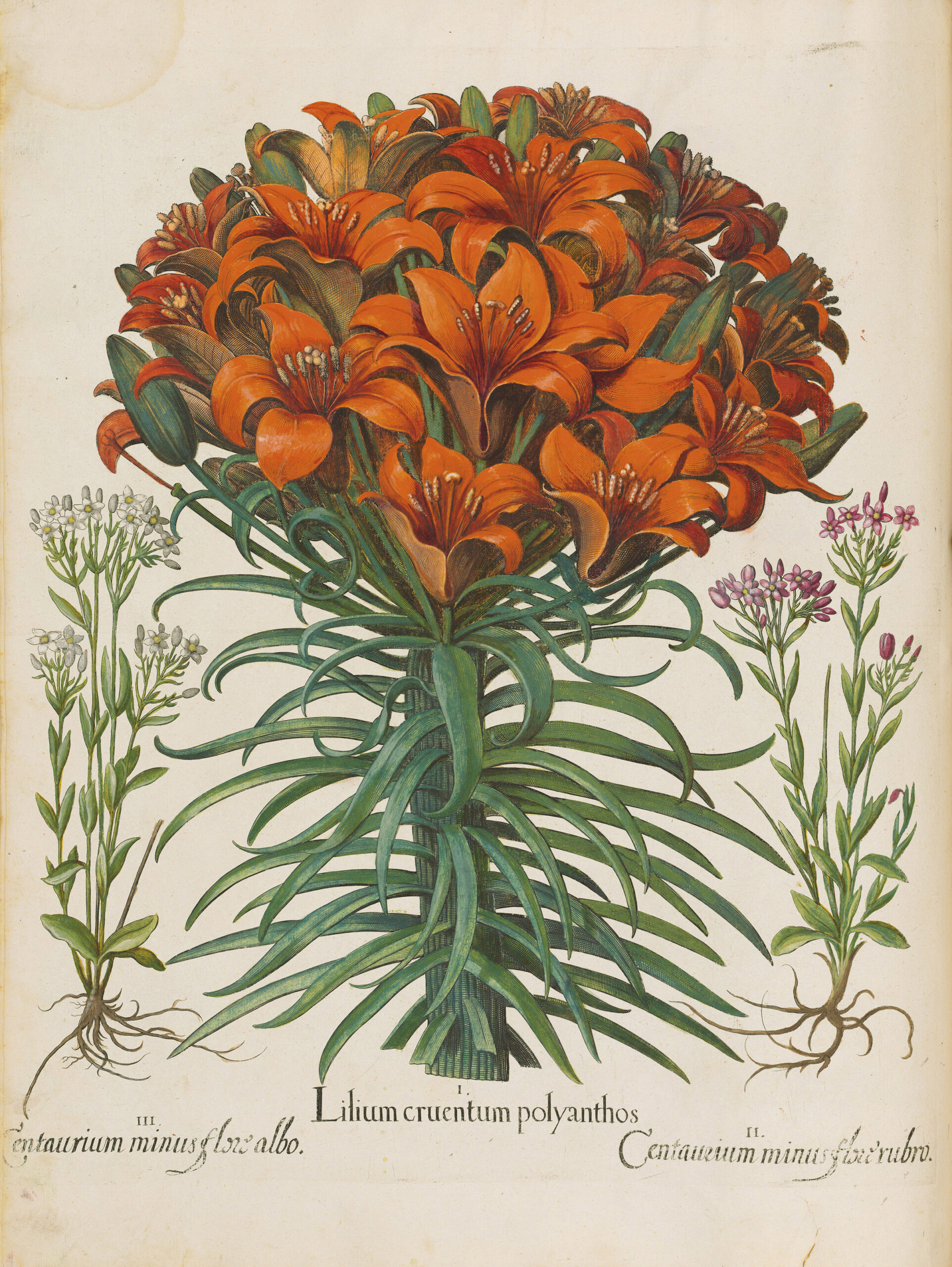
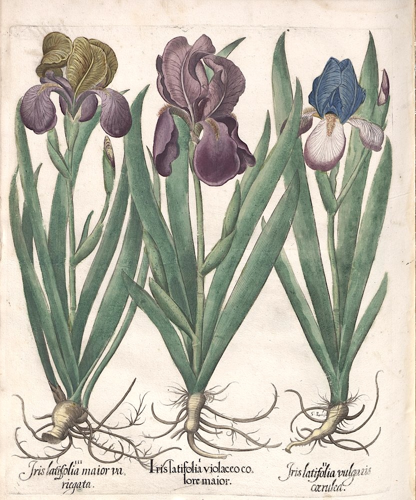
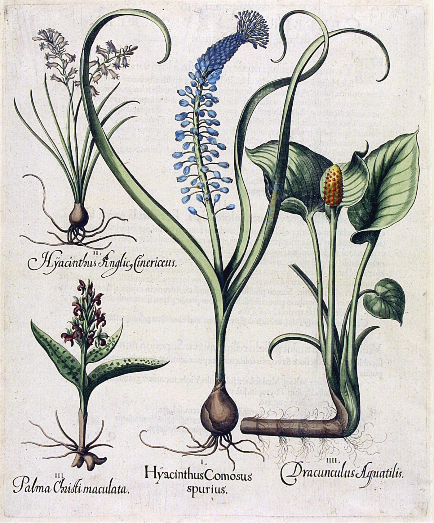
If you made it big in seventeenth-century Bavaria, you showed it by creating a garden with all the plants in the known world. That’s what Johann Konrad von Gemmingen, Prince-Bishop of Eichstätt did, anyway, and he wasn’t about to let his botanical wonderland die with him. To that end, he engaged a specialist by the name of Basilius Besler to document the whole thing, and with a lavishness never before seen in books in its category.
The medieval and Renaissance world had its “herbals” (as previously featured here on Open Culture), many of which tended toward the utilitarian, focusing on the culinary or medical properties of plants; Hortus Eystettensis would take the form at once to new artistic and scientific heights.
When the book came out in 1613, after sixteen years of research and production, von Gemmingen was already dead. But it proved successful enough as a product that Besler made sufficient money to set himself up with a house in a fashionable part of Nuremberg for the price of just five copies — five copies of the extravagant (and extravagantly expensive) hand-colored edition, at least.
Hortus Eystettensis “changed botanical art almost overnight,” writes David Marsh in a detailed blog post on the book’s creation and legacy at The Gardens Trust. “Now, suddenly plants were being portrayed as beautiful objects in their own right,” with depictions that could attain life size, all categorized in a systematic manner anticipating classification systems to come. Marsh sees the project as exemplifying a couple major cultural ideas of its time: one was “the collector’s cabinet of curiosities or wunderkammer, which helped reveal a gentleman’s interest and knowledge of the world around him.” Another was the concept of the perfect garden, which “should, if at all possible, represent Eden and contain as wide a range of plants and other features as possible.”
This level of ambition has always had its costs, to the consumer as well as the producer: Marsh notes that a 2006 replica of Hortus Eystettensis had a price tag of $10,000, though a more affordable edition has since been made available from Taschen, the major publisher most likely to understand Besler’s uncompromising aesthetic sensibility in the craft of books. But you can also read it for free online at an edition digitized by Teylers Museum in the Netherlands, which, in a sense, brings von Gemmingen’s project full-circle: he sought to encompass the whole world in his garden, and now his garden — in Besler’s richly detailed rendering — is open to the whole world.
Based in Seoul, Colin Marshall writes and broadcasts on cities, language, and culture. His projects include the Substack newsletterBooks on Cities, the book The Stateless City: a Walk through 21st-Century Los Angeles and the video series The City in Cinema. Follow him on Twitter at @colinmarshall or on Facebook.
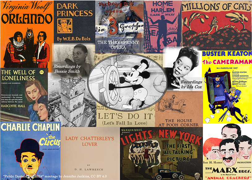
More than thirty years after it was first privately published in 1928, Lady Chatterley’s Lover became the subject of the most famous obscenity trial in English history. Though the ultimate decision of R v Penguin Books Ltd in favor of the publisher opened a cultural floodgate in that country, the novel was also subject to bans elsewhere, including the United States and Japan. Nearly a century after D. H. Lawrence wrote Lady Chatterley’s Lover — and a world apart as regards attitudes about public morality — it can be somewhat difficult to understand what all the fuss was about. But now that the book has entered the public domain in the United States, it could potentially be made artistically and socially dangerous again.
The same could be said of a number of other notable works of literature, from Virginia Woolf’s sex-switching satire Orlando to Bertolt Brecht’s piece of revolutionary theater Die Dreigroschenoper (known in translation as The Threepenny Opera) to a cultural phenomenon-spawning story like J. M. Barrie’s Peter Pan; or the Boy Who Wouldn’t Grow Up.
These and others are named on this year’s Public Domain Day post by Jennifer Jenkins, director of the Duke Center for the Study of the Public Domain. If not for multiple extensions of copyright law, she notes, all of them would have originally gone public domain in 1984, and we would now have almost four decades’ worth of additional creations reinterpreting, re-imagining, and re-using them. Still, “better late than never!”
At this point in history, the artifacts freed for anyone’s use aren’t just written works, but also films, musical compositions, and even actual sound recordings. These include classic Disney cartoons Steamboat Willie and Plane Crazy, which introduced the world to a certain Mickey Mouse; live-action movies from major filmmakers, like Charlie Chaplin’s TheCircus and Carl Theodor Dreyer’s The Passion of Joan of Arc; and such songs with broad cultural footprints as “Yes! We Have No Bananas,” “When You’re Smiling,” and “Mack the Knife” — or rather “Die Moritat von Mackie Messer,” in the original German from Die Dreigroschenoper. Alas, those of us who want to do our own thing with Bobby Darin’s version will have to wait until February of 2067.
Based in Seoul, Colin Marshall writes and broadcasts on cities, language, and culture. His projects include the Substack newsletterBooks on Cities, the book The Stateless City: a Walk through 21st-Century Los Angeles and the video series The City in Cinema. Follow him on Twitter at @colinmarshall or on Facebook.
When The Great Gatsby was first published, it flopped; nearly a century later, its place at the pinnacle of American literature is almost universally agreed upon. Of the objectors, many no doubt remember too vividly having to answer essay questions about the meaning of the green light on the Buchanans’ dock. Perhaps “the most debated symbol in the history of American literature,” it tends to be interpreted simultaneously as “Gatsby’s love for Daisy, money, and the American dream,” as James Payne puts it in his new Great Books Explained video above. Examined more closely, “what it may suggest is that the American dream’s most un-discussed quality is its inaccessibility.”
“Fitzgerald felt that the American dream has lost its way,” Payne says. “Baseball, America’s pastime and the purest of games, had been corrupted by the Black Sox game fixing of 1919, a real-life scandal mentioned in The Great Gatsby. Fitzgerald used it as an allegory of America: if baseball is corrupt, then we are really in trouble.”
Hence Gatsby’s ultimate discovery that Daisy, the woman for whom he had wholly reinvented himself (in that quintessentially American way), falls so far short of what he’d imagined; hence how Gatsby’s own “classic rags-to-riches story” is “complicated by the fact that he made his money in bootlegging.” In the end, “the American dream only belongs to establishment figures,” those “who were born into it. Everyone’s class is fixed, just like the World Series.”
Though not well-received in its day, The Great Gatsby offered a premonition of disaster ahead that subsequently came true in both the American economy and Fitzgerald’s personal life. But even in the book, “despite his fear that America is lost, he still offers hope.” Hence the vivid quasi-optimism of the closing lines about how “Gatsby believed in the green light, the orgastic future that year by year recedes before us,” which frames Americans as “boats against the current, borne back ceaselessly into the past” — a passage whose interpretation teachers are always liable to demand. If you happen to be a student yourself, saving Payne’s video in hopes of a quick and easy A on your English lit exam, know that there are few more time-honored techniques in pursuit of the American dream than looking for shortcuts.
Based in Seoul, Colin Marshall writes and broadcasts on cities, language, and culture. His projects include the Substack newsletterBooks on Cities, the book The Stateless City: a Walk through 21st-Century Los Angeles and the video series The City in Cinema. Follow him on Twitter at @colinmarshall or on Facebook.
You can hang onto the source of Rudolph’s shame and eventual triumph — the glowing red nose that got him bounced from his playmates’ reindeer games before saving Christmas.
Lose all those other now-iconic elements — the Island of Misfit Toys, long-lashed love interest Clarice, the Abominable Snow Monster of the North, Yukon Cornelius, Sam the Snowman, and Hermey the aspirant dentist elf.
As originally conceived, Rudolph (runner up names: Rollo, Rodney, Roland, Roderick and Reginald) wasn’t even a resident of the North Pole.
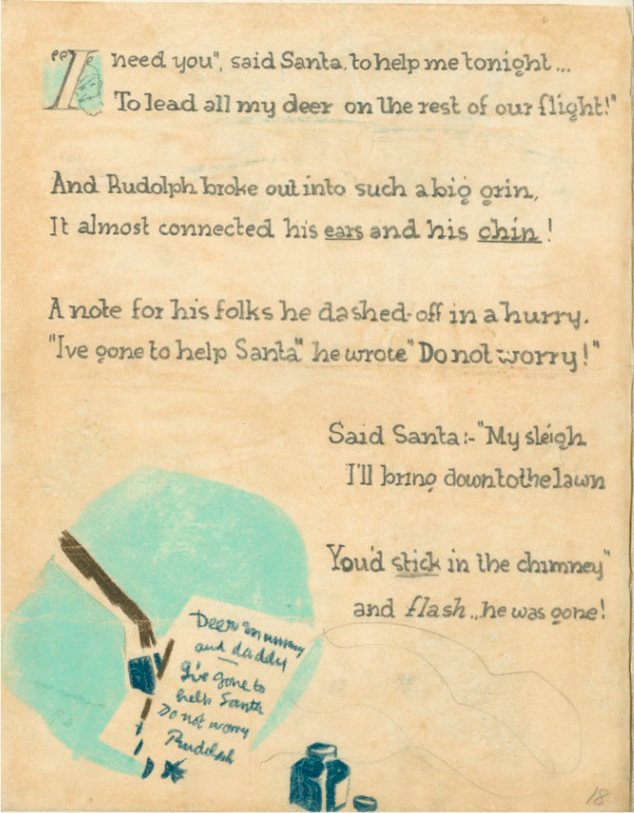
He lived with a bunch of other reindeer in an unremarkable house somewhere along Santa’s delivery route.
Santa treated Rudolph’s household as if it were a human address, coming down the chimney with presents while the occupants were asleep in their beds.
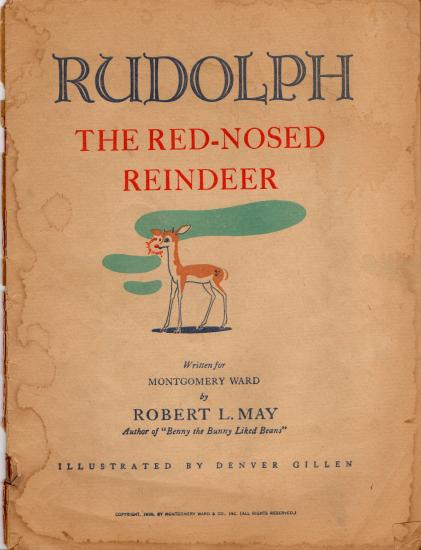
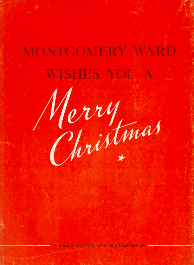
To get to Rudolph’s origin story we must travel back in time to January 1939, when a Montgomery Ward department head was already looking for a nationwide holiday promotion to draw customers to its stores during the December holidays.
He settled on a book to be produced in house and given away free of charge to any child accompanying their parent to the store.
Copywriter Robert L. May was charged with coming up with a holiday narrative starring an animal similar to Ferdinand the Bull.
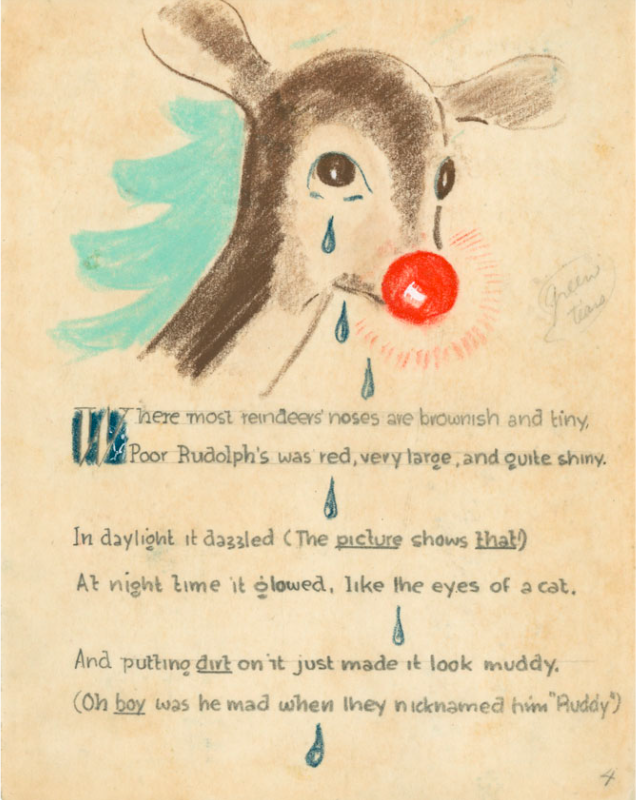
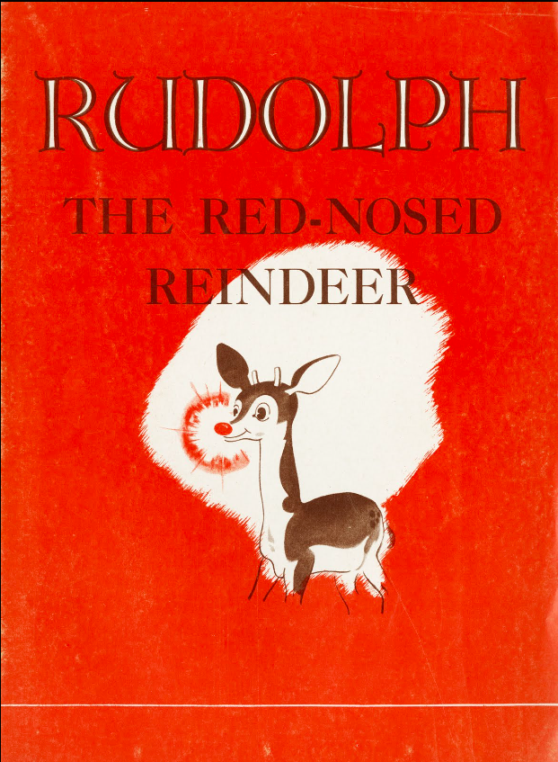
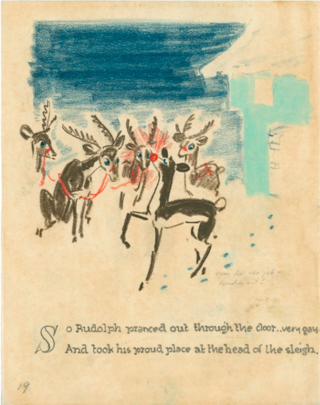
After giving the matter some thought, May tapped Denver Gillen, a pal in Montgomery Ward’s art department, to draw his underdog hero, an appealing-looking young deer with a red nose big enough to guide a sleigh through thick fog.
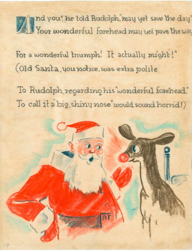
(That schnozz is not without controversy. Prior to Caitlin Flanagan’s 2020 essay in the Atlantic chafing at the television special’s explicitly cruel depictions of othering the oddball, Montgomery Ward fretted that customers would interpret a red nose as drunkenness. In May’s telling, Santa is so uncomfortable bringing up the true nature of the deer’s abnormality, he pretends that Rudolph’s “wonderful forehead” is the necessary headlamp for his sleigh…)
On the strength of Gillen’s sketches, May was given the go-ahead to write the text.
His rhyming couplets weren’t exactly the stuff of great children’s literature. A sampling:
Twas the day before Christmas, and all through the hills,
The reindeer were playing, enjoying the spills.
Of skating and coasting, and climbing the willows,
And hopscotch and leapfrog, protected by pillows.
___
And Santa was right (as he usually is)
The fog was as thick as a soda’s white fizz
—-
The room he came down in was blacker than ink
He went for a chair and then found it a sink!
No matter.
May’s employer wasn’t much concerned with the artfulness of the tale. It was far more interested in its potential as a marketing tool.
“We believe that an exclusive story like this aggressively advertised in our newspaper ads and circulars…can bring every store an incalculable amount of publicity, and, far more important, a tremendous amount of Christmas traffic,” read the announcement that the Retail Sales Department sent to all Montgomery Ward retail store managers on September 1, 1939.
Over 800 stores opted in, ordering 2,365,016 copies at 1½¢ per unit.
Promotional posters touted the 32-page freebie as “the rollickingest, rip-roaringest, riot-provokingest, Christmas give-away your town has ever seen!”
The advertising manager of Iowa’s Clinton Herald formally apologized for the paper’s failure to cover the Rudolph phenomenon — its local Montgomery Ward branch had opted out of the promotion and there was a sense that any story it ran might indeed create a riot on the sales floor.
His letter is just but one piece of Rudolph-related ephemera preserved in a 54-page scrapbook that is now part of the Robert Lewis May Collection at Dartmouth, May’s alma mater.
Another page boasts a letter from a boy named Robert Rosenbaum, who wrote to thank Montgomery Ward for his copy:
I enjoyed the book very much. My sister could not read it so I read it to her. The man that wrote it done better than I could in all my born days, and that’s nine years.
The magic ingredient that transformed a marketing scheme into an evergreen if not universally beloved Christmas tradition is a song …with an unexpected side order of corporate generosity.
May’s wife died of cancer when he was working on Rudolph, leaving him a single parent with a pile of medical bills. After Montgomery Ward repeated the Rudolph promotion in 1946, distributing an additional 3,600,000 copies, its Board of Directors voted to ease his burden by granting him the copyright to his creation.
Once he held the reins to the “most famous reindeer of all”, May enlisted his songwriter brother-in-law, Johnny Marks, to adapt Rudolph’s story.
The simple lyrics, made famous by singing cowboy Gene Autry’s 1949 hit recording, provided May with a revenue stream and Rankin/Bass with a skeletal outline for its 1964 stop-animation special.
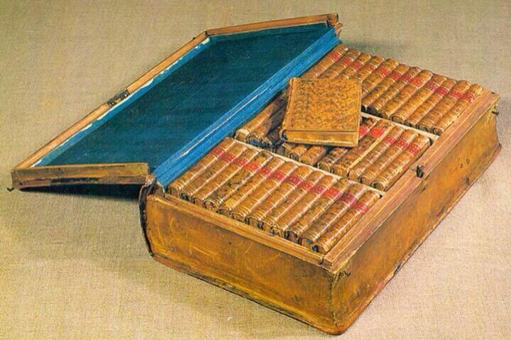
Every piece of technology has a precedent. Most have several different types of precedents. You’ve probably used (and may well own) an eBook reader, for instance, but what would have afforded you a selection of reading material two or three centuries ago? If you were a Jacobean Englishman of means, you might have used the kind of traveling library we featured in 2017, a handsome portable case custom-made for your books. (If you’re Tom Stoppard in the 21st century, you still do.) If you were Napoleon, who seemed to love books as much as he loved military power — he didn’t just amass a vast collection of them, but kept a personal librarian to oversee it — you’d take it a big step further.
“Many of Napoleon’s biographers have incidentally mentioned that he […] used to carry about a certain number of favorite books wherever he went, whether traveling or camping,” says an 1885 Sacramento Daily Union article posted by Austin Kleon, “but it is not generally known that he made several plans for the construction of portable libraries which were to form part of his baggage.” The piece’s main source, a Louvre librarian who grew up as the son of one of Napoleon’s librarians, recalls from his father’s stories that “for a long time Napoleon used to carry about the books he required in several boxes holding about sixty volumes each,” each box first made of mahogany and later of more solid leather-covered oak. “The inside was lined with green leather or velvet, and the books were bound in morocco,” an even softer leather most often used for bookbinding.
To use this early traveling library, Napoleon had his attendants consult “a catalogue for each case, with a corresponding number upon every volume, so that there was never a moment’s delay in picking out any book that was wanted.” This worked well enough for a while, but eventually “Napoleon found that many books which he wanted to consult were not included in the collection,” for obvious reasons of space. And so, on July 8, 1803, he sent his librarian these orders:
The Emperor wishes you to form a traveling library of one thousand volumes in small 12mo and printed in handsome type. It is his Majesty’s intention to have these works printed for his special use, and in order to economize space there is to be no margin to them. They should contain from five hundred to six hundred pages, and be bound in covers as flexible as possible and with spring backs. There should be forty works on religion, forty dramatic works, forty volumes of epic and sixty of other poetry, one hundred novels and sixty volumes of history, the remainder being historical memoirs of every period.
In sum: not only did Napoleon possess a traveling library, but when that traveling library proved too cumbersome for his many and varied literary demands, he had a whole new set of not just portable book cases but even more portable books made for him. (You can see how they looked packed away in the image tweeted by Cork County Library above.) This prefigured in a highly analog manner the digital-age concept of recreating books in another format specifically for compactness and convenience — the kind of compactness and convenience now increasingly available to all of us today, and to a degree Napoleon never could have imagined, let alone demanded. It may be good to be the Emperor, but in many ways, it’s better to be a reader in the 21st century.
Note: This post was originally published in 2017. Given that Napoleon is back in the news, with the new Ridley Scott film, we’re bringing it back.
Based in Seoul, Colin Marshall writes and broadcasts on cities and culture. His projects include the book The Stateless City: a Walk through 21st-Century Los Angeles and the video series The City in Cinema. Follow him on Twitter at @colinmarshall or on Facebook.
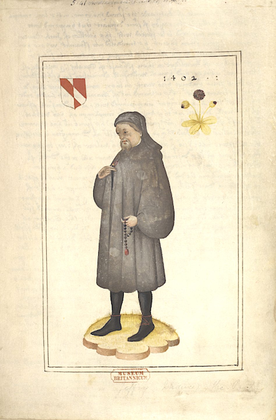
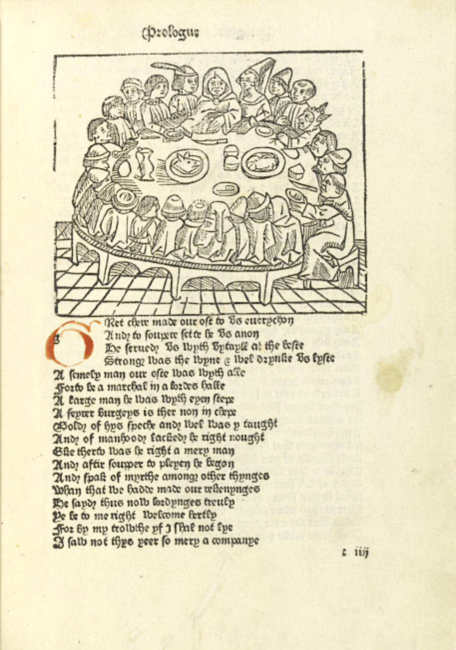
Earlier this year, Oxford professor of English literature Marion Turner published The Wife of Bath: A Biography. Even if you don’t know anything about that book’s subject, you’ve almost certainly heard of her, and perhaps also of her traveling companions like the Knight, the Summoner, the Nun’s Priest, and the Canon’s Yeoman. These are just a few of the pilgrims whose storytelling contest structures Geoffrey Chaucer’s fourteenth-century magnum opus The CanterburyTales, whose influence continues to reverberate through English literature, even all these centuries after the author’s death. In commemoration of the 623rd anniversary of that work, the British Library has opened a vast online Chaucer archive.
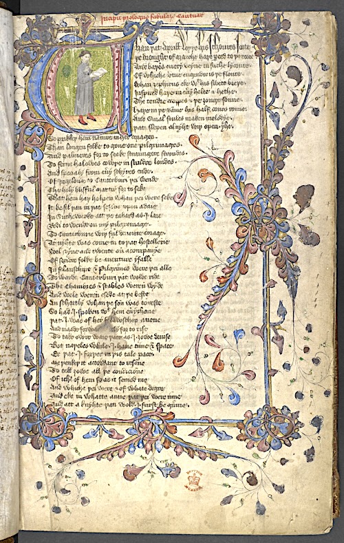
This archive comes as a culmination of what the Guardian’s Caroline Davies describes as “a two and a half year project to upload 25,000 images of the often elaborately illustrated medieval manuscripts.” Among these artifacts are “complete copies of Chaucer’s poems but also unique survivals, including fragmentary texts found in Middle English anthologies or inscribed in printed editions and incunabula (books printed before 1501).”
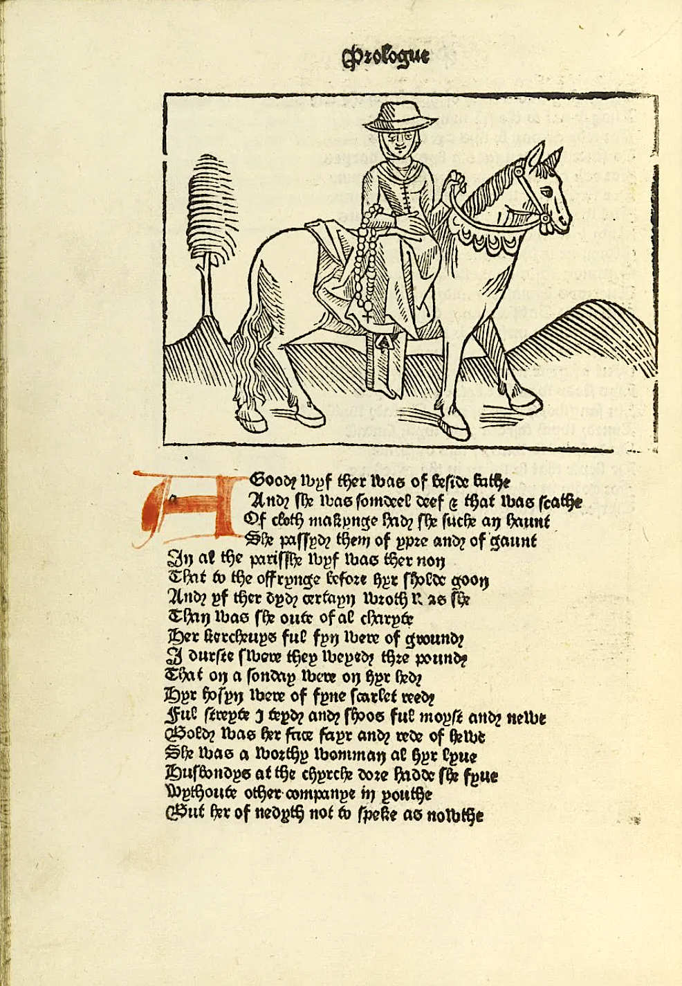
If you’re looking for The Canterbury Tales, you’ll find no fewer than 23 versions of it, the earliest of which “was written only a few years after Chaucer’s death in roughly 1400.” Also digitized are “rare copies of the 1476 and 1483 editions of the text made by William Caxton,” now considered “the first significant text to be printed in England.”
Four centuries later, designer-writer-social reformer William Morris collaborated with celebrated painter Edward Burne-Jones to create an edition W. B. Yeats once called “the most beautiful of all printed books”: the Kelmscott Chaucer, previously featured here on Open Culture, which you can also explore in the British Library’s new archive (as least as soon as its ongoing cyber attack-related issues are resolved). As its wider contents reveal, Chaucer was the author of not just The Canterbury Tales but also a variety of other poems, the classical-dream-vision story collection The Legend of Good Women, an instruction manual for an astrolabe, and translations of The Romance of the Rose and The Consolation of Philosophy. And his Trojan epic Troilus and Criseyde may sound familiar, thanks to the inspiration it gave, more than 200 years later, to a countryman by the name of William Shakespeare.
Based in Seoul, Colin Marshall writes and broadcasts on cities, language, and culture. His projects include the Substack newsletterBooks on Cities, the book The Stateless City: a Walk through 21st-Century Los Angeles and the video series The City in Cinema. Follow him on Twitter at @colinmarshall or on Facebook.
The Spanish conquista of the Americas happened long enough ago — and left behind a spotty enough body of historical records — that we tend to perceive it as much through simplifications, exaggerations, and distortions as we do through facts. What we now call Mexico underwent “essentially an internal conflict between different indigenous groups who saw the arrival of strangers as an opportunity to resist having to pay tribute to the Aztec Empire,” says Universidad Nacional Autónoma de Mexico history professor Berenice Alcántara Rojas. “When the Spaniards initially attacked the Mexica capital, they were swiftly driven out.”
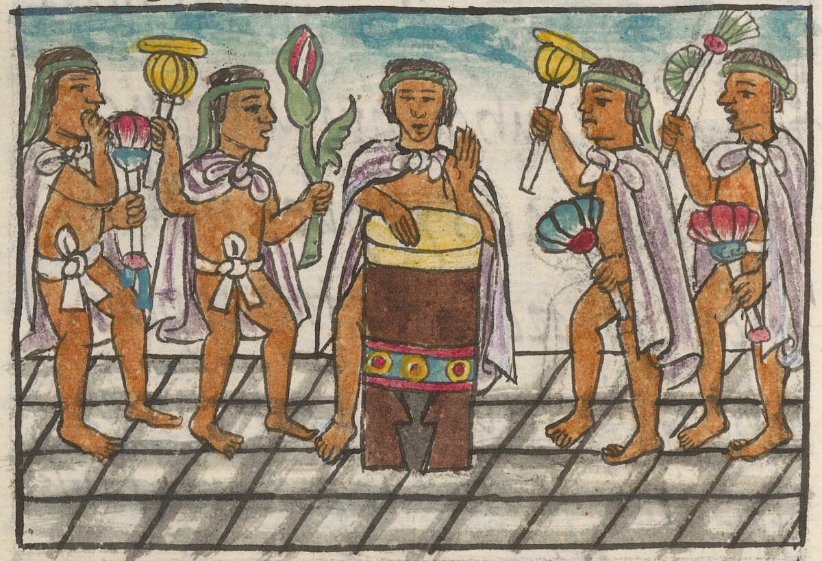
“Only when aided by various groups of Indigenous allies, as well as by the spread of a terrible smallpox epidemic, did they manage to force the ruler Cuauhtemoc and other Mexica leaders to capitulate,” Rojas continues, drawing upon details provided in the version of the events laid out in the Florentine Codex.
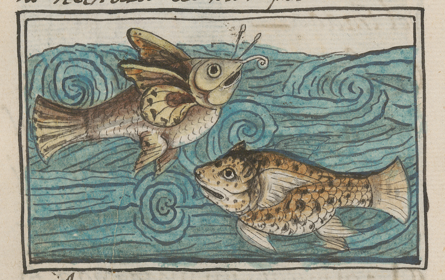
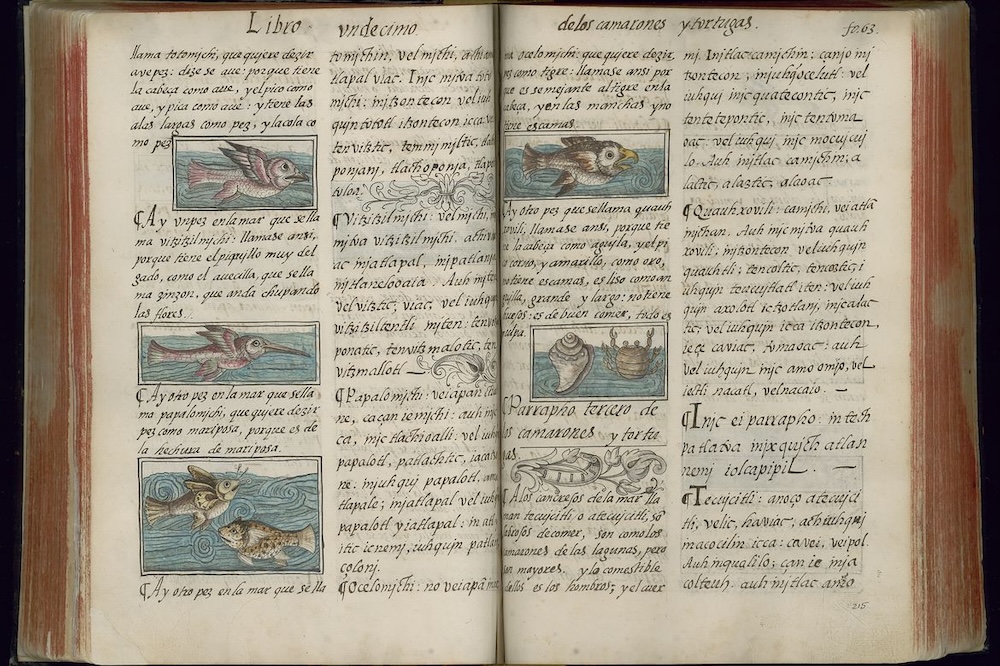
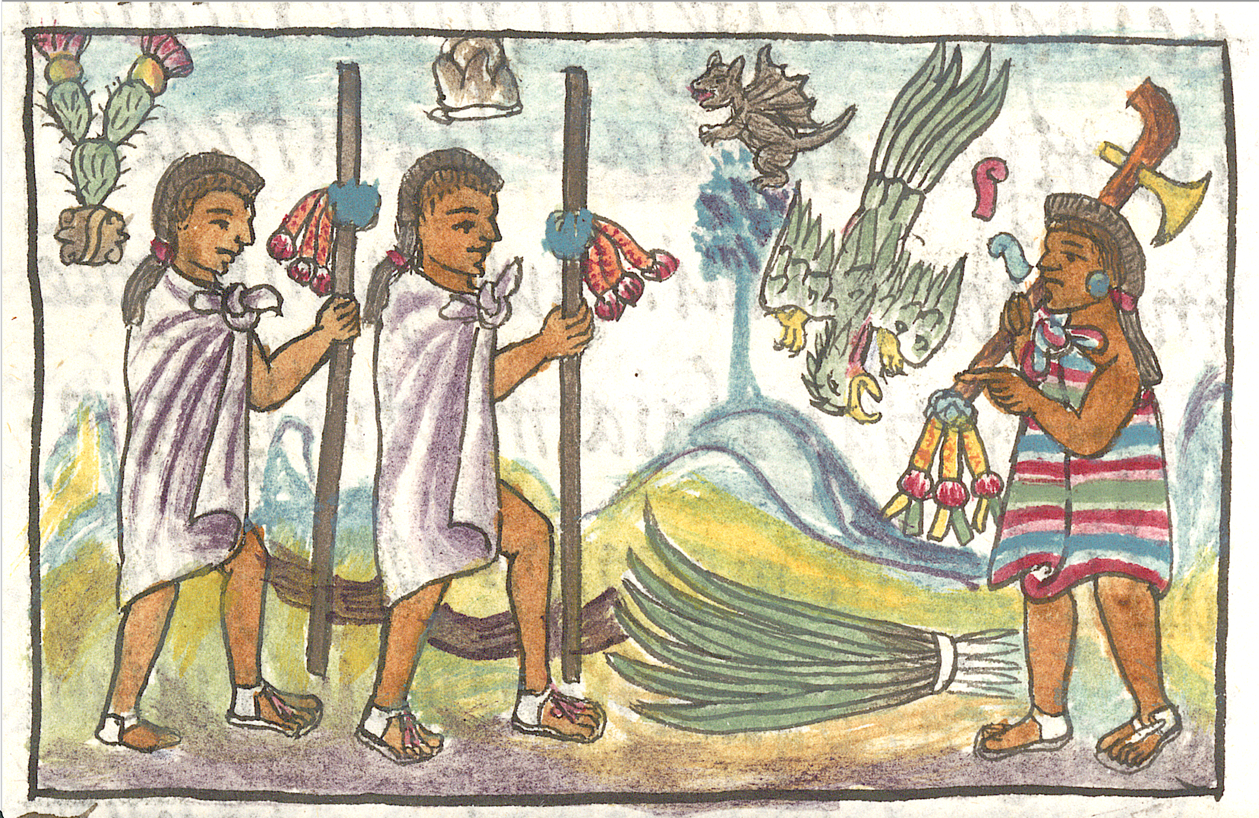
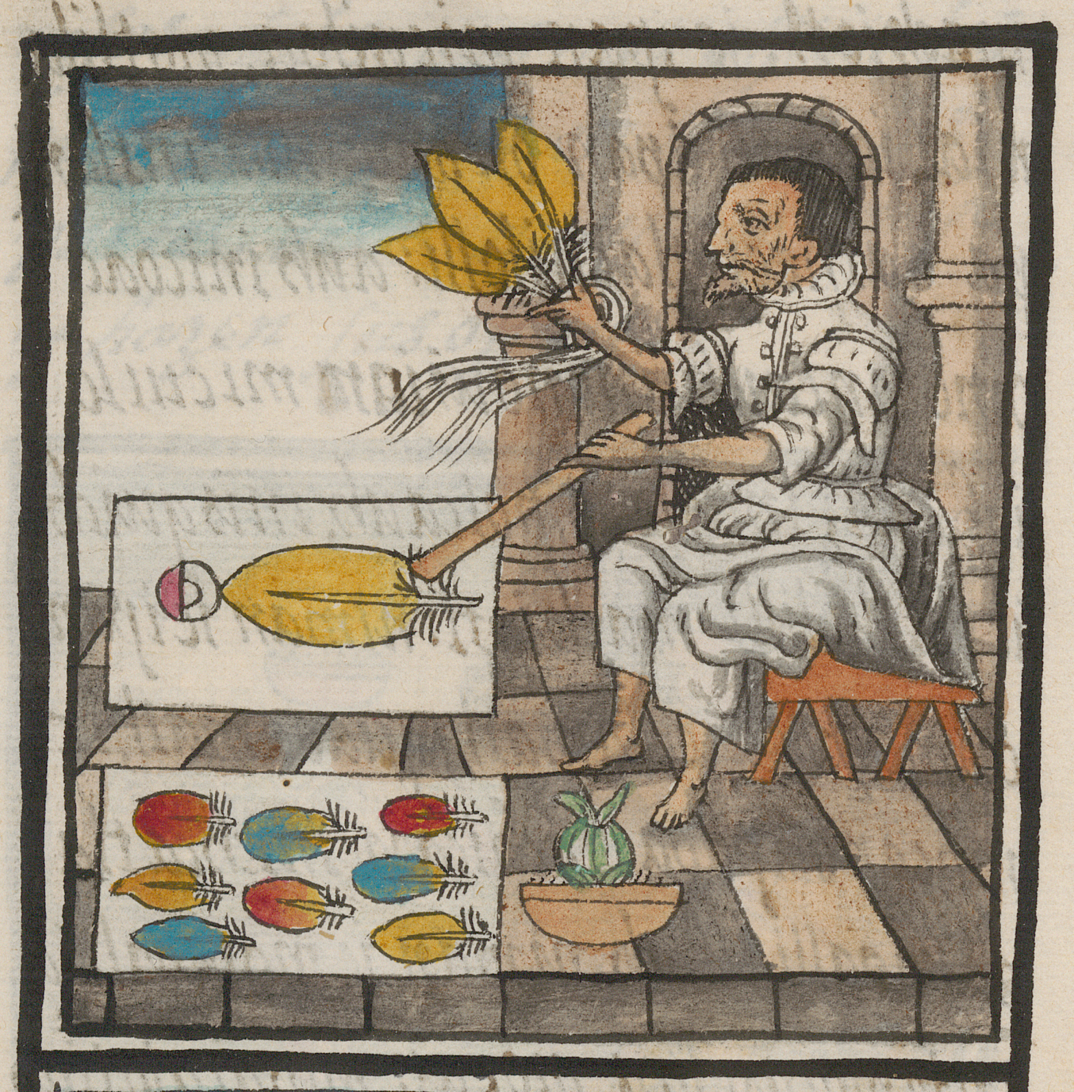
That encyclopedic series of twelve 16th-century illustrated manuscripts lavishly documents the known society and nature of that land at the time — and has now, nearly 450 years later, been acknowledged as “the most reliable source of information about Mexica culture, the Aztec Empire, and the conquest of Mexico.”
“In 1547, Bernardino de Sahagún, a Spanish Franciscan friar who committed most of his life to working closely with the Indigenous peoples of Mexico, began collecting information about central Mexican Nahua culture, life, people, history, astronomy, flora, fauna, and the Nahuatl language, among other topics,” says the Getty Research Institute. “Nahua elders, grammarians, scribes, and artists worked with Sahagún to compile a three-volume, 12-book, 2500-page illustrated manuscript, modeling its content on European encyclopedias, especially Pliny the Elder’s Natural History,” all of which has been digitized, translated, and made available at the Getty’s web site.
A thoroughly multicultural project avant la lettre, the Florentine Codex (named for the Medici family library in Florence, where it was sent upon its completion) has only just become accessible to a wide online readership. Though it’s “been digitally available via the World Digital Library since 2012, for most users it remained impenetrable because reading it requires knowledge of sixteenth-century Nahuatl and Spanish, and of pre-Hispanic and early modern European art traditions.” By offering searchable text in modern versions of both those languages as well as English — to say nothing of its browsable sections organized by people, animals, deities, and even by Nahuatl terms like coyote and tortilla — the Digital Florentine Codex re-illuminates an entire civilization.
Based in Seoul, Colin Marshall writes and broadcasts on cities, language, and culture. His projects include the Substack newsletterBooks on Cities, the book The Stateless City: a Walk through 21st-Century Los Angeles and the video series The City in Cinema. Follow him on Twitter at @colinmarshall or on Facebook.
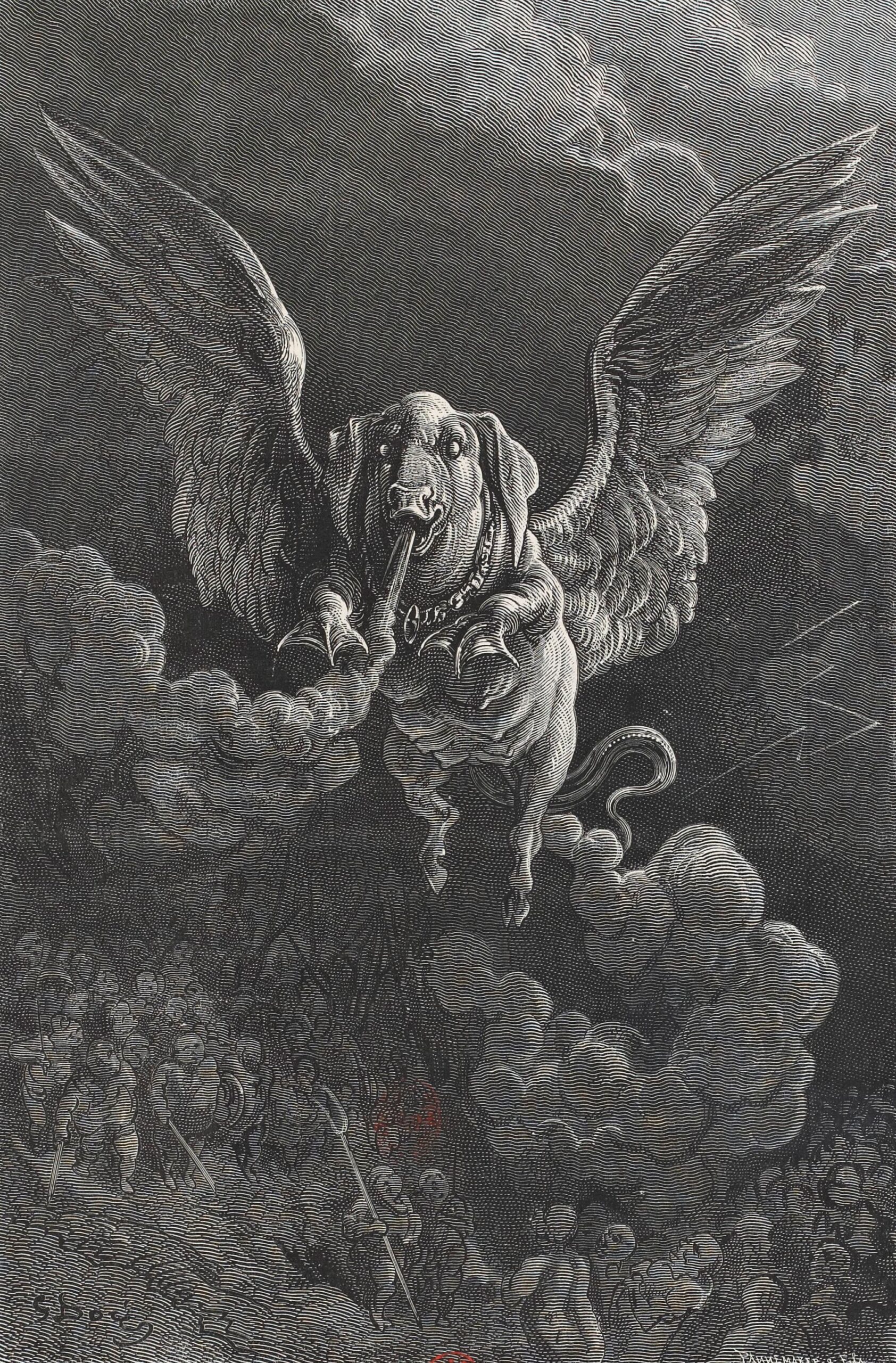
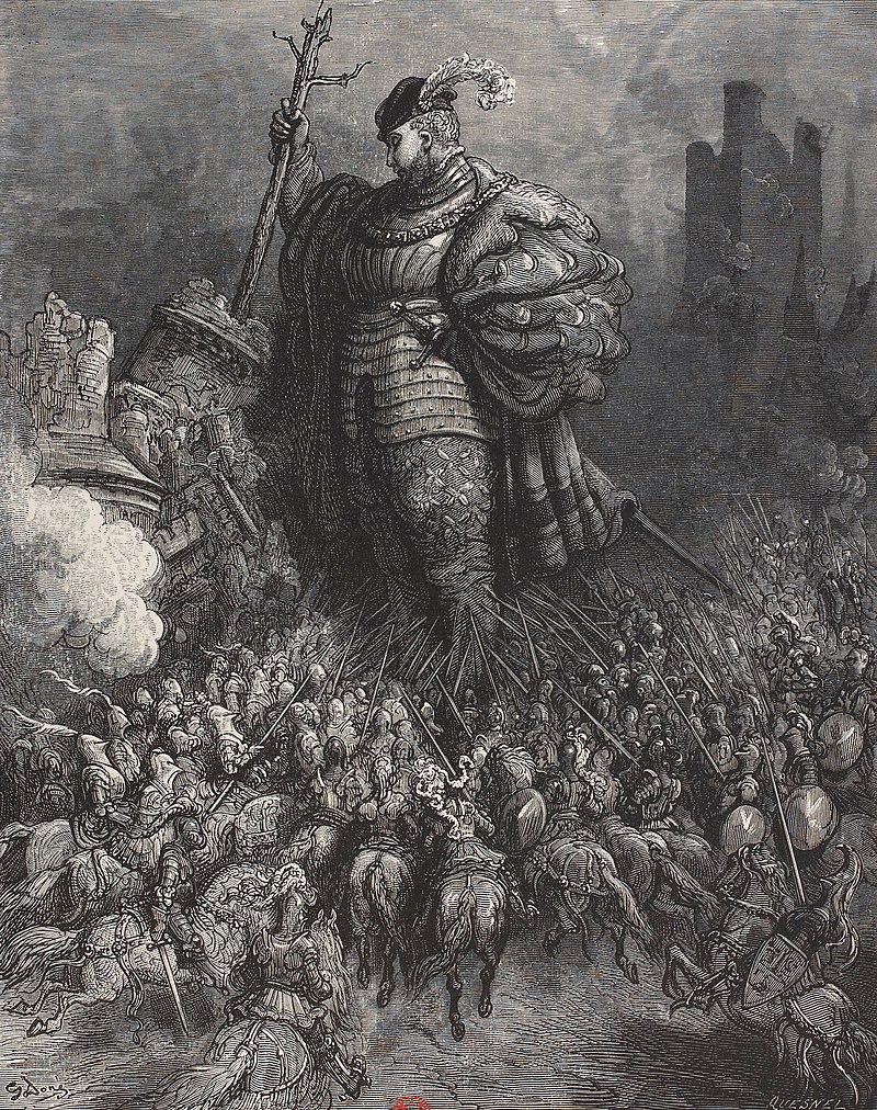
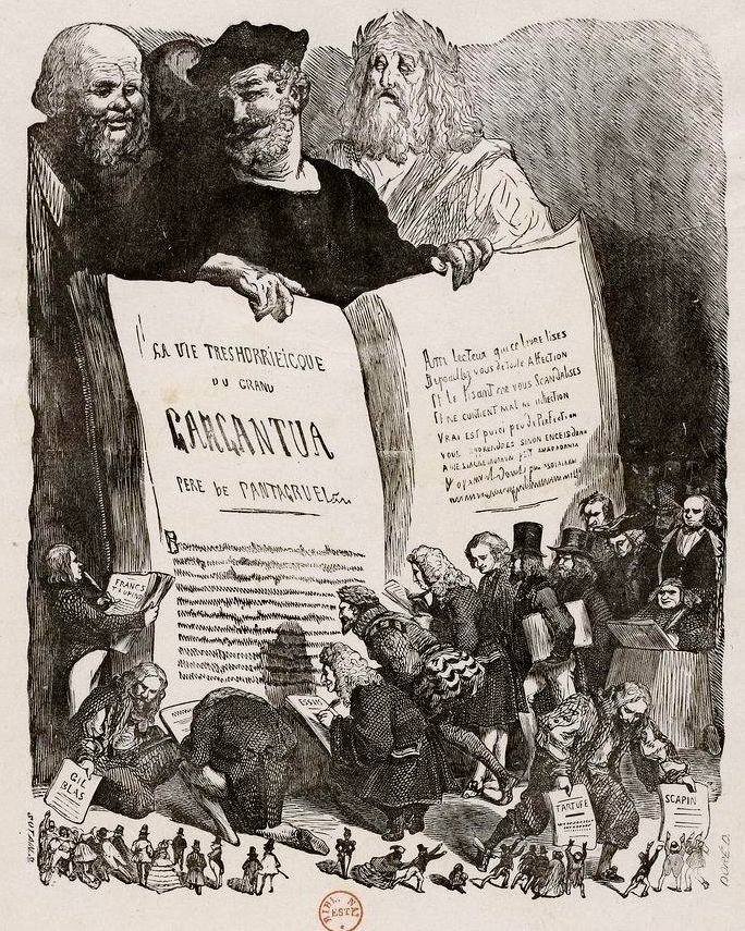
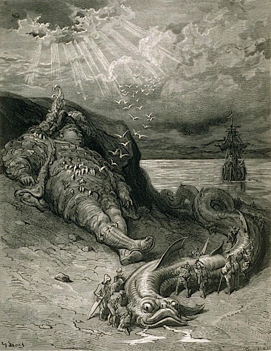
When François Rabelais came up with a couple of giants to put at the center of a series of inventive and ribald works of satirical fiction, he named one of them Gargantua. That may not sound particularly clever today, gargantuan being a fairly common adjective to describe anything quite large. But we actually owe the word itself to Rabelais, or more specifically, to the nearly half-millennium-long legacy of the character into whom he breathed life. But there’s so much more to Les Cinq livres des faits et dits de Gargantua et Pantagruel, or The Five Books of the Lives and Deeds of Gargantua and Pantagruel, whose enduring status as a masterpiece of the grotesque owes much to its author’s wit, linguistic virtuosity, and sheer brazenness.
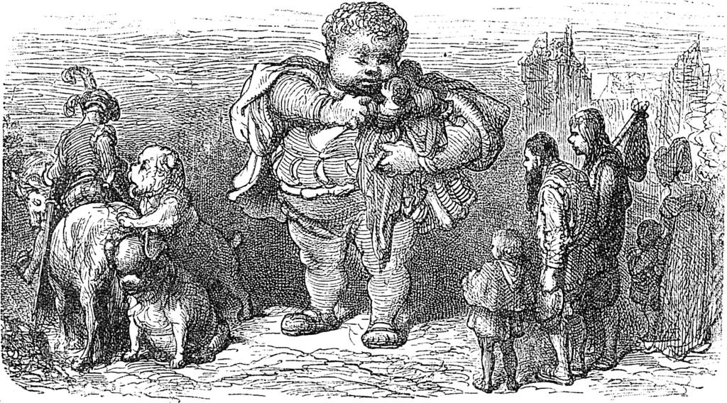
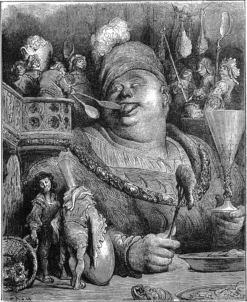
Nor has it hurt that the books have inspired vivid illustrations from a host of artists, one of whom in particular stands out: Gustave Doré, whom Richard Smyth calls “one of the most prolific — and most successful — book illustrators of the nineteenth century.”
Here at Open Culture, we’ve previously featured the art he created to accompany the work of Dante, Cervantes, and Poe, each a writer possessed of a highly distinctive set of literary powers, and each of whom thus received a different but equally lavish and evocative treatment from Doré.
For Rabelais, says the site of book dealer Heribert Tenschert, the 22-year-old artist produced (in 1854) “100 images that oscillate between the whimsical and the uncanny, between realism and fantasy,” a count he would expand to 700 in another edition two decades later.
You can see a great many of Doré’s illustrations for Gargantua and Pantagruelat Wikimedia Commons. The simultaneous extravagance and repugnance of the series’ medieval France may seem impossibly distant to us, but it can hardly have felt like yesterday to Doré either, given that he was working three centuries after Rabelais.
As suggested by Heribert Tenschert, perhaps these imaginative visions of the Middle Ages — like Balzac’s Rabelaisian Les contes drolatiques, which he also illustrated — “resonated with Doré because they reminded him of the mysterious atmosphere of his childhood, which he had spent in the middle of the medieval city of Strasbourg.” Whatever his connection, Doré created images that still bring to mind a whole range of descriptors: somberly jocular, rigorously voluptuous, compellingly repellent, and above all pantagruelist. (Look it up.)
Based in Seoul, Colin Marshall writes and broadcasts on cities, language, and culture. His projects include the Substack newsletterBooks on Cities, the book The Stateless City: a Walk through 21st-Century Los Angeles and the video series The City in Cinema. Follow him on Twitter at @colinmarshall or on Facebook.
We're hoping to rely on loyal readers, rather than erratic ads. Please click the Donate button and support Open Culture. You can use Paypal, Venmo, Patreon, even Crypto! We thank you!
Open Culture scours the web for the best educational media. We find the free courses and audio books you need, the language lessons & educational videos you want, and plenty of enlightenment in between.