How Blade Runner Captured the Imagination of a Generation of Electronic Musicians
“I feel that there is ‘Before Blade Runner’ and ‘After Blade Runner,’” says director Denis Villeneuve. “The movie was like a landmark in film history aesthetic.” The quote comes from this FACTmagazine promo released ahead of Villeneuve’s 2017 sequel Blade Runner 2049, which examines the impact the soundtrack had on science fiction films and electronic music, as well how its entire aesthetic echoed into the ‘90s and beyond.
Composer Vangelis and director Ridley Scott had worked together previously on a Chanel commercial, and the composer had thought the choice to use his music was “brave,” according to Villeneuve. A few years later Vangelis would be asked to compose the score, which he did, improvising over footage.
The gearheads in the doc point out the Lexicon 224 reverb, a great analog effects unit, as well as the “beast,” the Yahama CS80, which would often go out of tune. (Check out YouTube user Perfect Circuit trying out some of its features).
“The best time (the synth) found its voice was on that album,” says musician Kuedo.
The doc also interviews Tricky, Gary Numan, Ikonika, Abayomi, Clare Wieck, Kuedo, Mogwai’s Stuart Braithwaite, and music producer Hans Berg, all of whom have found Blade Runner creeping into their work intentionally or subliminally. Ikonika even calls her music alter-ego a “replicant,” after the film’s androids. But the film for her was a warning: “You could see the future taking over and it would be the good times,” she says about the early ‘80s. And “then Blade Runner was like, after that, this is going to happen.” The soundtrack has gone on to have its own series of re-releases, just like Scott has released a Director’s Cut of the film.
First, it was never properly released as an album until 1994. Immediately bootlegs appeared collecting much more of the score from the film. In 2002, the best of them, the “Esper Edition,” delivered 33 tracks from the score. (And there’s a further “Retirement Edition” of the “Esper” kicking around out there.) Then in 2007, Universal Music released a 25th anniversary edition, with an extra disc of music composed for the film and *another* disc of *new* music Vangelis composed for the release. All of which shows a work that is beloved and held dear by fans.
Now that we’ve hit the month depicted in the film, and Los Angeles doesn’t exactly look like the opening scene (smoke and fire, yes; rain, not so much), it’s time to take stock of its dystopian vision.
As musician Kuedo says, “Almost 40 years later we’re still chasing it, but it’s still there ahead of us.”
Note: Villeneuve chose Christopher Nolan favorite Hans Zimmer to compose the sequel’s score, working with Benjamin Wallfisch…both much safer choices than Vangelis.
Related Content:
Stream 72 Hours of Ambient Sounds from Blade Runner: Relax, Go to Sleep in a Dystopian Future
Ted Mills is a freelance writer on the arts who currently hosts the artist interview-based FunkZone Podcast and is the producer of KCRW’s Curious Coast. You can also follow him on Twitter at @tedmills, read his other arts writing at tedmills.com and/or watch his films here.
Read More...Download Hellvetica, a Font that Makes the Elegant Spacing of Helvetica Look as Ugly as Possible

Among typography enthusiasts, all non-contrarians love Helvetica. Some, like filmmaker Gary Hustwit and New York subway map creator Massimo Vignelli, even made a documentary about it. Created by Swiss graphic designer Max Miedinger with Haas Type Foundry president Eduard Hoffmann and first introduced in 1957, Helvetica still stands as a visual definition of not just modernism but modernity itself. That owes in part to its clean, unambiguous lines, and also to its use of space: as all the aforementioned typography enthusiasts will have noticed, Helvetica leaves little room between its letters, which imbues text written in the font with a certain solidity. No wonder it so often appears, more than half a century after its debut, on the signage of public institutions as well as on the promotion of products that live or die by the ostensible timelessness of their designs.
But as times change, so must even near-perfect fonts: hence Helvetica Now. “Four years ago, our German office [was] kicking around the idea of creating a new version of Helvetica,” Charles Nix, type director at Helvetica-rights-holder Monotype tells The Verge. “They had identified a short laundry list of things that would be better.” What shortcomings they found arose from the fact that the font had been designed for an analog age of optical printing, and “when we went digital, a lot of that nuance of optical sizing sort of washed away.” Ultimately, the project was less about updating Helvetica than restoring characters lost in its adaptation to digital, including “the straight-legged capital ‘R,’ single-story lowercase ‘a,’ lowercase ‘u’ without a trailing serif, a lowercase ‘t’ without a tailing stroke on the bottom right, a beardless ‘g,’ some rounded punctuation.”
The development of Helvetica Now also necessitated a close look at all the versions of Helvetica so far developed (the most notable major revision being Neue Helvetica, released in 1983) and adapting their best characteristics for an age of screens. Few of those characteristics demanded more attention than the spacing — or to use the typographical term, the kerning. But however astonishing a showcase it may be, Helvetica Now doesn’t drive home the importance of the art of kerning in as visceral a manner as another new typeface: Hellvetica, designed by New York creative directors Zack Roif and Matthew Woodward. Much painstaking labor has also gone into Hellvetica’s kerning, but not to make it as beautiful as possible: on the contrary, Roif and Woodard have taken Helvetica and kerned it for maximum ugliness.
The Verge’s Jon Porter describes Hellvetica as “a self-aware Comic Sans with kerning that’s somehow much much worse.” If that most hated Windows font hasn’t been enough to inflict psychological disturbance on the designers in your life, you can head to Hellvetica’s official site and “experience it in all its uneven, gappy glory.” Roif and Woodard have made Hellvetica free to use, something that certainly can’t be said of any genuine version of Helvetica. In fact, the sheer cost of licensing that most modern of all fonts has, in recent years, pushed even the formerly Helvetica-using likes of Apple, Google, and IBM to come up with their own typefaces instead — all of which, tellingly, resemble Helvetica. We can consider them all weapons in the life of a designer, which, as Vignelli put it, “is a life of fight. Fight against the ugliness.” Happy downloading…
Related Content:
The History of Typography Told in Five Animated Minutes
Designer Massimo Vignelli Revisits and Defends His Iconic 1972 New York City Subway Map
Van Gogh’s Ugliest Masterpiece: A Break Down of His Late, Great Painting, The Night Café (1888)
Based in Seoul, Colin Marshall writes and broadcasts on cities, language, and culture. His projects include the book The Stateless City: a Walk through 21st-Century Los Angeles and the video series The City in Cinema. Follow him on Twitter at @colinmarshall or on Facebook.
Read More...The First High-Resolution Map of America’s Food Supply Chain: How It All Really Gets from Farm to Table

The phrase “farm to table” has enjoyed vogue status in American dining long enough to be facing displacement by an even trendier successor, “farm to fork.” These labels reflect a new awareness — or an aspiration to awareness — of where, exactly, the food Americans eat comes from. A vast and fertile land, the United States produces a great deal of its own food, but given the distance of most of its population centers from most of its agricultural centers, it also has to move nearly as great a deal of food over long domestic distances. Here we have the very first high-resolution map of that food supply chain, created by researchers at the University of Illinois studying “food flows between counties in the United States.”
“Our map is a comprehensive snapshot of all food flows between counties in the U.S. – grains, fruits and vegetables, animal feed, and processed food items,” writes Assistant Professor of Civil and Environmental Engineering Megan Konar in an explanatory post at The Conversation. (The top version shows the total tons of food moved, and the bottom one is broken down to the county scale.)
“All Americans, from urban to rural are connected through the food system. Consumers all rely on distant producers; agricultural processing plants; food storage like grain silos and grocery stores; and food transportation systems.” The map visualizes such journeys as that of a shipment of corn, which “starts at a farm in Illinois, travels to a grain elevator in Iowa before heading to a feedlot in Kansas, and then travels in animal products being sent to grocery stores in Chicago.”
Konar and her collaborators’ research arrives at a few surprising conclusions, such as that Los Angeles county is both the largest shipper and receiver of food in the U.S. Not only that, but almost all of the nine counties “most central to the overall structure of the food supply network” are in California. This may surprise anyone who has laid eyes on the sublimely huge agricultural landscapes of the Midwest “Cornbelt.” But as Konar notes, “Our estimates are for 2012, an extreme drought year in the Cornbelt. So, in another year, the network may look different.” And of the grain produced in the Midwest, much “is transported to the Port of New Orleans for export. This primarily occurs via the waterways of the Ohio and Mississippi Rivers.”
Konar also warns of troubling frailties: “The infrastructure along these waterways—such as locks 52 and 53—are critical, but have not been overhauled since their construction in 1929,” and if they were to fail, “commodity transport and supply chains would be completely disrupted.” The analytical minds at Hacker News have been discussing the implications of the research shown on this map, including whether the U.S. food supply chain is really, as one commenter put it, “very brittle and contains many weak points.” The American Society of Civil Engineers, as Konar tells Food & Wine, has given the country’s civil engineering infrastructure a grade of D+, which at least implies considerable room for improvement. But against what from some angles look like long odds, food keeps getting from American farms to American tables — and American forks, American mouths, American stomachs, and so on.
Related Content:
Download 91,000 Historic Maps from the Massive David Rumsey Map Collection
View and Download Nearly 60,000 Maps from the U.S. Geological Survey (USGS)
Based in Seoul, Colin Marshall writes and broadcasts on cities, language, and culture. His projects include the book The Stateless City: a Walk through 21st-Century Los Angeles and the video series The City in Cinema. Follow him on Twitter at @colinmarshall or on Facebook.
Read More...The Virtual Choir: Watch a Choir Conductor Digitally Unite 3500 Singers from Around the World
For decades we’ve been hearing promises about how communication technology will one day eliminate distance itself, making everyone around the globe feel as if they might as well be in the same room. Such a future would have its downside as well as its upside, but even now, approaching the third decade of the 21st century, it hasn’t quite arrived yet. Nevertheless, we’ve already grown so used to the idea of real-time global collaboration that it takes an extraordinarily ambitious project to let us step back and appreciate the technological reality that makes it possible. Take, for example, conductor Eric Whitacre’s Virtual Choir, whose performance of Whitacre’s own piece “Lux Arumque” appears above.
“Virtual,” here, is a bit of a misnomer, encouraging as it does Gibsonian visions of the 100-percent digital voices of synthetic singers resonating purely in cyberspace. And while Whitacre’s project wouldn’t have been possible without streaming digital audio and video technology — as well as the infrastructure of what we may as well still call cyberspace — it begins with the real voices of 100-percent analog humans.
185 such humans, to be precise, based in twelve countries, and all of them visible on their separate screens as Whitacre plays the role of conductor on his own. The much larger-scale performance of “Water Night,” a piece composed for the poetry of Octavio Paz, brings together 3,746 videos from 73 countries, necessitating a credits sequence longer than the piece itself.
The Virtual Choir grew, as many such immense works do, from a small seed: “It all started with this one young girl who sent me this video of herself singing one of my choral pieces,” says Whitacre in this video on the preparation for the Virtual Choir’s “Sleep” video. “I was struck so hard by the beauty, the intimacy of it, the sweetness of it, and I thought, ‘Boy, it would be amazing if we could get 100 people to do this and cut it all together.” The experience of assembling this virtual choir, or even hearing it, shows that “singing together and making music together is a fundamental human experience,” and on a scale hardly imaginable a generation or two ago. But on the most basic level, even this new way of making music is merely an expansion of the oldest way of making music: with one human voice, then another, and another.
via Swiss Miss
Related Content:
30 Fans Joyously Sing the Entirety of Bob Marley’s Legend Album in Unison
25 John Lennon Fans Sing His Album Working Class Hero Word for Word, and Note for Note
Patti Smith Sings “People Have the Power” with a Choir of 250 Fellow Singers
Watch David Byrne Lead a Massive Choir in Singing David Bowie’s “Heroes”
Watch Choirs Around the World Simulate the Rainstorm in Toto’s “Africa” Using Only Their Hands
Based in Seoul, Colin Marshall writes and broadcasts on cities, language, and culture. His projects include the book The Stateless City: a Walk through 21st-Century Los Angeles and the video series The City in Cinema. Follow him on Twitter at @colinmarshall or Facebook.
Read More...The Internet Archive Is Digitizing & Preserving Over 100,000 Vinyl Records: Hear 750 Full Albums Now

There seems to be widespread agreement—something special was lost in the rushed-to-market move from physical media to digital streaming. We have come to admit that some older musical technologies cannot be improved upon. Musicians, producers, engineers spend thousands to replicate the sound of older analog recording technology, with all its quirky, inconsistent operation. And fans buy record players and vinyl records in surprisingly increasing numbers to hear the warm and fuzzy character of their sound.
Neil Young, who has relentlessly criticized every aspect of digital recording, has dismissed the resurgence of the LP as a “fashion statement” given that most new albums released on vinyl are digital masters. But buyers come to vinyl with a range of expectations, writes Ari Herstand at Digital Music News: “Vinyl is an entire experience. Wonderfully tactile…. When we stare at our screens for the majority of our days, it’s nice to look at art that doesn’t glow and isn’t the size of my hand.” Vinyl can feel and look as good as it sounds (when properly engineered).
While shiny, digitally mastered vinyl releases pop up in big box stores everywhere, the real musical wealth lies in the past—in thousands upon thousands of LPs, 45s, 78s—relics of “the only consumer playback format we have that’s fully analog and fully lossless,” says vinyl mastering engineer Adam Gonsalves. Few institutions can afford to store thousands of physical albums, and many rarities and oddities exist in vanishingly fewer copies. Their crackle and hiss may be forever lost without the intervention of digital preservationists like the Internet Archive.
The Archive is “now expanding its digitization project to include LPs,” reports Faye Lessler on the organization’s blog. This will come as welcome news to cultural historians, analog conservationists, and vinyl enthusiasts of all kinds, who will mostly agree that digitization is far better than extinction, though the tactile and visual pleasures may be irreplaceable. The Archive has focused its efforts on the over 100,000 audio recordings from the Boston Public Library’s collection, “in order to prevent them from disappearing forever when the vinyl is broken, warped, or lost.”
“These recordings exist in a variety of historical formats, including wax cylinders, 78 rpms, and LPs,” though the project is currently focused on the latter. “They span musical genres including classical, pop, rock, and jazz, and contain obscure recordings like this album of music for baton twirlers, and this record of radio’s all-time greatest bloopers.” The method of rapidly converting the artifacts at the rate of ten LPs per hour (which you can read more about at the Archive blog) serves as a testament to what digital technology does best—using machine learning and metadata to automate the archival process and create extensive, searchable databases of catalogue information.
Currently, the project has uploaded 1,180 recordings to its site, “but some of the albums are only available in 30 second snippets due to rights issues,” Lessler points out. Browse the “Unlocked Recordings” category to hear 750 digitized LPs available in full: these include a recording of Gian Carlo Menotti’s ballet The Unicorn, the Gorgon, and the Manticore, further up; The Begetting of the President, above, a satire of Nixon’s rise to power as Biblical epic, read by Orson Welles in his King of Kings’ voice; and Tchaikovsky’s Piano Concerto no. 1 in B‑flat minor, played by Van Cliburn, below.
The range and variety captured in this collection—from fireworks sound effects to Elton John’s second, self-titled album to classic Pearl Baily to 80s new wave band The Communards to Andres Segovia playing Bach to the Smokey and the Bandit 2 soundtrack—will outlast copyright restrictions. And they will leave behind an extensive record, no pun intended, of the LP: “our primary musical medium for over a generation,” says the Archive’s special projects director CR Saikley, “witness to the birth of both Rock & Roll and Punk Rock… integral to our culture from the 1950s to the 1980s.” Vinyl remains the most revered of musical formats for good reason—reasons future generations will discover, at least virtually, for themselves someday.
via Kottke
Related Content:
How Vinyl Records Are Made: A Primer from 1956
An Interactive Map of Every Record Shop in the World
Josh Jones is a writer and musician based in Durham, NC. Follow him at @jdmagness
Read More...An Animated Leonard Cohen Offers Reflections on Death: Thought-Provoking Excerpts from His Final Interview
A month before Leonard Cohen died in November, 2016, The New Yorker’s editor David Remnick traveled to the songwriter’s Los Angeles home for a lengthy interview in which Cohen looked both forward and back.
As a former Zen monk, he was also adept at inhabiting the present, one in which the shadow of death crept ever closer.
His former lover and muse, Marianne Ihlen, had succumbed to cancer earlier in the summer, two days after receiving a frank and loving email from Cohen:
Well, Marianne, it’s come to this time when we are really so old and our bodies are falling apart and I think I will follow you very soon. Know that I am so close behind you that if you stretch out your hand, I think you can reach mine. And you know that I’ve always loved you for your beauty and your wisdom, but I don’t need to say anything more about that because you know all about that. But now, I just want to wish you a very good journey. Goodbye old friend. Endless love, see you down the road.
The New Yorker has never shied from over-the-top physical descriptions. The courteous, highly verbal young poet, who’d evinced “a kind of Michael Corleone Before the Fall look, sloe-eyed, dark, a little hunched” was now very thin, but still handsome, with the handshake of “a courtly retired capo.”
In addition to an album, You Want It Darker, to promote, Cohen had a massive backlog of unpublished poems and unfinished lyrics to tend to before the sands of time ran out.
At 82, he seemed glad to have all his mental faculties and the support of a devoted personal assistant, several close friends and his two adult children, all of which allowed him to maintain his music and language-based workaholic habits.
Time, as he noted, provides a powerful incentive for finishing up, despite the challenges posed by the weakening flesh:
At a certain point, if you still have your marbles and are not faced with serious financial challenges, you have a chance to put your house in order. It’s a cliché, but it’s underestimated as an analgesic on all levels. Putting your house in order, if you can do it, is one of the most comforting activities, and the benefits of it are incalculable.
He had clearly made peace with the idea that some of his projects would go unfinished.
You can hear his fondness for one of them, a “sweet little song” that he recited from memory, eyes closed, in the animated interview excerpt, above:
Listen to the hummingbird
Whose wings you cannot see
Listen to the hummingbird
Don’t listen to me.
Listen to the butterfly
Whose days but number three
Listen to the butterfly
Don’t listen to me.
Listen to the mind of God
Which doesn’t need to be
Listen to the mind of God
Don’t listen to me.
These unfinished thoughts close out Cohen’s beautifully named posthumous album, Thanks for the Dance, scheduled for release later this month.
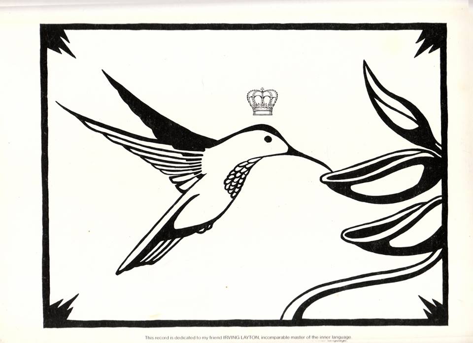
Dianne V. Lawrence, who designed Cohen’s hummingbird logo, a motif beginning with 1979’s Recent Songs album, speculates that Cohen equated the hummingbird’s enormous energy usage and sustenance requirements with those of the soul.
Read Remnick’s article on Leonard Cohen in its entirety here. Hear a recording of David Remnick’s interview with Cohen–his last ever–below:
Related Content:
Hear Leonard Cohen’s Final Interview: Recorded by David Remnick of The New Yorker
How Leonard Cohen Wrote a Love Song
Ayun Halliday is an author, illustrator, theater maker and Chief Primatologist of the East Village Inky zine. Join her in NYC on Monday, December 9 for her monthly book-based variety show, Necromancers of the Public Domain. Follow her @AyunHalliday.
Read More...Watch J.S. Bach’s “Air on the G String” Played on the Actual Instruments from His Time
There is no wrong way to listen to the music of Johann Sebastian Bach. You may prefer the austere, idiosyncratic piano interpretations of Glenn Gould; you may prefer the groundbreaking analog-synthesizer renditions painstakingly recorded by Wendy Carlos (whose early fans included Gould himself); or you may prefer faithful performances using only the instruments extant in the late 17th to mid-18th century period in which Bach lived. In that last case, the San Francisco early-music ensemble Voices of Music has you covered. You may remember us previously featuring their performances of Vivaldi and Pachelbel; in the video above, you can hear and see them play Bach.
More specifically, you can hear them play the second movement, Aria, from Bach’s orchestral suite in D Major, BWV 1068. The instruments they play it on include an Italian baroque violin from 1660 and an Austrian baroque viola from 1680, as well as more recently crafted examples rigorously modeled after instruments from that same era. “As instruments became modernized in the 19th century, builders and players tended to focus on the volume of sound and the stability of tuning,” says VoM’s explanation of their use of period instruments. “Modern steel strings replaced the older materials, and instruments were often machine made. Historical instruments, built individually by hand and with overall lighter construction, have extremely complex overtones — which we find delightful.”
Any lover of Bach’s music has heard this piece many times, not least due to its popularization in the late 19th century, in an arrangement by German violinist August Wilhelmj, as “Air on the G String.” The original work dates to “some time between the years 1717 and 1723,” writes music blogger Özgür Nevres, when Bach composed it for his patron Prince Leopold of Anhalt. It also holds the honor of being the first work by Bach ever recorded, “by the Russian cellist Aleksandr Verzhbilovich and an unknown pianist, in 1902 (as the Air from the Overture No. 3 in D major, BWV 1068).” But no matter how many different recordings from different eras of Bach’s orchestral suite in D Major in which you’ve steeped yourself, if you’ve only heard it played on modern instruments, a performance like Voices of Music’s shows that it still has surprises to offer.
Related Content:
Watch Glenn Gould Perform His Last Great Studio Recording of Bach’s Goldberg Variations (1981)
All of Bach for Free! New Site Will Put Performances of 1080 Bach Compositions Online
How a Bach Canon Works. Brilliant
Based in Seoul, Colin Marshall writes and broadcasts on cities, language, and culture. His projects include the book The Stateless City: a Walk through 21st-Century Los Angeles and the video series The City in Cinema. Follow him on Twitter at @colinmarshall, on Facebook, or on Instagram.
Read More...The Very First Picture of the Far Side of the Moon, Taken 60 Years Ago
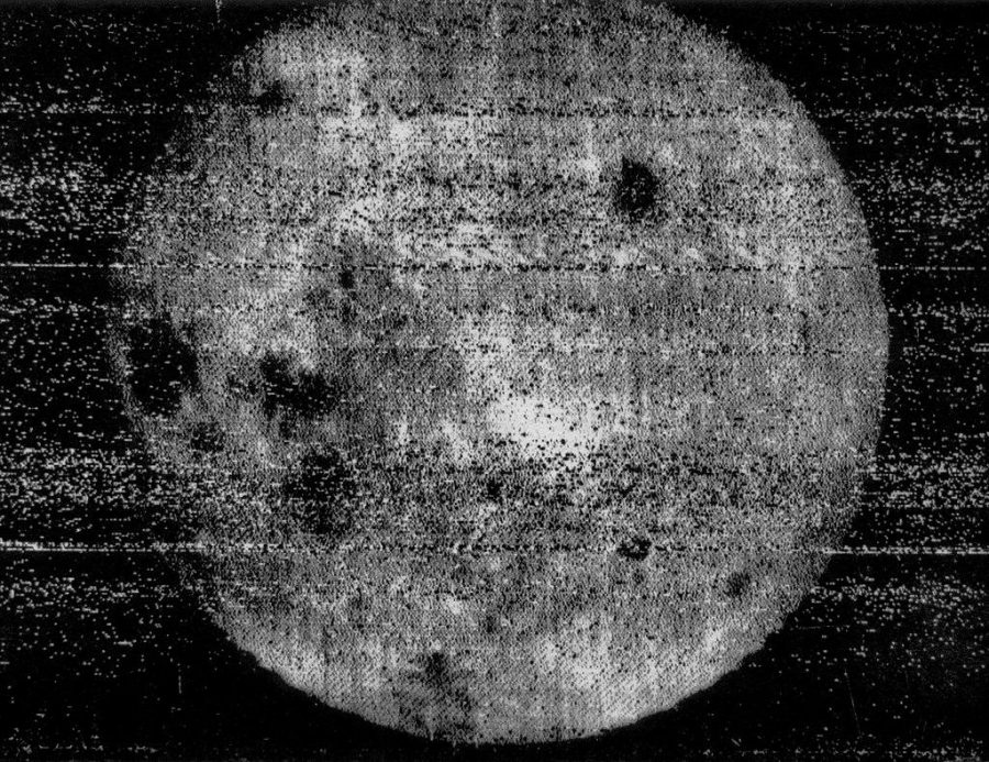
Sixty years ago, mankind got its very first glimpse of the far side of the Moon, so called because it faces away from the Earth. (And as astronomers like Neil DeGrasse Tyson have long taken pains to point out to Pink Floyd fans, it isn’t “dark.”) Taken by the Soviet Union, that first photo may not look like much today, especially compared to the high-resolution color images sent back from the surface itself by China’s Chang’e‑4 probe earlier this year. But with the technology of the late 1950s, even the technology commanded by the Soviets’ then-world-beating space program, the fact that it was taken at all seems not far short of miraculous. How did they do it?
“This photograph was taken by the Soviet spacecraft Luna 3, which was launched a month after the Luna 2 spacecraft became the first man-made object to impact on the surface of the Moon,” explains astronomer Kevin Hainline in a recent Twitter thread. “Luna 2 followed Luna 1, the first spacecraft to escape a geosynchronous Earth orbit.” Luna 3 was designed to take photographs of the Moon, hardly an uncomplicated prospect: “To take pictures you have to be stable on three-axes. You have to take the photographs remotely. AND you have to somehow transfer those pictures back to Earth.” The first three-axis stabilized spacecraft ever sent on a mission, Luna 3 “had to use a little photocell to orient towards the Moon so that now, while stabilized, it could take the pictures. Which it did. On PHOTOGRAPHIC FILM.”
Even those of us who took pictures on film for decades have started to take for granted the convenience of digital photography. But think back to all the hassle of traditional photography, then imagine making a robot carry them out in space. Once taken Luna 3’s photos “were then moved to a little CHEMICAL PLANT to DEVELOP AND DRY THEM.” (In other words, “Luna 3 had a little 1 Hour Photo inside.”) Then they continued into “a device that shone a cathode ray tube, like in an older TV, through them, towards a device that recorded the brightness and converted this to an electrical signal.” You can read about what happened then in more detail at Damn Interesting, where Alan Bellows describes how the spacecraft sent “the lightness and darkness information line-by-line via frequency-modulated analog signal — in essence, a fax sent over radio.”
Soviet Scientists could thus “retrieve one photographic frame every 30 minutes or so. Due to the distance and weak signal, the first images received contained nothing but static. In subsequent attempts in the following few days, an indistinct, blotchy white disc began to resolve on the thermal paper printouts at Soviet listening stations.” As Luna 3’s photos became clearer, they revealed, as Hainline puts it, that “the backside of the moon was SO WEIRD AND DIFFERENT” — covered in the craters, for example, which have become its visual signature. For a modern-day equivalent to this achievement, we might look not just to Chang’e‑4 but to the image of a black hole captured by the Event Horizon Telescope this past April — the one that led to an abundance of articles like “In Defense of the Blurry Black Hole Photo” and “We Need to Admit That the Black Hole Photo Isn’t Very Good.” Astrophotography has come a long way, but at least back in 1959 it didn’t produce quite so many takes.
Related Content:
Mankind’s First Steps on the Moon: The Ultra High Res Photos
8,400 Stunning High-Res Photos From the Apollo Moon Missions Are Now Online
How Scientists Colorize Those Beautiful Space Photos Taken By the Hubble Space Telescope
There’s a Tiny Art Museum on the Moon That Features the Art of Andy Warhol & Robert Rauschenberg
The Glorious Poster Art of the Soviet Space Program in Its Golden Age (1958–1963)
Wonderfully Kitschy Propaganda Posters Champion the Chinese Space Program (1962–2003)
Based in Seoul, Colin Marshall writes and broadcasts on cities, language, and culture. His projects include the book The Stateless City: a Walk through 21st-Century Los Angeles and the video series The City in Cinema. Follow him on Twitter at @colinmarshall or on Facebook.
Read More...Bowie’s Bookshelf: A New Essay Collection on The 100 Books That Changed David Bowie’s Life
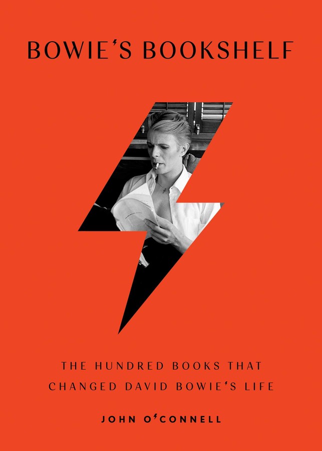
Like some rock stars of his generation, David Bowie had a literary cast of mind; unlike most of those colleagues, he also made his association with books explicit. (Not for nothing did he appear on that READ poster.) Whenever this subject arises, it’s tempting to bring up the story of how The Man Who Fell to Earth director Nicolas Roeg poked fun at the extreme number of books with which Bowie surrounded himself during the time he was acting in that film, as we did when we posted about the David Bowie book club. Launched by Bowie’s son, the filmmaker Duncan Jones, that project was meant to read through Bowie’s own list of top 100 books, previously featured here on Open Culture. Now, thanks to the work of music journalist John O’Connell, Bowie’s love of books has a book of its own.
Published in the UK as Bowie’s Books and in the US as Bowie’s Bookshelf, O’Connell’s essay collection takes the 100 books the man who was Ziggy Stardust, Aladdin Sane, and The Thin White Duke named as favorites. In each he finds the relevant questions (or at least fascinating ones) to ask about each book’s relationship to Bowie’s life and work: “How did the power imbued in a single suit of armor in The Iliad impact a man who loved costumes, shifting identity, and the siren song of the alter-ego?” Or, “How did the poems of T.S. Eliot and Frank O’Hara, the fiction of Vladimir Nabokov and Anthony Burgess, the comics of The Beano and The Viz, and the groundbreaking politics of James Baldwin influence Bowie’s lyrics, his sound, his artistic outlook?”
Kirkus Reviews notes that “many of Bowie’s selections speak to his obvious passion for music, especially early rock ’n’ roll and R&B (Greil Marcus, Gerri Hershey), his famous Japanophilia (Yukio Mishima, Tadanori Yokoo), and his stint in Germany (Alfred Döblin, Otto Friedrich).” O’Connell’s completist analysis of Bowie’s top-100-books list, composed for an exhibition at the Victoria & Albert Museum just six years ago, also reveals “the range and playfulness in Bowie’s reading, from hefty tomes on the Russian Revolution to laddish comic books like The Beano.” Other essays cover Lolita, The Gnostic Gospels, A Confederacy of Dunces, and White Noise, all part of a mixture that would tantalize any cultural critic — much like the work of David Bowie, who still constitutes a culture unto himself.
Bowie’s Bookshelf: The Hundred Books that Changed David Bowie’s Life can be ordered now.
Related Content:
David Bowie Urges Kids to READ in a 1987 Poster Sponsored by the American Library Association
The Story of How David Jones Became David Bowie Gets Told in a New Graphic Novel
David Bowie Picks His 12 Favorite David Bowie Songs: Listen to Them Online
Based in Seoul, Colin Marshall writes and broadcasts on cities, language, and culture. His projects include the book The Stateless City: a Walk through 21st-Century Los Angeles and the video series The City in Cinema. Follow him on Twitter at @colinmarshall or on Facebook.
Read More...The Morals That Determine Whether We’re Liberal, Conservative, or Libertarian
An old friend once wrote a line I’ll never forget: “There are two kinds of people in the world, then there are infinitely many more.” It always comes to mind when I confront binary generalizations that I’m told define two equally opposing positions, but rarely capture, with any accuracy, the complexity and contrariness of human beings—even when said humans live inside the same country.
Voting patterns, social media bubbles, and major network infotainment can make it seem like the U.S. is split in two, but it is split into, if not an infinity, then a plurality of disparate ideological dispositions. But let’s say, for the sake of argument, that there are two kinds of people. Let’s say the U.S. divides neatly into “liberals” and “conservatives.” What makes the difference between them? Fiscal policy? Education? Views on “law and order,” social welfare, science, religion, public versus private good? Yes, but….
Best-selling NYU psychologist Jonathan Haidt has controversially claimed that morality—based in emotion—really drives the wedge between competing “tribes” engaged in pitched us-versus-them war. The real contest is gut-level, mostly centered on disgust these days, one of the most primitive of emotional responses (we learn in the hand-drawn animation of a Haidt lecture below). Haidt argues that our sense of us and them is rooted, irrevocably, in our earliest cognitions of physical space.
Haidt situates his analysis under the rubric of “moral foundations theory,” a school of thought “created by a group of social and cultural psychologists to understand why morality varies so much across cultures yet still shows so many similarities and recurrent themes.” Another moral foundations theorist, Peter Ditto, professor of Psychology and Social Behavior at the University of California, Irvine, uses his research to draw similar conclusions about “hyperpartisanship” in the U.S. According to Ditto, as he describes in the short video at the top, “morals influence if you’re liberal or conservative.”
How? Ditto identifies five broad, universal moral categories, or “pillars,” that predict political thought and behavior: harm reduction, fairness, loyalty, authority/tradition, and purity. These concerns receive different weighting between self-identified liberals and conservatives in surveys, with liberals valuing harm reduction and fairness highly and generally overlooking the other three, and conservatives giving equal weight to all five (on paper at least). Ditto does step outside the binary in the last half of the segment, noting that his studies turned up a significant number of people who identified as libertarians.
He takes a particular interest in this category. Libertarians, says Ditto, don’t rank any moral value highly, marking their worldview as “pragmatic” and strikingly amoral. They appear to be intensely self-focused and lacking in empathy. Other strains—from democratic socialism to anarchism to fascism—that define American politics today, go unmentioned, as if they didn’t exist, though they are arguably as influential as libertarianism in the strange flowerings of the American left and right, and inarguably as deserving of study.
The idea that one’s morals define one’s politics doesn’t seem particularly novel, but the research of psychologists like Haidt and Ditto offers new ways to think about morality in public life. It also raises pertinent questions about the gulf between what people claim to value and what they actually, consistently, support, and about how the evolution of moral sensibilities seems to sort people into groups that also share historical identities, zip codes, and economic interests. Nor can we cannot discount the active shaping of public opinion through extra-moral means. Finally, in a two-party system, the options are as few as they can be. Political allegiance can be as much convenience, or reaction, as conviction. We might be right to suspect that any seeming political—or moral—unity on one side or the other could be an effect of amplified oversimplification.
Related Content:
Do Ethicists Behave Any Better Than the Rest of Us?: Here’s What the Research Shows
Josh Jones is a writer and musician based in Durham, NC. Follow him at @jdmagness
Read More...Support Us
We're hoping to rely on loyal readers, rather than erratic ads. Please click the Donate button and support Open Culture. You can use Paypal, Venmo, Patreon, even Crypto! We thank you!

About Us

Open Culture scours the web for the best educational media. We find the free courses and audio books you need, the language lessons & educational videos you want, and plenty of enlightenment in between.
Advertise With Us
FREE UPDATES!
GET OUR DAILY EMAIL
Get the best cultural and educational resources on the web curated for you in a daily email. We never spam. Unsubscribe at any time.
FOLLOW ON SOCIAL MEDIA
Open Culture editor Dan Colman scours the web for the best educational media. He finds the free courses and audio books you need, the language lessons & movies you want, and plenty of enlightenment in between.
Advertise With Us

