Frank Zappa’s Surreal Movie 200 Motels: The First Feature Film Ever Shot on Videotape (1971)
As a famous first, Frank Zappa’s 1971 film 200 Motels set a standard for hundreds of wacky experimental, B‑movies to come. The first full-length film shot entirely on videotape, the cheap alternative to film that had thus far been used primarily for TV shows and news broadcasts, the movie exploited the medium’s every possibility. “If there is more that can be done with videotape,” wrote Roger Ebert in his review at the time, “I do not want to be there when they do it.”
The movie is not only a “joyous, fanatic, slightly weird experiment in the uses of the color videotape process”; it is also a visual encapsulation of Zappa’s most comically juvenile, most musically virtuosic sensibilities, with Ringo Star playing “Zappa as ‘a very large dwarf,’” the Mothers of Invention playing themselves, Keith Moon appearing as a nun, the Royal Philharmonic Orchestra taking abuse from Zappa, and a series of rowdy, raunchy misadventures piled one atop the other.
“It assaults the mind with everything on hand,” Ebert both marveled and half-complained. “Videotape reportedly allowed Zappa to film the entire movie in about a week, to do a lot of the editing and montage in the camera and to use cheap videotape for his final editing before transferring the whole thing to a surprisingly high-quality 35mm image.” As the making-of documentary below notes, the movie was edited without “the use of computer facilities,” and its layers of effects helped invent new aesthetic forms which now feel quite familiar.
Hyperkinetic, surrealist, and bizarre, 200 Motels is a mélange of animation, musical performance, crude jokes, and “a kind of magical mystery trip,” wrote Ebert, “through all the motels, concert halls, cities, states and groupies of a road tour.” It was not beloved by critics then (though Ebert gave it 3 out of 4 stars) and still gets a mixed reception. It may or may not be the “kind of movie you have to see more than once,” given its full-on sensory assault.
But Zappa’s experimental tour de force is essential viewing for Zappa fans, and also for students of the videotape aesthetic that has become an almost classic style in its own right. We can see in 200 Motels the roots of the music video—Zappa was a decade ahead of MTV—though, for better or worse, its “whimsically impenetrable plotline and absurdist sub-Monty Python humor,” as Ian Gittens writes at The Guardian, “were met with widespread bafflement and it sank without a trace.”
In the 80s, however, 200 Motels found new life in a format that seemed well suited to its look, VHS. Then it found a home on the internet, that Valhalla of ancient video of every kind. A touted DVD boxset, it appears, will not be coming. (Seems the distributer has been slapped with a “winding up order” of some kind.) But you can find it on disc, “intact and with the correct aspect ratio” as one happy reviewer notes.
Whatever medium you happen to watch 200 Motels on, your experience of it will very much depend on your tolerance for Zappa’s brand of scatological satire. But if you’re willing to take Roger Ebert’s word for such things, you should try to see this oddball piece of movie history at least once.
Related Content:
Frank Zappa Explains the Decline of the Music Business (1987)
Hear the Musical Evolution of Frank Zappa in 401 Songs
Frank Zappa’s Amazing Final Concerts: Prague and Budapest, 1991
Josh Jones is a writer and musician based in Durham, NC. Follow him at @jdmagness.
Read More...How Monument Valley Became the Most Iconic Landscape of the American West
The American West has never been a place so much as a constellation of events—incursion, settlement, seizure, war, containment, and extermination in one order or another. These bloody histories, sanitized and seen through anti-indigenous ideology, formed the backdrop for the American Western—a genre that depends for its existence on creating a convincing sense of place.
But where most Westerns are supposed to be set—Colorado, California, Texas, Kansas, or Montana—seems less important than that their scenery conform to a stereotype of what The West should look like. That image has, in film after film, been supplied by the towering buttes of Monument Valley. The Vox video above tells the story of how this particular place became the symbol of the American West, beginning with the ironic fact that Monument Valley isn’t actually part of the U.S., but a tribal park on the Navajo Nation reservation, inside the states of Utah and Arizona.
“For centuries, only Native Americans, specifically the Paiute and Navajo, occupied this remote landscape, fielding conflicts with the U.S. government.” That would change when settlers and sheep traders Harry and Leone “Mike” Goulding set up a trading post right outside Navajo territory on the Utah side. Goulding tried tirelessly to attract tourists to Monument Valley during the Great Depression but didn’t get any traction until he took photos of the landscape to Hollywood.
The movie world immediately saw potential, and Western directing legend John Ford chose the stunning location for his 1939 film Stagecoach. It would be the first of scores of films shot in Monument Valley and the origin of cinematic iconography now inseparable from our idea of the rugged American West. The landscape, and Ford’s vision, elevated the Western from low-budget pulp to “one of Hollywood’s most popular genres for the next 20 years.”
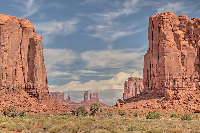
Photo by Dsdugan, via Wikimedia Commons
Stagecoach provided the “breakout role for American icon John Wayne” (who once declared that Native people “selfishly tried to keep their land” for themselves and thus deserved to be dispossessed.) And just as Wayne became the face of the Western hero, Monument Valley became the central icon of its mythos. Ford used Monument Valley seven more times in his films, most notably in The Searchers, set in Texas, widely praised as one of the best Westerns ever made.
Ford’s final film to feature the landscape takes place all over the country, appropriately, given its title, How the West Was Won. Its all-star cast, including Wayne, sold this major 1962 epic, marketed with the tagline “24 great stars in the mightiest adventure ever filmed.” But it wouldn’t have been a true Western at that point, or not a true John Ford Western, without Monument Valley as one of its many landscapes. The imagery may have become cliché, but “clichés are useful for storytelling,” signaling to audiences “what kind of story this is.”
From Stagecoach to Marlboro Ads to Thelma and Louise to The Lego Movie to the Cohen Brothers’ comic classic Western tribute The Ballad of Buster Scruggs, the image of Monument Valley has become shorthand for freedom, adventure, and the risks of the frontier. But like other iconic places in other forbidding landscapes around the world, the myth of Monument Valley covers over the historical and present-day struggles of real people. We get a little bit of that story in the Vox explainer, but mostly we learn how Monument Valley became an endlessly repeating “backdrop” that “could be anywhere in the West.”
Related Content:
The Great Train Robbery: Where Westerns Began
John Wayne: 26 Free Western Films Online
Josh Jones is a writer and musician based in Durham, NC. Follow him at @jdmagness
Read More...Peruvian Scholar Writes & Defends the First Thesis Written in Quechua, the Main Language of the Incan Empire
We hear many tragic stories of disappearing indigenous languages, their last native speakers dying out, and the symbolic and social worlds embedded in those languages going with them, unless they’re recorded (or recovered) by historians and archived in museums. Such reporting, sad but necessary, can sometimes obscure the millions of living indigenous language speakers who suffer from systemic neglect around the world.
The situation is beginning to change. The UN has called 2019 the Year of Indigenous Languages, not only to raise awareness of the loss of language diversity, but also to highlight the world’s continued linguistic richness. A 2015 World Bank report estimated that 560 different languages are spoken in Latin America alone.
The South American language Quechua—once a primary language of the Incan empire—claims one of the highest number of speakers: 8 million in the Andean region, with 4 million of those speakers in Peru. Yet, despite continued widespread use, Quechua has been labeled endangered by UNESCO. “Until recently,” writes Frances Jenner at Latin American Reports, “the Peruvian government had few language preservation policies in place.”
“In 2016 however, TV Perú introduced a Quechua-language daily news program called Ñuqanchik meaning ‘All of us,’ and in Cusco, the language is starting to be taught in some schools.” Now, Peruvian scholar Roxana Quispe Collantes has made history by defending the first doctoral thesis written in Quechua, at Lima’s 468-year old San Marco University. Her project examines the Quechuan poetry of 20th century writer Alencastre Gutiérrez.
Collantes began her thesis presentation with a traditional thanksgiving ceremony,” writes Naveen Razik at NITV News, “and presented her study titled Yawar Para (Blood Rain),” the culmination of seven years spent “traveling to remote communities in the mountainous Canas region” to “verify the words and phrases used in Gutiérrez’s works.” The examiners asked her questions in Quechua during the nearly two hour examination, which you can see above.
The project represents a significant personal achievement for Collantes who “grew up speaking Quechua with her parents and grandparents in the Acomayo district of Cusco,” reports The Guardian. Collante’s work also represents a step forward for the support of indigenous language and culture, and the recognition of Quechua in particular. The language is foundational to South American culture, giving Spanish—and English—words like puma, condor, llama, and alpaca.
But it is “rarely—if ever—heard on national television or radio stations.” Quechua speakers, about 13% of Peruvians, “are disproportionately represented among the country’s poor without access to health services.” The stigma attached to the language has long been “synonymous with discrimination” and “social rejection” says Hugo Coya, director of Peru’s television and radio institute and the “driving force” behind the new Quechua news program.
Collantes’ work may be less accessible to the average Quechua speaker than TV news, but she hopes that it will make major cultural inroads towards greater acceptance. “I hope my example will help to revalue the language again and encourage young people, especially young women, to follow my path, “she says. “My greatest wish is for Quechua to become a necessity once again. Only by speaking it can we revive it.” Maybe in part due to her extensive efforts, UNESCO can take Quechua off its list of 2,860 endangered languages.
Related Content:
The Tree of Languages Illustrated in a Big, Beautiful Infographic
Josh Jones is a writer and musician based in Durham, NC. Follow him at @jdmagness
Read More...The Beauty of Degraded Art: Why We Like Scratchy Vinyl, Grainy Film, Wobbly VHS & Other Analog-Media Imperfection
“Whatever you find weird, ugly, or nasty about a medium will surely become its signature,” writes Brian Eno in his published diary A Year with Swollen Appendices. “CD distortion, the jitteriness of digital video, the crap sound of 8‑bit — all these will be cherished as soon as they can be avoided.” Eno wrote that in 1995, when digital audio and video were still cutting-edge enough to look, sound, and feel not quite right yet. But when DVD players hit the market not long thereafter, making it possible to watch movies in flawless digital clarity, few consumers with the means hesitated to make the switch from VHS. Could any of them have imagined that we’d one day look back on those chunky tapes and their wobbly, muddy images with fondness?
Anyone with much experience watching Youtube has sensed the lengths to which its creators go in order to deliberately introduce into their videos the visual and sonic artifacts of a pre-digital age, from VHS color bleed and film-surface scratches to vinyl-record pops and tape hiss. “Why do we gravitate to the flaws that we’ve spent more than a century trying to remove from our media?” asks Noah Lefevre, creator of the Youtube channel Polyphonic, in his video essay “The Beauty of Degraded Media.” He finds examples everywhere online, even far away from his platform of choice: take the many faux-analog filters of Instagram, an app “built around artificially adding in the blemishes and discolorations that disappeared with the switch to digital photography.”
Lefevre even traces humanity’s love of degraded media to works and forms of art long predating the internet: take now-monochromatic ancient Greek statues, which “were originally painted with bold, bright colors, but as the paints faded, the art took on a new meaning. The pure white seems to carry an immaculate beauty to it that speaks to our perception of Greek philosophies and myths centuries later.” He likens what he and other digital-media creators do today to a kind of reverse kintsugi, the traditional Japanese art of repairing broken pottery with conspicuous gold and silver seams: “Instead of filling in flaws in imperfect objects, we’re creating artificial flaws in perfect objects.” Whether we’re streaming video essays and vaporwave mixes or watching VHS tapes and spinning vinyl records, “we want our media to feel lived in.”
Or as Eno puts it, we want to hear “the sound of failure.” And we’ve always wanted to hear it: “The distorted guitar is the sound of something too loud for the medium supposed to carry it. The blues singer with the cracked voice is the sound of an emotional cry too powerful for the throat that releases it. The excitement of grainy film, of bleached-out black and white, is the excitement of witnessing events too momentous for the medium assigned to it.” This leads into advice for artists, something that Eno — who has made as much use of deliberate imperfection in his role as a producer for acts like U2 and David Bowie as he has in his own music and visual art — has long excelled at giving: “When the medium fails conspicuously, and especially if it fails in new ways, the listener believes something is happening beyond its limits.” It was true of art in the 90s, and it’s even truer of art today.
Related Content:
A Celebration of Retro Media: Vinyl, Cassettes, VHS, and Polaroid Too
Brian Eno Explains the Loss of Humanity in Modern Music
How Computers Ruined Rock Music
How Ancient Greek Statues Really Looked: Research Reveals Their Bold, Bright Colors and Patterns
Based in Seoul, Colin Marshall writes and broadcasts on cities, language, and culture. His projects include the book The Stateless City: a Walk through 21st-Century Los Angeles and the video series The City in Cinema. Follow him on Twitter at @colinmarshall or on Facebook.
Read More...The Paintings of Miles Davis: Discover Visual Art Inspired by Kandinsky, Basquiat, Picasso, and Joni Mitchell
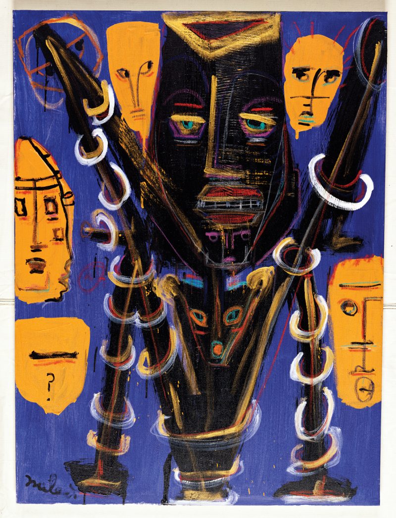
Few artists have lived as many creative lifetimes as Miles Davis did in his 65 years, continuing to evolve even after his death with the posthumous release of a lost album Rubberband earlier this year. The album’s cover, featuring an original painting by Davis himself, may have turned fans on to another facet of the composer/bandleader/trumpeter’s artistic evolution—his career as a visual artist, which he began in earnest just a decade before his 1991 death.
“During the early 1980s,” writes Tara McGinley at Dangerous Minds, Davis “made creating art as much a part of his life as making music…. He was said to have worked obsessively each day on art when he wasn’t touring and he studied regularly with New York painter Jo Gelbard.” Never one to do anything by half-measures, Davis turned out canvas after canvas, though he didn’t exhibit much in his lifetime.
He painted mainly for himself. “It’s like therapy for me,” he said, “and keeps my mind occupied with something positive when I’m not playing music.” Being the intimidating Miles Davis, however, it wasn’t exactly easy for him to find artistic peers with whom he could commune. When he first approached Gelbard, the artist says, “I was scared to death! I could barely speak.”
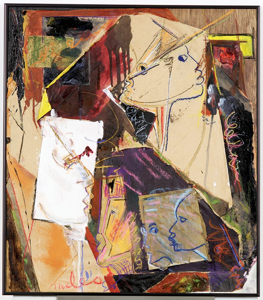
The two lived in the same New York building and Gelbard eventually relaxed enough to give Davis lessons, then later became his girlfriend, collaborating with him on work like the cover of the 1989 album Amandla. As she characterizes his style:
The way Miles painted was not the way he played or the way he sketched. He was so minimal and light-handed in his sound, in his walk. His body was very light; he was a slight man, a delicate kind of guy. His sketches are light and airy and minimal, but when he took his brush and paint, he was deadly – he was like a child with paints in kindergarten. He would pour it on and mix it until it got too muddy and over-paint. He just loved the texture and the feel. It got all over his clothes and his hands and his hair and it was just fun for him…
Miles also found a peer in fellow painter Joni Mitchell. She describes how he called her one day and said, “Joni, I like that painting that you did. Nice colors. I want to come over and watch you paint.” Davis, her musical hero, wouldn’t record with her (though she found out later that he owned all her records). “He would talk painting but he wouldn’t talk music with me.”
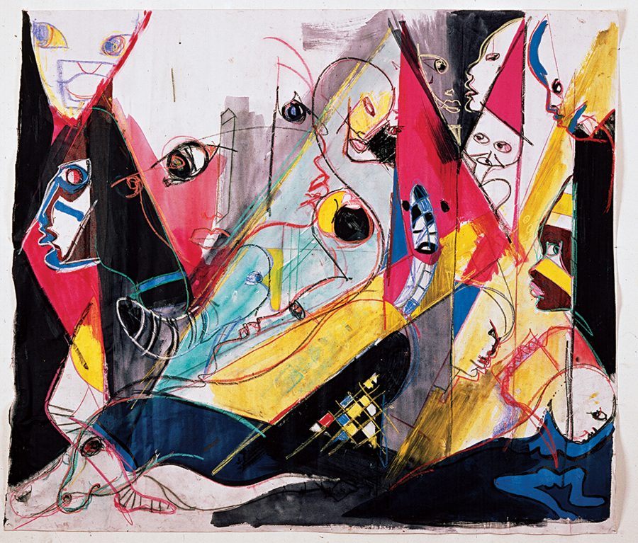
Davis’ paintings are rough and expressionistic, a counterpoint to the formal discipline of his music. (McGinley succinctly describes them as a “sharp, bold and masculine mixture of Kandinsky, Jean-Michel Basquiat, Picasso and African tribal art”.) He didn’t make inroads in the art world, but painting did become “a profitable sideline,” noted the L.A. Times in ’89. Friends and fellow musicians like Lionel Richie and Quincy Jones bought his work. “A magazine called Du in Zurich bought some of my sketches for a special edition they’re putting out on me,” he said.
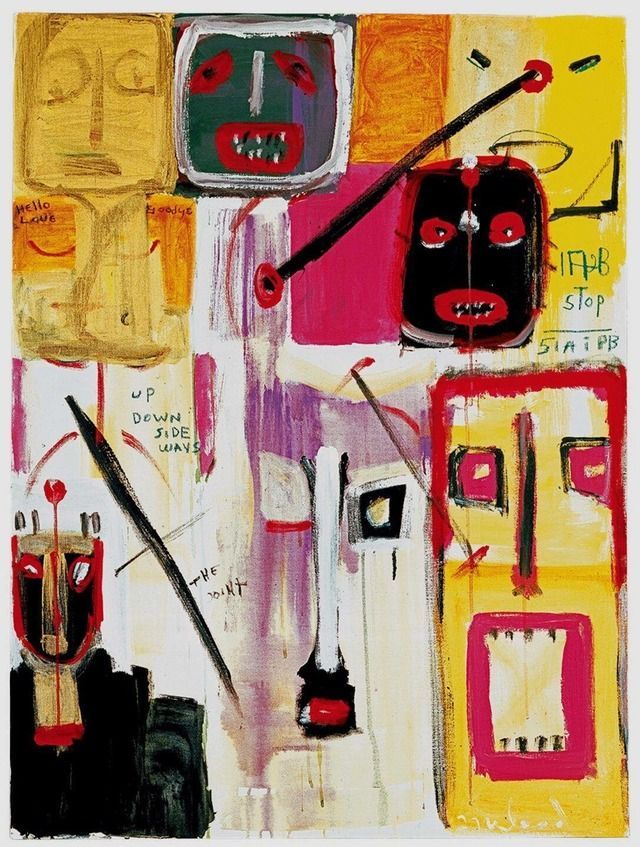
In 2013, a hardcover edition of his collected paintings appeared, with a foreword by Jones, perhaps the most avid of Miles Davis collectors. There are many other voices in the book, including author Steve Gutterman—who interviewed Davis before his death and writes an introduction—and various family members who contribute personal stories. Miles sums up his own “refreshingly unpretentious attitude” toward his artwork in one brief statement: “It ain’t that serious.”
Pick up a copy of Miles Davis: The Collected Artwork here.
Note: This post updates material that first appeared on our site in 2014.
Related Content:
Kind of Blue: How Miles Davis Changed Jazz
Hear a 65-Hour, Chronological Playlist of Miles Davis’ Revolutionary Jazz Albums
Listen to The Night When Miles Davis Opened for the Grateful Dead in 1970
The Influence of Miles Davis Revealed with Data Visualization: For His 90th Birthday Today
Josh Jones is a writer and musician based in Durham, NC. Follow him at @jdmagness
Read More...A Collection of Vintage Fruit Crate Labels Offers a Voluptuous Vision of the Sunshine State
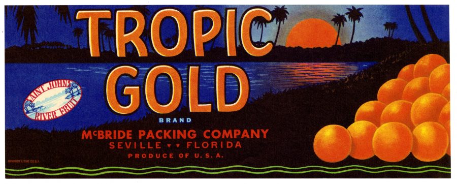
Ah, Florida… The Sunshine State.
Tourists began flocking to it in earnest once the railroads expanded in the late 19th century, drawn by visions of sunset beaches, graceful palms, and plump citrus fruit in a warm weather setting.
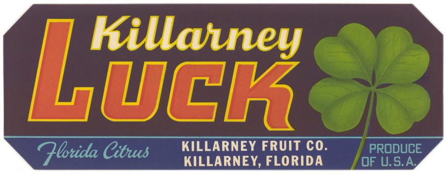
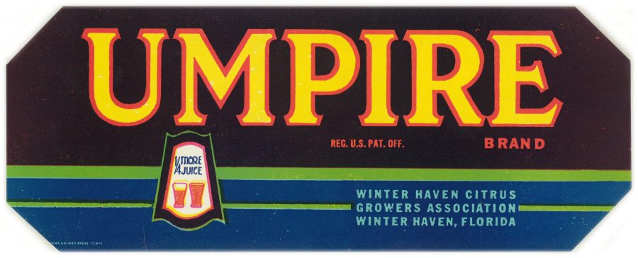
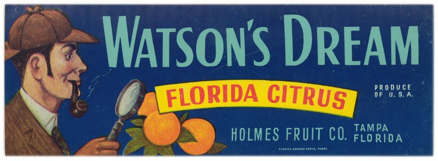
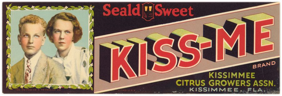
The fantasy gathered steam in the 1920s when citrus growers began affixing colorful labels to the fruit crates that shipped out over those same railroad lines, seeking to distinguish themselves from the competition with memorable visuals.
These labels offered lovers of grapefruit and oranges who were stuck in colder climes tantalizing glimpses of a dreamy land filled with Spanish Moss and graceful long-legged birds. Words like “golden” and “sunshine” sealed the deal.
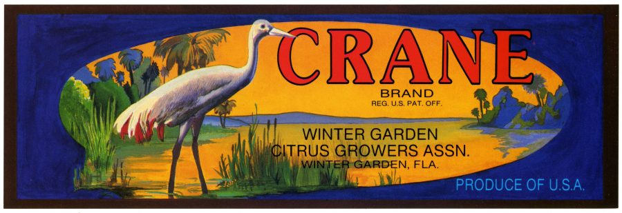
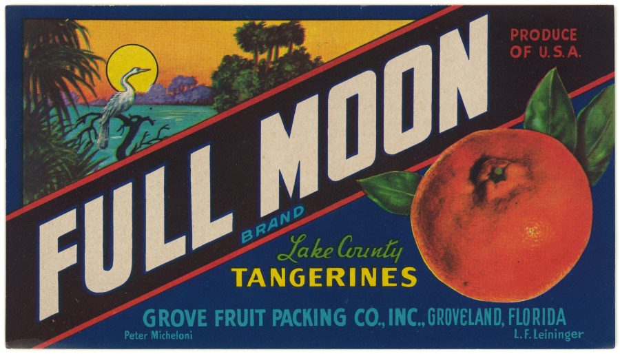
(The reality of citrus picking, then and now, is one of hard labor, usually performed by underpaid, unskilled migrants.)
The State Library of Florida’s Florida Crate Label Collection has amassed more than 600 examples from the 1920s through the 1950s, many of which have been digitized and added to a searchable database.
While the majority of the labels peddle the sunshine state mythos, others pay homage to growers’ family members and pets.
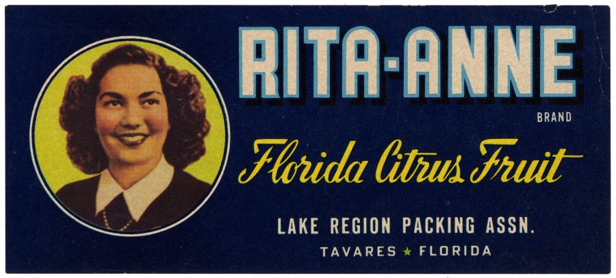
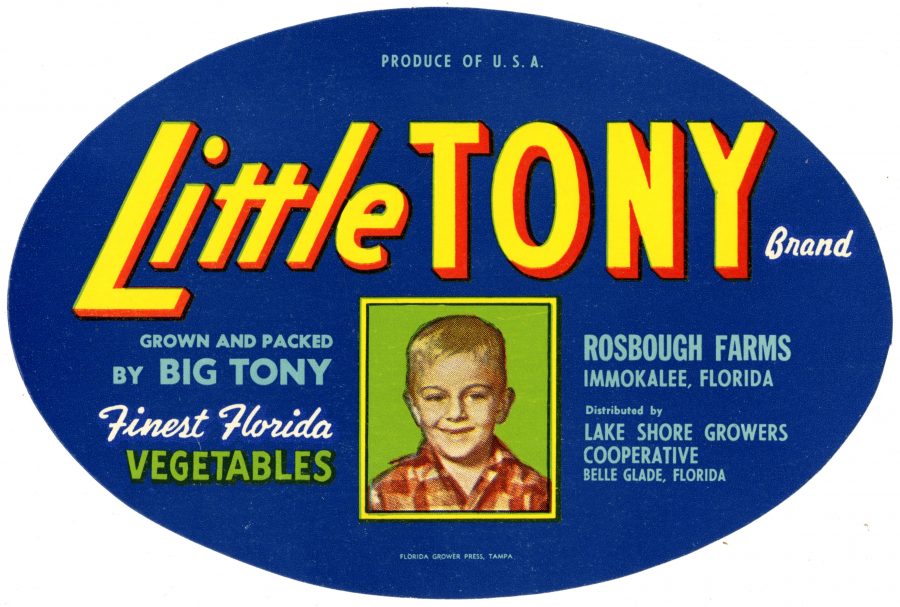
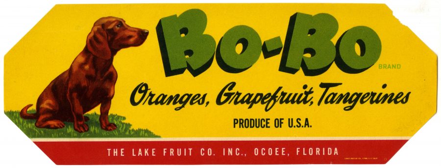
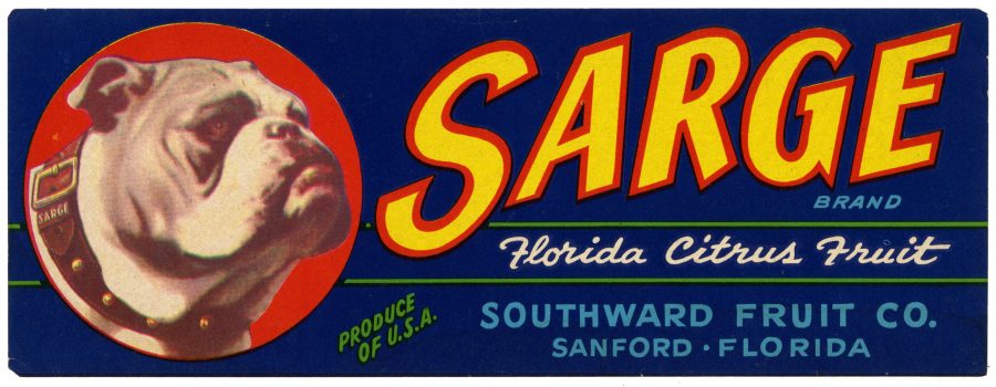
Others like Killarney Luck, Umpire, Sherlock’s Delight, and Watson’s Dream built brand identity by playing on the grove’s name or location, though one does wonder about the models for the deliciously dour Kiss-Me label. Siblings, perhaps? Maybe the Kissimmee Citrus Growers Association disapproved of the PDA their name seems so ripe for.
Native Americans’ prominent representation likely owed as much to the public’s fascination with Westerns as to the state’s tribal heritage, evident in the names of so many locations, like Umatilla and Immokalee, where citrus crops took root.
Meanwhile, Mammy, Aunty, and Dixieland brands relied on a stereotypical representation of African-Americans that had a proven track record with consumers of pancakes and Cream of Wheat.
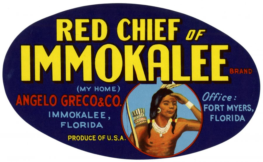
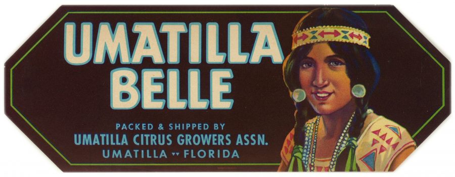
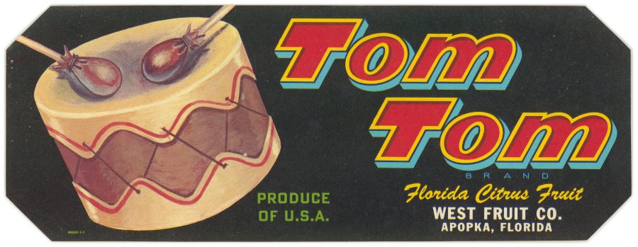
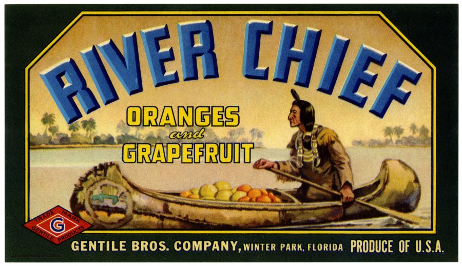
The vibrantly illustrated crate labels were put on hold during World War II, when the bulk of the citrus crop was earmarked for the military.
By the mid-50s, cardboard boxes on which company names and logos could be printed directly had become the industry standard, relegating crate labels to antique stores, swap meets, and flea markets.
Begin your exploration of the Florida Crate Label Collection here, browsing by image, place, company, or brand name.

Via Kottke
Related Content:
An Archive of 3,000 Vintage Cookbooks Lets You Travel Back Through Culinary Time
Browse a Collection of Over 83,500 Vintage Sewing Patterns
Ayun Halliday is an author, illustrator, theater maker and Chief Primatologist of the East Village Inky zine. Join her in NYC on Monday, November 4 when her monthly book-based variety show, Necromancers of the Public Domain celebrates Louise Jordan Miln’s “Wooings and Weddings in Many Climes (1900). Follow her @AyunHalliday.
Read More...
Explore 1400 Paintings & Drawings by Vincent van Gogh–and Much More–at the Van Gogh Museum’s Online Collection
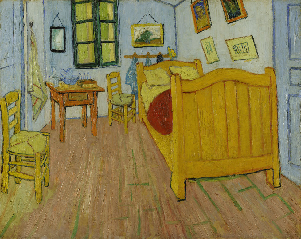
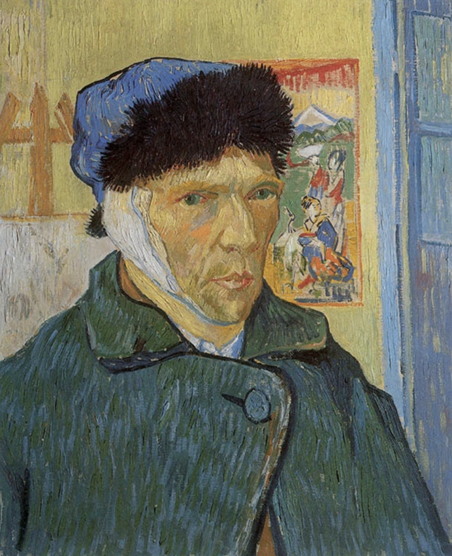
Readers will receive no prizes for guessing what they’ll find, broadly speaking, at the Van Gogh Museum. But they may well be surprised by the full scope of the Van Gogh and Van Gogh-related work and information on offer for their free perusal at the Van Gogh Museum’s online collection. Naturally, you can view and learn about all of the paintings and drawings by Vincent van Gogh in the collection, including some of his best-known pieces like The Potato Eaters, a scene of “the harsh reality of country life” the artist deliberately chose for its difficulty; The Bedroom (or Bedroom in Arles), with its bright colors “meant to express absolute ‘repose’ or ‘sleep’”; and, painted between 1886 and 1889, no fewer than 21 self-portraits, including Self-Portrait with Bandaged Ear, the face we think of when we think of van Gogh himself.
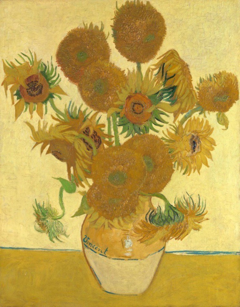
For van Gogh’s most famous series of floral still-life paintings the Van Gogh Museum’s online collection goes much deeper, offering an entire section of its site dedicated to “everything about Sunflowers.”
Among its subsections you’ll find the story of how van Gogh “painted sunflowers as no one before him had ever done,” a look into the conservation of one of the most fragile of the artist’s masterpieces, and even a for-the-young-and-young-at-heart Sunflowers coloring-book page. If you get through all that and still feel your appetite for post-impressionist renderings of Helianthus not fully satiated, the collection’s curators also offer a link to van Gogh’s other depictions of sunflowers, from Shed with Sunflowers to Sunflowers Gone to Seed.
Online or off, collections dedicated to the work of a single artist sometimes suffer tunnel vision, providing a wealth of detail about the life and the masterpieces, but little in the way of context. The Van Gogh Museum doesn’t, having put on view not just van Gogh’s work, but also that of the Japanese woodblock makers from whom he drew inspiration (previously featured here on Open Culture) as well as that of more recent artists who have drawn their own inspiration from van Gogh: Britain’s Jason Brooks, China’s Zeng Fanzhi, and the Netherlands’ own Pieter Laurens Mol, to say nothing of the likes of Edvard Munch and Francis Bacon. Elsewhere you can even explore “the Parisian print world of the 19th century,” a “period of artistic innovation and decadence” that did more than its part to shape van Gogh’s sensibility. As the Van Gogh Museum clearly understands, to know an artist requires immersing yourself not just in their work, but in their world as well. Enter the van Gogh online collection here.
Related Content:
Download Hundreds of Van Gogh Paintings, Sketches & Letters in High Resolution
13 of Van Gogh’s Paintings Painstakingly Brought to Life with 3D Animation & Visual Mapping
Van Gogh’s Ugliest Masterpiece: A Break Down of His Late, Great Painting, The Night Café (1888)
Based in Seoul, Colin Marshall writes and broadcasts on cities, language, and culture. His projects include the book The Stateless City: a Walk through 21st-Century Los Angeles and the video series The City in Cinema. Follow him on Twitter at @colinmarshall or on Facebook.
Read More...Watch 700 Videos Nostalgia-Inducing Videos from the Early Days of MTV
‘We’re gonna do for TV what FM did for radio’–Mark Goodman, the first ever MTV VJ.
When I was growing up, MTV was that rare commodity. Not all cable providers had it, and those that did charged an extra fee to get it. That meant there were certain kids in school that we were friends with just because their parents had it. (Sorry Tom, no hard feelings!)
This exhaustive (and sometimes exhausting) YouTube playlist offers 710 videos that were staples of the channel in its 1980s heyday, right through the ‘90s when it slowly morphed into a lifestyle channel and VH‑1 and then M2 picked up the slack of endlessly rotating memories.
Music videos had been around long before MTV. From Scopitones to the Beatles’ promo films for “Penny Lane” and such, visuals and pop music were natural allies. And through the ‘70s and early ‘80s, music programs mixed live studio performances with videos often. But not 24/7 often. And not, as the the first VJs proclaimed on August 1, 1981, in *stereo*. This was a big deal for a lot of people.
After introducing the crew one at a time–Mark Goodman, Alan Hunter, Martha Quinn, J.J. Jackson, and Nina Blackwood, all soon to become household names–the first video rolled: The Buggles’ “Video Killed the Radio Star.”
Early viewers soon discovered this however: MTV didn’t really have a lot of videos, and in that first year, certain ones got played more than their popularity deserved. (They seemed to play Saga’s “On the Loose” once every hour.) The other thing viewers noticed: there was a lot, a LOT of hard rock and Adult Oriented Rock as they used to say in radio marketing. After the new wave of the Buggles came Pat Benatar, Rod Stewart, REO Speedwagon, Styx, .38 Special, April Wine, Gerry Rafferty. (To be fair, there was also The Cars, Split Enz (!), and The Pretenders.
And then there were the predominantly white faces in all the videos. MTV was designed to appeal to rock fans and not, ahem, “urban listeners”. Electronic music, dance music, r’n’b, and other genres were noticeably absent. (It took public shaming by David Bowie and the undeniable pop juggernauts of Michael Jackson and Prince to change that.)
By 1982, the channel had expanded for many reasons. One of them was the amount of brilliant videos coming out of the UK, shot by directors who seemed to really get the potential of the art form. Tim Pope, Russell Mulcahy (who shot most of Duran Duran’s videos), and the duo of Annabel Jankel and Rocky Morton brought in a knowledge of film history, animation, and surrealism to their videos, which complemented the mix and match fashion of the New Romantics.
But on both sides of the Atlantic, artists were realizing the potential of the visual element to their entire identities. Plus, there was money. Lots and lots of money. (Some of it even went to the musicians!)
As the ‘80s came to a close, MTV had changed music culture for better and for worse. It had dedicated programs to rap music, to alternative music, to heavy metal, and turned Spring Break into a rite of passage. And there were still some good years left in it.
Music videos are everywhere on YouTube now, but atomized just like everything else. You forge your own path as you go down the rabbit hole. They still have the power to shock, like last year’s “This Is America” by Childish Gambino, or unite the country very briefly like “Old Town Road” by Lil NasX. But what is missing, really, is that repetition. We all knew what Michael Jackson looked like because “Billy Jean” and “Thriller” were on our TVs all the time. Same with Madonna. Now we know our stars from their social media, from their magazine spreads, from their live shows, and sometimes, just sometimes, from these little music films that used to be the center of the universe.
Watch the complete playlist of 700 early MTV videos here.
Related Content:
Watch David Bowie Take MTV to Task for Failing to Play Music Videos by Black Artists (1983)
Michel Gondry’s Finest Music Videos for Björk, Radiohead & More: The Last of the Music Video Gods
David Fincher’s Five Finest Music Videos: From Madonna to Aerosmith
Ted Mills is a freelance writer on the arts who currently hosts the artist interview-based FunkZone Podcast and is the producer of KCRW’s Curious Coast. You can also follow him on Twitter at @tedmills, read his other arts writing at tedmills.com and/or watch his films here.
Read More...Salvador Dalí’s Tarot Cards Get Re-Issued: The Occult Meets Surrealism in a Classic Tarot Card Deck

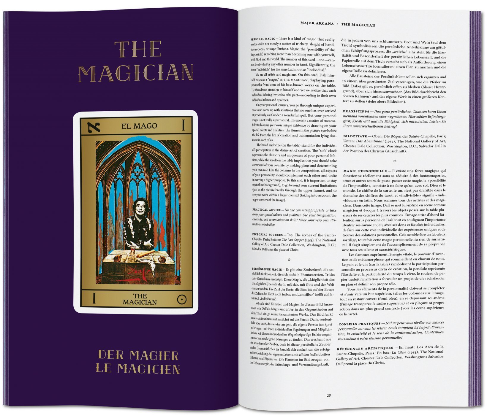
Tarot began as a card game and became a tool of occult divination. In that form, with its usually elaborate illustrations, the tarot deck found a major cultural role as an art object: here on Open Culture we’ve featured decks either designed or inspired by the likes of Aleister Crowley, H.R. Giger, Philip K. Dick, and Salvador Dalí. That last, whose limited edition was published in 1984, has proven to be enough of an object of desire to gain the attention of Taschen, the publisher of visually (and often, in terms of dimensions and weight, physically) intensive photo and art books. Next month they’re bringing out a new edition of Dalí’s tarot deck, boxed with a companion book by tarot scholar Johannes Fiebig.
“Legend has it that when preparing props for the James Bond film Live and Let Die, producer Albert Broccoli commissioned Surrealist maestro Salvador Dalí to create a custom deck of tarot cards,” says Taschen’s description of the product. (Bond fans will remember Jane Seymour as Solitaire, the tarot reader whom Roger Moore fatefully encounters early in the picture.)
Even though Dalí and Broccoli ultimately couldn’t come to an agreement — not least over the amount of money upon which the artist insisted — Dalí decided to see the work through to completion on his own.
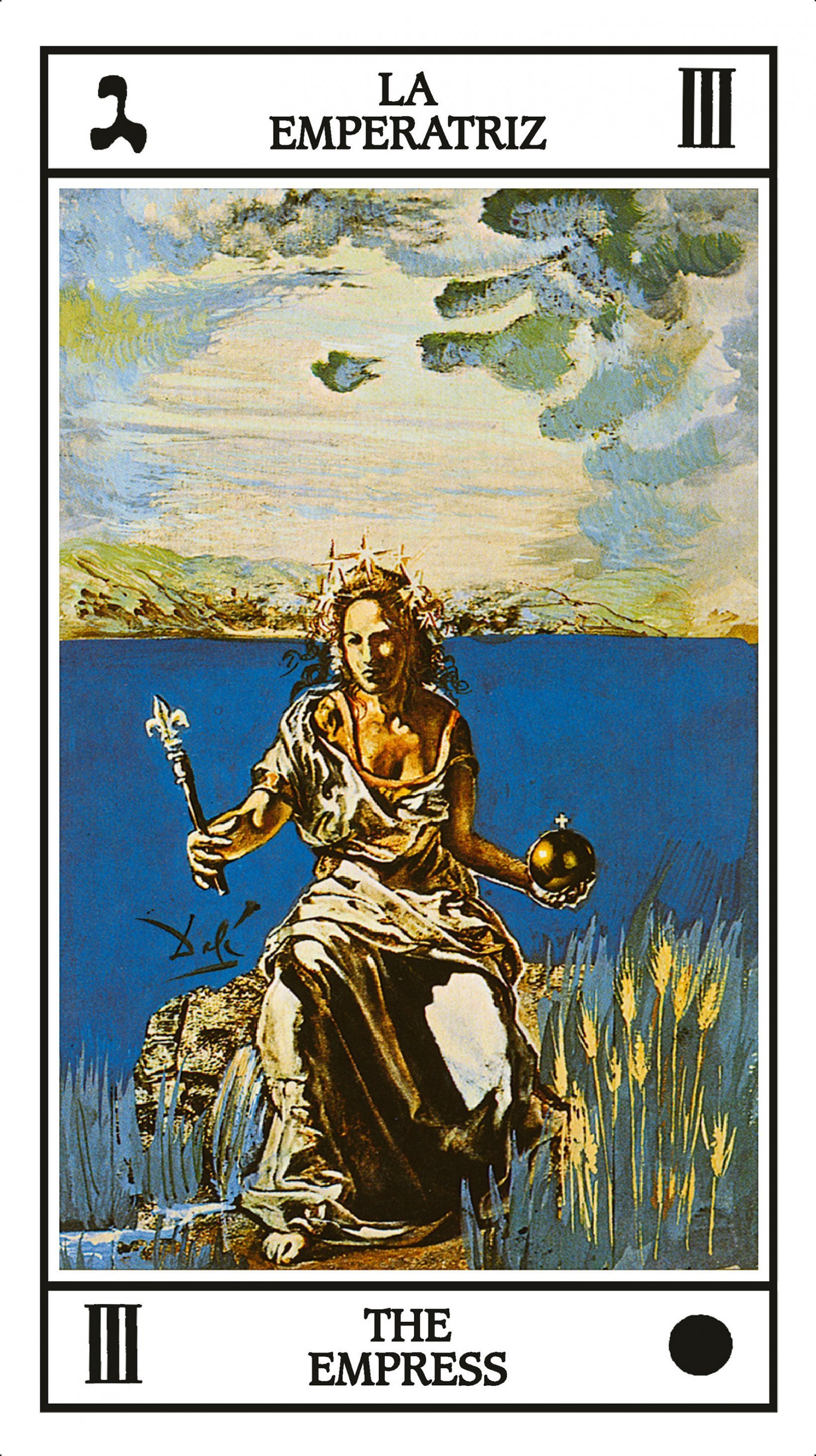
As Josh Jones noted when we previously featured Dalí’s tarot, the early 1970s was an auspicious time for such a project: “The occult interests of the 60s counterculture were mainstreamed in the 70s thanks to books like Stuart Kaplan’s Tarot Cards for Fun and Fortune Telling,” and Dalí had successfully tapped the mystical zeitgeist not long before with his illustrations for a 1969 edition of Alice’s Adventures in Wonderland. Drawing from all the Western art that came before his own, Dalí created a tarot deck that Taschen can now pitch as a “surreal kaleidoscope of European art history,” a kind of psychedelic course in Western civilization presented across 78 cards. Dalí also worked himself in, making an appearance as the Magician and the King of Pentacles, and including his wife Gala — whose interest in mysticism surely encouraged her husband’s own enthusiasm for the project — as the Empress.
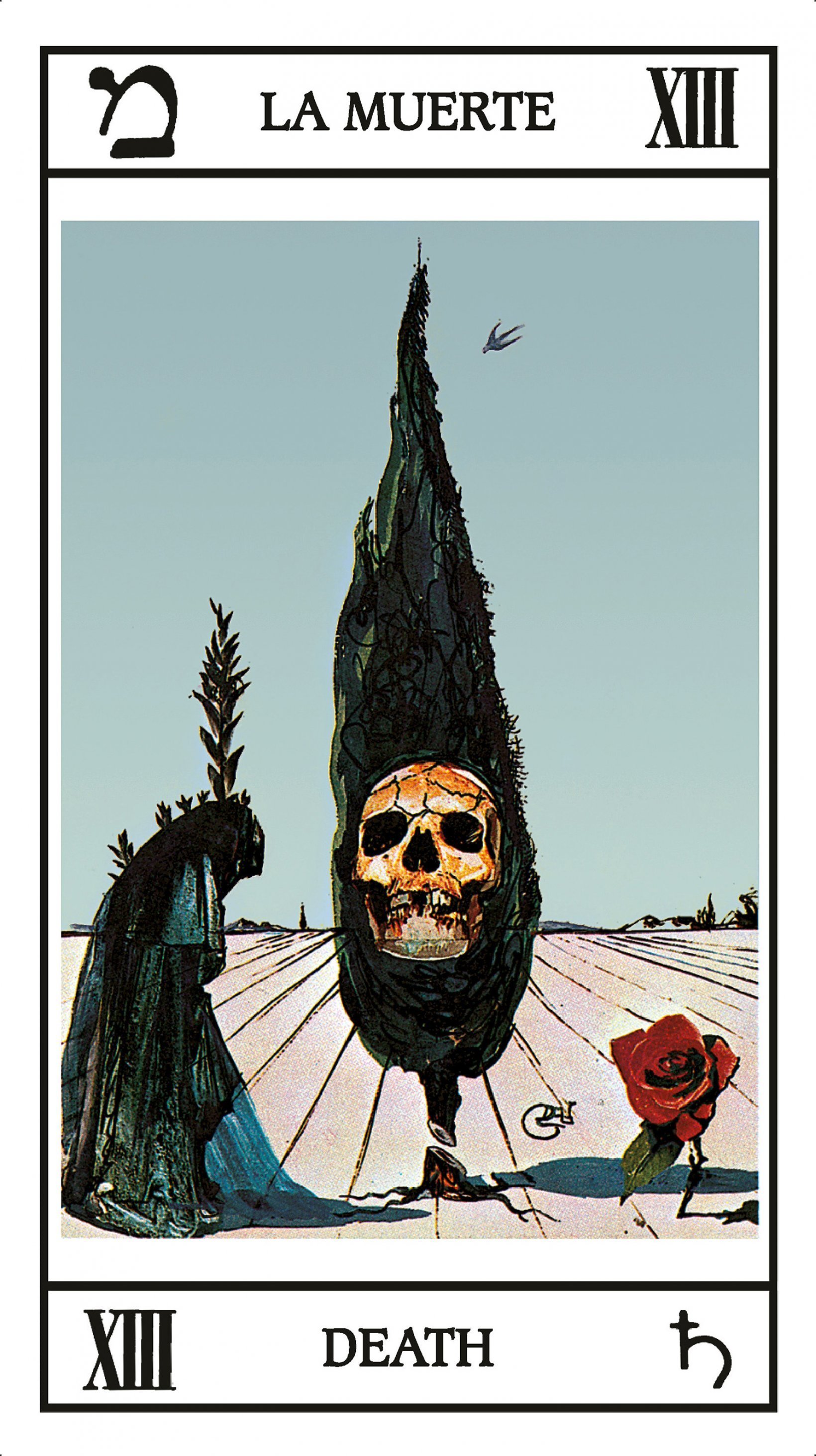
Anyone who has had an interest in Dalí’s work (and a lack of willingness to pay premium prices for those first editions) will find themselves intrigued by Taschen’s Dalí Tarot. Those unfamiliar with the rules of the tarot can rest assured that the companion book, in addition to providing stories about the deck’s conception, also includes Fiebig’s explanations of the meanings of the cards as well as how to perform readings with them. Perceived correctly, so enthusiasts say, the cards of the tarot open a window onto an alternate perception of reality — a similarity with Dalí’s art hardly lost on the artist himself. Order a copy (set to be released on November 15) here.
Related Content:
The Tarot Card Deck Designed by Salvador Dalí
Salvador Dalí’s Illustrations for The Bible (1963)
Salvador Dalí’s 1973 Cookbook Gets Reissued: Surrealist Art Meets Haute Cuisine
Salvador Dalí’s Avant-Garde Christmas Cards
Based in Seoul, Colin Marshall writes and broadcasts on cities, language, and culture. His projects include the book The Stateless City: a Walk through 21st-Century Los Angeles and the video series The City in Cinema. Follow him on Twitter at @colinmarshall or on Facebook.
Read More...Joni Mitchell Publishes a Book of Her Rarely Seen Paintings & Poetry
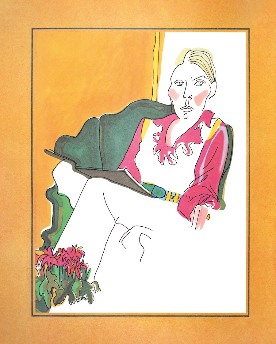
Self Portrait.”Art work by Joni Mitchell, from “Morning Glory on the Vine” / Courtesy Houghton Mifflin Harcourt
Joni Mitchell is a woman of many talents—too many for the label “singer-songwriter” to encompass. It does not capture the literary depth of her lyricism, the unique strength of her distinctive voice, or the deftness and versatility of her guitar playing. Nor the fact that she’s one of the most interesting personalities in rock (or folk-rock/folk/folk-jazz, whatever). Mitchell’s biography is riveting; her chatty and cantankerous interviews a treat.
And, if you somehow didn’t know from her many album covers, Mitchell is also an accomplished visual artist. “I have always thought of myself as a painter derailed by circumstance,” she said in 2000. “I sing my sorrow and I paint my joy.” It’s a great quote, though she also sings her joy and paints sorrow—as in the portrait of her hero, Miles Davis, made just after his death. (Davis was a painter too, and they bonded over art.)
Mitchell began selling her work “when I was in high school to dentists, doctors—small time,” she told Rolling Stone in 1990. She has written poetry since her teenage years. Her imagistic songwriting came from a love of literary language. “I wrote poetry,” she says, “and I always wanted to make music. But I never put the two things together,” until she heard Dylan’s “Positively Fourth Street” and realized “you could make your songs literature.”
Painter, poet, singer, songwriter, guitarist—all of the artistic sides of Mitchell have mingled throughout her career in the visual splendor of her covers, compositions, and lyrics. They also came together in a rare 1971 book. After the release of Blue, Mitchell “gathered more than thirty drawings and watercolors in a ring binder and paired them with handwritten lyrics and bits of poetry,” writes Amanda Petrusich at The New Yorker.
She had the book handbound in an edition of 100 copies and gave it to friends for the holidays, calling it “The Christmas Book.” Now it has a different title, Morning Glory on the Vine, for a new edition to be released October 22nd. Part of the extensive celebrations for Mitchell’s 75th birthday, this edition fulfills a decade-long desire for the artist. “I always wanted to redo it and simplify the presentation,” she tells Petrusich. “Work is meant to be seen.”
The collection “feels consonant with Mitchell’s songwriting” in that it captures “tantalizing details about home,” in this case the home in Laurel Canyon that she shared with Graham Nash, the inspiration for the Crosby, Stills & Nash song “Our House.” Still life compositions and self-portraits, both “vivid” and “intimate,” complement her vulnerable, playful, “funny and weird,” lyrics and verses. You can see more of the paintings from Morning Glory on the Vine at The New Yorker and order a copy of the book here.
Related Content:
Songs by Joni Mitchell Re-Imagined as Pulp Fiction Book Covers & Vintage Movie Posters
Josh Jones is a writer and musician based in Durham, NC. Follow him at @jdmagness
Read More...Support Us
We're hoping to rely on loyal readers, rather than erratic ads. Please click the Donate button and support Open Culture. You can use Paypal, Venmo, Patreon, even Crypto! We thank you!

About Us

Open Culture scours the web for the best educational media. We find the free courses and audio books you need, the language lessons & educational videos you want, and plenty of enlightenment in between.
Advertise With Us

FREE UPDATES!
GET OUR DAILY EMAIL
Get the best cultural and educational resources on the web curated for you in a daily email. We never spam. Unsubscribe at any time.
FOLLOW ON SOCIAL MEDIA

Open Culture editor Dan Colman scours the web for the best educational media. He finds the free courses and audio books you need, the language lessons & movies you want, and plenty of enlightenment in between.
Advertise With Us


