Édouard Manet’s Le Déjeuner sur l’herbe (1863) caused quite a stir when it made its public debut in 1863. Today, we might assume that the controversy surrounding the painting had to do with its containing a nude woman. But, in fact, it does not contain a nude woman — at least according to the analysis presented by gallerist-Youtuber James Payne in his new Great Art Explained video above. “The woman in this painting is not nude,” he explains. “She is naked.” Whereas “the nude is posed, perfect, idealized, the naked is just someone with no clothes on,” and, in this particular work, her faintly accusatory expression seems to be asking us, “What are you looking at?”
Here on Open Culture, we’ve previously featured Manet’s even more scandalous Olympia, which was first exhibited in 1865. In both that painting and Déjeuner, the woman is based on the same real person: Victorine Meurent, whom Manet used more frequently than any other model.
“A respected artist in her own right,” Meurent also “exhibited at the Paris Salon six times, and was inducted into the prestigious Société des Artistes Français in 1903.” That she got on that path after a working-class upbringing “shows a fortitude of mind and a strength of character that Manet needed for Déjeuner.” But whatever personality she exuded, her non-idealized nudity, or rather nakedness, couldn’t have changed art by itself.
Manet gave Meurent’s exposed body an artistic context, and a maximally provocative one at that, by putting it on a large canvas “normally reserved for historical, religious, and mythological subjects” and making choices — the visible brushstrokes, the stage-like background, the obvious classical allusions in a clearly modern setting — that deliberately emphasize “the artificial construction of the painting, and painting in general.” What underscores all this, of course, is that the men sitting with her all have their highly eighteen-sixties-looking clothes on. Manet may have changed the rules, opening the door for Impressionism, but he still reminds us how much of art’s power, whatever the period or movement, comes from sheer contrast.
Based in Seoul, Colin Marshall writes and broadcasts on cities, language, and culture. His projects include the Substack newsletterBooks on Cities, the book The Stateless City: a Walk through 21st-Century Los Angeles and the video series The City in Cinema. Follow him on Twitter at @colinmarshall or on Facebook.
We’ve all seen their works in fixed form, enshrined in museums and printed in books. But there’s something special about watching a great artist at work. Over the years, we’ve posted film clips of some of the greatest artists of the 20th century caught in the act of creation. Today we’ve gathered together eight of our all-time favorites.
Above is the only known film footage of the French Impressionist Claude Monet, made when he was 74 years old, painting alongside a lily pond in his garden at Giverny. The footage was shot in the summer of 1915 by the French actor and dramatist Sacha Guitry for his patriotic World War I‑era film, Ceux de Chez Nous, or “Those of Our Land.” For more information, see our previous post, “Rare Film: Claude Monet at Work in His Famous Garden at Giverny, 1915.”
Pierre-Auguste Renoir, 1915:
You may never look at a painting by the French Impressionist Pierre-Auguste Renoir in quite the same way after seeing the footage above, which is also from Sacha Guitry’s Ceux de Chez Nous. Renoir suffered from severe rheumatoid arthritis during the last decades of his life. By the time this film was made in June of 1915, the 74-year-old Renoir was physically deformed and in constant pain. The painter’s 14-year-old son Claude is shown placing the brush in his father’s permanently clenched hand. To learn more about the footage and about Renoir’s terrible struggle with arthritis, be sure to read our post, “Astonishing Film of Arthritic Impressionist Painter, Pierre-Auguste Renoir (1915).”
In 1926, filmmaker Hans Cürlis took the rare footage above of the Russian abstract painter Wassily Kandinsky applying paint to a blank canvas at the Galerie Neumann-Nierendorf in Berlin. Kandinsky was about 49 years old at the time, and teaching at the Bauhaus. To learn more about Kandinsky and to watch a video of actress Helen Mirren discussing his work at the Museum of Modern Art in New York, see our post, “The Inner Object: Seeing Kandinsky.”
Henri Matisse, 1946:
The French artist Henri Matisse is shown above when he was 76 years old, making a charcoal sketch of his grandson, Gerard, at his home and studio in Nice. The clip is from a 26-minute film made by François Campaux for the French Department of Cultural Relations. To read a translation of Matisse’s spoken words and to watch a clip of the artist working on one of his distinctive paper cut-outs, go to “Vintage Film: Watch Henri Matisse Sketch and Make His Famous Cut-Outs (1946).”
Pablo Picasso, 1950:
In the famous footage above, Spanish artist Pablo Picasso paints on glass at his studio in the village of Vallauris, on the French Riviera. It’s from the 1950 film Visite à Picasso (A Visit with Picasso) by Belgian filmmaker Paul Haesaerts. Picasso was about 68 years old at the time. You can find the full 19-minute film here.
Jackson Pollock, 1951:
In the short film above,called Jackson Pollock 51, the American abstract painter talks about his work and creates one of his distinctive drip paintings before our eyes. The film was made by Hans Namuth when Pollock was 39 years old. To learn about Pollock and his fateful collaboration with Namuth, see “Jackson Pollock: Lights, Camera, Paint! (1951).”
Alberto Giacometti, 1965:
The Swiss artist Alberto Giacometti is most famous for his thin, elongated sculptures of the human form. But in the clip above from the 1966 film Alberto Giacometti by the Swiss photographer Ernst Scheidegger, Giacometti is shown working in another medium as he paints the foundational lines of a portrait at his studio in Paris. The footage was apparently shot in 1965, when Giacometti was about 64 years old and had less than a year to live. To learn about Giacometti’s approach to drawing and to read a translation of the German narration in this clip, be sure to see our post, “Watch as Alberto Giacometti Paints and Pursues the Elusive ‘Apparition,’ (1965).”
If you know more than a few millennials, you probably know someone who reveres Calvin and Hobbes as a sacred work of art. That comic strip’s cultural impact is even more remarkable considering that it ran in newspapers for only a decade, from 1985 to 1995: barely an existence at all, by the standards of the American funny pages, where the likes of Garfield has been lazily cracking wise for 45 years now. Yet these two examples of the comic-strip form could hardly be more different from each other in not just their duration, but also how they manifest in the world. While Garfield has long been a marketing juggernaut, Calvin and Hobbes creator Bill Watterson has famously turned down all licensing inquiries.
That choice set him apart from the other successful cartoonists of his time, not least Charles Schulz, whose work on Peanuts had inspired him to start drawing comics in the first place. Calvin and Hobbes may not have its own toys and lunchboxes, but it does reflect a Schulzian degree of thoughtfulness and personal dedication to the work. Like Schulz, Watterson eschewed delegation, creating the strip entirely by himself from beginning to end. Not only did he execute every brushstroke (not a metaphor, since he actually used a brush for more precise line control), every theme discussed and experienced by the titular six-year-old boy and his tiger best friend was rooted in his own thoughts.
“One of the beauties of a comic strip is that people’s expectations are nil,” Watterson said in an interview in the twenty-tens. “If you draw anything more subtle than a pie in the face, you’re considered a philosopher.” However modest the medium, he spent the whole run of Calvin and Hobbes trying to elevate it, verbally but even more so visually. Or perhaps the word is re-elevate, given how his increasingly ambitious Sunday-strip layouts evoked early-twentieth-century newspaper fixtures like Little Nemo and KrazyKat, which sprawled lavishly across entire pages. Even if there could be no returning to the bygone golden age of the comic strip, he could at least draw inspiration from its glories.
Ironically, from the perspective of the twenty-twenties, Watterson’s work looks like an artifact of a bygone golden age itself. In the eighties and nineties, when even small-town newspapers could still command a robust readership, the comics section had a certain cultural weight; Watterson has spoken of the cartoonist’s practically unmatched ability to influence the thoughts of readers on a daily basis. In my case, the influence ran especially deep, since I became a Calvin and Hobbes-loving millennial avant la lettre while first learning to read through the Sunday funnies. It took no time at all to master Garfield, but when I started getting Calvin and Hobbes, I knew I was making progress; even when I didn’t understand the words, I could still marvel at the sheer exuberance and detail of the art.
Calvin and Hobbes also attracted enthusiasts of other generations, not least among other cartoonists. Joel Allen Schroeder’s documentary Dear Mr. Watterson features more than a few of them expressing their admiration for how he raised the bar, as well as for how his work continues to enrapture young readers. Its timelessness owes in part to its lack of topical references (in contrast to, say, Doonesbury, which I remember always being the most formidable challenge in my days of incomplete literacy), but also to its understanding of childhood itself. Like Stephen King, a creator with whom he otherwise has little in common, Watterson remembers the exotic, often bizarre textures reality can take on for the very young.
He also remembers that childhood is not, as J. M. Coetzee once put it, “a time of innocent joy, to be spent in the meadows amid buttercups and bunny-rabbits or at the hearthside absorbed in a storybook,” but in large part “a time of gritting the teeth and enduring.” Being six years old has its pleasures, to be sure, but it also comes with strong doses of tedium, powerlessness, and futility, which we tend not to acknowledge as adults. Calvin and Hobbes showed me, as it’s shown so many young readers, that there’s a way out: not through studiousness, not through politeness, and certainly not through following the rules, but through the power of the imagination to re-enchant daily life. If it gets you sent to your room once in a while, that’s a small price to pay.
Based in Seoul, Colin Marshall writes and broadcasts on cities, language, and culture. His projects include the Substack newsletterBooks on Cities, the book The Stateless City: a Walk through 21st-Century Los Angeles and the video series The City in Cinema. Follow him on Twitter at @colinmarshall or on Facebook.
Anyone can learn to draw the cast of Peanuts, but few can do it every day for nearly half a century. The latter, as far as we know, amounts to a group of one: Charles Schulz, who not only created that world-famous comic strip but drew it single-handed throughout its entire run. He was, as a nineteen-sixties CBS profile put it, “a one-man production team: writer, humorist, social critic.” That clip opens the video above, which compiles footage of Schulz drawing Peanuts while making observations on the nature of his craft. “When you draw a comic strip, if you’re going to wait for inspiration, you’ll never make it,” he says. “You have to become professional enough at this so that you can almost deliberately set down an idea at will.”
Schulz’s dedication to his work may have been an inborn trait, but he didn’t find his way to that work only through his particular abilities. His particular inabilities also played their part: “I studied art in a correspondence course, because I was afraid to go to art school,” he says in a later BBC segment.
“I couldn’t see myself sitting in a room where everyone else in the room could draw much better than I.” With better writing skills, “perhaps I would have tried to become a novelist, and I might have become a failure.” With better drawing skills, “I might have tried to become an illustrator or an artist. I would’ve failed there. But my entire being seems to be just right for being a cartoonist.”
In drawing, he also found a medium of thought. “The really practical way of getting an idea, when you have nothing really to draw, is just taking a blank piece of paper and maybe drawing one of the characters in a familiar pose, like Snoopy sleeping on top of the doghouse,” he says. Then, you might naturally “imagine what would happen if, say, it began to snow. And so you’d doodle in a few snowflakes, something like that. Perhaps you would be led to wonder what would happen if it snowed very hard, and the snow covered him up completely.” If you continue on to draw, say, Snoopy’s loyal friend Woodstock being similarly snowed in, you’re well on your way to a complete strip. Now do it 17,897 times, and maybe you’ll qualify for Schulz’s league.
Based in Seoul, Colin Marshall writes and broadcasts on cities, language, and culture. His projects include the Substack newsletterBooks on Cities, the book The Stateless City: a Walk through 21st-Century Los Angeles and the video series The City in Cinema. Follow him on Twitter at @colinmarshall or on Facebook.
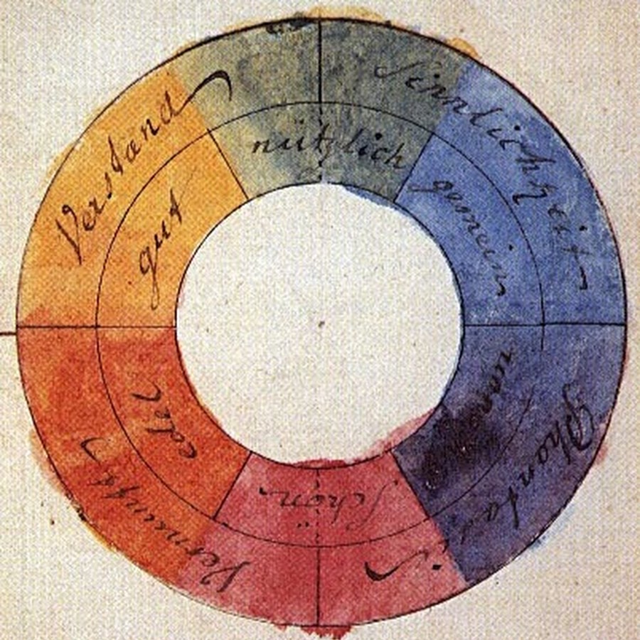
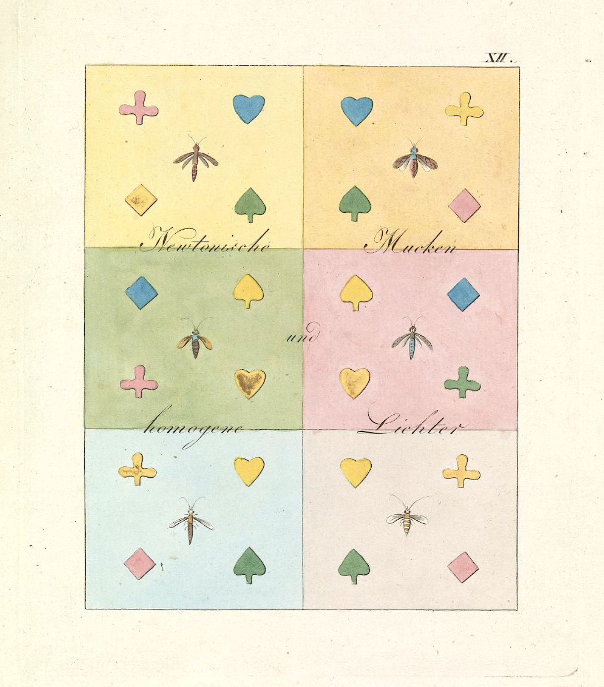
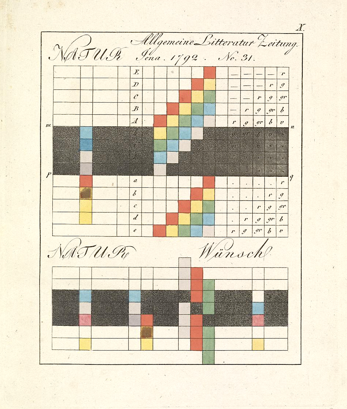
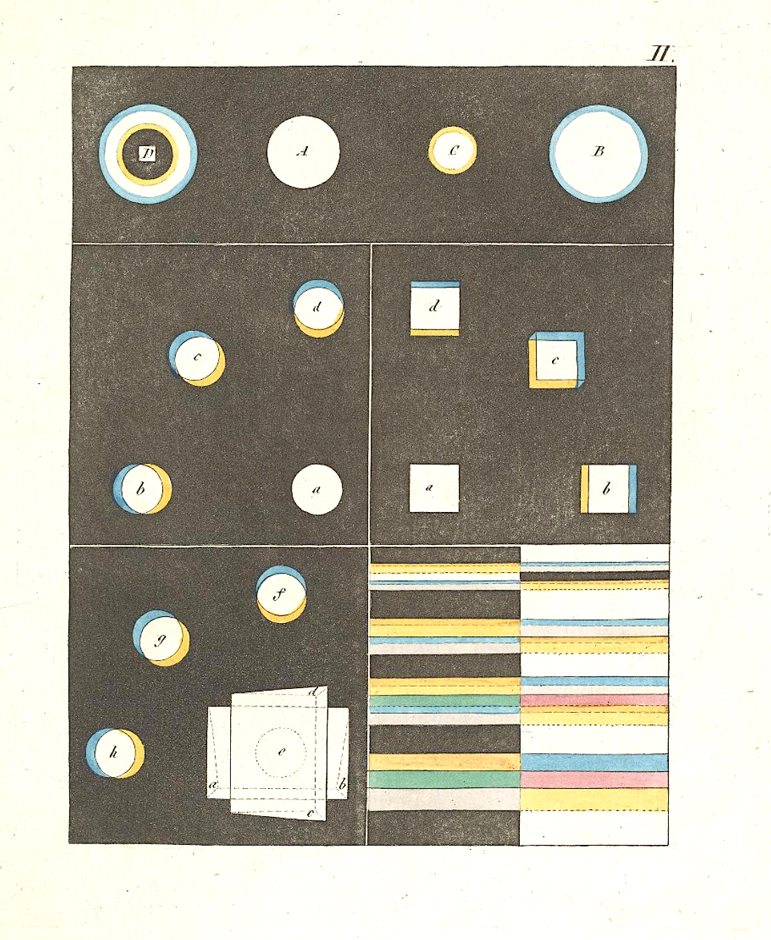
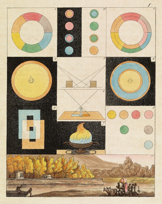
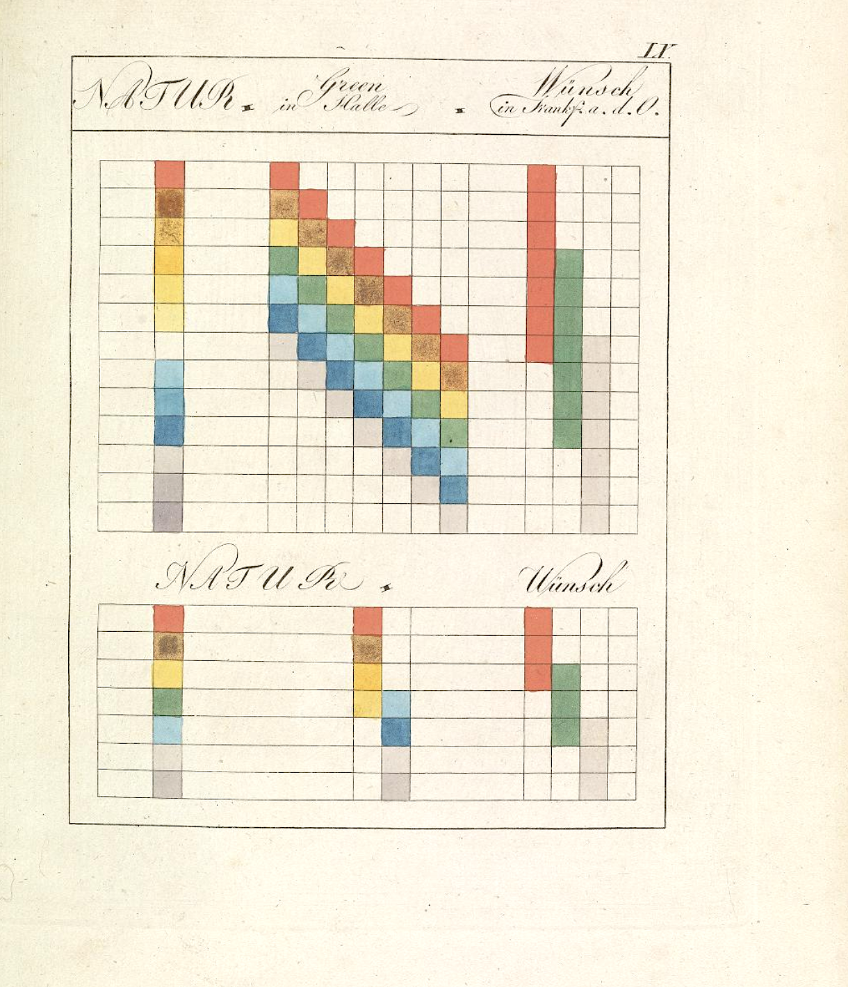
I doubt I need to list for you the many titles of the 18th century German savant and polymath Johann Wolfgang von Goethe, but allow me to add one or two that were new to me, at least: color theorist (or phenomenologist of color) and progenitor of abstract expressionism. As a fascinating Booktryst post informs us, Goethe’s book on color, Zur Farbenlehre (Theory of Colors), written in 1810, disputed the Newtonian view of the subject and formulated a psychological and philosophical account of the way we actually experience color as a phenomenon. In his account, Goethe describes how he came by his views:
Along with the rest of the world, I was convinced that all the colors are contained in the light; no one had ever told me anything different, and I had never found the least cause to doubt it, because I had no further interest in the subject.
But how I was astonished, as I looked at a white wall through the prism, that it stayed white! That only where it came upon some darkened area, it showed some color, then at last, around the window sill all the colors shone… It didn’t take long before I knew here was something significant about color to be brought forth, and I spoke as through an instinct out loud, that the Newtonian teachings were false.
Schopenhauer would later write that “[Goethe] delivered in full measure what was promised by the title of his excellent work: data toward a theory of colour. They are important, complete, and significant data, rich material for a future theory of colour.” It was a theory, Schopenhauer admits, that does not “[furnish] us with a real explanation of the essential nature of colour, but really postulates it as a phenomenon, and merely tells us how it originates, not what it is.”
Another later philosophical interpreter of Goethe, Ludwig Wittgenstein—a thinker greatly interested in visual perception—also saw Goethe’s work as operating very differently than Newton’s optics—not as a scientific theory but rather as an intuitive schema. Wittgenstein remarked that Goethe’s work “is really not a theory at all. Nothing can be predicted by means of it. It is, rather, a vague schematic outline, of the sort we find in [William] James’s psychology. There is no experimentum crucis for Goethe’s theory of colour.”
Yet a third later German genius, Werner Heisenberg, commented on the influence of Zur Farbenlehre, writing that “Goethe’s colour theory has in many ways borne fruit in art, physiology and aesthetics. But victory, and hence influence on the research of the following century, has been Newton’s.”
I’m not fit to evaluate the relative merits of Goethe’s theory, or lack thereof, versus Newton’s rigorous work on optics. Whole books have been written on the subject. But whatever his intentions, Goethe’s work has been well-received as a psychologically accurate account that has also, through his text and many illustrations you see here, had significant influence on twentieth century painters also greatly concerned with the psychology of color, most notably Wassily Kandinsky, who produced his own “schematic outline” of the psychological effects of color titled Concerning the Spiritual in Art, a classic of modernist aesthetic theory. As is usually the case with Goethe, the influence of this single work is wider and deeper than he probably ever foresaw.
Founded in 1577, Kobaien remains Japan’s oldest manufacturer of sumi ink sticks. Made of soot and animal glue, the ink stick—when ground against an inkstone, with a little water added—produces a beautiful black ink used by Japanese calligraphers. And, often, a 200-gram ink stick from Kobaien can cost over $1,000.
How can soot and animal glue command such a high price? As the Business Insider video above shows, there’s a fine art to making each ingredient—an art honed over the centuries. Watching the artisans make the soot alone, you immediately appreciate the complexity beneath the apparent simplicity. When you’re done watching how the ink gets made, you’ll undoubtedly want to watch the artisans making calligraphy brushes, an art form that has its own fascinating history. Enjoy!
“We can say of Shakespeare,” wrote T.S. Eliot—in what may sound like the most backhanded of compliments from one writer to another—“that never has a man turned so little knowledge to such great account.” Eliot, it’s true, was not overawed by the Shakespearean canon; he pronouncedHamlet “most certainly an artistic failure,” though he did love Coriolanus. Whatever we make of his ambivalent, contrarian opinions of the most famous author in the English language, we can credit Eliot for keen observation: Shakespeare’s universe, which can seem so sprawlingly vast, is actually surprisingly spare given the kinds of things it mostly contains.
This is due in large part to the visual limitations of the stage, but perhaps it also points toward an author who made great works of art from humble materials. Look, for example, at a search cloud of the Bard’s plays.
You’ll find one the front page of the Victorian Illustrated Shakespeare Archive, created by Michael John Goodman, an independent researcher, writer, educator, curator and image-maker. The cloud on the left features a galaxy composed mainly of elemental and archetypal beings: “Animals,” “Castles and Palaces,” “Crowns,” “Flora and Fauna,” “Swords,” “Spears,” “Trees,” “Water,” “Woods,” “Death.” One thinks of the Zodiac or Tarot.
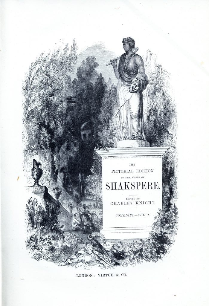
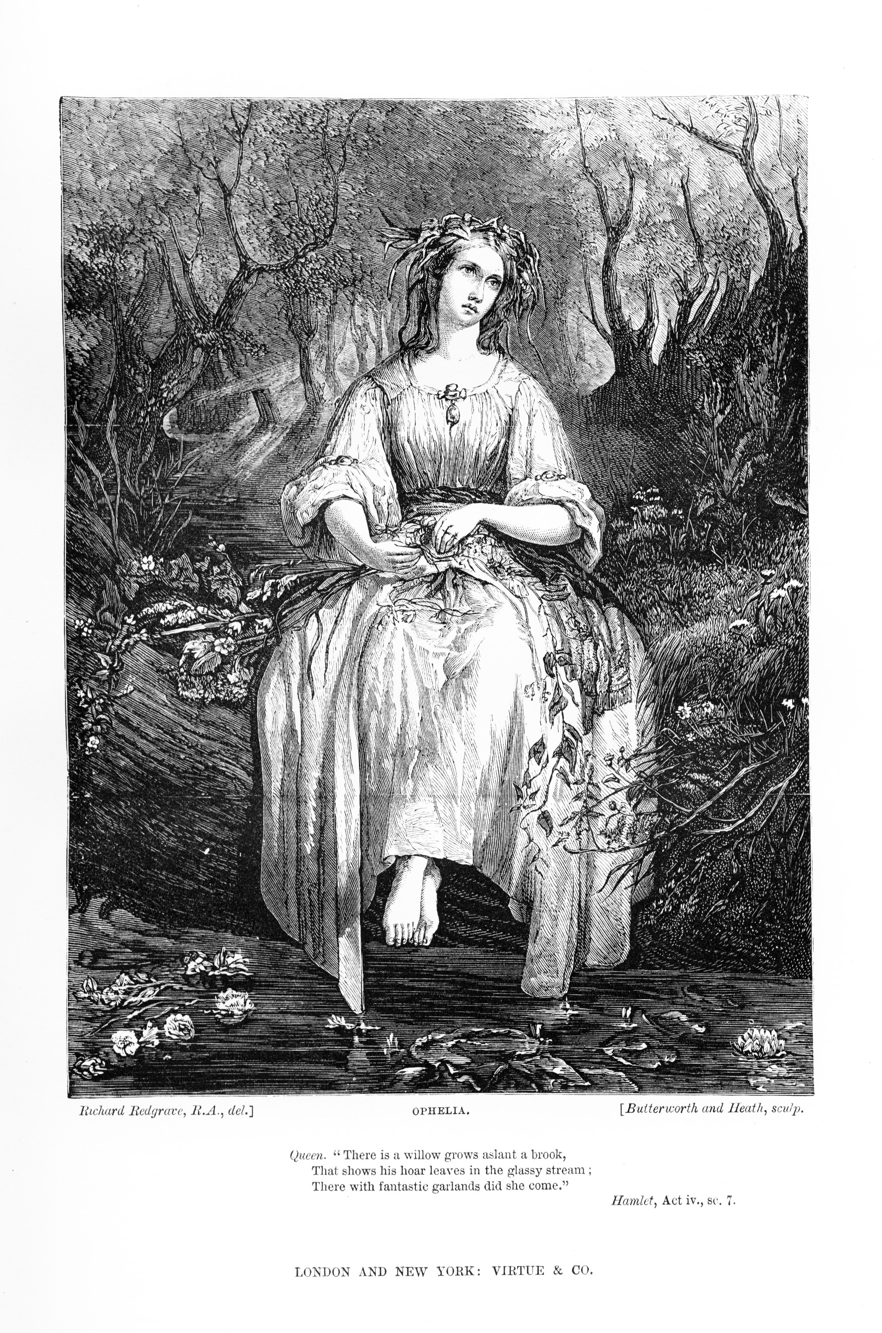
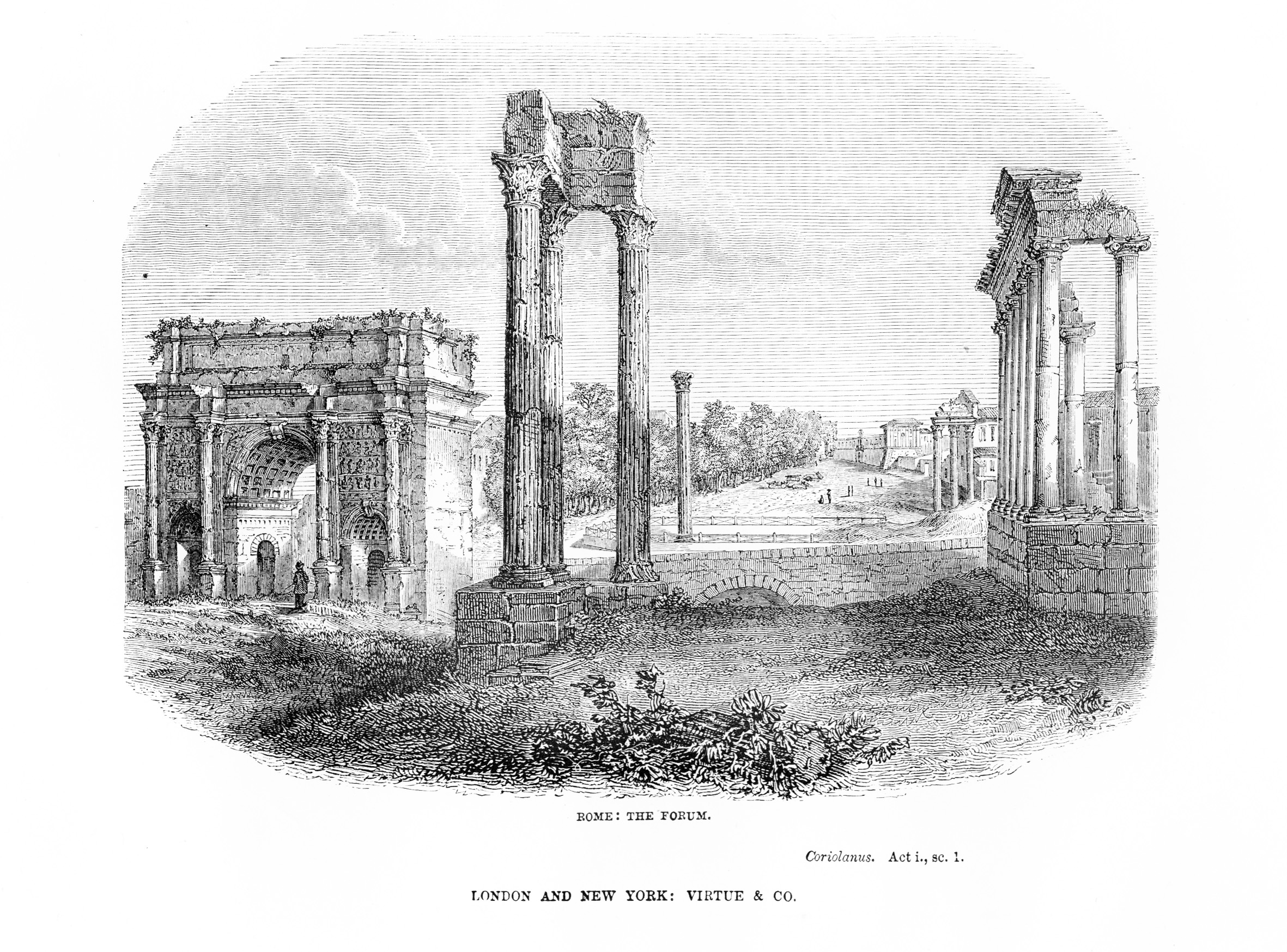
This particular search cloud, however, does not represent the most prominent terms in the text, but rather the most prominent images in four collections of illustrated Shakespeare plays from the Victorian period. Goodman’s site hosts over 3000 of these illustrations, taken from four major UK editions of Shakespeare’s Complete Works published in the mid-19th century. The first, published by editor Charles Knight, appeared in several volumes between 1838 and 1841, illustrated with conservative engravings by various artists. Knight’s edition introduced the trend of spelling Shakespeare’s name as “Shakspere,” as you can see in the title page to the “Comedies, Volume I,” at the top of the post. Further down, see two representative illustrations from the plays, the first of Hamlet’s Ophelia and second Coriolanus’ Roman Forum, above.
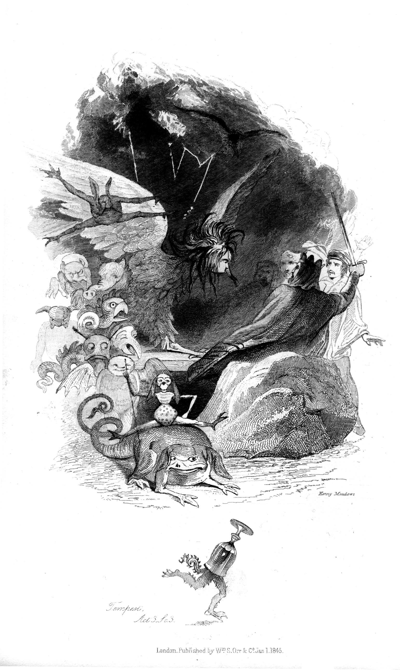
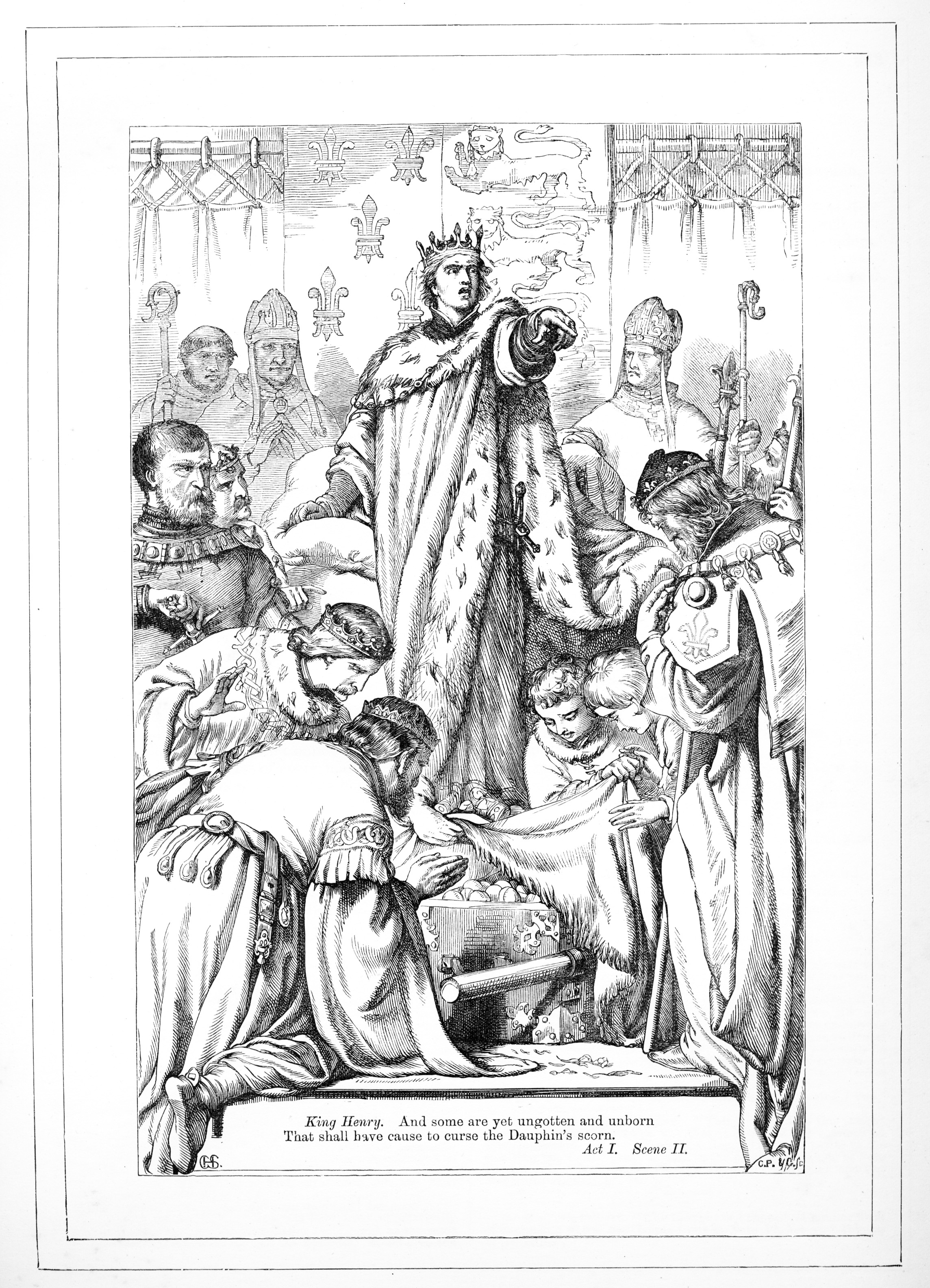
Part of a wave of “early Victorian populism” in Shakespeare publishing, Knight’s edition is joined by one from Kenny Meadows, who contributed some very different illustrations to an 1854 edition. Just above, see a Goya-like illustration from The Tempest. Later came an edition illustrated by H.C. Selous in 1864, which returned to the formal, faithful realism of the Knight edition (see a rendering of Henry V, below), and includes photograuvure plates of famed actors of the time in costume and an appendix of “Special Wood Engraved Illustrations by Various Artists.”
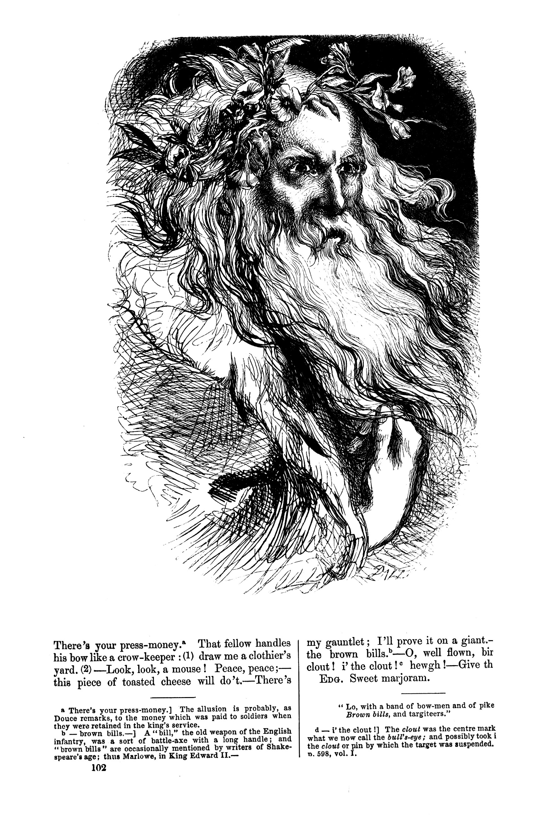
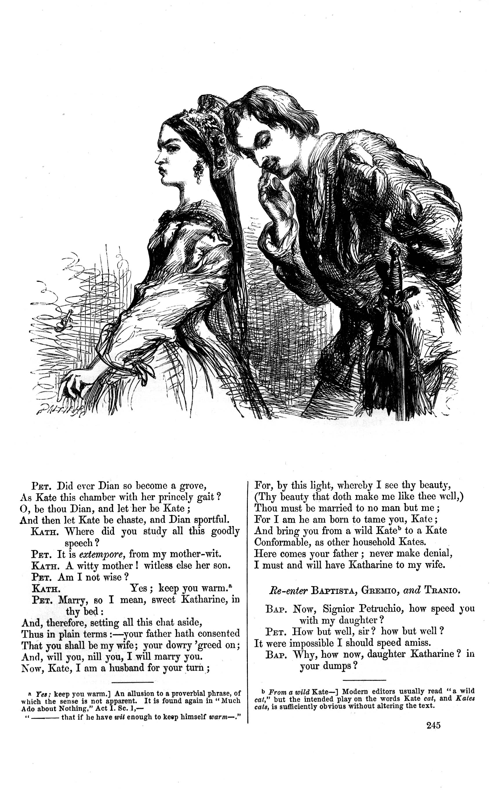
The final edition whose illustrations Goodman has digitized and catalogued on his site features engravings by artist John Gilbert. Also published in 1864, the Gilbert may be the most expressive of the four, retaining realist proportions and mise-en-scène, yet also rendering the characters with a psychological realism that is at times unsettling—as in his fierce portrait of Lear, below. Gilbert’s illustration of The Taming of the Shrew’s Katherina and Petruchio, further down, shows his skill for creating believable individuals, rather than broad archetypes. The same skill for which the playwright has so often been given credit.
But Shakespeare worked both with rich, individual character studies and broader, archetypal, material: psychological realism and mythological classicism. What I think these illustrated editions show us is that Shakespeare, whoever he (or she) may have been, did indeed have a keen sense of what Eliot called the “objective correlative,” able to communicate complex emotions through “a skillful accumulation of imagined sensory impressions” that have impressed us as much on the canvas, stage, and screen as they do on the page. The emotional expressiveness of Shakespeare’s plays comes to us not only through eloquent verse speeches, but through images of both the starkly elemental and the uniquely personal.
Spend some time with the illustrated editions on Goodman’s site, and you will develop an appreciation for how the plays communicate differently to the different artists. In addition to the search clouds, the site has a header at the top for each of the four editions. Click on the name and you will see front and back matter and title pages. In the pull-down menus, you can access each individual play’s digitized illustrations by type—“Histories,” “Comedies,” and “Tragedies.” All of the content on the site, Goodman writes, “is free through a CC license: users can share on social media, remix, research, create and just do whatever they want really!”
Update: This post originally appeared on our site in 2016. Since then, Goodman has been regularly updating the Victorian Illustrated Shakespeare Archive with more editions, giving it more richness and depth. These editions include “one published by John Tallis, which features famous actors of the time in character.” This also includes “the first ever comprehensive full-colour treatment of Shakespeare’s plays with the John Murdoch edition.” The archive, Goodman tells us, “now contains ten editions of Shakespeare’s plays and is fairly comprehensive in how people were experiencing Shakespeare, visually, in book form in the 19th Century.”
Note: When you navigate to a specific coloring book within thecollection, you may initially encounter a blank section on the page. Please scroll down to locate the actual download link for the coloring book.
We're hoping to rely on loyal readers, rather than erratic ads. Please click the Donate button and support Open Culture. You can use Paypal, Venmo, Patreon, even Crypto! We thank you!
Open Culture scours the web for the best educational media. We find the free courses and audio books you need, the language lessons & educational videos you want, and plenty of enlightenment in between.