11 Hypnotic, Close-Up Minutes Watching Tool’s Legendary Drummer Danny Carey in Action
Like the great prog drummers of old—Bill Bruford, Neil Peart, Phil Collins—Tool’s Danny Carey is an artisan. They don’t make drumming like that anymore. He says so himself (sort of) in an interview with Music Radar about his side project Legend of the Seagullmen with Mastadon’s Brent Hinds. Remembering how Robert Fripp would stand on the edge of the stage, watching Tool play when King Crimson opened for the modern prog-metal giants, Carey remarks, “We weren’t syncing to some bullshit like so many other bands. We were actually playing live. It’s a sad thing when almost every band you see isn’t doing that. It’s the clicks and backing tracks that are keeping time. I’ve never played to a click on stage in my life.”
A “click track,” for those who don’t know, is exactly what it sounds like: a playback of clicks (or any percussive sound) to the desired tempo, pumped into a musician’s earpiece to keep them playing in time. A useful tool of the recording studio, many musicians, as Carey says, now use it on stage, along with vocal pitch correction software and pre-recorded backing tracks to make sure everything sounds exactly like it does on record.
All of this technology ruins the feel of live performance, Carey maintains. He would know. He’s been playing live since the 80s and playing with Tool since the band formed thirty years ago. He also jams every other month, he says, “with these weird dudes who played with Miles Davis or Mahavishnu Orchestra.” So… yeah. The dude’s got some classic chops.
But technology isn’t all bad in live music, far from it. Being a drummer used to mean that hardly anyone could see you on a big stage. You might be the most talented, best-looking member of the band, but you were hidden away behind your kit with the singers and guitarists soaking up the glory. Even when certain celebrity rock drummers get their own stages (with their own mini-roller coasters), it can be impossible to see what they’re doing up close. No longer. Thanks to unobtrusive cameras that can stream video from anywhere, no corner of the stage need be obscured. We can watch a Tool show from over Carey’s shoulder, as in the video of “Pneuma,” live in concert, at the top, produced by drum equipment company Vic Firth to demonstrate Carey’s new signature sticks.
It’s better to let Carey’s playing speak for itself, but for reference, “Pneuma” comes from Tool’s very eagerly-awaited 2019 album Fear Inoculum, just one of many tracks “filled with twist after turn, conventional song structure be damned,” Ilya Stemkovsky writes at Modern Drummer, “with Carey at the center of the storm, providing the heaviest, most massive bottom possible. He even gets his own solo percussion track, ‘Chocolate Chip Trip,’ on which he incorporates gongs and bells, among other sounds.” Maybe this live view, and Tool’s well-deserved Grammy Win for Best Metal Performance this year for “7empest,” will inspire more drummers to drop the click and bring back what Carey calls the “dedication to your vibe” from the days of artisanal drumming.
Related Content:
The Neuroscience of Drumming: Researchers Discover the Secrets of Drumming & The Human Brain
Witness Rush Drummer Neil Peart’s (RIP) Finest Moments On Stage and Screen
What Makes John Bonham Such a Good Drummer? A New Video Essay Breaks Down His Inimitable Style
See Why Ginger Baker (RIP) Was One of the Greatest Drummers in Rock & World Music
Josh Jones is a writer and musician based in Durham, NC. Follow him at @jdmagness
Read More...The Incredible Six-Octave Vocal Range of Opera-Singing Punk Diva Nina Hagen
If you’re a reader of this site, it’s likely you known the name Klaus Nomi, the diminutive German singer who stunned New Wave audiences in New York with his angelic soprano voice and opera covers. If you know of Nomi, you likely know of Nina Hagen, who started releasing records in her native East Germany in the late 70s, mixing opera with punk, funk, and reggae and covering classics from Tina Turner to The Tubes “White Punks on Dope.” She became a major star, but her name does not come up often these days. She is long overdue for a revival.
Like Nomi, Hagen was a master of fright make-up and exaggerated, Expressionist faces. She did not, however, have an alien alter-ego or collection of spacesuits. What she had was a wholly original style all her own, full of eccentric vocalizations critic Robert Christgau compared to The Exorcist’s Linda Blair.
Her stage shows were what Hagen herself described as “indescribable.” She applied her “umpteen-octave range,” as Christgau wrote, without restraint to every imaginable kind of material, from cabaret to Norman Greenbaum’s “Spirit in the Sky.”
Impossible to classify, Hagen was beloved by the likes of the Sex Pistols and the Slits. Less than a decade after her 1978 debut with the Nina Hagen Band, she appeared in Tokyo with the Japanese Philharmonic Orchestra in a concert broadcast to 15 countries, performing the songs of Bertolt Brecht and Kurt Weill. (See her that same year, 1985, sing from Carmen in Copenhagen, Denmark, just above.) She converted to Christianity later in life, frequently sings gospel tunes, and released an album called Personal Jesus in 2010 featuring a cover of the iconic Depeche Mode song.
Hagen emerged in 1978 alongside a number of theatrical female singers with preternaturally unsettling voices, debuting at the same time as Siouxsie Sioux, Kate Bush, and Diamanda Galas (who has received her own comparisons to Linda Blair). But her own journey was particularly unusual. “Listening to Hagen chat matter-of-factly about her life,” wrote The Irish Times in a review, “Madonna seems like Doris Day in comparison, while your pretender Lady Gaga is, in Hagen’s own words, ‘a pop prostitute who has more to do with bikini advertising.’”
Put more in more positive terms, the singer honed her theatrical “quick-change” persona through a “barrage of influences,” the New York Times noted. Critics were divided over her eclecticism. Rolling Stone called her 1982 solo, English-language debut the “most unlistenable” album ever made, an unfairly harsh assessment that didn’t stop her from experimenting with even more dissonant, disorienting sounds.
As Hagen herself tells her story:
I grew up in East Berlin, in a family of artists. I heard opera all day long. From the time I was 9 years old I was imitating the singers; later I studied opera. But we also got Western television and radio, from the Americans in West Berlin. When I was 11 years old, I turned into a hippie and gave flowers to policemen. And when I was 21 and left Berlin for London, I became a punk.
She became a punk diva, that is. Hagen’s vocal range—which you can hear demonstrated in the thorough video analysis above—over her band’s prog-like jams (as in “Naturträne), conjured up both angels and demons. She evokes dread with guttural growls and wide-eyed stares, she can look “childlike, sweet or terrifying,” or all three at once, and she never lacks the essential quality an opera singer needs to make it in rock and roll: a sense of humor.
Related Content:
Klaus Nomi Performs with Kraftwerk on German Television (1982)
How to Listen to Music: A Free Course from Yale University
Josh Jones is a writer and musician based in Durham, NC. Follow him at @jdmagness
Read More...The David Lynch Retrospective: A Two Hour Video Essay on Lynch’s Complete Filmography, from Eraserhead to Inland Empire
If you were to watch David Lynch’s complete filmography from beginning to end, how would you see reality afterward? Video essayist Lewis Bond surely has some idea. As the creator of Channel Criswell, whose examinations of auteurs like Andrei Tarkovsky, Francis Ford Coppola, and Martin Scorsese we’ve previously featured here on Open Culture, he once released a meditation on what makes a Lynch film “Lynchian.” Now, under the new banner of The Cinema Cartography (and in partnership with film streaming service MUBI), Bond not only returns to the well of the Lynchian, but plunges in deeply enough to come up with The David Lynch Retrospective.
In two hours, this video essay makes a journey through all the dark recesses of Lynch’s feature filmography — a filmography that, admittedly, can at times seem made up of nothing but dark recesses. It begins in 1977 with Eraserhead, Lynch’s first full-length picture as well as his least remitting. However harrowing its biomechanical strangeness, that debut drew the eye of Hollywood, resulting in Lynch’s hiring to direct The Elephant Man, a chiaroscuro vision of the life of deformed 19th-century Englishman Joseph Merrick. There follows the infamous Dune, which finds Lynch at the helm (at least nominally) of a $40-million adaptation of Frank Herbert’s science-fiction epic, an extravagant mismatch as was ever made between director and material.
Bond mentions that he considered excluding Dune from The David Lynch Retrospective, seeing as the director himself has disowned the picture. Still, no Lynch enthusiast can deny that it brought him to the artistically uncompromising positions that have made the rest of his body of work what it is. But what, exactly, is it? Bond draws some possibilities from Blue Velvet, Lynch’s return to the art house whose memorably oneiric fusion of idyllic small-town America with sadism and voyeurism also functions as a statement of philosophical and aesthetic intent. Not that Lynch is given to statements, per se: as Bond emphasizes in a variety of ways, none of these works admit of direct explication, and this holds as true for the ultra-pastiche road movie Wild at Heart as it does for the split-personality neo-noir Lost Highway.
Then comes 1999’s The Straight Story, a movie about an old man who drives a tractor across the American Midwest to visit his brother. Bond frames the latter as the most Lynchian choice the director could have made, its seemingly thorough mundanity shedding light on his perception of cinema and reality itself. It also lowers the Lynch-filmography binge-watcher’s psychological defenses for the simultaneous Hollywood fantasy and nightmare to come, Mulholland Drive. Though Bond describes it as “the zenith of all that’s Lynchian,” not every fan agrees that it’s Lynch’s masterpiece: some opt for the impenetrable three-hour dose of pure Lynchianism (and cryptic sitcom rabbits) that is Inland Empire. Bond describes Inland Empire, still Lynch’s most recent feature, as “a torturous film, and this should be seen only as complimentary.” There speaks a true Lynchian.
Related Content:
What Makes a David Lynch Film Lynchian: A Video Essay
A Young David Lynch Talks About Eraserhead in One of His First Recorded Interviews (1979)
How David Lynch Manipulates You: A Close Reading of Mulholland Drive
Watch an Epic, 4‑Hour Video Essay on the Making & Mythology of David Lynch’s Twin Peaks
Twin Peaks Actually Explained: A Four-Hour Video Essay Demystifies It All
Based in Seoul, Colin Marshall writes and broadcasts on cities, language, and culture. His projects include the Substack newsletter Books on Cities, the book The Stateless City: a Walk through 21st-Century Los Angeles and the video series The City in Cinema. Follow him on Twitter at @colinmarshall, on Facebook, or on Instagram.
Read More...Jazz Typefaces Capture the Essence of 100 Iconic Jazz Musicians
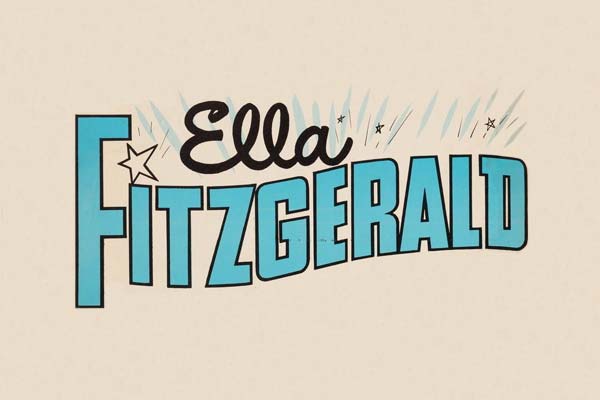
In the 1950s and 60s, one record label stood “like a beacon,” writes Robin Kinross at Eye, among a host of Civil Rights era independents that helped jazz “escape the racial-commercial constraints applied by White Americans, and find its own place, unpatronised and relatively free of exploitation.” That label, Blue Note, ushered in the birth of the cool—both cool jazz and its many hip signifiers—as much through graphic design as through its meticulous approach to recording.
Blue Note album covers may seem principally distinguished by the photography of Francis Wolff, whose instincts behind the camera produced visual icon after icon. But the label’s style depended on the layout, graphic design, and lettering of Reid Miles, who drew on minimalist Swiss trends in “over 500 album covers for Blue Note Records,” designer Reagan Ray writes. “He pioneered the use of creatively-arranged type over monochromatic photography, which is a style that is still widely used in graphic design today.”
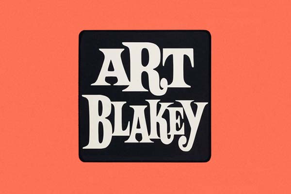
As we noted in a recent post on Blue Note’s legendary design team, Reid’s lettering sometimes edged the photography to the margins, or off the cover altogether. Jazz greats were given the freedom to create the music they wanted, but it was the designers who had to sell their creativity to the public in a visual language.
They had done so with distinctive typefaces before Reid, of course. But the art of lettering became far more interesting through his influence, both more playful and more refined at the same time.
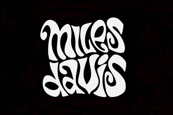
Since typeface has always played a significant role in the music’s commercial success, Ray decided to compile several hundred samplings of album lettering of jazz musician’s names, “for easy browsing and analysis” of typeface as an essential element all on its own. The gallery may attempt “to cover most of the genre’s significant musicians,” but there are, Ray admits, many inevitable omissions.
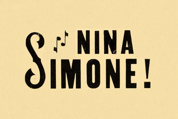
Nonetheless, it’s a formidable visual record of the various looks of jazz in lettering, and the visual identities of its biggest artists over the course of several decades. Ray does not name any of the designers, which is frustrating, but those in the know will recognize the work of Reid and others like album cover pioneer Alex Steinweiss. You may well spot lettering by Milton Glaser, whom Ray previously covered in a huge curated gallery of the famous designer’s album art.
The names behind the big names matter, but it’s the musicians themselves these individualized typefaces are meant to immediately evoke. Consider just how well most all of these examples do just that—representing each artist’s music, period, and image with the perfect font and graphic arrangement, each one a unique logo. Somewhat like the music it represents, Ray’s gallery is, itself, a collective tour-de-force performance of visual jazz.
Visit Ray’s gallery here.
Related Content:
Classic Jazz Album Covers Animated & Brought to Life
The Groundbreaking Art of Alex Steinweiss, Father of Record Cover Design
Josh Jones is a writer and musician based in Durham, NC. Follow him at @jdmagness
Read More...Dear Facebook, This is How You’re Breaking Democracy: A Former Facebook Insider Explains How the Platform’s Algorithms Polarize Our Society
Is this what we want? A post-truth world where toxicity and tribalism trump bridge building and consensus seeking? —Yaël Eisenstat
It’s an increasingly familiar occurrence.
A friend you’ve enjoyed reconnecting with in the digital realm makes a dramatic announcement on their social media page. They’re deleting their Facebook account within the next 24 hours, so shoot them a PM with your email if you’d like to stay in touch.
Such decisions used to be spurred by the desire to get more done or return to neglected pastimes such as reading, painting, and going for long unconnected nature walks.
These announcements could induce equal parts guilt and anxiety in those of us who depend on social media to get the word out about our low-budget creative projects, though being prone to Internet addiction, we were nearly as likely to be the one making the announcement.
For many, the break was temporary. More of a social media fast, a chance to reevaluate, rest, recharge, and ultimately return.
Legitimate concerns were also raised with regard to privacy. Who’s on the receiving end of all the sensitive information we’re offering up? What are they doing with it? Is someone listening in?
But in this election year, the decision to quit Facebook is apt to be driven by the very real fear that democracy as we know it is at stake.
Former CIA analyst, foreign service officer, and—for six months—Facebook’s Global Head of Elections Integrity Ops for political advertising, Yaël Eisenstat, addresses these preoccupations in her TED Talk, “Dear Facebook, This is How You’re Breaking Democracy,” above.
Eisenstat contrasts the civility of her past face-to-face ”hearts and minds”-based engagements with suspected terrorists and anti-Western clerics to the polarization and culture of hatred that Facebook’s algorithms foment.
As many users have come to suspect, Facebook rewards inflammatory content with amplification. Truth does not factor into the equation, nor does sincerity of message or messenger.
Lies are more engaging online than truth. As long as [social media] algorithms’ goals are to keep us engaged, they will feed us the poison that plays to our worst instincts and human weaknesses.
Eisenstat, who has valued the ease with which Facebook allows her to maintain relationships with far-flung friends, found herself effectively demoted on her second day at the social media giant, her title revised, and her access to high level meetings revoked. Her hiring appears to have been purely ornamental, a palliative ruse in response to mounting public concern.
As she remarked in an interview with The Guardian’s Ian Tucker earlier this summer:
They are making all sorts of reactive changes around the margins of the issues, [to suggest] that they are taking things seriously – such as building an ad library or verifying that political advertisers reside in the country in which they advertising – things they should have been doing already. But they were never going to make the fundamental changes that address the key systemic issues that make Facebook ripe for manipulation, viral misinformation and other ways that the platform can be used to affect democracy.
In the same interview she asserted that Facebook’s recently implemented oversight board is little more than an interesting theory that will never result in the total overhaul of its business model:
First of all, it’s another example of Facebook putting responsibility on someone else. The oversight board does not have any authority to actually address any of the policies that Facebook writes and enforces, or the underlying systemic issues that make the platform absolutely rife for disinformation and all sorts of bad behaviour and manipulation.
The second issue is: it’s basically an appeal process for content that was already taken down. The bigger question is the content that remains up. Third, they are not even going to be operational until late fall and, for a company that claims to move fast and break things, that’s absurd.
Nine minutes into her TED Talk, she offers concrete suggestions for things the Facebook brass could do if it was truly serious about implementing reform:
- Stop amplifying and recommending disinformation and bias-based hatred, no matter who is behind it—from conspiracy theorists to our current president.
- Discontinue personalization techniques that don’t differentiate between targeted political content and targeted ads for athletic footwear.
- Retrain algorithms to focus on a metrics beyond what users click or linger on.
- Implement safety features that would ensure that sensitive content is reviewed before it is allowed to go viral.
Hopefully viewers are not feeling maxed out on contacting their representatives, as government enforcement is Eisenstat’s only prescription for getting Facebook to alter its product and profit model. And that will require sustained civic engagement.
She supplements her TED Talk with recommendations for artificial intelligence engineer Guillaume Chaslot’s insider perspective op-ed “The Toxic Potential of YouTube’s Feedback Loop” and The Filter Bubble: How the New Personalized Web Is Changing What We Read and How We Think by MoveOn.org’s former Executive Director, Eli Pariser.
Your clued-in Facebook friends have no doubt already pointed you to the documentary The Social Dilemma, which is now available on Netflix. Or perhaps to Jaron Lanier’s Ten Arguments for Deleting Your Social Media Accounts Right Now.
Read the transcript of Yaël Eisenstat’s TED Talk here.
Related Content:
The Problem with Facebook: “It’s Keeping Things From You”
Ayun Halliday is an author, illustrator, theater maker and Chief Primatologist of the East Village Inky zine. Follow her @AyunHalliday.
Read More...An Animated Reading of “The Jabberwocky,” Lewis Carroll’s Nonsense Poem That Somehow Manages to Make Sense
“I can explain all the poems that ever were in vented—and a good many that haven’t been invented just yet.” —Humpty Dumpty
“The Jabberwocky,” Lewis Carroll’s classic poem from Through the Looking Glass, and What Alice Found There—the second installment of the most famously nonsensical adventure in literary history—is “full of seemingly nonsensical words that somehow manage to make sense,” says narrator Jack Cutmore-Scott in the animated reading above from TED-Ed Animation. That word, nonsense, is associated with Carroll’s fantasy world more than any other, but what does it mean for a story to be nonsense and be intelligible at the same time?
Carroll, a mathematician by training, understood the fundamental principle of nonsense, which “T.S. Eliot reminded us, is not an absence of sense but a parody of it,” as J. Patrick Lewis writes at The New York Times. “Some of the portmanteau words Carroll invented—chortle, burble, frabjous and others—are now fully vested members of the lexicon. And the verse’s structure is a mirror, as Alice discovered, of classical English poetry.” Carroll composed the first four lines ten years before Through the Looking Glass, as a parodic “Stanza of Anglo-Saxon Poetry” to amuse his family.
It may help, or not, to keep in mind that Carroll is not only mocking English poetic forms and conventions, but a particular historical form of English that is mostly unrecognizable to modern readers, and certainly to Alice. But the poem’s syntax and structure are so familiar that we can easily piece together a monster-slaying narrative in which, as Alice remarks, “somebody killed something.”
The ever-humble Humpty Dumpty is happy to explain, as was Carroll in his original composition, to which he attached a glossary very similar to the egg’s definitions and gave “the literal English” of the first stanza as:
“It was evening, and the smooth active badgers were scratching and boring holes in the hill side; all unhappy were the parrots, and the grave turtles squeaked out“.
There were probably sun dials on the top of the hill, and the “borogoves” were afraid that their nests would be undermined. The hill was probably full of the nests of “raths”, which ran out squeaking with fear on hearing the “toves” scratching outside. This is an obscure, but yet deeply affecting, relic of ancient Poetry.
Does this help? It does explain the mood Carroll is after, and he achieves it. The Jabberwocky is funny and playful and all the rest, but it is also deeply unsettling in its obscure mysteries and frightening descriptions of its title character.
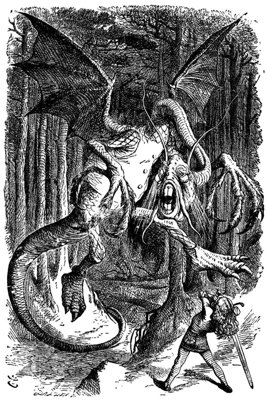
In John Tenniel’s famous illustration of the beast, it appears as a scaly, leathery dragon with a face somewhere between a deep-sea fish and an overgrown sewer rat. The animation by Sjaak Rood gives it a more classically dragon-like appearance, in the crazed style of Ralph Steadman, while the Bandersnatch looks like something Paul Klee would have invented. The choice of artistic influences here shows Rood connecting deeply with the nonsense tradition in modern art, one which also turns familiar forms into nightmarish beings that fill our heads with ideas.
Related Content:
O Frabjous Day! Neil Gaiman Recites Lewis Carroll’s “Jabberwocky” from Memory
Lewis Carroll’s Photographs of Alice Liddell, the Inspiration for Alice in Wonderland
Josh Jones is a writer and musician based in Durham, NC. Follow him at @jdmagness
Read More...Hand-Colored Maps of Wealth & Poverty in Victorian London: Explore a New Interactive Edition of Charles Booth’s Historic Work of Social Cartography (1889)
Mapping has always been contentious, no matter where you look in time. Maps preserve ideological assumptions on paper, rationalizing physical space as they render it in two dimensions. No matter how didactic, they can become political weapons. In the case of Charles Booth’s visually impressive Maps Descriptive of London Poverty, we have a series of maps whose own assumptions can sometimes seem at odds with their ostensible purpose: to improve the living conditions of London’s poor.
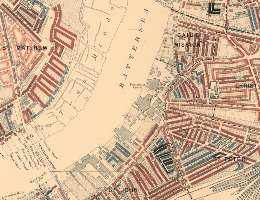
Booth’s “colourful poverty maps were created between 1886 and 1903,” Zoe Craig writes at Londonist, as part of a “ground-breaking study into the lives of ordinary Londoners.” A philanthropist born into wealth in the shipping trade, Booth took it upon himself to study poverty in London in order to initiate social reforms.
He succeeded. The study, conducted by Booth and a team of researchers, led to the creation of Old Age pensions, which Booth called “limited socialism,” as well as school meals for hungry children. He was clear about that fact that he saw such reforms as a bulwark against socialist revolution.
The study’s seventeen volumes are filled with picturesque accounts. “Picking through the tidbits of information from these people’s lives will make you feel a bit like a Victorian costume drama police detective,” Craig remarks. This reference to policing feels pointed, given the role of the police in maintaining class hierarchies in Victorian London. As an American, it can be hard to look at Booth’s map and not also see the 20th redlining practices in U.S. cities. Consider, for example, the categories Booth applied to London’s classes:
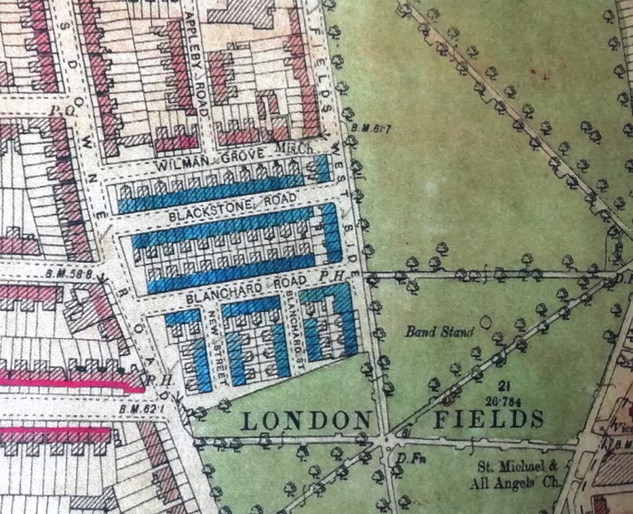
Called ‘Inquiry Into the Life and Labour of the People in London’, the epic work studied families and residents living across London, and coloured the streets according to their financial situation: between black for ‘lowest class, vicious, semi-criminal’ through pink for mixed ‘some comfortable, some poor’ to orange for ‘wealthy’.
As in Daniel Patrick Moynihan’s paternalistic 1965 report on the Black underclass in the U.S., the language reinforces Social Darwinist ideas that deem the “lowest class” unfit for full participation in civil society—“vicious, semi-criminal…”

Of course, the social and historical context differs markedly, but we might also consider Feargus O’Sullivan’s observations at Bloomberg CityLab. A new published edition of the map, he writes, “accompanied by compelling if bleak period photos, reveals a city that possesses echoes of London today. It depicts, after all, a densely-packed metropolis with a cosmopolitan population where immensely wealthy people lived just around the corner from neighbors who were struggling to make ends meet.”
Maps may not create the social conditions they describe, but they can help perpetuate them, rendering people visible in ways that allow for even more control over their lives. Criticisms of Booth’s study claimed that not only did the proposed reforms not go far enough but that the report described London’s class structure while offering little to no analysis of the causes of poverty. In language that sounded less objectionable to Victorian ears, the poor are mostly blamed for their own condition.

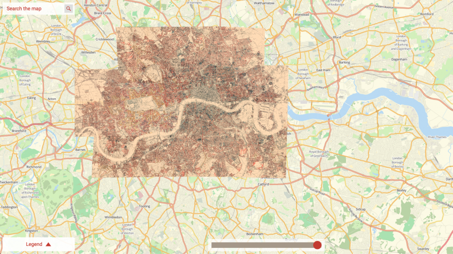
None of the study’s particular limitations take away from the graphic achievements of its maps and explanatory charts. They are, the London School of Economics writes, a striking “early example of social cartography.” The LSE hosts an incredibly detailed, searchable, high-resolution interactive version of the maps, assembled together and overlaid on a modern GPS map of London. They also detail the various editions of the maps as they appeared between 1898 and 1903.
Hand-colored and based on the 1869 Ordnance Survey, the maps seemed “sufficiently important” to Booth to warrant “comprehensive revision.” Here, the police appear in person to guide the process. “Social investigators accompanied policemen on their beats across London,” the LSE writes, “and recorded their own impressions of each street and the comments of the policemen.” You can read the police notebooks from these surveys at the LSE and learn more about the 12 district maps and the demographic data they represent at Mapping London. The LSE printed a hardcover print edition of Booth’s work in 2019, complete with 500 illustrations. You can purchase a copy here. Or visit the interactive edition here.
Related Content:
Josh Jones is a writer and musician based in Durham, NC. Follow him at @jdmagness
Read More...Why James Gandolfini’s Tony Soprano Is “the Greatest Acting Achievement Ever Committed to the Screen”: A Video Essay
The ongoing “golden age” of prestige television drama began more than twenty years ago, but how many shows have truly surpassed The Sopranos, the one that started it all? However many series come and go, raising large and often obsessive fan bases with their varying mixtures of crime, history, politics, science fiction, fantasy, and intrigue, none have shown the cultural staying power of this six-season tale of a mob boss in turn-of-the-21st-century New Jersey. That The Sopranos remains relevant owes in part to the vision of creator David Chase as well as to the tour de force performance of star James Gandolfini.
Evan Puschak, better known as the Nerdwriter, has stronger words of approbation: Gandolfini’s is “probably the greatest acting achievement ever committed to the screen, small or big.” In the video essay “How James Gandolfini Navigates Emotion” he marshals in support of this claim just one scene, but a scene that features Gandolfini at the height of his dramatic powers.
Taken from the fifth-season episode “Unidentified Black Males,” originally aired in 2004 (and co-written by Matthew Weiner, later to create the prestige-TV franchise Mad Men), this selection takes place in the office of Tony’s psychiatrist Dr. Jennifer Melfi, played by Lorraine Bracco. (When The Sopranos debuted, two months before the premiere of Harold Ramis’ Analyze This, a mobster in therapy was very much a novel idea.)
“Tony Soprano is going to have a panic attack in this therapy session,” says Puschak, and “the way James Gandolfini builds to that attack” demonstrates “how he carries us with him through a complex sequence of emotions.” Here Gandolfini rises to the formidable challenge of lying convincingly: not convincingly in the sense that Dr. Melfi believes him, but convincingly in the sense that we believe the grapple with conflicting truths and untruths that characterizes Tony’s life. Tony must pin his recent spate of panic attacks on something other than his cousin Tony B, who committed a hit he shouldn’t have. That Tony doesn’t quite believe his own words Gandolfini transmits with “his tone, his eyes, and the tilt of his head.” He uses the musicality of Tony’s speech, “some combination of leftover Italian rhythms and a New York-inflected North Jersey accent,” to build to “larger and larger crescendoes.”
As it foreshadows the approaching emotional turmoil, his “rhythmic anger, like waves crashing on the shore, is hypnotic, drawing you deeper into his mental and emotional space with each new cycle.” Tony then doubles down on his lie, trying to cover for his cousin by inventing on the spot a story about having been beaten up by a gang of shoe thieves in 1986. Only later in the scene does the truth come out, or at least partially leak out, even as Gandolfini portrays Tony struggling to fight back the panic attack that has emerged as a result of telling these stories. For all the technique it showcases, the scene ends in a classically dramatic fashion, with a kind of catharsis — which, if you know The Sopranos, you know is hardly the word Tony has for it.
Related Content:
How David Chase Breathed Life into the The Sopranos
David Chase Reveals the Philosophical Meaning of The Soprano’s Final Scene
James Gandolfini Reads from Maurice Sendak’s Children’s Story In The Night Kitchen
How Humphrey Bogart Became an Icon: A Video Essay
How David Lynch Manipulates You: A Close Reading of Mulholland Drive
Based in Seoul, Colin Marshall writes and broadcasts on cities, language, and culture. His projects include the Substack newsletter Books on Cities, the book The Stateless City: a Walk through 21st-Century Los Angeles and the video series The City in Cinema. Follow him on Twitter at @colinmarshall, on Facebook, or on Instagram.
Read More...Understanding Chris Marker’s Radical Sci-Fi Film La Jetée: A Study Guide Distributed to High Schools in the 1970s
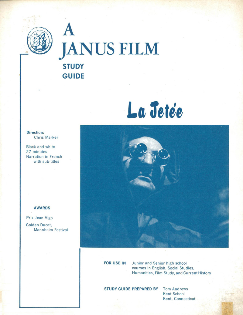
Pop quiz, hot shot. World War III has devastated civilization. As a prisoner of survivors living beneath the ruins of Paris, you’re made to go travel back in time, to the era of your own childhood, in order to secure aid for the present from the past. What do you do? You probably never faced this question in school — unless you were in one of the classrooms of the 1970s that received the study guide for Chris Marker’s La Jetée. Like the innovative 1962 science-fiction short itself, this educational pamphlet was distributed (and recently tweeted out again) by Janus Films, the company that first brought to American audiences the work of auteurs like Ingmar Bergman, Federico Fellini, and Akira Kurosawa.
Written by Connecticut prep-school teacher Tom Andrews, this study guide describes La Jetée as “a brilliant mixture of fantasy and pseudo-scientific romance” that “explores new dramatic territory and forms, and rushes with a stunning logic and a powerful impact to its shocking climax.”
The film does all this “almost entirely in still photographs, their static state corresponding to the stratification of memory.” More practically speaking, at “twenty-seven minutes in length, La Jetée is an ideal class-period vehicle” that “can help students speculate on the awesome potential of life as it may exist after a third world war” as well as “man’s inhumanity to man, not only as it may occur in the future, but as it already has occurred in our past.”
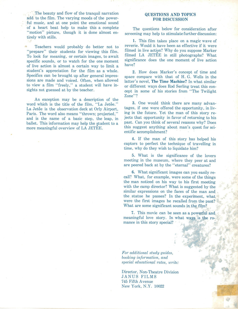
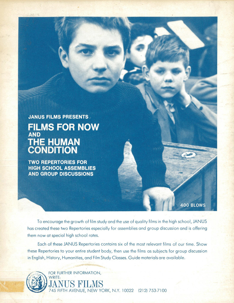
“Why do you suppose Marker filmed La Jetée in still photographs? What significance does the one moment of live action have?” “How does Marker’s concept of time and space compare with that of H.G. Wells in the latter’s novel, The Time Machine?” “If the man of this story has helped his captors to perfect the technique of time travel, why do they wish to liquidate him?” These and other suggested discussion questions appear at the end of the study guide, all of whose pages you can read at Socks. It was produced for Films for Now and The Human Condition, “two repertories for high school assemblies and group discussions” based on Janus’ formidable cinema library. (François Truffaut’s The 400 Blows also looks to have been among their educational offerings.) You can see further analysis of La Jetée in A.O. Scott’s New York Times Critics’ Picks video, as well as the Criterion Collection video essay Echo Chamber: Listening to La Jetée.
Much later, in the mid-1990s, Terry Gilliam would pay tribute with his Hollywood homage 12 Monkeys, and Marker himself still had many films to make, including his second masterpiece, the equally unconventional Sans Soleil. But at time of this study guide’s publication, La Jetée’s considerable influence had only just begun to manifest. It was around then that pioneering cyberpunk novelist William Gibson viewed the film in college. “I left the lecture hall where it had been screened in an altered state, profoundly alone,” he later remembered. “My sense of what science fiction could be had been permanently altered.” Perhaps his instructor heeded Andrews’ advice that “teachers would probably do better not to ‘prepare’ their students for viewing this film.” Not that anyone, in the 58 years of the film’s existence, has anyone ever truly been prepared for their first viewing of La Jetée.
Related Content:
Petite Planète: Discover Chris Marker’s Influential 1950s Travel Photobook Series
A Concise Breakdown of How Time Travel Works in Popular Movies, Books & TV Shows
Based in Seoul, Colin Marshall writes and broadcasts on cities, language, and culture. His projects include the Substack newsletter Books on Cities, the book The Stateless City: a Walk through 21st-Century Los Angeles and the video series The City in Cinema. Follow him on Twitter at @colinmarshall, on Facebook, or on Instagram.
Read More...The Liberal Arts Can Make People Less Susceptible to Authoritarianism, a New Study Finds

“Correlation does not equal causation” isn’t always a fun thing to say at parties, but it is always a good phrase to keep in mind when approaching survey data. Does the study really show that? Might it show the opposite? Does it confirm pre-existing biases or fail to acknowledge valid counterevidence? A little bit of critical thinking can turn away a lot of trouble.
I’ll admit, a new study, “The Role of Education in Taming Authoritarian Attitudes,” confirms many of my own biases, suggesting that higher education, especially the liberal arts, reduces authoritarian attitudes around the world. The claim comes from Georgetown University’s Center on Education and the Workforce, which analyzed and aggregated data from World Values Surveys conducted between 1994 and 2016. The study takes it for granted that rising authoritarianism is not a social good, or at least that it poses a distinct threat to democratic republics, and it aims to show how “higher education can protect democracy.”

Authoritarianism—defined as enforcing “group conformity and strict allegiance to authority at the expense of personal freedoms”—seems vastly more prevalent among those with only a high school education. “Among college graduates,” Elizabeth Redden writes at Inside Higher Ed, “holders of liberal art degrees are less inclined to express authoritarian attitudes and preferences compared to individuals who hold degrees in business or science, technology, engineering and mathematics fields.”
The “valuable bulwark” of the liberal arts seems more effective in the U.S. than in Europe, perhaps because “American higher education places a strong emphasis on a combination of specific and general education,” the full report speculates. “Such general education includes exposure to the liberal arts.” The U.S. ranks at a moderate level of authoritarianism compared to 51 other countries, on par with Chile and Uruguay, with Germany ranking the least authoritarian and India the most—a 6 on a scale of 0–6.
Higher education also correlates with higher economic status, suggesting to the study authors that economic security reduces authoritarianism, which is expressed in attitudes about parenting and in a “fundamental orientation” toward control over autonomy.

The full report does go into greater depth, but perhaps it raises more questions than it answers, leaving the intellectually curious to work through a dense bibliography of popular and academic sources. There is a significant amount of data and evidence to suggest that studying the liberal arts does help people to imagine other perspectives and to appreciate, rather than fear, different cultures, religions, etc. Liberal arts education encourages critical thinking, reading, and writing, and can equip students with tools they need to distinguish reportage from pure propaganda.
But we might ask whether these findings consistently obtain under actually existing authoritarianism, which “tends to arise under conditions of threat to social norms or personal security.” In the 2016 U.S. election, for example, the candidate espousing openly authoritarian attitudes and preferences, now the current U.S. president, was elected by a majority of voters who were well-educated and economically secure, subsequent research discovered, rather than stereotypically “working class” voters with low levels of education. How do such findings fit with the data Georgetown interprets in their report? Is it possible that those with higher education and social status learn better to hide controlling, intolerant attitudes in mixed company?
Learn more at this report summary page here and read and download the full report as a PDF here.
Related Content:
Why We Need to Teach Kids Philosophy & Safeguard Society from Authoritarian Control
Critical Thinking: A Free Course
Josh Jones is a writer and musician based in Durham, NC. Follow him at @jdmagness
Read More...Support Us
We're hoping to rely on loyal readers, rather than erratic ads. Please click the Donate button and support Open Culture. You can use Paypal, Venmo, Patreon, even Crypto! We thank you!

About Us

Open Culture scours the web for the best educational media. We find the free courses and audio books you need, the language lessons & educational videos you want, and plenty of enlightenment in between.
Advertise With Us
FREE UPDATES!
GET OUR DAILY EMAIL
Get the best cultural and educational resources on the web curated for you in a daily email. We never spam. Unsubscribe at any time.
FOLLOW ON SOCIAL MEDIA
Open Culture editor Dan Colman scours the web for the best educational media. He finds the free courses and audio books you need, the language lessons & movies you want, and plenty of enlightenment in between.
Advertise With Us

