No cartoon Dutch landscape omits a windmill. With their wooden frames and large blades, those mechanical structures have been used in the Netherlands since at least the twelfth century, first to pump water out of potentially arable lowlands, and later for such uses as sawing wood and pounding grain. Today, of course, there exist much more efficient technologies for those jobs, but the windmill nevertheless remains a Dutch cultural icon. In the Netherlands the wind itself also blows as strong as ever, just waiting to be harnessed: if not by industry, then perhaps by art. Enter Theo Jansen, inventor of the strandbeest — Dutch for “beach beast,” an apt description of its nature.
Elaborately constructed with off-the-shelf materials like wood, PVC piping, and sheets of fabric, Jansen’s large and fantastical-looking strandbeesten walk through the sand as if moving under their own volition. In fact they’re wind-powered kinetic sculptures, articulated in such a way as to make their movements look wholly organic.
“I make skeletons that are able to walk on the wind,” Jansen once said. “Over time, these skeletons have become increasingly better at surviving the elements such as storms and water and eventually I want to put these animals out in herds on the beaches, so they will live their own lives.” His goals also include equipping future generations of strandbeesten with a kind of mechanical artificial intelligence, which would let them avoid the kind of dangers that got their ancestors toppled or stuck. But in their sheer uncanny magnificence, even the least intelligent examples have fascinated the world. A few years ago Jansen and one of his creations even appeared on The Simpsons, suggesting that one day, cartoon Dutch landscapes may be incomplete without a strandbeest.
Based in Seoul, Colin Marshall writes and broadcasts on cities, language, and culture. His projects include the Substack newsletterBooks on Cities, the book The Stateless City: a Walk through 21st-Century Los Angeles and the video series The City in Cinema. Follow him on Twitter at @colinmarshall or on Facebook.
Very little is known about the Dutch painter Hieronymus Bosch. And I am going to suggest that is a good thing. Would it help to know that this man who created truly inspired, endlessly fascinating views of heaven and hell, of creature-filled gardens of debauchery, had a particular point of view on humanity? Or that he thought there was a “correct” way to understand his paintings? Perhaps it’s the mystery of the man that brings us closer to these works, to study them in detail, and to delight in their playful horror. And for those who really want detail, the Bosch Project is the place to find it.
The Bosch Project (aka the Bosch Research and Conservation Project) began in 2010 as a way to bring together the artist’s 45 paintings “spread across 2 continents, 10 countries, 18 cities, and 20 collections” for in-depth research, available to everyone.
Here is where the Bosch Project website shines. The “synchronized image viewers” allow us to zoom in to the smallest brushstroke to examine Bosch’s detailed worlds and characters. And in a nod to his use of triptychs, the other two sides of the painting zoom in as well. It makes for some interesting, but not essential, juxtapositions. It’s also easy to move around in the work with just the scrollwheel of the mouse. Other paintings allow the viewer to examine the infrared reflectogram of the painting’s layers, exposing Bosch’s corrections and deletions. Closer examination of his grand panels reveals Bosch’s cartoonish brushwork, his caricature, and his immense humor. For sure, the artist wanted us to meditate on greater matters like our own salvation, but there’s so much fun in the way he paints animals, or in the bacchanalia of The Garden of Earthly Delights, you can be forgiven for thinking he’d want to party as well. Grab that scroll wheel and check out the Garden—there’s plenty of room. Enter the Bosch Project website here.
Ted Mills is a freelance writer on the arts who currently hosts the Notes from the Shed podcast and is the producer of KCRW’s Curious Coast. You can also follow him on Twitter at @tedmills, and/or watch his films here.
If so, don’t feel bad. There were probably a lot of other news items vying for your attention back in March of 2020, when the first volume was released “for diversion, entertainment and relaxation in times of self-isolation.”
By the time the second volume made its debut less than two months later, the first had been downloaded some 30,000 times.
Tell your scarcity mentality to stand down. You may be late to the party, but all 40 images can still be downloaded for free, “to ease and aid pleasurable focus in these oddest of times.”
It’s our belief that odd times call for odd images so we’re reproducing some of our favorites below, though be advised there are also plenty of calming botanical prints and graceful maidens for those craving a less challenging coloring experience.
And below, the 13-year-old Michelangelo’s reproduction in tempera on a wood panel. Biographers Giorgio Vasari and Ascanio Condivi both told how the young artist visited the fish market, seeking inspiration for the demons’ scales. Perhaps you will be inspired by the barely teenaged High Renaissance master’s palette, though it’s YOUR coloring page, so you do you.
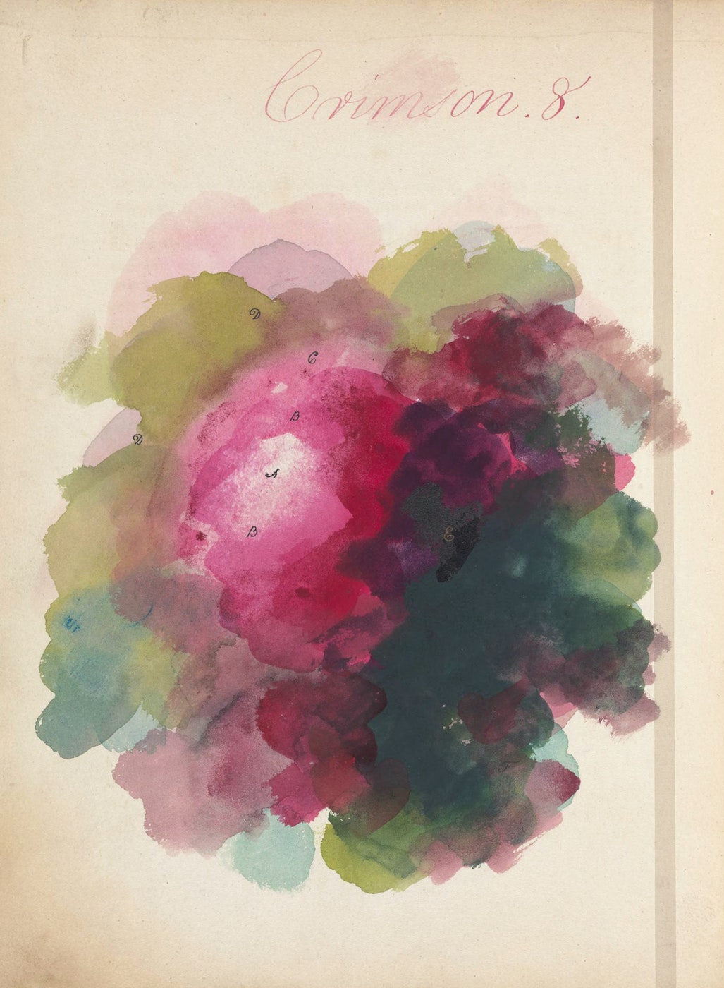
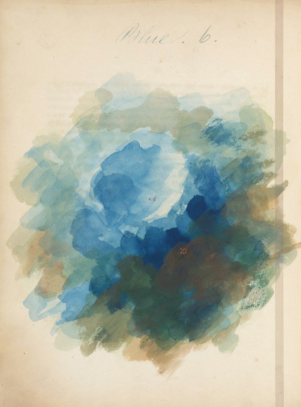
Comprised of pictures of various flowers, the author gives his (presumably) adult readers detailed instructions for paint mixing and color choice (including the delightful sounding “gall-stone brown”).
Perhaps you will bring some of Sayer’s suggested colors to bear on the above image from Parisian bookseller Richard Breton’s Les songes drolatiques de Pantagruel (1565), a collection of 120 grotesque woodcut figures intended as a tribute to the bawdy writer (and priest!) François Rabelais, or a possibly just a canny marketing ploy.
Next, let’s color this perky fellow from Giovanni Battista Nazari’s famous alchemical treatise on metallic transmutation, Della tramutatione metallica sogni tre from 1599.
The “winged pig in the world” by Dutch engraver and mapmaker Cornelis Anthonisz doesn’t look very cheerful, does he? He’s on top of the imperial orb, but he’s also an allegory of the corrupt world. Hopefully, this will get sorted by the time pigs fly.
As to Ambroise Paré’s 1598 rendering of a “camphur” … well, let’s just say THIS is what a proper unicorn should look like.
According to an annotated checklist that accompanied the Metropolitan Museum’s Cloisters’ 75th Anniversary exhibition Search for the Unicorn, Paré, a pioneering French barber surgeon, claimed that it live(d) in the Arabian Desert, and that its horn can cure various maladies, especially poisoning.”
There’s a lot to unpack there. Think about it as you color.
Hokusai, Albrecht Dürer, and Aubrey Beardsley, are among the artists whose work you’ll encounter, “arranged in vague order of difficulty — from a simple 17th-century kimono pattern to an intricate thousand-flowered illustration.”
Download Volume 1 of the Public Domain Review Coloring book in US Letter or A4 format.
George Orwell lives on, to varying degrees of aptness, in the form of the word Orwellian. David Lynch has, within his lifetime, made necessary the term Lynchian. Though few of us will leave such adjectival legacies of our own, we should at least aspire to do so, and that task requires looking back to the original master: François Rabelais. Merriam-Webster defines Rabelaisian as “marked by gross robust humor, extravagance of caricature, or bold naturalism.” Rabelais expressed this sensibility at great length in La vie de Gargantua et de Pantagruel, a pentalogy of elaborate satirical novels published from the 1530s to the 1560s — and more recently endorsed by Harold Bloom, Joseph Brodsky, Henry Miller, and Marilyn Monroe.
Rabelais died in the 1550s, hence the still-unresolved questions about the authorship of the fifth and final Gargantua and Pantagruel book: was it completed from his notes? Was it, in fact, a fabrication by another writer?
There is no main text, just a preface wherein publisher Richard Breton writes that “the great familiarity I had with the late François Rabelais has moved and even compelled me to bring to light the last of his work, the drolatic dreams of the very excellent and wonderful Pantagruel.” Yet, as Green explains, “the book’s wonderful images are very unlikely to be the work of Rabelais himself — the attribution probably a clever marketing ploy.” You can view these amusing and grotesque images at the Public Domain Review, and in the context of the book as preserved at the Internet Archive. “Be warned,” says Intriguing History, the artist “seems to enjoy the use of a lot of phallic imagery, along with frogs, fish and elephants.” But who is the artist?
“The creator of the prints is now widely thought to be François Desprez,” writes Green, “a French engraver and illustrator” who published a couple of similarly imaginative sets of images with Breton in 1567. Whoever made them, these Rabelaisian woodcuts remained surreal enough through the centuries to catch the eye of none other than Salvador Dalí, who in 1973 paid tribute to them with a set of lithographs of his own. (You can see more examples at the Lockport St. Gallery.) As far as the title, an exegesis at Poemas del río Wang offers a clarification: “Drolatic is an adjective of dream,” and so “we must ask what kind of dream is this. It is certainly the dream of reason, as it gives birth to monsters” — monsters, as a satirist like Rabelais well understood, not altogether unlike ourselves.
Based in Seoul, Colin Marshall writes and broadcasts on cities, language, and culture. His projects include the Substack newsletterBooks on Cities, the book The Stateless City: a Walk through 21st-Century Los Angeles and the video series The City in Cinema. Follow him on Twitter at @colinmarshall or on Facebook.
If you search for David Bowie on Spotify, a familiar icon pops up: the man himself, eyes closed, made up with a deathly-looking pallor and a red-and-blue lighting bolt across his face. This is the photo on the front of Bowie’s sixth album, 1973’s Aladdin Sane. “Perhaps more iconic than the music inside,” says the narrator of the Trash Theory video essay above, “it stands as the Mona Lisa of album covers.” It was also, at the time of production, the most costly album cover of all time: this was at the behest of Bowie’s manager Tony Defries, who suspected that sparing no expense on the image would motivate RCA, his label, to spare no expense promoting the album itself.
One might call this a bold move for an artist like Bowie, who had only just made it big. In the early years of his career he’d racked up failure after failure: with 1971’s Hunky Dory, a kind of declaration of commitment to musical and artistic “changes,” he had a succès d’estime, but not until the following year did he become a bona fide star.
Though young British audiences couldn’t get enough of Ziggy and the Spiders, reactions across the United States were rather less enthusiastic. There, says the Trash Theory narrator, “they were not the type of British rock that rock radio played: hard-hitting, riff-heavy behemoths like Led Zeppelin or the Rolling Stones. But this indifference was shaping what Bowie wanted to do next.” His experience of America inspired a new, harder-edged persona, Aladdin Sane. Ziggy Stardust “was a vision of the best a rock star could be, an inspirational figure, while Aladdin was more about fame’s darker underbelly, filtered through imagined Americana and futuristic nostalgia” — and the character needed a look to match.
Shot by Brian Duffy, described in the San Francisco Art Exchange vide0 above as “a very eccentric and incredible photographer,” the Aladdin Sane cover was printed with a seven-color system unprecedented in the medium. (Up to that point, four-color had been the standard.) According to Trash Theory, Bowie described makeup artist Pierre Laroche’s lightning bolt “as representative of schizophrenia, and more specifically, his split feelings about his 1972 American tour.” (The shape came from the logo on a National Panasonic rice cooker in Duffy’s studio.) Though the result has become, in the words of curator Victoria Broackes, “probably the most recognizable symbol in rock and roll,” Bowie never actually assumed this look onstage; ahead of him, there still lay four more decades of changes to go through.
Based in Seoul, Colin Marshall writes and broadcasts on cities, language, and culture. His projects include the Substack newsletterBooks on Cities, the book The Stateless City: a Walk through 21st-Century Los Angeles and the video series The City in Cinema. Follow him on Twitter at @colinmarshall or on Facebook.
We’ve all have heard of the fuchsia, a flower (or genus of flowering plant) native to Central and South America but now grown far and wide. Though even the least botanically literate among us know it, we may have occasional trouble spelling its name. The key is to remember who the fuchsia was named for: Leonhart Fuchs, a German physician and botanist of the sixteenth century. More than 450 years after his death, Fuchs is remembered as not just the namesake of a flower, but as the author of an enormous book detailing the varieties of plants and their medicinal uses. His was a landmark achievement in the form known as the herbal, examples of which we’ve featured here on Open Culture from ninth- and eighteenth-century England.
But De Historia Stirpium Commentarii Insignes, as this work was known upon its initial 1542 publication in Latin, has worn uncommonly well through the ages. Or rather, Fuchs’ personal, hand-colored original has, coming down to us in 2022 as the source for Taschen’s The New Herbal. “A masterpiece of Renaissance botany and publishing,” according to the publisher, the book includes “over 500 illustrations, including the first visual record of New World plant types such as maize, cactus, and tobacco.”
Buyers also have their choice of English, German, and French editions, each with its own translations of Fuchs’ “essays describing the plants’ features, origins, and medicinal powers.” (You can also read a Dutch version of the original online at Utrecht University Library Special Collections.)
Naturally, some of the information contained in these nearly five-century-old scientific writings will be a bit dated at this point, but the appeal of the illustrations has never dimmed. “Fuchs presented each plant with meticulous woodcut illustrations, refining the ability for swift species identification and setting new standards for accuracy and quality in botanical publications.” Over 500 of them go into the book: “Weighing more than 10 pounds,” writes Colossal’s Grace Ebert, “the nearly 900-page volume is an ode to Fuchs’ research and the field of Renaissance botany, detailing plants like the leafy garden balsam and root-covered mandrake.”
Taschen’s reproductions of these works of botanical art look to do justice to Leonhart Fuchs’ legacy, especially in the brilliance of their colors. It’s enough to reinforce the assumption that the man has received tribute not just through fuchsia the flower but fuchsia the color as well. But such a dual connection turns out to be in doubt: the color’s name derives from rosaniline hydrochloride, also known as fuchsine, originally a trade name applied by its manufacturer Renard frères et Franc. The name fuschine, in turn, derives from fuchs, the German translation of renard. The New Herbal is, of course, a work of botany rather than linguistics, but it should nevertheless stimulate in its beholders an awareness of the interconnection of knowledge that fired up the Renaissance mind.
Based in Seoul, Colin Marshall writes and broadcasts on cities, language, and culture. His projects include the Substack newsletterBooks on Cities, the book The Stateless City: a Walk through 21st-Century Los Angeles and the video series The City in Cinema. Follow him on Twitter at @colinmarshall or on Facebook.
The Birth of Venus, we often hear, depicts the ideal woman. Yet half a millennium after Sandro Botticelli painted it, how many of us whose tastes run to the female form really see it that way? “I’ve always been struck by how Venus is strangely asexual, and her nudity is clinical,” says gallerist James Payne, creator of the Youtube channel Great Art Explained. “Maybe that’s because she represents sex as a necessary function: sex for procreation, the ultimate goal in a dynastic marriage.” This, safe to say, isn’t the sort of thing that gets most of us going in the 21st century. But this famous painting does something more important than to show us a naked woman: it reveals, as Payne puts it in a new video essay, “a dramatic shift in western art.”
If you accept the definition of the Renaissance that has it start in the 15th century, The Birth of Venus’ completion in the 1480s makes it quite an early Renaissance artwork indeed. In that period, “a renewed interest in ancient Greco-Roman culture led to an intellectual and artistic rebirth, a rise in humanist philosophy, and radical changes in ideas about religion, politics, and science.”
In art, Botticelli bridged “the gap between medieval Gothic art and the emerging humanism.” In the Middle Ages, Christianity’s dominance had been total, but “the Renaissance gave artists like Botticelli freedom to explore new subject matter, albeit within a Christian framework.” At the time, “the idea that art could be for pleasure, and not just to serve God, was new and radical.”
Botticelli’s “inclusion of a near-life-sized female nude was unprecedented in Western art,” and underscored her origin in not Christian scripture but Greek myth. With her “statue-like pose” and alabaster skin, Venus “is unreal, an idealized figure not bound by actual laws,” but her shy self-covering “makes voyeurs of us all.” Botticelli, in his religiousness, could have been “depicting Venus as an emblem of sacred or divine love,” but his genius lay in his ability “to take a pagan story, a nude female, and make them acceptable to contemporary Christian thinking.” Chaste and untouchable though the goddess may look in his rendering, knowledge of the painting’s daring, almost subversive conception makes it more exciting to behold. A bit of context, as Payne well knows, always gives art a charge.
Based in Seoul, Colin Marshall writes and broadcasts on cities, language, and culture. His projects include the Substack newsletterBooks on Cities, the book The Stateless City: a Walk through 21st-Century Los Angeles and the video series The City in Cinema. Follow him on Twitter at @colinmarshall or on Facebook.
It’s presentation may be Surreal, but it’s not an entirely unrealistic thing to prepare as The Art Assignment’s Sarah Urist Green discovers, above.
The recipe, published in Les Diners de Gala, Dali’s over-the-top cult cookery book from 1973, has pedigree.
Dali got it off a chef at Paris’ fabled Tour d’Argent, who later had second thoughts about giving away trade secrets, and balked at sharing exact measurements for the dish:
Bush of Crawfish in Viking Herbs
In order to realize this dish, it is necessary to have crawfish of 2 ounces each. Prepare the following ingredients for a broth: ‘fumet’ (scented reduced bullion) of fish, of consommé, of white wine, Vermouth, Cognac, salt, pepper, sugar and dill (aromatic herb). Poach the crawfish in this broth for 20 minutes. Let it cool for 24 hours and arrange the crawfish in a dome. Strain the broth and serve in cups.
Green may seek repentance for the sin of poaching lobsters’ freshwater cousins, but Dali, who blamed his sex-related guilt on his Catholic upbringing, was unconflicted about enjoying the “delicious little martyrs”:
If I hate that detestable degrading vegetable called spinach, it is because it is shapeless, like Liberty. I attribute capital esthetic and moral values to food in general, and to spinach in particular. The opposite of shapeless spinach, is armor. I love eating suits of arms, in fact I love all shell fish… food that only a battle to peel makes it vulnerable to the conquest of our palate.
If your scruples, schedule or savings keep you from attempting Dali’s Surreal shellfish tower, you might try enlivening a less aspirational dish with Green’s wholesome, homemade fish stock:
Devin Lytle and Jared Nunn, test driving Dali’s Cassanova cocktail and Eggs on a Spit for History Bites on Buzzfeed’s Tasty channel, seem less surefooted than Green in both the kitchen and the realm of art history, but they’re totally down to speculate as to whether or not Dali and his wife, Gala, had a “healthy relationship.”
If you can stomach their snarky, self-referential asides, you might get a bang out of hearing them dish on Dali’s revulsion at being touched, Gala’s alleged penchant for bedding younger artists, and their highly unconventional marriage.
Despite some squeamishness about the eggs’ viscousness and some reservations about the surreal amount of butter required, Lytle and Nunn’s reaction upon tasting their Dali recreation suggest that it was worth the effort:
Cassanova cocktail
• The juice of 1 orange
• 1 tablespoon bitters (Campari)
• 1 teaspoon ginger
• 4 tablespoons brandy
• 2 tablespoons old brandy (Vielle Cure)
• 1 pinch Cayenne pepper
This is quite appropriate when circumstances such as exhaustion, overwork or simply excess of sobriety are calling for a pick-me-up.
Here is a well-tested recipe to fit the bill.
Let us stress another advantage of this particular pep-up concoction is that one doesn’t have to make the sour face that usually accompanies the absorption of a remedy.
At the bottom of a glass, combine pepper and ginger. Pour the bitters on top, then brandy and “Vielle Cure.” Refrigerate or even put in the freezer.
Thirty minutes later, remove from the freezer and stir the juice of the orange into the chilled glass.
Drink… and wait for the effect.
It is rather speedy.
Your best bet for preparing Eggs on a Spit, which Lytle compares to “an herby, scrambled frittata that looks like a brain”, are contained in artist Rosanna Shalloe’s modern adaption.
What would you do if you discovered an original, autographed copy of Les Diners de Gala in the attic of your new home?
A young man named Brandon takes it to Rick Harrison’s Gold & Silver Pawn Shop, hoping it will fetch $2500.
Harrison, star of the History Channel’s Pawn Stars, gives Brandon a quick primer on the Persistence of Memory, Dali’s famous “melting clocks” painting (failing to mention that the artist insisted the clocks should be interpreted as “the Camembert of time.”)
Brandon walks with something less than the hoped for sum, and Harrison takes the book home to attempt some of the dishes. (Not, however, Bush of Crayfish in Viking Herb, which he declares, “a little creepy, even for Dali.”)
Alas, his younger relatives are wary of Oasis Leek Pie’s star ingredient and refuse to entertain a single mouthful of whole fish, baked with guts and eyes.
They’re not alone. The below newsreel suggests that comedian Bob Hope had some reservations about Dalinian Gastro Esthetics, too.
We intend to ignore those charts and tables in which chemistry takes the place of gastronomy. If you are a disciple of one of those calorie-counters who turn the joys of eating into a form of punishment, close this book at once; it is too lively, too aggressive, and far too impertinent for you. — Salvador Dali
We're hoping to rely on loyal readers, rather than erratic ads. Please click the Donate button and support Open Culture. You can use Paypal, Venmo, Patreon, even Crypto! We thank you!
Open Culture scours the web for the best educational media. We find the free courses and audio books you need, the language lessons & educational videos you want, and plenty of enlightenment in between.