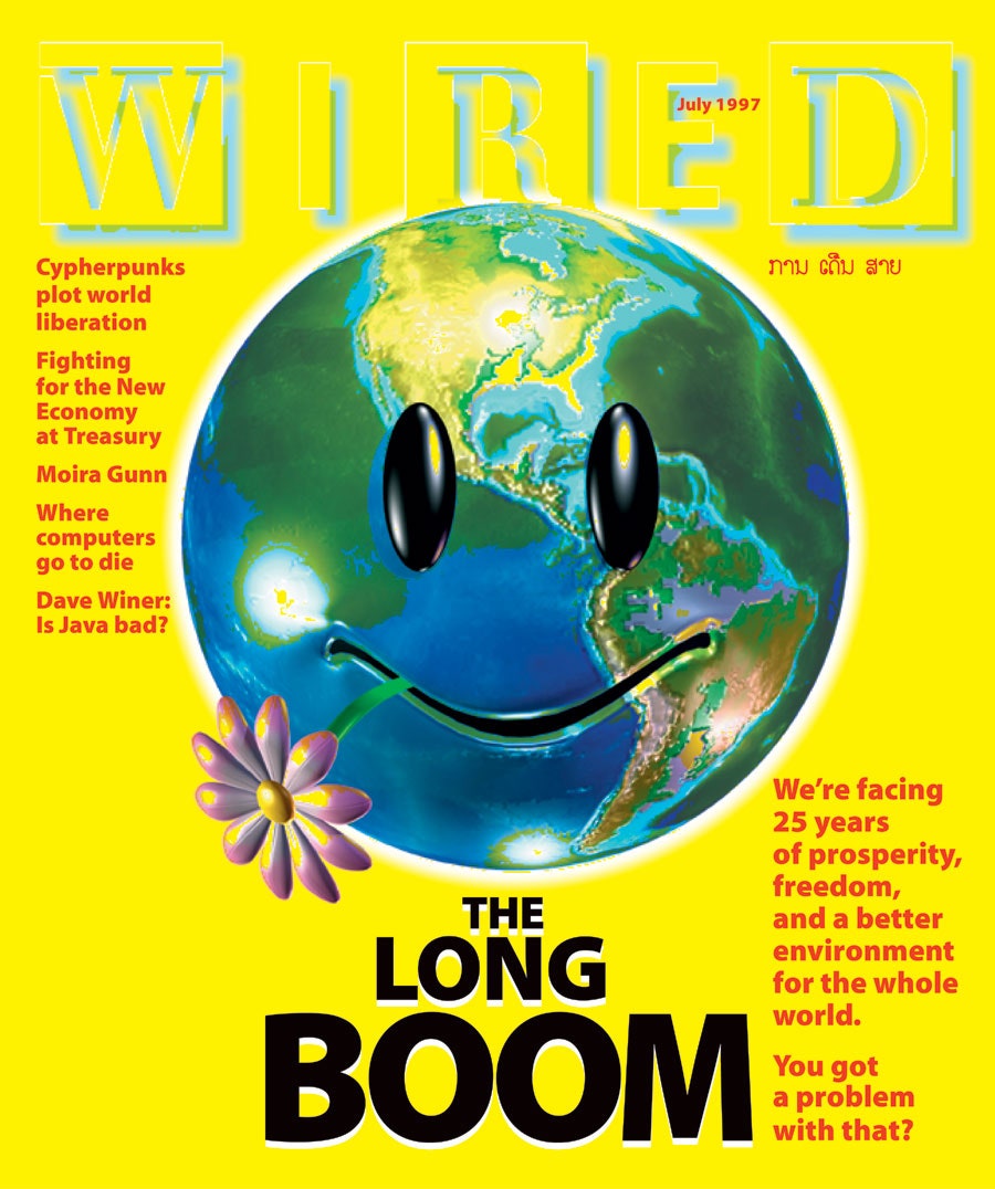
Hydrogen-powered cars. Biological, then quantum computing. Gene-therapy cancer treatments. An end to the War on Drugs. Reliable automatic translation. The impending end of the nation-state. Man setting foot on Mars. These are just a few of the developments in store for our world by the year 2020 — or so, at any rate, predicts “The Long Boom,” the cover story of a 1997 issue of Wired magazine, the official organ of 1990s techno-optimism. “We’re facing 25 years of prosperity, freedom, and a better environment for the whole world,” declares the cover itself. “You got a problem with that?”
Since the actual year 2020, this image has been smirkingly re-circulated as a prime example of blinkered End-of-History triumphalism. From the vantage of 2021, it’s fair to say that the predictions of the article’s authors Peter Schwartz and Peter Leyden (who expanded their thesis into a 2000 book) went wide of the mark.
But their vision of the 21st century hasn’t proven risible in every aspect: a rising China, hybrid cars, video calls, and online grocery-shopping have become familiar enough hardly to merit comment, as has the internet’s status as “the main medium of the 21st century.” And who among us would describe the cost of university as anything but “absurd”?
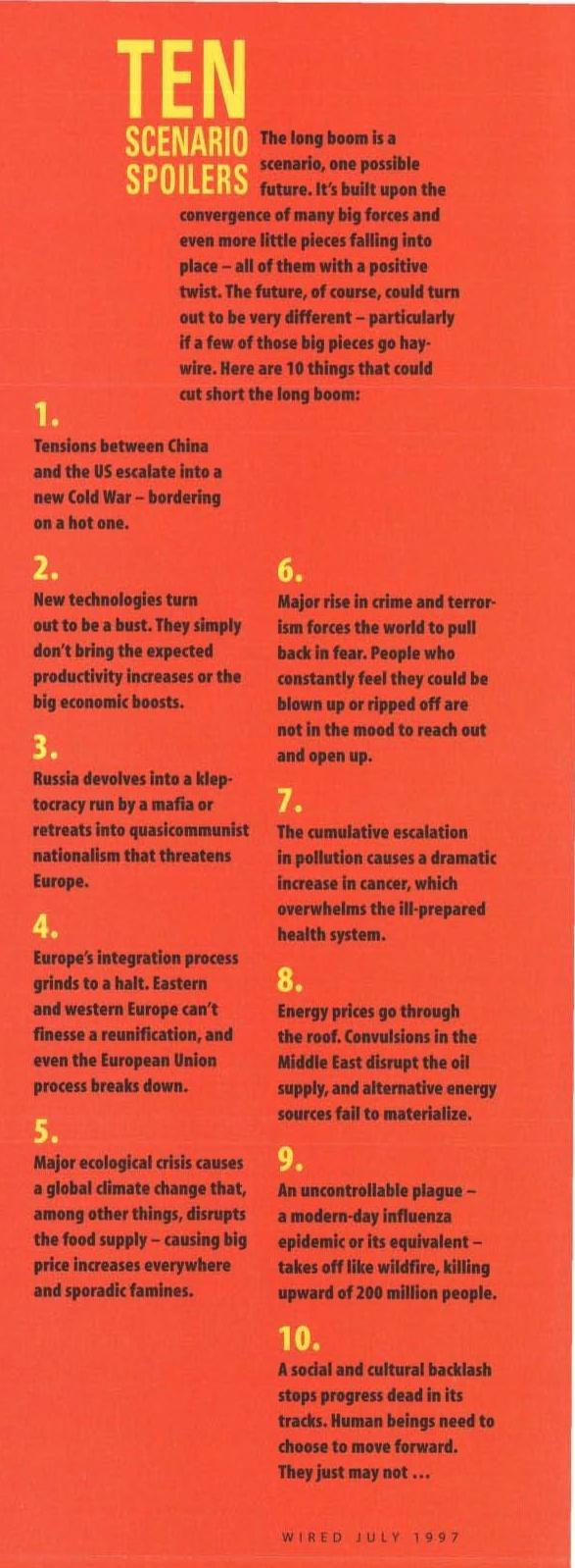
Schwartz and Leyden do allow for darker possibilities than their things-can-only-get-better rhetoric make it seem. Some of these they enumerate in a sidebar (remember sidebars?) headlined “Ten Scenario Spoilers.” Though not included in the article as archived on Wired’s web site, it has recently been scanned and posted to social media, with viral results. A “new Cold War” between the U.S. and China; a “global climate change that, among other things, disrupts the food supply”; a “major rise in crime and terrorism forces the world to pull back in fear”; an “uncontrollable plague — a modern-day influenza epidemic or its equivalent”: to one degree or another, every single one of these ten dire developments seems in our time to have come to pass.
“We’re still on the front edge of the great global boom,” we’re reminded in the piece’s conclusion. “A hell of a lot of things could go wrong.” You don’t say. Yet for all of the 21st-century troubles that few riding the wave of first-dot-com-boom utopianism would have credited, we today run the risk of seeing our world as too dystopian. Now as then, “the vast array of problems to solve and the sheer magnitude of the changes that need to take place are enough to make any global organization give up, any nation back down, any reasonable person curl up in a ball.” We could use a fresh infusion of what Schwartz and Leyden frame as the boom’s key ingredient: American optimism. “Americans don’t understand limits. They have boundless confidence in their ability to solve problems. And they have an amazing capacity to think they really can change the world.” In that particular sense, perhaps we all should become Americans after all.
Related Content:
Pioneering Sci-Fi Author William Gibson Predicts in 1997 How the Internet Will Change Our World
In 1926, Nikola Tesla Predicts the World of 2026
From the Annals of Optimism: The Newspaper Industry in 1981 Imagines its Digital Future
Based in Seoul, Colin Marshall writes and broadcasts on cities and culture. His projects include the book The Stateless City: a Walk through 21st-Century Los Angeles and the video series The City in Cinema. Follow him on Twitter at @colinmarshall or on Facebook.