The First Photograph of a Human Being: A Photo Taken by Louis Daguerre in 1838
You’ve likely heard the reason people never smile in very old photographs. Early photography could be an excruciatingly slow process. With exposure times of up to 15 minutes, portrait subjects found it impossible to hold a grin, which could easily slip into a pained grimace and ruin the picture. A few minutes represented a marked improvement on the time it took to make the very first photograph, Nicéphore Niépce’s 1826 “heliograph.” Capturing the shapes of light and shadow outside his window, Niépce’s image “required an eight-hour exposure,” notes the Christian Science Monitor, “long enough that the sunlight reflects off both sides of the buildings.”
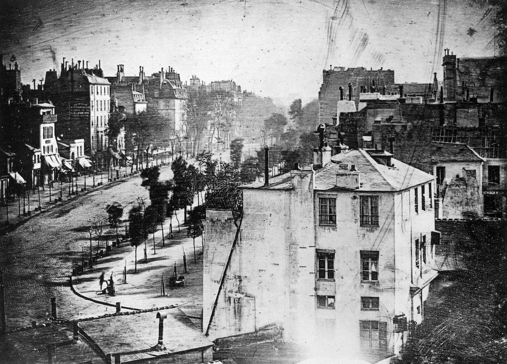
Niépce’s business and inventing partner is much more well-known: Louis Jacques Mandé Daguerre, who went on after Niépce’s death in 1833 to develop the Daguerreotype process, patenting it in 1839. That same year, the first selfie was born. And the year prior Daguerre himself took what most believe to be the very first photograph of a human, in a street scene of the Boulevard du Temple in Paris. The image shows us one of Daguerre’s early successful attempts at image-making, in which, writes NPR’s Robert Krulwich, “he exposed a chemically treated metal plate for ten minutes. Others were walking or riding in carriages down that busy street that day, but because they moved, they didn’t show up.”
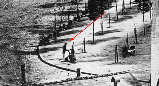
Visible, however, in the lower left quadrant is a man standing with his hands behind his back, one leg perched on a platform. A closer look reveals the fuzzy outline of the person shining his boots. A much finer-grained analysis of the photograph shows what may be other, less distinct figures, including what looks like two women with a cart or pram, a child’s face in a window, and various other passersby. The photograph marks a historically important period in the development of the medium, one in which photography passed from curiosity to revolutionary technology for both artists and scientists.
Although Daguerre had been working on a reliable method since the 1820s, it wasn’t until 1838, the Metropolitan Museum of Art explains, that his “continued experiments progressed to the point where he felt comfortable showing examples of the new medium to selected artists and scientists in the hope of lining up investors.” Photography’s most popular 19th century use—perhaps then as now—was as a means of capturing faces. But Daguerre’s earliest plates “were still life compositions of plaster casts after antique sculpture,” lending “the ‘aura’ of art to pictures made by mechanical means.” He also took photographs of shells and fossils, demonstrating the medium’s utility for scientific purposes.
If portraits were perhaps less interesting to Daguerre’s investors, they were essential to his successors and admirers. Candid shots of people moving about their daily lives as in this Paris street scene, however, proved next to impossible for several more decades. What was formerly believed to be the oldest such photograph, an 1848 image from Cincinnati, shows what appears to be two men standing at the edge of the Ohio River. It seems as though they’ve come to fetch water, but they must have been standing very still to have appeared so clearly. Photography seemed to stop time, freezing a static moment forever in physical form. Blurred images of people moving through the frame expose the illusion. Even in the stillest, stiffest of images, there is movement, an insight Eadweard Muybridge would make central to his experiments in motion photography just a few decades after Daguerre debuted his world-famous method.
Note: An earlier version of this post appeared on our site in 2017.
Related Content:
The First Photograph Ever Taken (1826)
The First “Selfie” In History Taken by Robert Cornelius, a Philadelphia Chemist, in 1839
Josh Jones is a writer and musician based in Durham, NC.
Read More...
Beautiful, Color Photographs of Paris Taken a Century Ago—at the Beginning of World War I & the End of La Belle Époque
It may well be that the major pivot points of history are only visible to those around the bend. For those of us immersed in the present—for all of its deafening sirens of violent upheaval—the exact years future generations will use to mark our epoch remain unclear. But when we look back, certain years stand out above all others, those that historians use as arrestingly singular book titles: 1066: The Year of Conquest, 1492: The Year the World Began, 1776. The first such year in the 20th century gets a particularly grim subtitle in historian Paul Ham’s 1914: The Year the World Ended.
It sounds like hyperbolic marketing, but that apocalyptic description of the effects of World War I comes from some of the most eloquent voices of the age, whether those of American expatriates like Gertrude Stein or T.S. Eliot, or of European soldier-poets like Wilfred Owen or Siegfried Sassoon.
In France, the horrors of the war prompted its survivors to remember the years before it as La Belle Epoque, a phrase—wrote the BBC’s Hugh Schofield in the centenary essay “La Belle Eqoque: Paris 1914,”—that appeared “much later in the century, when people who’d lived their gilded youths in the pre-war years started looking back and reminiscing.”
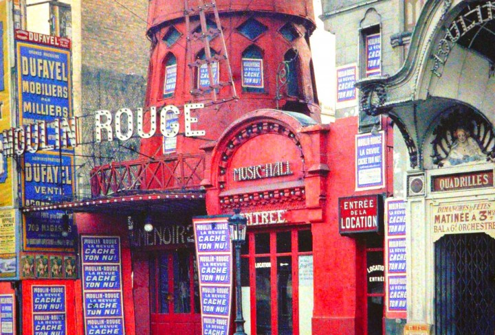
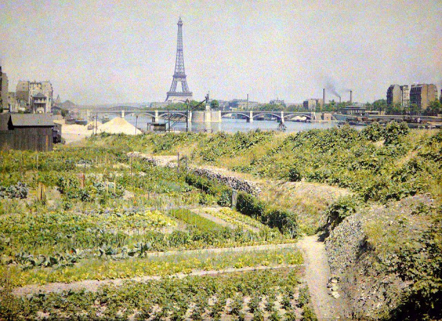
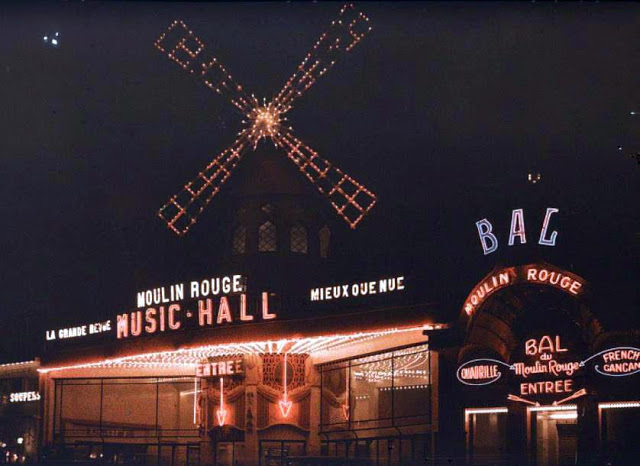
We’re used to seeing the period of 1914 in grainy, dreary black-and-white, and to seeing nostalgic celebrations of La Belle Epoque represented graphically by the lively full-color posters and advertisements one finds in décor stores. But thanks to the full color photos you see here, we can see photographs of World War I‑era Paris in full and vibrant color—images of the city 110 years ago almost just as Parisians saw it at the time. Icons like the Moulin Rouge come to life in bright daylight, above, and lighting up the night, below.
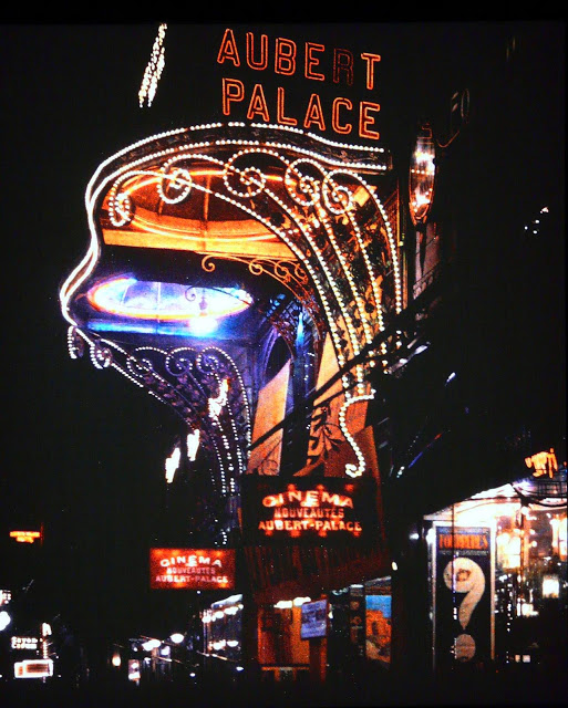
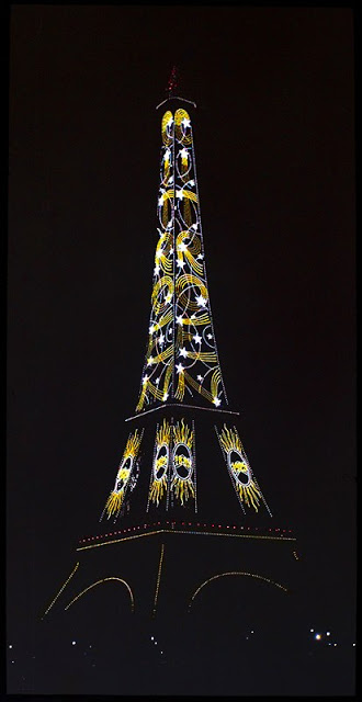
Early cinema Aubert Palace, below, in the Grands Boulevards, shimmers beautifully, as does the art-deco lighting of the Eiffel Tower, further down.
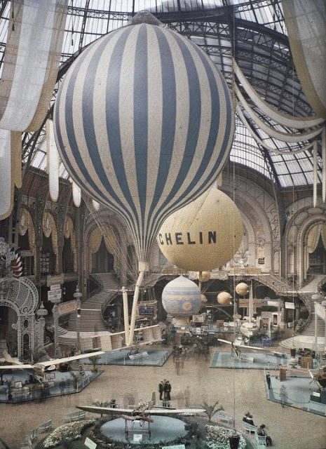
Below, hot air balloons hover in the enormous Grand Palais, and further down, a photograph of Notre Dame on a hazy day almost looks like a watercolor.
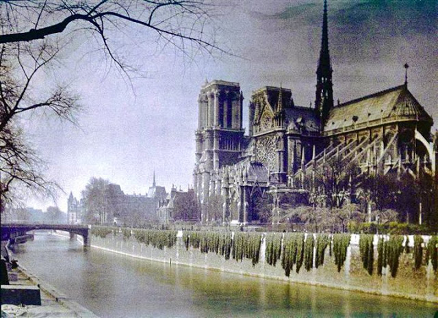
The photographs were made, writes Messy N Chic, “using Autochrome Lumière technology between 1914 and 1918 [a technique developed in 1903 by the Lumière brothers, credited as the first filmmakers]…. [T]here are around 72,000 Autochromes from the time period of places all over the world, including Paris in its true colors.”
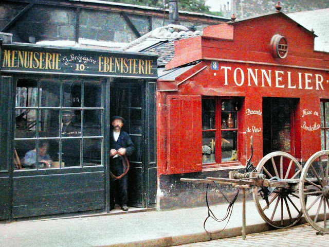
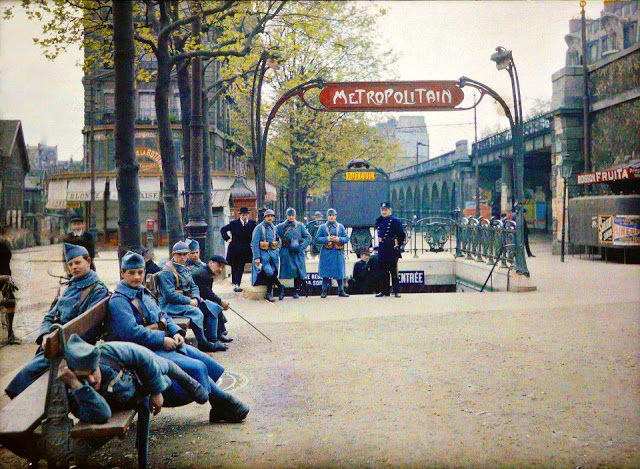
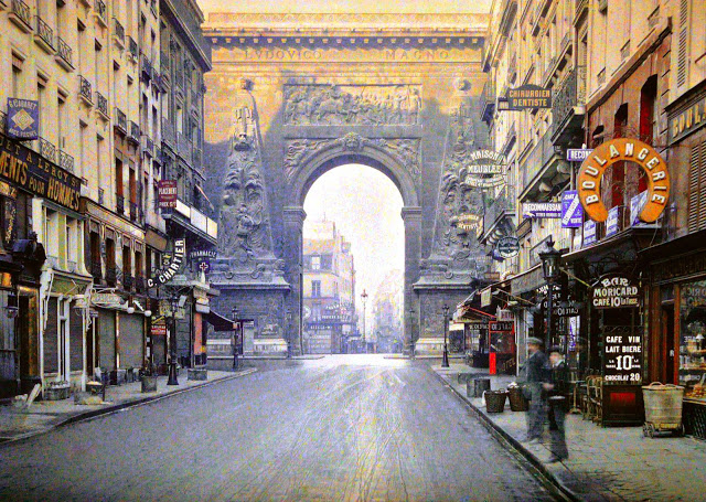
Not all of the photographs are of famous architectural monuments or nightlife destinations. Very many show ordinary street scenes, like those above, one depicting a number of bored French soldiers, presumably awaiting deployment.
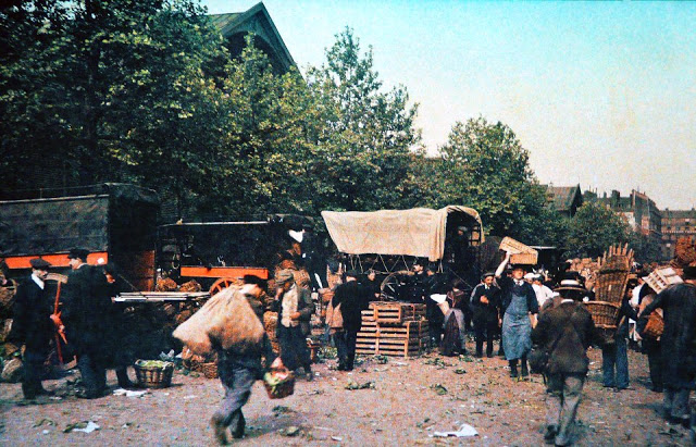
The Paris of 1914 was a European capital in major transition, in more ways than one. “Modernity was the moving spirit,” writes Schofield; “It was the time of the machine. The city’s last horse-drawn omnibus made its way from Saint-Sulpice to La Villette in January 1913.”

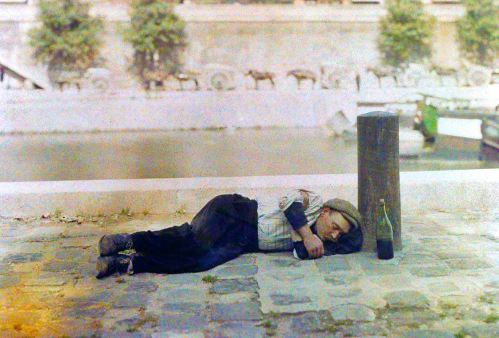
Schofield also points out that, like Gilded Age New York, “the public image of Paris was the creation of romantic capitalists. The reality for many was much more wretched… there were entire families living on the street, and decrepit, overcrowded housing with nonexistent sanitation.”
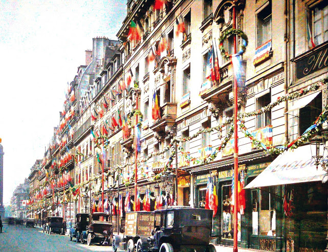
Modernity was leaving many behind, class conflict loomed in France as it erupted in Russia, even as the global catastrophe of World War I threatened French elites and proletariat alike, who both served and who both died at very high rates.

You can see many more of these astonishingly beautiful full-color photographs of 1914 Paris—at the end of La Belle Epoque—at Vintage Everyday and Messy N Chic.
Note: An earlier version of this post appeared on our site in 2015.
Related Content:
Paris Had a Moving Sidewalk in 1900, and a Thomas Edison Film Captured It in Action
Josh Jones is a writer and musician based in Durham, NC.
Read More...The Groundbreaking Animation That Defined Pink Floyd’s Psychedelic Visual Style: Watch “French Windows” (1972)
You could argue that, of all rock bands, that Pink Floyd had the least need for visual accompaniment. Sonically rich and evocatively structured, their albums evolved to offer listening experiences that verge on the cinematic in themselves. Yet from fairly early in the Floyd’s history, their artistic ambitions extended to that which could not be heard. Can you really understand their enterprise, it’s fair to ask, if you remain merely one of their listeners, never entering the visual dimension — not just their album covers, reproductions of which still grace many a dorm room wall, but also their elaborate stage shows, music videos (which they were making before that form had a name), and films? One man had more responsibility for the development of the Floyd’s visual style than any other: Ian Emes.
In 1972, Emes took it upon himself to animate their song “One of These Days” from the previous year’s album Meddle. When the finished work, “French Windows,” aired on the BBC music show The Old Grey Whistle Test, it caught the eye of the Floyd’s keyboard player Rick Wright. The group then got in touch with Emes, asking to use “French Windows” as a projection behind their concerts.
They went on to commission further work from him, for songs like “Speak to Me,” Time,” and “On the Run” from The Dark Side of the Moon. This professional connection endured for decades. When Roger Waters put on his own performances of The Wall — including the enormously scaled show in Berlin in 1990 — he had Emes direct its animated sequences. The post-Waters version of Pink Floyd even called up Emes in 2015 to ask him to make a film to accompany their final album The Endless River.
It was, in a way, the completion of a circle: “One of These Days” is a mostly instrumental song, and The Endless River is a mostly instrumental album; “French Windows” uses rotoscoping, which involves tracing over live action footage to make more realistically smooth animation, and the Endless River film presents its own live action footage in a manner that sometimes verges on the abstract. Both works create their own visual environments, which dovetails with what Emes, who died two years ago, once described as the appeal for him of the Floyd: “They went to architecture college and so I think their music creates spaces. It creates environments of sound and I was so stimulated that my mind would soar, and so I would see images that were stimulated by the music.” Their music takes a different form before the mind’s eye of each fan, but it was Emes who made his visions a part of their legacy.
Related Content:
Psychedelic Scenes of Pink Floyd’s Early Days with Syd Barrett, 1967
Download Pink Floyd’s 1975 Comic Book Program for The Dark Side of the Moon Tour
How Pink Floyd Built The Wall: The Album, Tour & Film
Based in Seoul, Colin Marshall writes and broadcasts on cities, language, and culture. His projects include the Substack newsletter Books on Cities and the book The Stateless City: a Walk through 21st-Century Los Angeles. Follow him on the social network formerly known as Twitter at @colinmarshall.
Read More...The Ambitious Engineering Behind the Golden Gate Bridge
As many as a million people crossed the Golden Gate Bridge on foot to celebrate the 50th anniversary of its construction in 1987. More than a few of them would have remembered San Francisco as it was before it had its most iconic structure — and indeed, some would even remember walking across it once before, on its inaugural “Pedestrian Day” in 1937. Barring the possibility of unusually vigorous supercentenarians, that won’t be the case 12 years from now, on the Golden Gate Bridge’s 100th anniversary. But we’ll still be able to appreciate the enormous ambition of its builders, not least its chief design engineer Joseph Strauss, who, along with Charles Alton Ellis, made possible a project long assumed impossible.
The video from Sabin Civil Engineering at the top of the post explains every stage of the Golden Gate Bridge’s design and construction. Building a suspension bridge over the Golden Gate, the deep strait between San Francisco Bay and the Pacific Ocean, posed formidable challenges. The distinctive shape we know from so many photographs emerged in part from the need to anchor the bridge in such a way as to balance out the massive forces that would otherwise bend its towers inward, and the steel-on-steel construction of its suspenders and deck was necessary to prevent catastrophic crack formation.
The deck hangs from 250 pairs of cables, and each of the main cables that run the length of the bridge actually consists of 27,000 steel wires wound together. A system of thermal expansion joints accommodates regular elongation and shrinkage of nearly four feet.
And we haven’t even got into the underwater blasting and terrifying-looking drilling work required to put up the towers in the first place. In any case, the painstaking efforts of the engineers and laborers alike have surely been vindicated by the Golden Gate Bridge’s functionality and popularity over the past 88 years. Naturally, it’s had to undergo considerable maintenance and retrofitting in that time, and it would take a true romantic to ignore its limitations entirely. (Take its lack of rail capacity, which was neither technically nor economically feasible to incorporate during the Great Depression.) Still, when 300,000 people jammed themselves onto its deck at once on its 50th anniversary, it may have bent in the middle, but it didn’t break. That was a testament to the civil engineering acumen of Strauss and company — but let’s hope the centenary festivities are better organized.
Related content:
“The Bay Lights,” the World’s Largest LED Light Sculpture, Debuts in San Francisco
The 5 Innovative Bridges That Make New York City, New York City
A Mesmerizing Trip Across the Brooklyn Bridge: Watch Footage from 1899
Built to Last: How Ancient Roman Bridges Can Still Withstand the Weight of Modern Cars & Trucks
Based in Seoul, Colin Marshall writes and broadcasts on cities, language, and culture. His projects include the Substack newsletter Books on Cities and the book The Stateless City: a Walk through 21st-Century Los Angeles. Follow him on the social network formerly known as Twitter at @colinmarshall.
Read More...Dozens of M.C. Escher Prints Have Been Digitized & Put Online by the Boston Public Library
In addition to the iconic scene in Jim Henson’s Labyrinth, or appearances in animated TV shows and video games, M.C. Escher’s work has adorned the covers of albums like Mott the Hoople’s 1969 debut and the speculative fiction of Italo Calvino and Jorge Luis Borges. A big hit with hippies and 1960s college students, writes Heavy Music Artwork, his mind-bending prints became associated with “questioning accepted views of normal experience and testing the limits of perception with hallucinogenic drugs.” While he appreciated his cult following, Escher “did not encourage their mystical interpretations of his images.” Replying to one enthusiastic fan of his print Reptiles, who claimed to see in it an image of reincarnation, Escher replied, “Madame, if that’s the way you see it, so be it.”
Rather than illustrate higher states of consciousness or metaphysical entities, Bruno Ernst writes in The Magic Mirror of M.C. Escher, the artist intended to create practical, “pictorial representation of intellectual understanding.” Illustrations, that is, of philosophical and scientific thought experiments. The son of a civil engineer, Escher began his studies in architecture before moving to drawing and printmaking.
The challenge of creating built environments—even seemingly impossible ones—always seemed to occupy his mind. Along with themes from the natural world, a high percentage of his works center on buildings—inspired by formative early years in Rome and his admiration for Islamic art and Spanish architecture.
In the 50s and 60s Escher’s art piqued the interest of academics and mathematicians, an audience he found more congenial to his vision. He corresponded with scientists and incorporated their ideas into his work, meanwhile claiming to be “absolutely innocent of training or knowledge in the exact sciences.” In the 50s, Escher “dazzled” the likes of mathematicians like Roger Penrose and HSM Coxeter. In turn, notes Maev Kennedy, he “was inspired by Penrose’s perspectival triangle and Coxeter’s work on crystal symmetry.”
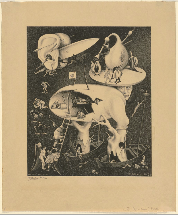
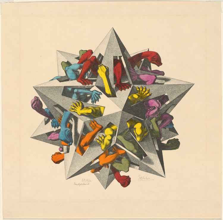
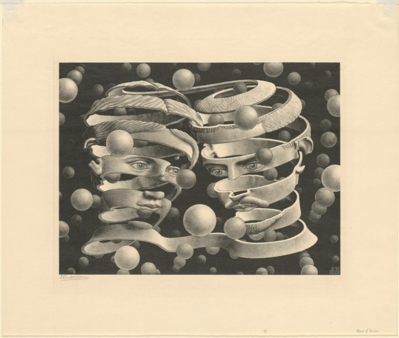
For all the excitement he created among mathematicians, it took a bit longer for Escher to get noticed in the art world. When Penrose’s uncle showed Escher’s version of the perspectival triangle to Picasso, “Picasso had heard of the British mathematician but not of the Dutch artist.” Escher’s fame spread outside of the sciences in part through the interests of the counterculture. He may have shrugged off mystical and psychedelic readings of his prints, but he had an innate penchant for the marvelously weird (see his copy of a scene, for example, from Hieronymus Bosch, above, or his surreal print Gravity, below).
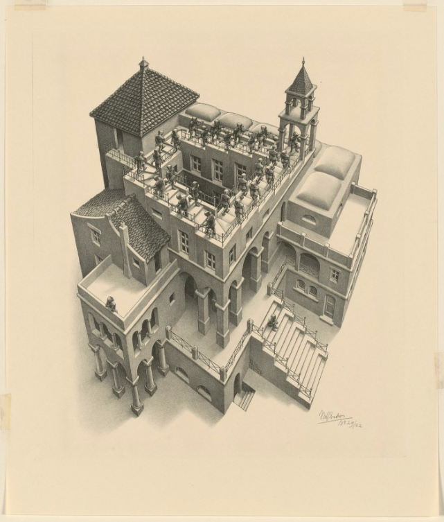
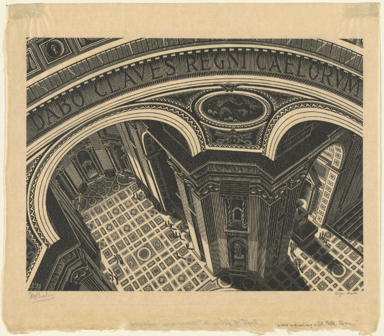
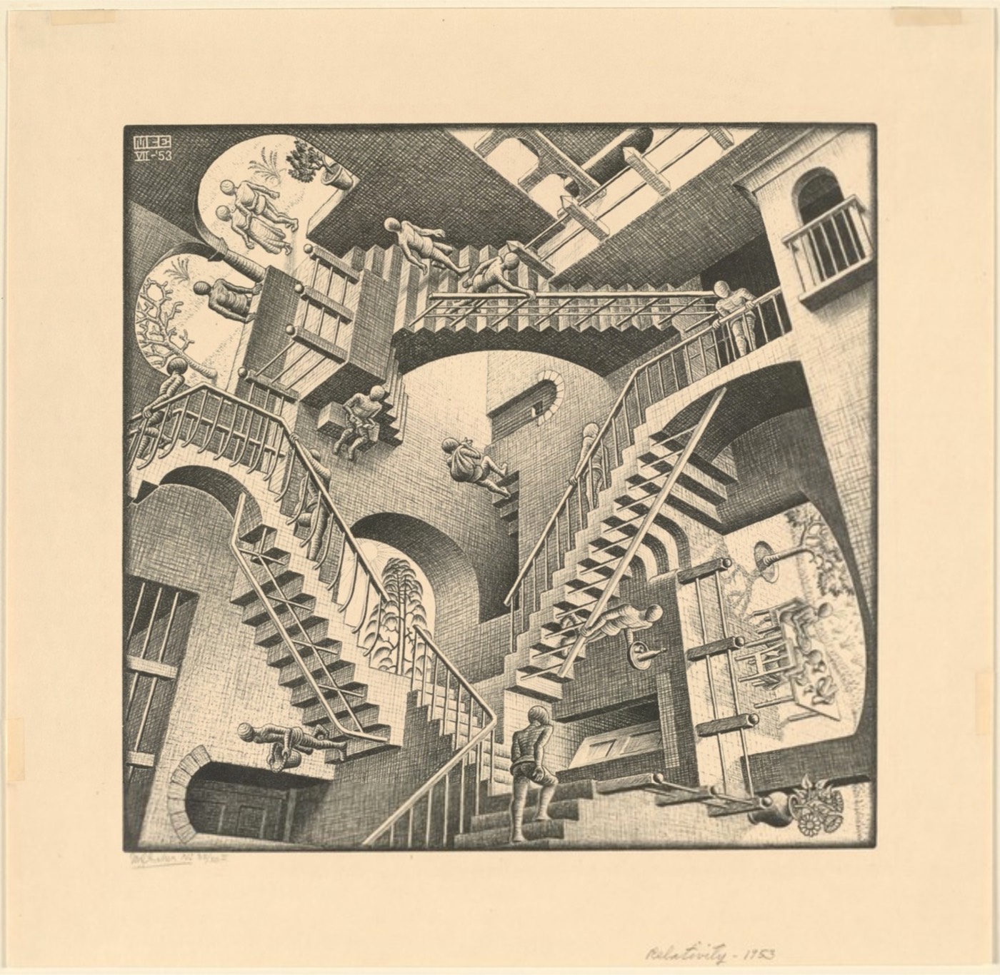
See the prints pictured here and a few dozen more digitized in high resolution at Digital Commonwealth, courtesy of Boston Public Library, who scanned their Escher collection and made it available to the public. Zoom into the fine details of prints like Inside Saint Peter’s, further up—a finely rendered but otherwise not-especially-Escher-like work—and the labyrinthine Ascending and Descending at the top. Whether—as Harvard Library curator John Overholt confesses—you’re a “nerd who loves M.C. Escher” for his mathematical mind, an artist with a mystical bent who loves him for his hallucinatory qualities, or some measure of both, you’ll find exactly the Escher you’re looking for in this digital gallery.
Note: An earlier version of this post appeared on our site in 2018.
Related Content:
M.C. Escher Cover Art for Great Books by Italo Calvino, George Orwell & Jorge Luis Borges
Josh Jones is a writer and musician based in Durham, NC.
Read More...Skiing Down Mount Everest with No Oxygen: It’s a Wild Ride
From Red Bull’s YouTube Channel: “Ski mountaineer Andrzej Bargiel becomes the first person to climb Mount Everest and ski back to Everest Base Camp without supplementary oxygen. After nearly 16 hours climbing in the high altitude “death zone” (above 8,000m where oxygen levels are dangerously low), Bargiel clipped into his skis on the summit of the tallest mountain on earth and started his descent via the South Col Route. He reached Camp II that night and rested — the summit ridge and Hillary Step had taken longer than planned, meaning darkness made it dangerous and difficult to navigate further that day. The next morning, he skied through the treacherous Khumbu Icefall — guided by a drone flown by his brother, Bartek — before safely arriving at Base Camp to become the first person to ascend and descend Mount Everest on skis with no supplementary oxygen.”
Viewer be warned, it’s quite a ride!
Read More...The Roman Empire’s Vast Road Network—186,000 Miles of It—Has Just Been Mapped in a New Digital Atlas

Everywhere you look, you can find traces of the ancient Roman civilization from which the modern West descends. That’s especially true if you happen to be looking in Europe, though echoes of Latin make themselves heard in major languages used all over the world. Take, for example, the common English word itinerary, meaning a planned route for travel, which descends from iter, the Latin word for a journey, route, or path. The Romans eventually spoke of itineraria, which meant more or less the same thing as we do when we speak of our travel itineraries. Now, bridging these distant eras, we have Itiner‑e, a new online map of ancient Rome’s road network, the most comprehensive yet.
Originally envisioned as a kind of “Google Maps for Roman roads,” Itiner‑e is a project of Tom Brughmans of Aarhus University, and Pau de Soto Cañamares and Adam Pažout of the Autonomous University of Barcelona. Its users can digitally explore nearly 300,000 kilometers of roads laid across the vast Roman Empire at its height in the mid-second century — or at least as much of that network as educated guesses can reconstruct.
Researchers can only be sure about less than three percent of the network, with another seven percent of ancient Roman roads documented in existence if not in precise location. Regardless, Itiner‑e is based on an unprecedentedly wide (and open) dataset, which incorporates topographic mapping, satellite imagery and centuries of historical records.
Among Itiner-e’s many features is a confidence rating, which shows just how confident we can be that any given road actually looked like it does on the map. You can also view the whole thing in 3D to get a sense of the elevations involved in construction and travel of the network; use a routing tool to determine suggested routes around the empire “by foot, ox cart or donkey”; and even check satellite imagery to find still-extant parts of Roman roads and draw comparisons with the same parts of the world today. Though a fair few major Roman roads have evolved into current routes for trains and automobiles, we can’t exactly travel on them in the same way the Romans did. Still, when next you plan a European itinerary of your own, consider punching it in to Itiner‑e and seeing how the journey most likely would’ve been made 1,875 years ago.
Related Content:
How the Ancient Romans Built Their Roads, the Lifelines of Their Vast Empire
The Roads of Ancient Rome Visualized in the Style of Modern Subway Maps
A Map Showing How the Ancient Romans Envisioned the World in 40 AD
Built to Last: How Ancient Roman Bridges Can Still Withstand the Weight of Modern Cars & Trucks
The Roman Roads and Bridges You Can Still Travel Today
Plan Your Trip Across the Roads of the Roman Empire, Using Modern Web Mapping Technology
Based in Seoul, Colin Marshall writes and broadcasts on cities, language, and culture. His projects include the Substack newsletter Books on Cities and the book The Stateless City: a Walk through 21st-Century Los Angeles. Follow him on the social network formerly known as Twitter at @colinmarshall.
Read More...Leonardo da Vinci’s Visionary Inventions Rendered in 3D Animation: Helicopters, Robotic Knights, The First Ever Diving Suit & More
To imagine ourselves into the time of Leonardo da Vinci, we must first imagine a world without such things as helicopters, parachutes, tanks, diving suits, robots. Yet those all existed for Leonardo himself — or rather, they existed in his imagination. What he didn’t build in real life, he documented in his notebooks, leaving behind material for appreciations of his genius that would continue half a millennium later. One such appreciation appears above in a new video from Lost in Time, which renders his inventions using the kind of 3D animation technology even the paradigmatic Renaissance man couldn’t have begun to foresee.
This helps us see Leonardo’s work from the perspective of his contemporaries, and to feel how surprised they would’ve been to encounter a seated knight who stands up, opens his visor, and reveals that there’s no one inside the armor. That sort of thing might even amuse us here in the twenty-first century, but accustomed as we are to seeing machines that move around under their own power — and now, seeing them take more credible humanoid form every day — we wouldn’t be inclined to credit it with any kind of life force.
In the fourteen-nineties, however, manpower was what people knew, so they instinctively looked for the man. Leonardo, too, conceived most of his inventions to employ human muscle, the study of whose inner workings enabled him to make the gears and pulleys of his “robotic” knight move its limbs realistically.
According to the plans in one of Leonardo’s notebooks, his “aerial screw,” involving a linen sail wrapped around a wooden mast, would need four men running in circles around a revolving platform, which would theoretically cause the mast to rotate and the whole contraption to lift into the air. As designed, it wouldn’t have been able to take off, but in 2019, University of Maryland scientists modified it to work successfully in miniature, as a kind of drone. As shown in the video, that’s not the only one of Leonardo’s unrealized inventions his intellectual descendants have tried out for themselves. It seems that none have yet attempted to construct his nearly 80-foot-wide crossbow, whose use on the battlefield required the efforts of a dozen soldiers, but then, that’s probably all to the good.
Related Content:
The Ingenious Inventions of Leonardo da Vinci Recreated with 3D Animation
Leonardo da Vinci Draws Designs of Future War Machines: Tanks, Machine Guns & More
Explore the Largest Online Archive Exploring the Genius of Leonard da Vinci
Based in Seoul, Colin Marshall writes and broadcasts on cities, language, and culture. His projects include the Substack newsletter Books on Cities and the book The Stateless City: a Walk through 21st-Century Los Angeles. Follow him on the social network formerly known as Twitter at @colinmarshall.
Read More...A 400-Year-Old Ring that Unfolds to Track the Movements of the Heavens
Rings with a discreet dual purpose have been in use since before the common era, when Hannibal, facing extradition, allegedly ingested the poison he kept secreted behind a gemstone on his finger. (More recently, poison rings gave rise to a popular Game of Thrones fan theory…)
Victorians prevented their most closely kept secrets—illicit love letters, perhaps? Last wills and testaments?—from falling into the wrong hands by wearing the keys to the boxes containing these items concealed in signet rings and other statement-type pieces.
A tiny concealed blade could be lethal on the finger of a skilled (and no doubt, beautiful) assassin. These days, they might be used to collect a bit of one’s attacker’s DNA.
Enter the fictional world of James Bond, and you’ll find a number of handy dandy spy rings including one that doubles as a camera, and another capable of shattering bulletproof glass with a single twist.
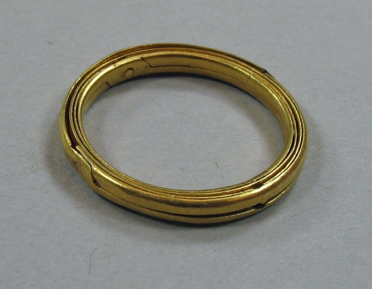
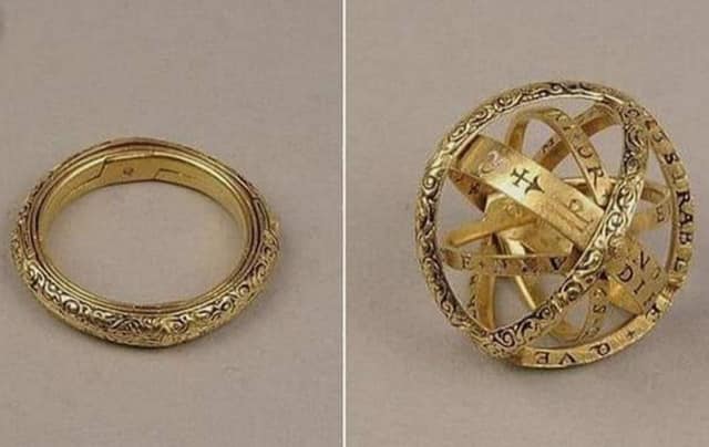
Armillary sphere rings like the ones in the British Museum’s collection and the Swedish Historical Museum (top) serve a more benign purpose. Folded together, the two-part outer hoop and three interior hoops give the illusion of a simple gold band. Slipped off the wearer’s finger, they can fan out into a physical model of celestial longitude and latitude.
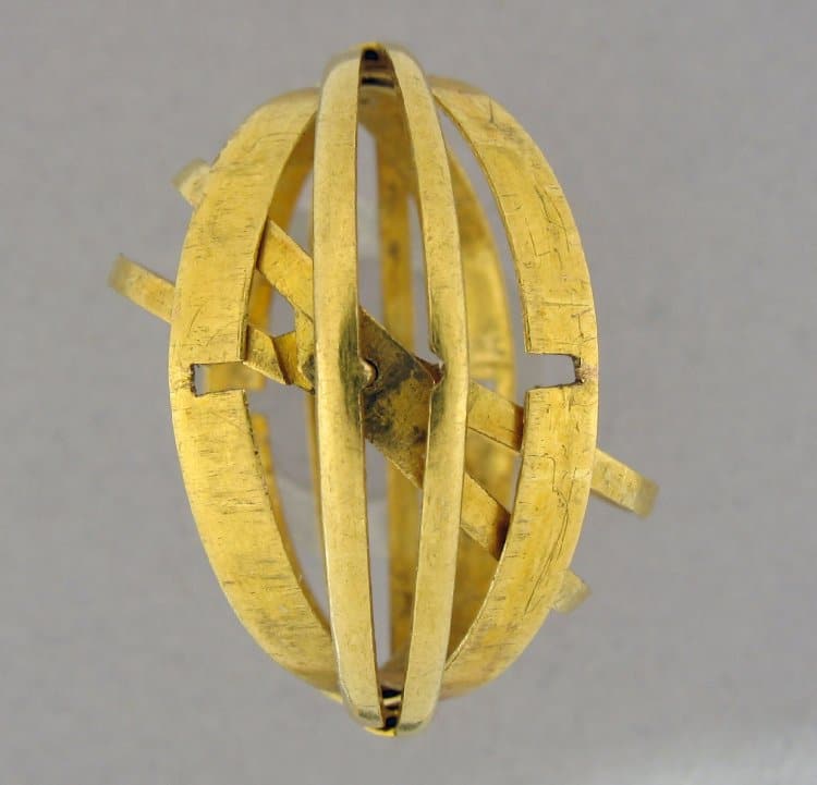
Art historian Jessica Stewart writes that in the 17th century, rings such as the above specimen were “used by astronomers to study and make calculations. These pieces of jewelry were considered tokens of knowledge. Inscriptions or zodiac symbols were often used as decorative elements on the bands.”
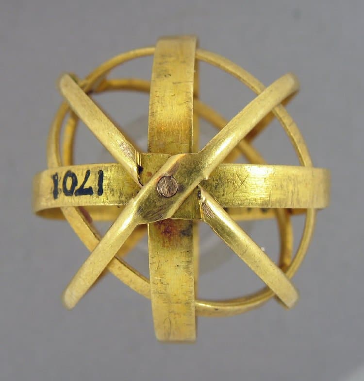
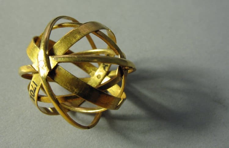
The armillary sphere rings in the British Museum’s collection are made of a soft high-alloy gold.
Jewelry-loving modern astronomers seeking an old school finger-based calculation tool that really works can order armillary sphere rings from Brooklyn-based designer Black Adept.
If you would like to support the mission of Open Culture, consider making a donation to our site. It’s hard to rely 100% on ads, and your contributions will help us continue providing the best free cultural and educational materials to learners everywhere. You can contribute through PayPal, Patreon, and Venmo (@openculture). Thanks!
Related Content:
When Astronomer Johannes Kepler Wrote the First Work of Science Fiction, The Dream (1609)
The Rembrandt Book Bracelet: Behold a Functional Bracelet Featuring 1400 Rembrandt Drawings
Ayun Halliday is an author, illustrator, theater maker and Chief Primatologist in New York City.
Read More...Inside the Making of the Alien Suit: How H. R. Giger’s Dark Vision Came to Life in Ridley Scott’s Film
In the whole of Alien, the titular entity only appears on screen for about three minutes. That’s one reason the movie holds up so well against the other creature features of its era: in glimpses, you never get a chance to register signs of the alien’s being an artificial construction. That’s not to say it was a shoddy piece of work; quite the contrary, as explained in the new video above from CinemaTyler. Its creation demanded the dedicated efforts of an international group of professionals including special effects artist Carlo Rambaldi, who’d engineered the giant ape head in the 1976 King Kong remake and the aliens in Close Encounters of the Third Kind (and would later work on an even more iconic extraterrestrial for E.T.).
Charged with designing the alien, and eventually with overseeing its fabrication and assembly, was the artist H. R. Giger, whose artistic sensibility occupied the intersection of organism and machine, Eros and Thanatos. Though it’s most thoroughly expressed in the deadly creature that stows away aboard the space tug Nostromo, it also, to one degree or another, pervades the whole movie’s look and feel.
Whether from the late seventies or any other period, the usual sleek, antiseptic sci-fi futures date rather quickly, a condition hardly suffered by the unrelievedly dark, dank, and dysfunctional setting of Alien. This surprisingly grimy realism makes the threat of the alien feel that much more real; hidden in its many shadows, Giger’s vision preys that much more effectively on our imagination.
Not that it was guaranteed to succeed in doing so. As CinemaTyler explains, the process of creating the alien came up against countless setbacks, all under increasingly severe constraints of both time and budget. At times the production got lucky, as when it happened upon the nearly seven-foot-tall Bolaji Badejo, who ended up wearing the alien costume (despite Scott’s insistence, early in the production, that he didn’t want to make a movie about “a man in a suit”). But it was attempting to create a being of a kind never seen on screen before, one that had to be developed through trial and error, more often the latter than the former. And it was hardly the only difficult aspect of the making of Alien, as evidenced by the eleven-and-counting episodes of CinemaTyler’s series on the subject. Maybe in space, no one can hear you scream, but one can easily imagine the cries of frustration let out by Scott, Giger, and all their pressured collaborators down here on Earth.
Related Content:
High School Kids Stage Alien: The Play, Get Kudos from Ridley Scott and Sigourney Weaver
Based in Seoul, Colin Marshall writes and broadcasts on cities, language, and culture. His projects include the Substack newsletter Books on Cities and the book The Stateless City: a Walk through 21st-Century Los Angeles. Follow him on the social network formerly known as Twitter at @colinmarshall.
Read More...Support Us
We're hoping to rely on loyal readers, rather than erratic ads. Please click the Donate button and support Open Culture. You can use Paypal, Venmo, Patreon, even Crypto! We thank you!

About Us

Open Culture scours the web for the best educational media. We find the free courses and audio books you need, the language lessons & educational videos you want, and plenty of enlightenment in between.
Advertise With Us

FREE UPDATES!
GET OUR DAILY EMAIL
Get the best cultural and educational resources on the web curated for you in a daily email. We never spam. Unsubscribe at any time.
FOLLOW ON SOCIAL MEDIA

Open Culture editor Dan Colman scours the web for the best educational media. He finds the free courses and audio books you need, the language lessons & movies you want, and plenty of enlightenment in between.
Advertise With Us


