Why R.E.M.‘s 1991 Out of Time May Be the “Most Politically Important Album” Ever
Raise your hand if you bought your first music on cassette tapes. No, not those detourned objects of nostalgia circa 2013, but the “this is the latest technology and that’s that” kinda thing. Okay, you in the back there, remember when the CD came to town? Yeah, and remember those boxes—all that ridiculous packaging, with the long cardboard box twice as long as the product? What was that all about? The rest of you, keep up: It was a different time. Okay, since we all still know what vinyl looks like when handsomely placed on store shelves (maybe you’ve seen this at your local Urban Outfitters), we know that record sleeves are big and square and CD cases are small and square. And the problem for those record stores when the CDs came to replace tapes—but not the precious vinyl—was that the main displays were for the big squares, and the stores didn’t wanna change ‘em. Thus the long CD box: two of them side by side equaled the area of one record.
Problem solved? Not for spoilsports like R.E.M. who (you in the back, remember?) released that album Green in ’88 and went on endlessly about “think global, act local” enviro—blah blah. Why they cared so much about the lives of shade-giving, wish-granting trees I’ll never know, but they did, and it bothered them, these wasteful boxes. So, enter Tipper Gore. Wait, what? Who? How? A short history: Some time ago, Al Gore’s wife Tipper and many others were upset by raunchy lyrics—especially by the 2 Live Crew fellows—and lobbied for those “Parental Advisory” stickers to get stuck on explicit CDs, and some music was censored, and Gore and her coalition of mostly right-wing friends found a convenient boogeyman in popular music. (Are you googling? It’s spelled “PMRC”). A lot of this agitation over explicit lyrics came from genuinely concerned parents. A lot of it came from political opportunists and people who like using legislation to enforce their religious morality.

Where in Stipe’s name is this going? It ties together through one man, Jeff Gold, Warner Brother’s exec during the release of the band’s 1991 album Out of Time. Gold needed the long box for this CD, and he wanted the then-new Rock the Vote project to register millions of young music buyers, who would then, he reasoned, vote out the pols who did the censorship. Gold and Rock the Vote founder and Virgin records co-founder Jeff Ayeroff convinced the band to do the long box thing by making half the box a Rock the Vote petition for the Motor Voter Bill, which would allow voters to register through their local DMV. And that, according to radio show 99% Invisible, is how REM became the face of Rock the Vote and the Motor Voter Bill in 1993. Marketing! And environmentalism. See that sensitive activist at the top of the post? That’s Michael Stipe making a Rock the Vote pitch. See that picture above? (Click to embiggen.) That’s the dorsal side of Out of Time’s CD long box package. The card at the bottom addresses itself to the young record buyer’s Senator. It says,
Dear Senator:
I support the Motor Voter Bill. According to the U.S. Census, in the last presidential election 78% of 18–29 year olds who were registered to vote voted. We aren’t as apathetic as some people think. It’s just that the laws make it hard for many of us to register.
I hope I can say my Senator supports the Motor Voter Bill.
Your Constituent
In no small part because of R.E.M.’s lobbying, the Motor Voter Bill was passed. Many did not like it then and do not like it now. They say it encourages voter fraud, which you might think would be rampant and completely out of control by now, but is not in the least. In any case, the law remains unreasonably controversial, as do many, many laws that make it easier for all kinds of citizens to vote. But you probably know that story already.
For more on why Out of Time is possibly “the most politically important album of all time,” listen to the first episode of new podcast Pitch below, and visit their site for a transcript of their detailed interview with Jeffs Gold and Ayeroff. And for Stipe’s sake, get yourself registered and get to the polls this November.
via 99% Invisible
Related Content:
Filmmaker Errol Morris Gives Us “11 Excellent Reasons Not to Vote?”
Take The Near Impossible Literacy Test Louisiana Used to Suppress the Black Vote (1964)
Three Public Service Announcements by Frank Zappa: Vote, Brush Your Teeth, and Don’t Do Speed
Josh Jones is a writer and musician based in Durham, NC. Follow him at @jdmagness
Read More...Watch The Reality of the Virtual: 74 Minutes of Pure Slavoj Žižek (2004)
Slavoj Žižek must make a tempting documentary subject; you have only to fire up the camera and let him do his thing. Or at least the Slovenian academic provocateur and intellectual performance artist, in films like The Pervert’s Guide to Cinema, The Pervert’s Guide to Ideology, and Žižek!, has given the impression that he can effortlessly carry a film all by himself. The directors of those aforementioned movies did a bit more than sit Žižek down before a rolling camera, but Ben Wright, maker of The Reality of the Virtual, seems to have taken the man’s raw oratorical value as the very premise of his project. This 74-minute documentary — if even the word “documentary” suits such a radically simplified form — simply has Žižek sit at a table, in front of some bookshelves, and talk, ostensibly about “real effects produced by something which does not yet fully exist,” as he identifies them in the realms of psychoanalysis, politics, sociology, physics, and popular culture.
“Shot by Ben Wright over the course of a single day,” writes the New York Times’ Nathan Lee, “here is the apotheosis of the talking-head movie, made up entirely of seven long, static takes of Mr. Žižek,” animated only by his own “habitual repertory of twitches, spasms and uncontrolled perspiration, an alarming frenzy of exuberance that contributes to his reputation as a rock star of philosophy.” The theme at hand, which certainly has something to do with belief and truth, possibility and impossibility, the reality within the unreal and the unreal within reality, takes him through the widest possible range of associated subjects. Those who appreciate Žižek primarily as a master of focused digression — and I have to imagine his fan base contains many such people — will find no purer expression of that particular skill. Then again, to truly experience Žižek, maybe you have to take an actual class taught by him. If The Reality of the Virtual inspires you to do so, count yourself as braver than I.
Find many more heady films on our list of Free Documentaries, part of our larger collection, 4,000+ Free Movies Online: Great Classics, Indies, Noir, Westerns, Documentaries & More.
Related Content:
Žižek!: 2005 Documentary Reveals the “Academic Rock Star” and “Monster” of a Man
A Shirtless Slavoj Žižek Explains the Purpose of Philosophy from the Comfort of His Bed
Colin Marshall hosts and produces Notebook on Cities and Culture and writes essays on cities, language, Asia, and men’s style. He’s at work on a book about Los Angeles, A Los Angeles Primer. Follow him on Twitter at @colinmarshall or on Facebook.
Read More...Map Showing Where Today’s Countries Would Be Located on Pangea
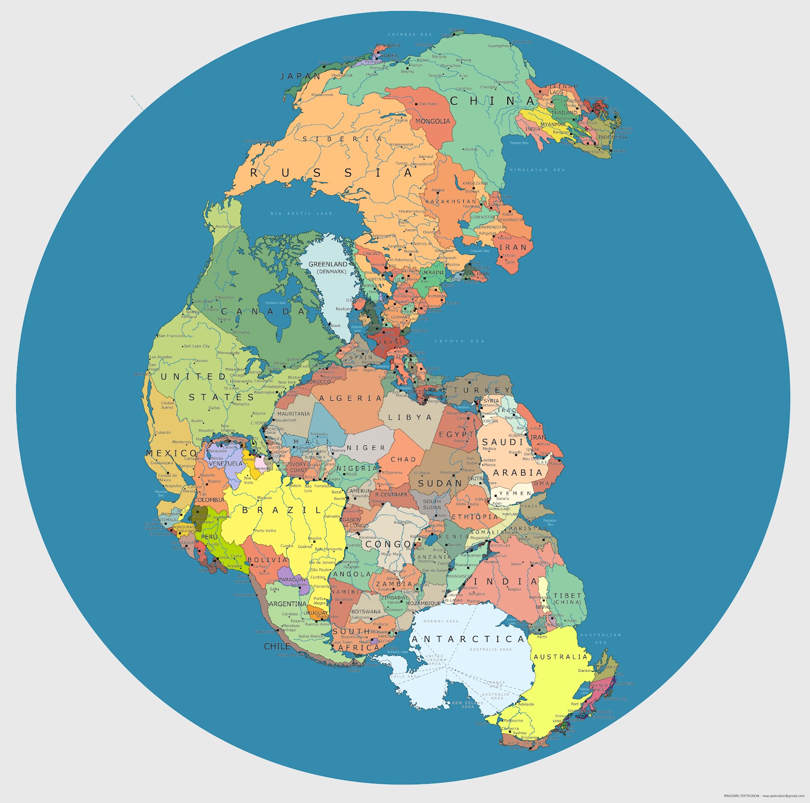
The supercontinent of Pangea formed some 270 million years ago, during the Early Permian Period, and then began to break up 70 million years later, eventually yielding the continents we inhabit today. Pangea was, of course, a peopleless place. But if you were to drop today’s nations on that great land mass, here’s what it might look like. (Click on the image to view it in a much larger, high resolution format.) The map’s creator is Massimo Pietrobon, someone who playfully describes himself as “a famous explorer and cartographer of Atlantis,” and who has taken on other experiments with maps in the past. When someone claimed that the scale of certain countries wasn’t exactly right, Massimo was quick to confess on his blog, “Yes, it’s just a trial, it can be better.” But it’s a creative start.
If you would like to support the mission of Open Culture, consider making a donation to our site. It’s hard to rely 100% on ads, and your contributions will help us continue providing the best free cultural and educational materials to learners everywhere. You can contribute through PayPal, Patreon, and Venmo (@openculture). Thanks!
via Pickover’s Reality Carnival
Related Content:
An Interactive Map of Odysseus’ 10-Year Journey in Homer’s Odyssey
Play Caesar: Travel Ancient Rome with Stanford’s Interactive Map
Download 78 Free Online History Courses: From Ancient Greece to The Modern World
Read More...Theodor Adorno’s Philosophy of Punctuation
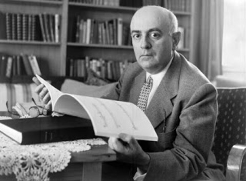
German critical theorist Theodor Adorno is known for many things, but a light touch isn’t one of them. His work includes despairing post-fascist ethics and a study on the sociology and psychology of fascism. Those who dig deeper into his catalog may know his rigorously philosophical Negative Dialectics or dense, opaque Aesthetic Theory. Given the seriously heavy nature of these books, you might be surprised, as I was, to read the paragraph below:
An exclamation point looks like an index finger raised in warning; a question mark looks like a flashing light or the blink of an eye. A colon, says Karl Kraus, opens its mouth wide: woe to the writer who does not fill it with something nourishing. Visually, the semicolon looks like a drooping moustache; I am even more aware of its gamey taste. With self-satisfied peasant cunning, German quotation marks («> >) lick their lips.
The skillful deployment of aphorism seems typical; the playfulness not so much. But Adorno’s short essay, “punctuation marks,” takes a sober turn shortly thereafter, and for good reason. Punctuation is serious business. Sounding much more like the Adorno I know, the dour Marxist writes, “History has left its residue in punctuation marks, and it is history, far more than meaning or grammatical function, that looks out at us, rigidified and trembling slightly, from every mark of punctuation.” Okay.
Well, Adorno would just hate what I’m about to do, but—hey—this is the internet; who has the time and concentration to traverse the rocky course of thought he carves out in his work? Maybe you? Good, read the full essay. Not you? See below for some bite-sized highlights.
Punctuation as music: “punctuation marks,” Adorno writes, “are marks of oral delivery.” As such, they function like musical notation. “The comma and the period correspond to the half-cadence and the authentic cadence.” Exclamation points are “like silent cymbal clashes, question marks like musical upbeats.” Colons are like “dominant seventh chords.” Adorno, a musicologist and composer himself, heard things in these symbols most of us probably don’t.
The semicolon: There is no mark of punctuation that Adorno rejects outright. All have their place and purpose. He does decry the modernist tendency to mostly leave them out, since “then they simply hide.” But Adorno reserves a special pride of place for the semicolon. He claims that “only a person who can perceive the different weights of strong and weak phrasings in musical form” can understand the difference between semicolon and comma. He differentiates between the Greek and German semicolon. And he expresses alarm “that the semicolon is dying out.” This, he claims, is due to a fear of “page-long paragraphs”—the kind he often writes. It is “a fear created by the marketplace—by the consumer who does not want to tax himself.” Right, I told you, he would hate the internet, though he seems to thrive—posthumously—on Twitter.
Quotation marks: While Adorno accepts every punctuation mark as meaningful, he does not accept all uses of them. In the case of the quotation mark, his advice is precisely what I have received, and have passed on to overly glib and thoughtless students. Quotation marks, he writes, should only be used for direct quotes, “and if need be when the text wants to distance itself from a word it is referring to.” This can include writing words as words (the word “word” is a word…). Adorno rejects quotation marks as an “ironic device.” This usage presents “a predetermined judgment on the subject”; it offers a “blind verdict.”
The ellipsis: On this mark, Adorno becomes very prickly, particular, and, well… elliptical. Three dots “suggests an infinitude of thoughts and associations.” Two is the mark of a hack. I leave it to you to parse his reasoning.
The dash: First, we have “the serious dash,” in which “thought becomes aware of its fragmentary character.” Dashes may signal “mute lines into the past, wrinkles on the brow” of the text, ”uneasy silence.” Dashes need not connect thoughts. The “desire to connect everything,” Adorno writes, is the mark of “literary dilettantes.” Thus the “modern dash” is debased, a symptom of “the progressive degeneration of language.” It prepares us “in a foolish way for surprises that by that very token are no longer surprising.” Adorno also prefers another use of dashes—more below.
Parentheses: Parenthetical phrases (like this) create “enclaves” and admit the “superfluousness” of their contents, which is why many stylebooks frown upon them. Their use in this way “capitulate[s] to pedantic philistinism.” The “cautious writer”—writes punctiliously cautious Adorno—will place parentheticals between dashes, “which block off parenthetical material from the flow of the sentence without shutting it up in a prison.” The parentheses do have their place, as do all marks of punctuation in Adorno’s lexical theory. But probably only if you are Proust.
Reading Adorno—on punctuation and anything else—can be intimidating. His erudition, his disdain for carelessness, middlebrow expediency, and the crude forms of expression given birth by commerce of all kinds: these are attitudes that can seem at times like overbearing elitism. And yet, Adorno understands the burdensome nature of writing prescriptions. “The writer,” he admits, “is in a permanent predicament when it comes to punctuation marks: if one were fully aware while writing, one would sense the impossibility of ever using a mark of punctuation correctly and would give up writing altogether.” Far too many have done so. We “cannot trust in the rules,” nor can we ignore them. What to do? Err on the side of the abstemious says our poker-faced German Strunk; to avoid sloppiness or rote misuse, follow an Epicurean mean: “better too few than too many.”
Related Content:
Cormac McCarthy’s Three Punctuation Rules, and How They All Go Back to James Joyce
The Curious History of Punctuation: Author Reveals the Beginnings of the #, ¶, ☞, and More
Hear Theodor Adorno’s Avant-Garde Musical Compositions
Josh Jones is a writer and musician based in Durham, NC. Follow him at @jdmagness
Read More...The Baffler Makes Its Back Issues All Free to Read Online
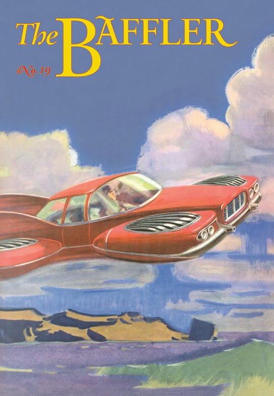
The New Yorker wasn’t the only magazine that relaunched its web site this week. The Baffler did the same. They got a new look and feel. And they made plenty of loyal readers happy by making 25 years of back issues freely available online. The editors of the magazine — that “loose collective of disaffiliated culture critics, knowledge workers, poets, illustrators, and closet utopians” — write:
Well, when The Baffler was born in 1988, we never could have foreseen this #innovation, but here we are. Please enjoy this new and uncharacteristically shiny iteration of The Baffler online—featuring not only our new issue (no. 25, “The None and the Many”), but also, for the first time ever, all of our digitized archives in one place.
That’s 25 issues, 432 contributors, 277 salvos, 450 graphics, 172 poems, 73 stories, 3,396 pages made of 1,342,785 words. You can click on individual pieces or flip through entire issues page by page, if you so desire.
You can flip through the sporadically-published back issues and revel in the iconoclastic magazine that “ridicules respectable business leaders, laughs at popular consumer brands as souvenirs of the cultural industry, and debunks the ideology of free-market nincompoops in the media and on the campuses.” Or, if you’re looking for some more direction, you can head to the The Paris Review, where Dan Piepenbring makes some recommendations, starting with his “personal favorite, Steve Albini’s “The Problem with Music,” a terse, caustic critique of the record industry at the height of yuppie-ism and major-label excess.”
Related Content:
The New Yorker Web Site is Entirely Free This Summer (Until It Goes Behind a Paywall This Fall)
Read More...
A Quick Animated Tour of Iconic Modernist Houses
From Italian graphic designer Matteo Muci comes “a two-minute animated voyage through some of the most iconic masterpieces of modern architecture: Ville Savoye by Le Corbusier, Rietveld Schröder House by Gerrit Rietveld, Farnsworth House by Ludwig Mies van der Rohe, Glass House by Philip Johnson and Fallingwater by Frank Lloyd Wright.” Illustrations of the houses can be viewed and freely downloaded here.
H/t goes to Ian M. for sending this quick visual treat our way.
Related Content:
An Animated Tour of Fallingwater, One of Frank Lloyd Wright’s Finest Creations
Alain de Botton’s Quest for The Perfect Home and Architectural Happiness
The History of Western Architecture: From Ancient Greece to Rococo (A Free Online Course)
Bauhaus, Modernism & Other Design Movements Explained by New Animated Video Series
Ice Cube & Charles Eames Revel in L.A. Architecture
Free: The Guggenheim Puts 99 Modern Art Books Online
Read More...
Stanley Kubrick Faked the Apollo 11 Moon Landing in 1969, Or So the Conspiracy Theory Goes
This week is the anniversary of the Apollo 11 journey to the moon. And while most people will celebrate the event by acknowledging the abilities and courage of Neil Armstrong and company in this landmark of human endeavor, a small, though vocal, group of people will decry the moon landing as a fraud.
In that spirit, French filmmaker William Karel spins an elaborate tale of intrigue in Dark Side of the Moon. (See outtakes above.) The 2002 film posits that the Apollo 11 moon landing was staged by none other than Stanley Kubrick. How else did the director get his hands on a super advanced lens from NASA to shoot those gorgeous candle-lit scenes in Barry Lyndon? The film is slickly produced and features an impressive array of interviewees from Henry Kissinger, to Buzz Aldrin to Christiane Kubrick. Some of the other people interviewed include Jack Torrance and David Bowman. If that’s not a tip off that the whole movie is fake, then the blooper reel at the end drives the point home. Only a lot of people didn’t get the joke. Conspiracy enthusiasts Wayne Green cited the movie as further proof that the moon landing was faked.
Moon hoaxers like to point to The Shining as a confession by Kubrick that he was forced into a Big Lie. In the documentary Room 237, Jay Weidner claims as much. And Michael Wysmierski argues the same in The Shining Code 2.0, a feature length video that you can watch below. Or get right to the meat of things here.
And just in case you get swept up in Wysmierski’s loony logic, filmmaker S. G. Collins makes the very compelling argument that the technology simply didn’t exist to fake the moon landing in 1969. Case closed.
Related Content:
Stanley Kubrick’s Very First Films: Three Short Documentaries
Room 237: New Documentary Explores Stanley Kubrick’s The Shining and Those It Obsesses
Rare 1960s Audio: Stanley Kubrick’s Big Interview with The New Yorker
Jonathan Crow is a Los Angeles-based writer and filmmaker whose work has appeared in Yahoo!, The Hollywood Reporter, and other publications. You can follow him at @jonccrow.
Read More...
Dante’s Divine Comedy Illustrated in a Remarkable Illuminated Medieval Manuscript (c. 1450)
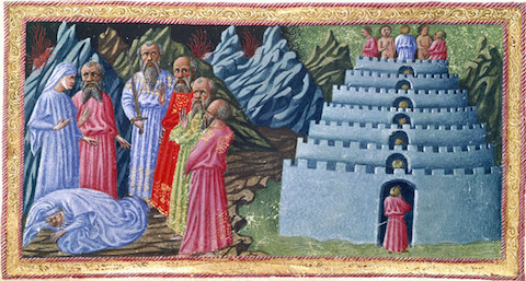
Few writers have inspired so many artists, so deeply and for so long, as Dante Alighieri. His epic poem the Divine Comedy (find in our collection of Free eBooks) has received striking illuminations at the hands of Gustave Doré, Sandro Botticelli, Alberto Martini, and Salvador Dalí — to name only those we’ve featured before here on Open Culture. The names Priamo della Quercia and Giovanni di Paolo may mean relatively little to you right now, but they’ll mean much more once you’ve taken a look at the illustrations featured here and at The World of Dante, which come from an illuminated manuscript of the Divine Comedy at the British Library known as Yates Thompson 36. Produced in Siena around 1450 for an unknown original patron, “the codex belonged to Alfonso V, king of Aragon, Naples, and Sicily,” and includes “110 large miniatures and three historiated initials.” (See all here.) Della Quercia illustrated the Inferno and Purgatorio and all three historiated initials; di Paolo illustrated Paradiso.
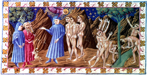
“This makes for two distinctly different styles,” continues The World of Dante’s page. “Priamo’s work reflects the more realistic style of late fifteenth-century Florentine painting, an influence which is particularly noticeable in his use of contours and outlines in the depiction of nudes. Giovanni di Paolo’s style is closer to that of late fourteenth-century Sienese artists,” producing results “greatly admired for their visual interpretation of the poem: the artist doesn’t just transcribe Dante’s words but seeks to render their meaning.”
The British Library’s medieval manuscripts blog describes it as “certainly a lavish production” that “must have been an expensive undertaking,” given the status of the men doing the illuminating as “two of the preeminent artists of the day.” But when it came to visualizing Dante’s journey, quite literally, to hell and back in 15th-century Italy, no artist ranked too highly. Even today, I can’t imagine any artist reading the Divine Comedy, illuminated or no, without getting a few vivid ideas of their own.
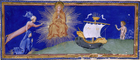
More images can be found on the British Library web site (scroll down the page). A Yale course entirely dedicated to Dante appears in our collection, 1,700 Free Online Courses from Top Universities.
Related Content:
Botticelli’s 92 Illustrations of Dante’s Divine Comedy
Gustave Doré’s Dramatic Illustrations of Dante’s Divine Comedy
Alberto Martini’s Haunting Illustrations of Dante’s Divine Comedy (1901–1944)
Salvador Dalí’s 100 Illustrations of Dante’s The Divine Comedy
Colin Marshall hosts and produces Notebook on Cities and Culture and writes essays on cities, language, Asia, and men’s style. He’s at work on a book about Los Angeles, A Los Angeles Primer. Follow him on Twitter at @colinmarshall or on Facebook.
Read More...The First Animations of Mike Judge, Creator of Beavis and Butt-head & Office Space (1991)
Mike Judge first became famous for creating the crude and crudely drawn cartoon series Beavis and Butt-head (find complete episodes online here). The show was about two high school burnouts whose running commentary on the latest music videos was so boneheaded and baldly vulgar that you couldn’t help but laugh. Prissy culture warriors pointed to the show as yet another symptom of America’s decline while legions of stoned college students gleefully tuned in. In 1998, Judge made the jump to live action features with Office Space, a hilarious, if uneven, take on the banalities of American corporate culture. It’s one of those movies that no one saw in the theater but, thanks to cable, everyone of a certain age can quote. (“If you can come in on Saturday, that would be great.”) Currently, he is the creator for the hit HBO series Silicon Valley.
Judge started in animation after working for a spell as first a computer programmer and then a blues bassist. After seeing an animation cel on display in a local movie theater in 1989, he ran out and bought a Bolex 16mm camera and started making movies. Two years later, he was producing odd, thoroughly unpolished animated shorts that made the rounds in film festivals, eventually launching a career in Hollywood.
Above is a short about Milton, the nebbish stapler-obsessed cubicle dweller who was the genesis for Office Space. Stephen Root played him in the movie. His boss is the same passive-aggressive prick as in the movie though played with less unctuous zeal as Gary Cole’s performance. The short proved to be such a success that MTV’s Liquid Television ordered more.
Next is The Honky Problem, about an emotionally unbalanced country singer named ‘Inbred Jed.’ He wants you to know that he is really, really, really happy to be playing at a remote trailer parker populated by a bunch of characters out of a David Lynch movie. In fact, if it weren’t for the jokey voice over at the end, this short is creepy enough to almost pass for an episode of Lynch’s own animated series, Dumbland.
And there’s this short also from 1991 called simply Huh?, which pits the shrill against the oblivious.
You can find more Animations in our collection, 4,000+ Free Movies Online: Great Classics, Indies, Noir, Westerns, Documentaries & More.
Related Content:
Dumbland, David Lynch’s Twisted Animated Series (NSFW)
Watch All of Terry Gilliam’s Monty Python Animations in a Row
Tim Burton’s The World of Stainboy: Watch the Complete Animated Series
Jonathan Crow is a Los Angeles-based writer and filmmaker whose work has appeared in Yahoo!, The Hollywood Reporter, and other publications. You can follow him at @jonccrow.
Read More...T.S. Eliot Reads Old Possum’s Book of Practical Cats & Other Classic Poems (75 Minutes, 1955)
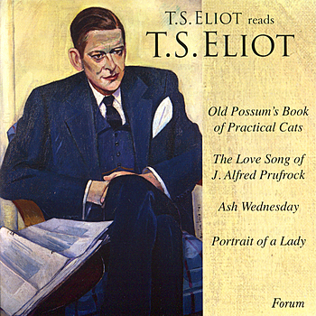 Not only did T.S. Eliot draw the cover for the first edition of his Old Possum’s Book of Practical Cats, featured yesterday, he even read it aloud for the audiobook edition. You may think the time of the audiobook, now a popular form on digital audio devices everywhere, must have begun long after the time of Eliot had already ended. (Eliot died in 1965.) But as we know from having previously featured their mid-1970s albums of Leonard Nimoy reading Ray Bradbury, the record label Caedmon positioned themselves well ahead of the audiobook game. Using recordings made from readings given in London in 1955, Caedmon managed to release albums of Eliot speaking his own work aloud. Today we offer you T.S. Eliot Reads T.S. Eliot, made available via Spotify. The 18 tracks, running some 75 minutes, mostly features Eliot reading from Old Possum’s Book of Practical Cats. But he also recites a handful of other classic poems. (If you need Spotify, you can download the software here):
Other audio editions of Old Possum’s Book of Practical Cats (some including a score) would come out later, but, for many Eliot enthusiasts, nothing else can quite match hearing the man himself introduce the likes of Rum Tum Tugger, Mr. Mistoffelees, and Bustopher Jones. Listeners in most geographies should be able to access the Spotify playlist. But if you live in Canada and South Africa (where some readers have reported problems) we can recommend that you listen (or re-listen) to Eliot’s readings of his modernist masterpieces “The Waste Land” and “The Love Song of J. Alfred Prufrock”, plus his Four Quartets. And if, by chance, you feel like hearing Eliot’s verse but not Eliot’s voice, how about letting Bob Dylan take over reading duties?
Eliot’s reading of Old Possum’s Book of Practical Cats will be added to our collection, 1,000 Free Audio Books: Download Great Books for Free.
Related content:
T.S. Eliot Illustrates His Letters and Draws a Cover for Old Possum’s Book of Practical Cats
Listen to T.S. Eliot Recite His Late Masterpiece, the Four Quartets
Bob Dylan Reads From T.S. Eliot’s Great Modernist Poem The Waste Land
Colin Marshall hosts and produces Notebook on Cities and Culture and writes essays on cities, language, Asia, and men’s style. He’s at work on a book about Los Angeles, A Los Angeles Primer. Follow him on Twitter at @colinmarshall or on Facebook.
Read More...Support Us
We're hoping to rely on loyal readers, rather than erratic ads. Please click the Donate button and support Open Culture. You can use Paypal, Venmo, Patreon, even Crypto! We thank you!

About Us

Open Culture scours the web for the best educational media. We find the free courses and audio books you need, the language lessons & educational videos you want, and plenty of enlightenment in between.
Advertise With Us

FREE UPDATES!
GET OUR DAILY EMAIL
Get the best cultural and educational resources on the web curated for you in a daily email. We never spam. Unsubscribe at any time.
FOLLOW ON SOCIAL MEDIA

Open Culture editor Dan Colman scours the web for the best educational media. He finds the free courses and audio books you need, the language lessons & movies you want, and plenty of enlightenment in between.
Advertise With Us

