Pantone has declared “Peach Fuzz” the Color of the Year. This selection, however, raises the question: How did Pantone become the global authority on color? Above, the Wall Street Journal describes how Pantone began as a commercial printing company during the 1950s. Then, in the early 60s, it evolved into something quite different. Recognizing that its clients (and other companies) need to print materials with consistent colors, Pantone created a universal color language, the Pantone Matching System (PMS), where each color is assigned a specific number. For instance, “Peach Fuzz” corresponds to #FFBE98. As Slate points out, this system ensured that “printers and clients would have a shared reference when they talk to one another—an industry standard, so that a color would mean the same thing all the way from a designer’s vision to the printed item.” Over the next 60 years, Pantone continued to nurture the Pantone Matching System, undoubtedly generating significant revenue along the way and, more importantly, making itself the arbiter of color worldwide.
If you would like to support the mission of Open Culture, consider making a donation to our site. It’s hard to rely 100% on ads, and your contributions will help us continue providing the best free cultural and educational materials to learners everywhere. You can contribute through PayPal, Patreon, and Venmo (@openculture). Thanks!
Participants in these studies were assigned to play one of two parts — teacher or learner. Partner pairs were seated in separate rooms, accessible to each other by microphones. The teacher read the learner a list of matched words they’d expected to remember shortly thereafter. If the learner flubbed up, the teacher was to administer an electric shock via a series of labelled switches, upping it by 15-volts for each successive error. The microphones ensured that the teacher was privy to the learner’s increasingly distressed reactions — screams, desperate protestation, and — at the highest voltage — radio silence.
Should a teacher hesitate, they’d be reminded that the parameters of the experiment, for which they were earning $4.50, required them to continue. They also received reassurance that the painful shocks caused no permanent tissue damage.
Here’s the thing:
The teachers were innocent as to the experiment’s true nature. They thought the study’s focus was punishment’s effect on learning ability, but in fact, Milgram was studying the limits of obedience to authority.
The learners were all in on the ruse. They received no shocks. Their responses were all feigned.
If our eyes don’t deceive us, the Milgram experiment that the AI imagines is even more extreme than the original. It appears all participants, including those waiting for their turn, are in the same room.
As someone commented on Bluesky, the new social media platform on which Ullman shared his hypothetical playsets, “the subtle details the AI has got wrong here are the stuff of nightmares.”
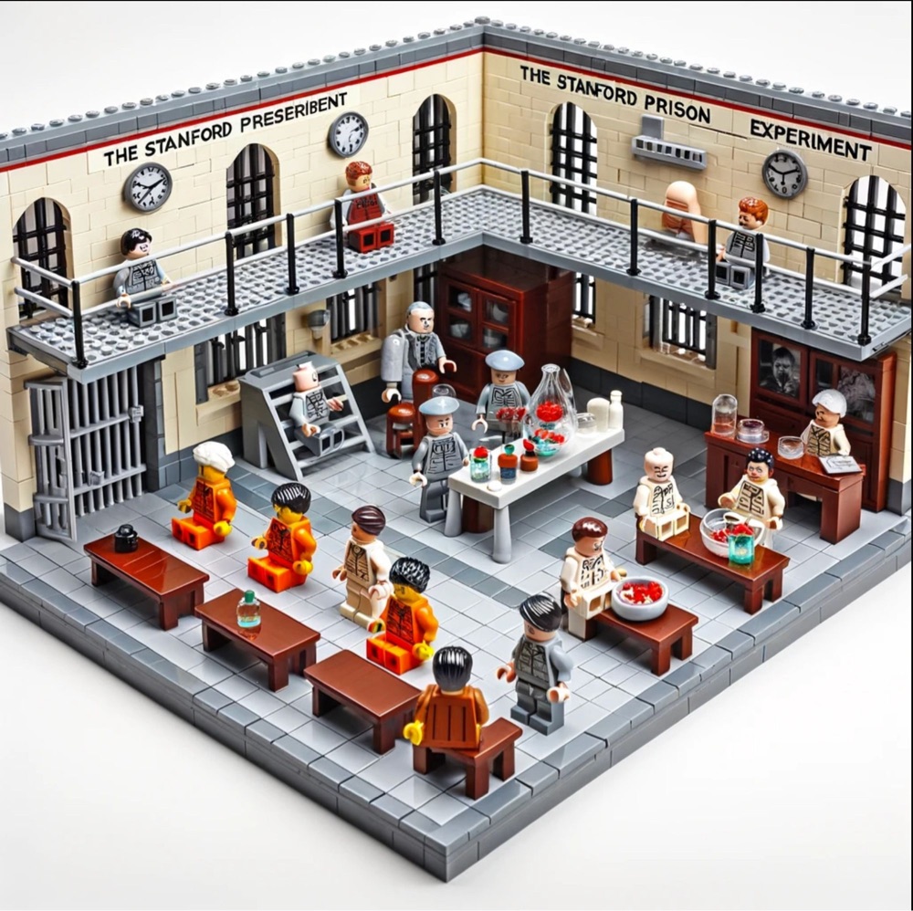
AI’s take on the Stanford prison experiment seems more benign than the controversial 1971 experiment that recruited 24 student participants for a filmed study of prison life to be staged in Stanford University’s psychology department’s basement, randomly dividing them into prisoners and guards.
AI’s faithful recreation of the LEGO figurines’ physical limitations can’t really capture the faux guards’ brutality — making their prisoners clean out toilets with their bare hands, stripping them naked, and depriving them of food and beds. Their power abuses were so wanton, and the prisoners’ distress so extreme, that the planned duration of two weeks was scrapped six days in.
It’s worth noting that all the student participants came to the study with clean bills of physical and mental health, and no histories of criminal arrest.
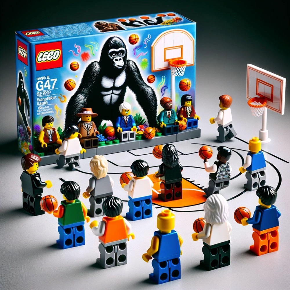
Far less upsetting are the cognitive science experiment playsets depicting the delayed gratification of the Stanford Marshmallow Test and the selective attention of the Invisible Gorilla Test (both right above).
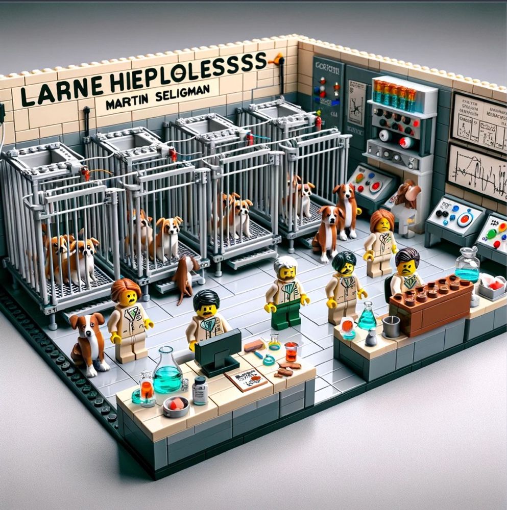
No word on whether he has plans to continue experimenting with AI-engineered LEGO playset proposals featuring historic experiments of psychology and cognitive science.
Follow on Bluesky if you’re curious. You’ll need to register for a free account and apply for an invite code, if you haven’t already… wait, are we setting ourselves up to be unwitting participants in another psych experiment?
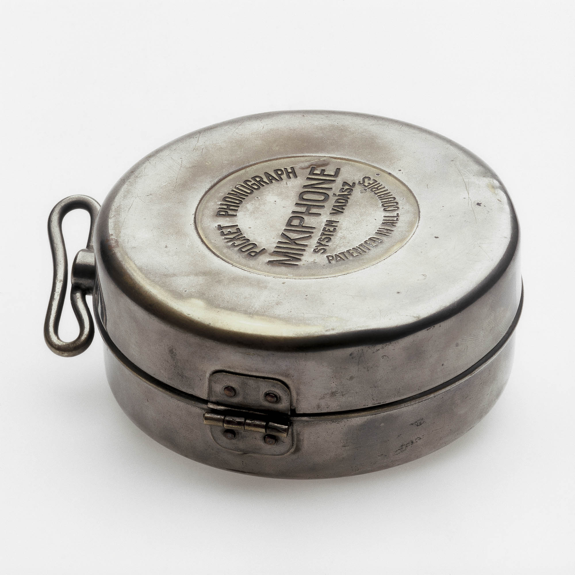
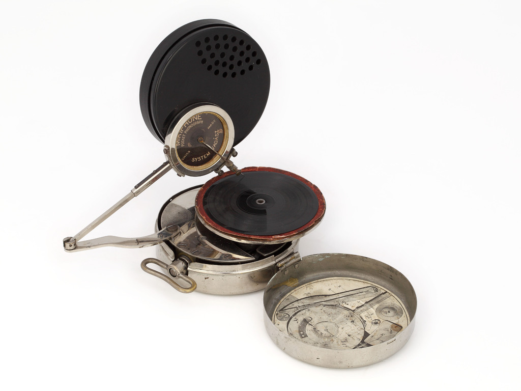
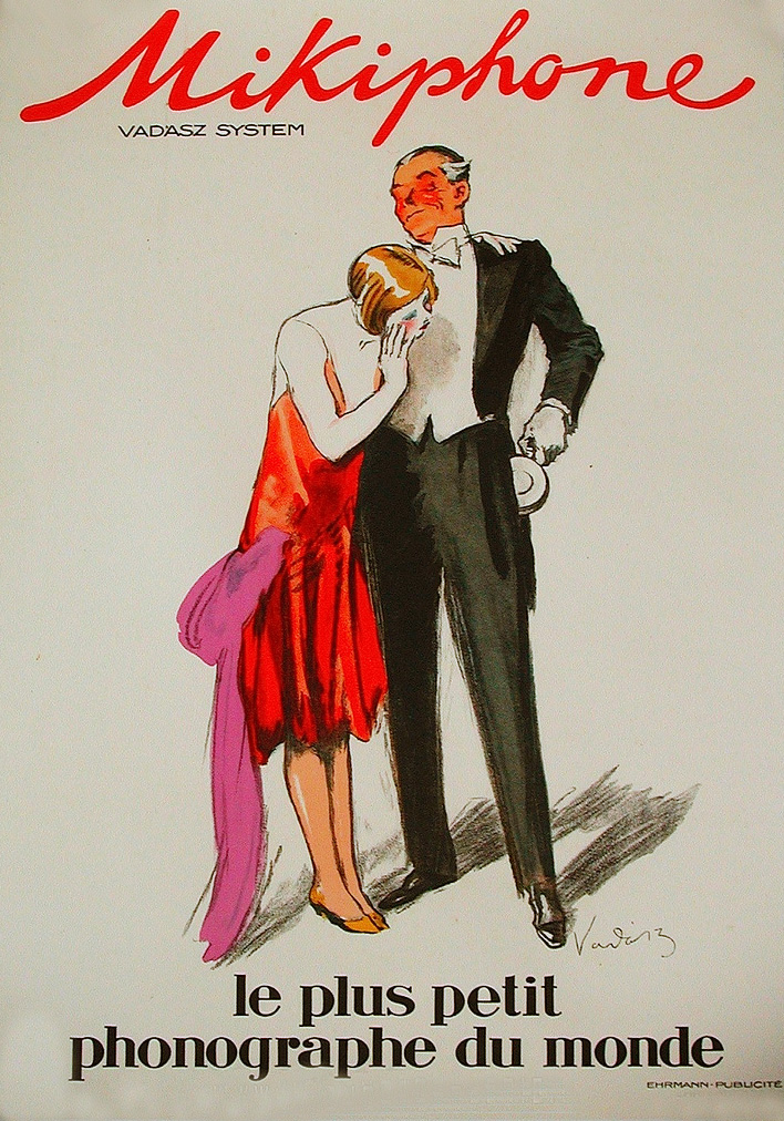
The invention of siblings Miklós and Étienne Vadász, the world’s first pocket record player caused a stir when it was introduced a century ago, nabbing first prize at an international music exhibition and finding favor with modernist architect Le Corbusier, who hailed it for embodying the “essence of the esprit nouveau.”
Unlike more recent portable audio innovations, some assembly was required.
It’s fair to assume that the Stanford Archive of Recorded Sound staffer deftly unpacking antique Mikiphone components from its cunning Sony Discman-sized case, above, has more practice putting the thing together than a nervous young fella eager to woo his gal al fresco with his just purchased, cutting edge 1924 technology.
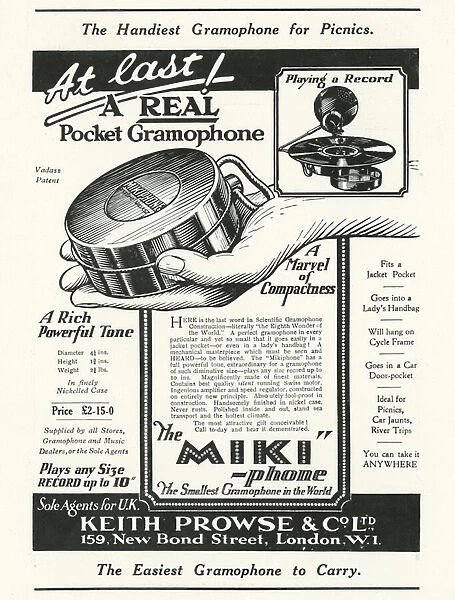
A period advertisement extols the Mikiphone’s portability …
Fits in a jacket pocket
Goes in a lady’s handbag
Will hang on a cycle frame
Goes in a car door pocket
Ideal for picnics, car jaunts, river trips
…but fails to mention that in order to enjoy it, you’d also have to schlep along a fair amount of 78 RPM records, whose 10-inch diameters aren’t nearly so pocket and purse-compatible.
Maison Paillard produced approximately 180,000 of these hand-cranked wonders over the course of three years. When sales dropped in 1927, the remaining stock was sold off at a discount or given away to contest winners.
These days, an authentic Mikphone can fetch $500 and upward at auction. (Beware of Mikiphonies!)
Even those who remain impervious to disco fever seem willing to acknowledge its cultural significance as evidenced by a recent exchange on the Trouser Press forum:
It was everywhere and could indeed get tiresome. But today I can appreciate how well put-together those records by an artist like the Bee Gees were…
Hearing techno for the first time in the early 90s, and realizing it was just disco in a new, all-electronic package, made me realize how good a lot of it was…
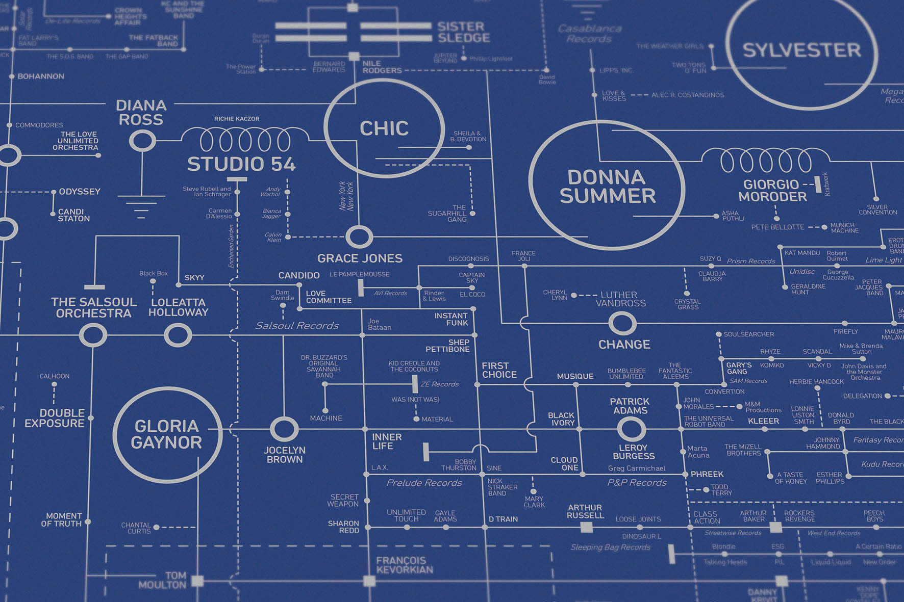
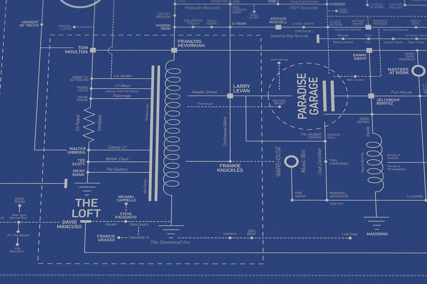
And while the disco explosion eventually saw young straight singles doing the Bump in Indianapolis, Phoenix, and Spokane, Dorothy sticks close to the epicenter by including such legendary New York City clubs as Studio 54, The Gallery, Paradise Garage, The Saint, and The Loft, a private discotheque in DJ David Mancuso’s Lower Manhattan apartment.
There was a mix of sexual orientation, there was a mix of races, mix of economic groups. A real mix, where the common denominator was music.
One can’t mention the music at The Loft without giving props to the innovative and efficient sound system Rosner devised for Mancuso’s 1,850-square-foot space, using a McIntosh amplifier, an AR amplifier, Vega bass bottom speakers, and two Klipschorn Cornwall loudspeakers, whose circuit diagram inspired the Disco Love Blueprint’s layout.
As composer and producer Matt Sommers told The Vinyl Factory, those speakers surrounded dancers with the sort of high volume, undistorted sound they could lose themselves in:
…the Mancuso parties were unique because what he did was take it to a whole other level and created that envelopment experience where you could really get lost and I think that’s what people love about that, because you can just let your troubles go and enjoy it.
The non-profit digital library Internet Archive is rich in interesting material, but its lack of curation can often leave the user feeling like they’re sorting through the world’s most disorganized junk shop, rooting for hidden treasure.
Marier was also discouraged by “a combination of confusing boolean operators and an absolute hodgepodge of different metadata tags and category names:
I figured that if I was having these problems, then there were likely other folks who were as well. So I decided to put my design skills to good use and work on a solution. The biggest issues that I felt needed to be solved were the user experience, and the content curation. For the archive’s curation, I opted to curate each item manually. While I could have likely figured out a way to curate these items using an automated script, I feel that there is an inherent value to human curation. When a collection is curated by a computer it can seem confusing and arbitrary. Whereas with human curation there is often a deliberate connection between each object in the collection. For the navigation I wanted to ensure that it was simple enough that anyone could understand it and operate it. So instead of having a ton of complex operators, I instead decided to organize them by their aspect in design.
Graphic design nerds, rejoice!
Marier determines which of the finds should make the cut by considering relevance and image quality.
A quick peek suggests graphic designers are not the only ones who stand to benefit from this labor of love.
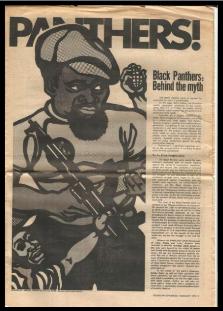
Educators, historians, and activists will be rewarded with a supplement to the Guardian from February 1970, which provided an overview of the Black Panther Party in their own words. There’s a ton of information and history packed into these 8 pages, from its formation and its 10-point program, to an interview with then-incarcerated party chairman Bobby Seale.
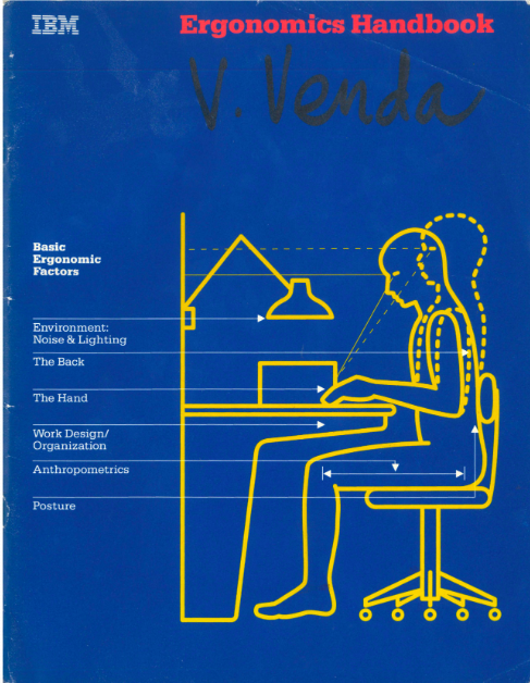
The IBM Ergonomics Handbook from 1989 addresses an evergreen topic. Office managers, physical therapists, and digital nomads should take note. Its recommendations on configuring the work space for maximum efficiency, productivity and employee comfort are solid. It’s not this handsome little yellow and blue employee manual’s fault that references to now-obsolete technology render it a bit quaint:
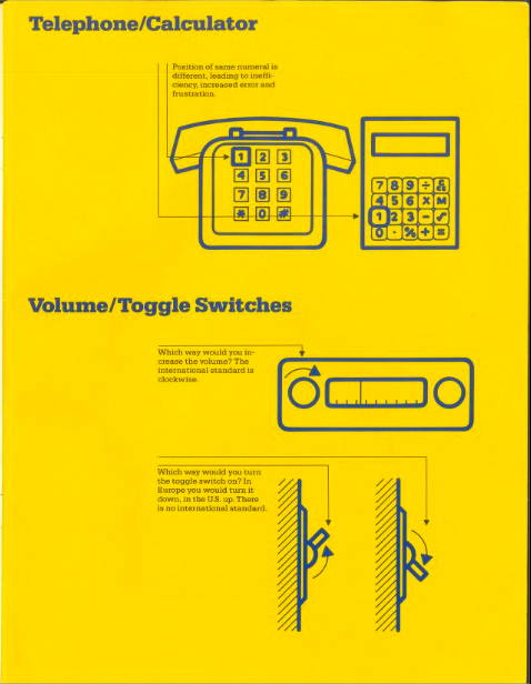
Think of two fairly recent innovations in our lives — the push button telephone and the pocket calculator. Both have a standard key set layout, but not the same layout.
Marier elected to let each pick be represented by its covers, figuring “what better way to browse designed objects than by how they look.”
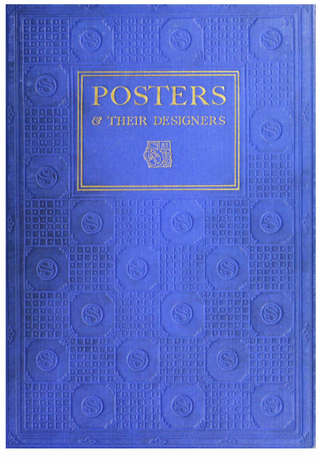
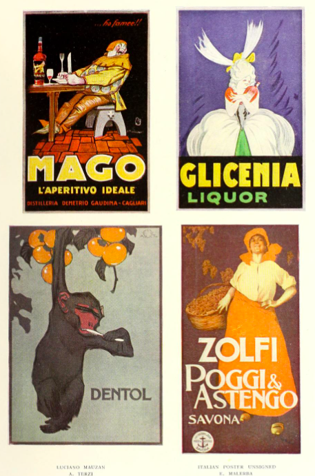
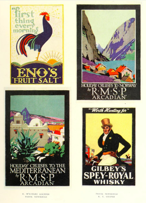
We agree, though we’re worried about where this might leave 1924’s Posters & Their Designers. How can its staid blue cover compete against its sexy neighbors in the posters category?
Small business owners, set dressers and public domain fans should give Posters & Their Designers a chance. Behind that discreet blue cover are a wide assortment of stunning early 20th century posters, including some full color reproductions.
While not specifically typography related, Marier wisely gives this resource a typography tag. Hand lettering loyalists and font fanatics will find much to admire.
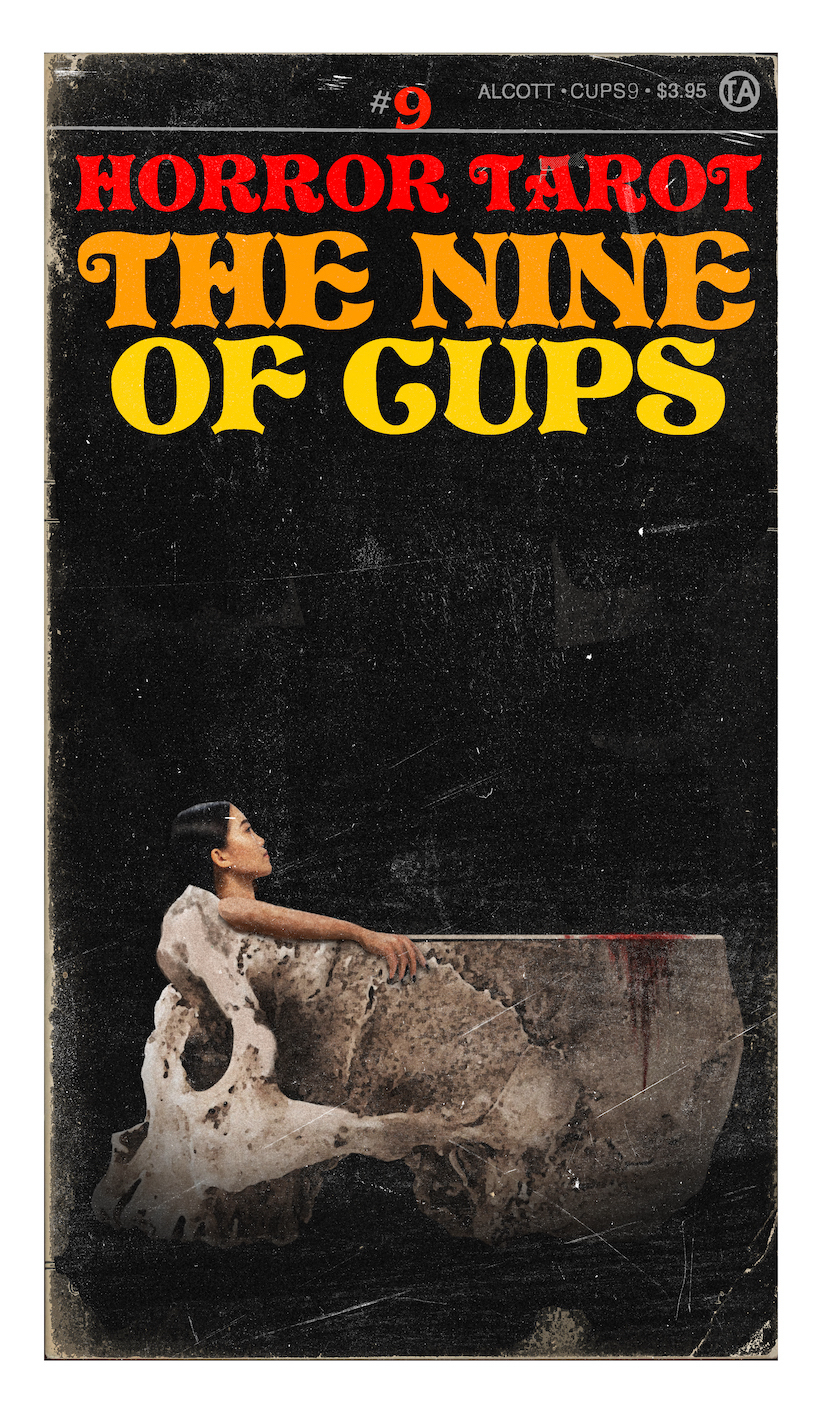
The artist admires the genre’s capacity for conveying subversive messages, explaining that “horror is where we think about the unthinkable and revel in the things that are bad for us:”
Drama can exalt the finest in humanity, but horror shows us who we really are. From The Golem to Frankenstein to The Shining to The Silence of the Lambs, horror uses metaphor to explore the darkest and most unforgivable aspects of human nature.
As he did with his Pulp Tarot deck, Alcott put in hundreds of research hours, studying movie posters, pulp magazines, fan mags, paperback books, and classic comics to get a feel for period design trends and execution:
I love seeing the different developments in printing, from etching to lithography to silkscreens to offset printing. All those different methods of creating images, all ridiculously complicated back then, are now taken care of easily with a few mouse clicks. In my own perverse way, I want to bring those days back. I want to see the flaws in the process, I want to see the limitations of reproduction, and, most of all, I want to be able to feel the paper the images are printed on.
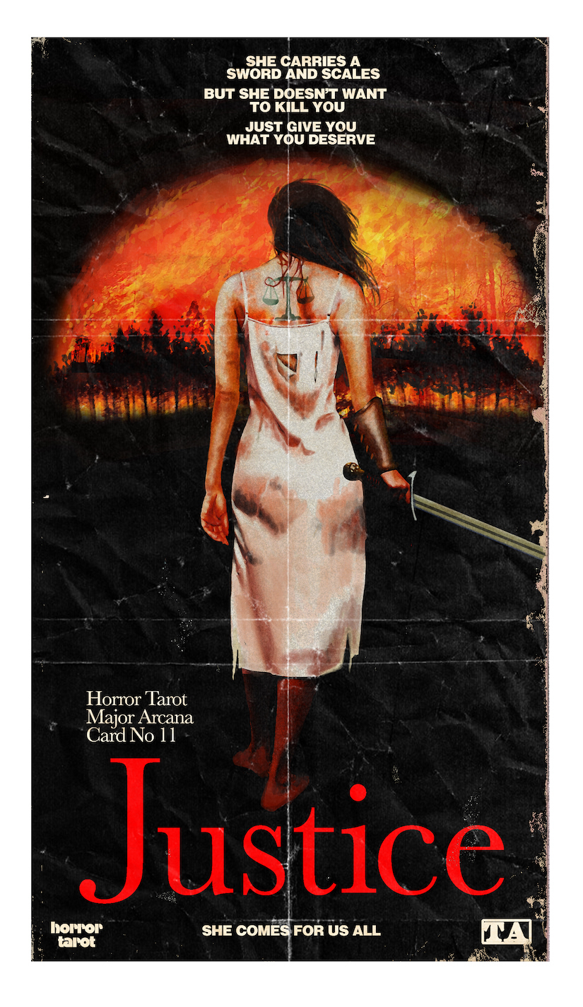
The cards of the Major Arcana are inspired by film posters spanning the silent era to the present day. Each card has close ties to Horror Tarot Studios, a fictional production company that purports to have been in business since the dawn of the motion picture.
The Justice card references marketing tactics for gritty 70s drive-in staples like Last House on the Left and I Spit on Your Grave. The deck’s instruction booklet contains a few anecdotes about the production of these movies, a helpful bit of context for those who might have missed (or skipped) that fertile era of women’s revenge pictures:
I wanted the Horror Tarot Justice to be someone the reader can root for, even if they’re horrified by what Justice promises: not death, but “what you deserve.”
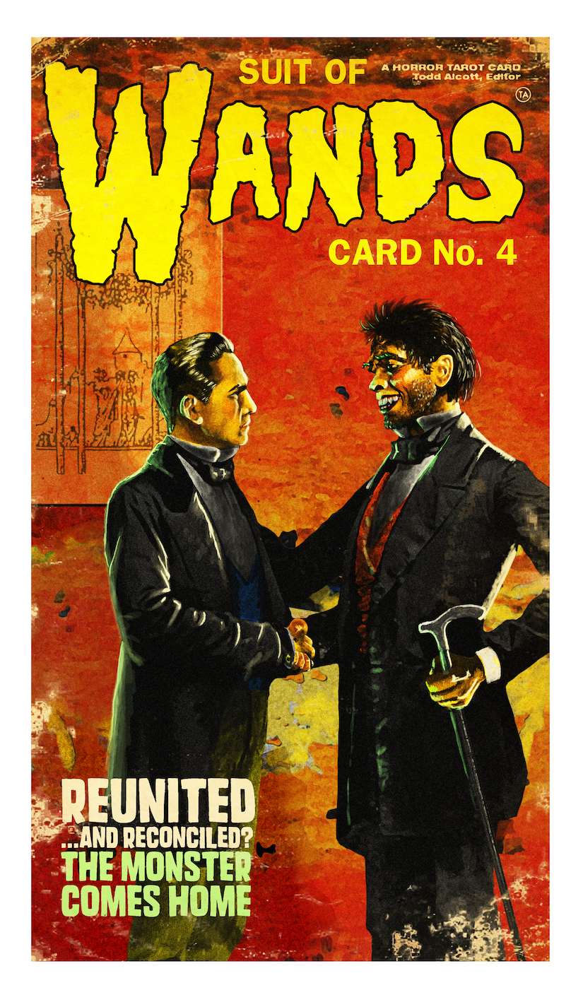
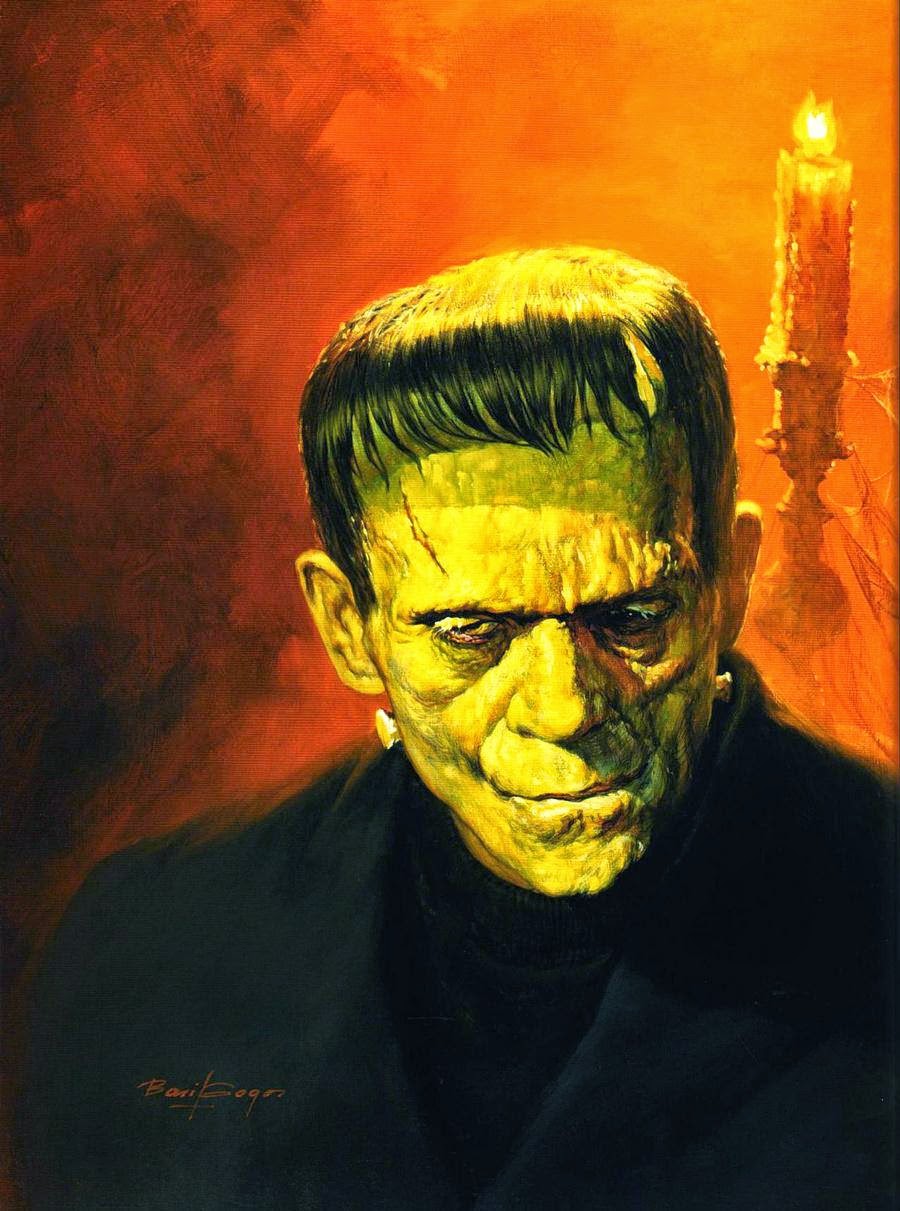
You may have no knowledge of that seminal publication, but you’d probably recognize some of the cover artwork by painter Basil Gogos, featuring such MVPs as Frankenstein’s monster, the Creature from the Black Lagoon, the Phantom of the Opera and Dracula. Alcott says that many of Gogos’ iconic monster portraits are more deeply ingrained in the public memory than the art the studios chose to promote their movies:
…for the Suit of Wands I wanted to create a series of portraits done in his style, featuring characters he never got around to painting. The Four of Wands is a card about homecoming and reconciliation, and I had the idea to paint Frederick March’s Dr. Jekyll and Mr. Hyde as two separate men, meeting for the first time in a back alley in Victorian London.
A homecoming doesn’t necessarily require a physical return to a physical home — it can be completely internal. I wanted to show Dr. Jekyll coming to terms with his inner struggle.
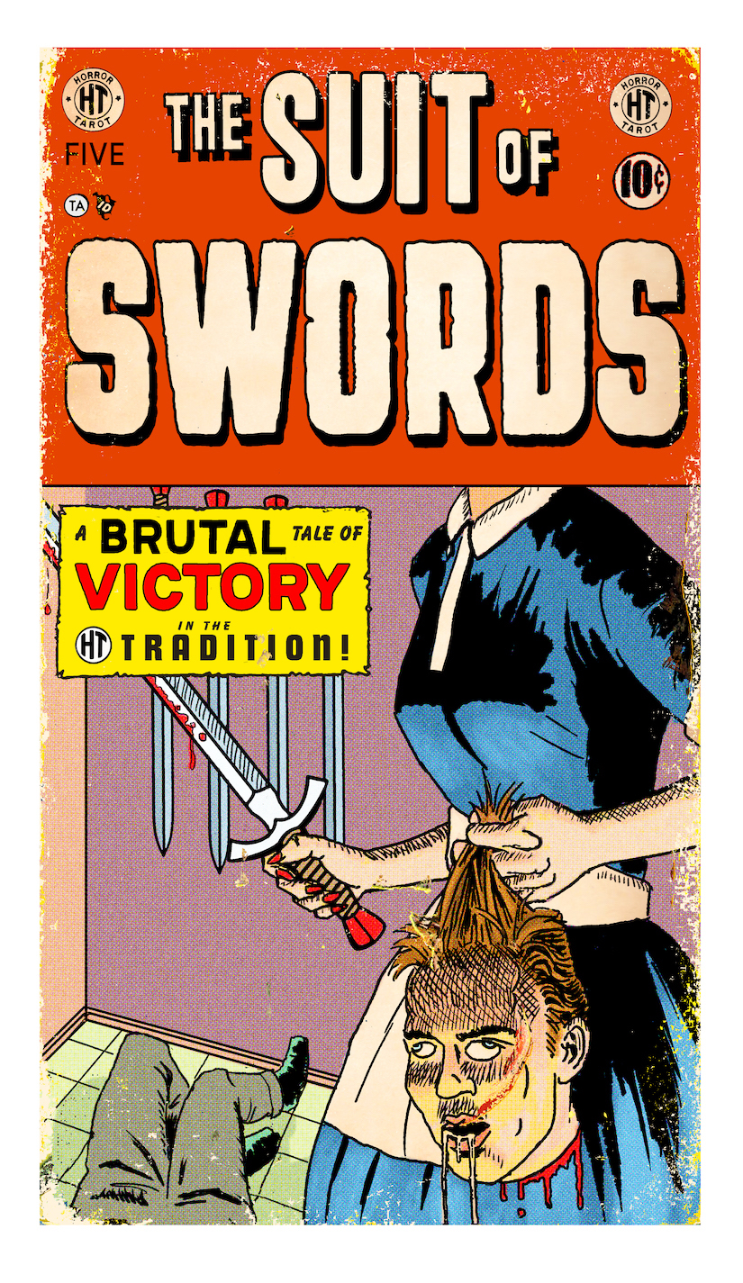
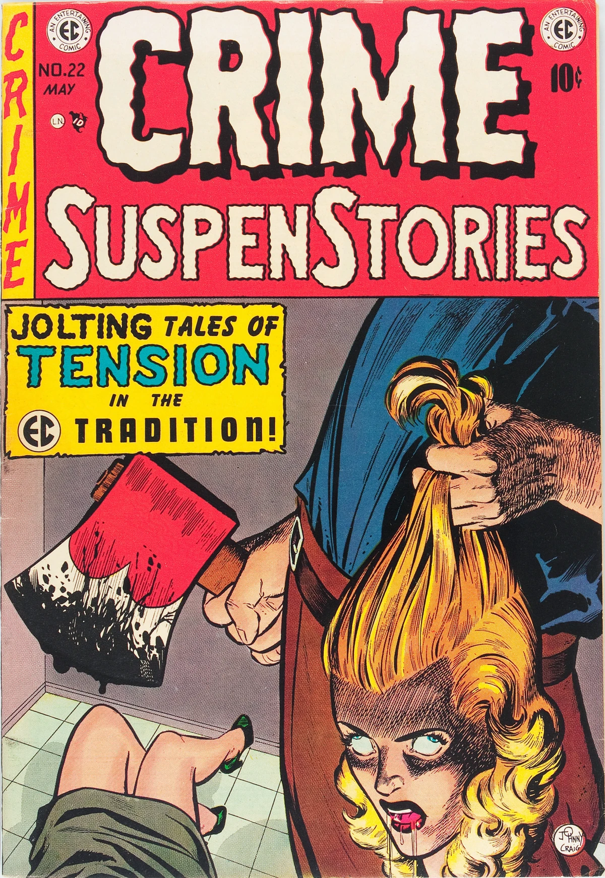
The Suit of Swords recreates the look of another indelible horror trope — the EC comics of the 1950s:
These comics were so lurid and perverse that they actually sparked a congressional investigation, which ended up putting them out of business. Again, before the internet, this is what horror fans had available to them, and comics publishers had to keep pushing the limits of what was acceptable in order to stay ahead of the competition.
For the Five of Swords, I parodied and gender-swapped the infamous cover of Crime SuspenStories #22. The Five of Swords is a card about being a bad winner, about gloating at your opponent’s defeat, about overkill. I figured that a housewife murdering her husband and then beheading him with a sword counted as overkill.
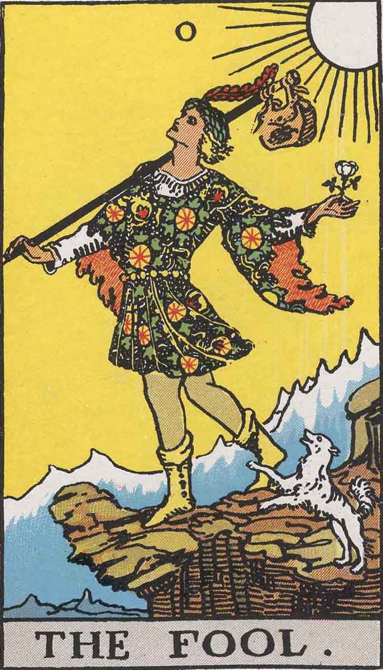
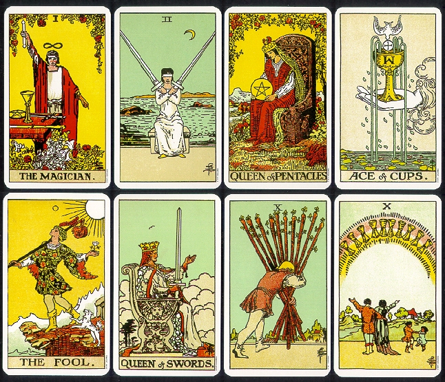
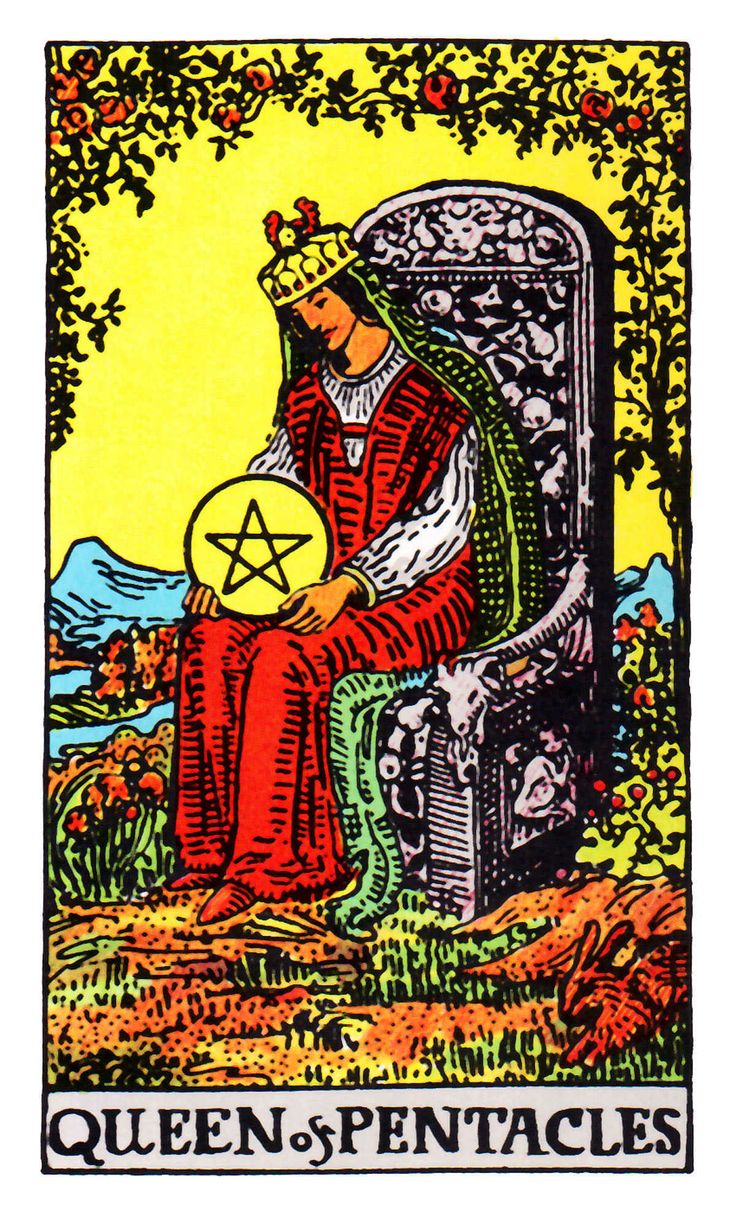
It is generally accepted that the standard deck of playing cards we use for everything from three-card monte to high-stakes Vegas poker evolved from the Tarot. “Like our modern cards,” writes Sallie Nichols, “the Tarot deck has four suits with ten ‘pip’ or numbered cards in each…. In the Tarot deck, each suit has four ‘court’ cards: King, Queen, Jack, and Knight.” The latter figure has “mysteriously disappeared from today’s playing cards,” though examples of Knight playing cards exist in the fossil record. The modern Jack is a survival of the Page cards in the Tarot. (See examples of Tarot court cards here from the 1910 Rider-Waite deck.) The similarities between the two types of decks are significant, yet no one but adepts seems to consider using their Gin Rummy cards to tell the future.
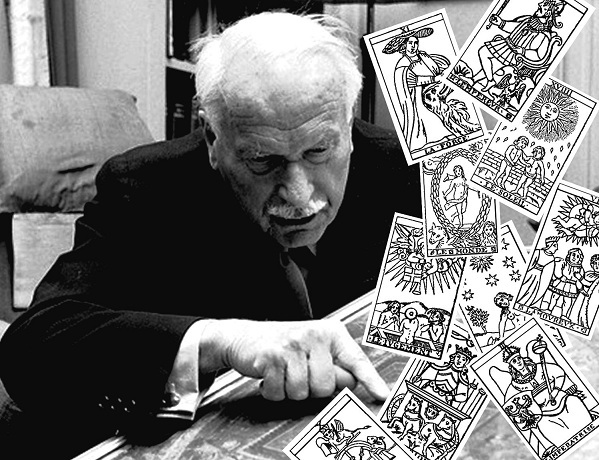
The eminent psychiatrist Carl Jung, however, might have done so.
As Mary K. Greer explains, in a 1933 lecture Jung went on at length about his views on the Tarot, noting the late Medieval cards are “really the origin of our pack of cards, in which the red and the black symbolize the opposites, and the division of the four—clubs, spades, diamonds, and hearts—also belongs to the individual symbolism.
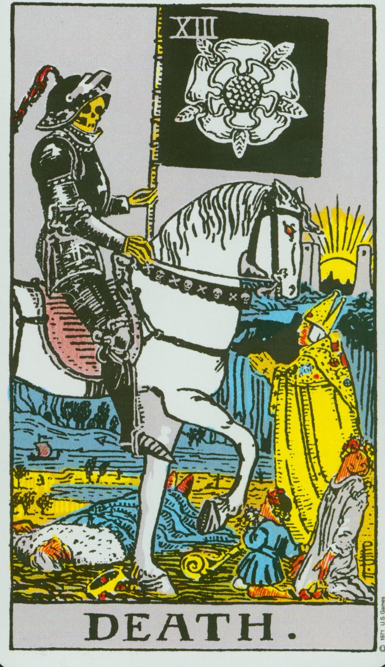
They are psychological images, symbols with which one plays, as the unconscious seems to play with its contents.” The cards, said Jung, “combine in certain ways, and the different combinations correspond to the playful development of mankind.” This, too, is how Tarot works—with the added dimension of “symbols, or pictures of symbolical situations.” The images—the hanged man, the tower, the sun—“are sort of archetypal ideas, of a differentiated nature.”
Thus far, Jung hasn’t said anything many orthodox Jungian psychologists would find disagreeable, but he goes even further and claims that, indeed, “we can predict the future, when we know how the present moment evolved from the past.” He called for “an intuitive method that has the purpose of understanding the flow of life, possibly even predicting future events, at all events lending itself to the reading of the conditions of the present moment.” He compared this process to the Chinese I Ching, and other such practices. As analyst Marie-Louise von Franz recounts in her book Psyche and Matter:
Jung suggested… having people engage in a divinatory procedure: throwing the I Ching, laying the Tarot cards, consulting the Mexican divination calendar, having a transit horoscope or a geometric reading done.
Content seemed to matter much less than form. Invoking the Swedenborgian doctrine of correspondences, Jung notes in his lecture, “man always felt the need of finding an access through the unconscious to the meaning of an actual condition, because there is a sort of correspondence or a likeness between the prevailing condition and the condition of the collective unconscious.”
What he aimed at through the use of divination was to accelerate the process of “individuation,” the move toward wholeness and integrity, by means of playful combinations of archetypes. As another mystical psychologist, Alejandro Jodorowsky, puts it, “the Tarot will teach you how to create a soul.” Jung perceived the Tarot, notes the blog Faena Aleph, “as an alchemical game,” which in his words, attempts “the union of opposites.” Like the I Ching, it “presents a rhythm of negative and positive, loss and gain, dark and light.”
Much later in 1960, a year before his death, Jung seemed less sanguine about Tarot and the occult, or at least downplayed their mystical, divinatory power for language more suited to the laboratory, right down to the usual complaints about staffing and funding. As he wrote in a letter about his attempts to use these methods:
Under certain conditions it is possible to experiment with archetypes, as my ‘astrological experiment’ has shown. As a matter of fact we had begun such experiments at the C. G. Jung Institute in Zurich, using the historically known intuitive, i.e., synchronistic methods (astrology, geomancy, Tarot cards, and the I Ching). But we had too few co-workers and too little means, so we could not go on and had to stop.
Later interpreters of Jung doubted that his experiments with divination as an analytical technique would pass peer review. “To do more than ‘preach to the converted,’” wrote the authors of a 1998 article published in the Journal of Parapsychology, “this experiment or any other must be done with sufficient rigor that the larger scientific community would be satisfied with all aspects of the data taking, analysis of the data, and so forth.” Or, one could simply use Jungian methods to read the Tarot, the scientific community be damned.
You can see images of each of Wang’s cards here. His books purport to be exhaustive studies of Jung’s Tarot theory and practice, written in consultation with Jung scholars in New York and Zurich. Sallie Nichols’ Jung and Tarot: An Archetypal Journey is less voluminous and innovative—using the traditional, Pamela Coleman-Smith-illustrated, Rider-Waite deck rather than an updated original version. But for those willing to grant a relationship between systems of symbols and a collective unconscious, her book may provide some penetrating insights, if not a recipe for predicting the future.
Note: An earlier version of this post appeared on our site in 2017.
If you would like to support the mission of Open Culture, consider making a donation to our site. It’s hard to rely 100% on ads, and your contributions will help us continue providing the best free cultural and educational materials to learners everywhere. You can contribute through PayPal, Patreon, and Venmo (@openculture). Thanks!
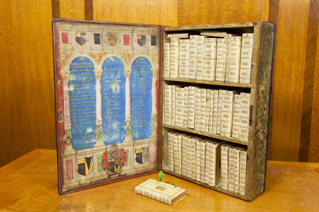
In the striking image above, you can see an early experiment in making books portable–a 17th century precursor, if you will, to the modern day Kindle.
According to the library at the University of Leeds, this “Jacobean Travelling Library” dates back to 1617. That’s when William Hakewill, an English lawyer and MP, commissioned the miniature library–a big book, which itself holds 50 smaller books, all “bound in limp vellum covers with coloured fabric ties.” What books were in this portable library, meant to accompany noblemen on their journeys? Naturally the classics. Theology, philosophy, classical history and poetry. The works of Ovid, Seneca, Cicero, Virgil, Tacitus, and Saint Augustine. Many of the same texts that showed up in The Harvard Classics (now available online) three centuries later.
Apparently three other Jacobean Travelling Libraries were made. They now reside at the British Library, the Huntington Library in San Marino, California, and the Toledo Museum of Art in Toledo, Ohio.
If you would like to support the mission of Open Culture, consider making a donation to our site. It’s hard to rely 100% on ads, and your contributions will help us continue providing the best free cultural and educational materials to learners everywhere. You can contribute through PayPal, Patreon, and Venmo (@openculture). Thanks!
We're hoping to rely on loyal readers, rather than erratic ads. Please click the Donate button and support Open Culture. You can use Paypal, Venmo, Patreon, even Crypto! We thank you!
Open Culture scours the web for the best educational media. We find the free courses and audio books you need, the language lessons & educational videos you want, and plenty of enlightenment in between.


