We dare not speculate as to what Leonardo DaVinci would make of artificial intelligence.
We are, however, fairly confident that he would love the Internet.
The Renaissance-era genius applied his sophisticated understanding of the human body and the natural world to other types of systems, including plans for civil engineering projects, military projectiles, and flying machines.
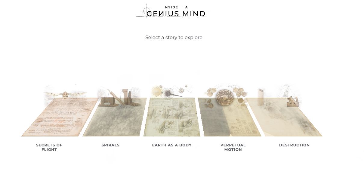
Google Arts & Culture’s new initiative Inside a Genius Mind offers an interactive experience of the codices in which Da Vinci made his sketches, diagrams, and notes.
It’s also a curatorial collaboration between a human — Oxford art history professor Martin Kemp — and artificial intelligence.
Professor Kemp, author of Living with Leonardo: Fifty Years of Sanity and Insanity in the Art World and Beyond, brings a lifetime of rigorous study and passion for the subject.
His non-human counterpart used machine learning to delve into the notebooks’ contents, investigating some 1040 pages from 6 volumes and “drawing thematic connections across time and subject matter to reflect Leonardo’s spirit of interdisciplinary imagination, innovation and the profound unity at the heart of his apparently diverse pursuits.”
Upon launching the experiment, you bushwhack your way through the individual codices by clicking on the sketches floating toward you like elements in a classic space-themed video game, or choose to enjoy one of five curated stories.
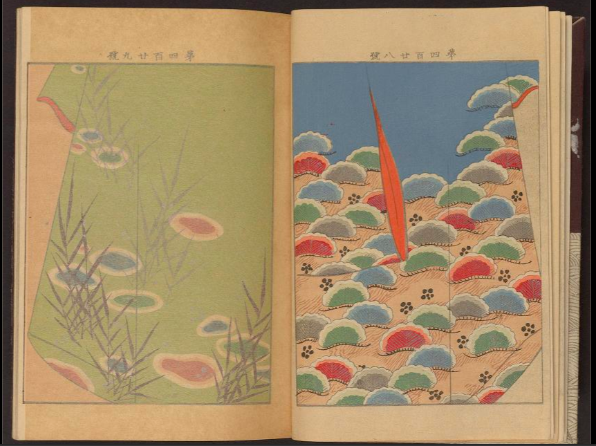
We went with Earth as Body, which gathers seven pages from the UK’s Royal Collection Trust’s Codex Windsor, and one from the Codex Leicester, which inspired an animated model that should surely please its current owner, Bill Gates.

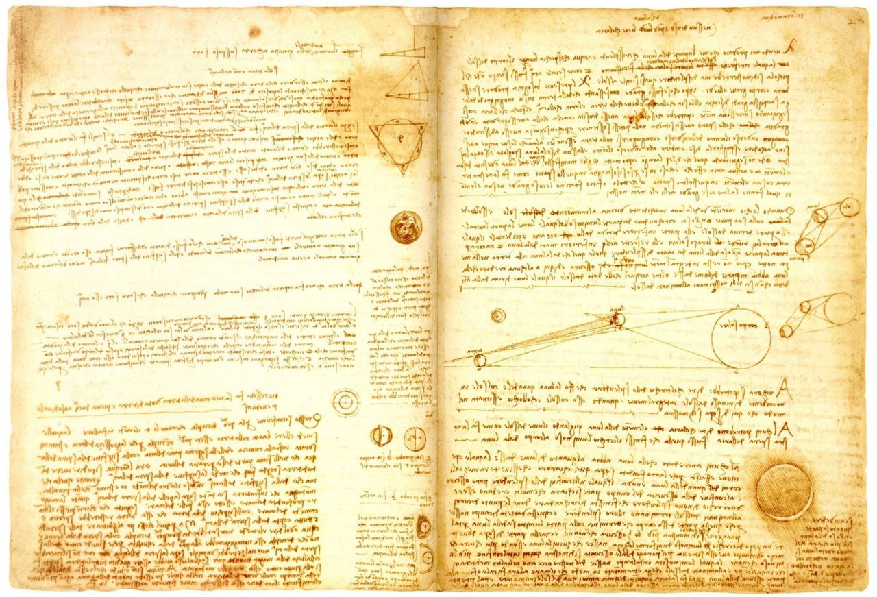
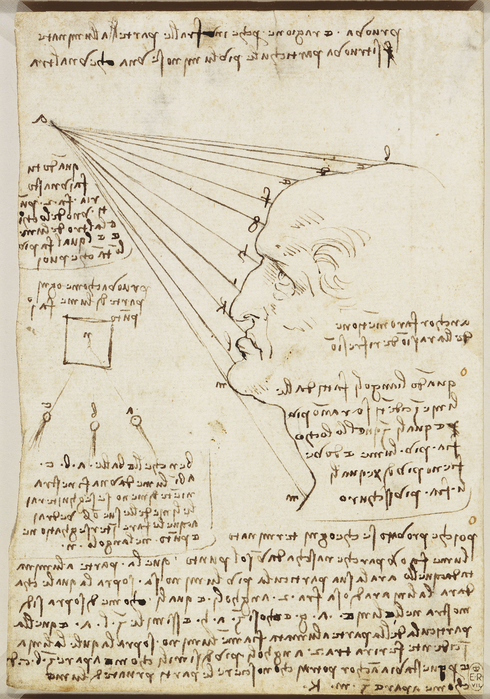
Using a discreet and somewhat fiddly navigation bar on the left side of the screen, we toured Leonardo’s renderings of the flayed muscles of the upper spine, the vessels and nerves of the neck and liver, the Arno valley with the route of a proposed canal that would run from Florence to Pisa, a view of the Alps from Milan, the fall of light on a face, studies of optics and men in action, and observations of the moon and earthshine.
How are these things related?
“Leonardo believed that the human body represented the whole natural world in miniature” and the selections do offer food for thought that Leonardo’s passion for the underlying laws of nature is the common thread running through his research and art.
Each image is accompanied a button inviting you to “explore” the work further. Click it for information about dimensions, provenance, and media, as well as some tantalizing biographical tidbits, such as this, adapted from the catalogue for the 2019 exhibit Leonardo da Vinci: A Life in Drawing:
Leonardo had first studied anatomy in the late 1480s. By the end of his life he claimed to have performed 30 human dissections, intending to publish an illustrated treatise on the subject, but this was never completed, and Leonardo’s work thus had no discernible impact on the discipline. His only documented dissection was carried out in the winter of 1507–8, when he performed an autopsy on an old man whose death he had witnessed in a hospital in Florence. The studies on this page from Leonardo’s notebook are based on that dissection: on the verso Leonardo depicts the vessels of the liver; and in notes elsewhere in the notebook he gives the first known clinical description of cirrhosis of the liver.
Perhaps you’d like to circumvent the machine learning and use your own genius mind to make connections a la Da Vinci?
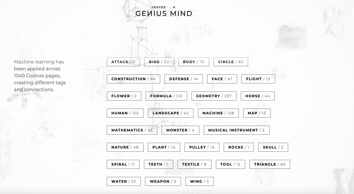
Try messing around with the AI tags. See what you can cobble together to forge a cohesive alliance between such elements as wing, horse, map, musical instruments, and spiral.
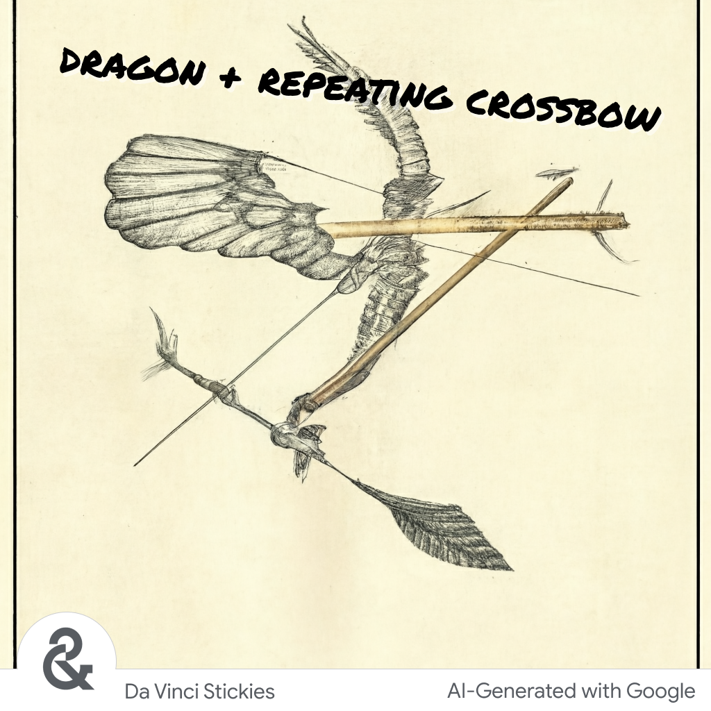
Or cleanse your palate by putting a mash-up of two codex sketches on a digital sticky with the help of Google AI, mindful that the master, who lived to the ripe old age of 67, was probably a bit more intentional with his time…
Begin your explorations of Google Arts & Culture’s Inside a Genius Mind here.
Related Content
The Ingenious Inventions of Leonardo da Vinci Recreated with 3D Animation
Leonardo Da Vinci’s To Do List (Circa 1490)
– Ayun Halliday is the Chief Primatologist of the East Village Inky zine and author, most recently, of Creative, Not Famous: The Small Potato Manifesto and Creative, Not Famous Activity Book. Follow her @AyunHalliday.