“For most of the last two thousand years, the Bible has been virtually the only history book used in Western civilization,” writes Isaac Asimov in his Guide to the Bible. “Even today, it remains the most popular, and its view of ancient history is still more widely and commonly known than is that of any other.” As a result, “millions of people today know of Nebuchadnezzar, and have never heard of Pericles, simply because Nebuchadnezzar is mentioned prominently in the Bible and Pericles is never mentioned at all.” That same disproportionate recognition is accorded to “minor Egyptian pharaohs” like Shishak and Necho, “people whose very existence is doubtful” like Nimrod and the Queen of Sheba, and “small towns in Canaan, such as Shechem and Bethel.”
Asimov notes that “only that is known about such places as happens to be mentioned in the Bible. Ecbatana, the capital of the Median Empire, is remembered in connection with the story of Tobit, but its earlier and later history are dim indeed to most people, who might be surprised to know that it still exists today as a large provincial capital in the modern nation of Iran.” In the video from Hochelaga above, we learn that Iran, then called Persia, is celebrated in the Bible “for ending the Jewish exile and returning Israel to its homeland. The Book of Usaiah gives a special shout-out to its King, Cyrus the Great: he is given the title ‘anointed one,’ or ‘messiah.’ ”
Though “Persia has played a huge role in the history of the region, and at a time was one of the largest empires of its day,” it’s just one of the surprisingly many lands to receive Biblical acknowledgement. As Hochelaga creator Tommy Trelawny makes clear, “when the Bible was written, the countries as we know them today didn’t even exist.” But though the concept of the modern nation-state hadn’t yet come into being, the places that would give rise to a fair few of the nation-states in the twenty-first century certainly had: “shout-out to Egypt, Lebanon, Israel, Persia, Cyprus, Greece, Italy, and Spain, that still exist today, or at least go by the names that appear in the Bible.”
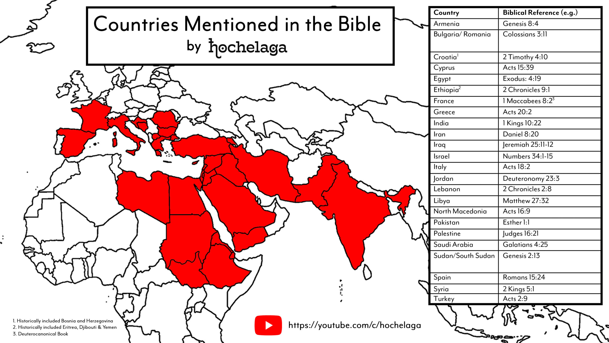
You may notice, Trelawny adds, that “many of these exotic lands are mentioned in the story of King Solomon’s temple, and how precious raw materials were imported from faraway places, from the strongest Lebanese cedars to the finest Indian ivories.” It hardly matters “whether King Solomon was even real; we know these geographical regions exist today, and that Biblical writers seemed to know of them as well.” As depicted in the Bible or other sources, the ancient world can seem scarcely recognizable to us. But if we make the necessary adjustments to our perspective, we can see a process of globalization not dissimilar to what we see in our own societies — whose fascination with distant lands and expensive luxuries seems hardly to have diminished over the millennia.
Related content:
Christianity Through Its Scriptures: A Free Course from Harvard University
Introduction to the Old Testament: A Free Yale Course
Introduction to New Testament History and Literature: A Free Yale Course
Ancient Israel: A Free Course from NYU
Based in Seoul, Colin Marshall writes and broadcasts on cities, language, and culture. His projects include the Substack newsletter Books on Cities, the book The Stateless City: a Walk through 21st-Century Los Angeles and the video series The City in Cinema. Follow him on Twitter at @colinmarshall or on Facebook.
