“Just as we take the train to get to Tarascon or Rouen, we take death to reach a star,” Vincent Van Gogh wrote to his brother from Arles in the summer of 1888:
What’s certainly true in this argument is that while alive, we cannot go to a star, any more than once dead we’d be able to take the train.
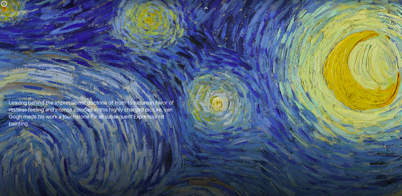
The following summer, as a patient in the asylum of Saint-Paul-de-Mausole in Provence, he painted what would become his best known work — The Starry Night.
The summer after that, he was dead of a gunshot wound to the abdomen, commonly believed to be self-inflicted.
Judging from thoughts expressed in that same letter, Van Gogh may have conceived of such a death as a “celestial means of locomotion, just as steamboats, omnibuses and the railway are terrestrial ones”:
To die peacefully in old age would be to go there on foot.
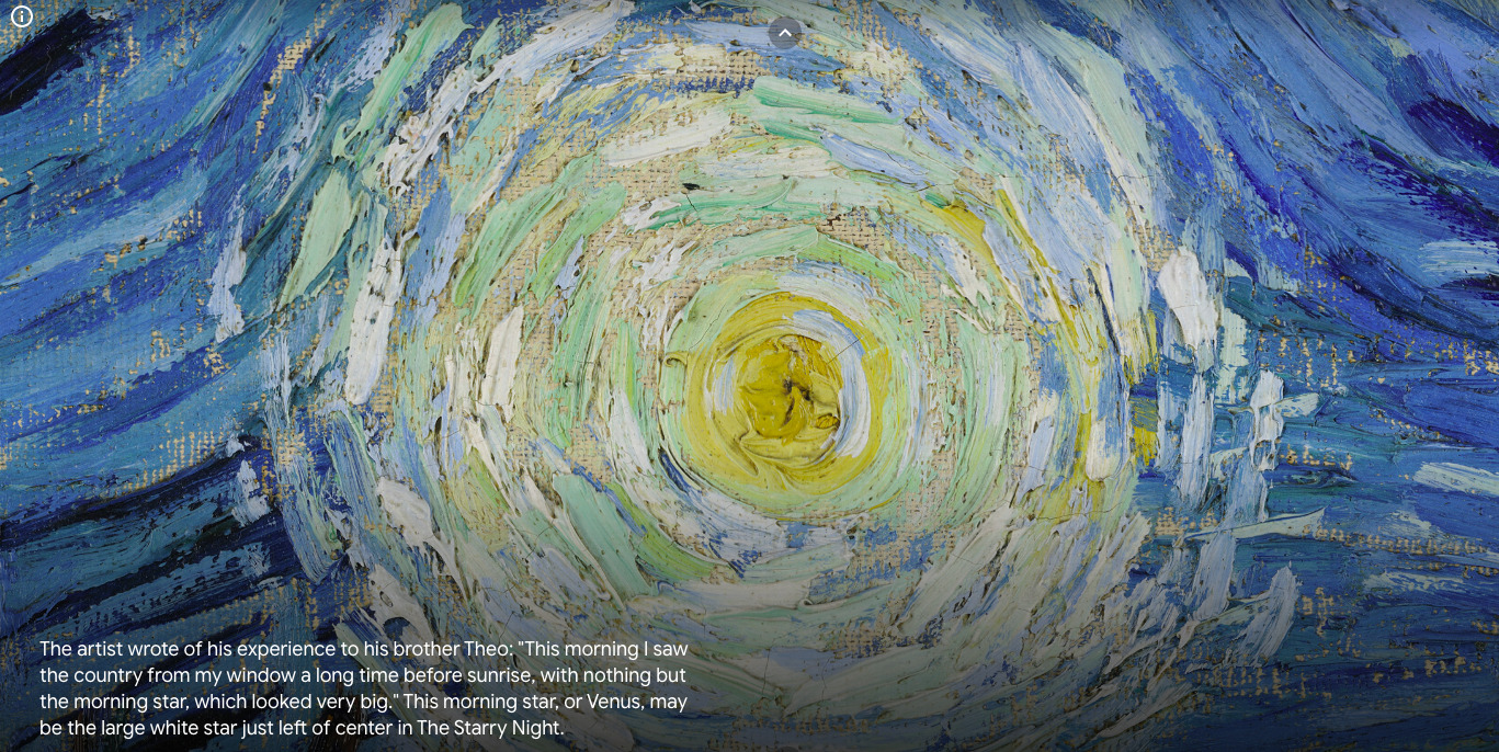
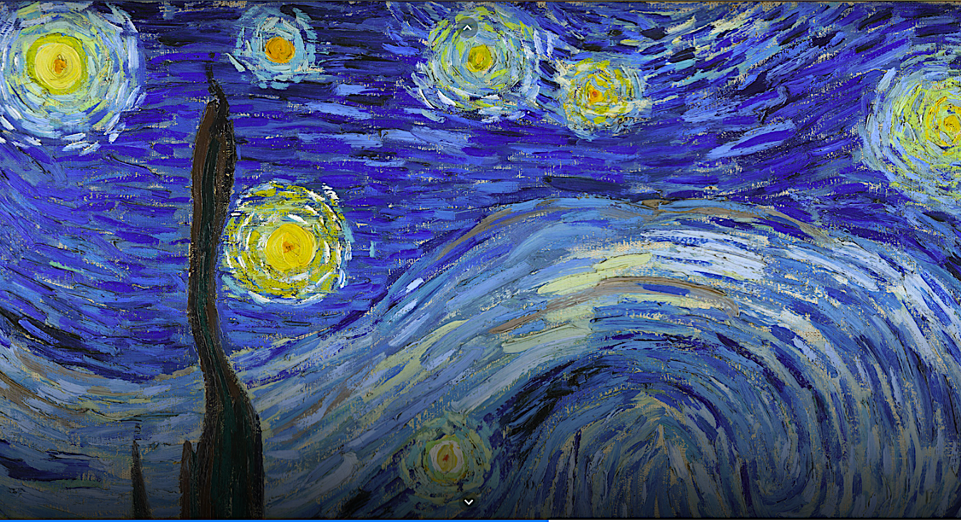
Although his window at the asylum afforded him a sunrise view, and a private audience with the prominent morning star he mentioned in another letter to Theo, Starry Night’s vista is “both an exercise in observation and a clear departure from it,” according to 2019’s MoMA Highlights: 375 Works from The Museum of Modern Art:
The vision took place at night, yet the painting, among hundreds of artworks van Gogh made that year, was created in several sessions during the day, under entirely different atmospheric conditions. The picturesque village nestled below the hills was based on other views—it could not be seen from his window—and the cypress at left appears much closer than it was. And although certain features of the sky have been reconstructed as observed, the artist altered celestial shapes and added a sense of glow.
Those who can’t visit MoMA to see The Starry Night in person may enjoy getting up close and personal with Google Arts and Culture’s zoomable, high res digital reproduction. Keep clicking into the image to see the painting in greater detail.
Before or after formulating your own thoughts on The Starry Night and the emotional state that contributed to its execution, get the perspective of singer-songwriter Maggie Rogers in the below episode of Art Zoom, in which popular musicians share their thoughts while navigating around a famous canvas.
Bonus! Throw yourself into a free coloring page of The Starry Night here.
Related Content:
Vincent Van Gogh’s “The Starry Night”: Why It’s a Great Painting in 15 Minutes
Ayun Halliday is an author, illustrator, theater maker and Chief Primatologist of the East Village Inky zine. Follow her @AyunHalliday.

