Technology Arbitrage: Amazon is Selling Airpods Pro Headphones for $50 Less Than Apple

Psst. Amazon currently has AirPods Pro headphones for $199, while Apple has them listed for $249. It’s the deal of the day for anyone looking for wireless Bluetooth earbuds, with noise-cancelling, immersive sound.
Read More...How Jan van Eyck’s Masterpiece, the Ghent Altarpiece, Became the Most Stolen Work of Art in History
It’s a little miraculous that so much European art and architecture survives, given how often the continent has erupted into wars that burned down nearly everything else. The Ghent Altarpiece, or Adoration of the Lamb, may be the most famous case in point. It is also, by far, the most stolen work of art in history, the victim of 13 different crimes over the past 600 years. Completed in 1432 by Flemish painter Jan van Eyck, and considered one of the world’s greatest treasures, the huge, multi-paneled painting (a polyptych) has weathered it all.
The altarpiece has “almost been destroyed in a fire,” Noah Charney writes at The Guardian, “was nearly burned by rioting Calvinists, it’s been forged, pillaged, dismembered, censored, stolen by Napoleon, hunted in the first world war, sold by a renegade cleric, then stolen repeatedly during the second world war…. Göring wanted it for his private collection, Hitler as the centrepiece of his citywide super-museum.”
In the short TED-Ed lesson above, Charney, author of the book Stealing the Mystic Lamb: The True Story of the World’s Most Coveted Masterpiece, sketches the history of the final theft in 1934 by the Nazis of a lower panel that has never been recovered. “This may sound very silly,” Charney tells NPR, “but in fact, the Nazis and Hitler in particular were absolutely convinced that the occult and the supernatural was real.” They thought of the Ghent altarpiece as a map to the relics of Christ’s crucifixion.
The case of the missing panel remains open to this day “and new leads are followed all the time,” Charney writes. It is a story full of “many bizarre twists,” and just one of many in the altarpiece’s long history. But why? What is it about the Ghent Altarpiece, besides occult fascination, that has drawn so much unwanted attention? Eleven feet high by 15 feet wide and made up of 24 panels (originally), the work “redefined art and became instantly famous,” notes New Statesman’s Michael Prodger. In his masterpiece, Jan van Eyck, who took over for his older brother Hubert, “created a series of firsts in art.”
The Ghent altarpiece is “the first realistic interior, the first genuine landscape, the first proper cityscape, the first tangible nudes, the first lifelike Renaissance portraits. [Van Eyck took oil paint to unprecedented levels of sophistication—with glazes and transparent layers giving depth and undreamed of effects of light—to match his preternatural powers of observation.” In the video series above and below by art historians Beth Harris and Steven Zucker, you can learn much more about the qualities that have made the Ghent Altarpiece irresistible.
Related Content:
Meet Notorious Art Forger Han Van Meegeren, Who Fooled the Nazis with His Counterfeit Vermeers
Josh Jones is a writer and musician based in Durham, NC. Follow him at @jdmagness
Read More...Why Is Napoleon’s Hand Always in His Waistcoat?: The Origins of This Distinctive Pose Explained
If the name of Napoleon Bonaparte should come up in a game of charades, we all know what to do: stand up with one foot in front of the other, stick a hand into our shirt, and consider the round won. Yet the recognition of this pose as distinctively Napoleonic may not be as wide as we assume, or so Coleman Lowndes discovered in the research for the video above, “Napoleon’s Missing Hand, Explained.” Asked to act out the image of Napoleon, not all of Lowndes colleagues at Vox tried to evoke his hand in his waistcoat, opting instead for grand posturing and an approximation of the (probably apocryphal) modest stature for which that posturing supposedly compensated. Yet enough of us still picture Napoleon hand-in-waistcoat that we might well wonder: how did that image take shape in the first place?
Representations of the most famous statesman in all French history, from paintings made in his life time to Bill and Ted’s Excellent Adventure, include countless examples of the pose. This has given rise to bodily-oriented speculations — a manual deformity, internal organs pained by the cancer that killed him — but the form came with historical precedent.
“Concealing a hand in one’s coat was a portraiture cliche long before Napoleon was painted that way in the early 1800s,” says Lowndes, in reference to Jacques-Louis David’s The Emperor Napoleon in His Study at the Tuileries, a portrait definitive enough to head up Napoleon’s Wikipedia entry. Notables previously depicted with one conspicuously hidden hand include George Washington, Mozart, and Francisco Pizarro.
Even ancient Greek orator Aeschines “claimed that restricting the movement of one hand was the proper way to speak in public.” According to one 18th-century British etiquette guide, “keeping a hand in one’s coat was key to posturing oneself with manly boldness, tempered with becoming modesty.” It eventually became common enough to lose its high status, until David captured Napoleon’s use of it in his masterly propagandistic portrait. But the extent we think of Napoleon keeping a hand perpetually in his waistcoat today surely owes much to the many caricaturists and parody artists who took up the trope, including Charlie Chaplin — who, after trying a mustache and bowler hat for a role, knew what it was to be turned iconic by a seemingly minor stylistic choice.
Related Content:
Napoleon: The Greatest Movie Stanley Kubrick Never Made
Napoleon’s Kindle: See the Miniaturized Traveling Library He Took on Military Campaigns
The Face of Bill Murray Adds Some Joy to Classic Paintings
Based in Seoul, Colin Marshall writes and broadcasts on cities, language, and culture. His projects include the Substack newsletter Books on Cities, the book The Stateless City: a Walk through 21st-Century Los Angeles and the video series The City in Cinema. Follow him on Twitter at @colinmarshall, on Facebook, or on Instagram.
Read More...How Joni Mitchell’s Song of Heartbreak, “River,” Became a Christmas Classic
From Elvis’ “Blue Christmas” to Tom Waits’ “Christmas Card from a Hooker in Minneapolis” to the Pogues’ “Fairytale of New York,” the most honest Christmas songs freely acknowledge the holiday’s dark underbelly. There are always those for whom the holidays are times of heartbreak, which, as we know, makes for better songwriting than tinsel, elves, and stockings. Near the top of any list of miserable Christmas songs sits Joni Mitchell’s holiday classic “River,” in which she laments losing “the best baby I ever had” over the season.
“River” is not really a Christmas song; it just happens to be set during the holidays: “It’s coming on Christmas, they’re cutting down trees,” Joni sings, “They’re putting up reindeer, singing songs of joy and peace.” This tranquil scene provides a tragic foil for the song’s true subject. “Ultimately,” writes J. Freedom du Lac at The Washington Post, “‘River’ is a bereft song about a broken romance and a woman who desperately wants to escape her heartbreak, saying repeatedly: ‘I wish I had a river I could skate away on.’”
Mitchell’s “despairing drama” has “long been a popular cover among musicians, hundreds of whom have recorded it for commercial release.” (According to her website, it has been recorded 763 times, second only to “Both Sides Now” at almost twice that number.) Last year Ellie Goulding’s cover rose to No. 1 in Europe. First released on Mitchell’s 1971 classic Blue, the song deliberately evokes the holidays with strains of “Jingle Bells” in its opening bars before descending into its deeply melancholy melody.
“River” did not enter modern Christmas singalongs until the 1990s. In the Polyphonic video at the top, “Joni Mitchell and the Melancholy of Christmas,” we begin all the way back in the 1880s, with the first recordings of “Jingle Bells.” The history frames Mitchell’s use of the melody, almost a form of sampling, as radical protest of a tune that has become “synonymous with Christmas joy.” It has been recorded by virtually everyone, and was even broadcast from space in 1965 “when astronauts aboard NASA’s Gemini 6 played it as part of a Christmas prank.”
No, says Mitchell, there are real people with real problems down here, and sometimes Christmas sucks. There’ll be no dashing through the snow: “It don’t snow here / Stays pretty green.” The story behind the song is well-known: Mitchell ended her two-year relationship with Graham Nash in 1970, then “skated away” to Europe to escape the “crazy scene.” While in Crete, “she sent Nash a telegram to tell him their relationship was over,” notes Tom Eames. No one should try to force a happy holiday in such times. If you’re craving a little realness with your cheer, consider adding “River” to your playlist.
Related Content:
The Expansive Vocal Range of Joni Mitchell: From the Early to Later Years
Josh Jones is a writer and musician based in Durham, NC. Follow him at @jdmagness
Read More...The Art of Movie Posters: View Online 40,000+ Movie Posters & Learn How They’re Made
If you can’t judge a movie by its poster, it’s not for the poster designer’s lack of trying. Nearly as venerable as cinema itself, the art of the movie poster has evolved to attract the attention and interest of generation after generation of filmgoers — and, safe to say, developed a few best practices along the way. Some examples go beyond effective advertisement to become icons in and of themselves: take for example, the poster for Quentin Tarantino’s Pulp Fiction, designed by James Verdesoto. In the Vanity Fair video above, Verdesoto draws on a variety of “one-sheets” in order to explain a few of the tricks of the trade.
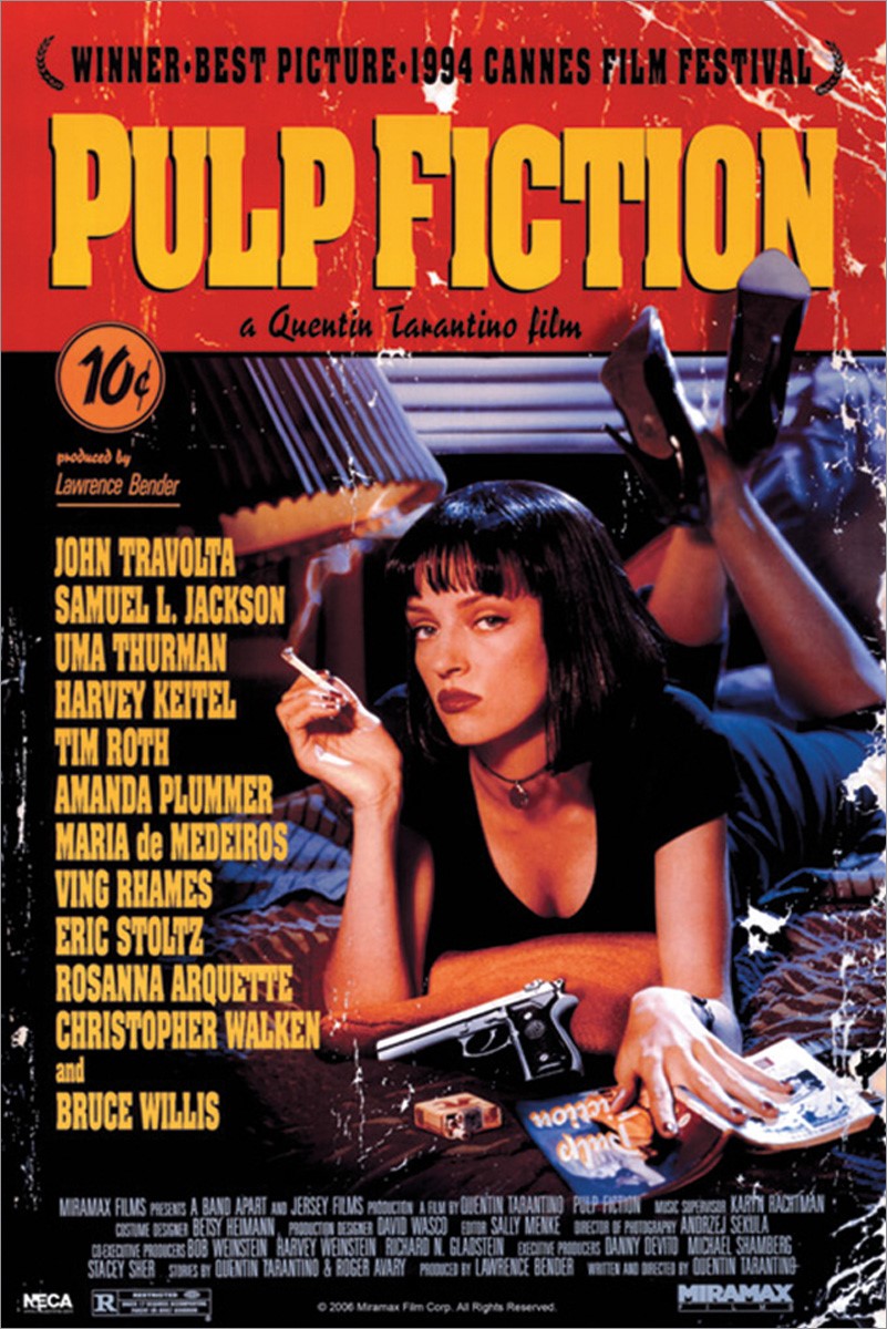
Like any cultural artifact, movie posters are subject to trend and fashion. It just happens that trends and fashions in movie poster design can last for decades, with each revival bringing an underlying aesthetic concept back into the zeitgeist in a new way. Surely you’ll recall a few years, not long ago, when every major comedy seemed to stamp bold red text on a pure white background: American Pie, the remakes of Cheaper by the Dozen, and The Heartbreak Kid, even the likes of Norbit.
This has been going on at least since the 1980s, as Verdesoto shows by pulling out the poster for John Hughes’ beloved Planes, Trains, and Automobiles, then comparing it to the conceptually similar one for Meet the Parents to note differences in the use of fonts, photographs, and negative space.
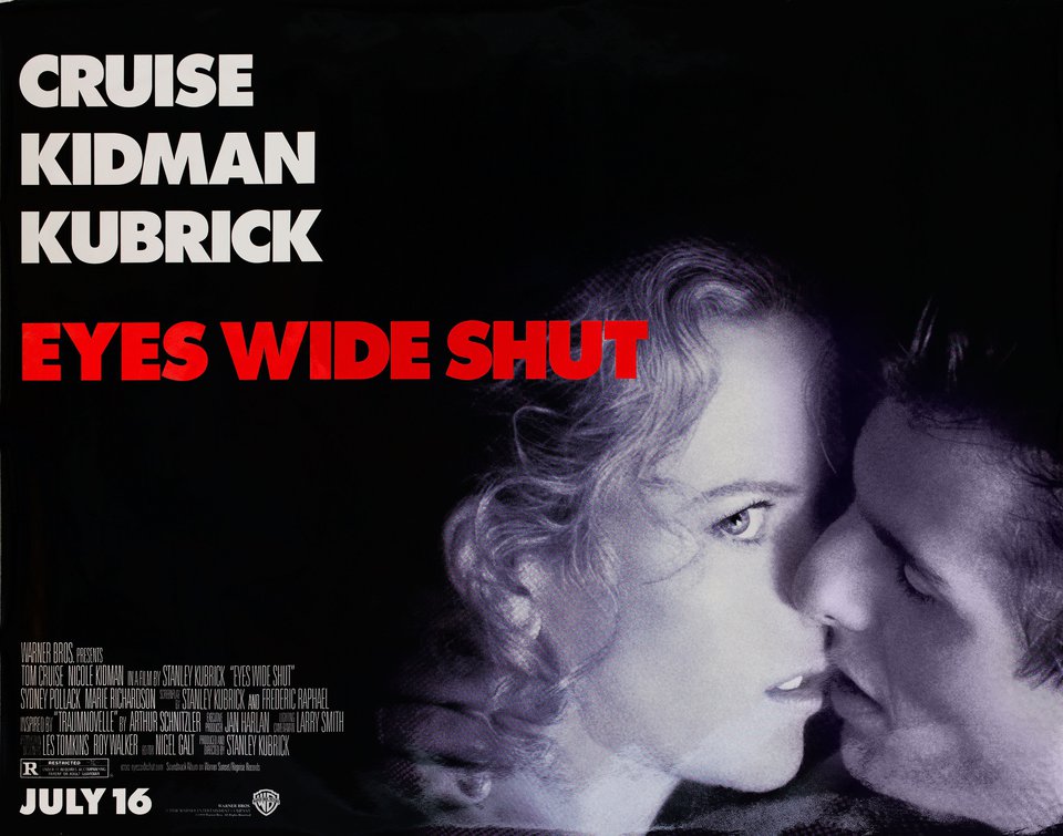
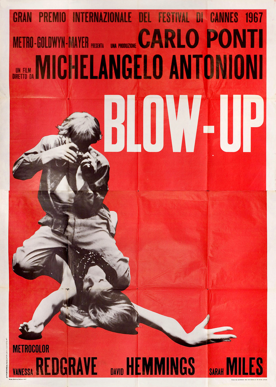
Since The Firm, thrillers have often been signaled with hunted-looking men running down blue-toned corridors or streets, often in silhouette; a great many explosive action movies since Die Hard have gone in for black-and-white posters that emphasize slashes of red or orange. Even the non-genre of “independent films,” often modest of marketing budget, have their own color: canary yellow “a cheap way to catch the eye.” Case in point: Vincent Gallo’s The Brown Bunny, a notorious film that also happened to come with one of the most memorable posters of the 2000s, due not just to its yellow background but because its conscious reference to European designs of the 1950s and 60s, such as the one for Michelangelo Antonioni’s Blow-Up.
You can behold (and in some cases even download) countless many works of movie-poster art, from a variety of decades and a variety of nations, at the sites of the University of Texas Harry Ransom Center and the New York movie poster gallery Posteritati. Here on Open Culture we’ve also featured Taschen’s book of dynamic movie posters of the Russian avant-garde, online archives of the famously artistic movie posters of Poland and Czechoslovakia, not to mention compellingly odd hand-painted movie posters from Ghana. Spend enough time with all of them, and you may find yourself possessed of enough of an intellectual investment in this thoroughly modern art form to start investing in a genuine collection of your own. But no matter your enthusiasm for movie posters, it’ll be a while before you catch up with Martin Scorsese.
Related Content:
50 Film Posters From Poland: From The Empire Strikes Back to Raiders of the Lost Ark
An Archive of 20,000 Movie Posters from Czechoslovakia (1930–1989)
Based in Seoul, Colin Marshall writes and broadcasts on cities, language, and culture. His projects include the Substack newsletter Books on Cities, the book The Stateless City: a Walk through 21st-Century Los Angeles and the video series The City in Cinema. Follow him on Twitter at @colinmarshall, on Facebook, or on Instagram.
Read More...Watch the Oscar-Winning “Gerald McBoing-Boing” (1950): It’s Ranked as the 9th Greatest Cartoon of All Time
To understand how revolutionary this short film from 1950 was to contemporary viewers, just consider the previous four decades (or so) of animated films. There were talking animals, singing animals, bouncing animals, and in Disney films humans based on rotoscoping live action. From its humble and humorous beginnings, animation was striding towards realism as fast as it could. But in the first minute of this adaptation of a Theodor “Dr. Seuss” Geisel story, you can see that’s all been tossed out the window, a window shaped like a trapezoid.
This animation from the renegade studio United Productions of America (UPA) ushered in the space age look that suited the dynamic post-war American economy. The pace of life was frantic, sleek, modern, and the animated characters and backgrounds follow suit: laws of perspective are gone. Backgrounds are suggested with one or two objects, and color is impressionistic, not realistic. The characters are cute, but drawn with an economy of line.
Which would all suit a story by Dr. Seuss that already existed as a children’s record, told in his familiar rhythmic rhyming style.
The Gerald of the title is a young boy who doesn’t speak in words, but in sound effects. His parents freak out, a doctor can’t help, and his classmates and school reject him. But like many a Dr. Seuss story, Gerald’s problem is actually a gift, and the film concludes in a positive way, celebrating difference. The film went on to win the Oscar for Best Animated Short that year, beating out the established studios of Warner Bros., MGM, and Disney. It paved the way for the more minimal animation of Hanna-Barbera (Gerald’s dad has a proto-George Jetson look) and opened the door for more abstract films from the National Film Board of Canada, and influence the Klasky Csupo studio and others in the 1990s animation rebirth.
UPA was formed from the exodus of several top Disney animators after a creators’ strike in 1941. Head among them was John Hubley, a layout artist who bristled against Disney’s realism and wanted to branch out. At first known as Industrial Film and Poster Service, the studio made films for the United Auto Workers and for the Army, making educational films for young privates with the Private Snafu series after Warner Bros stepped aside. Chuck Jones helped direct these shorts. Anti-Communist sentiment put an end to government work, and, so by the late 1940s, UPA decided to take on the big studios with theatrical shorts and after “Gerald McBoing-Boing” was a hit, they continued with the Mr. Magoo series, several McBoingBoing sequels, and a TV version of Dick Tracy.
The studio dried up in the 1960s and instead of animation teamed up with Toho Studios in Japan and helped introduce a generation of American audiences to kaiju (giant monster) films like Godzilla by re-cutting and distributing many of their films.
Along with its Oscar, “Gerald McBoing-Boing” is now part of the Library of Congress’ Film Registry as a significant American Film and often gets voted as one of the greatest animated films of the 20th Century. (It was voted the 9th best animation of all time, by 1,000 animation professionals.)
Lastly, Gerald’s last name lives on as the inspiration for the “happy mutants” zine and website, boingboing.net.
Related Content:
Ted Mills is a freelance writer on the arts who currently hosts the Notes from the Shed podcast and is the producer of KCRW’s Curious Coast. You can also follow him on Twitter at @tedmills, and/or watch his films here.
Read More...The Sistine Chapel of the Ancients: Archaeologists Discover 8 Miles of Art Painted on Rock Walls in the Amazon

All images by José Iriarte
Over twelve thousand years ago, some of the first humans in the Amazon hunted, painted, and danced with the massive extinct mammals of the ice age: giant sloths and armadillos, ice-age horses, and mastodons…. How do we know? We have pictures, or rock paintings, rather–many thousands of them made around 12,500 years ago and only recently “found on an eight-mile rock surface along the Guayabero River the Colombian Amazon,” Hakim Bishara reports at Hyperallergic. The prehistoric wonder has been dubbed the “Sistine Chapel of the ancients.”
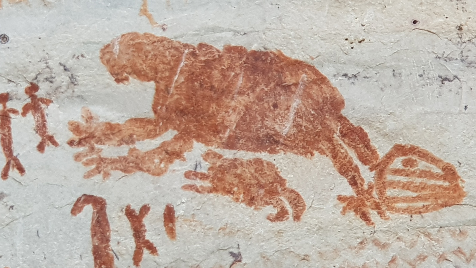
The discovery, made last year, was kept secret until the release of a new documentary airing this month called Jungle Mystery: Lost Kingdoms of the Amazon. Palaeo-anthropologist Ella Al-Shamahi, presenter of the Channel 4 series and a member of the team that found the site, explains why it may be hard to imagine such great prehistoric beasts lumbering through the rainforest.
Their existence in this rock art offers a clue to major climatological shifts that have occurred in the region over millennia. As Al-Shamahi tells The Observer:
One of the most fascinating things was seeing ice age megafauna because that’s a marker of time. I don’t think people realise that the Amazon has shifted in the way it looks. It hasn’t always been this rainforest. When you look at a horse or mastodon in these paintings, of course they weren’t going to live in a forest. They’re too big. Not only are they giving clues about when they were painted by some of the earliest people – that in itself is just mind-boggling – but they are also giving clues about what this very spot might have looked like: more savannah-like.
“We’re talking about several tens of thousands of paintings,” says the team’s leader, José Iriarte, professor of archaeology at Exeter University. “It’s going to take generations to record them.” The rock wall art illustrates many extinct species, including prehistoric lama and three-toed hoofed mammals with trunks, as well as realistic depictions of monkeys, bats, snakes, turtles, tapirs, birds, lizards, fish, and deer. Remains found near the site offer clues to the ancient peoples’ diets, which included piranha, alligators, snakes, frogs, and “rodents such as paca, capybara, and armadillos,” Bishara notes.
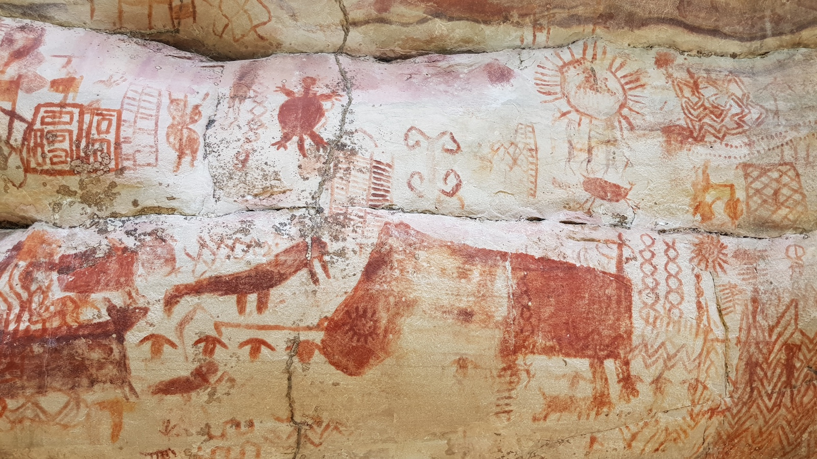
Many of the images are painted to the scale of handprints left in many places along the wall, and some are much larger. Researchers were particularly surprised by the method of composition. Some of the art is so high up it can only be seen by drone. “I’m 5ft 10in,” says Shamahi, “and I would be breaking my neck looking up. How were they scaling those walls?” It appears the artists used some form of rappelling. There are “depictions of wooden towers among the paintings,” reports The Guardian, “including figures appearing to bungee jump from them.”
Further study in the coming decades, and centuries, will reveal much more about how the paintings were made. The why, however, will prove more elusive. Iriarte speculates they served a sacred purpose. “It’s interesting to see that many of these large animals appear surrounded by small men with their arms raised, almost worshipping these animals.” The presence of hallucinogenic plants among the paintings leads him to compare the paintings with contemporary Amazonian people, for whom “non-humans like animals and plants have souls, and they communicate and engage with people in cooperative or hostile ways through the rituals and shamanic practices that we see depicted in the rock art.”
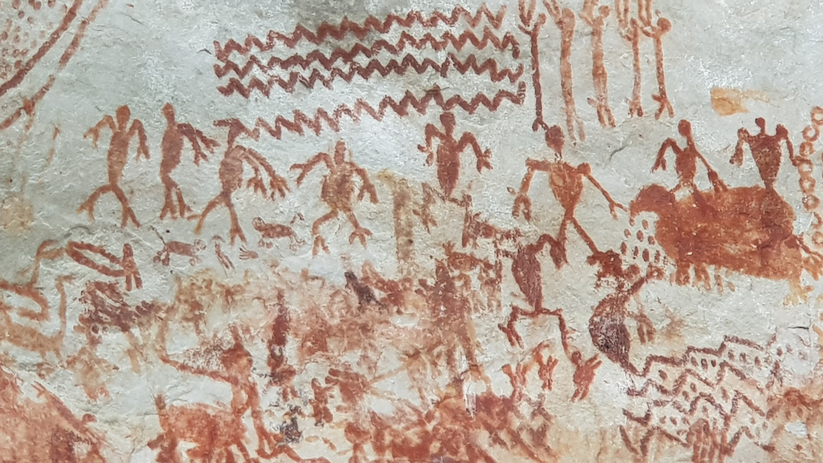
Whatever their purpose, the over 100,000 paintings on the eight-mile wall contain an immeasurable store of information about ancient Amazonians’ creativity and ingenuity. They also add, perhaps, to the mountain of rock art evidence suggesting, Barbara Ehrenreich argued recently, that before organized war became the dominant practice of civilizations, “humans once had better ways to spend their time.” The publication of the research team’s findings is available here. See more images of the site at Hyperallergic and Designboom and watch the first two episodes of Jungle Mystery: Lost Kingdoms of the Amazon here.
via Colossal
Related Content:
A Recently-Discovered 44,000-Year-Old Cave Painting Tells the Oldest Known Story
Was a 32,000-Year-Old Cave Painting the Earliest Form of Cinema?
40,000-Year-Old Symbols Found in Caves Worldwide May Be the Earliest Written Language
Josh Jones is a writer and musician based in Durham, NC. Follow him at @jdmagness
Read More...
The Internet Archive is Saving Classic Flash Animations & Games from Extinction: Explore Them Online
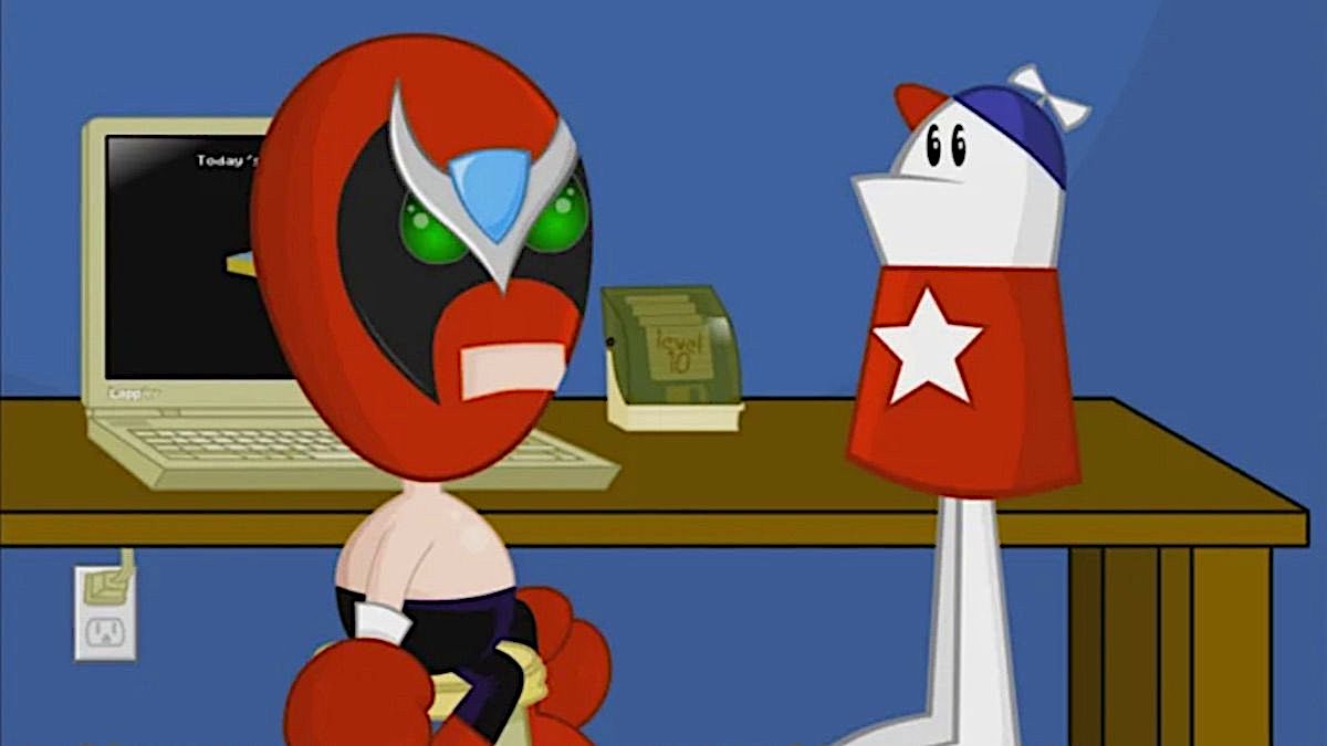
Flash is finally dead, and the world… does not mourn. Because the announcement of its end actually came three years ago, “like a guillotine in a crowded town square,” writes Rhett Jones at Gizmodo. It was a slow execution, but it was just. So useful in Web 1.0 days for making animations, games, and serious presentations, Flash had become a vulnerability, a viral carrier that couldn’t be patched fast enough to keep the hackers out. “Adobe’s Flash died many deaths, but we can truly throw some dirt on its grave and say our final goodbyes because it’s getting the preservation treatment.” Like the animated GIF, Flash animations have their own online library.

All those lovely Flash memes—the dancing badgers and the snake, peanut butter and jelly time—will be saved for perplexed future generations, who will use them to decipher the runes of early 2000’s internet-speak. However silly they may seem now, there’s no denying that these artifacts were once central constituents of pop culture.
Flash was much more than a distraction or frustrating browser crasher. It provided a “gateway,” Jason Scott writes at the Internet Archive blog, “for many young creators to fashion near-professional-level games and animation, giving them the first steps to a later career.” (Even if it was a career making “advergames.”)
A single person working in their home could hack together a convincing program, upload it to a huge clearinghouse like Newgrounds, and get feedback on their work. Some creators even made entire series of games, each improving on the last, until they became full professional releases on consoles and PCs.
Always true to its purpose, the Internet Archive has devised a way to store and play Flash animations using emulators created by Ruffle and the BlueMaxima Flashpoint Project, who have already archived tens of thousands of Flash games. All those adorable Homestar Runner cartoons? Saved from extinction, which would have been their fate, since “without a Flash player, flash animations don’t work.” This may seem obvious, but it bears some explanation. Where image, sound, and video files can be converted to other formats to make them accessible to modern players, Flash animations can only exist in a world with Flash. They are like Edison’s wax cylinders, without the charming three-dimensions.

Scott goes into more depth on the rise and fall of Flash, a history that begins in 1993 with Flash’s predecessor, SmartSketch, which became FutureWave, which became Flash when it was purchased by Macromedia, then by Adobe. By 2005, it started to become unstable, and couldn’t evolve along with new protocols. HTML5 arrived in 2014 to issue the “final death-blow,” kind of.… Will Flash be missed? It’s doubtful. But “like any container, Flash itself is not as much of a loss as all the art and creativity it held.” The Archive currently hosts over 1,500 Flash animations from those turn-of-the-millennium internet days, and there are many more to come. Enter the Archive’s Flash collection here.
Related Content:
36,000 Flash Games Have Been Archived and Saved Before Flash Goes Extinct: Play Them Offline
What the Entire Internet Looked Like in 1973: An Old Map Gets Found in a Pile of Research Papers
Josh Jones is a writer and musician based in Durham, NC. Follow him at @jdmagness
Read More...Japanese Art Installation Lets People Play Erik Satie’s “Gymnopédie No. 1” As They Walk on Socially-Distanced Notes on the Floor

The global pandemic has revealed the depths of systematic cruelty in certain places in the world that have refused to commit resources to protecting people from the virus or refused to even acknowledge its existence. Other responses show a different way forward, one in which everyone contributes meaningfully through the principled actions of wearing masks and social distancing or the principled non-action of staying home to slow the spread.
Then there’s the critical role of art, design, and music in our survival. As we have seen—from spontaneous balcony serenades in Italy to poignant animated video poetry—the arts are no less crucial to our survival than public health. Human beings need delight, wonder, humor, mourning, and celebration, and we need to come together to experience these things, whether online or in real, if distant, life. Ideally, public health and art can work together.
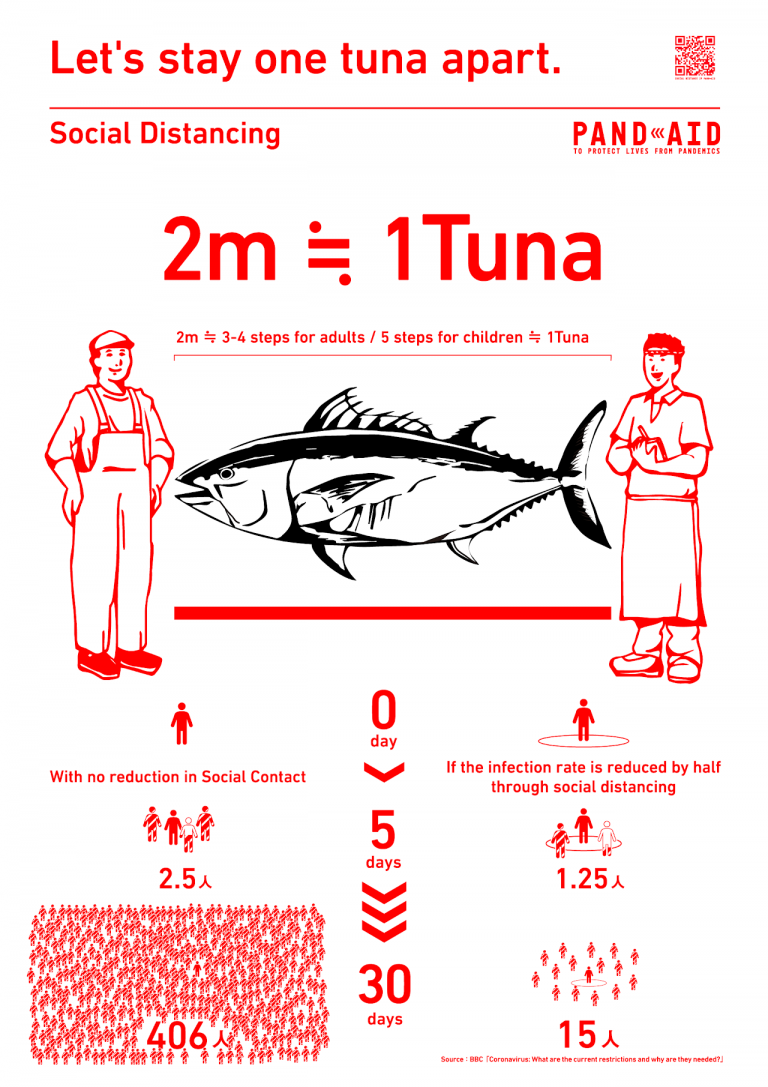
Japanese designer Eisuke Tachikawa has put his skills to work doing exactly that. When cases began spiking in his country in April, Tachikawa and his design firm Nosigner made some beautifully designed, and very funny, posters to encourage social distancing as part of an initiative called Pandaid. Then they created Super Mario Brothers coin stickers to place six feet (or two meters, or one tuna) apart. In its English translation, at least, the text on Nosigner’s site is direct about their intentions: “As this continues we wanted to value-translate the social constraints of social distancing into something positive and enjoyable.”
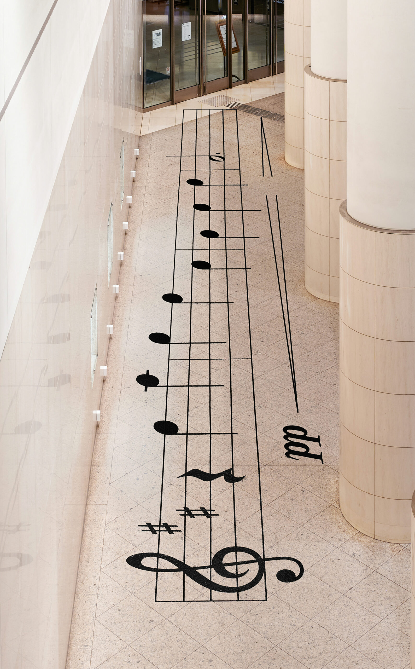
Tachikawa and Nosigner have “developed a brand,” they announced recently, called SOCIAL HARMONY “in order to spread the culture of social distancing in a humorous way.” Their latest installation, however, does not incorporate jokes or Nintendo references. Rather it draws on one of the most popular and beloved pieces of minimalist classical music, Erik Satie’s “Gymnopédie No. 1” (proclaimed by Classic FM as “the most flat-out relaxing piece of piano music ever written”). “People stand on a large music sheet on the floor and notes are played the moment you step on them. By respecting social distances and going one note at a time, the public is able to play” Satie’s piece.
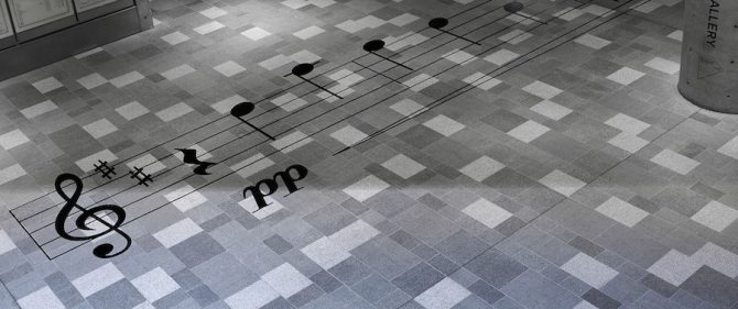
Even for such a succinct composition, this must require a rigorous amount of coordination. But it is necessary to play the notes in order: “Since the melody changes with every stop, one can create one’s own Gymnopédie No. 1, since the played melody changes with every step.” The piece was installed at the entrance hall to the Yokohama Minatomirai Hall for DESIGNART TOKYO 2020, where it will remain until the end of the year. Surely there will be other forms of “social harmony” to come from the Japanese designers. Like the practice of social distancing itself, we can only hope such projects catch on and go global, until the widespread vaccination and an end to the pandemic can bring us closer again.

via Spoon & Tamago
Related Content:
A New Digital Archive Preserves Black Lives Matter & COVID-19 Street Art
Josh Jones is a writer and musician based in Durham, NC. Follow him at @jdmagness
Read More...Learn How to Play Chess Online: Free Chess Lessons for Beginners, Intermediate Players & Beyond
The most desired Christmas gift of 2020? A chess set. It’s certainly desired, at any rate, by the rapt viewers of The Queen’s Gambit, the acclaimed Netflix miniseries that debuted in October. Created by screenwriter-producers Scott Frank and Allan Scott, its seven episodes tell the story of Beth Harmon, an orphan in 1950s Kentucky who turns out to be a chess prodigy, then goes on to become a world-class player. During the Cold War, the intellectual and geopolitical prospect of American and Soviet masters going head to head stoked public interest in chess; over the past month, the surprise success of The Queen’s Gambit has had a similar effect.
Whether or not you feel a sense of kinship with the series’ unrelentingly chess-obsessed young protagonist, you may well feel an urge to learn, or re-learn, to play the game. If so, all the resources you need are online, and today we’ve rounded them up for you.
To get started, Chess.com has produced “Everything You Need to Know About Chess,” a series of Youtube videos “designed to give every aspiring chess player the ‘one chess lesson of their life’ if they were only to get one.” Watch them, or explore these web-based tutorials. And even if you don’t have a chess set of your own, you can get started playing immediately thereafter: create an account at Chess.com and you can play against the computer or real players around the world matched to your skill level, all for free.
To shore up your knowledge of the game’s fundamentals, watch this five-video series by instructor John Bartholomew on topics like undefended pieces, coordination, and typical mistakes. The Chess Website’s Youtube channel covers even more, and its basics playlist teaches everything from opening principles to the nature of individual pieces, pawn, rook, knight, and beyond.
But nobody with a taste for chess can stop at the basics, and the supply of instruction has grown to meet the demand. The St. Louis Chess Club offers a series of lectures from national masters and grandmasters geared toward beginning, intermediate, and advanced players.
At Chess School, you’ll find videos on“the greatest chess games ever played, the immortal chess games, the best games from the latest tournaments, world champion’s games, instructive chess games, famous players games and much more.” Among serious players you’ll find many fans of Agadmator, whose extensive playlists examine current masters like Magnus Carlsen, past masters like Garry Kasparov, and examples of techniques like the English Opening and the Sicilian Defense, the later of which enjoyed quite a moment in the era of The Queen’s Gambit. The series has hardly gone unnoticed in the chess world: on channels like Chess Network, you’ll even find videos about the strategies employed by Beth Harmon, whose style has been programmed into chess-playing AI “bots.” They also have a “Beginner to Chess Master” playlist that will continually build your understanding of the game in a step by step manner.
The character’s personality, however, remains a creation of Walter Tevis, author of the eponymous novel The Queen’s Gambit. Tevis’ other works famously brought to the screen include The Hustler and The Man Who Fell to Earth: works of literature concerned, respectively, with mastery of a deceptively complex game and the condition of the social outsider. These themes come together in The Queen’s Gambit, whose author also described it as “a tribute to brainy women.” Perhaps you plan to give such a person in your life a chess set this year. If so, you know which book to wrap up with it — apart, of course, from Ward Farnsworth’s 700-page Predator at The Chessboard: A Field Guide To Chess Tactics. Or Bobby Fischer Teaches Chess. If you have other favorite resources, please feel free to add them to the list below…
Related Content:
A Free 700-Page Chess Manual Explains 1,000 Chess Tactics in Straightforward English
A Beautiful Short Documentary Takes You Inside New York City’s Last Great Chess Store
A Brief History of Chess: An Animated Introduction to the 1,500-Year-Old Game
Vladimir Nabokov’s Hand-Drawn Sketches of Mind-Bending Chess Problems
Garry Kasparov Now Teaching an Online Course on Chess
Based in Seoul, Colin Marshall writes and broadcasts on cities, language, and culture. His projects include the Substack newsletter Books on Cities, the book The Stateless City: a Walk through 21st-Century Los Angeles and the video series The City in Cinema. Follow him on Twitter at @colinmarshall, on Facebook, or on Instagram.
Read More...Support Us
We're hoping to rely on loyal readers, rather than erratic ads. Please click the Donate button and support Open Culture. You can use Paypal, Venmo, Patreon, even Crypto! We thank you!

About Us

Open Culture scours the web for the best educational media. We find the free courses and audio books you need, the language lessons & educational videos you want, and plenty of enlightenment in between.
Advertise With Us

FREE UPDATES!
GET OUR DAILY EMAIL
Get the best cultural and educational resources on the web curated for you in a daily email. We never spam. Unsubscribe at any time.
FOLLOW ON SOCIAL MEDIA

Open Culture editor Dan Colman scours the web for the best educational media. He finds the free courses and audio books you need, the language lessons & movies you want, and plenty of enlightenment in between.
Advertise With Us