From 2010 to 2012, filmmaker Kirby Ferguson released “Everything is a Remix,” a four-part series (watch here) that explored art and creativity, and particularly how artists inevitably borrow from one another, drawing on past ideas and conventions, and then turn these materials into something beautiful and new. In the initial series, Ferguson focused on musicians, filmmakers, writers and even video game makers. Now, a little more than a decade later, Ferguson has resurfaced and released a fifth and final chapter in his series, with this episode focusing on a different kind of artist: artificial intelligence. Responding to the rise of AI-generated art, Ferguson delves into the ethics of art generated by machines, particularly when they’re trained with human-created art. Is AI-generated art a form of piracy? Or is it another kind of creative remix? And what does AI mean for the future of art and creativity? These are just some of the weighty questions Ferguson tackles in his final installment. Watch it above.
If you would like to support the mission of Open Culture, consider making a donation to our site. It’s hard to rely 100% on ads, and your contributions will help us continue providing the best free cultural and educational materials to learners everywhere. You can contribute through PayPal, Patreon, and Venmo (@openculture). Thanks!
Everyone knows that Georges Seurat’s Un dimanche après-midi à l’Île de la GrandeJatte, or A Sunday Afternoon on the Island of La Grande Jatte, resides at the Art Institute of Chicago. Or at least everyone who’s seen Ferris Bueller’s Day Off knows it. The Art Institute appears as just one of the implausibly varied attractions of Chicago enjoyed by that film’s titular hooky-playing high-school senior and his friends — even the anxiety-ridden Cameron, drops from a moment out of his troubled life while transfixed by Seurat’s most famous painting. The closer he looks, the less discernible its genteel Parisian figures become, dissolving into fields of colored dots.
“George Seurat spent most of his adult life thinking about color,” says gallerist-Youtuber James Payne, “studying theories and working out systematically how one color, placed in a series of dots next to those of another, creates a whole different color when it hits the retina of the human eye.”
By the time of La Grande Jatte — which he meticulously planned, laboriously executed, and completed between 1884 and 1886 — “he made sure we saw color exactly how he wanted us to.” Payne tells the story of Seurat, his scientific, aesthetic, and philosophical interests, and the fruits of his intellectual and artistic labors, in the new video from his channel Great Art Explained at the top of the post.
Seurat first painted La Grande Jatte using not dots but dashes, “vertical for trees and horizontal for the water.” After further developing his color theory, he returned to the canvas and “added hundreds of thousands of small dots of complimentary colors on top of what he’d already done, which appear as solid and luminous forms when seen from a distance.” The final stage involved the addition of a colored border around the entire scene, and not long thereafter elaborate interpretations of the outwardly placid painting began to multiply. But “the lack of narrative means we really should look to the artist’s obsession with form, technique, and theory, which is practically all he wrote about, and not the meaning or subject manner.” We may enjoy talking about art’s content, but it is art’s form, after all, that truly captivates us.
Based in Seoul, Colin Marshall writes and broadcasts on cities, language, and culture. His projects include the Substack newsletterBooks on Cities, the book The Stateless City: a Walk through 21st-Century Los Angeles and the video series The City in Cinema. Follow him on Twitter at @colinmarshall or on Facebook.
With 26 lines and 472 stations, the New York City subway system is practically a living organism, and way too big a topic to tackle in a short video.
Architect Michael Wyetzner may not have time to touch on rats, crime track fires, flooding, night and weekend service disruptions, or the adults-in-a-Peanuts-special sound quality of the announcements in the above episode of Architectural Digest’s Blueprints web series, but he gives an excellent overview of its evolving design, from the stations themselves to sidewalk entrances to the platform signage.
First stop, the old City Hall station, whose chandeliers, skylights, and Guastavino tile arching in an alternating colors herringbone pattern made it the star attraction of the just-opened system in 1904.
(It’s been closed since 1945, but savvy transit buffs know that they can catch a glimpse by ignoring the conductor’s announcement to exit the downtown 6 train at its last stop, then looking out the window as it makes a U‑turn, passing through the abandoned station to begin its trip back uptown. The New York Transit Museum also hosts popular thrice yearly tours.)
Express tracks have been a feature of New York’s subway system since the beginning, when Interborough Rapid Transit Company enhanced its existing elevated line with an underground route capable of carrying passengers from City Hall to Harlem for a nickel fare.
Wyetzner efficiently sketches the open excavation design of the early IRT stations — “cut and cover” trenches less than 20’ deep, with room for four tracks, platforms, and no frills support columns that are nearly as ubiquitous white subway tiles.
For the most part, New Yorkers take the subway for granted, and are always prepared to beef about the fare to service ration, but this was not the case on New Year’s Day, 2017, when riders went out of their way to take the Q train.
(The massive drills used to create tunnels and stations at a far greater depth than the IRT line, were left where they wound up, in preparation for Phase 2, which is slated to push the line up to 125th St by 2029. (Don’t hold your breath…)
The designers of the subway placed a premium on aesthetics, as evidenced by the domed Art Nouveau IRT entrance kiosks and beautiful permanent platform signs.
Wyetzner also name checks graphic designer Massimo Vignelli who was brought aboard in 1966 to standardize the informational signage.
The white-on-black sans serif font directing us to our desired connections and exits now seems like part of the subway’s DNA.
Perhaps 21st-century innovations like countdown clocks and digital screens listing real-time service changes and alternative routes will too, one of these days.
If Wyetzner is open to filming the follow-up viewers are clamoring for in the comments, perhaps he’ll weigh in on the new A‑train cars that debuted last week, which boast security cameras, flip-up seating to accommodate riders with disabilities, and wider door openings to promote quicker boarding.
(Yes, they’re still the quickest way to get to Harlem…)
“I have invented a new way of imitating flowers,” Mary Delany, a 72-year-old widow wrote to her niece in 1772 from the grand home where she was a frequent guest, having just captured her hostess’ geranium’s likeness, by collaging cut paper in a nearly identical shade.
Novelty rekindled the creative fire her husband’s death had dampened.
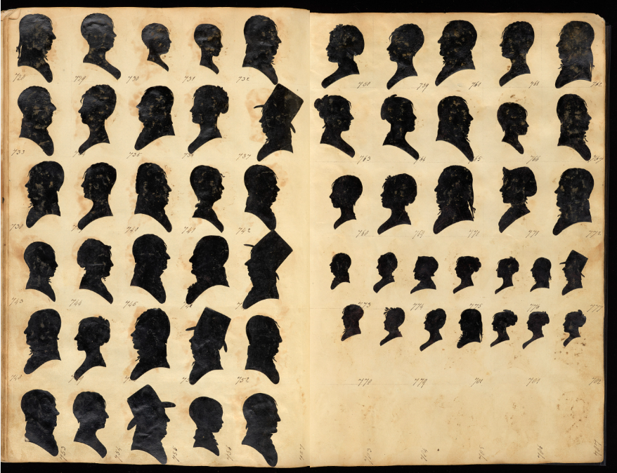
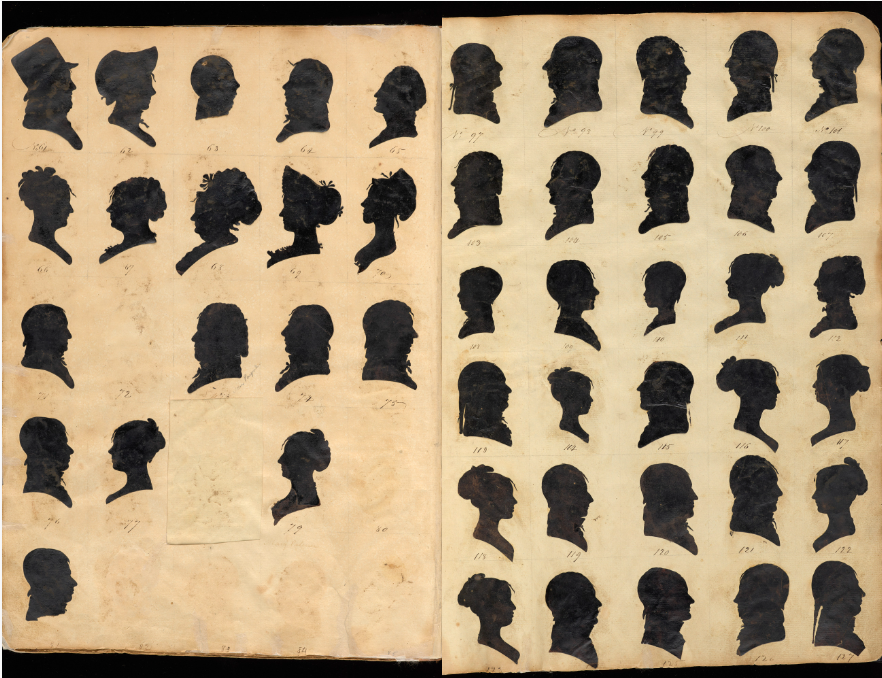
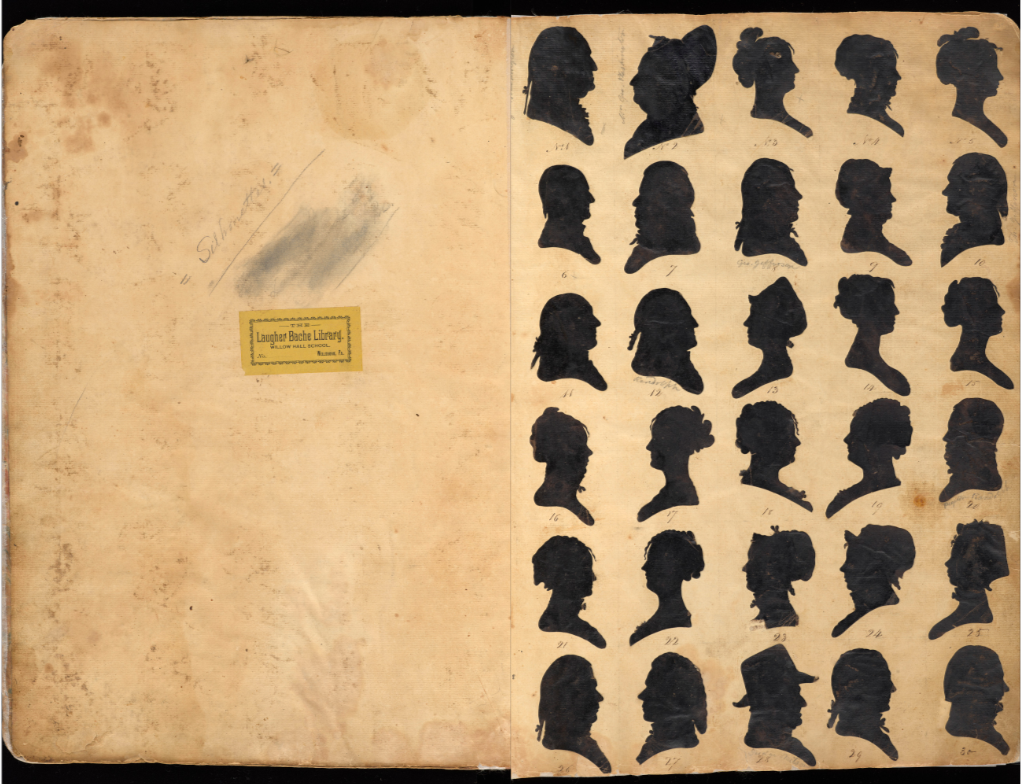
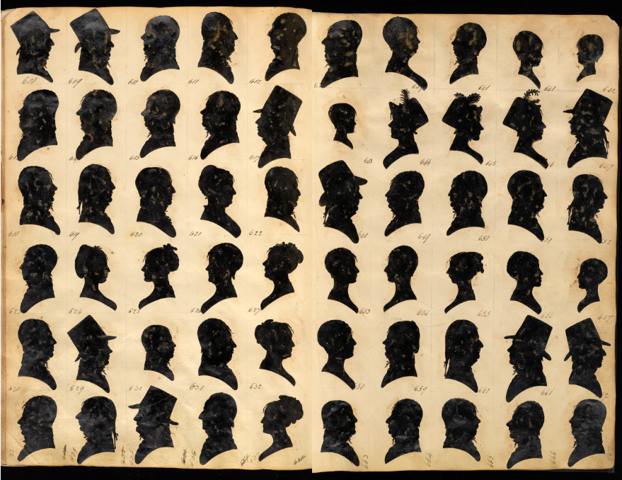
Former pursuits such as needlework, silhouette cut outs, and shell decorating went by the wayside as she dedicated herself fully to her botanical-themed “paper mosaicks.”
Over the next decade Mrs. Delany produced 985 astonishingly floral representations from meticulously cut, hand colored tissue, which she glued to hand painted black backings, and labeled with the specimens’ taxonomic and common names, as well as a collection of numbers, date and provenance.
In the beginning, she took inspiration from a giant collection of botanical specimens amassed by the celebrated botanist Sir Joseph Banks, with whom she became acquainted while spending summers at Bulstrode, the Buckinghamshire estate of her friend Margaret Bentinck, duchess of Portland and a fellow enthusiast of the natural world.
Bulstrode also provided her with abundant source material. The estate boasted botanic, flower, kitchen, ancient and American gardens, as well a staff botanist, the Swedish naturalist Daniel Solander charged with cataloguing their contents according to the Linnaean system.
Sir Joseph Banks commended Mrs. Delany’s powers of observation, declaring her assemblages “the only imitations of nature” from which he “could venture to describe botanically any plant without the least fear of committing an error.”
The main flower head … is so intensely public that it’s as if you’ve come upon a nude stody. She splays out approximately 230 shockingly vulvular purplish pink petals in the bloom, and inside the leaves she places the slenderest of ivory veins also cut separately from paper, with vine tendrils finer that a girl’s hair. It is so fresh that it looks wet and full of desire, yet the Passiflora is dull and matte
Mrs. Delany’s exquisitely rendered paper flowers became high society sensations, fetching her no small amount of invitations from titled hosts and hostesses, clamoring for specimens from their gardens to be immortalized in her growing Flora Delanica.
She also received donations of exotic plants at Balstrode, where greenhouses kept non-native plants alive, as she gleefully informed her niece in a 1777 letter, shortly after completing her work:
I am so plentifully supplied with the hothouse here, and from the Queen’s garden at Kew, that natural plants have been a good deal laid aside this year for foreigners, but not less in favour. O! How I long to show you the progress I have made.
Her work was in such demand, that she streamlined her creation process from necessity, coloring paper in batches, and working on several pieces simultaneously.
Her failing eyesight forced her to stop just shy of her goal of one thousand flowers.
She dedicated the ten volumes of Flora Delanica to her friend, the duchess of Portland, mistress of Balstrode “(whose) approbation was such a sanction to my undertaking, as made it appear of consequence and gave me courage to go on with confidence.”
She also reflected on the great undertaking of her seventh decade in a poem:
Jokes about “reality television” being a contradiction in terms go as far back in pop-culture history as the format itself. But the fact remains that, deliberately or otherwise, its programs do reflect certain characteristics of the societies that produce them. Before turning into one of the most globally successful franchises of this century’s reality-TV boom, the once-controversial strangers-in-a-house show Big Brother premiered in the Netherlands. It will be left as an exercise to the reader what that says about the Dutch, who have been tuning in to a very different kind of reality programming in the past month: De Nieuwe Vermeer, or The New Vermeer.
“The results are judged by Vermeer experts from the Rijksmuseum, the Dutch national museum in Amsterdam, and from the Mauritshuis, a collection of old masters in The Hague.” The professionals face such tasks as faithfully reconstructing Vermeer’s lost works, whether they vanished centuries ago or in the Isabella Stewart Gardner Museum theft of 1990. The amateurs work in their own media, including “stained glass, printmaking and even Lego.”
All this has made The New Vermeer “an instant sensation in the Netherlands, with 1.3 million viewers (in a country of 17 million) tuning in for the first episode.” Like any successful reality TV show these days, it has also inspired a wealth of supplementary content, including a podcast and an online gallery showing all the artwork created by the contestants. “You can’t currently watch the series in the U.S., writes Artnet’s Sarah Cascone, “but the network is streaming a weekly YouTube ‘Masterclass’ ” offering “step-by-step instructions on how to create your own Vermeer canvas.” At the moment, those videos are available only in Dutch, presumably on the assumption that The New Vermeer won’t travel well outside the Netherlands. But if, by some slim chance, it turned into a Big Brother-scale phenomenon, imagine the golden age of reality TV that would lie ahead.
Based in Seoul, Colin Marshall writes and broadcasts on cities, language, and culture. His projects include the Substack newsletterBooks on Cities, the book The Stateless City: a Walk through 21st-Century Los Angeles and the video series The City in Cinema. Follow him on Twitter at @colinmarshall or on Facebook.
We’ve featured the work of Spanish filmmaker Cristóbal Vila before: His short film “Inspirations” celebrated the mathematical art of M.C. Escher. “Fallingwater” animated one of Frank Lloyd Wright’s finest creations. And “Nature by Numbers” showed us geometrical and mathematical formulas found in nature.
Today, we bring you Vila’s “Wabi-Sabi: A Handful of Memories from Traditional Japan.” As he notes on his site, the animation captures the “aspects that interest me the most about traditional Japan,” featuring “scenes inspired by nature, gardens, architecture, interior scenes, etc.” And it attempts to “create a calm and balanced atmosphere through the use of light, composition, materials, movement… and the choice of the motifs themselves.”
Above, you can watch “Wabi-Sabi,” a Japanese term that refers to “the [aesthetic] beauty of the impermanent, the imperfect, the rustic, and the melancholy,” as explains The School of Life video below. If you’re entranced by Vila’s short film, also watch the “Making of” video (middle).
If you would like to support the mission of Open Culture, consider making a donation to our site. It’s hard to rely 100% on ads, and your contributions will help us continue providing the best free cultural and educational materials to learners everywhere. You can contribute through PayPal, Patreon, and Venmo (@openculture). Thanks!
The Austrian symbolist painter, Gustav Klimt, a driving force of the Vienna Secession, has joined the ranks of famous, dead artists being served up as pricey, super-sized, Instagram-friendly immersive experiences.
Having visited the Gold in Motion immersive Klimt exhibit at New York City’s recently inaugurated Hall des Lumières with Artnet’s Ben Davis, she definitely has some notes:
They take liberties with the originals. If you know the originals well, which I do, it’s sometimes hard to figure out what they were working from. The color is sometimes way off. And some of the images are not by Klimt at all. They seem like pastiches of Klimt or pieces of Klimts that they’ve pasted together in different ways…these images are blown up to a height of, what, 20 feet? It really doesn’t work, aesthetically. Klimt’s drawings are especially difficult because they’re so delicate, at times almost invisible.
But mustn’t some young visitors, after posting the plethora of selfies that motivate many a pilgrimage to this “multi-sensory celebration,” be moved to learn more about the artist it’s cashing in on?
That’d be a good thing, right?
Of course it would, and Paul Priestley provides a great introduction to Klimt’s life and work in the above episode of his Art History Schoolweb series.
We grant that spending 13 minutes with a middle-aged arts educator in a festive vest is a less sexy-seeing prospect than “step(ping) into a wonderland of moving paintings” to be “amazed by the golden era of modernism.”
But Priestley offers something you can’t really focus on while gawking at enormous 360º projections of The Kiss during a $35 timed entry — historical context and a generous portion of art world dish on a “lifelong bachelor who had countless liaisons during his lifetime, usually with his models, and is rumored to have fathered more than a dozen children.”
Priestley makes clear how the young Klimt’s career took a fateful turn with Philosophy (below), part of a massive commission for the ceiling of Vienna University’s Great Hall, that was ultimately destroyed by the Nazis, but has since been resurrected after a fashion using AI, black and white photos, and eyewitness descriptions.
When Klimt’s first go at it was displayed, it was savaged by critics as “chaotic, nonsensical and out of keeping with the intended setting.”
Philosophy’s drubbing put an end to Klimt’s official commissions, but private ones flourished due to the bohemian painter’s “beautiful women in elegantly languid and flattering poses.”
Imagine how those status conscious society matrons would have reacted to seeing their likenesses tapped as immersive art, which Vice’s Alex Fleming-Brown pegs as “the latest lazy lovechild of TikTok and enterprising warehouse landlords.”
It’s an astonishing painting, but there’s so much more to discover about Klimt and his four decades worth of work.
But first, with apologies to any readers who genuinely enjoy immersive art exhibits — many do — here are Jane Kallir’s not entirely conciliatory thoughts on Beethoven Frieze, Klimt’s voluptuous vision of lust, love and disease, which was deliberately enhanced by accompanying sculpture and live music when it made its public debut in 1902, and is currently being parceled out and writ large in digital form in the building formerly known as New York’s Emigrant Industrial Savings Bank:
I asked myself whether Klimt would have approved of the Beethoven Frieze projections. I believe most artists embrace cutting-edge technology, whatever it may be in their day and age. The Beethoven Frieze segment is a Gesamtkunstwerk on a scale that Klimt might have dreamed of—might have. This is the one part of the presentation that could be faithful to his intentions.
If a painter is ahead of his time, his work won’t sell particularly well while he’s alive. If an architect is ahead of his time, his work probably won’t exist at all — not in built form, at least. Such was the case with Étienne-Louis Boullée, who constructed few projects in the eighteenth century in which he lived, almost none of which remain standing today. The best Boullée devotees can do for a site of pilgrimage is the Hôtel Alexandre in Paris’ eighth arrondissement, which, though handsome enough, doesn’t quite offer a sense of why he would have devotees in the first place. To understand that, one must look to Boullée’s unbuilt works, the most notable of which are introduced in the video from Kings and Things above.
“Paper architect” identifies a member of the profession who may design structures prolifically but seldom, if ever, builds them. It is not a desirable label, especially in its implication of willful impracticality (even by architectural standards). But as practiced by Boullée, paper architecture became an art form unto itself: he left behind not just an extensive essay on his art, but voluminous drawings that envision a host of neoclassical buildings as ambitious in his time as they were unfashionable — and often, due to their sheer size, unbuildable.
These included an updated colosseum, a spherical cenotaph for Isaac Newton taller than the Great Pyramids of Giza, a basilica meant to give its beholders an impression of the universe itself, a royal library of near-Borgesian proportions, and even an actual Tower of Babel.
For Boullée, bigger was better, an idea that would sweep global architecture a century and a half after his death. By the mid-twentieth century, the world had also come to accept a Boullée-like preference for minimal ornamentation as well as his conception of what his contemporaries jokingly termed architecture parlante: that is, buildings that “speak” about their purpose visually, and in no uncertain terms. (You can hear more about it in the video below, a segment by professor Erika Naginski from Harvard’s online course “The Architectual Imagination.”) When Boullée designed a Palace of Justice, he placed a courthouse directly over a jailhouse, articulating “one enormous metaphor for crime overwhelmed by the weight of justice.” This may have been a bit much even for the new French Republic, but for those who appreciated Boullée’s work, it pointed the way to the architecture of the future — a future we would later call modern.
Based in Seoul, Colin Marshall writes and broadcasts on cities, language, and culture. His projects include the Substack newsletterBooks on Cities, the book The Stateless City: a Walk through 21st-Century Los Angeles and the video series The City in Cinema. Follow him on Twitter at @colinmarshall or on Facebook.
We're hoping to rely on loyal readers, rather than erratic ads. Please click the Donate button and support Open Culture. You can use Paypal, Venmo, Patreon, even Crypto! We thank you!
Open Culture scours the web for the best educational media. We find the free courses and audio books you need, the language lessons & educational videos you want, and plenty of enlightenment in between.