Discover The Grammar of Ornament, One of the Great Color Books & Design Masterpieces of the 19th Century

In the mid-17th cen­tu­ry, young Eng­lish­men of means began to mark their com­ing of age with a “Grand Tour” across the Con­ti­nent and even beyond. This allowed them to take in the ele­ments of their civ­i­liza­tion­al her­itage first-hand, espe­cial­ly the arti­facts of clas­si­cal antiq­ui­ty and the Renais­sance. After com­plet­ing his archi­tec­tur­al stud­ies, a Lon­don­er named Owen Jones embarked upon his own Grand Tour in 1832, rather late in the his­to­ry of the tra­di­tion, but ide­al tim­ing for the research that inspired the project that would become his lega­cy.

Accord­ing to the Vic­to­ria and Albert Muse­um, Jones vis­it­ed “Italy, Greece, Egypt and Turkey before arriv­ing in Grana­da, in Spain to car­ry out stud­ies of the Alham­bra Palace that were to cement his rep­u­ta­tion.”

He and French archi­tect Jules Goury, “the first to study the Alham­bra as a mas­ter­piece of Islam­ic design,” pro­duced “hun­dreds of draw­ings and plas­ter casts” of the his­tor­i­cal, cul­tur­al, and aes­thet­ic palimpsest of a build­ing com­plex. The fruit of their labors was the book Plans, Ele­va­tions, Sec­tions and Details of the Alham­bra, “one of the most influ­en­tial pub­li­ca­tions on Islam­ic archi­tec­ture of all time.”

Pub­lished in the 1840s, the book pushed the print­ing tech­nolo­gies of the day to their lim­its. In search of a way to do jus­tice to “the intri­cate and bright­ly col­ored dec­o­ra­tion of the Alham­bra Palace,” Jones had to put in more work research­ing “the then new tech­nique of chro­molith­o­g­ra­phy — a method of pro­duc­ing mul­ti-col­or prints using chem­i­cals.” In the fol­low­ing decade, he would make even more ambi­tious use of chro­molith­o­g­ra­phy — and draw from a much wider swath of world cul­ture — to cre­ate his print­ed mag­num opus, The Gram­mar of Orna­ment.

With this book, Jones “set out to reac­quaint his col­leagues with the under­ly­ing prin­ci­ples that made art beau­ti­ful,” write Met­ro­pol­i­tan Muse­um of Art cura­tor Femke Speel­berg and librar­i­an Robyn Flem­ing. “Instead of writ­ing an aca­d­e­m­ic trea­tise on the sub­ject, he chose to assem­ble a book of one hun­dred plates illus­trat­ing objects and pat­terns from around the world and across time, from which these prin­ci­ples could be dis­tilled.” To accom­plish this he drew on his own trav­el expe­ri­ences as well as resources clos­er at hand, includ­ing “the muse­o­log­i­cal and pri­vate col­lec­tions that were avail­able to him in Eng­land, and the objects that had been on dis­play dur­ing the Uni­ver­sal Exhi­bi­tions held in Lon­don in 1851 and 1855.”

The Gram­mar of Orna­ment was pub­lished in 1856, emerg­ing into a Britain “dom­i­nat­ed by his­tor­i­cal revivals such as Neo­clas­si­cism and the Goth­ic Revival,” says the V&A. “These design move­ments were rid­dled with reli­gious and social con­no­ta­tions. Instead, Owen Jones sought a mod­ern style with none of this cul­tur­al bag­gage. Set­ting out to iden­ti­fy the com­mon prin­ci­ples behind the best exam­ples of his­tor­i­cal orna­ment, he for­mu­lat­ed a design lan­guage that was suit­able for the mod­ern world, one which could be applied equal­ly to wall­pa­pers, tex­tiles, fur­ni­ture, met­al­work and inte­ri­ors.”

Indeed, the pat­terns so lav­ish­ly repro­duced in the book soon became trends in real-world design. They weren’t always employed with the intel­lec­tu­al under­stand­ing Jones sought to instill, but since The Gram­mar of Orna­ment has nev­er gone out of print (and can even be down­loaded free from the Inter­net Archive), his prin­ci­ples remain avail­able for all to learn — and his painstak­ing­ly artis­tic print­ing work remains avail­able for all to admire — even in the cor­ners of the world that lay beyond his imag­i­na­tion.

You can pur­chase a com­plete and unabridged col­or edi­tion of The Gram­mar of Orna­ment online.

Relat­ed Con­tent:

The Com­plex Geom­e­try of Islam­ic Art & Design: A Short Intro­duc­tion

Explore the Beau­ti­ful Pages of the 1902 Japan­ese Design Mag­a­zine Shin-Bijut­sukai: Euro­pean Mod­ernism Meets Tra­di­tion­al Japan­ese Design

A Beau­ti­ful 1897 Illus­trat­ed Book Shows How Flow­ers Become Art Nou­veau Designs

The Bauhaus Book­shelf: Down­load Orig­i­nal Bauhaus Books, Jour­nals, Man­i­festos & Ads That Still Inspire Design­ers World­wide

Every Page of Depero Futur­ista, the 1927 Futur­ist Mas­ter­piece of Graph­ic Design & Book­mak­ing, Is Now Online

Based in Seoul, Col­in Mar­shall writes and broad­casts on cities, lan­guage, and cul­ture. His projects include the Sub­stack newslet­ter Books on Cities, the book The State­less City: a Walk through 21st-Cen­tu­ry Los Ange­les and the video series The City in Cin­e­ma. Fol­low him on Twit­ter at @colinmarshall or on Face­book.

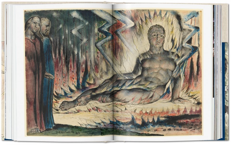
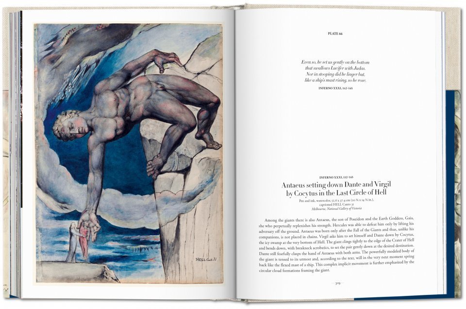
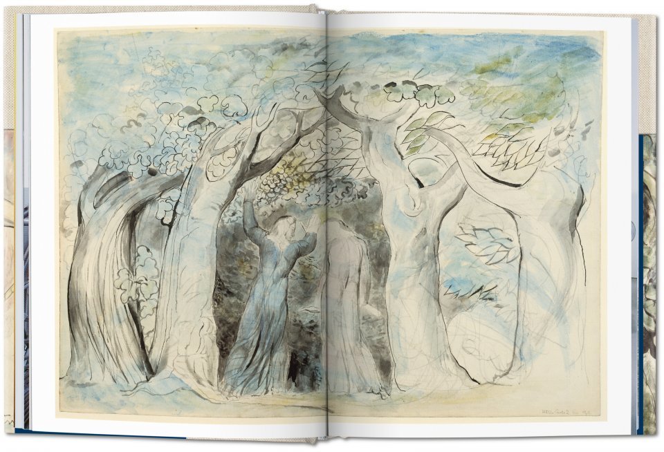
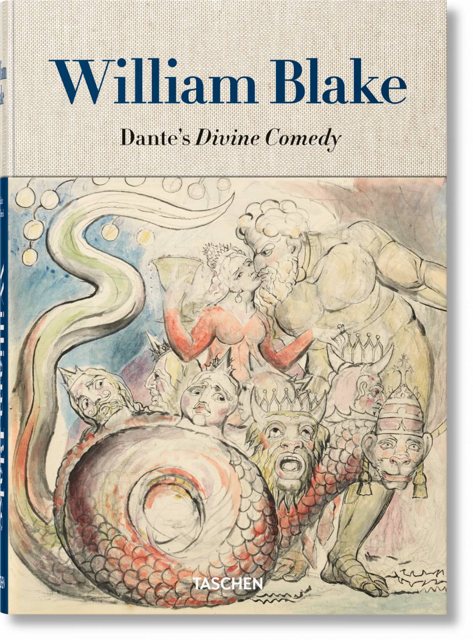
Explore Divine Comedy Digital, a New Digital Database That Collects Seven Centuries of Art Inspired by Dante’s Divine Comedy

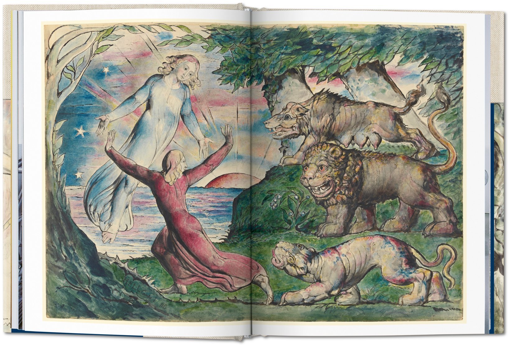
The num­ber of art­works inspired by Dante’s Divine Com­e­dy in the sev­en hun­dred years since the poet com­plet­ed his epic, ver­nac­u­lar mas­ter­work is so vast that refer­ring to the poem inevitably means refer­ring to its illus­tra­tions. These began appear­ing decades after the poet­’s death, and they have not stopped appear­ing since. Indeed, it might be fair to say that the title Divine Com­e­dy (sim­ply called Com­e­dy before 1555) names not only an epic poem but also its many con­stel­la­tions of art­works and inter­pre­ta­tions, which would have filled a mod­est-sized set of Dante ency­clo­pe­dias before the inter­net.

Luck­i­ly for art his­to­ri­ans and Dante schol­ars work­ing today, there is now Divine Com­e­dy Dig­i­tal, a beau­ti­ful­ly designed data­base which brings these art­works — spread out all over the world — togeth­er in one vir­tu­al place.

The inter­face requires no spe­cial Dante knowl­edge to nav­i­gate, though it helps to be famil­iar with the poem and/or have a ref­er­ence copy near­by when look­ing through the menus. Divid­ing neat­ly into the poem’s three books (or can­tiche), the menu at the left fur­ther breaks down into cir­cles (Infer­no), ter­races (Pur­ga­to­rio), and Can­tos (all three books).

Tog­gling between options in a menu on the right allows vis­i­tors to see the num­ber of illus­trat­ed vers­es in each Can­to or the num­ber of art­works. With­in a mat­ter of min­utes, you’ll be dis­cov­er­ing Dante illus­tra­tions you nev­er knew exist­ed, from Sal­vador Dali’s The Delight­ful Mount (1950, above) to Alessan­dro Vel­lutel­lo’s Dante and St. Bernard, Mary and the Trin­i­ty (1544) and hun­dreds of oth­ers in the years in-between.

Call­ing itself a “slow surf­ing site,” Divine Com­e­dy Dig­i­tal con­tains a handy tuto­r­i­al if you do get lost and allows users “not only to nav­i­gate through the col­lec­tion, but also to sug­gest miss­ing art­works.” So far, the 17th and 18th cen­turies are huge­ly under­rep­re­sent­ed, though not for a lack of Dante-inspired art­work made in that two-hun­dred year peri­od. The gaps mean there is much more Dante art to come.

Released in June of this year, the project is the work of The Visu­al Agency, “an infor­ma­tion design agency spe­cial­ized in data-visu­al­iza­tion based in Milan and Dubai” and was cre­at­ed to cel­e­brate the 700th anniver­sary of Dante’s death. As he con­tin­ues to inspire artists for the next few hun­dred years, per­haps the work based on his epic poem will trend more dig­i­tal than medieval, cre­at­ing inter­pre­ta­tions the poet nev­er could have dreamt. Enter the Divine Com­e­dy Dig­i­tal project here.

You can also see some of the ear­li­est illus­trat­ed edi­tions of Dante’s Divine Com­e­dy (1487–1568), cour­tesy of Colum­bia Uni­ver­si­ty, here.

Relat­ed Con­tent:

A Free Course on Dante’s Divine Com­e­dy from Yale Uni­ver­si­ty

Rarely-Seen Illus­tra­tions of Dante’s Divine Com­e­dy Are Now Free Online, Cour­tesy of the Uffizi Gallery

Mœbius Illus­trates Dante’s Par­adiso

Artists Illus­trate Dante’s Divine Com­e­dy Through the Ages: Doré, Blake, Bot­ti­cel­li, Mœbius & More

Visu­al­iz­ing Dante’s Hell: See Maps & Draw­ings of Dante’s Infer­no from the Renais­sance Through Today

Hear Dante’s Infer­no Read Aloud by Influ­en­tial Poet & Trans­la­tor John Cia­r­di (1954)

A Dig­i­tal Archive of the Ear­li­est Illus­trat­ed Edi­tions of Dante’s Divine Com­e­dy (1487–1568)

Josh Jones is a writer and musi­cian based in Durham, NC. Fol­low him at @jdmagness.

Frida Kahlo: The Life of an Artist

Fri­da Kahlo has been a mar­tyr to art his­to­ry. Her twinned self-por­trait The Two Fridas sits at num­ber 87 on a list of the 100 most pop­u­lar paint­ings (behind Diego Rivera’s The Flower Car­ri­er and Cas­sius Coolidge’s Dogs Play­ing Pok­er series). She is “one of the most icon­ic and con­tra­dic­to­ry cul­tur­al fig­ures around,” Judy Cox writes: “a card-car­ry­ing Com­mu­nist whose image adorned a bracelet worn by There­sa May, a fem­i­nist who has her own bar­bie doll.”

Her cul­tur­al cre­den­tials sell. Her work is acclaimed as a lead­ing exam­ple of indi­genis­mo, as Den­ver art muse­um senior cura­to­r­i­al assis­tant Jesse Laird Orte­ga writes, “a polit­i­cal, intel­lec­tu­al, and artis­tic move­ment that cel­e­brat­ed indige­nous peo­ples in Mex­i­co.” Kahlo her­self is laud­ed as “a pas­sion­ate nation­al­ist who advo­cat­ed for the rev­o­lu­tion… and sup­port­ed farm­ers and work­ers.”

This praise sounds sus­pi­cious to oth­er crit­ics. “Miss­ing from the pub­lic dis­course about the artist are dis­cus­sions about how the ‘nation­al­ism’ that Kahlo pro­mot­ed,” Joan­na Gar­cia Cher­an argues, “both in her art and per­son­al style per­pet­u­at­ed the con­struc­tion of a mythol­o­gized Indi­an­ness at the expense of Indige­nous peo­ple.” Kahlo only began wear­ing the rebo­zos and oth­er indige­nous fash­ions she made famous when she mar­ried Diego Rivera (for the first time) in 1929.

Does Paul Priest­ly, the host of the Art His­to­ry School video les­son above, help smooth out the con­tra­dic­tions of Kahlo’s life and art? No, but to be fair, he makes no pre­tense to high­er crit­i­cism. The les­son is a basic intro­duc­tion (with a con­tent warn­ing for younger view­ers) to the well-known facts of Frida’s life, those amply cov­ered in doc­u­men­taries like Ken Madel’s Fri­da Kahlo: A Rib­bon Around a Bomb and (with plen­ty of dra­mat­ic license, of course) the Salma Hayek-star­ring biopic Fri­da.

Priest­ley’s video is a sound intro­duc­tion to Kahlo’s life, how­ev­er, pre­cise­ly because it shies away from hagiog­ra­phy or the­o­ry. He walks us through the facts of the artist’s life in brief, with clips of a woman read­ing Frida’s own words and images of her work along­side pho­to­graph­ic por­traits of her­self at every stage of life, allow­ing view­ers to see the side-by-side devel­op­ment of Kahlo’s art and her pub­lic per­sona.

In the midst of Kahlo wor­ship and icon­o­clasm, what seems too often neglect­ed is Kahlo’s com­plex human­i­ty. She was not one thing or anoth­er — nei­ther whol­ly Marx­ist saint, nor a bour­geois appro­pri­a­tor; nei­ther whol­ly fem­i­nist hero, nor trag­ic vic­tim of patri­ar­chal male hero wor­ship: she was both and nei­ther, at many times, a fig­ure twinned in her imag­i­na­tion and split in half by cul­tur­al log­ics that want to claim and pos­sess art and artists for their own.

Relat­ed Con­tent:  

Vis­it the Largest Col­lec­tion of Fri­da Kahlo’s Work Ever Assem­bled: 800 Arti­facts from 33 Muse­ums, All Free Online

Dis­cov­er Fri­da Kahlo’s Wild­ly-Illus­trat­ed Diary: It Chron­i­cled the Last 10 Years of Her Life, and Then Got Locked Away for Decades

Take a Vir­tu­al Tour of Fri­da Kahlo’s Blue House Free Online

Josh Jones is a writer and musi­cian based in Durham, NC. Fol­low him at @jdmagness

The Meaning of Hieronymus Bosch’s Spellbinding Triptych, The Garden of Earthly Delights

Hierony­mus Bosch was born Jheron­imus van Aken. We know pre­cious lit­tle else about him, not even the year of his birth, which schol­ar Nicholas Baum guess­es must have been right in the mid­dle of the fif­teenth cen­tu­ry. But we do know that the artist was born in the Dutch town of s‑Hertogenbosch, bet­ter known as Den Bosch, to which his assumed name pays trib­ute. It is thus to Den Bosch that Baum trav­els in the The Mys­ter­ies of Hierony­mus Bosch, the 1983 BBC TV movie above, in search of clues to an inter­pre­ta­tion of Bosch’s mys­te­ri­ous, grotesque, and some­times hilar­i­ous paint­ings. What man­ner of place could pro­duce an artis­tic mind capa­ble of The Gar­den of Earth­ly Delights?

“My first reac­tion was dis­ap­point­ment,” Baum says of Den Bosch. “I was­n’t expect­ing such a very ordi­nary, very com­mer­cial, very provin­cial lit­tle town. I could­n’t for the life of me fit any­body as extra­or­di­nary as Bosch into a sleepy lit­tle place like this.” A hard­work­ing every­day Dutch­man might laugh at Baum’s Eng­lish imag­i­na­tion hav­ing got away with him; per­haps he’d even quote his coun­try’s well-worn proverb about nor­mal human behav­ior being crazy enough.

Nev­er­the­less, fueled by a near-life­long fas­ci­na­tion with Bosch’s fan­tas­ti­cal and for­bid­ding art, Baum goes deep­er: quite lit­er­al­ly deep­er, in one case, descend­ing to the dank cel­lar beneath the house where the artist grew up in order to take in “the authen­tic smell and feel of Bosch’s own day.”

Fur­ther insights come when Baum inves­ti­gates Bosch’s mem­ber­ship in the Catholic fra­ter­ni­ty of the Com­mon Life. A few decades lat­er, that same order would also edu­cate north­ern Renais­sance philoso­pher Eras­mus, whose reli­gios­i­ty is well known. Bosch must have been no less pious, but for cen­turies that did­n’t fig­ure as thor­ough­ly into the inter­pre­ta­tion of his paint­ings as it might have. Focused on the vivid images of bac­cha­na­lia Bosch incor­po­rat­ed into his work, some spec­u­lat­ed on his involve­ment in orgy-ori­ent­ed secret soci­eties. But Baum’s jour­ney con­vinces him that Bosch was “a fierce and pious Chris­t­ian” who paint­ed with the goal of turn­ing a glut­to­nous, wealth- and plea­sure-obsessed human­i­ty back toward the teach­ings of the Bible. And half a mil­len­ni­um lat­er, it is his wild­ly imag­i­na­tive ren­der­ings of sin that con­tin­ue to com­pel us — as well as hold out the promise of fur­ther secrets yet unex­plained.

For any­one inter­est­ed, Taschen now pub­lish­es an Bosch: The Com­plete Works, a beau­ti­ful and exhaus­tive explo­ration of the painter’s work. It includes a spe­cial chap­ter on The Gar­den of Earth­ly Delights.

Relat­ed Con­tent:

The Mean­ing of Hierony­mus Bosch’s The Gar­den of Earth­ly Delights Explained

Take a Vir­tu­al Tour of Hierony­mus Bosch’s Bewil­der­ing Mas­ter­piece The Gar­den of Earth­ly Delights

Hierony­mus Bosch’s Medieval Paint­ing The Gar­den of Earth­ly Delights Comes to Life in a Gigan­tic, Mod­ern Ani­ma­tion

Take a Mul­ti­me­dia Tour of the But­tock Song in Hierony­mus Bosch’s Paint­ing The Gar­den of Earth­ly Delights

The Musi­cal Instru­ments in Hierony­mus Bosch’s The Gar­den of Earth­ly Delights Get Brought to Life, and It Turns Out That They Sound “Painful” and “Hor­ri­ble”

New App Lets You Explore Hierony­mus Bosch’s “The Gar­den of Earth­ly Delights” in Vir­tu­al Real­i­ty

Based in Seoul, Col­in Mar­shall writes and broad­casts on cities, lan­guage, and cul­ture. His projects include the Sub­stack newslet­ter Books on Cities, the book The State­less City: a Walk through 21st-Cen­tu­ry Los Ange­les and the video series The City in Cin­e­ma. Fol­low him on Twit­ter at @colinmarshall or on Face­book.

Thirty-Six Views of Mount Fuji: A Deluxe New Art Book Presents Hokusai’s Masterpiece, Including “The Great Wave Off Kanagawa”

Like most Japan­ese mas­ters of ukiyo‑e wood­block art, Kat­sushi­ka Hoku­sai is best known monony­mous­ly. But he’s even bet­ter known by his work — and by one piece of work in par­tic­u­lar, The Great Wave off Kana­gawa. Even those who’ve nev­er heard the name Hoku­sai have seen that print, arrest­ing in its some­how calm tur­bu­lence, or at least they’ve seen one of its count­less mod­ern par­o­dies and trib­utes (most recent­ly, a large-scale homage in the medi­um of LEGO). But when he died in 1849, the pro­lif­ic and long-lived artist left behind a body of work amount­ing to more than 30,000 paint­ings, sketch­es, prints, and illus­tra­tions (as well as a how-to-draw book).

None of those 30,000 works are quite as famous as his Great Wave off Kana­gawa, but very few indeed are as ambi­tions as the series to which it belongs, Thir­ty-Six Views of Mount Fuji. It is that two-year project, the artis­tic fruit of an obses­sion with Fuji and its envi­rons, that Taschen has tak­en as the mate­r­i­al for their new book Hoku­sai: Thir­ty-six Views of Mount Fuji.

Pro­duced in a 224-page “XXL edi­tion,” it gath­ers “the finest impres­sions from insti­tu­tions and col­lec­tions world­wide in the com­plete set of 46 plates along­side 114 col­or vari­a­tions” — all sewn togeth­er, appro­pri­ate­ly, with “Japan­ese bind­ing.”

Not only does the book repro­duce Thir­ty-six Views of Mount Fuji with Taschen’s sig­na­ture atten­tion to image qual­i­ty, it presents The Great Wave off Kana­gawa in a way few actu­al­ly see it: in con­text. For that most wide­ly pub­lished of all Hoku­sai prints launched the series, which con­tin­ued on to Fine Wind, Clear Morn­ing, Thun­der­storm Beneath the Sum­mit, and Kajikaza­wa in Kai Province, that last being an image held in espe­cial­ly high esteem by ukiyo‑e enthu­si­asts. One such enthu­si­ast, east Asian art his­to­ri­an Andreas Marks, has per­formed this book’s edit­ing and writ­ing, as he did with Taschen’s pre­vi­ous Japan­ese Wood­block Prints (1680–1938). Expe­ri­enc­ing the whole of Thir­ty-six Views of Mount Fuji, more than one read­er will no doubt become as trans­fixed by Hoku­sai as Hoku­sai was by his home­land’s most beloved moun­tain. You can pick up a copy of Hoku­sai: Thir­ty-six Views of Mount Fuji here.

Relat­ed Con­tent:

The Great Wave off Kana­gawa by Hoku­sai: An Intro­duc­tion to the Icon­ic Japan­ese Wood­block Print in 17 Min­utes

The Evo­lu­tion of The Great Wave off Kanaza­wa: See Four Ver­sions That Hoku­sai Paint­ed Over Near­ly 40 Years

The Met Puts 650+ Japan­ese Illus­trat­ed Books Online: Mar­vel at Hokusai’s One Hun­dred Views of Mount Fuji and More

Get Free Draw­ing Lessons from Kat­sushi­ka Hoku­sai, Who Famous­ly Paint­ed The Great Wave off Kana­gawa: Read His How-To Book, Quick Lessons in Sim­pli­fied Draw­ings

A Beau­ti­ful New Book of Japan­ese Wood­block Prints: A Visu­al His­to­ry of 200 Japan­ese Mas­ter­pieces Cre­at­ed Between 1680 and 1938

See Clas­sic Japan­ese Wood­blocks Brought Sur­re­al­ly to Life as Ani­mat­ed GIFs

Based in Seoul, Col­in Mar­shall writes and broad­casts on cities, lan­guage, and cul­ture. His projects include the Sub­stack newslet­ter Books on Cities, the book The State­less City: a Walk through 21st-Cen­tu­ry Los Ange­les and the video series The City in Cin­e­ma. Fol­low him on Twit­ter at @colinmarshall or on Face­book.

Andy Warhol’s Art Explained: What Makes His Iconic Campbell’s Soup Cans & Marilyn Monroe Diptych Art?

Pop Art looks out into the world. It does­n’t look like a paint­ing of some­thing, it looks like the thing itself. — Artist Roy Licht­en­stein

By 2021, most of us accept that Andy Warhol’s Camp­bel­l’s Soup Cans are art, but there are some who are still not con­fi­dent as to why.

No shame in that.

Art His­to­ri­an Steven Zuck­er and the Khan Academy’s Sal Khan tack­le the ques­tion head on in the below video, con­clud­ing that the work is not only a reflec­tion of the time in which it was cre­at­ed, but that the enor­mi­ty of its impact was made pos­si­ble by that tim­ing.

Forty-five years before Warhol escort­ed those low­ly, instant­ly rec­og­niz­able soup cans from the super­mar­ket to the far lofti­er realm of muse­um and gallery, the art world was thrown into an uproar over Mar­cel Duchamp’s provoca­tive ready­made, Foun­tain, a pre­fab­ri­cat­ed uri­nal sub­mit­ted to the Soci­ety of Inde­pen­dent Artists inau­gur­al exhi­bi­tion as the work of the fic­ti­tious R. Mutt. The Tate Modern’s web­site sum­ma­rizes its impor­tance:

Foun­tain test­ed beliefs about art and the role of taste in the art world. Inter­viewed in 1964, Duchamp said he had cho­sen a uri­nal in part because he thought it had the least chance of being liked (although many at the time did find it aes­thet­i­cal­ly pleas­ing). He con­tin­ued: ‘I was draw­ing people’s atten­tion to the fact that art is a mirage. A mirage, exact­ly like an oasis appears in the desert. It is very beau­ti­ful until, of course, you are dying of thirst. But you don’t die in the field of art. The mirage is sol­id.’

Campbell’s soup cans pos­sess a sim­i­lar solid­i­ty.

The famil­iar label dates back to 1898 when a Campbell’s exec drew inspi­ra­tion from Cor­nell Uni­ver­si­ty’s red and white foot­ball uni­forms.

A full page mag­a­zine ad from 1934 intro­duces Cream of Mush­room and Noo­dle with Chick­en (soon to become Chick­en Noo­dle) by remind­ing read­ers to “Look for the Red-and-White Label.”

By 1962, Campbell’s had giv­en con­sumers their pick of 32 fla­vors, and Warhol paint­ed all 32 of them. Not the con­tents. Just those uni­form cans.

Los Ange­les’ Ferus Gallery sold five of them before gal­lerist Irv­ing Blum real­ized that their impact was great­est when all 32 were dis­played togeth­er, to echo how con­sumers were used to see­ing the real thing.

Warhol had a per­son­al con­nec­tion to his sub­ject mat­ter, but it wasn’t like he set out to rep a life­long favorite. Rather, he was fol­low­ing up on a friend’s sug­ges­tion to paint some­thing every­one would would rec­og­nize, with or with­out pas­sion­ate feel­ings. (He seemed to be with­out:)

I used to drink it. I used to have the same lunch every day, for 20 years, I guess, the same thing over and over again.

Warhol brought a suc­cess­ful com­mer­cial illus­tra­tor’s eye to his Campell’s Soup Cans, cap­i­tal­iz­ing on the public’s exist­ing knowl­edge. The col­ors, the cus­tom cur­sive logo over the sans serif fla­vor font, and the shape of the cans had couched them­selves in the ear­ly-60s Amer­i­can con­scious­ness.

As had indus­tri­al­iza­tion as the over­ar­ch­ing sys­tem by which most lives were ordered. The artist may not have offered overt com­ment on mass pro­duced items, con­ve­nience foods, or brand loy­al­ty. He just depend­ed on the pub­lic to be so inti­mate­ly acquaint­ed with them, they had fad­ed into the wall­pa­per of their dai­ly lives.

Nor was the pub­lic over­ly accus­tomed to every­day objects recon­cep­tu­al­ized as art. These days, we’re a bit blasé.

Warhol’s sub­ject mat­ter may have been pro­sa­ic, but his tim­ing, Khan and Zuck­er tell us, could not have been bet­ter.

As Campbell’s is to soup, Mar­i­lyn Mon­roe is to celebri­ty — an endur­ing house­hold name. Her sexy, youth­ful image is imprint­ed on fans born decades after her death.

The most uni­ver­sal Mar­i­lyn is the one from the Nia­gara pub­lic­i­ty still, immor­tal­ized in acrylic and silkscreen in Warhol’s Mar­i­lyn Dip­tych. One of his most defin­ing works, it was pro­duced the same year as his soup cans (and Monroe’s sui­cide at the age of 36).

In con­sid­er­ing this work for his ongo­ing series, Great Art Explained, gal­lerist James Payne delves into Warhol’s fas­ci­na­tion with mul­ti­ples, celebri­ty, reli­gious iconog­ra­phy, machi­na­tion, and death, not­ing that “both Warhol and Mar­i­lyn under­stood trans­for­ma­tion”:

From ear­ly on in his career, Andy Warhol had an extra­or­di­nary abil­i­ty of find­ing the sacred in the pro­fane.… He was a prod­uct of the East­ern Euro­pean immi­grant expe­ri­ence who him­self became an icon, a shy, gay, work­ing class man who became the court painter of the 1970s, an artist who embraced con­sumerism,  celebri­ty and the coun­ter­cul­ture and changed mod­ern art in the process.

Relat­ed Con­tent: 

Andy Warhol Demys­ti­fied: Four Videos Explain His Ground­break­ing Art and Its Cul­tur­al Impact

Andy Warhol Explains Why He Decid­ed to Give Up Paint­ing & Man­age the Vel­vet Under­ground Instead (1966)

Take a Vir­tu­al Tour of the Andy Warhol Exhi­bi­tion at the Tate Mod­ern

Ayun Hal­l­i­day is an author, the­ater­mak­er, and Chief Pri­ma­tol­o­gist of the East Vil­lage Inky zine. Fol­low her @AyunHalliday

The Life & Art of Hilma Af Klint: A Short Art History Lesson on the Pioneering Abstract Artist

Like many artists whose abstrac­tions cement­ed their lega­cy, Hilma af Klint was trained to paint por­traits, botan­i­cals, and land­scapes.

The nat­u­ral­ist works of her ear­ly adult­hood depict bour­geois, late-19th cen­tu­ry Swedish life, and, by asso­ci­a­tion, the sort of sub­ject mat­ter and approach that were deemed most fit­ting for a female artist, even in a soci­ety where women were allowed to work along­side men.

But some­thing else was afoot with Hilma, as artist and edu­ca­tor Paul Priest­ley points out in the above episode from his Art His­to­ry School series.

Her 10-year-old sister’s death from the flu may have caused her to lean into an exist­ing inter­est in spir­i­tu­al­ism, but as Iris Müller-West­er­mann, direc­tor of Mod­er­na Museet Malmö told The Guardian’s Kate Kell­away, the “math­e­mat­i­cal, sci­en­tif­ic, musi­cal, curi­ous” teen was like­ly moti­vat­ed by her own thirst for knowl­edge as by this fam­i­ly tragedy:

 You have to under­stand this was the age when nat­ur­al sci­ences went beyond the vis­i­ble: Hein­rich Hertz dis­cov­ered elec­tro­mag­net­ic waves [1886], Wil­helm Rönt­gen invent­ed the x‑ray [1895]…Hilma is like Leonar­do – she want­ed to under­stand who we are as human beings in the cos­mos.

Her inter­est in the occult did not make her an out­sider. Spir­i­tu­al­ism was con­sid­ered a respectable intel­lec­tu­al pre­oc­cu­pa­tion. Abstract painters Vasi­ly Kandin­skyPiet Mon­dri­anKasimir Male­vich and Fran­tisek Kup­ka were also using their art to try and get at that which the eye could not see.

All but Hilma were hailed as pio­neers.

The New York Times review of Los Ange­les Coun­ty Muse­um of Art’s 1986 exhib­it The Spir­i­tu­al in Art: Abstract Paint­ing 1890–1985, men­tions some of their spir­i­tu­al bona fides:

They were gen­er­at­ed by such ven­tures into mys­ti­cism as Theos­o­phy, Anthro­pos­o­phy, Rosi­cru­cian­ism, East­ern phi­los­o­phy, and var­i­ous East­ern and West­ern reli­gions. Spir­i­tu­al ideas were not periph­er­al to these artists’ lives, not some­thing that hap­pened to pop into their minds as they stood by their can­vas. Kup­ka par­tic­i­pat­ed in seances and was a prac­tic­ing medi­um. Kandin­sky attend­ed pri­vate fetes involved with mag­ic, black mass­es and pagan rit­u­als. Mon­dri­an was a mem­ber of the Dutch Theo­soph­i­cal Soci­ety and lived briefly in the quar­ters of the French Theo­soph­i­cal Soci­ety in Paris. He said once that he ”got every­thing from the Secret Doc­trine” of Theos­o­phy, which was an attempt by its founder Hele­na Petro­v­na Blavatsky to do noth­ing less than read, digest and syn­the­size all reli­gions. It has been known for some time how much of Mon­dri­an’s sym­bol­ism — includ­ing the ubiq­ui­tous ver­ti­cal and hor­i­zon­tal lines — and how much of his utopi­anism, was shaped by Theo­soph­i­cal doc­trine.

Review­er Michael Bren­son devotes one sen­tence to Hilma, “a pre­vi­ous­ly unknown Swedish artist whose some­what mechan­i­cal abstract paint­ings and draw­ings of organ­ic, geo­met­ri­cal forms were marked by Theos­o­phy and Anthro­pos­o­phy.”

Thir­ty-five years lat­er, she’s receiv­ing much more cred­it. As Priest­ley says in his video biog­ra­phy, Hilma, and not Kandin­sky, is now hailed as the first painter to exper­i­ment with abstrac­tion.

Would Hilma have wel­comed such a dis­tinc­tion?

She main­tained that she was but a receiv­ing instru­ment for Amaliel, a “high mas­ter” from anoth­er dimen­sion, who made con­tact dur­ing the séances she par­tic­i­pat­ed in reg­u­lar­ly with four friends who met week­ly to prac­tice auto­mat­ic draw­ing and writ­ing.

Amaliel charged her with cre­at­ing the art­work for the inte­ri­or of a tem­ple that was part of the high mas­ters’ vision. The Guggenheim’s class­room mate­ri­als for The Paint­ings for the Tem­ple note that her friends warned Hilma against accept­ing this oth­er­world­ly com­mis­sion, “that the inten­si­ty of this kind of spir­i­tu­al engage­ment could dri­ve her into mad­ness.”

But Hilma threw her­self into the assign­ment, pro­duc­ing 111 paint­ings dur­ing a one-and-a-half year peri­od, claim­ing:

The pic­tures were paint­ed direct­ly through me, with­out any pre­lim­i­nary draw­ings and with great force. I had no idea what the paint­ings were sup­posed to depict; nev­er­the­less, I worked swift­ly and sure­ly, with­out chang­ing a sin­gle brush­stroke.

For what­ev­er rea­son, the paint­ings proved too much for Rudolph Stein­er, the founder of the Anthro­po­soph­i­cal Soci­ety, whom she had invit­ed to view them, pay­ing his trav­el expens­es in hope that he would pro­vide a detailed analy­sis and inter­pre­ta­tion of the images. Instead, he coun­seled her that no one would under­stand them, and that the only course of action would be to keep the paint­ings out of sight and out of mind for fifty years. To do oth­er­wise might endan­ger her health.

A dis­ap­point­ing response that ulti­mate­ly led to the paint­ings being socked away for an even longer peri­od.

Good news for Kandin­sky… and pos­si­bly for Stein­er.

At any rate, the com­pe­ti­tion was coerced into elim­i­nat­ing her­self, inad­ver­tent­ly plant­i­ng the seeds for some major, if delayed art world excite­ment. Hilma, who died more than forty years before the L.A. Coun­ty Muse­um show, was not able to bask in the atten­tion on any earth­ly plane.

For those curi­ous in a take that is not entire­ly root­ed in the art world, Light­forms Art Cen­ter in Hud­son, New York host­ed a recent Hilma Af Klint exhib­it. Their strong ties to the Anthro­po­soph­i­cal com­mu­ni­ty make for some inter­est­ing exhib­it com­men­tary.

Relat­ed Con­tent: 

The Com­plete Works of Hilma af Klint Are Get­ting Pub­lished for the First Time in a Beau­ti­ful, Sev­en-Vol­ume Col­lec­tion

New Hilma af Klint Doc­u­men­tary Explores the Life & Art of the Trail­blaz­ing Abstract Artist

Dis­cov­er Hilma af Klint: Pio­neer­ing Mys­ti­cal Painter and Per­haps the First Abstract Artist

Ayun Hal­l­i­day is an author, illus­tra­tor, the­ater mak­er and Chief Pri­ma­tol­o­gist of the East Vil­lage Inky zine. Fol­low her @AyunHalliday.

Watch the Tate Modern Restore Mark Rothko’s Vandalized Painting, Black on Maroon: 18 Months of Work Condensed Into 17 Minutes

“The peo­ple who weep before my pic­tures are hav­ing the same reli­gious expe­ri­ence I had when I paint­ed them. And if you, as you say, are moved only by their col­or rela­tion­ship, then you miss the point.” — Mark Rothko

In 2012, a Russ­ian artist call­ing him­self Vladimir Umanets wrote his name and the words “A poten­tial piece of yel­low­ism” in black mark­er on the cor­ner of Mark Rothko’s 1958 can­vas Black on Maroon. The dam­age to the paint­ing, housed at the Tate Mod­ern since 1970, was sub­stan­tial, and it turned out to be one of the museum’s most chal­leng­ing restora­tion projects, as well as one of its most suc­cess­ful — “far more suc­cess­ful than any of us dared hope,” said Tate direc­tor Nicholas Sero­ta. The paint­ing went back on dis­play in May of 2014.

Due to Rothko’s lay­ered tech­nique, the painting’s “sur­face is real­ly del­i­cate and it turned out that most of the sol­vent sys­tems that could dis­solve and remove the ink could poten­tial­ly dam­age the paint­ing as well.” Patri­cia Smithen, the Tate’s head of con­ser­va­tion, told The Guardian. The video above from the muse­um shows the art and sci­ence that went into restor­ing the famous work, an eigh­teen-month-long process that involved some reverse engi­neer­ing from a can­vas donat­ed by the Rothko fam­i­ly.

Black on Maroon seemed like an odd choice for a protest, as a blog­ger at Art His­to­ry Abroad wrote the fol­low­ing day: “‘Why Rothko?’. His paint­ings [are] often crit­i­cised by those who don’t favour their abstrac­tion, but rarely deemed polit­i­cal­ly or social­ly moti­vat­ed to a point that they might pro­voke van­dal­ism.” The pres­ence of Black on Maroon and oth­er Sea­gram Murals at the Tate, in fact, mark an act of protest by Rothko him­self (who com­mit­ted sui­cide the day the paint­ings arrived at the Lon­don muse­um).

The Sea­gram Murals were orig­i­nal­ly com­mis­sioned for the Four Sea­sons restau­rant in the Sea­gram build­ing in New York, designed by Mies van der Rohe and Philip John­son. Sev­en paint­ings were com­mis­sioned, Rothko made 30. He report­ed­ly told Harper’s edi­tor John Fis­ch­er he want­ed to cre­ate “some­thing that will ruin the appetite of every son-of-a-bitch who ever eats in that room.” When he final­ly got the chance to dine at the com­plet­ed restau­rant, he was dis­gust­ed, with­drew his work, and returned his com­mis­sion, writ­ing, “it seemed clear to me at once that the two were not for each oth­er.” He spent the next decade think­ing about how and where to dis­play the paint­ings.

Umanets did not seem to care much about the his­to­ry of the murals in the Tate’s Rothko Room and claims his choice had no mean­ing. “I didn’t sin­gle out Rothko to make my state­ment,” he wrote in a pub­lic let­ter of apol­o­gy pub­lished after he spent a year and a half in prison. “I would have done the same had the artist been Damien Hirst or Tracey Emin. It was a spon­ta­neous deci­sion and noth­ing per­son­al.” Like­wise, his Dada-esqe “Man­i­festo of Yel­low­ism” out­lines a pro­gram with a dis­tinct lack of con­cern for speci­fici­ty and a vague­ly satir­i­cal desire to flat­ten art into one col­or, one pur­pose, one mean­ing.

Even as he pub­licly abjured his act of protest (maybe by order of the court?), Umanets also expressed a gen­uine con­cern for the future of art, “Art has become a busi­ness, which appears to serve only the needs of the art mar­ket. As a result the art world no longer has rad­i­cal thinkers and polemi­cists will­ing to scythe new and dif­fer­ent path­ways. Every­one is play­ing safe.” He might have made his point more clear­ly by going after Jeff Koons. Rothko was a rad­i­cal thinker, and his Sea­gram Murals rep­re­sent a final refusal to com­pro­mise with the demands of the art mar­ket.

Relat­ed Con­tent: 

A Short Doc­u­men­tary on Artist Jeff Koons, Nar­rat­ed by Scar­lett Johans­son

Watch an Art Con­ser­va­tor Bring Clas­sic Paint­ings Back to Life in Intrigu­ing­ly Nar­rat­ed Videos

The MoMA Teach­es You How to Paint Like Pol­lock, Rothko, de Koon­ing & Oth­er Abstract Painters

Great Art Explained: Watch 15 Minute Intro­duc­tions to Great Works by Warhol, Rothko, Kahlo, Picas­so & More

Josh Jones is a writer and musi­cian based in Durham, NC. Fol­low him at @jdmagness

« Go BackMore in this category... »
Quantcast