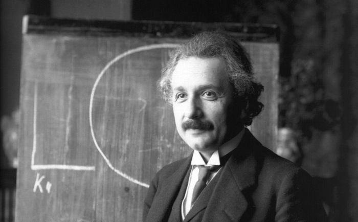
How 16th-Century Artist Joris Hoefnagel Made Insects Beautiful—and Changed Science Forever

In Eng­lish, most of the words we’d use to refer to insects sound off-putting at best and fear­some at worst, at least to those with­out an ento­mo­log­i­cal bent. Dutch, close a lin­guis­tic rela­tion though it may be, offers a more endear­ing alter­na­tive in beestjes, which refers to all these “lit­tle beasts” in which the artists and sci­en­tists of Europe start­ed to take a major inter­est in the late six­teenth cen­tu­ry. As was the style of that era, the mag­is­te­ria of art and sci­ence tend­ed to over­lap, a phe­nom­e­non nowhere more clear­ly reflect­ed — at least with regard to the insect king­dom — than in the work of Joris Hoef­nagel, a Flem­ish artist whose illus­tra­tions of beestjes com­bined beau­ty and accu­ra­cy in a man­ner nev­er seen before.


You can now see Hoef­nagel’s art up close at the exhi­bi­tion Lit­tle Beasts: Art, Won­der, and the Nat­ur­al World, which will be up at the Nation­al Gallery of Art in Wash­ing­ton, DC until ear­ly Novem­ber. If you won’t be able to make it out to the muse­um, have a look at the exhi­bi­tion’s web site, which shows off the splen­dor of Hoef­nagel’s work as pub­lished in The Four Ele­ments, a col­lec­tion of about 300 water­col­ors grouped into four vol­umes in the fif­teen-sev­en­ties and eight­ies, each one named for an ele­ment: Aqua con­tains water ani­mals; Ter­ra land ani­mals; Aier birds and plants; and Ignis, or “fire,” insects.

“We don’t real­ly know why Hoef­nagel put insects in the fire vol­ume,” says Evan “Nerd­writer” Puschak in the new video above. “Maybe because both fire and insects sym­bol­ize trans­for­ma­tion.”


“What we do know,” Puschak adds, “is that these insect minia­tures are mag­nif­i­cent­ly ren­dered.” Hoef­nagel even made improve­ments on the nature illus­tra­tions of his artis­tic pre­de­ces­sor Albrecht Dür­er, whose own abil­i­ties to ren­der our world with fideli­ty had been regard­ed as near­ly super­hu­man. One par­tic­u­lar work that sur­pass­es Dür­er is Hoef­nagel’s depic­tion of a stag bee­tle, which he accom­pa­nied with the Latin inscrip­tion “SCARABEI UMBRA,” or “the shad­ow of the stag bee­tle”: pos­si­bly a ref­er­ence to the unprece­dent­ed real­ism of the insec­t’s shad­ow as Hoef­nagel ren­dered it, but in any case a com­mon say­ing at the time about hol­low threats. For how­ev­er fright­en­ing the stag bee­tle looked, as Hoef­nagel well knew, the actu­al crea­ture was gen­tle — just anoth­er wee beast­ie after all.

Relat­ed Con­tent:

The Genius of Albrecht Dür­er Revealed in Four Self-Por­traits

Vladimir Nabokov’s Delight­ful But­ter­fly Draw­ings

Ernst Haeckel’s Sub­lime Draw­ings of Flo­ra and Fau­na: The Beau­ti­ful Sci­en­tif­ic Draw­ings That Influ­enced Europe’s Art Nou­veau Move­ment (1889)

Two Mil­lion Won­drous Nature Illus­tra­tions Put Online by The Bio­di­ver­si­ty Her­itage Library

Cap­ti­vat­ing Col­lab­o­ra­tion: Artist Hubert Duprat Uses Insects to Cre­ate Gold­en Sculp­tures

Watch The Insects’ Christ­mas from 1913: A Stop Motion Film Star­ring a Cast of Dead Bugs

Based in Seoul, Col­in Marshall writes and broad­casts on cities, lan­guage, and cul­ture. His projects include the Sub­stack newslet­ter Books on Cities and the book The State­less City: a Walk through 21st-Cen­tu­ry Los Ange­les. Fol­low him on the social net­work for­mer­ly known as Twit­ter at @colinmarshall.

How Scientists Recreated Ancient Egypt’s Long-Lost Pigment, “Egyptian Blue”

Pho­to cour­tesy of Wash­ing­ton State Uni­ver­si­ty.

It’s become fash­ion­able, in recent years, to observe that we live in an increas­ing­ly beige-and-gray world from which all col­or is being drained. Whether or not that’s real­ly the case, all of us still enjoy easy access to a range of col­ors that nobody in the ancient world could have imag­ined, and not just through our screens. Look around you, and your eye will soon fall upon some object or anoth­er whose hue alone would have looked impos­si­bly exot­ic in the civ­i­liza­tion of, say, ancient Egypt. My cof­fee cup offers a sim­ple but vivid exam­ple, with its blue-green, and maybe yours does too.

“Most ancient pig­ments were derived from nat­ur­al resources — ochre, char­coal, or lime, for exam­ple,” writes Ben Seal at Carnegie Muse­ums of Pitts­burgh. “In some cas­es, Egyp­tians were able to use lapis lazuli, a meta­mor­phic rock that was only found in Afghanistan, to rep­re­sent the col­or blue.” But such a “cost-pro­hib­i­tive and com­plete­ly imprac­ti­cal” source, as Seal quotes Carnegie Muse­um of Nat­ur­al His­to­ry Egyp­tol­o­gist Lisa Haney describ­ing it, moti­vat­ed ancient Egyp­tians to come up with “a process to emu­late its intense ultra­ma­rine hue. With­out a con­sis­tent way to rep­re­sent the beau­ti­ful blues of the world around them, they had to get cre­ative.”

Just this past May, Haney and a team of oth­er researchers from CMNH, Wash­ing­ton State Uni­ver­si­ty, and the Smith­son­ian Insti­tu­tion’s Muse­um Con­ser­va­tion Insti­tute pub­lished a paper on their work of re-cre­at­ing what’s called “Egypt­ian blue,” the ear­li­est known syn­thet­ic pig­ment. Extant on arti­facts and used also, it seems, in ancient Rome, and at least once in the Renais­sance (by no less a Renais­sance man than Raphael) its orig­i­nal recipe has since been lost to his­to­ry. Using peri­od mate­ri­als like “cal­ci­um car­bon­ate that could have been drawn from lime­stone or seashells; quartz sand; and a cop­per source” heat­ed to around 1,000 degrees Cel­sius, Seal writes, “the researchers pre­pared near­ly two dozen pow­dered pig­ments in a stun­ning range of blues.”

Pho­to cour­tesy of Wash­ing­ton State Uni­ver­si­ty.

The key was to repli­cate cupror­i­vaite, “the min­er­al that gave Egypt­ian blue such res­o­nance,” and one of those exper­i­men­tal pow­ders turned out to be 50 per­cent cupror­i­vaite by vol­ume. The result­ing pig­ment, as Art­net’s Bri­an Bouch­er writes, is of more than his­tor­i­cal inter­est, with poten­tial mod­ern uses “due to its opti­cal, mag­net­ic, and bio­log­i­cal prop­er­ties. It emits light in the near-infrared part of the elec­tro-mag­net­ic spec­trum, which peo­ple can’t see. For that rea­son, it could be used in appli­ca­tions like dust­ing for fin­ger­prints and for­mu­lat­ing coun­ter­feit-proof inks.” Here in the twen­ty-first cen­tu­ry, we may have all the blues we need, but as in the ancient world, the job of stay­ing one step ahead of coun­ter­feit­ers is nev­er done.

via Hyper­al­ler­gic

Relat­ed con­tent:

A 3,000-Year-Old Painter’s Palette from Ancient Egypt, with Traces of the Orig­i­nal Col­ors Still In It

Behold Ancient Egypt­ian, Greek & Roman Sculp­tures in Their Orig­i­nal Col­or

The Met Dig­i­tal­ly Restores the Col­ors of an Ancient Egypt­ian Tem­ple, Using Pro­jec­tion Map­ping Tech­nol­o­gy

Dis­cov­er Harvard’s Col­lec­tion of 2,500 Pig­ments: Pre­serv­ing the World’s Rare, Won­der­ful Col­ors

Why Most Ancient Civ­i­liza­tions Had No Word for the Col­or Blue

Based in Seoul, Col­in Marshall writes and broad­casts on cities, lan­guage, and cul­ture. His projects include the Sub­stack newslet­ter Books on Cities and the book The State­less City: a Walk through 21st-Cen­tu­ry Los Ange­les. Fol­low him on the social net­work for­mer­ly known as Twit­ter at @colinmarshall.

How Art Conservators Restore Old Paintings & Revive Their Original Colors

We tend to imag­ine old paint­ings as hav­ing a mut­ed, yel­low-brown cast, and not with­out rea­son. Many of the exam­ples we’ve seen in life real­ly do look that way, though usu­al­ly not because the artist intend­ed it. As Julian Baum­gart­ner of Chicago’s Baum­gart­ner Fine Art Restora­tion explains in the video above, these paint­ings’ col­ors have changed over the decades, or in any case appeared to change, because of the lay­er of resin on top of them. When that kind of coat­ing is first applied, it actu­al­ly makes the hues under­neath look rich­er. As time pass­es, alas, chem­i­cal changes and the accu­mu­la­tion of dirt and grime can result in a dull, even sick­ly appear­ance.

“A lot of peo­ple say that the var­nish should nev­er be removed, “that that’s a pati­na that is on the sur­face of the paint­ing and that it adds to the paint­ing’s qual­i­ty: it makes the paint­ing look bet­ter, it makes it look more seri­ous,” says Baum­gart­ner.

“Those are all inter­est­ing opin­ions, but they’re all inac­cu­rate. If the artist want­ed to apply a pati­na to their paint­ing, they could apply a pati­na and tone down the col­ors. But most artists, when they apply a var­nish, do not envi­sion that that var­nish will ever become yel­low or brown, or will crack or become cloudy.” The idea is to get the col­ors back to how the artist would have seen them when the work first attained its fin­ished state.

There­in lies the dif­fer­ence between a paint­ing and, say, a cast-iron skil­let. But on some lev­el, the actu­al labor of clean­ing a work of art — as Baum­gart­ner demon­strates, sped-up, in the video — dif­fers less than one might imag­ine from that of clean­ing a kitchen imple­ment. The result, how­ev­er, can cer­tain­ly be more strik­ing, espe­cial­ly with a can­vas like this one, whose twin-sis­ter sub­jects pro­vide an ide­al means of show­ing the con­trast between col­ors long cov­ered by var­nish and those same col­ors new­ly exhumed. Though there now exist for­mu­las that don’t turn yel­low in quite the same way, more than a few artists stick to the clas­sic damar var­nish, which does have advan­tages of its own — not least keep­ing a few more gen­er­a­tions of con­ser­va­tors in busi­ness.

Relat­ed con­tent:

How an Art Con­ser­va­tor Com­plete­ly Restores a Dam­aged Paint­ing: A Short, Med­i­ta­tive Doc­u­men­tary

A Deter­mined Art Con­ser­va­tor Restores a Paint­ing of the Doomed Par­ty Girl Isabel­la de’ Medici: See the Before and After

Watch an Art Con­ser­va­tor Bring Clas­sic Paint­ings Back to Life in Intrigu­ing­ly Nar­rat­ed Videos

The Art of Restor­ing a 400-Year-Old Paint­ing: A Five-Minute Primer

Watch the Tate Mod­ern Restore Mark Rothko’s Van­dal­ized Paint­ing, Black on Maroon: 18 Months of Work Con­densed Into 17 Min­utes

The Joy of Watch­ing Old, Dam­aged Things Get Restored: Why the World is Cap­ti­vat­ed by Restora­tion Videos

Based in Seoul, Col­in Marshall writes and broad­casts on cities, lan­guage, and cul­ture. His projects include the Sub­stack newslet­ter Books on Cities and the book The State­less City: a Walk through 21st-Cen­tu­ry Los Ange­les. Fol­low him on the social net­work for­mer­ly known as Twit­ter at @colinmarshall.

How Jackson Pollock Redefined Modern Art: An Introduction

In his life­time, Jack­son Pol­lock had only one suc­cess­ful art show. It took place at the Bet­ty Par­sons Gallery in New York in Novem­ber 1949, and after­ward, his fel­low abstract expres­sion­ist Willem de Koon­ing declared that “Jack­son has final­ly bro­ken the ice.” Per­haps, accord­ing to Louis Menand’s book The Free World: Art and Thought in the Cold War, he meant that “Pol­lock was the first Amer­i­can abstrac­tion­ist to break into the main­stream art world, or he might have meant that Pol­lock had bro­ken through a styl­is­tic log­jam that Amer­i­can painters felt blocked by.” What­ev­er its intent, de Koon­ing’s remark annoyed art crit­ic and major Pol­lock advo­cate Clement Green­berg, who “thought that it reduced Pol­lock to a tran­si­tion­al fig­ure.”

It was­n’t nec­es­sar­i­ly a reduc­tion: as Menand sees it, “all fig­ures are tran­si­tion­al. Not every fig­ure, how­ev­er, is a hinge, some­one who rep­re­sents a moment when one mode of prac­tice swings over to anoth­er.” Pol­lock was such a hinge, as, in his way, was Green­berg: “After Pol­lock, peo­ple paint­ed dif­fer­ent­ly. After Green­berg, peo­ple thought about paint­ing dif­fer­ent­ly.”

When they made their mark, “there was no going back.” Gal­lerist-YouTu­ber James Payne exam­ines the nature of that mark in the new Great Art Explained video above, the first of a mul­ti-part series on Pol­lock­’s art and the fig­ures that made its cul­tur­al impact pos­si­ble. Even more impor­tant than Green­berg, in Payne’s telling, is Pol­lock­’s fel­low artist — and, in time, wife — Lee Kras­ner, whose own work he also gives its due.

We also see the paint­ings of Amer­i­can region­al­ist Thomas Hart Ben­ton, Pol­lock­’s teacher; Mex­i­can mural­ist David Alfaro Siqueiros, in whose work­shop Pol­lock par­tic­i­pat­ed; and even Pablo Picas­so, who exert­ed sub­tle but detectable influ­ences of his own on Pol­lock­’s work. Oth­er, non-artis­tic sources of inspi­ra­tion Payne explores include the psy­cho­log­i­cal the­o­ry of Carl Gus­tav Jung, with whose school of ther­a­py Pol­lock engaged in the late nine­teen-thir­ties and ear­ly for­ties. It was in those ses­sions that he pro­duced the “psy­cho­an­a­lyt­ic draw­ings,” one of sev­er­al cat­e­gories of Pol­lock­’s work that will sur­prise those who know him only through his large-can­vas, whol­ly abstract drip paint­ings. Each rep­re­sents one stage of a com­plex evo­lu­tion­ary process: Pol­lock may have been the ide­al artist for the new, post-war Amer­i­can world, but he hard­ly came ful­ly formed out of Wyoming.

Relat­ed con­tent:

Watch Por­trait of an Artist: Jack­son Pol­lock, the 1987 Doc­u­men­tary Nar­rat­ed by Melvyn Bragg

Watch “Jack­son Pol­lock 51,” a His­toric Short Film That Cap­tures Pol­lock Cre­at­ing Abstract Expres­sion­ist Art on a Sheet of Glass

How the CIA Secret­ly Used Jack­son Pol­lock & Oth­er Abstract Expres­sion­ists to Fight the Cold War

The MoMA Teach­es You How to Paint Like Pol­lock, Rothko, de Koon­ing & Oth­er Abstract Painters

Was Jack­son Pol­lock Over­rat­ed? Behind Every Artist There’s an Art Crit­ic, and Behind Pol­lock There Was Clement Green­berg

Anato­my of a Fake: Forgery Experts Reveal 5 Ways To Spot a Fake Paint­ing by Jack­son Pol­lock (or Any Oth­er Artist)

Based in Seoul, Col­in Marshall writes and broad­casts on cities, lan­guage, and cul­ture. His projects include the Sub­stack newslet­ter Books on Cities and the book The State­less City: a Walk through 21st-Cen­tu­ry Los Ange­les. Fol­low him on the social net­work for­mer­ly known as Twit­ter at @colinmarshall.

The 100 Greatest Paintings of All Time: From Botticelli and Bosch to Bacon and Basquiat

It would be a worth­while exer­cise for any of us to sit down and attempt to draw up a list of our 100 favorite paint­ings of all time. Nat­u­ral­ly, those not pro­fes­sion­al­ly involved with art his­to­ry may have some trou­ble quite hit­ting that num­ber. Still, how­ev­er many titles we can write down, each of us will no doubt come up with a mix­ture of the near-uni­ver­sal­ly known and the rel­a­tive­ly obscure, with paint­ings we’ve been see­ing repro­duced in pop­u­lar cul­ture since birth along­side works that made a strong and unex­pect­ed impres­sion on us the one time we came across them in a book or gallery. The 100-favorite-paint­ings list in video form above by Luiza Liz Bond is no excep­tion.

You may rec­og­nize Bond’s name from her work on the YouTube chan­nel The Cin­e­ma Car­tog­ra­phy, many of whose videos — on David Lynch, on Quentin Taran­ti­no, on ani­ma­tion, on cin­e­matog­ra­phy, on the great­est films ever made — we’ve pre­vi­ous­ly fea­tured here on Open Cul­ture. Recent­ly rebrand­ed as The House of Tab­u­la, that chan­nel now makes its aes­thet­ic and intel­lec­tu­al explo­rations into not just film but art broad­ly con­sid­ered.

And though paint­ing may not be the art form with which we spend most of our time these days, it’s still one of the first art forms that comes to our minds, per­haps thanks to its twen­ty or so mil­len­nia of his­to­ry. It’s from a rel­a­tive­ly nar­row but enor­mous­ly rich slice of that his­to­ry, span­ning the four­teenth cen­tu­ry to the twen­ti­eth, that Bond makes her 100 selec­tions.

Among them are more than a few paint­ings that long­time Open Cul­ture read­ers will remem­ber us hav­ing cov­ered before: Botticelli’s The Birth of Venus, Bosch’s The Gar­den of Earth­ly Delights, Michelan­gelo’s Sis­tine Chapel ceil­ing, Diego Velázquez’s Las Meni­nas, Frag­o­nard’s The Swing, Goy­a’s The Dog, Manet’s Lun­cheon on the Grass, Sar­gen­t’s Car­na­tion, Lily, Lily, Rose, van Gogh’s The Star­ry Night, Klimt’s The Kiss, Matis­se’s The Dance, Magrit­te’s The Lovers, Dalí’s The Per­sis­tence of Mem­o­ry, Picas­so’s Guer­ni­ca, Wyeth’s Christi­na’s World, and Basquiat’s Unti­tled. These works and many oth­ers con­sti­tute a jour­ney through the “world of high sym­bol­ism and reli­gios­i­ty to a pri­vate space where painters tell their per­son­al sto­ries through images on can­vas,” as Bond puts it. Wher­ev­er art’s next major des­ti­na­tion may be, only human cre­ativ­i­ty can take us there.

Relat­ed con­tent:

A Gallery of 1,800 Gigapix­el Images of Clas­sic Paint­ings: See Vermeer’s Girl with the Pearl Ear­ring, Van Gogh’s Star­ry Night & Oth­er Mas­ter­pieces in Close Detail

14 Self-Por­traits by Pablo Picas­so Show the Evo­lu­tion of His Style: See Self-Por­traits Mov­ing from Ages 15 to 90

The Evo­lu­tion of Kandinsky’s Paint­ing: A Jour­ney from Real­ism to Vibrant Abstrac­tion Over 46 Years

Take a Jour­ney Through 933 Paint­ings by Sal­vador Dalí & Watch His Sig­na­ture Sur­re­al­ism Emerge

1540 Mon­et Paint­ings in a Two Hour Video

The Met­ro­pol­i­tan Muse­um of Art Puts 490,000 High-Res Images Online & Makes Them Free to Use

Based in Seoul, Col­in Marshall writes and broad­casts on cities, lan­guage, and cul­ture. His projects include the Sub­stack newslet­ter Books on Cities and the book The State­less City: a Walk through 21st-Cen­tu­ry Los Ange­les. Fol­low him on the social net­work for­mer­ly known as Twit­ter at @colinmarshall.

Pablo Picasso’s Childhood Paintings: Precocious Works Painted Between the Ages of 8 and 15

It’s hard to imag­ine from this his­tor­i­cal dis­tance how upset­ting Pablo Picasso’s 1907 mod­ernist paint­ing Les Demoi­selles d’Avignon was to Parisian soci­ety at its debut. On its 100th anniver­sary, Guardian crit­ic Jonathan Jones described it as “the rift, the break that divides past and future.” The paint­ing caused an uproar, even among the artist’s peers. It was a moment of cul­ture shock, notes PBS. Its five nude fig­ures, bro­ken into pro­to-cubist planes and angles with faces paint­ed like African masks, met “with almost unan­i­mous shock, dis­taste, and out­rage.”

Hen­ri Matisse, him­self often cred­it­ed with ush­er­ing in mod­ernist paint­ing with his flat­tened fields of col­or, “is angered by the work, which he con­sid­ers a hoax, an attempt to paint the fourth dimen­sion.” Much of the out­rage was pur­port­ed to come from mid­dle-class moral qualms about the painting’s sub­ject, “the sex­u­al free­dom depict­ed in a broth­el.”

This is a lit­tle hard to believe. Nude women in broth­els, “odal­isques,” had long been a favorite sub­ject of some of the most revered Euro­pean painters. But where the women in these paint­ings always appear pas­sive, if not sub­mis­sive, Picas­so’s nudes pose sug­ges­tive­ly and meet the view­er’s gaze, active­ly unashamed.

What like­ly most dis­turbed those first view­ers was the per­ceived vio­lence done to tra­di­tion. While we can­not recov­er the ten­der sen­si­bil­i­ties of ear­ly 20th-cen­tu­ry Parisian crit­ics, we can, I think, expe­ri­ence a sim­i­lar kind of shock by look­ing at work Picas­so had done ten years ear­li­er, such as the 1896 First Com­mu­nion, fur­ther up, and 1897 study Sci­ence and Char­i­ty at the top, con­ser­v­a­tive genre paint­ings in an aca­d­e­m­ic style, beau­ti­ful­ly ren­dered with exquis­ite skill by a then 15-year-old artist. See an ear­li­er draw­ing, Study for a Tor­so, above, com­plet­ed in 1892 when Picas­so was only 11.

Giv­en his incred­i­ble pre­coc­i­ty, it may seem hard­ly any won­der that Picas­so inno­vat­ed scan­dalous­ly new means of using line, col­or, and com­po­si­tion. He was a prodi­gious mas­ter of tech­nique at an age when many artists are still years away from for­mal study. Where else could his rest­less tal­ent go? He paint­ed a favorite sub­ject in 1900, in the loose, impres­sion­ist Bull­fight, above, a return of sorts to his first oil paint­ing, Pic­a­dor, below, made when he was 8. Fur­ther down, see a draw­ing from the fol­low­ing year in his ear­ly devel­op­ment, “Bull­fight and Pigeons.”

This piece, with its real­is­tic-look­ing birds care­ful­ly drawn upside-down atop a loose sketch of a bull­fight, appeared in a 2006 show at the Phillips Col­lec­tion in Wash­ing­ton, DC fea­tur­ing child­hood art­works from Picas­so and Paul Klee. Con­trary, per­haps, to our expec­ta­tions, cura­tor Jonathan Fineberg remarks of this draw­ing that “9‑year-old Picasso’s con­fi­dent, play­ful scrib­ble” gives us more indi­ca­tion of his tal­ent than the fine­ly-drawn birds.

“It’s not just that Picas­so could ren­der well, because you could teach any­body to do that,” Fineberg says. Maybe not any­body, but the point stands—technique can be taught, cre­ative vision can­not. “It’s not about skill. It’s about unique qual­i­ties of see­ing. That’s what makes Picas­so a bet­ter artist than Andrew Wyeth. Art is about a nov­el way of look­ing at the world.” You may pre­fer Wyeth, or think the down­ward com­par­i­son unfair, but there’s no deny­ing Picas­so had a very “nov­el way of see­ing,” from his ear­li­est sketch­es to his most rev­o­lu­tion­ary mod­ernist mas­ter­pieces. See sev­er­al more high­ly accom­plished ear­ly works from Picas­so here.

Note: An ear­li­er ver­sion of this post appeared on our site in 2018.

Relat­ed Con­tent:

9‑Year-Old Edward Hop­per Draws a Pic­ture on the Back of His 3rd Grade Report Card

14 Self-Por­traits by Pablo Picas­so Show the Evo­lu­tion of His Style: See Self-Por­traits Mov­ing from Ages 15 to 90

Watch Pablo Picasso’s Cre­ative Process Unfold in Real-Time: Rare Footage Shows Him Cre­at­ing Draw­ings of Faces, Bulls & Chick­ens

The Gestapo Points to Guer­ni­ca and Asks Picas­so, “Did You Do This?;” Picas­so Replies “No, You Did!”

Josh Jones is a writer and musi­cian based in Durham, NC. Fol­low him at @jdmagness

A Young Jim Henson Teaches You How to Make Puppets with Socks, Tennis Balls & Other Household Goods (1969)

By the time he filmed this video archived on Iowa Pub­lic Tele­vi­sion’s YouTube chan­nel, Jim Hen­son was just about to strike gold with a new children’s show called Sesame Street. The year was 1969, and he already had 15 years of pup­petry expe­ri­ence under his belt, from children’s shows to com­mer­cials and exper­i­men­tal films.

On the cusp of suc­cess, Hen­son, along with fel­low pup­peteer Don Sahlin (the cre­ator and voice of Rowlf), ven­tures to teach kids how to make a pup­pet out of pret­ty much any­thing you’ll find around the house. Such a vision appears easy, but it real­ly shows the genius of Hen­son, as he and Sahlin make char­ac­ters from a ten­nis ball, a mop, a wood­en spoon, a cup, socks, an enve­lope, even pota­toes and pears. (There is a lot to be said for the inher­ent com­e­dy of goo­gly eyes, and the impor­tance of fake fur.)

An unknown assis­tant takes some of these pup­pets and brings them to life while Hen­son and his part­ner cre­ate more–funny voic­es, per­son­al­i­ties, even a bit of anar­chy are in play. Sur­pris­ing­ly, Ker­mit does not make an appear­ance, although his sock ances­tor does.

The man who saw poten­tial pup­pets in every­thing is in his ele­ment and relaxed. Check it out, smile, and then raid your kitchen for sup­plies for your own pup­pet show. And although Hen­son promis­es a fur­ther episode, it has yet to be found on YouTube, or else­where.

Note: An ear­li­er ver­sion of this post appeared on our site in 2016.

Relat­ed Con­tent:

Jim Henson’s Com­mer­cials for Wilkins Cof­fee: 15 Twist­ed Min­utes of Mup­pet Cof­fee Ads (1957–1961)

Watch Twin Beaks, Sesame Street’s Par­o­dy of David Lynch’s Icon­ic TV Show (1990)

Jim Henson’s Ani­mat­ed Film, Lim­bo, the Orga­nized Mind, Pre­sent­ed by John­ny Car­son (1974)

Watch The Sur­re­al 1960s Films and Com­mer­cials of Jim Hen­son

Ted Mills is a free­lance writer on the arts who cur­rent­ly hosts the artist inter­view-based FunkZone Pod­cast. You can also fol­low him on Twit­ter at @tedmills, read his oth­er arts writ­ing at tedmills.com and/or watch his films here.

George Orwell Reviews Salvador Dali’s Autobiography: “Dali is a Good Draughtsman and a Disgusting Human Being” (1944)

Images or Orwell and Dali via Wiki­me­dia Com­mons

Should we hold artists to the same stan­dards of human decen­cy that we expect of every­one else? Should tal­ent­ed peo­ple be exempt from ordi­nary moral­i­ty? Should artists of ques­tion­able char­ac­ter have their work con­signed to the trash along with their per­son­al rep­u­ta­tions? These ques­tions, for all their time­li­ness in the present, seemed no less thorny and com­pelling 81 years ago when George Orwell con­front­ed the strange case of Sal­vador Dali, an unde­ni­ably extra­or­di­nary tal­ent, and—Orwell writes in his 1944 essay “Ben­e­fit of Cler­gy”—a “dis­gust­ing human being.”

The judg­ment may seem over­ly harsh except that any hon­est per­son would say the same giv­en the episodes Dali describes in his auto­bi­og­ra­phy, which Orwell finds utter­ly revolt­ing. “If it were pos­si­ble for a book to give a phys­i­cal stink off its pages,” he writes, “this one would. The episodes he refers to include, at six years old, Dali kick­ing his three-year-old sis­ter in the head, “as though it had been a ball,” the artist writes, then run­ning away “with a ‘deliri­ous joy’ induced by this sav­age act.” They include throw­ing a boy from a sus­pen­sion bridge, and, at 29 years old, tram­pling a young girl “until they had to tear her, bleed­ing, out of my reach.” And many more such vio­lent and dis­turb­ing descrip­tions.

Dali’s litany of cru­el­ty to humans and ani­mals con­sti­tutes what we expect in the ear­ly life of ser­i­al killers rather than famous artists. Sure­ly he is putting his read­ers on, wild­ly exag­ger­at­ing for the sake of shock val­ue, like the Mar­quis de Sade’s auto­bi­o­graph­i­cal fan­tasies. Orwell allows as much. Yet which of the sto­ries are true, he writes, “and which are imag­i­nary hard­ly mat­ters: the point is that this is the kind of thing that Dali would have liked to do.” More­over, Orwell is as repulsed by Dali’s work as he is by the artist’s char­ac­ter, informed as it is by misog­y­ny, a con­fessed necrophil­ia and an obses­sion with excre­ment and rot­ting corpses.

But against this has to be set the fact that Dali is a draughts­man of very excep­tion­al gifts. He is also, to judge by the minute­ness and the sure­ness of his draw­ings, a very hard work­er. He is an exhi­bi­tion­ist and a careerist, but he is not a fraud. He has fifty times more tal­ent than most of the peo­ple who would denounce his morals and jeer at his paint­ings. And these two sets of facts, tak­en togeth­er, raise a ques­tion which for lack of any basis of agree­ment sel­dom gets a real dis­cus­sion.

Orwell is unwill­ing to dis­miss the val­ue of Dali’s art, and dis­tances him­self from those who would do so on moral­is­tic grounds. “Such peo­ple,” he writes, are “unable to admit that what is moral­ly degrad­ed can be aes­thet­i­cal­ly right,” a “dan­ger­ous” posi­tion adopt­ed not only by con­ser­v­a­tives and reli­gious zealots but by fas­cists and author­i­tar­i­ans who burn books and lead cam­paigns against “degen­er­ate” art. “Their impulse is not only to crush every new tal­ent as it appears, but to cas­trate the past as well.” (“Wit­ness,” he notes, the out­cry in Amer­i­ca “against Joyce, Proust and Lawrence.”) “In an age like our own,” writes Orwell, in a par­tic­u­lar­ly jar­ring sen­tence, “when the artist is an excep­tion­al per­son, he must be allowed a cer­tain amount of irre­spon­si­bil­i­ty, just as a preg­nant woman is.”

At the very same time, Orwell argues, to ignore or excuse Dali’s amoral­i­ty is itself gross­ly irre­spon­si­ble and total­ly inex­cus­able. Orwell’s is an “under­stand­able” response, writes Jonathan Jones at The Guardian, giv­en that he had fought fas­cism in Spain and had seen the hor­ror of war, and that Dali, in 1944, “was already flirt­ing with pro-Fran­co views.” But to ful­ly illus­trate his point, Orwell imag­ines a sce­nario with a much less con­tro­ver­sial fig­ure than Dali: “If Shake­speare returned to the earth to-mor­row, and if it were found that his favourite recre­ation was rap­ing lit­tle girls in rail­way car­riages, we should not tell him to go ahead with it on the ground that he might write anoth­er King Lear.”

Draw your own par­al­lels to more con­tem­po­rary fig­ures whose crim­i­nal, preda­to­ry, or vio­lent­ly abu­sive acts have been ignored for decades for the sake of their art, or whose work has been tossed out with the tox­ic bath­wa­ter of their behav­ior. Orwell seeks what he calls a “mid­dle posi­tion” between moral con­dem­na­tion and aes­thet­ic license—a “fas­ci­nat­ing and laud­able” crit­i­cal thread­ing of the nee­dle, Jones writes, that avoids the extremes of “con­ser­v­a­tive philistines who con­demn the avant garde, and its pro­mot­ers who indulge every­thing that some­one like Dali does and refuse to see it in a moral or polit­i­cal con­text.”

This eth­i­cal cri­tique, writes Char­lie Finch at Art­net, attacks the assump­tion in the art world that an appre­ci­a­tion of artists with Dali’s pecu­liar tastes “is auto­mat­i­cal­ly enlight­ened, pro­gres­sive.” Such an atti­tude extends from the artists them­selves to the soci­ety that nur­tures them, and that “allows us to wel­come dia­mond-mine own­ers who fund bien­nales, Gazprom bil­lion­aires who pur­chase dia­mond skulls, and real-estate moguls who dom­i­nate tem­ples of mod­ernism.” Again, you may draw your own com­par­isons.

Note: An ear­li­er ver­sion of this post appeared on our site in 2018.

Relat­ed Con­tent:

When The Sur­re­al­ists Expelled Sal­vador Dalí for “the Glo­ri­fi­ca­tion of Hit­ler­ian Fas­cism” (1934)

George Orwell Reviews Mein Kampf: “He Envis­ages a Hor­ri­ble Brain­less Empire” (1940)

How the Nazis Waged War on Mod­ern Art: Inside the “Degen­er­ate Art” Exhi­bi­tion of 1937

Tol­stoy Calls Shake­speare an “Insignif­i­cant, Inartis­tic Writer”; 40 Years Lat­er, George Orwell Weighs in on the Debate

Josh Jones is a writer and musi­cian based in Durham, NC. Fol­low him at @jdmagness

« Go BackMore in this category... »
Quantcast